JHWFPCL - Brand Identity

Kushi Grafixx


Overview
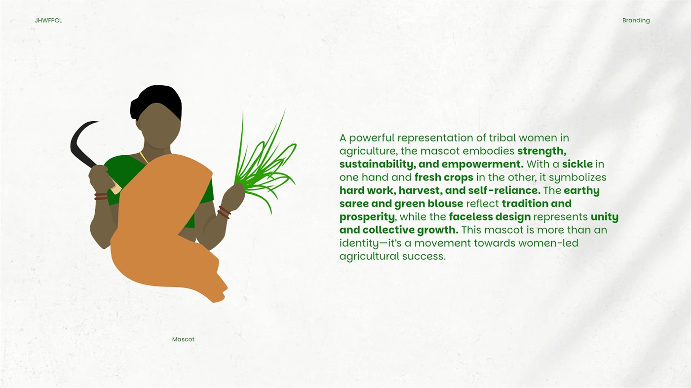
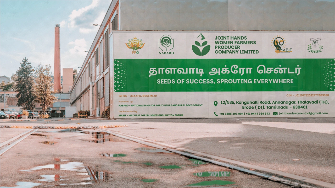
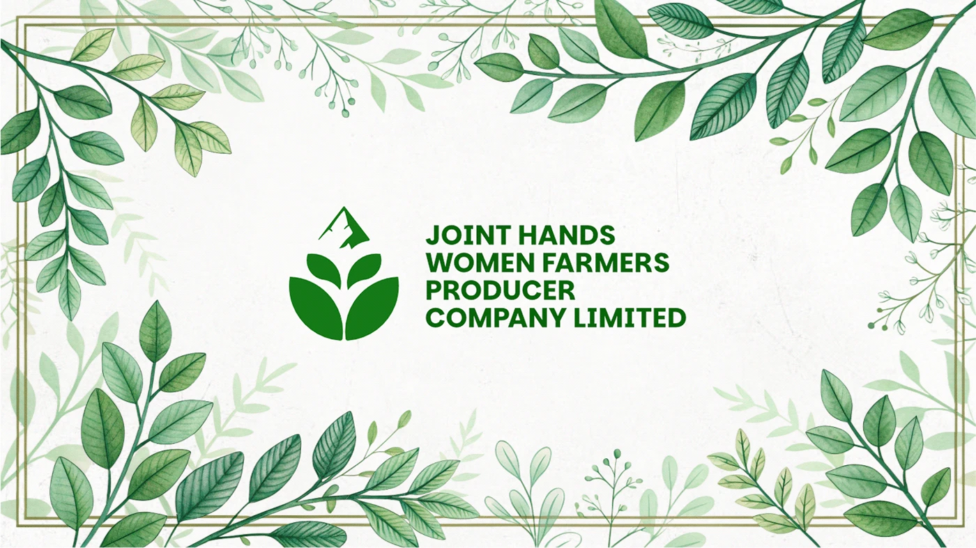
Joint Hands Women Farmers Producer Company Limited, based in Thalavady, Tamil Nadu, is dedicated to empowering women farmers and tribal producers. The organization focuses on adding value to forest and tribal produce while supporting agricultural growth through inputs like fertilizers and pesticides.
They needed a brand identity that would reflect their geographical roots, agricultural mission, and commitment to community-driven sustainability.
Challenges
Despite their strong mission, the organization lacked a visual identity that could:
• Represent Thalavady’s heritage while incorporating elements of agriculture.
• Symbolize empowerment for women farmers and tribal communities.
• Convey sustainability and collaboration through a simple yet meaningful design.
• Stand out in a crowded sector with a unique and recognizable identity.
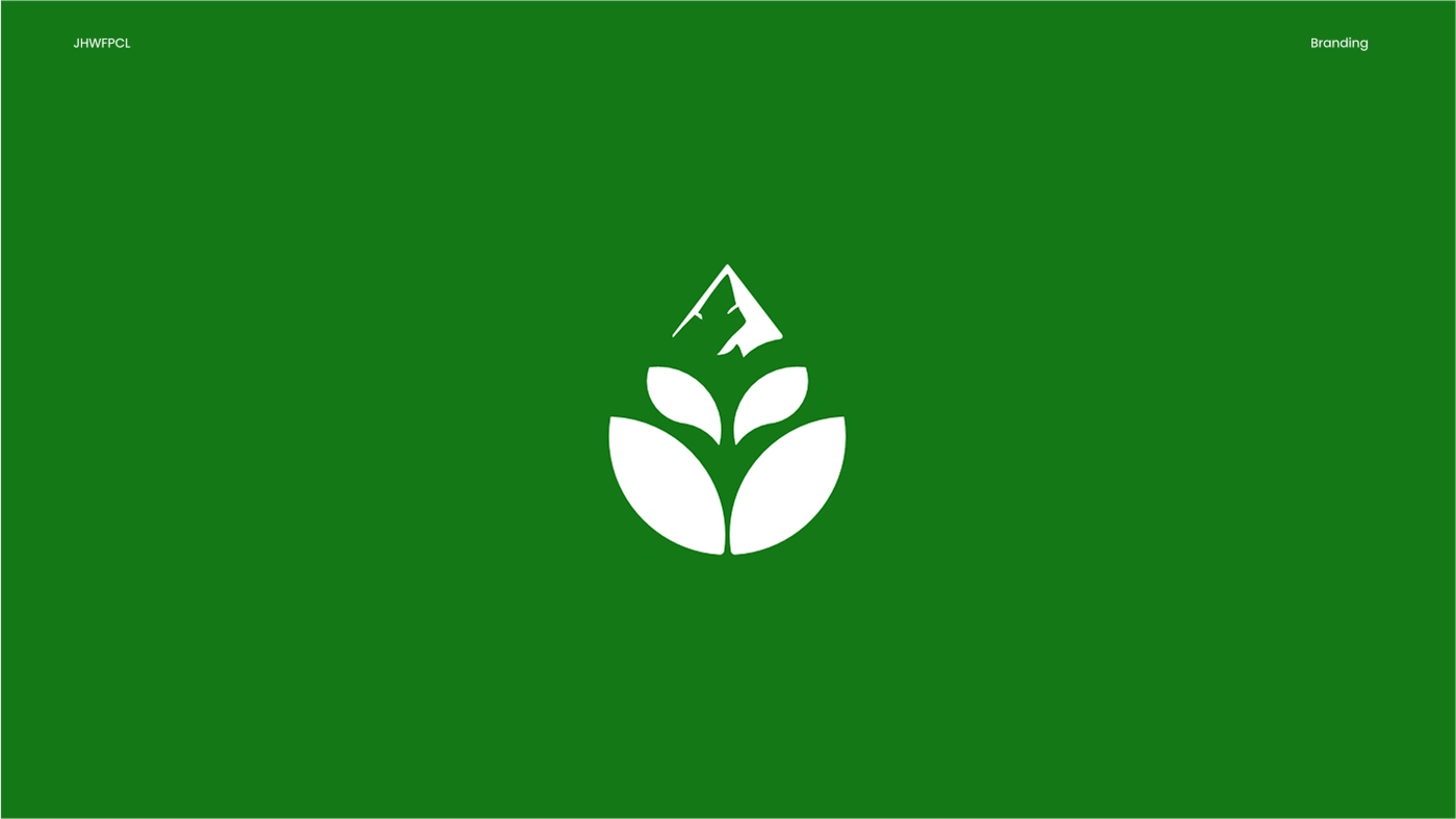
Solution
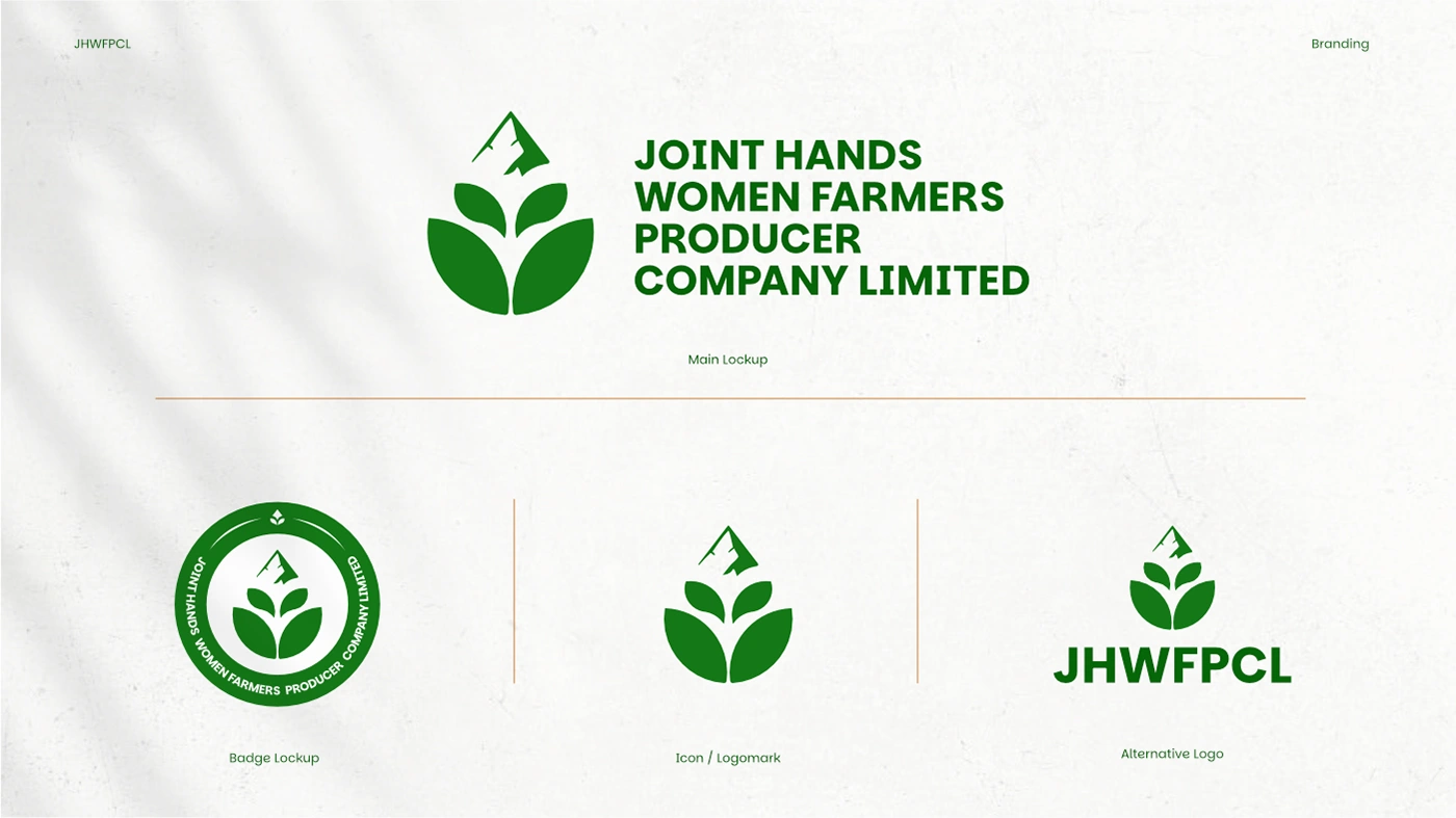
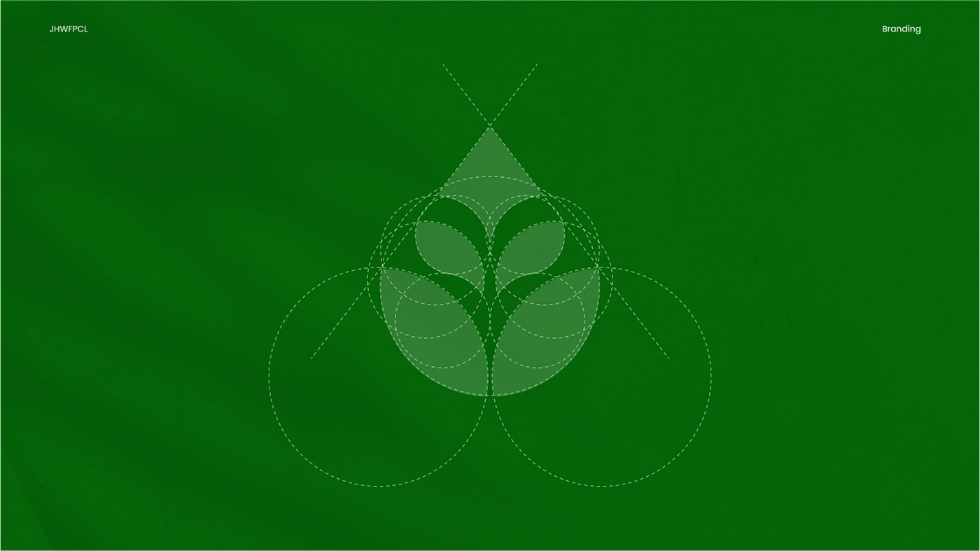
I crafted a symbolic and strategic logo that reflects their mission visually
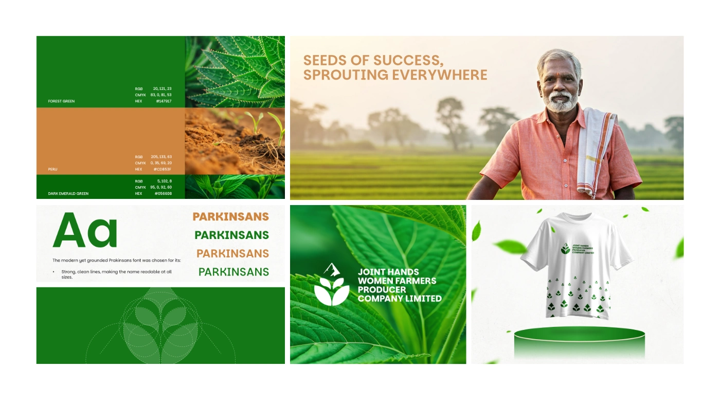
• Mountain Symbol (Top Element) – Represents Thalavady, grounding the logo in the region’s geographical significance.
• Three-Leaf Arrangement – Signifies growth, sustainability, and collective empowerment of women farmers and tribal producers.
• Central Stem (Connecting Element) – Depicts collaboration, unity, and the nurturing role of the organization in agriculture.
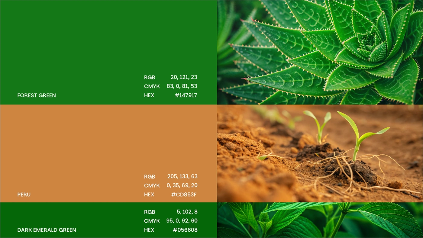
• Color Choice (Deep Green) – Reinforces themes of nature, organic farming, and environmental consciousness.
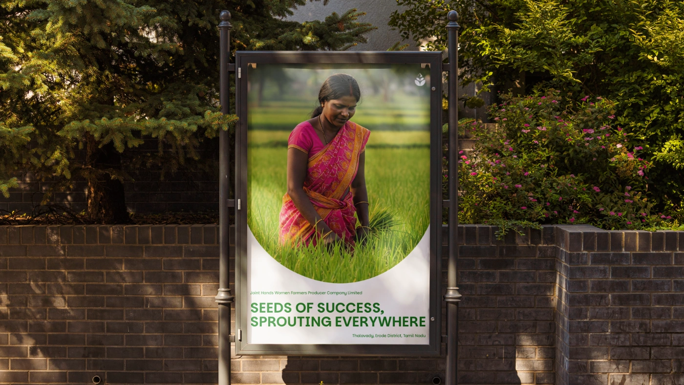
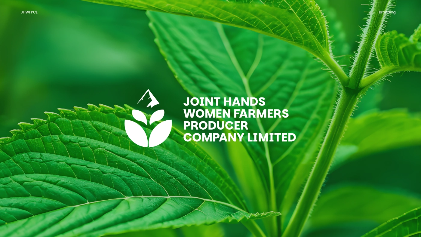
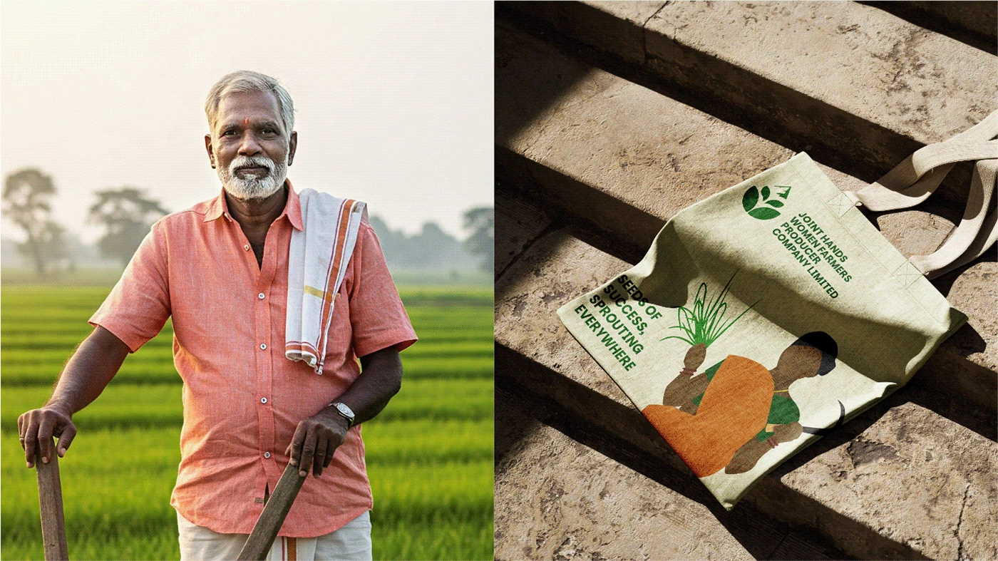
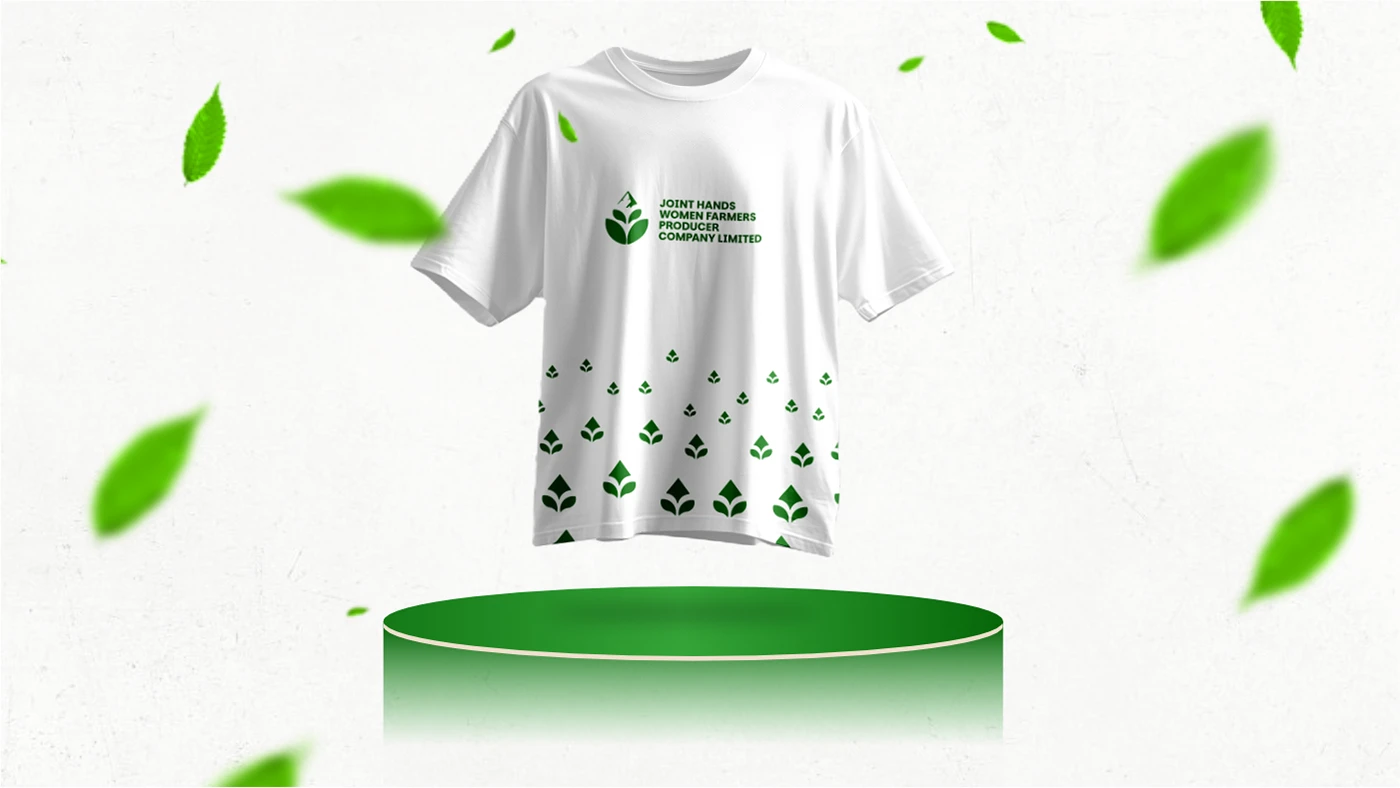
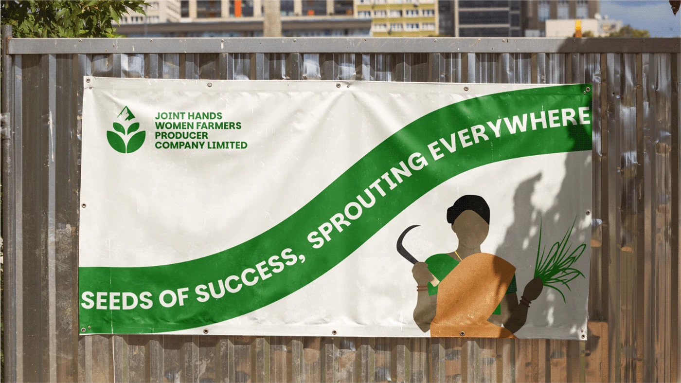
This minimal yet powerful design visually translates their mission into an identity that can be used across various mediums, from packaging to digital branding.


Like this project
Posted Apr 5, 2025
Thalavady's Joint Hands empowers women farmers. Mountain, leaves, stem logo reflects growth, unity, sustainability. Green signifies eco-friendly agriculture.
Likes
0
Views
2
Timeline
Feb 5, 2025 - Feb 20, 2025


Thalavady Farmers Foundation - Branding

Book Cover Designs

\\SQUARE© - Brand Identity Design :: Behance

Solid Wavelength - Brand Identity Design on Behance