Visual Identity for Transfix
Obeng Isaac

TRANSFIX - Brand Identity
Transfix is a piercing and tattoo studio redefining self-expression through bold artistry and precision. I created a brand identity that unites rebellion with refinement. The strategy was to build a visual language that communicates craftsmanship, confidence, and transformation—capturing both the raw emotional energy behind tattoos and the meticulous accuracy required in professional piercing. Central to the identity is a custom “T” symbol inspired by gothic calligraphy and the sharp geometry of piercing tools. This combination reflects Transfix’s dual personality: artistic edge and surgical precision. The logo’s angular flow mirrors the moment of “transfixing”—a point of contact where intention becomes permanent. A dark, atmospheric palette paired with a striking accent colour reinforces the intensity of self-expression, while clean, modern typography keeps the brand elevated and contemporary. Applied across signage, packaging, booking materials, and social assets, the system creates a cohesive visual experience that feels daring yet trustworthy. Overall, the brand positions Transfix as a premium studio where personal stories are transformed into bold, intentional art.

The custom “T” symbol draws from gothic calligraphy and the sharp geometry of piercing tools.
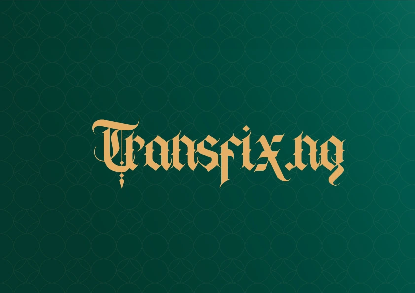
The typography-driven wordmark reinforces the brand’s bold stylistic character.
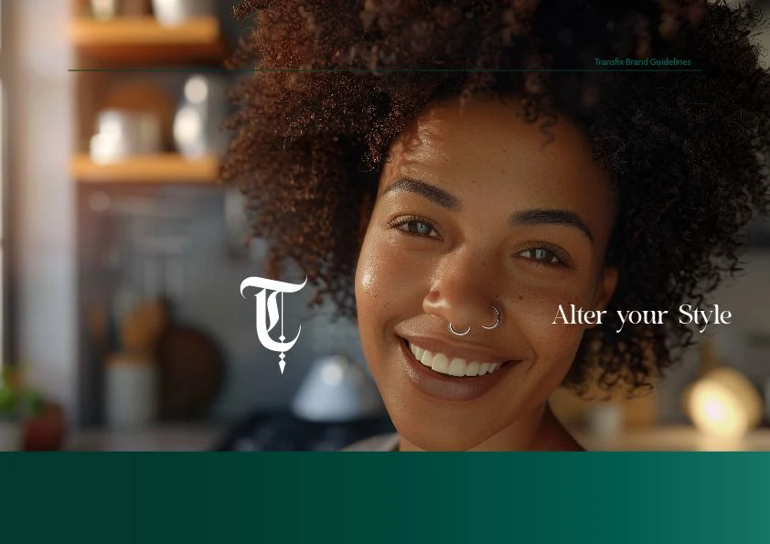
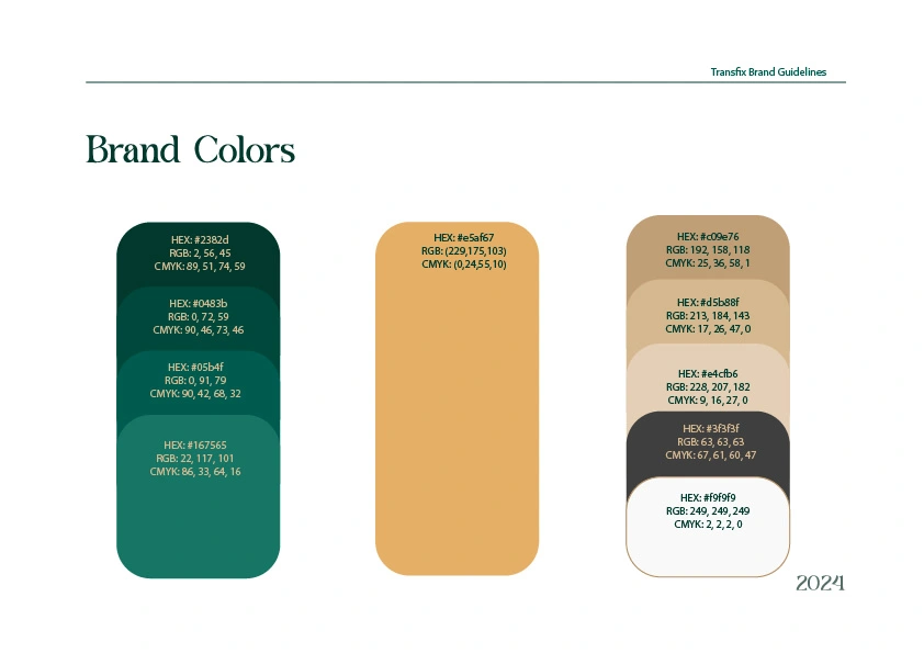
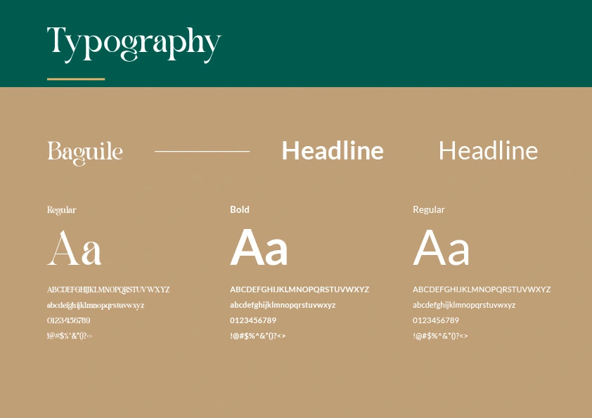
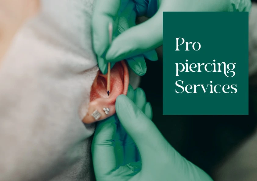

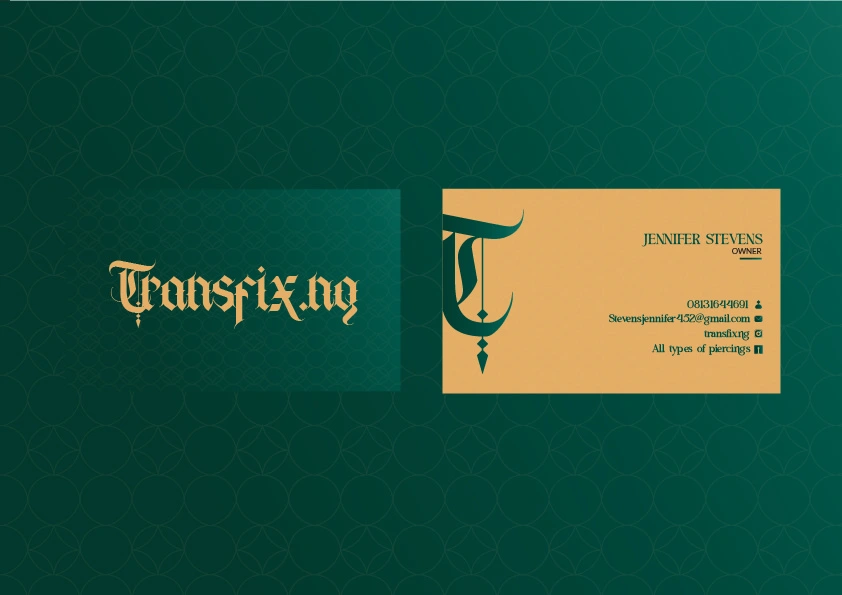
Image generated with lummi


Transfix is a piercing and tattoo studio redefining self-expression through bold artistry and precision.
Like this project
Posted Nov 18, 2025
Crafted a bold brand identity and visual design for a piercing and tattoo studio - turning ink and metal into a powerful visual story.
Likes
1
Views
3