Mono Realty Brand Identity design
Obeng Isaac
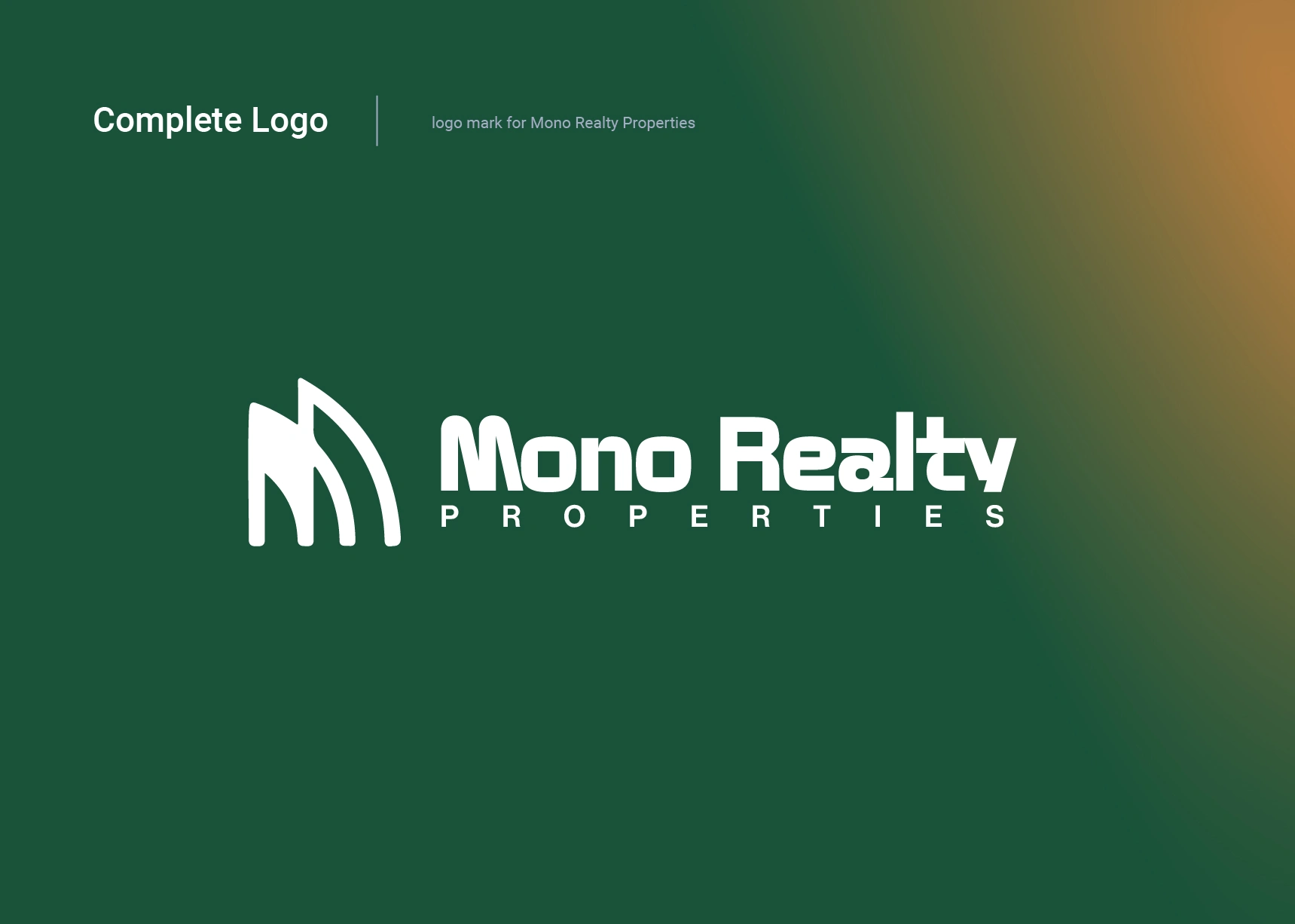
Brand Identity work for Mono Realty
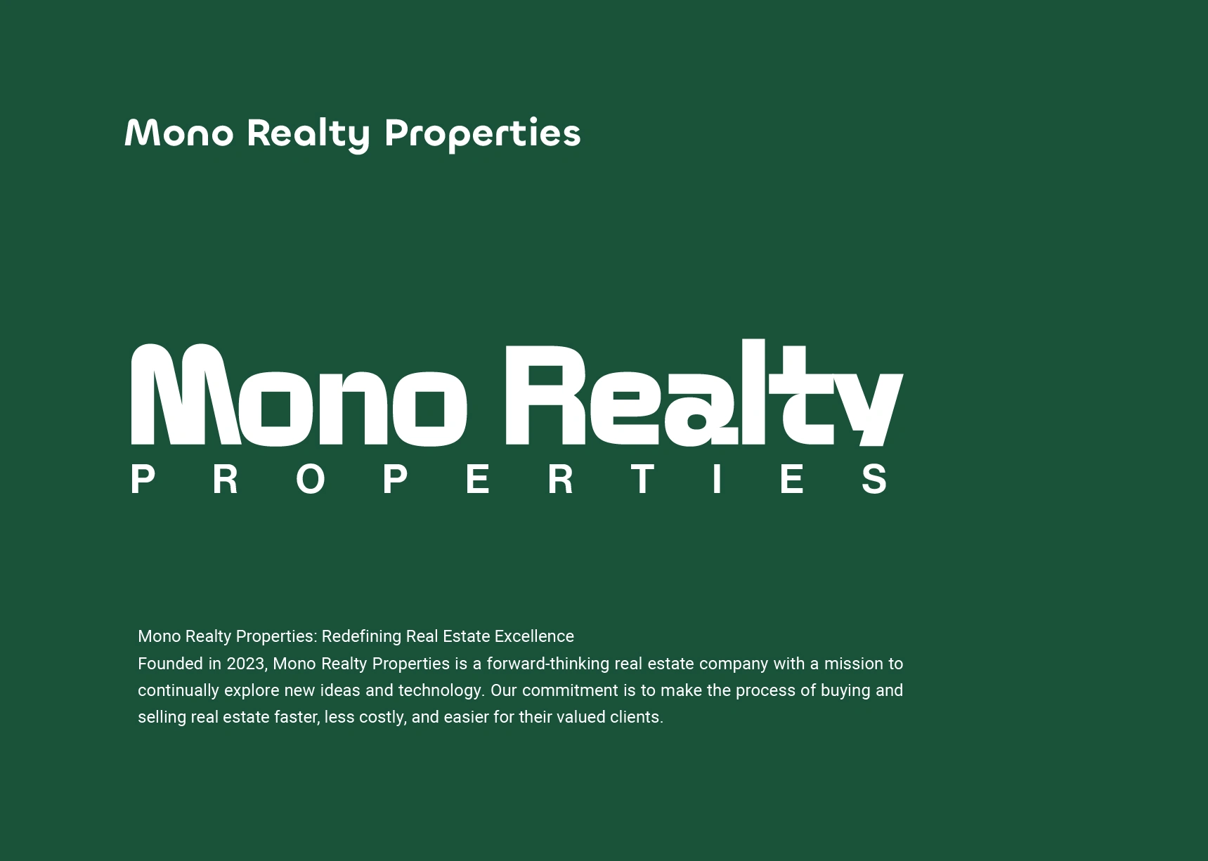
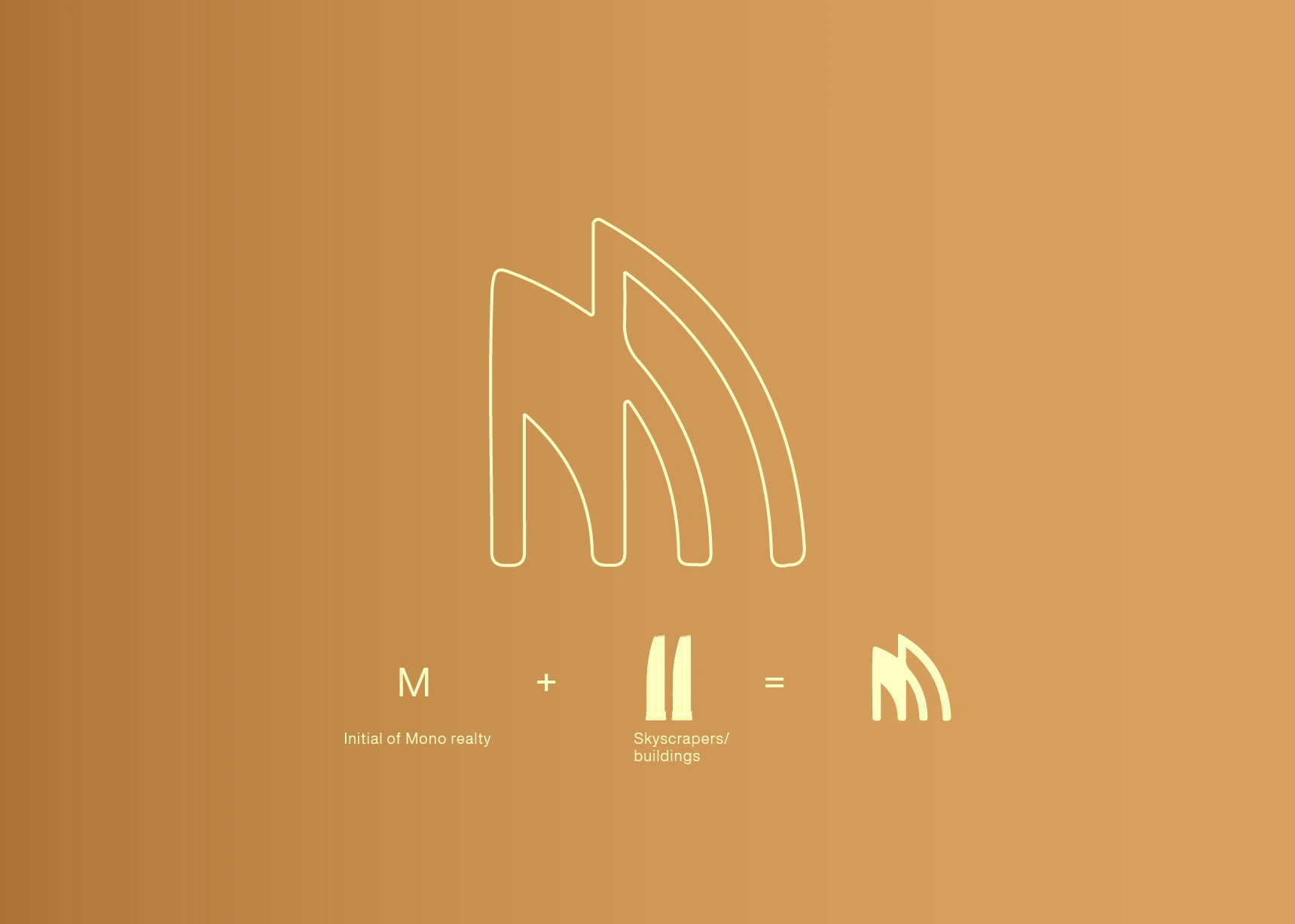
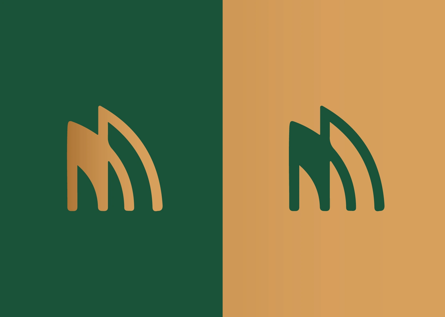
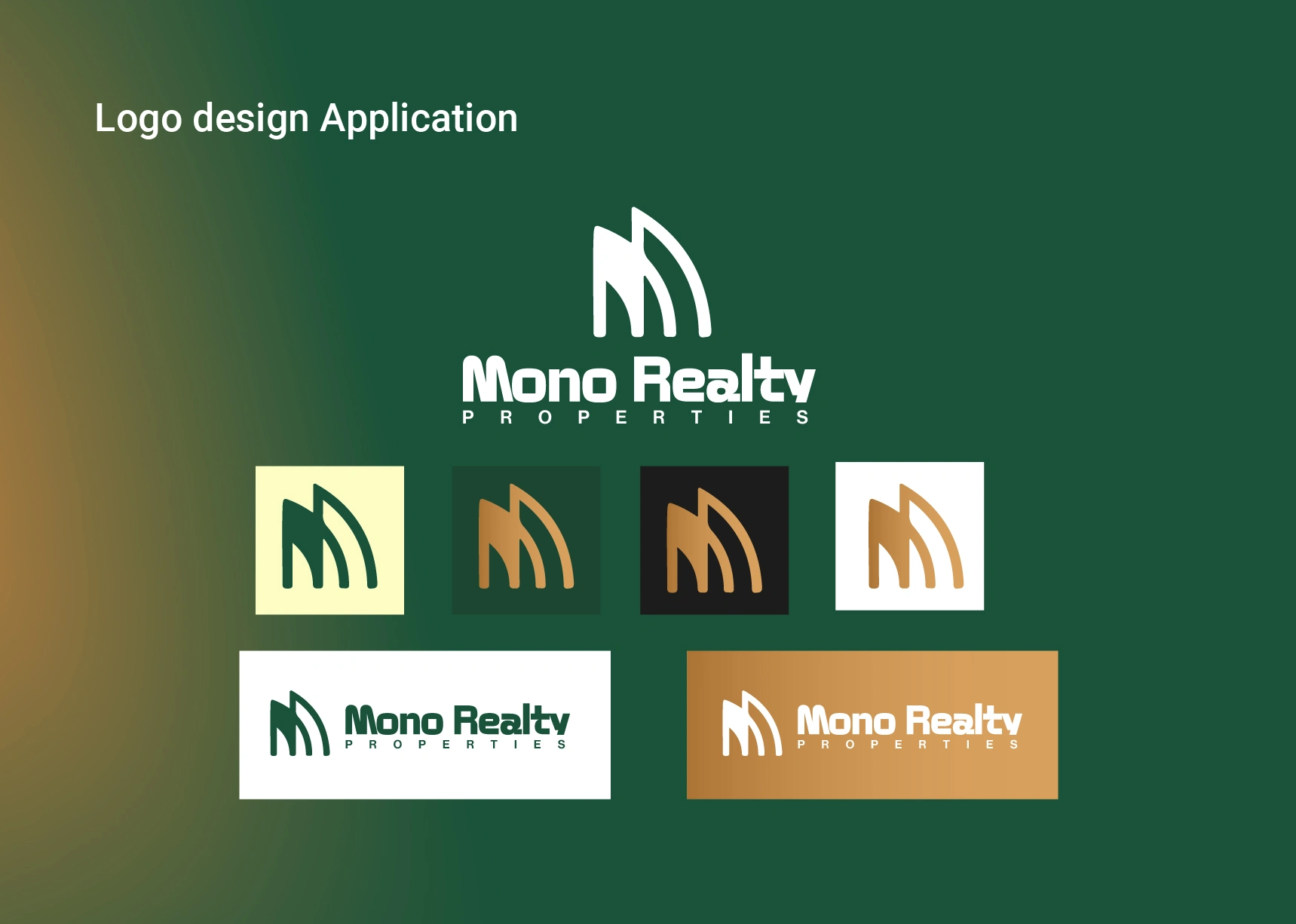
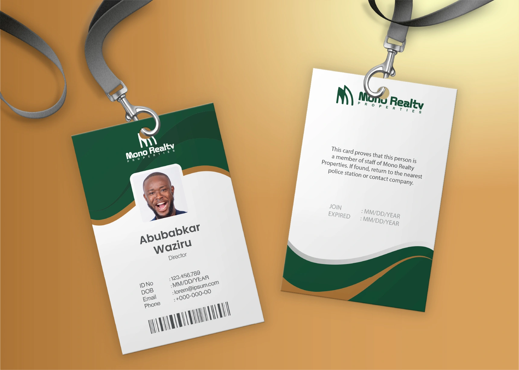
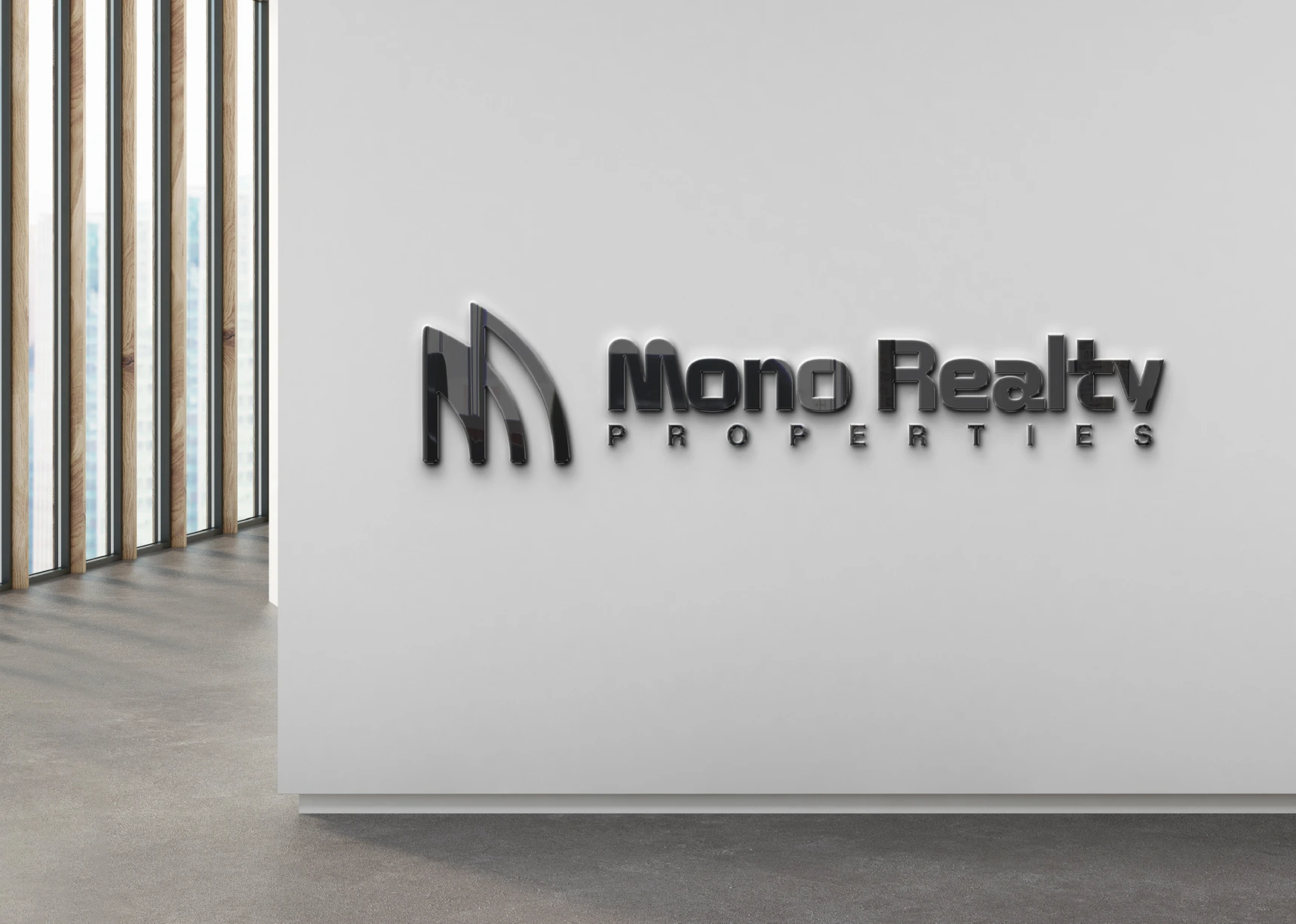
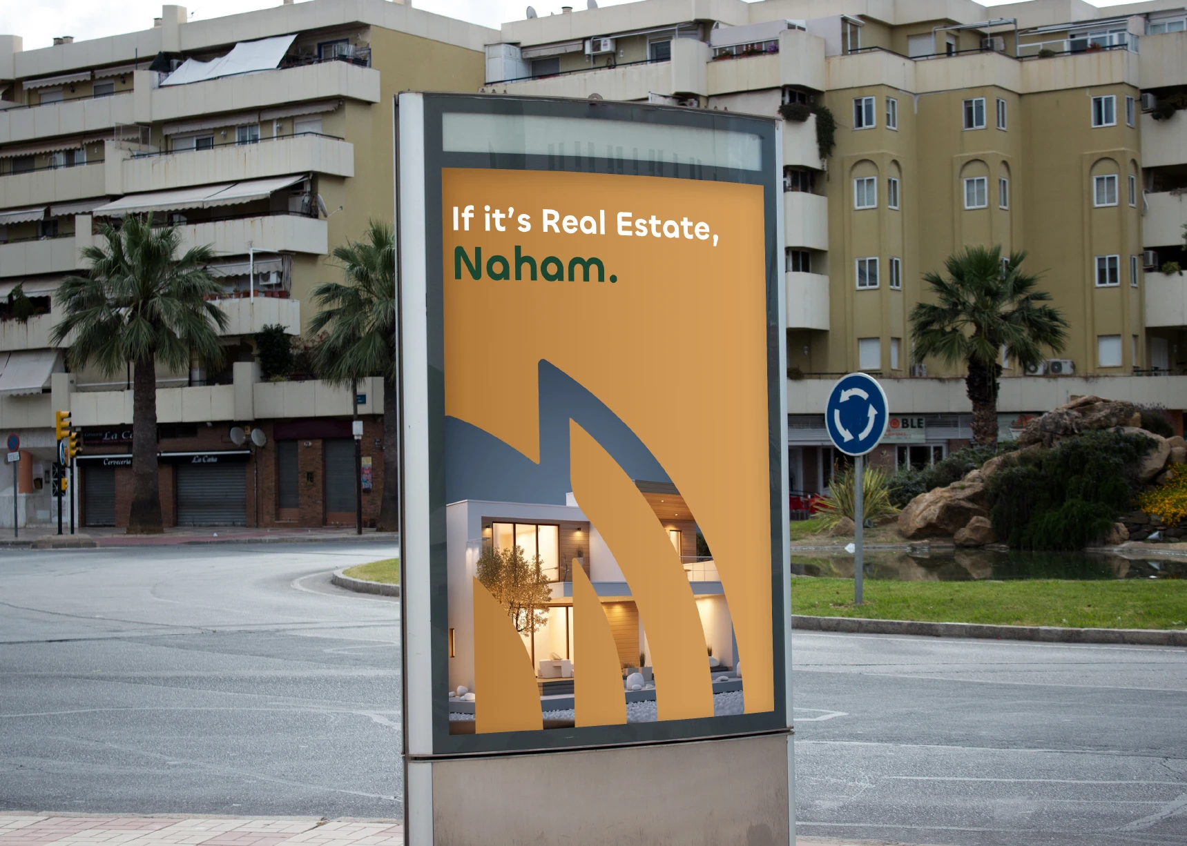
The brand identity for Mono Realty was designed to reflect the company’s mission of making real estate transactions faster, easier, and more cost-effective for modern clients. At the heart of the visual system is the custom “M” monogram, created by merging the silhouettes of two opposing skyscrapers. This approach not only forms the acronym of Mono Realty but also symbolises the meeting point between buyers and sellers, two sides of the market coming together through a seamless, well-guided process. The curved, ascending strokes echo architectural contours and forward motion, reinforcing the brand’s promise of progress, clarity, and upward opportunity in real estate.
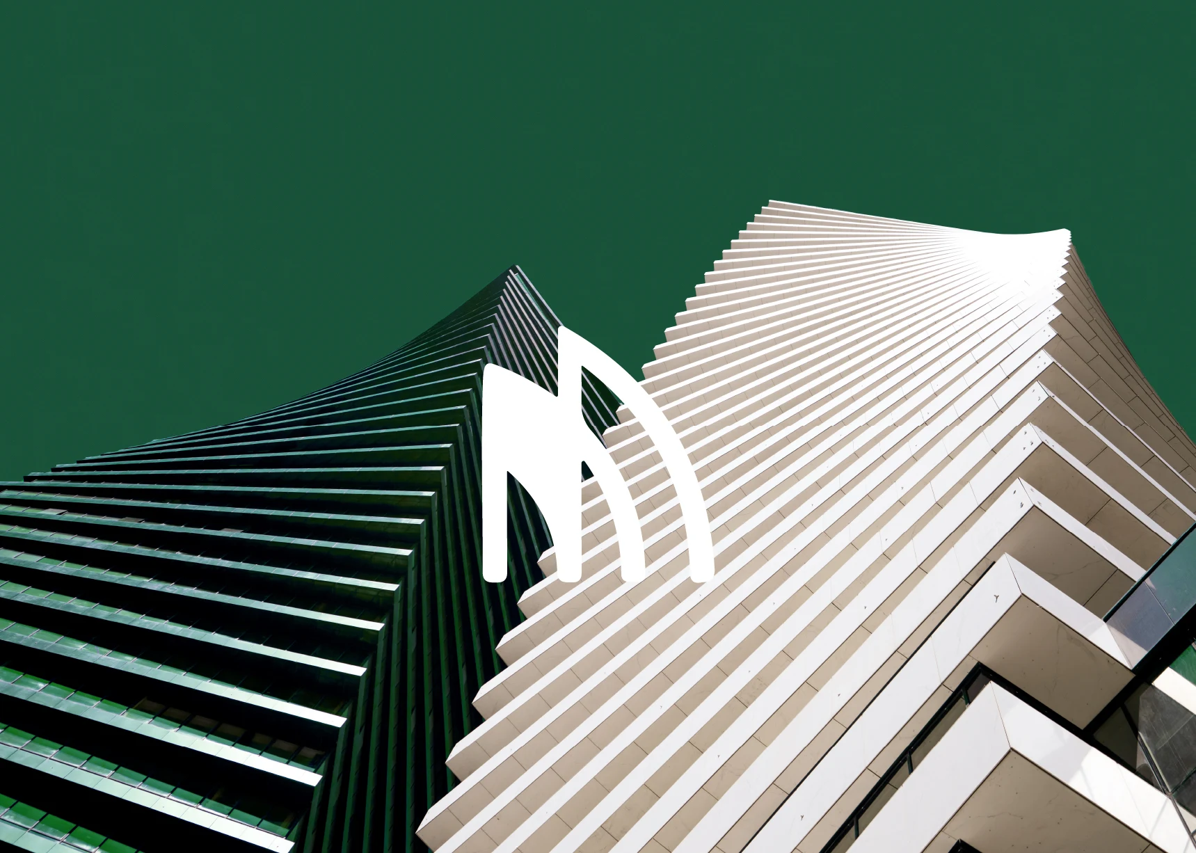
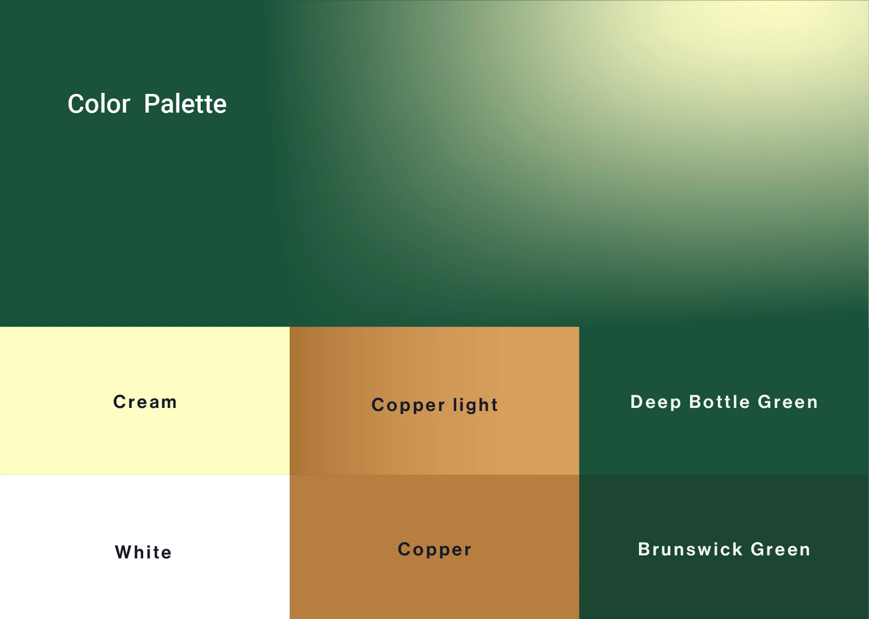
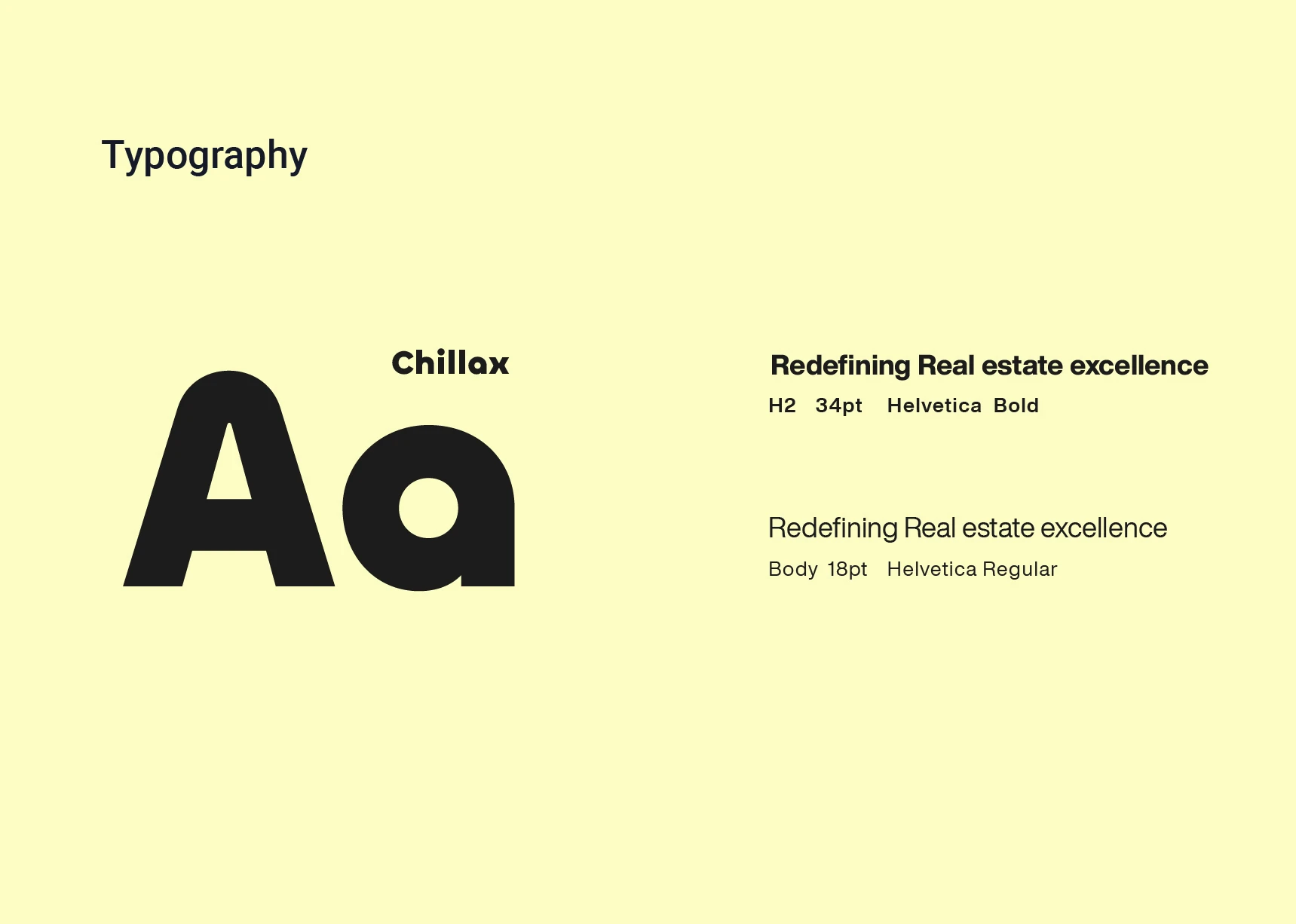
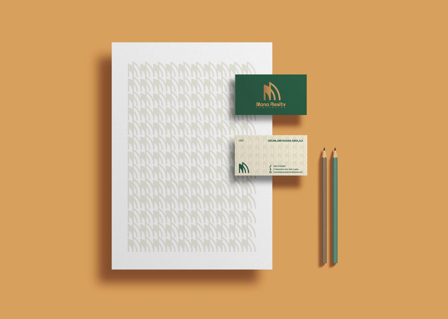
The deep green and warm gold palette was chosen to communicate trust, growth, and long-term value, giving the brand a premium yet approachable presence. When applied across business cards, stationery, and digital layouts, the identity maintains a clean and modern aesthetic that aligns with Mono Realty’s forward-thinking positioning. The skyscraper-inspired symbol seamlessly integrates with architectural photography and marketing materials, creating a cohesive narrative that frames Mono Realty not just as a service provider but as a strategic bridge guiding clients to their next investment with confidence and simplicity.


Like this project
Posted Nov 17, 2025
Brand identity design for Mono Realty Properties, a forward-thinking real estate firm making buying and selling homes faster, easier, and more affordable.