Brand Identity Transformation
Rachel Brown
Break the Silence DV Brand Identity
Good branding can literally save lives. This rebrand transformed a homemade-looking nonprofit identity into a sophisticated brand system that helps survivors feel safe seeking help.
PROJECT OVERVIEW
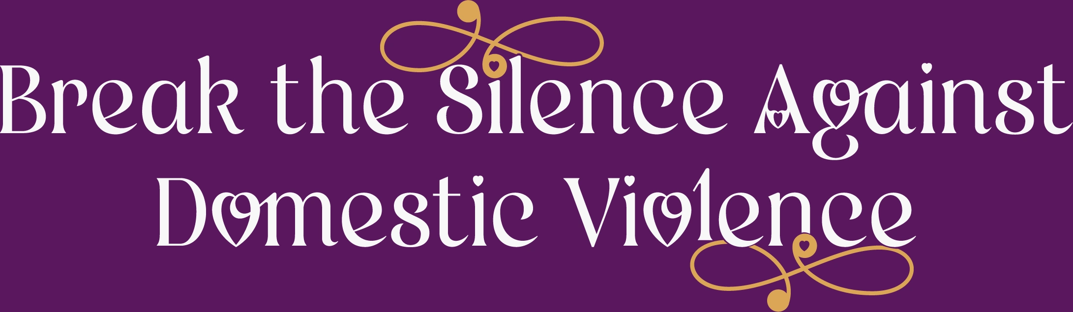
Client: Break the Silence Against Domestic Violence
Timeline: 3 Weeks (August 2025)
My Role: Brand Designer & Strategist
What I Delivered: Logo System, Brand Guidelines, Strategic Direction
This turned out to be one of the most meaningful projects I've worked on. Over three weeks, I collaborated with Break the Silence Against Domestic Violence (BTSADV) to transform their "homemade" brand identity into something sophisticated and professional that could actually help survivors feel safe seeking help.
The goal was straightforward: deliver a logo, brand guidelines, and strategic direction. What I didn't expect was how much this would teach me about designing for sensitive communities and the real impact thoughtful branding can have on vulnerable populations.
"We need something that doesn't scream 'domestic violence' but still represents strength. When survivors see it, they should feel safe, not scared."
— BTSADV Team
THE CHALLENGE
BTSADV came to me because their existing materials looked "homemade" and it was limiting their credibility. They were struggling with grant applications, community partnerships, and professional recognition.
But the challenge went way deeper than aesthetics.
Safety came first. The brand couldn't immediately identify as a domestic violence organization. Staff needed to feel comfortable wearing branded items in public. Survivors needed to feel safe approaching the organization without obvious public identification.
They needed something that felt "like a warm hug and a strong handshake at the same time." Welcoming but empowering. Comforting but strong. Professional but not corporate.
Budget was tight. I needed to maximize impact within limited scope, which meant every decision had to serve multiple purposes.
This required completely different thinking than corporate branding. Traditional approaches wouldn't work. Every design decision needed to be filtered through: "Does this serve survivors? Does this make them feel safer? Does this reduce barriers?"
RESEARCH & DISCOVERY
I spent Week 1 in deep discovery. That first 45-minute stakeholder meeting was transformative—I documented everything because I knew this wasn't typical client feedback.
Core values identified: Empowerment • Safety • Community • Hope • Respect • Accessibility
I also did competitive analysis of existing DV awareness campaigns, analyzed their social media for brand personality cues, and documented all their unique safety requirements.
The biggest learning? I needed to become comfortable discussing domestic violence, survivor experiences, and safety protocols professionally. This wasn't typical design vocabulary, but it was essential for understanding what they actually needed.
CREATIVE DEVELOPMENT
Based on everything I learned, I developed two mood board directions:
Direction 1: "Women" - Bold Contemporary Empowerment
Vibrant purples, striking imagery, confident energy. Modern, powerful, unapologetically strong. High-contrast combinations with contemporary luxury aesthetic.
Direction 2: "Healing" - Elegant Transformation
Flowing elements, sophisticated aesthetic, nurturing feel. Refined script typography with natural textures. Graceful and elegantly empowering.
"We love how confident and strong it feels while still maintaining that sophisticated aesthetic we're looking for."
— Executive Director
The team loved the confidence of Direction 1 but wanted elements from Direction 2 as well. Rather than insisting on one pure vision, I saw an opportunity to create something even better by actually listening to what they needed.
THE SOLUTION: BOLD CONTEMPORARY
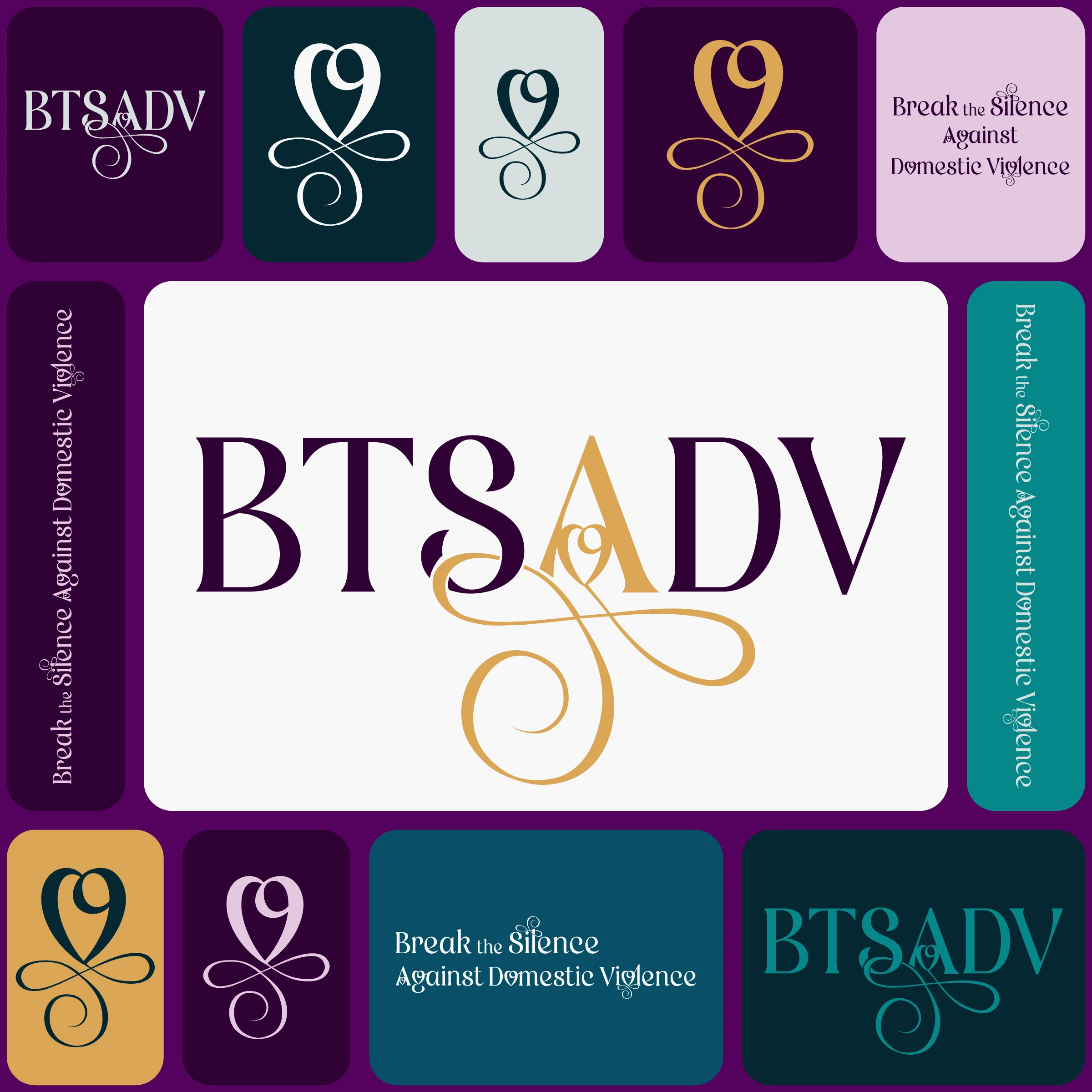
The final "Bold Contemporary" direction features a heart-infinity symbol representing continuous growth and healing—exactly what BTSADV is about.
The refined purple and gold palette maintains connection to DV awareness colors while elevating sophistication way beyond typical nonprofit branding.
Three Strategic Variations
Acronym + Flourishes
For immediate brand recognition, social media, and merchandise. Strong, memorable, instantly recognizable.
Full Organization Name
For formal contexts like grant applications, official documents, and professional partnerships where full identification is appropriate.
Standalone Symbol
For subtle applications where safety is crucial. Can be recognized by those who need help without obvious identification. Perfect for staff items and awareness materials.
Why This Works
Continuous growth symbolism through the heart-infinity mark reinforces their mission of ongoing support and transformation.
Refined sophistication builds credibility with funders and partners while remaining approachable for those seeking help.
Empowered strength through bold contemporary typography that commands attention without being aggressive.
Safe accessibility that's subtle enough to protect privacy while being recognizable to those who need it.
Versatile application across everything from business cards to future signage, in both color and black-and-white.
THE BEFORE & AFTER
Before: Well-intentioned but amateur execution. Circular text around infinity-heart symbol that was hard to read at small sizes. Limited color refinement and inconsistent application.
After: Sophisticated, professional brand system that commands respect while feeling safe and approachable. Clean, modern execution with strategic color palette and multiple variations for different use cases.
"You truly understood our vision and brought it to life in such a beautiful and meaningful way. The team here is absolutely thrilled with Logo Option 1 and we're so excited to start using it."
— Executive Director
WHEN PLANS CHANGE
Midway through Week 3, the client emailed to postpone the t-shirt design portion. Budget priorities had shifted, and they wanted to focus on core branding first.
My first reaction? Disappointment. I'd been excited about the merchandise component.
But this is where leadership actually happens.
Instead of treating it like scope reduction, I reframed it as an opportunity. I expanded the brand guidelines way beyond what was originally planned, created additional logo variations they hadn't requested, and developed detailed safety documentation.
The result? They told me we "exceeded expectations completely," and we've established an ongoing relationship for future work.
The lesson: Flexibility builds stronger relationships than rigid plans.
THE REAL IMPACT
For BTSADV
Professional materials that have already improved grant application outcomes
Staff confidence in representing the organization
Merchandise foundation ready for future revenue generation
Elevated community presence strengthening partnerships
For Survivors
Less intimidating, more approachable identity
Safe accessibility without obvious public identification
Empowering visual message reinforcing strength and hope
Removed barriers for people in crisis seeking help
For the Community
Recognized as legitimate, trustworthy resource
Attractive to business partnerships and volunteers
Professional presence building community trust
Foundation for future awareness campaigns
Success Metrics
✓ 100% on-time delivery within 3-week timeline
✓ Unanimous client approval at every milestone
✓ Professional-grade deliverables meeting industry standards
✓ Established ongoing relationship for future collaboration
✓ Immediate positive impact on grant materials
WHAT I LEARNED
Sensitive topics require completely different communication. I couldn't maintain typical designer-client dynamics. I needed to be a partner, a listener, sometimes just a human being acknowledging difficult realities.
Every design decision carries responsibility. This wasn't about creating something pretty—it was about creating something that could influence whether someone sought help in a crisis.
Emotional stakeholders need extra care. The team was deeply, personally passionate. I needed to honor that while guiding them professionally.
Flexibility beats rigid plans. That scope change could have damaged everything. Instead, it strengthened our relationship because I adapted gracefully.
Good design removes barriers. My work either made help more accessible or less accessible. There was no neutral ground.
Meaningful work means understanding impact. I'm not just delivering logo files—I'm delivering tools that serve survivors of domestic violence.
SKILLS DEMONSTRATED
Brand Strategy & Positioning • Visual Identity Design • Stakeholder Management • Adaptive Leadership • Empathetic Communication • Project Management • Safety-Conscious Design • Nonprofit Branding • Community Impact Focus
WHAT'S NEXT
This project has become a template for my nonprofit work, providing a framework for approaching sensitive community design that I can use and refine with each project.
This experience reinforced my commitment to using design for social good. This won't be my last project serving vulnerable communities.
Better Community: Better World Project | NSLS Executive Leadership Program
Interested in working together on meaningful community projects? Let's talk about how thoughtful design can serve your mission.
Like this project
Posted Dec 31, 2025
Good branding can literally save lives. This rebrand transformed a nonprofit identity into a sophisticated brand system.
Likes
0
Views
5