Poppin' Popcorn
Rachel Brown
Poppin' Popcorn Packaging Design
The Backstory
Poppin' Popcorn came to me with a fun challenge: create some seriously eye-catching packaging for their new "Poppin' Party Packs" that would make people stop. They wanted something that screamed, "Grab me!" while showing off all those tasty flavors they've cooked up!
What the Client Needed
The Poppin' Popcorn crew wanted a fun new look that would really make their brand stand out. They needed packaging that jumps off the shelf and catches everyone's eye when they're hunting for a snack. The designs had to shout their catchy tagline "Poppin' Fun, Poppin' Flavor!" while showing off all their different flavors. Most importantly, everything needed to look like one big popcorn family – different enough to tell apart but still obviously all from the same awesome snack brand that everyone's going to love grabbing for movie night or whenever the munchies hit.
Who We Were Aiming For
We wanted to grab the attention of all kinds of snack lovers out there! First up, the serious popcorn fanatics (yeah, you know exactly who you are!) who can't get enough of the good stuff. Then there's families looking for something tasty to share while hanging out together. We're also after anybody with working taste buds who's up for a flavor adventure beyond the boring everyday snacks. And let's not forget those impulse shoppers who spot our bags and think "Whoa, that packaging looks way too cool to just walk by!" - because sometimes you just can't help grabbing something that looks as awesome as it tastes!
How I Tackled the Project
Research Phase
First things first - I scoped out what was already taking up shelf space and got deep into all the snack packaging trends. Nothing beats rolling up your sleeves and doing the research yourself, so yeah, I absolutely munched my way through a ton of popcorn. Tough gig, right? But hey, somebody's gotta step up and take one for the team!
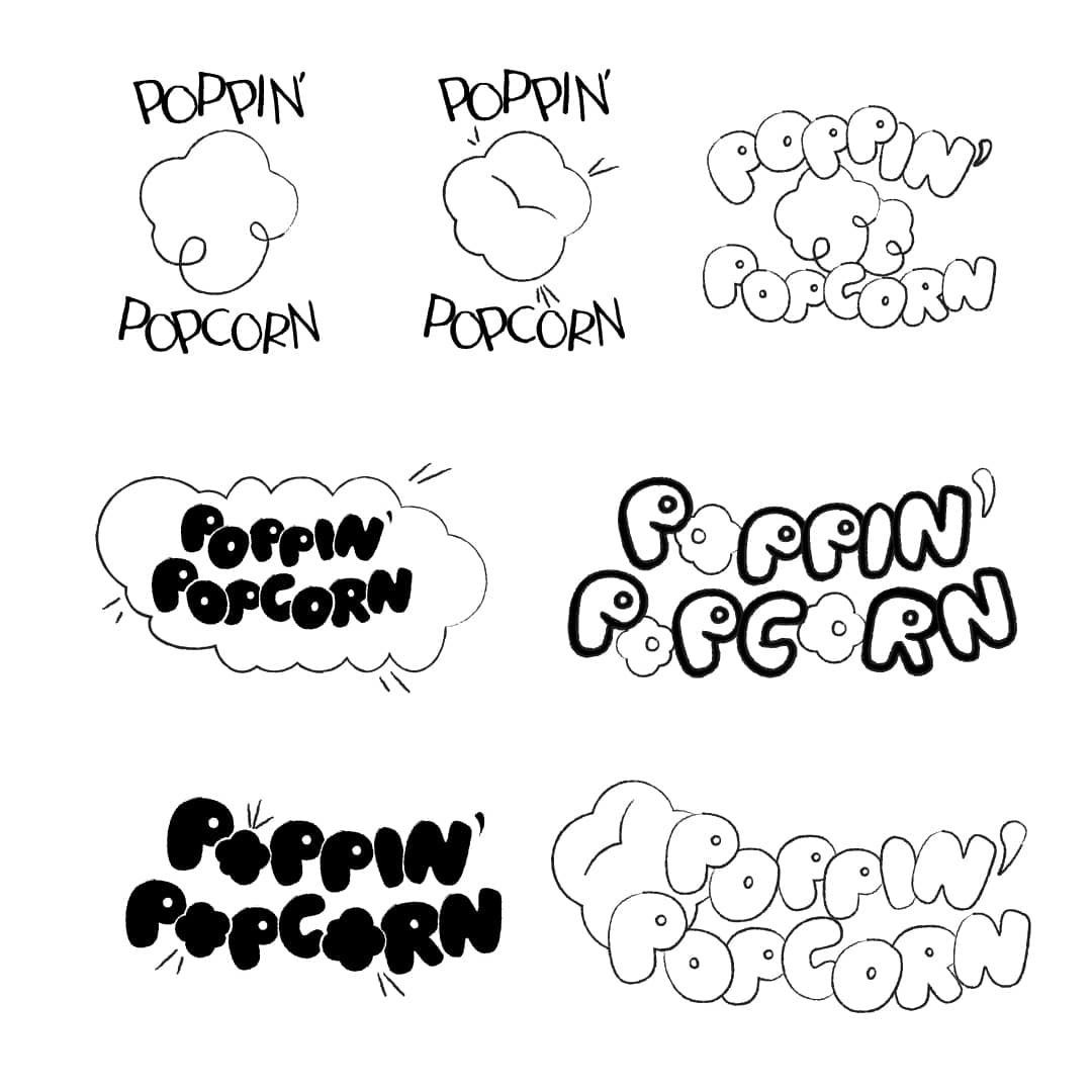
Sketching Phase
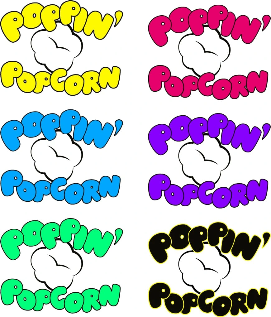
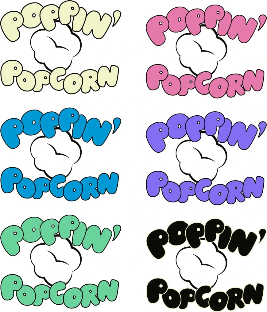
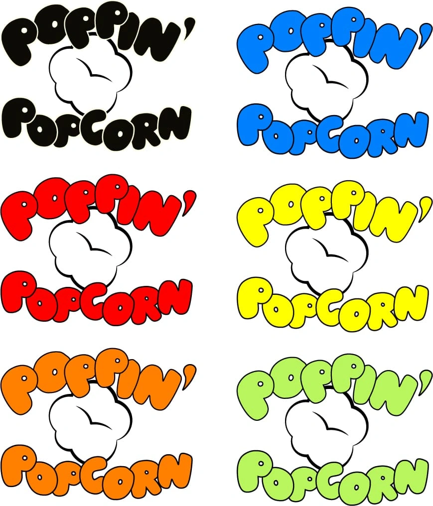
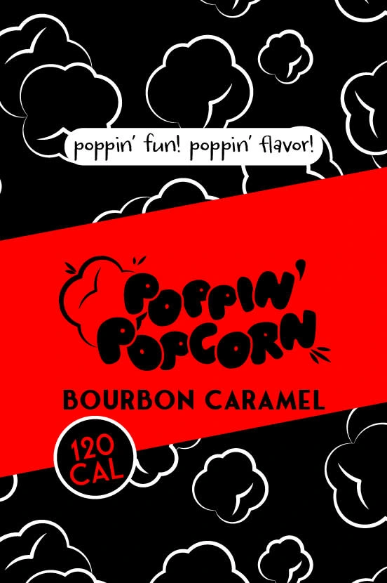
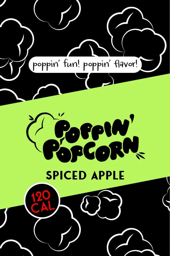
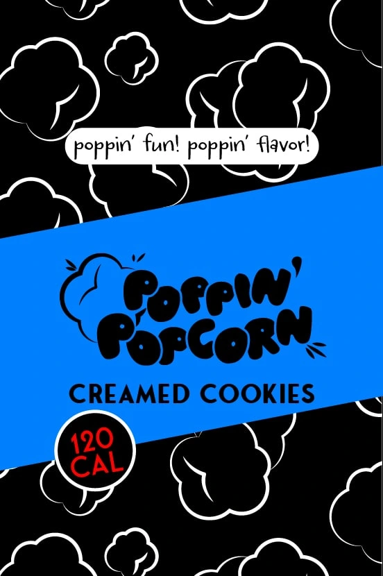
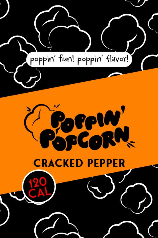
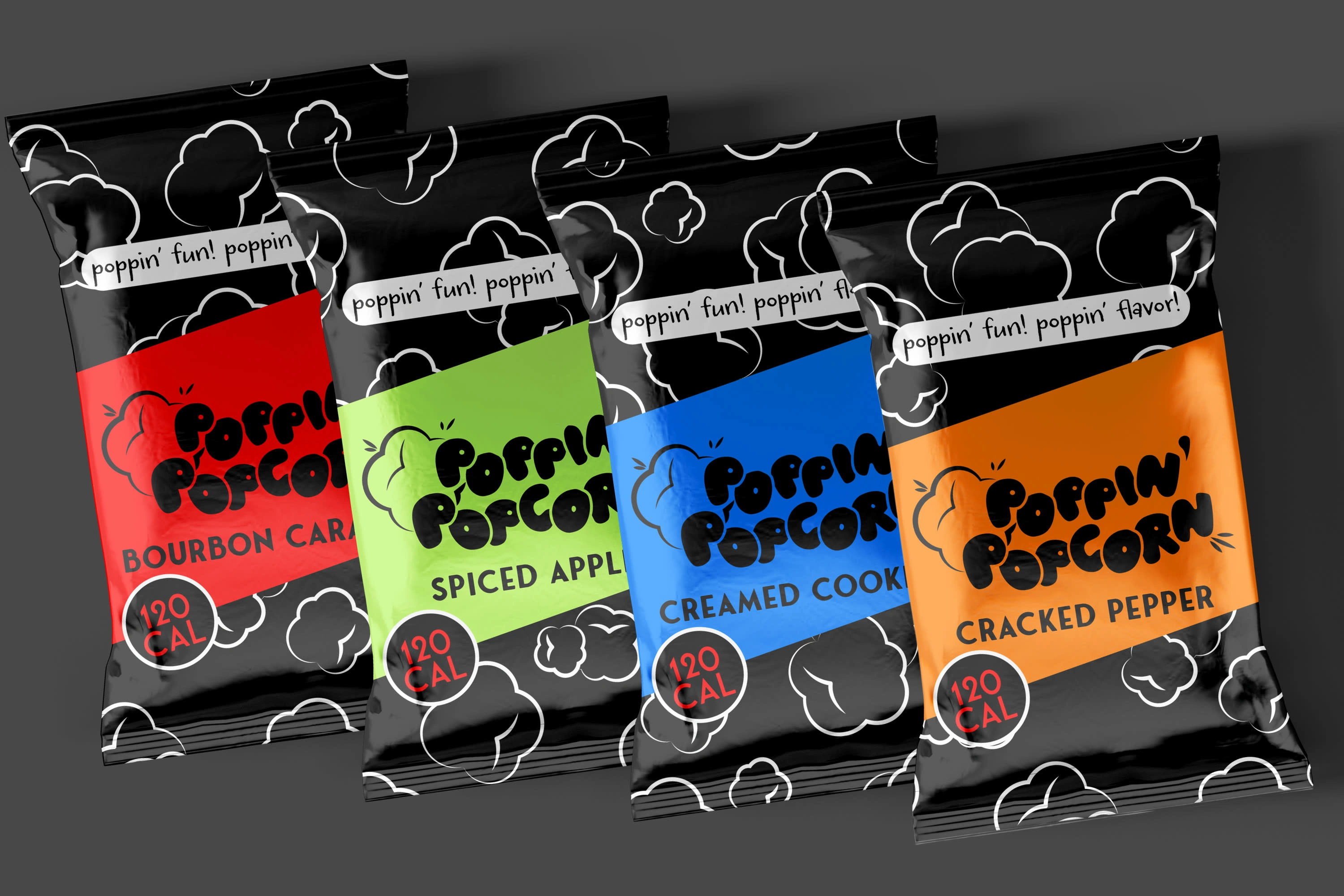
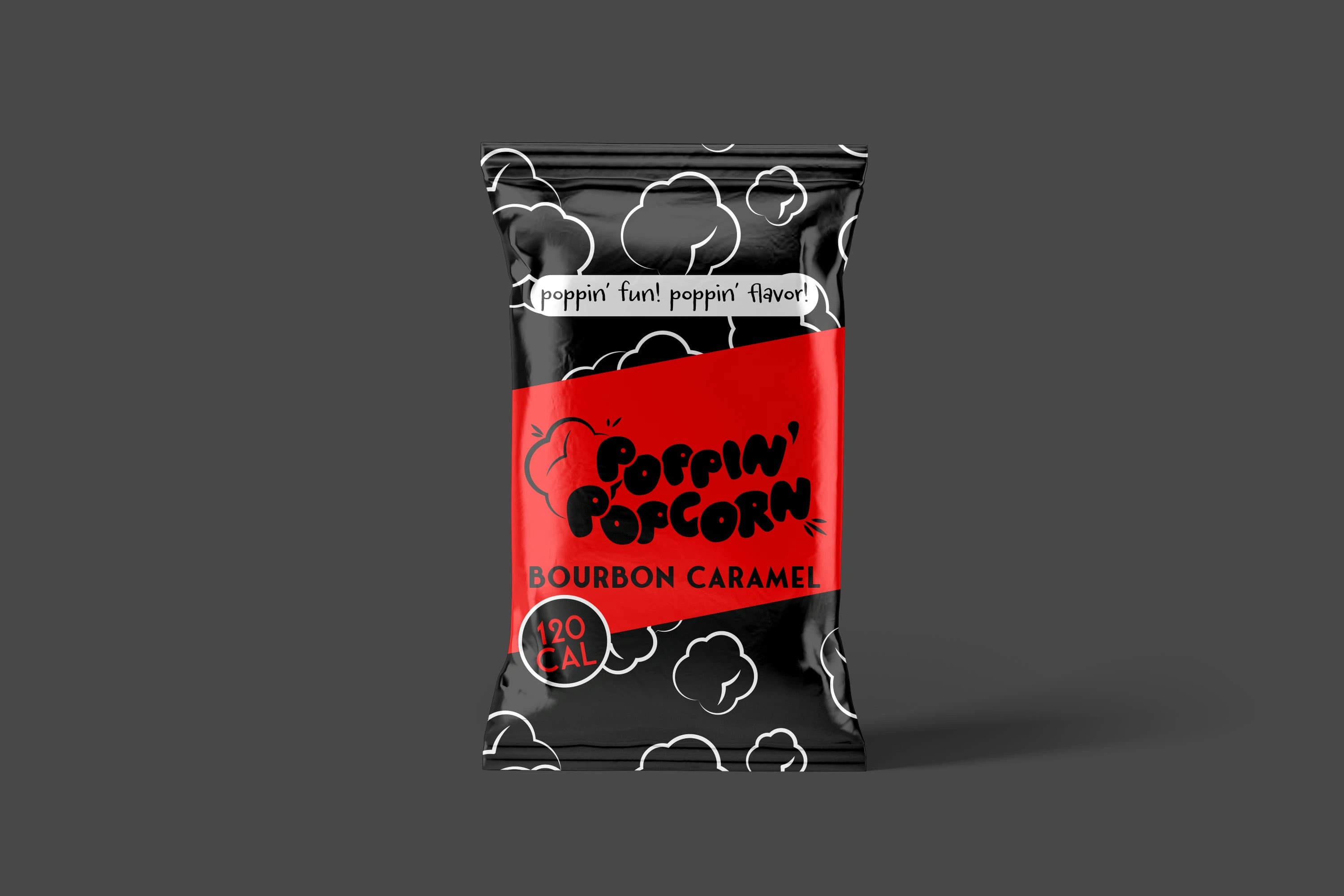
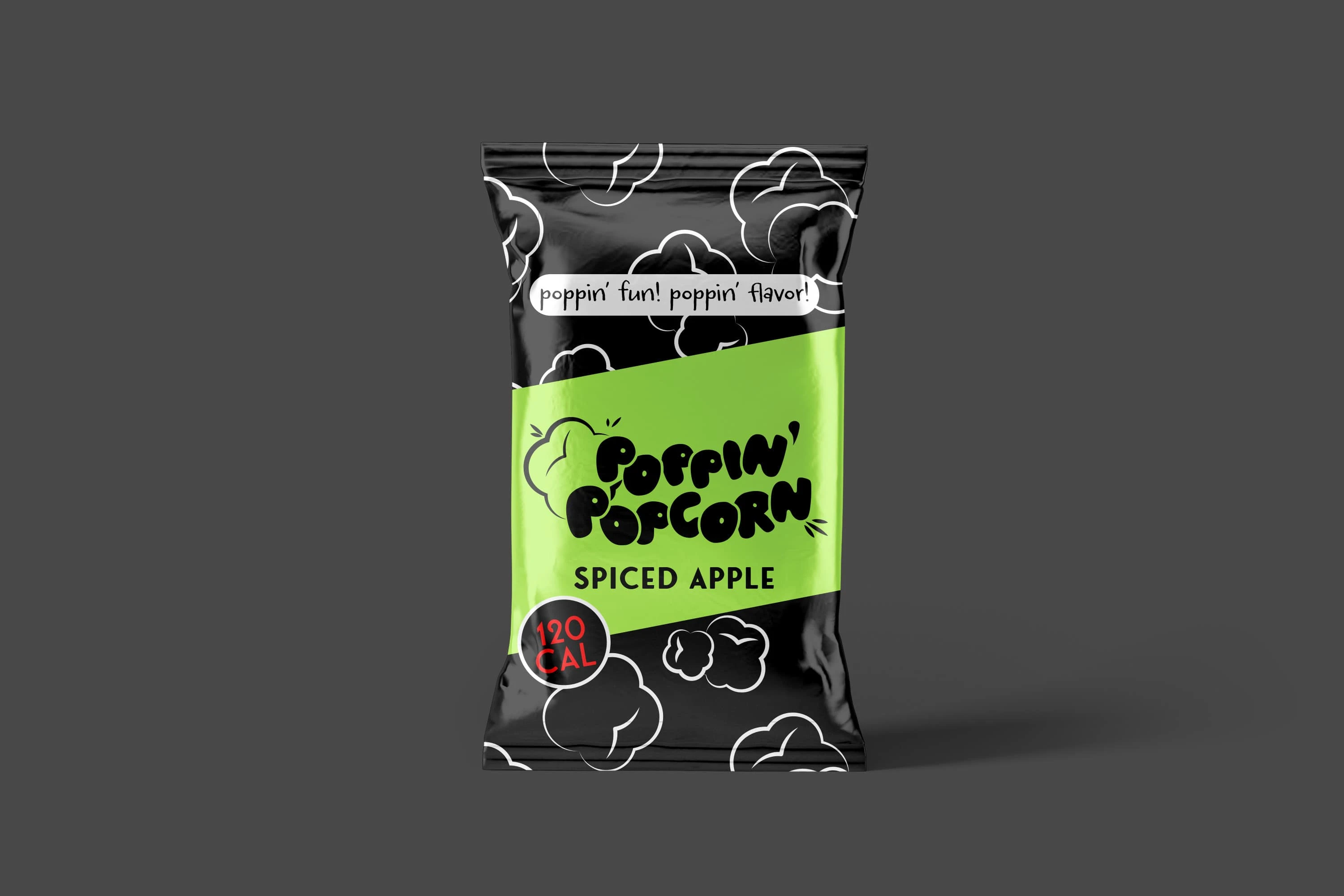
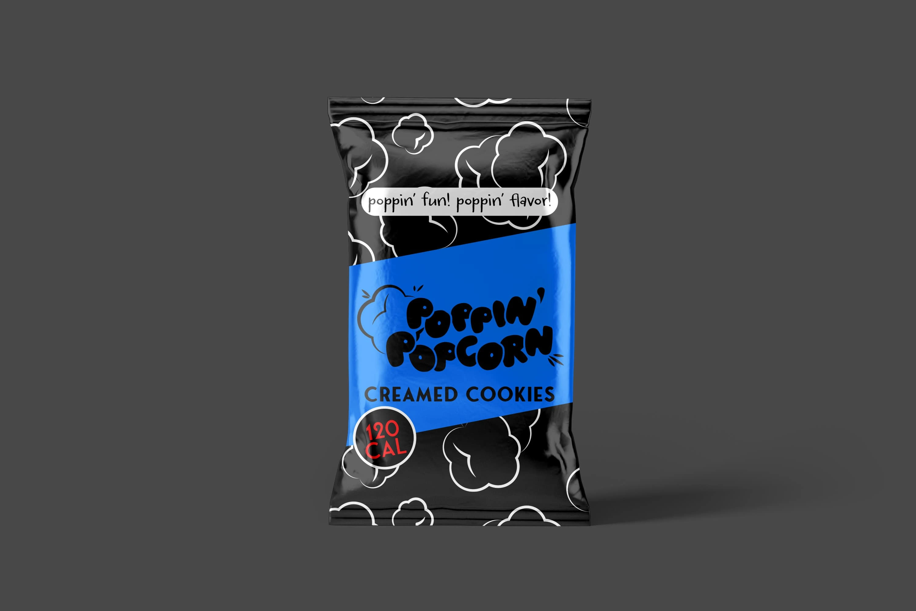
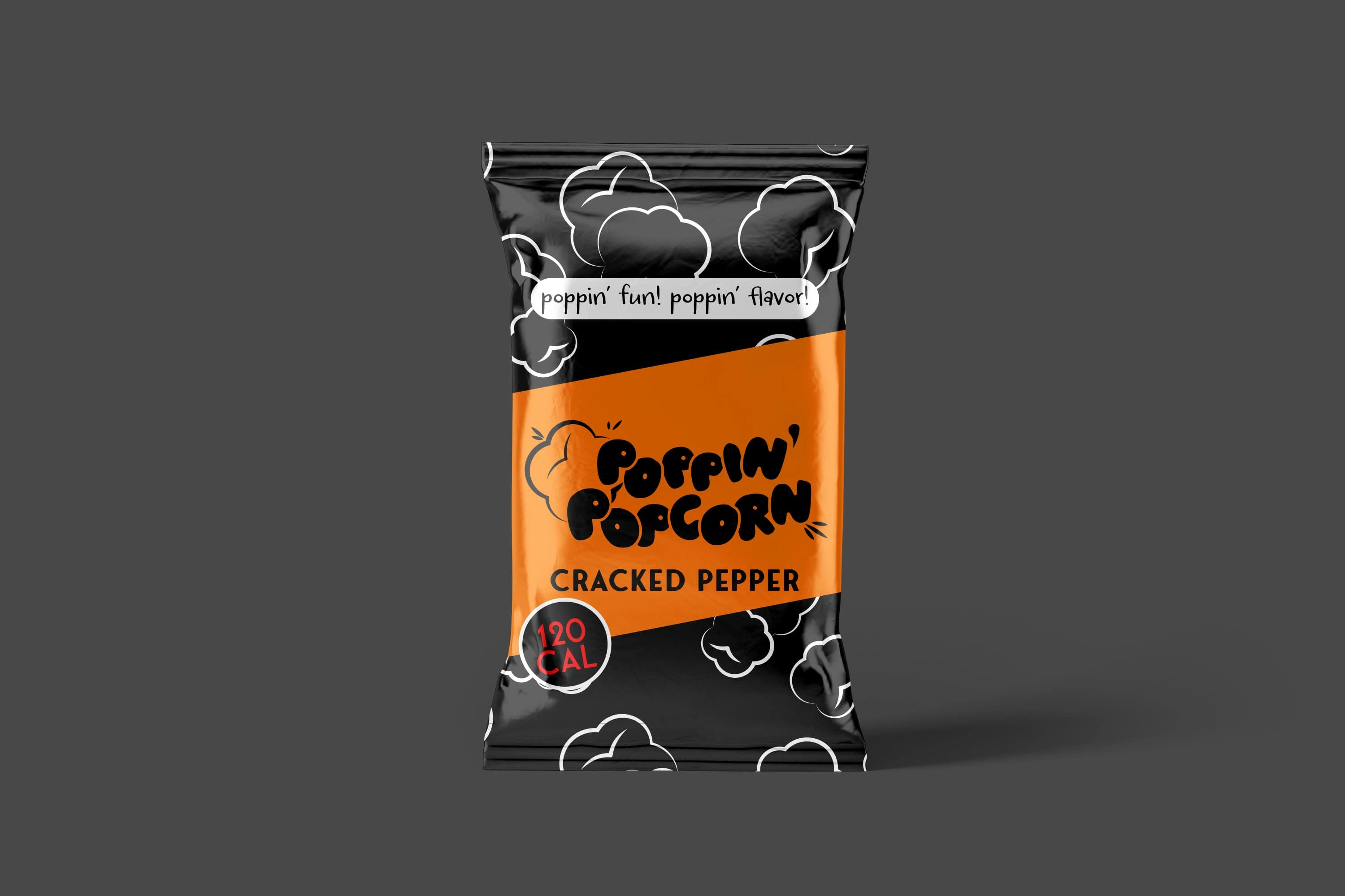
I went wild testing out all kinds of concepts to nail that perfect "popcorn moment" feeling! After tons of sketching, I landed on these super fun bubble letters that totally look like little popcorn kernels. I added this adorable popcorn character just hanging out with all the text, giving everything some personality. The whole vibe has letters with a bit of tilt and bounce to them because, let's be real, popcorn never just sits there all boring and still! Best part? The design looks killer whether it's in full color or just plain black and white, so it works everywhere we need it to.
Colors
I gave each flavor its own signature color scheme that totally captures its personality! I actually went through a bunch of different color versions first - played with some pastels that ended up looking too soft, then tried these wild neons that were basically screaming off the bag! After all that back-and-forth, I finally landed on these perfect primary colors that hit the sweet spot. Bourbon Caramel got this punchy red that basically screams "I'm bold and sweet at the same time!" For Cracked Pepper, we went with this rich purple that's got serious attitude - it's not messing around! Sea Salt rocks this cool, calm blue like the ocean. The Spiced Apple flavor shows off in this super fresh green that really pops against the black background. And for Creamed Cookies, I created this fun blue that's definitely its own thing - nothing like the sea salt blue, so nobody's getting those two mixed up! Each color tells you exactly what you're in for before you even take that first bite!
Putting It All Together
I pulled all these awesome elements together for the final packaging design! Everything sits on this sleek black background with these cool white popcorn illustrations that create this super dramatic effect. Each bag has bold color bands that instantly tell you which flavor you're grabbing without any confusion. I made sure their catchy tagline was front and center where nobody could miss it. All the bags clearly show they're just 120 calories for anyone keeping track of that stuff. And to top it all off, I went with this super glossy finish because, let's be real, shiny things just grab your attention when you're cruising down the snack aisle! The whole package really comes together to make you want to grab a bag (or five) every time you see it!
Finishing the Project
The finished product turned out pretty awesome (if I do say so myself)! I created packaging that seriously jumps off the shelf with tons of personality - you can't miss it when you're shopping. The system I built is super flexible, making sure each flavor stands out as its own thing while still obviously belonging to the same cool popcorn family. The whole look feels super fun but also gives off those quality snacking vibes, so people know they're getting something worth munching on. Best of all, I delivered a complete brand identity that they can splash across all their marketing stuff, from social media to billboards to whatever else they dream up. The whole project really came together and gave Poppin' Popcorn exactly what they needed to make a serious splash in the snack aisle!
Client Feedback
"We're absolutely loving our new look! People actually stop and stare at our products now, and sales have been popping! The designs are fun but still grown-up enough to appeal to everyone. Best design decision we've made!"
"How did you make Popcorn Sexy! Thank you so much!"
-Poppin' Popcorn Team
The Tools I Used
Good old creative brainstorming
Logo design wizardry
Color psychology (it's a real thing!)
Packaging design skills
Print production know-how
A genuine love for snacks that inspired the whole project
Want me to help your products stand out too? Let's chat! I love turning everyday products in to eye-catching must-haves.
Like this project
Posted Apr 9, 2025
Bold packaging for Poppin' Popcorn features bubble letters and a fun mascot!