CREE8 Homepage Redesign for Clarity
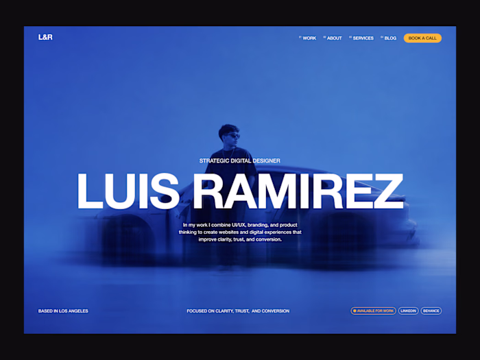
Luis Ramirez
Designing a Premium Cloud Studio Experience for Enterprise Creative Teams
The challenge
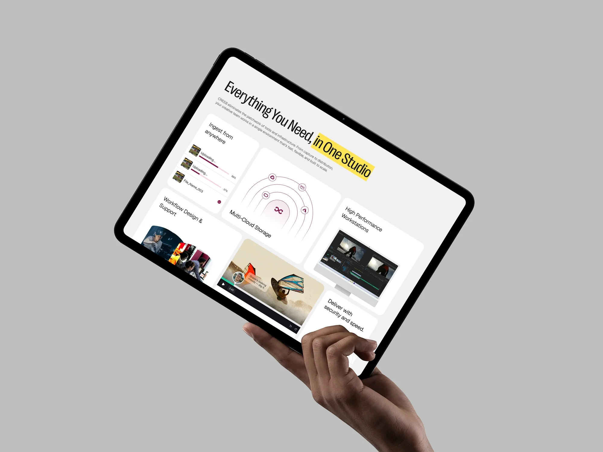
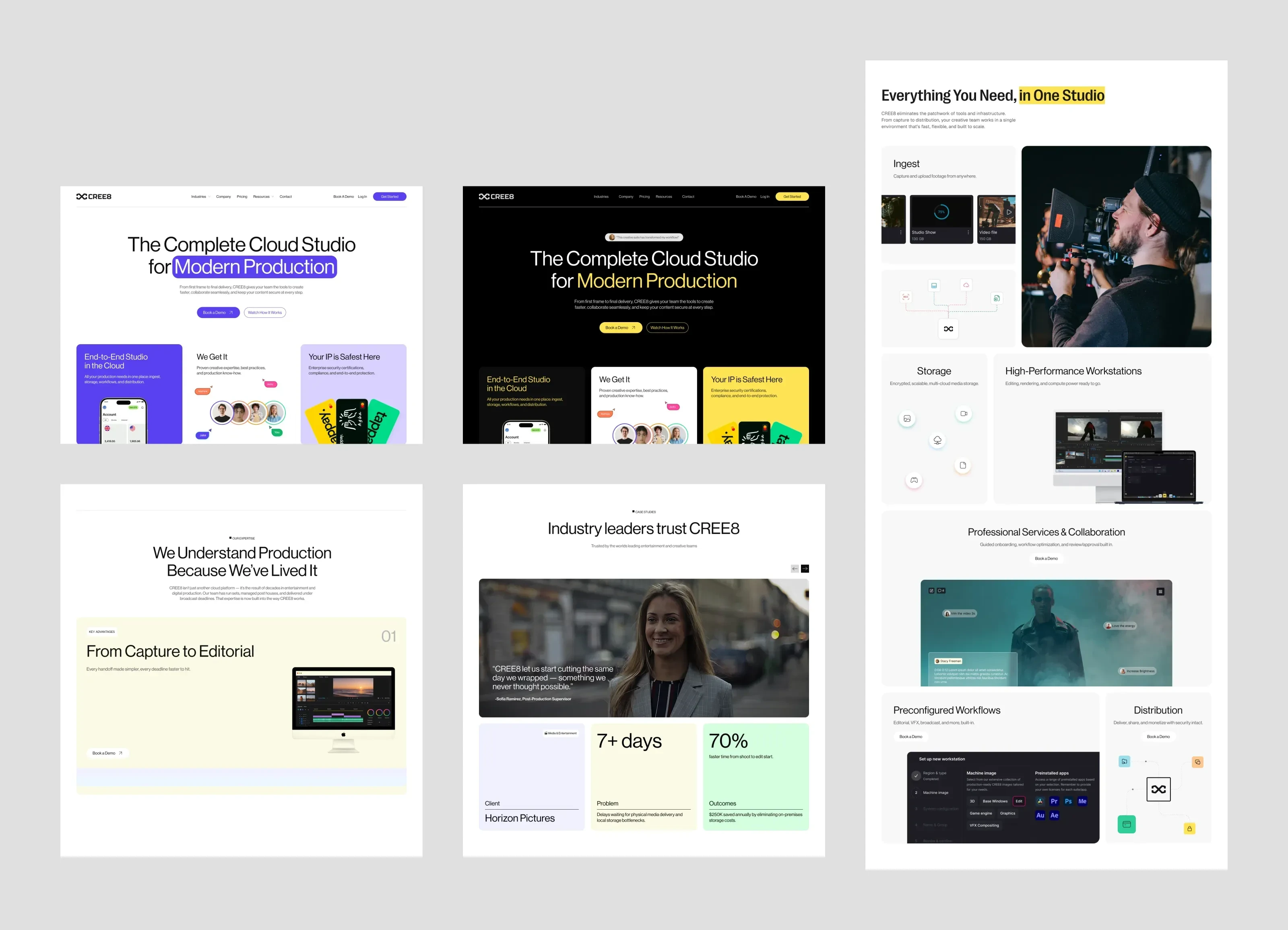
CREE8 brings together multiple tools and workflows into one connected platform for modern production teams. The challenge was presenting a broad set of capabilities in a way that felt clear, modern, and easy to understand without overwhelming visitors or relying on overly technical language.
The website also needed to speak to two audiences at once: creative teams looking for speed, flexibility, and seamless collaboration, and business buyers looking for security, scalability, and reliability. The experience had to capture the energy of modern creative production while still feeling polished and credible enough for a serious B2B platform.
Beyond improving clarity, the redesign needed to create stronger paths to action. This meant improving content flow, making calls to action more visible, surfacing value earlier, and introducing stronger trust signals so visitors could confidently book a demo, get in touch, or continue exploring the platform.
The Exploration
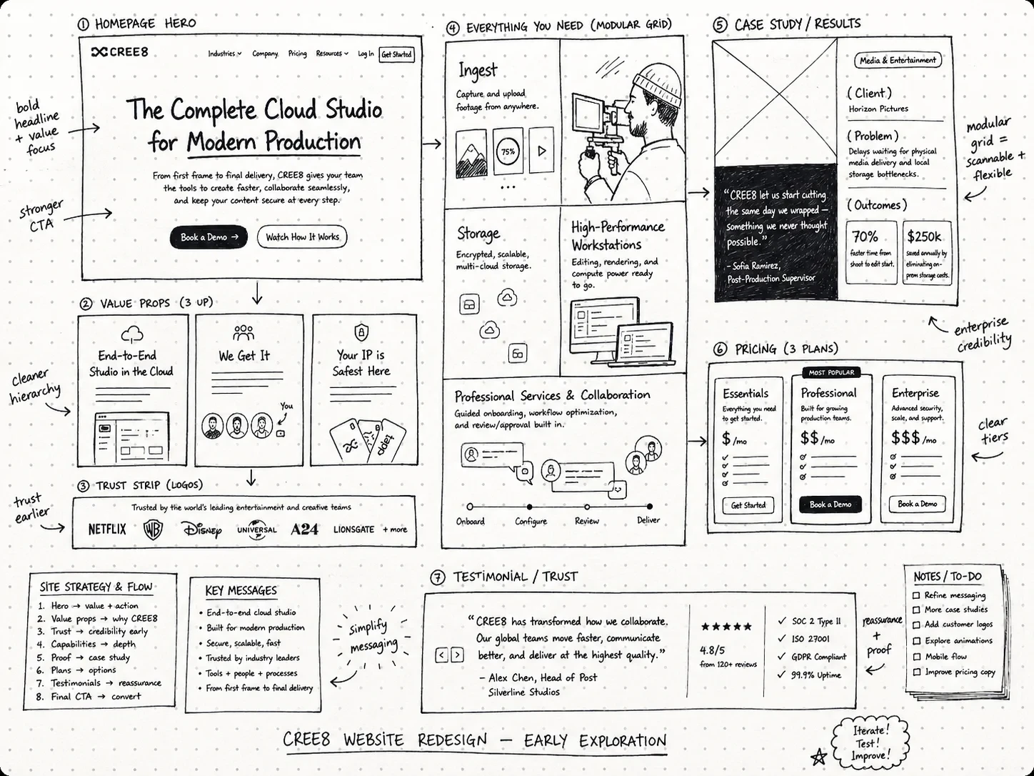
The exploration phase focused on finding the clearest way to communicate CREE8’s value across the homepage. Because the platform serves both creative production teams and enterprise buyers, the page needed to explain the product quickly while still building trust throughout the experience.
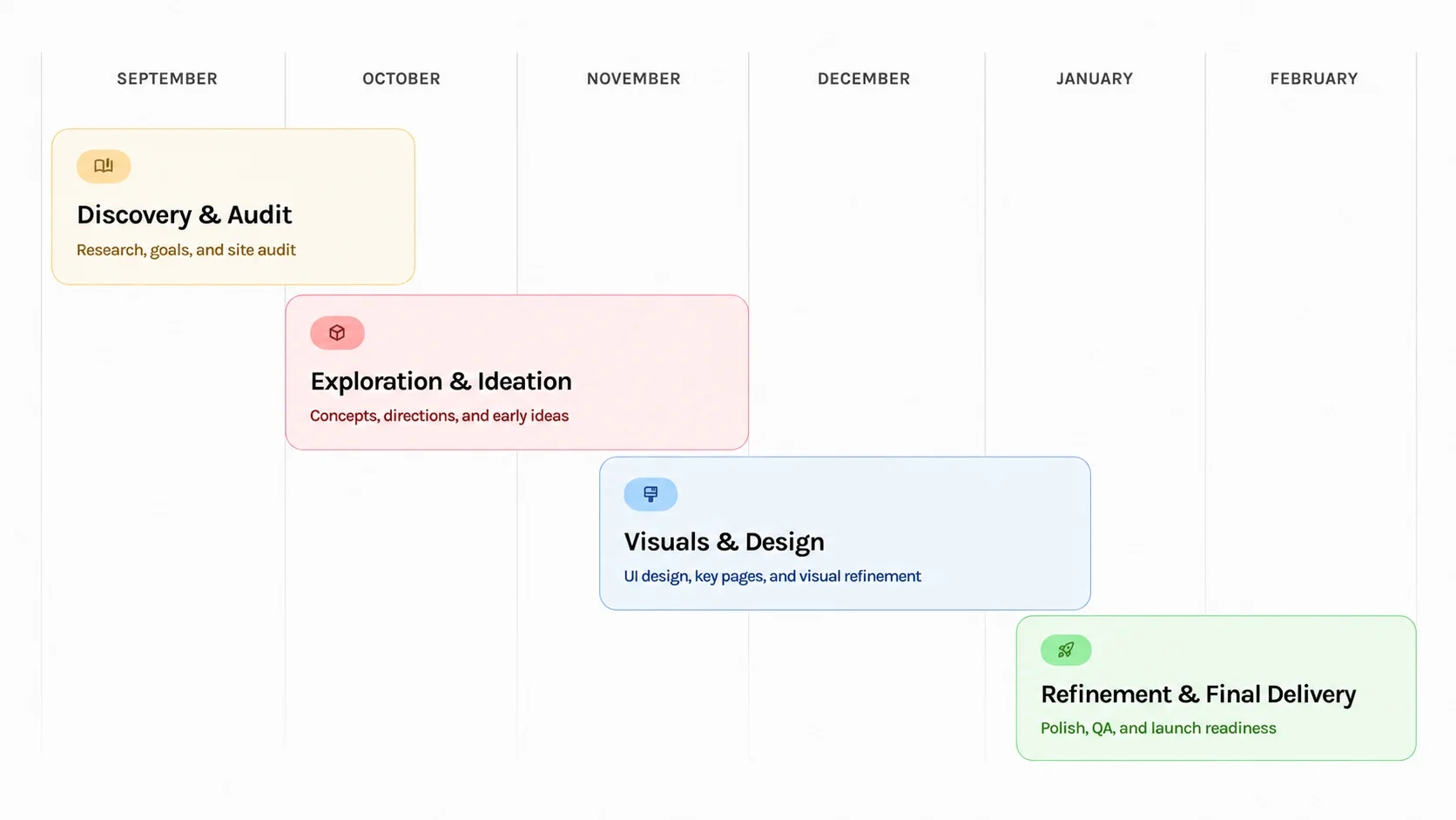
I explored multiple homepage structures, hero directions, bento-style product modules, case study placements, pricing sections, and CTA patterns. Each iteration tested how the story could move from product clarity to credibility to action without overwhelming visitors with too many features at once.
This process helped shape a homepage flow that felt more intentional: introduce the platform, prove its value, explain the workflow, build trust, and guide visitors toward booking a demo.
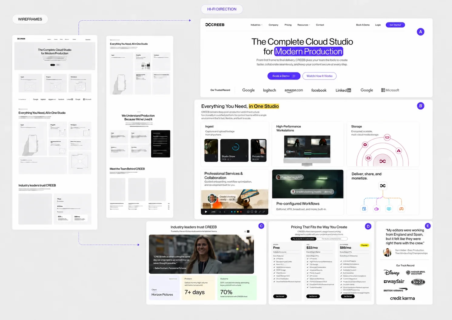
Website Redesign
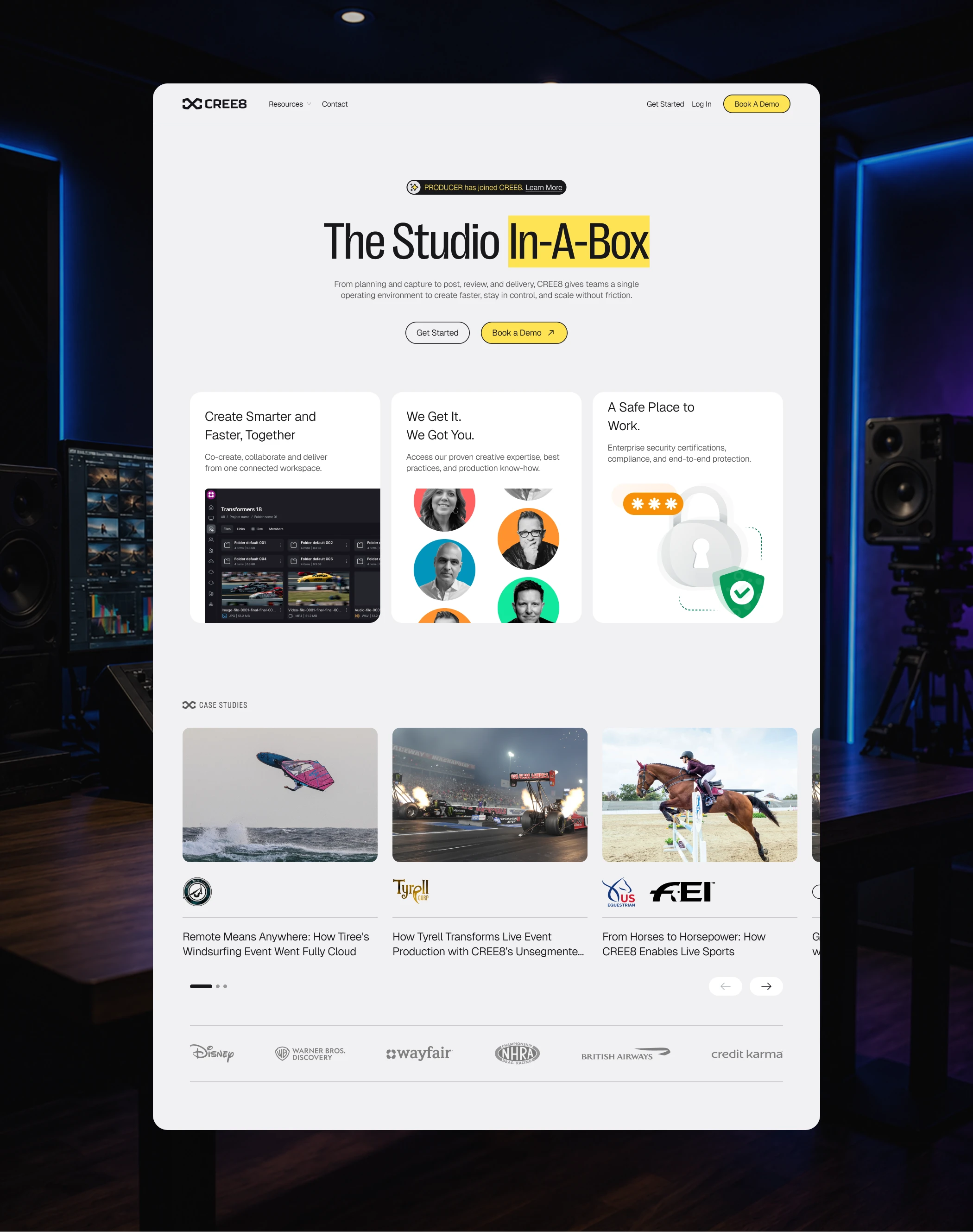
The final redesign focused on turning CREE8’s homepage into a clearer and more persuasive introduction to the platform. Instead of overwhelming visitors with a broad set of capabilities, the new direction structured the page around clarity, trust, and action — helping users quickly understand what CREE8 does, who it serves, and why it matters.
The homepage was redesigned to guide visitors through a stronger decision journey: a clearer hero message, product storytelling, trust-building sections, case studies, testimonials, pricing visibility, and more purposeful calls to action. Each section was designed to support credibility and help visitors move naturally from interest to deeper exploration.
The result was a more focused SaaS homepage that balanced creative energy with enterprise credibility, giving CREE8 a stronger digital presence and a clearer path from product understanding to action.

Like this project
Posted Jun 15, 2026
Redesigned CREE8’s homepage to clearly communicate its cloud studio platform, build enterprise trust, and guide visitors toward action.
Likes
1
Views
0
Clients
CREE8