Reimagining Instagram | App Design
Like this project
Posted Feb 10, 2024
This project focuses a strategic emphasis on habit formation empowering users to cultivate healthier digital habits and reclaim control over their valuable time
A Journey Towards Mindful Consumption
Reimagining instagram focused on creating a Quiet Environment, prioritizing user peacefulness, productivity and control, ensuring a harmonious and unintrusive interaction with technology.
Why Instagram is Interruptive? “If the product is Free, we’re the product.” Keeping people’s attention is the business model on which most social media apps are built.
Where do we draw the line? Uninstalling? So we are going to the app with a purpose but we see ourselves wasting too much time and not even achieving what we wanted in the first place.
What will be the Break from Doom-Scrolling? Instagram, being an entertainment-focused platform that benefits from extended user engagement, has been hesitant to highlight this feature prominently. That’s Screen Time Activity. Let’s reimagine that!
Drawing inspiration from Habit Stacking & Environment Design
Instead of aimlessly scrolling, our solution encourages users to watch content with a clear purpose, allowing them to dissect viewing habits and identify patterns.
Furthermore, our solution aligns with the concept of environmental design by empowering users to curate their Instagram feed. This curation facilitates an environment conducive to positive habits, echoing the transformative impact of environmental design on habit formation.
Cultivating Mindful Interaction
Introducing ScreenZen, the concept of segregated content categories for a balanced and productive scrolling.
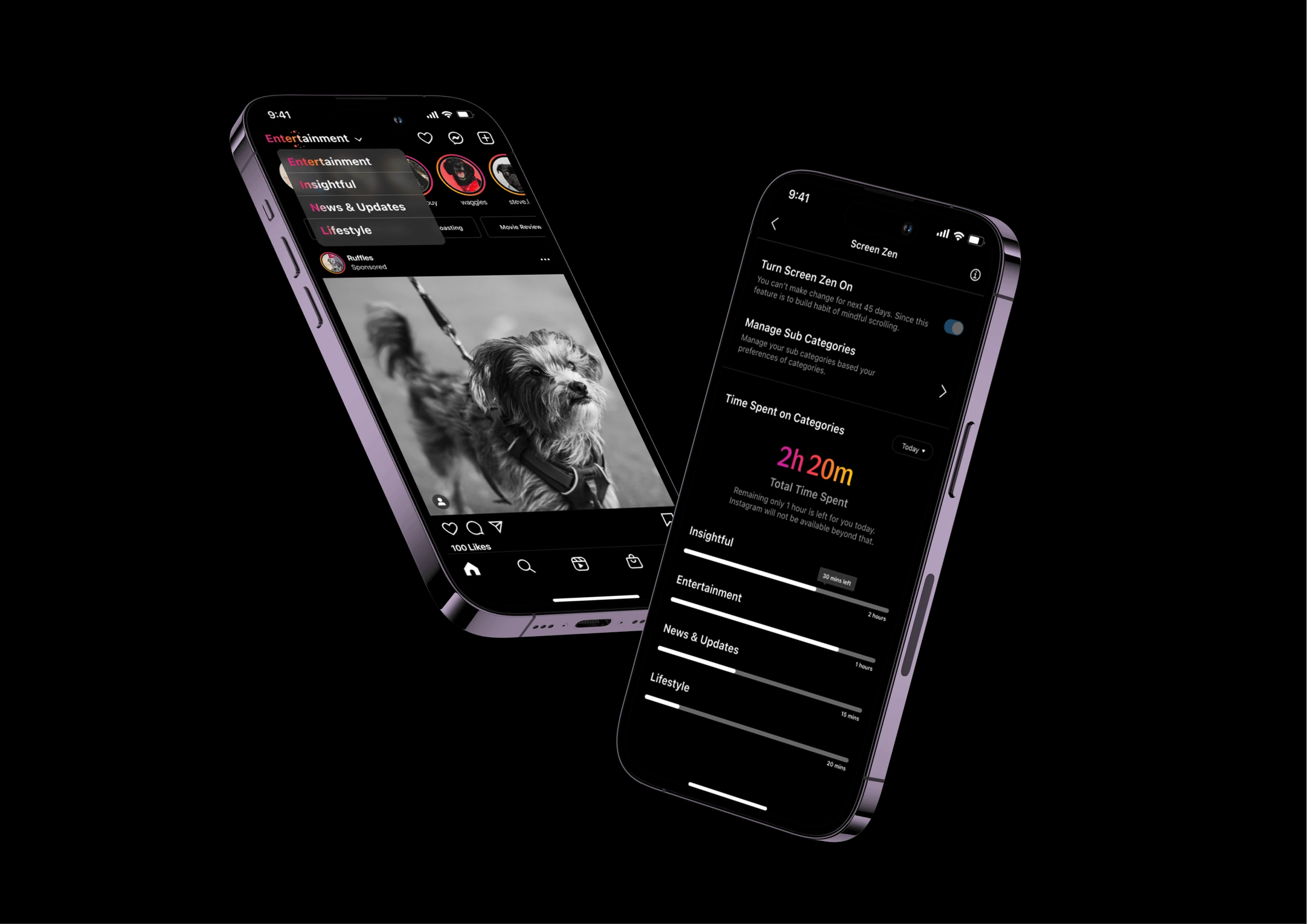
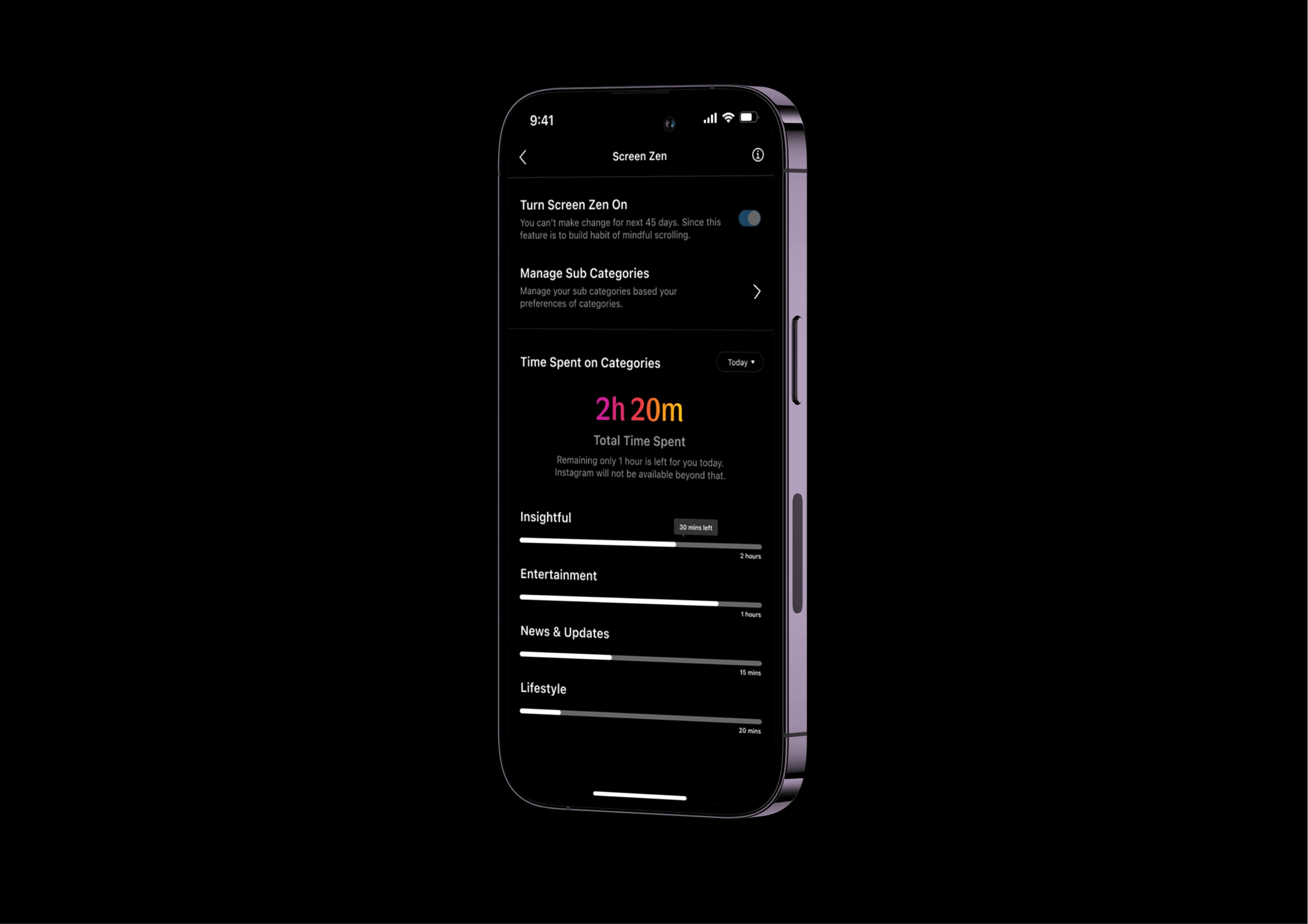
Segregating content into four distinct categories: Entertainment, Insightful, News & Updates, and Lifestyle. Allowing them to allocate dedicated time duration and choose subcategories as personalised filters for intentional content consumption.
Implementing a 45-day restriction on changing category timings, providing users with structured and consistent time limits that promote intentional engagement within each content category.
Screen Flow
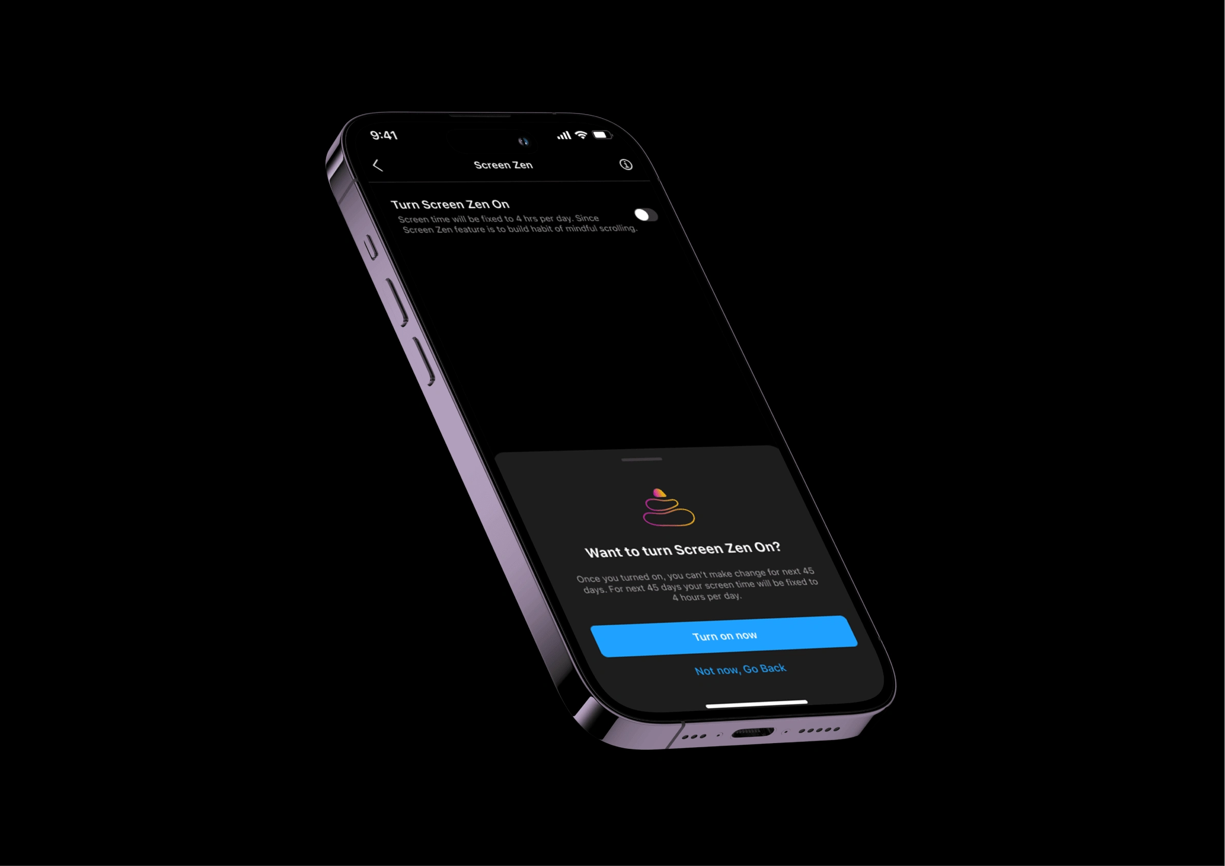
Enabling ScreenZen: Invites users to activate ScreenZen, featuring a confirming pop-up that highlights the 45-day restriction on timing adjustments, ensuring a deliberate commitment to mindful Instagram usage.
Onboarding Process: The onboarding process upon activating ScreenZen, providing users with options to set timing preferences for each category and select personalised subcategories for effective home screen content filtration, enhancing the intentional Instagram experience.
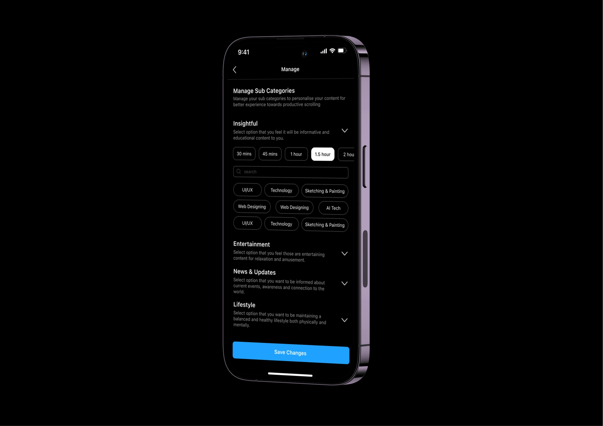
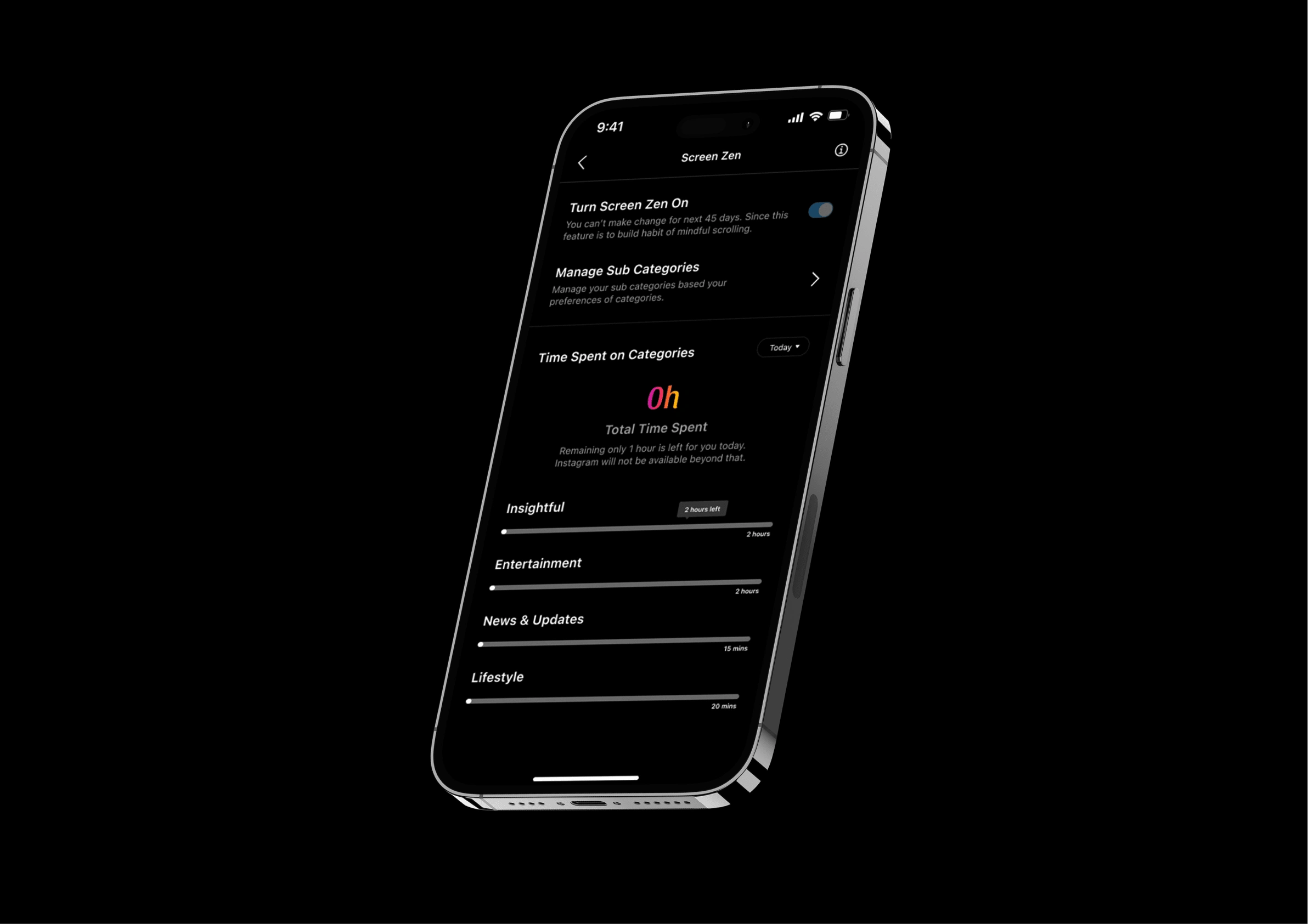
ScreenZen is Ready: After completing onboarding, the screen displays a progress bar illustrating today’s time allocation across different categories, offering users a visual representation of their intentional and balanced engagement with distinct content.
Home Screen: The redesigned home screen, featuring the category name prominently displayed at the top, accompanied by a visually informative gradient text representing the time spent on that specific category. The down arrow icon signifies the user’s ability to switch between categories, enhancing awareness of their content consumption.
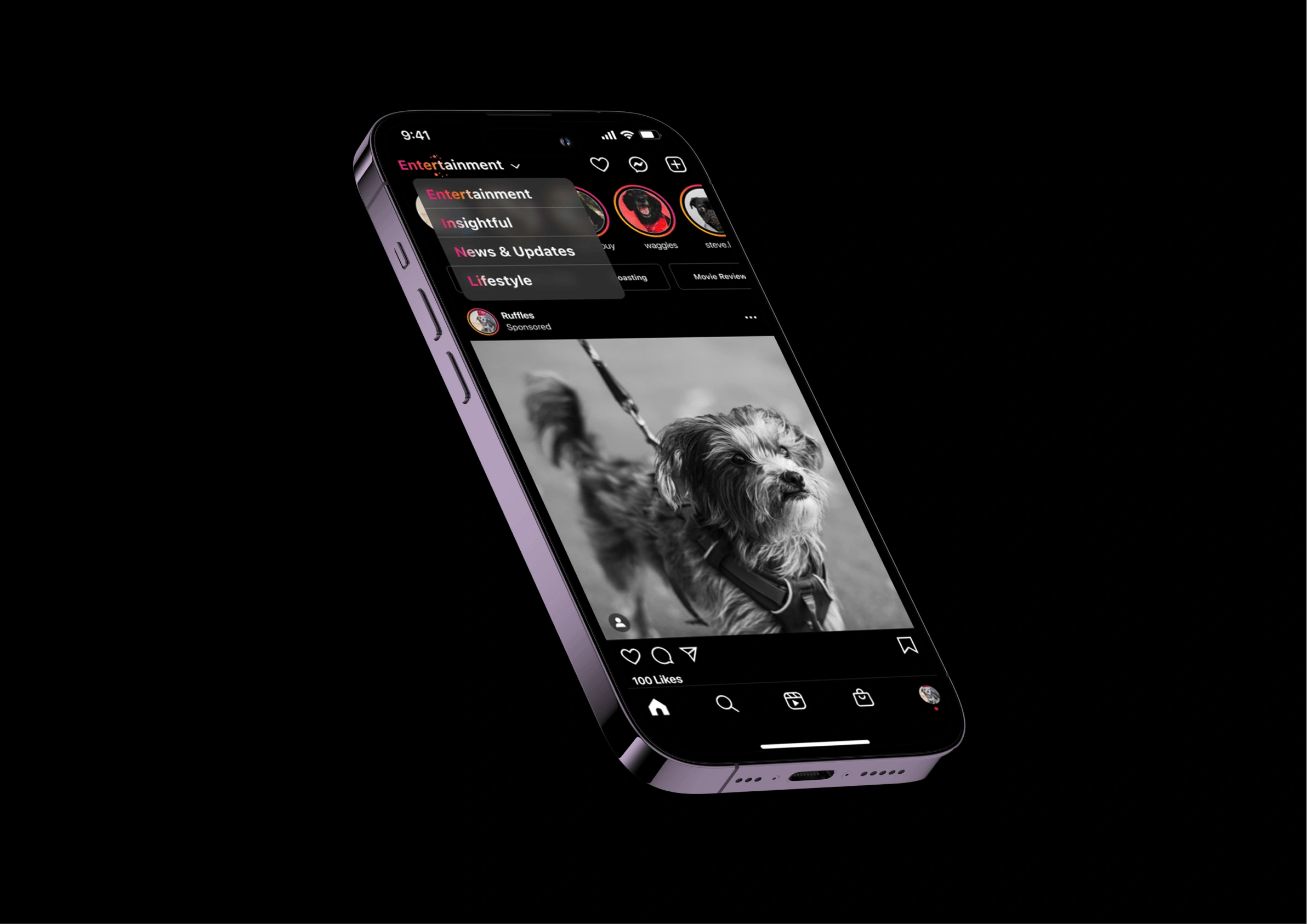
Offering a filter option tailored from the onboarding process, empowering users to selectively choose contents within their chosen category, further personalising and refining their Instagram experience.
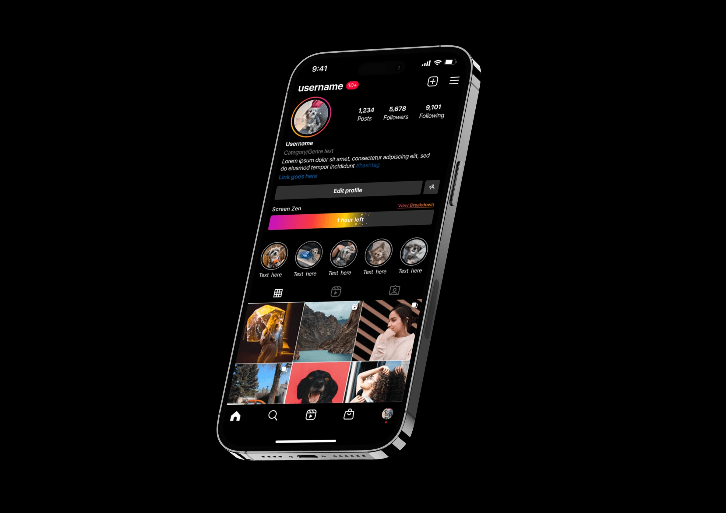
Profile Screen: In the Profile Screen, there is progress bar of ScreenZen content consumption timing. Additionally, an option to view a detailed breakdown allows users to analyse their time allocation across distinct categories.
ScreenZen Progress: A comprehensive breakdown of ScreenZen time spent. Progress bars for each category provide users with a detailed overview, fostering a nuanced understanding of their content consumption habits.
The Design Solution focuses a strategic emphasis on habit formation, empowering users to cultivate healthier digital habits and reclaim control over their valuable time.
Thanks for reading!


