Aesthetics are not the opposite
ajao jelil
Aesthetics are not the opposite of UX.
They are UX.
I used to treat visuals as the last step.
Get the flow right first. Then make it look good.
Building this food delivery app changed that thinking.
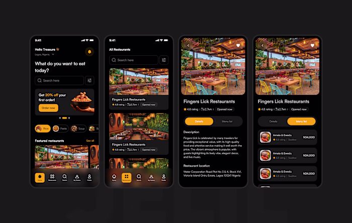
The onboarding has no feature list.
No bullet points. No "here's how it works."
Just a full-bleed photo of a steaming plate of food.
And one line: "Good food is just a few taps away."
That's it. That IS the onboarding.
Because the real question a new user is asking isn't
"how does this app work?"
It's "is this app worth my time?"
A beautiful, honest image answers that faster than any copy.
Here's what I've learnt designing consumer apps:
→ Presentation sets expectations before the product delivers
→ Visual quality signals product quality in the user's mind
→ How something looks is how something feels
→ Ugly onboarding = low trust = high drop-off
You can have perfect flows and still lose users at first glance.
Aesthetics aren't a nice-to-have.
They're conversion design.
Like this project
Posted Apr 21, 2026
Aesthetics are not the opposite of UX. They are UX. I used to treat visuals as the last step. Get the flow right first. Then make it look good. Building this...
Likes
0
Views
0
Tags