SaaS Dashboard UI/UX Design
Sagar Donda
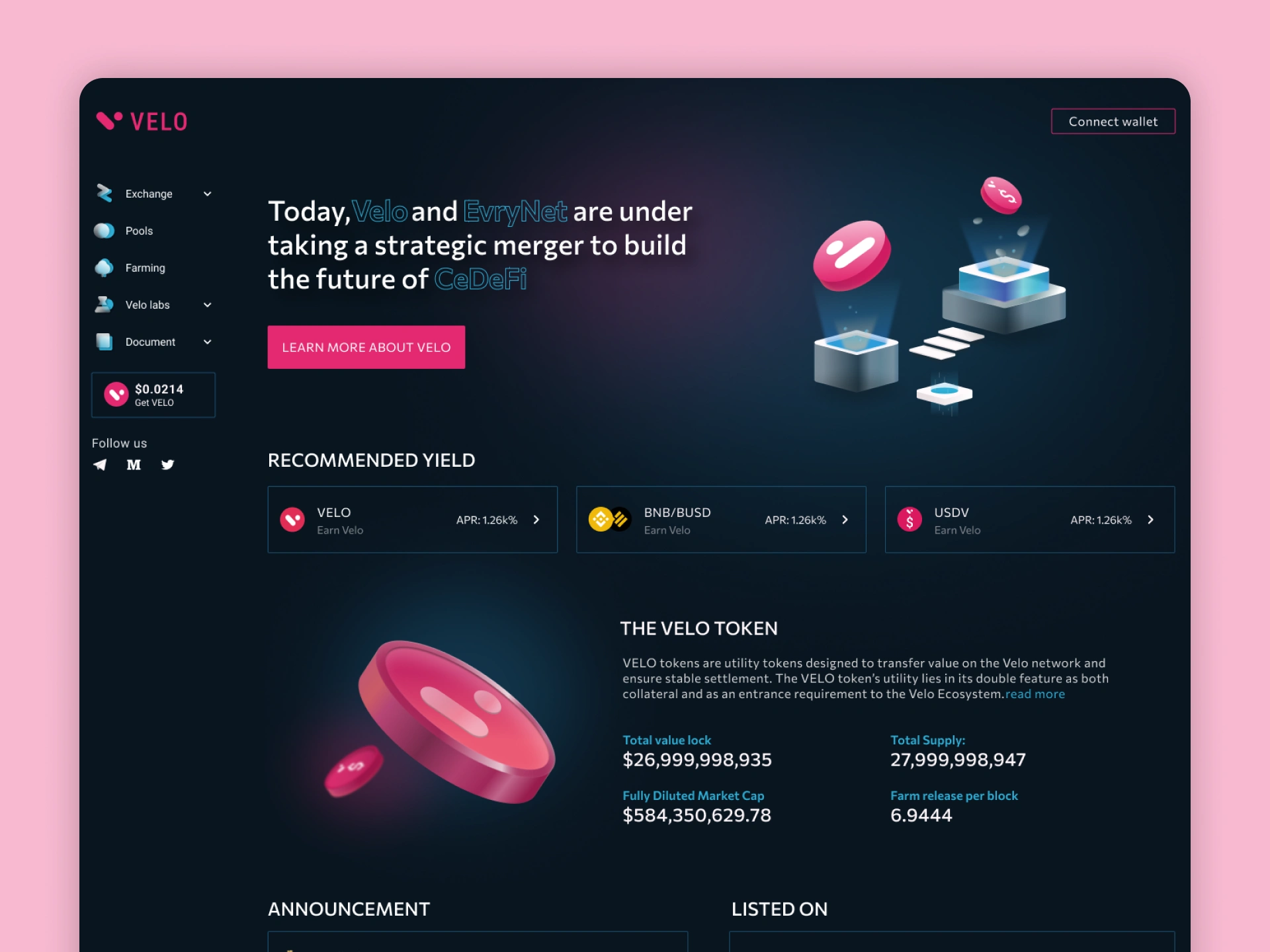
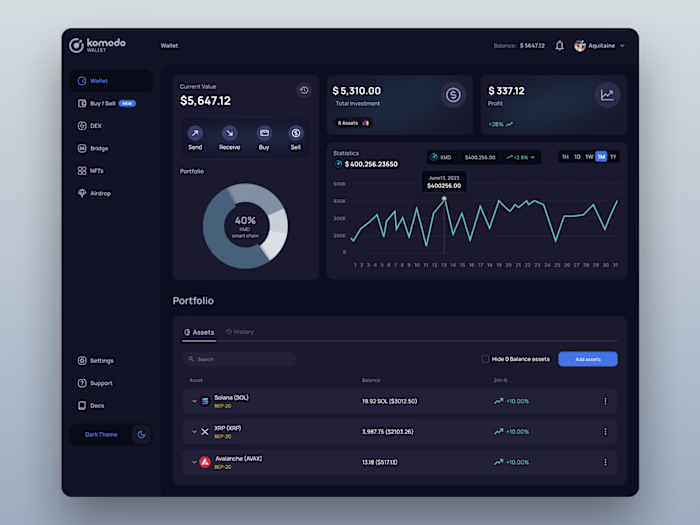
🧩 SaaS Dashboard UI/UX Design
🧾 Project Overview
This project focuses on designing a modern and visually engaging crypto SaaS dashboard for a platform offering features like exchange, farming, and token analytics. The goal was to create a clean and intuitive interface that allows users to easily explore financial data, track performance, and interact with different features.
The main focus was to balance complex data with simplicity, ensuring users can quickly understand key insights without feeling overwhelmed.
🎯 Challenges
Designing this dashboard came with several challenges due to the complexity of the platform.
The interface needed to handle multiple features and large amounts of financial data while still maintaining a clean and user-friendly experience. It was also important to design a dark UI that remains readable and visually appealing.
⚠️ Problems
• A large amount of data could overwhelm users
• Lack of a clear hierarchy can make navigation difficult
• Financial metrics are not easy to scan quickly
• Multiple features can create a cluttered interface
• Maintaining readability in dark mode
💡 Solutions
To address these challenges, I focused on simplifying the layout and improving the structure:
• Used a card-based layout to organize content clearly
• Created a strong visual hierarchy to highlight key data
• Designed a clean sidebar navigation for easy access
• Improved readability with proper spacing and contrast
• Simplified data using clear and minimal UI components
The result is a dashboard that feels modern, organized, and easy to use, even with complex data.
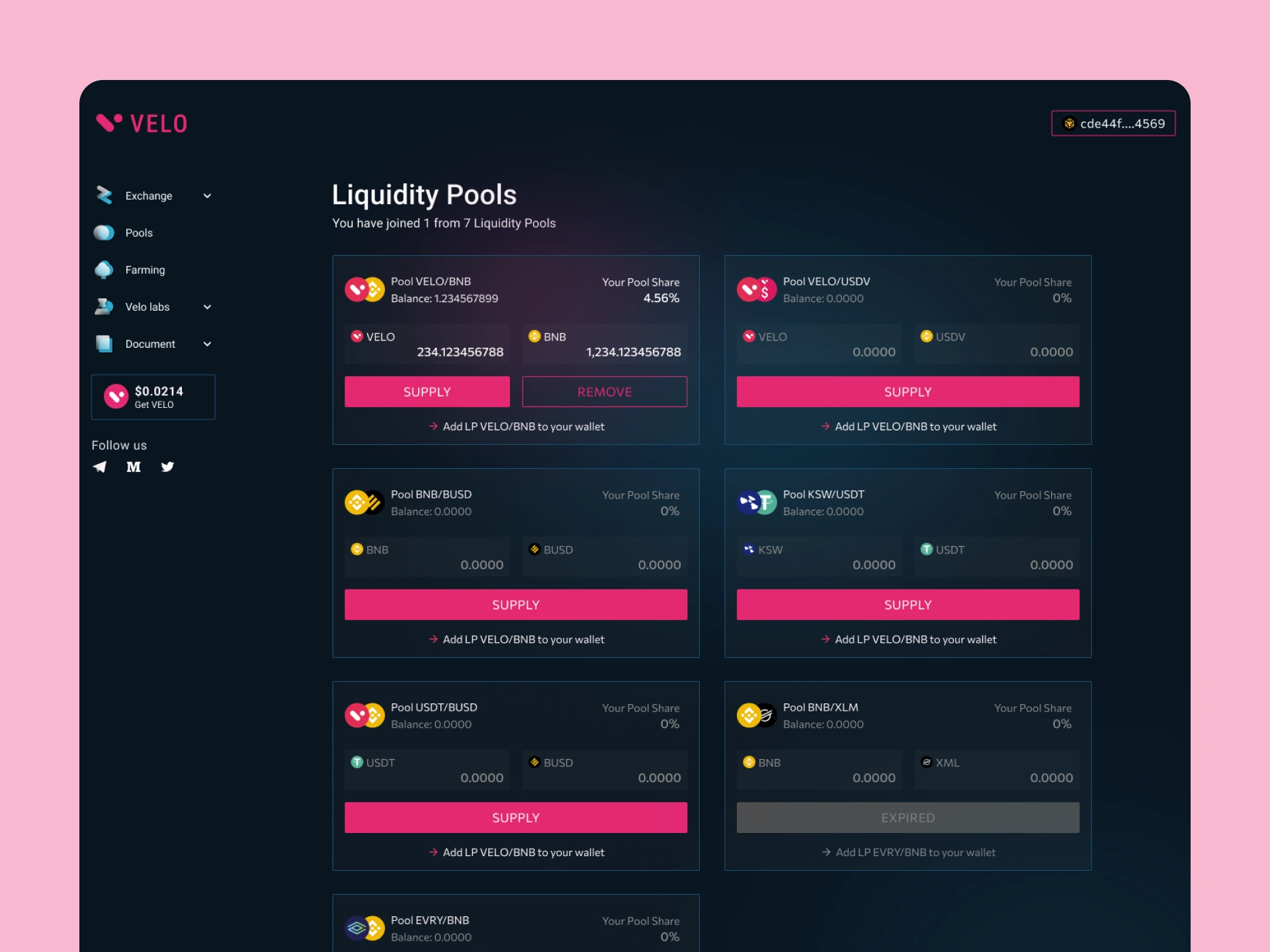
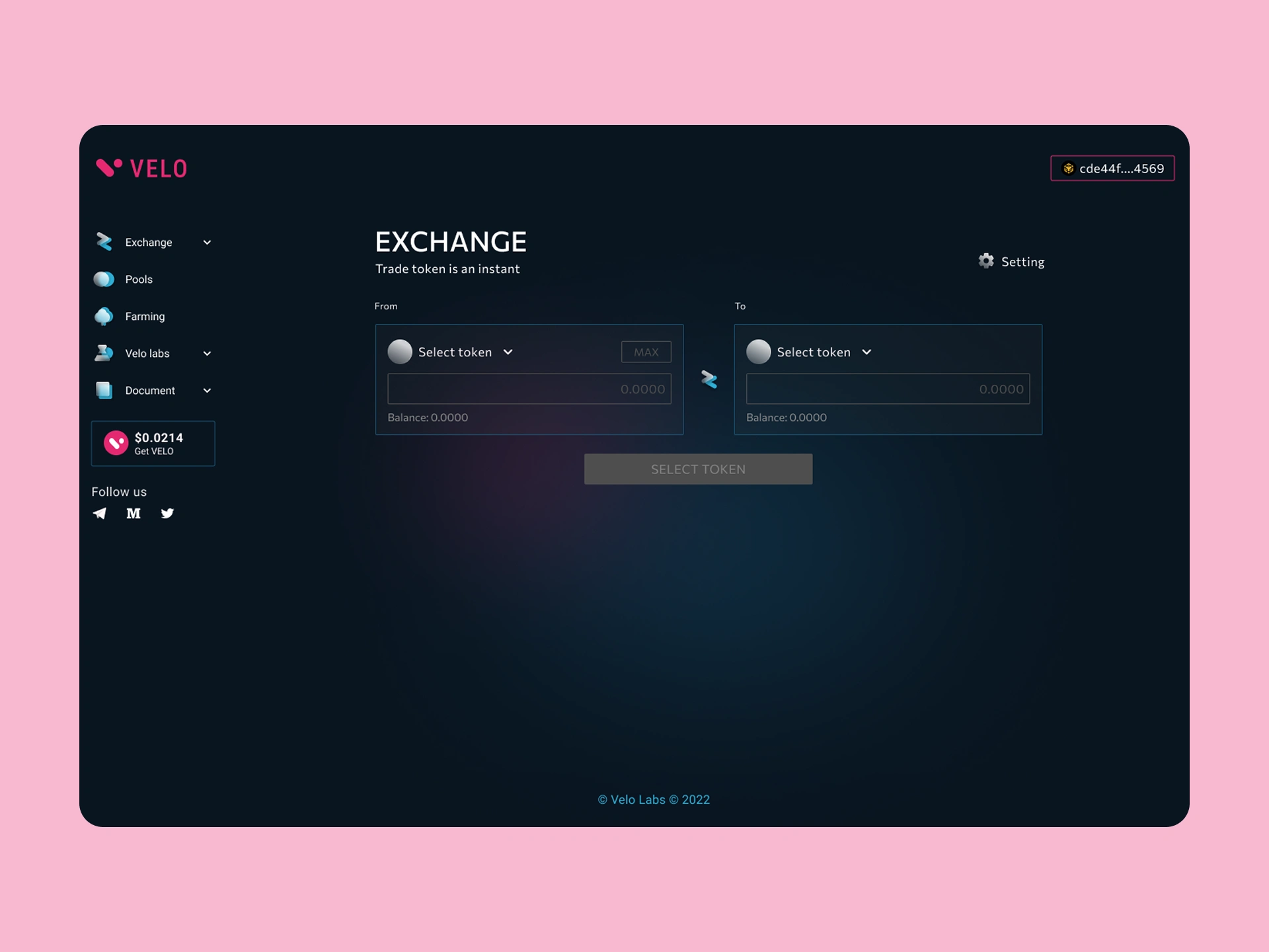
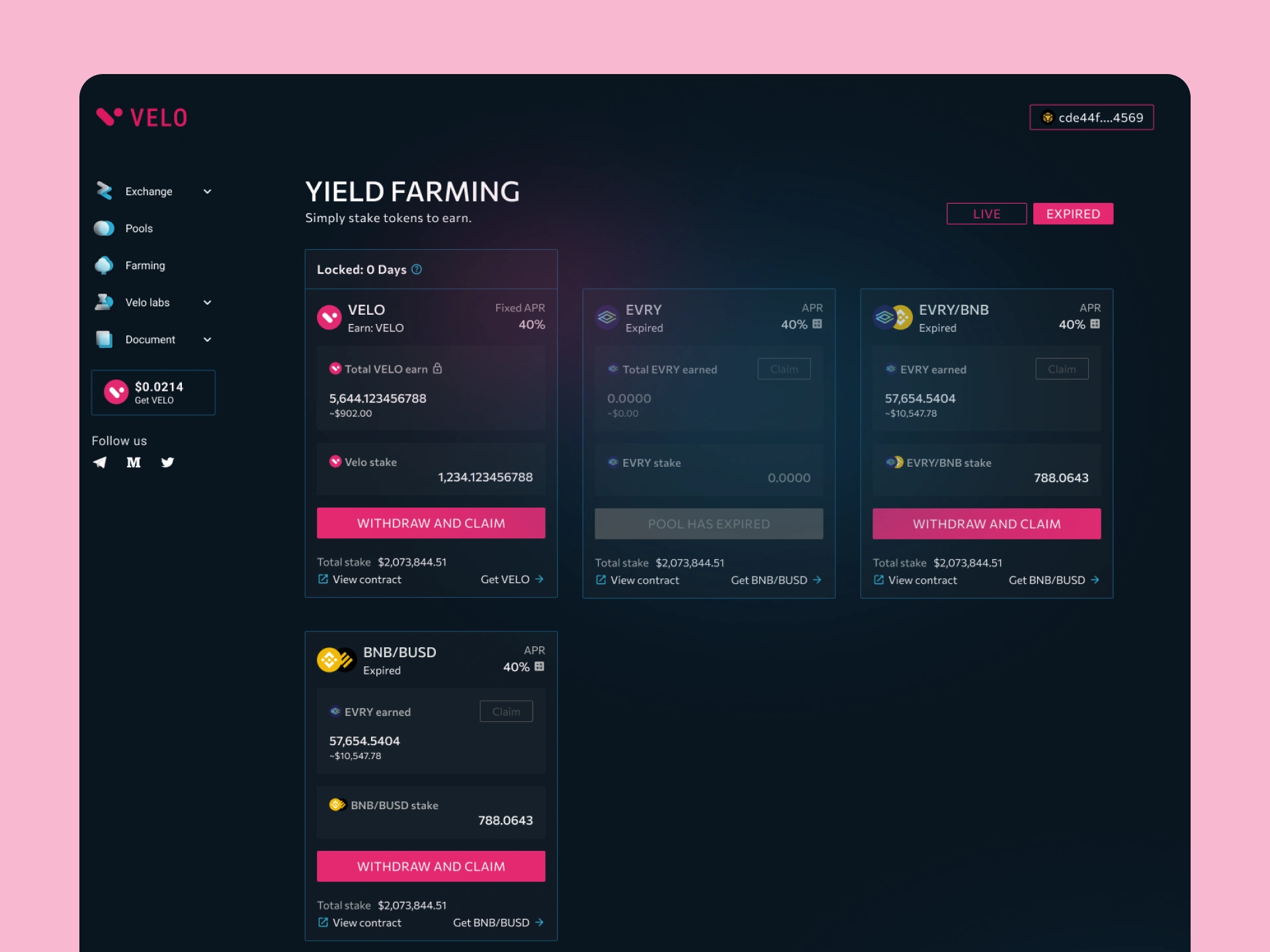
⭐ Key Features
• Modern and clean dark UI design
• Structured dashboard layout with clear sections
• Easy-to-use sidebar navigation
• Data visualization for analytics and metrics
• Card-based UI for better organization
• Highlighted key sections like recommended yield
• Clear call-to-action elements (connect wallet)
👨💻 My Role
I was responsible for the complete UI/UX design of the dashboard.
• User flow and layout planning
• Wireframing key screens
• High-fidelity UI design in Figma
• Creating reusable components
• Ensuring consistency and usability
🛠 Tools Used
Figma & FigJam
📊 Outcome
The final design delivers a clean and intuitive dashboard experience that makes complex financial data easier to understand. Users can quickly navigate between features, view important metrics, and interact with the platform efficiently.
Like this project
Posted Mar 23, 2026
Created a user-friendly SaaS dashboard with structured layout and clear data visualization to simplify complex financial insights.
Likes
0
Views
9