Rebranding Sihat :: Behance

Sihat
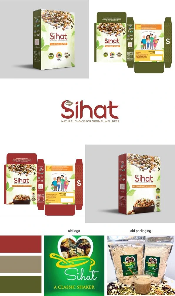
The client approached me, stating that their product was often misunderstood as coffee. Customers clarified its true nature. Uncertain about the next steps due to the product's misunderstanding, I discovered it was a heart-shaped image with a cup and spoon, featuring various pulses, nuts, and beans. The business name was "Sihat," with the tagline "A Classic Shaker." Surprisingly, the product was a healthy multigrain powder, available with or without nuts. This nutritious powder can be consumed by individuals aged 8 months to 70 years.
For the logo design, I aimed to create a concept that aligned with the product's essence. SIHAT Health Mix contains more than 20 different nuts and grains, blended with care for children, featuring premium packaging to maintain freshness for over three months in the fridge. This cereal acts as an immunity booster and aids in weight gain for babies. It's suitable for the whole family, from 8-month-old infants to adults and elderly individuals up to 70 years old.
Considering the target market's wide age range, I integrated clever elements into the business name "Sihat" to maximize its impact. The logo design focused on nuts and grains to convey modernity and timelessness while ensuring clarity even when resized to smaller frames.
After several sketches, I finalized a bold business name with hidden elements: a cashew symbolizing health and wellness within the negative space of the lower "S," and a leaf atop the "S" representing nature, growth, and renewal. The dot of the letter "i" was transformed into a grain shape, emphasizing the product's wholesome ingredients.
The tagline was revised to "Natural Choice for Optimal Wellness," resonating more effectively with the brand's values and offerings. The client approved the new logo and tagline, reflecting their satisfaction with the design's alignment with their business.
For the packaging design, I created two versions: one featuring images of grains and pulses, and the other incorporating grains, pulses, and nuts powder. The visual language aimed to communicate the product type to customers effectively. Red packaging indicated nut powder with pulses and grains, while green packaging denoted variants without nuts. Carefully selected imagery seamlessly integrated into the box design, complemented by an illustration of a happy, healthy family at the back along with the tagline.
The client expressed gratitude for the collaborative process, emphasizing the importance of mutual trust and professionalism. Positive feedback from the printing team confirmed the success of the packaging design, validating its impact and market appeal.
Like this project
Posted Sep 24, 2024
Graphic Design,Illustration,Branding,Adobe Photoshop,Adobe Illustrator


