
Enterprise Fintech Dashboard - Payments System UI
Most fintech dashboards fail at one thing:
they overwhelm instead of empower.For NadaPay, the goal was simple
make complex payment workflows feel effortless.
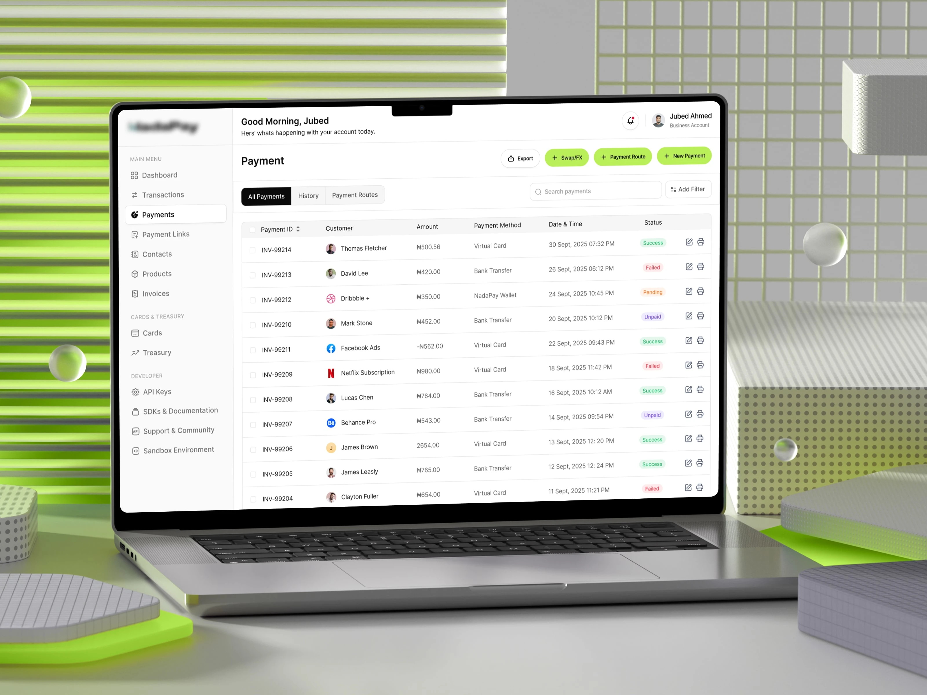
This design focuses on clarity at scale.
A structured data table, clear transaction states, and minimal visual noise help users instantly understand what’s happening and what needs attention.
Every detail serves a purpose:
• Smart filtering for faster navigation
• Clear success / pending / failed states
• Actionable controls without clutter
Instead of adding more features, the focus was on reducing friction.
Because in finance, speed and clarity aren’t just nice to have they’re critical.
0 likes · 0 views · Apr 6, 2026
Enterprise Fintech Dashboard - Payments System UI Most fintech dashboards fail at one thing: they overwhelm instead of empower.For NadaPay, the goal was simp...

