Obsidia | Transforming a Vision into Obsidia
Wendolyne Barrios
Herbal Alchemy: Transforming a Vision into Obsidia
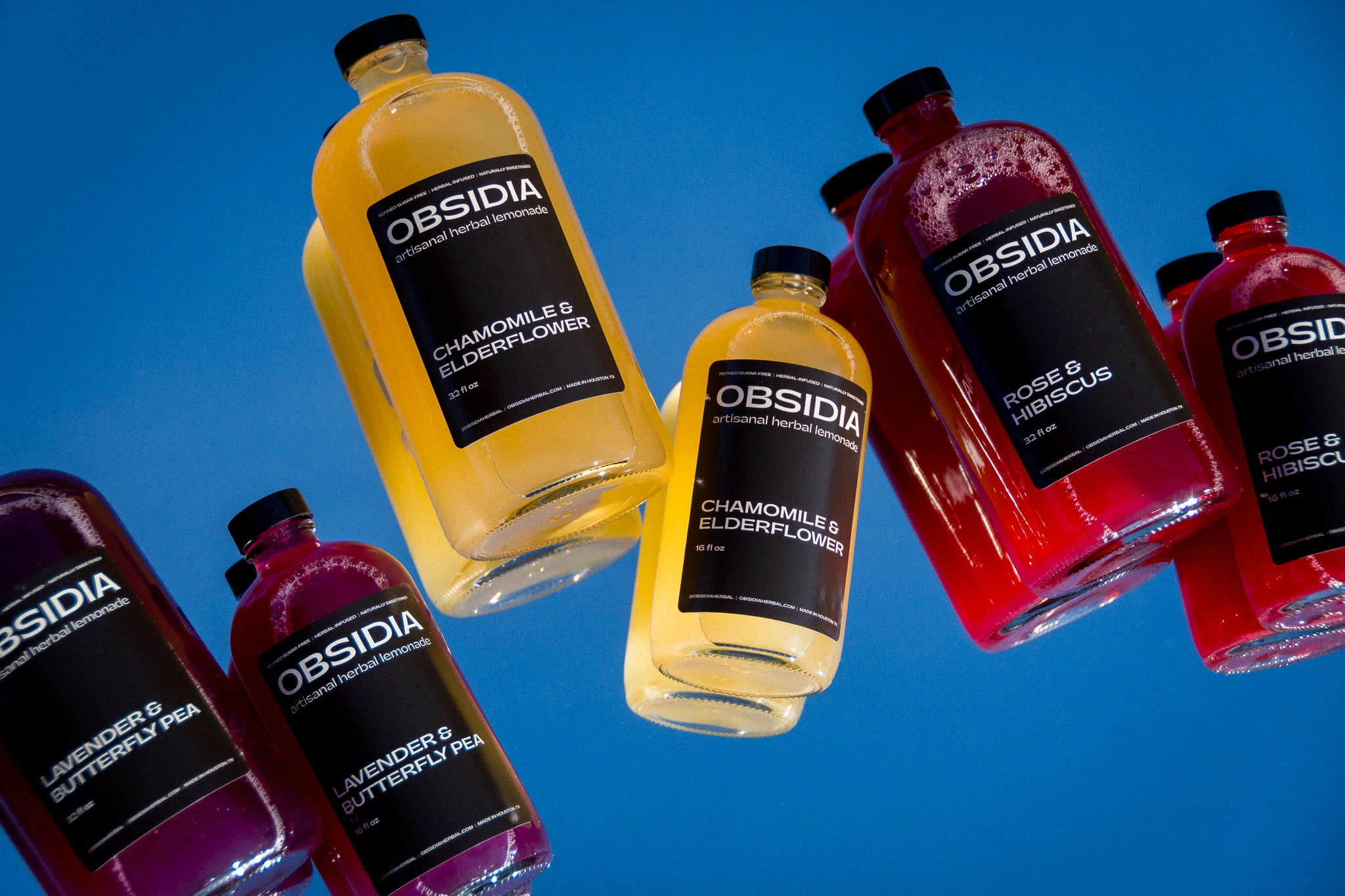
Obsidia is a brand that serves as a haven for the outliers and alternative crowd, offering artisanal herbal lemonades described as "witchcraft in a bottle." With a mystical color palette and intentional design, Obsidia stands out in the crowded market of organic beverages by emphasizing the artisanal craft behind each bottle, where every flavor combination is a carefully curated experience that feels both personal and unique.
About the project
01 • The Problem
Obsidia faced significant branding challenges in a market saturated with brightly colored, feminine herbal products that often felt too light in aesthetic. The goal was to create a unique identity that combined a darker, sophisticated look with the brand's commitment to all-natural, artisanal qualities. Communicating this distinct identity on limited label space without relying on graphics or illustrations presented a unique challenge.
02 • The Goal
The primary goal was to develop a brand identity that resonated with my vision of an elevated, goth lemonade—one I would personally want to purchase in stores. Focused on minimalism and modernity, the design needed to convey a mature vibe while establishing a strong presence in Houston, particularly at local pop-up markets and grocery stores.
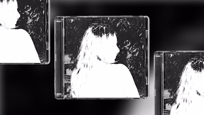
03 • The Solution
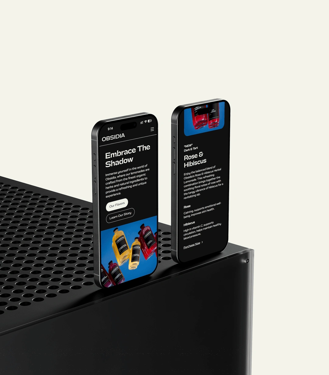
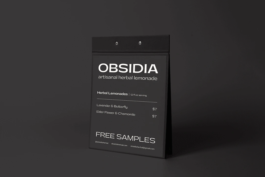
To achieve this, I employed a dark color scheme, predominantly black, allowing the accents to be from the lemonade flavors themselves—purple for lavender and butterfly, and yellow/gold for chamomile and elderflower. The visual identity emphasized minimalism and negative space, with clear text highlighting the brand's key attributes: "refined sugar-free, herbal infused, naturally sweetened." Consistent typography across labels, the website, and business cards helped solidify the brand's image, creating a cohesive look that reflects Obsidia's unique ethos rooted in thoughtful product design.
Like this project
Posted Dec 16, 2024
I created the brand identity, website, and product design for Obsidia, an artisanal herbal lemonade brand with a dark, sophisticated aesthetic.
Likes
1
Views
15