Bliss Beat | The Scene That Celebrates Itself
Wendolyne Barrios
The Scene That Celebrates Itself
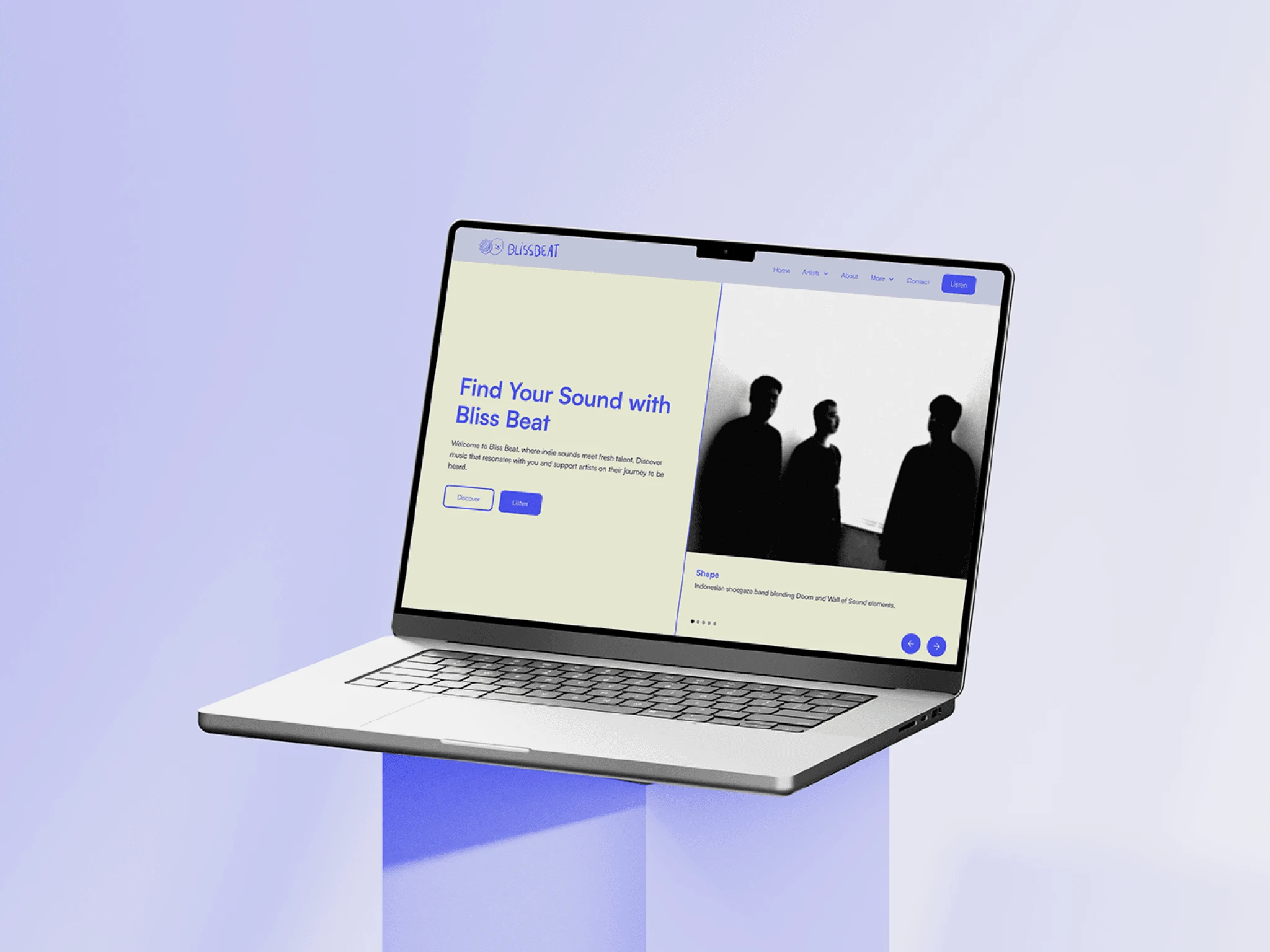
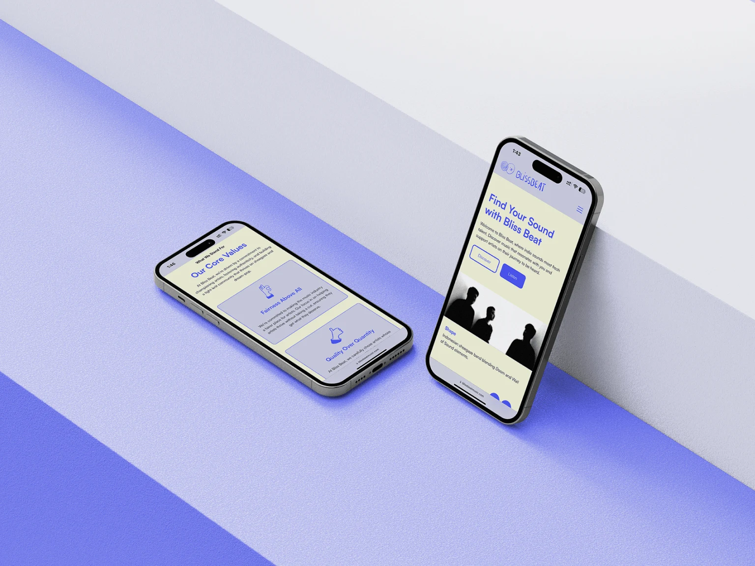
Working closely with Bliss Beat, I developed a cohesive brand identity and redesigned their website to unify their label's visual presence and improve user flow. The project involved organizing artist pages, creating a dedicated space for their radio show, and implementing a structured content architecture. By establishing a "round vibe" throughout, including custom iconography and a clean, consistent color palette, the site now offers a polished, intuitive experience that reflects Bliss Beat's unique style and strengthens its credibility.
01 • The Problem
Bliss Beat’s previous website lacked cohesion and brand consistency, which limited both functionality and aesthetic appeal. Their use of generic fonts and colors felt disjointed, and the layout struggled to support a logical user flow. Content was spread across various sections with no clear paths to explore, and the radio show operated as a separate entity with no visual connection to the label. This made the site hard to navigate, affecting user engagement and the brand's professional appeal.
02 • The Goal
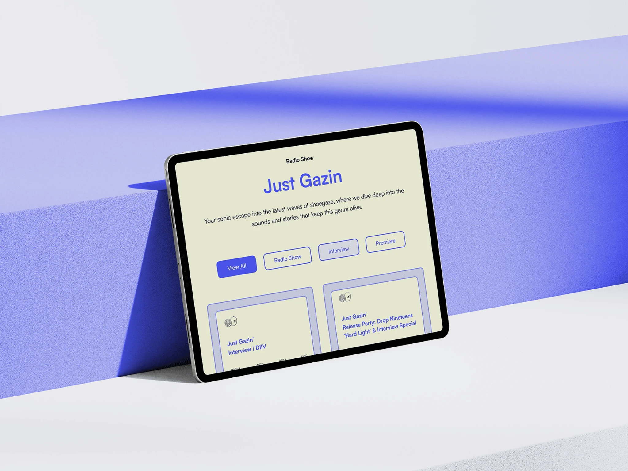
The primary objectives were to establish a clear, unified visual identity and improve the website’s usability to support Bliss Beat’s growth and reputation in the music industry. Thaís specifically requested a “round vibe” aesthetic to create a welcoming, modern look and wanted to streamline user engagement for artists, fans, and potential collaborators. An intuitive browsing experience was crucial, with a focus on organizing their radio shows and artist catalog in a way that would invite exploration and interaction.
03 • The Solution
To achieve Bliss Beat’s goals, I developed a cohesive color palette centered around their primary color, creating monochromatic shades for depth and dimension across the site. We introduced a rounded, clean typeface to align with the “round vibe” and complement the relaxed, approachable brand feel. Buttons, icons, and navigation elements used soft, rounded shapes to add to the aesthetic, balancing modernity with a welcoming feel.
The content architecture was reorganized to enable intuitive navigation, particularly for the radio show and artist sections. Filters and categorization were added to help users easily explore the artist roster and specific radio show episodes. I also collaborated with my client on custom icon illustrations that harmonized with the Bliss Beat logo, adding a unique, brand-aligned element to the overall design. The result is a structured, visually cohesive site that feels simultaneously professional and inviting, with a layout that naturally draws users deeper into the Bliss Beat universe.
Like this project
Posted Dec 16, 2024
Created a cohesive brand identity and streamlined website for Bliss Beat, integrating artist pages and radio shows for a seamless user experience.
Likes
0
Views
8