Nissan Global
Alexandria Smith
A redesign that allows prospective employees and business partners to gain insight into Nissan culture and diversity initiatives.
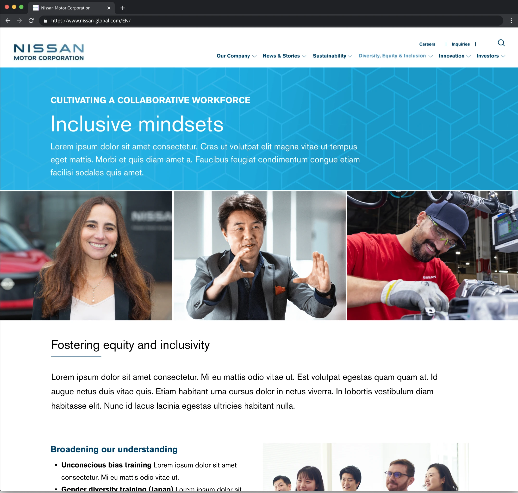
Image alt tag
Overview
Nissan Motor Corporation (NMC) enlisted the help of our team to audit the current site and content in order to redesign the diversity, equity, and inclusion (DEI) section of the corporate website.
Challenge
Nissan Motor Corporation have recently relaunched their corporate website, as of April 2022. Much of the content within the corporate website is lifted from previously existing materials which do not adequately reflect Nissan’s corporate profile or values. There is little information on NMC’s corporate philosophy and vision making it difficult to understand the company’s initiatives and direction.
Solution
Our team streamlined, consolidated and repurposed the site’s current DEI content while also incorporating new content provided by the client. We strategically instilled a welcoming and informative POV across the website to uplift NMC’s diverse culture and highlight their DEI initiatives.
Site & Content Audit
In order to understand the current layout and positioning of content , it was important to conduct an audit. I began to place relational content together in buckets in order to begin to consolidate. This also involved referencing new DEI messaging and new DEI initiatives documentation provided by the client. I collaborated closely with our content team of SEO specialists to clarify important content topics we need to keep in mind in order to satisfy user intent.
Initial thoughts:
Interaction costs: While navigating the site it became apparent that there was a lot of information hidden from users through a substantial use of accordion drop downs. Additionally, once an accordion was opened it could not be closed which could be a point of frustration for users.
Lack of a POV: Although there was a lot of great information present, it wasn't tied together in an intuitive way for users to follow along. Most of the drop downs has various data charts, stats, and images with no context provided.
Competitive Analysis
I wanted to get a competitive landscape of how other automotive brands such as Toyota, Honda, and BMW were positioning their DEI messaging and what important elements are typically highlighted. I thought it would be beneficial to also look at competitors outside of the automotive industry such as HP and IBM in order to gain a more holistic viewpoint. Through the analysis I learned:
Having relevant stats of a diverse pool of employees are great to showcase diversity efforts
DEI Leadership is important to show in order to strengthen trust and directly show the people behind the scenes pushing DEI initiatives in the workplace
Outlining a DEI history timeline in the workplace can convey authenticity and commitment over time
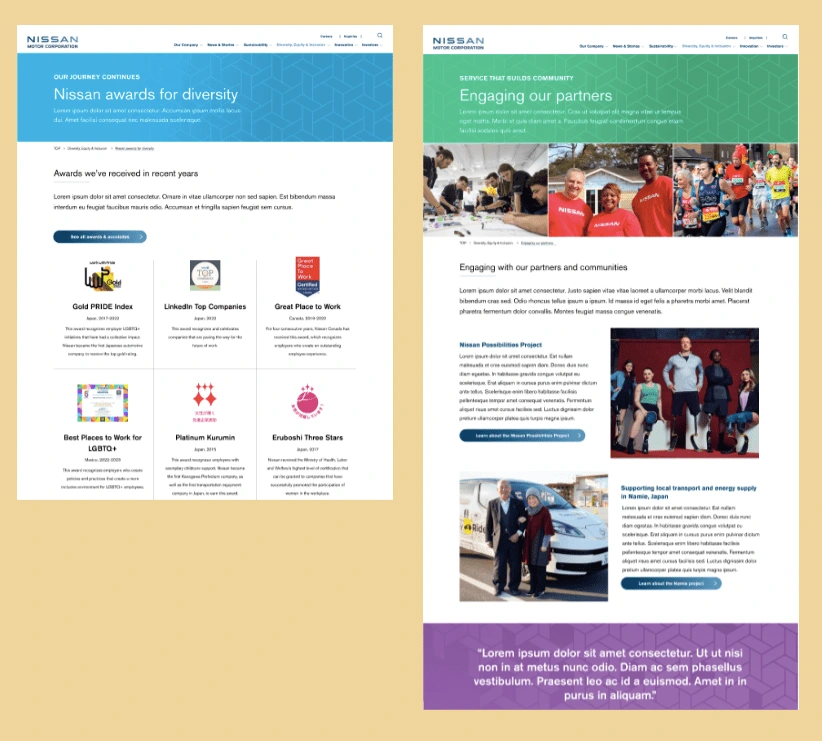
Screen design displayed in a mockup
Screen design displayed in a mockup
Screen design displayed in a mockup
Screen design displayed in a mockup
Landing page wireframe
First Round Wireframes
Initial wireframes were completed with the idea that the DEI team still wanted to keep all the initiatives on the current site incorporated into the new design in addition to the new content they provided. This was initially a challenge due to the overwhelming amount of content needing consolidation and regrouping.
For the landing page, my focus was on creating a nice high level snapshot of NMC’s messaging on DEI, highlighting relevant stat’s to showcase diversity efforts, and overviews of current initiatives. Subsequent pages were also wire framed with consolidated/grouped content resulting in text heavy pages w
Green Light from Client
After first round wireframes, the team and I gained much more clarity around current constraints. It was originally thought that the client wanted to consolidate and keep all current and new content in the redesign. However, to our surprise the client gave us both creative and strategic freedom to eliminate or add any content we see fit through recommendations. This was great news as it fostered realignment with the client and allowed us to begin greater ideation.
Ideation Workshop
I held an ideation workshop with the team aimed at creating a POV for the redesign. Some questions we began to ask ourselves were:
What overall POV are we trying to achieve for the DEI site?
What existing content can we utilize/re-purpose?
Are there any Nissan stories we can incorporate?
These questions helped us begin to brainstorm different ideas and whiteboard our thoughts. We considered using some of Nissan’s history to highlight diversity efforts. We contemplated leading through a product focused lens by including product stories that spotlight equity. However, we ultimately decided to keep a simple, welcoming, and informative approach for the site.
SEO Insight
I wanted to make sure that I was designing pages and laying out content recommendations that would meet user intent. For this reason, I partnered with our SEO team to find out what were some key search terms when it came to DEI. This was beneficial as it created a foundation to begin to work off of and cross reference existing materials.
SEO key search terms for DEI
Round 2 Wireframes
After reviewing content and brainstorming with the team during the workshop I began to lay out the foundation of the site by creating wireframes for each page. I wanted to ensure that each page had a clear flow and that each page had content that supported its messaging.
For instance, for the ‘inclusive mindsets’ page I wanted to make sure that leadership chats were spotlighted as well as employee resource groups in order to convey the fact that NMC is having open honest conversations around DEI and is supporting and empowering employee involvement. Large quotes from Nissan leaders would act as focal points that uplift the page's message while also breaking up content in order to not overload users with information.
The biggest between this round of wires and the ones prior is that a POV was starting to form as well as consistency across screens. When collaborating with creatives it was apparent that there needed to be some sort of format and storytelling across the screens. As the UX designer on the team I made it a priority to be clear about how content would be laid out and bucketed so that the art directors and copywriters had a foundation to build off of. At this stage of the wireframes one of the junior copywriters began to come in and start dropping in FOP headlines only in order to provide more context about the page and setup I began to layout.

Hi-Fidelity Designs
Once wireframes were approved by the client and aligned with the team, it was time to pass off to the creative team of creative directors and copywriters to begin to bring the design to life through colors and copy. During this stage, I was heavily involved in creative meetings to ensure UX standards were being met and that content was still being grouped appropriately. Although color scheme was made by the associate creative director, I partnered closely with her to source imagery from Nissan's assets to incorporate in the designs.
*Note : The images below are screenshots of some of the final delivered designs. Due to file size limitations, full screens could not be uploaded on this portfolio platform. I have no problem walking through these more in depth in Figma in order to see full page size :). Additionally, final designs have been Lorem'd other than headlines due to client changing designs in development.
Recording of live site
Final Design
Once the high fidelity wireframes were good to go it was time to pass off to NMC's partner agency for development. Although our team was unable to be in contact with the dev team, we are extremely proud of the work that we did and look forward to seeing how NMC incorporates more of our design elements as they continue building out pages.
What's Next?
Continue building relationship with client in order to test, learn, and optimize. It would be great to get either Google Analytics or HotJar access in order to see what areas of content users are engaging the most in and what areas they aren't. From there we can optimize and continue learning.
I would also be interested in knowing some comparison data about page visits and bounce rates between the redesign to the original site.
Alex Smith
UX designer
Like this project
Posted Jul 19, 2024
A complete redesign of their Diversity, Equity,
Likes
0
Views
17
Tags