PLED: A SaaS redesign
Alexandria Smith
Pled
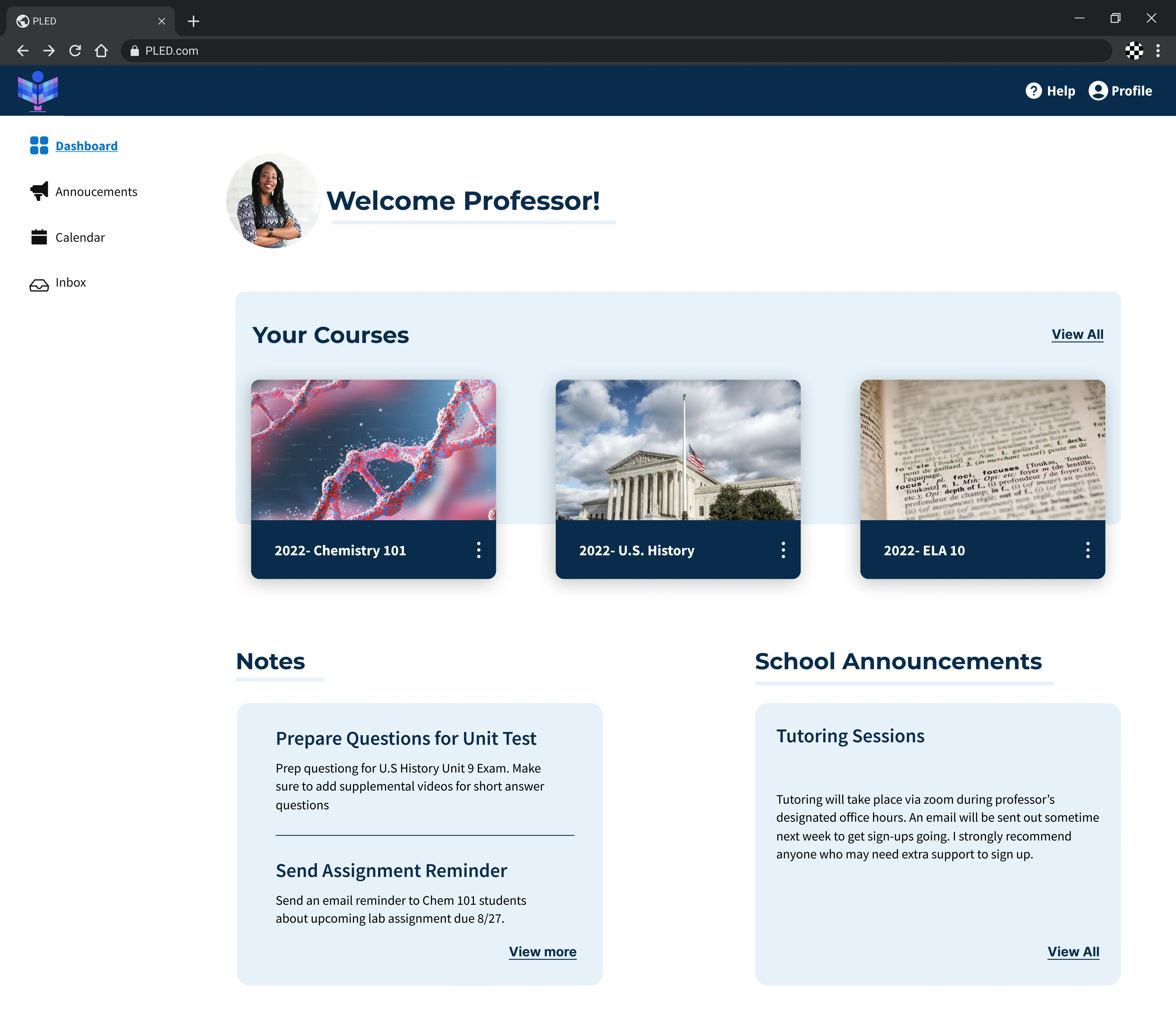
Image alt tag
Overview
Pled is an EdTech company with a goal of supporting students and education professionals from different locations and schools gain access to all their educational needs in one centralized location.
Challenge
Pled is a fully-integrated, fully-featured and centralized digital learning platform that enables seamless interactions between instructors and students. Pled came to the team wanting their current MVP updated with a user-centered approach and new UI with the goal of launching this product in India.
Solution
We designed the platform to maximize efficiency for all users by consolidating workflows and implementing a user interface (UI) that seamlessly aligns with the brand's vision. This included carefully curated functionalities that not only support student engagement but also foster collaboration amongst peers and educational professionals, promoting a more enriching learning experience..
Project Brief
The team and I reviewed the project brief given to us by the product manager. From there we decided to hop on a Zoom call to collaborate and discuss project objectives and deliverables. The brief explained that our objective was to design the logged in experience of their educational platform. As a team we thought it would be best to seek out more client clarity by curating a list of questions for the client in order to assess what their business objectives and goals were. Compiling this list allowed us to gather any information from the client we may need to refer back to throughout our design process and provided us the opportunity to really get to know the audience we were designing for.
Client Clarity
The client reviewed our questions and highlighted the key features they were looking for in the three user flows (student, professor, administrator) they envision for their platform. He gave details about the three users scope of work so that we grasped an idea of the type of navigation we needed to apply to the site. Additionally, the client agreed to set up a time to give a walkthrough of their current MVP they have and provided a list of competitors that are on the market. Client stated that Pled wants to eventually implement AR technology to the platform but is still in the process of laying out logistics.
Exploratory Research
To gain a better understanding of the current issues students face with educational platforms and e-learning I decided to take on the role of conducting secondary research. I discovered that the main challenges students face with online learning is lack of engagement, lack of social interaction, struggles with maintaining motivation, limited feedback, lack of time management skills, and much more. According to an article published in the Eurasian Journal of Humanities and Social Sciences, communication online is necessary in order to foster collaboration amongst students, peers, and educators (Axmedova T.B. & Kenjayeva N.D., 2021). Findings from this research allowed me to start visualizing important and necessary functionalities the platform needed to have in order to minimize challenges and pain points for users. Although most of the secondary research I uncovered focused on student experience rather than professor and administrators it gave clarity as to what those roles need in an online environment to effectively engage and support their students.
Heuristic Evaluation
As a team we began to work on a heuristic evaluation of Pled’s current platform design. We conducted this heuristic evaluation to inform our design decisions while building and minimize any usability challenges users could potentially experience. While conducting the evaluation we ran into four major usability issues.
Recognition rather than recall : Navigation did not indicate where the user was currently on a page. This can increase cognitive load and cause frustration for the user.
Aesthetic and minimalistic design: Certain colors did not pass contrast standards. This results in usability being inequitable for users.
Help users recognize, diagnose, and recover from errors: important messages on the platform were not highlighted to grab the users attention which could result in users missing important information/direction.
Help and documentation: users could benefit from more assistance with certain functionalities such as having example filler text when prompted to write a description. The addition of helpful icons like “select all’ or “delete” would help the professors/admin work more efficiently.
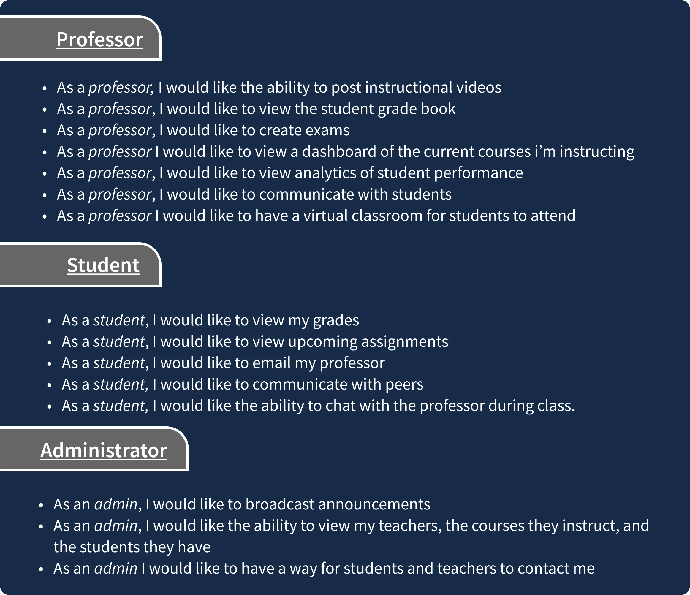
User Stories
With a better understanding of the project objective and user needs, the team and I began to create a list of user stories for the site. We categorized the stories by labeling them with levels of priority (High, Medium, Low). While creating the user stories I kept in mind the different functions each user would need to successfully navigate and engage with the platform in order to get their work done efficiently.
Wireframes
With user needs identified and an idea of where we wanted to take this project we began to start low-fidelity wireframing. As a team we delegated screens with me and another teammate focused on the professor experience of the platform.
While wireframing I kept in mind the functionalities a professor would need. I wanted to make sure that important content was front and center on the dashboard such as upcoming lessons and announcements, discussion boards were easy to engage with, and exams and grades were readily accessible. Although we delegated screens we maintained communication, gave feedback to each other, and collaborated on various other screens to ensure consistency among our designs.
Professor dashboard, discussion board, and exam creation wireframes
Style Guide
We then began working on a style guide for the UI of the platform. When discussing colors we ended up going with a deep blue as our primary. We went with this color because blue elicits a sense of calm, order, and security. We wanted Pled to look both professional and supportive from both students and academic professionals which is why we went with a rich deep navy blue and cool toned blues as compliments We finalized the typography, iconography, and began creating our component library.
User Testing
Being a previous research assistant I was thrilled to get to the usability testing portion of our process. As a team we conducted five moderated user tests via Zoom per our assigned flows (professor, admin, student). The main objective of testing was to assess our flows, navigation, and functionality.
I led research efforts by recruiting potential participants through educator forums, reddit, and social media. During testing participants were given tasks to follow in relation to our flow and encouraged to think aloud while navigating the platform. Participants were encouraged to share their thoughts on overall experience, website UI, frustrations, etc.
Examples of User Tasks Given
Professor Flow:
You need to upload the course syllabus, walk me through how you would go about doing so.
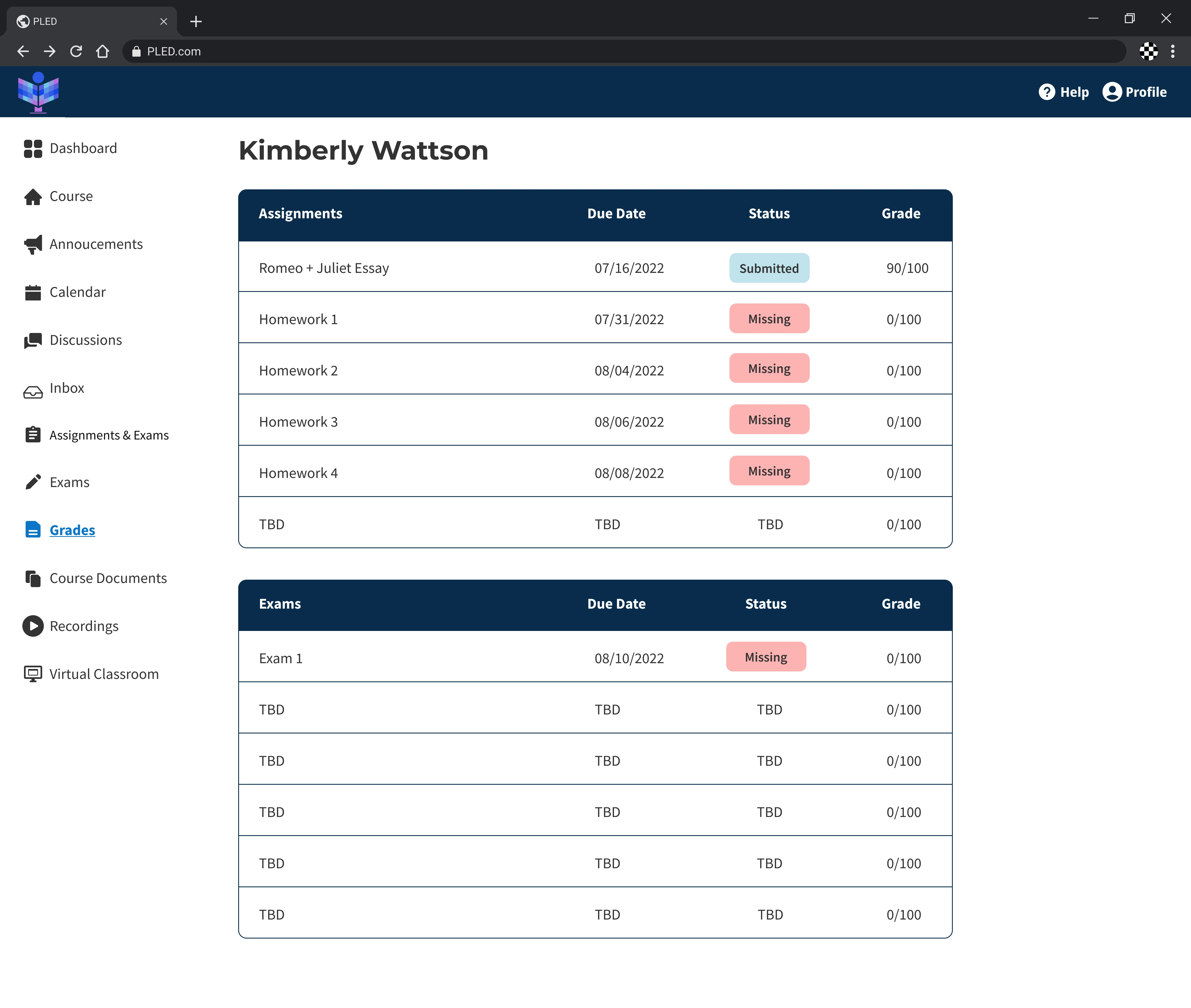
Your student Kimberly Wattson wants to know her current standing in the class, how you would view her progress?
You are about to instruct an online class in an hour, where would you go to begin instruction?
Test Results
Redesign & Handoff
Once I categorized our user test findings , I then went back to iterating our designs based on the feedback we received. I consolidated the navigation of the professor flow so attendance, grades, resources/uploads were course specific instead of general overview. I updated the professor dashboard so that professors see a glimpse of course related activity (discussions, calendar).
My goal was to make navigation more intuitive and less frustrating so that Pled would continue to have returning users. Once the changes were made I updated the development file with the appropriate annotations and the team provided more feedback and suggestions to the client on ways to fix the minor issues moving forward.
Consolidating the Dashboard
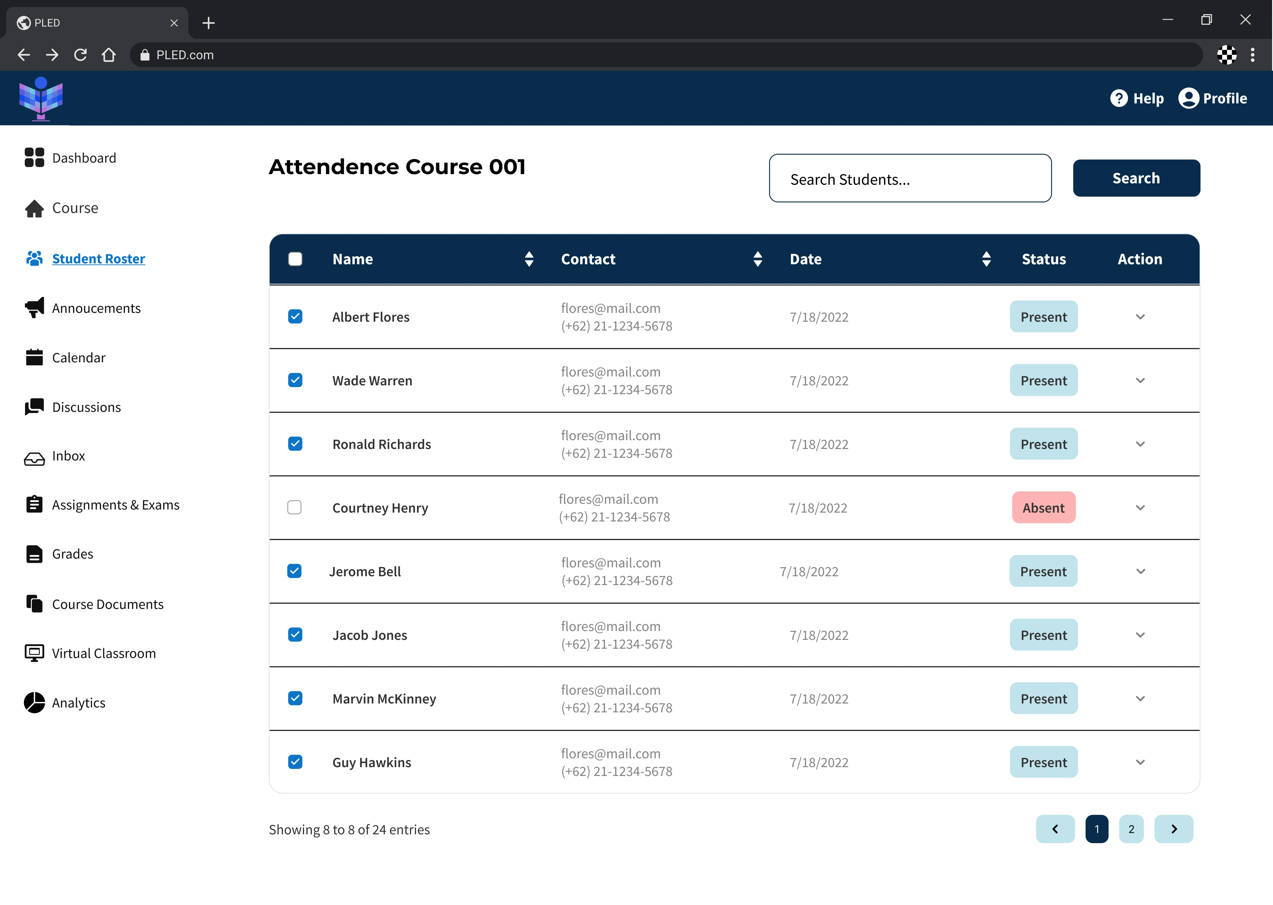
After testing it became apparent that the professor flow navigation needed to be updated. Since users would constantly refer back to 'course' when asked to review class progress, I changed the dashboard so that users will need to choose a course to view and then be directed to that course specific dashboard with the rest of the navigational elements available. I also highlighted some analytics relational to the course that is being viewed.
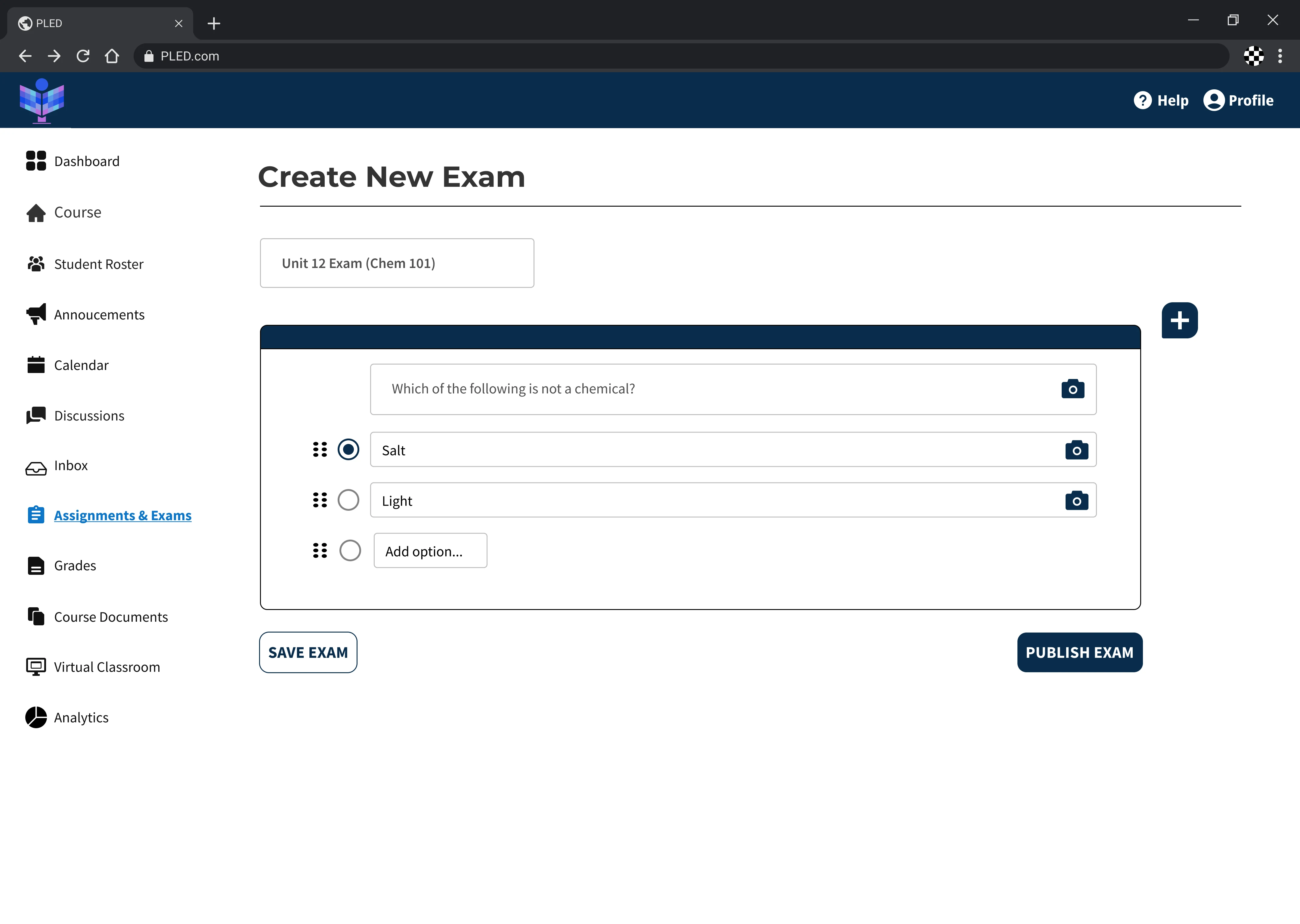
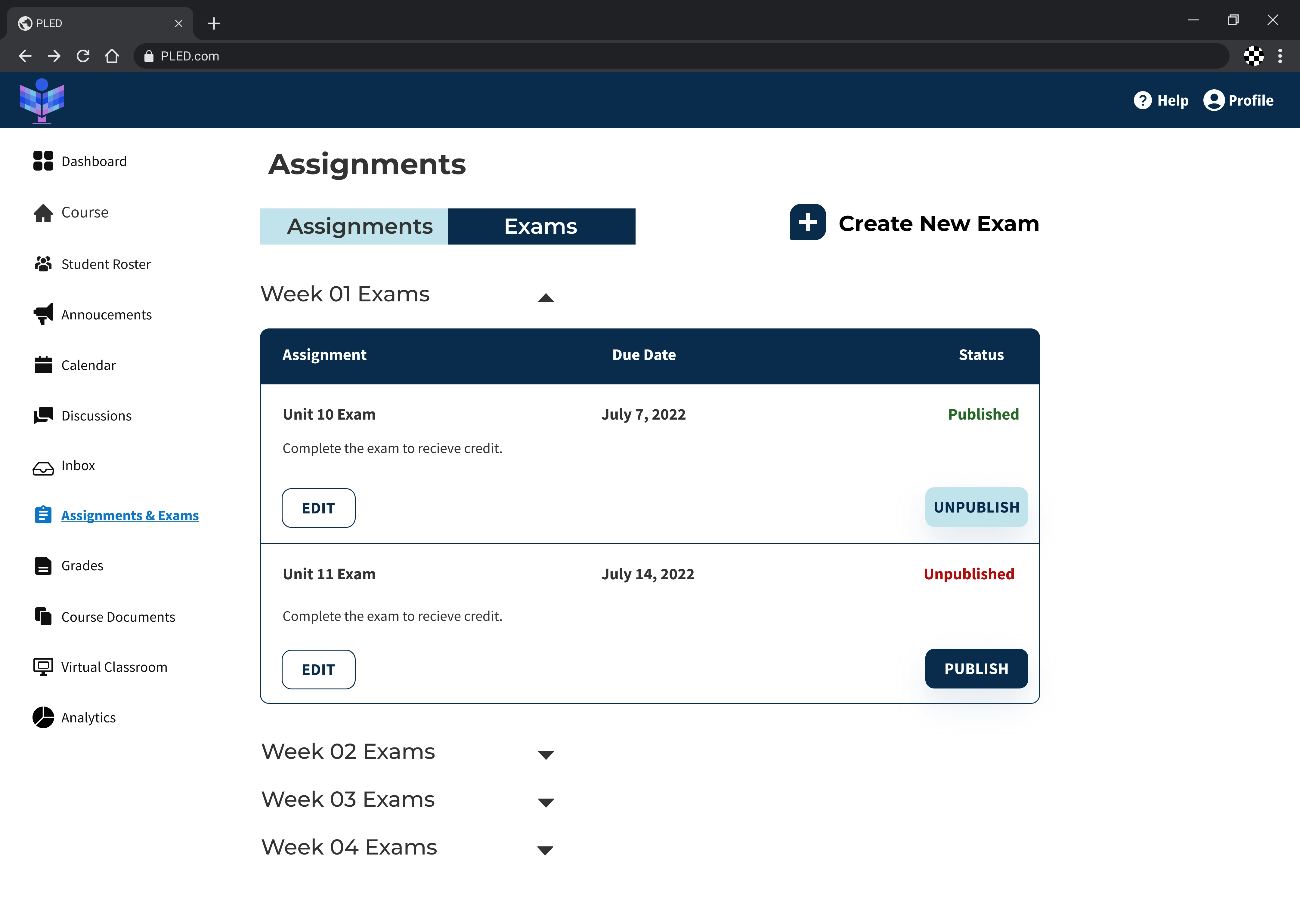
Assignments and Exams
Rather than have both 'assignments' and 'exams' on different tabs, I consolidated them both on the same page with users still having the open to toggle between the two on the top. This results in reduced interaction cost allowing users to get to what they seek in as few clicks as possible.
Development Handoff
Our team provided measurement and annotation documentation to developers to ensure that they understood the functionality of our designs and UI specifications.
"No major call outs, this looks good!"
-Pled Founder
Takeaway
Always, always, always advocate for user needs! I realized that even if stakeholders have a vision for their project as a designer I always have the opportunity to educate and inform them about user needs and habits. Educating and including stakeholders early in your design decisions not only strengthens collaboration but help stakeholders see the benefit of design and how it can help their business by helping users.
Utilizing Previous Experience
I enjoyed the usability testing portion of the process as it was something I was very familiar with having been a previous research assistant. I believe that it is very important to allow participants time to work think through a task before additional questioning. It was interesting to see at times how quickly I wanted to jump in to explain something or reiterate a question, however time allowed participants to gather their thoughts before walking through a task or answering a question resulting in great insights.
Looking Ahead
As Pled continues to expand their platform and its functionalities I recommend continuing to build out the analytics and grade book . It would be beneficial for professors to have a page that computes their data in order to work efficiently.
High Fidelity Designs
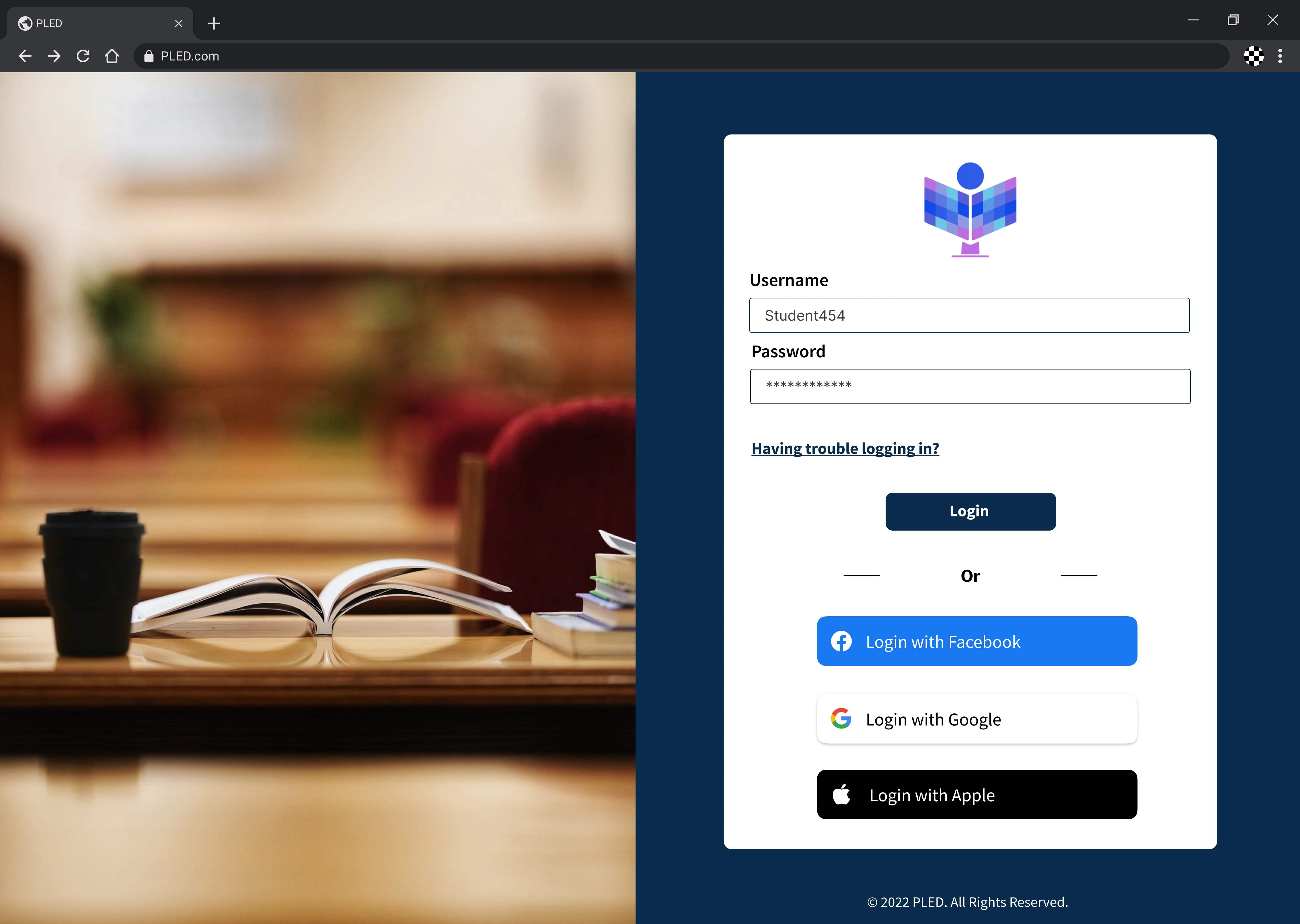
As a team we began applying UI to all screens. We utilized the component library we built for ourselves and referenced our style guide while working. I implemented UI on the official login page for Pled and the professor flow ; the dashboard, discussion board, assignments, grade book, and exams.
Since this is an educational platform, I wanted to have the deep navy blue incorporated intentionally in order to not distract users away from the important content. This resulted in a polished and elegant look that wasn't too overwhelming to the eye. The light shades of blue accented certain elements in order to guide users.
Screen design displayed in a mockup
Screen design displayed in a mockup
Screen design displayed in a mockup
Screen design displayed in a mockup
Screen design displayed in a mockup
Screen design displayed in a mockup
Alex Smith
UX designer
Like this project
Posted Jul 21, 2024
Helping educational institutions engage, inspire, and connect.
Likes
0
Views
48