Good Growth
A mobile app that introduces 'Arlo,' an AI Chatbot, aiming to provide mental health support. It gamifies the user experience with therapeutic CBT activities like journaling, breathing, and guided meditation.
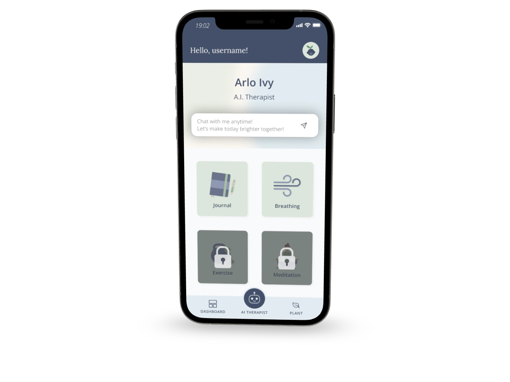
Image alt tag
Overview
This project was a result of a 48-hour Design Hackathon by Design Buddies and Liftyz. Our team collaborated to create an AI mental health app minimum viable product (MVP). Our united goal was to create an accessible and affordable mental health alternative to traditional therapy. While our app is not a replacement for therapy, it empowers individuals to gain more control over their mental health by providing AI recommendations for mindfulness activities that incorporate gamification for increased engagement.
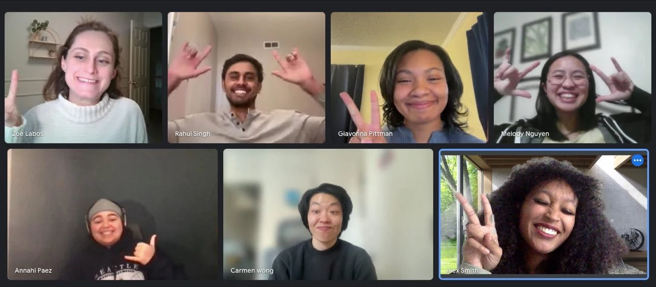
We started with big smiles and big ideas!
Kick-off
The design hackathon kicked off by providing teams a choice between three unique briefs. While the mental health app brief stood out as the most demanding due to its focus on AI integration and the need to be built from scratch, I rallied the team to embrace this challenge. It was an opportunity to create a minimum viable product (MVP) that could address the critical issue of mental health care in America. Leveraging my experience as a mental health counselor and peer specialist, I assured the team we could tap into valuable research insights from my former therapist colleagues.
Research
I spearheaded the research initiative by crafting a comprehensive research plan that involved surveying two key demographics: mental health professionals and potential users interested in managing their mental health. The mental health professional survey focused on gleaning valuable insights into prevalent mental health challenges, potential concerns regarding AI integration in mental health care, and any roadblocks that might deter individuals from seeking help. Conversely, the potential user survey aimed to identify their primary frustrations or concerns with traditional therapy approaches and explore how our app could be designed to offer the most effective support.
Insights from the survey with mental health professionals
Self-regulation being a key indicator of success
Confidentiality is of the utmost importance
Concerns with the superficiality of A.I & lack of trust in A.I
Easy accessibility and low prices compared to therapy could be beneficial
Gamification can enhance the experience
Common concerns of potential users and suggestions for app effectiveness
Obstacles maintaining regular check-ins
Activities/exercises that are effective are important
Privacy/confidentiality concerns
User data storage
Personalization of content
Competitor Research
We then started conducting a competitor review of similar applications on the market. We assessed Wysa, Woebot Health, Youper, Happify, and Headspace. We noticed that features such as symptom monitoring helps users identify patterns with their mental health, daily check-ins encourage users to stay on track, and gamification excites and motivates users to keep up with their goals.

Brainstorm Session
After synthesizing survey results, we ran a whiteboard session to brainstorm possible solutions. This was great because it allowed us to explore ‘blue sky’ ideas while remaining grounded by frequently referencing the feedback given in our surveys. For instance, a suggestion from a mental health professional was to embed CBT activities in AI user conversations for a more authentic experience. We also explored ways to incentivize users when they complete activities. Such as, offering a free 1:1 therapist consultation when they reach a certain level of activity engagement. This highlighted a business opportunity for our app while still encouraging individuals to seek out mental health support.

User Flow
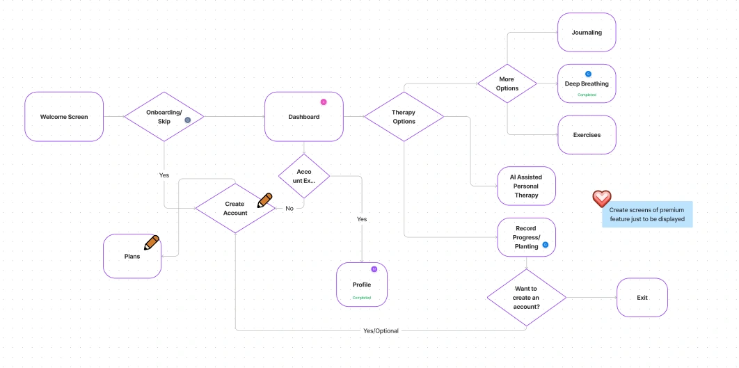
We continued our ideation efforts by brainstorming user flows for the app. Each member of our team completed a flow and we collaborated to reach our unified decision. We ultimately went with a user flow that included onboarding, account creation, and pathways for the user to explore CBT activities such as journaling, deep breathing, and meditation while also encouraging AI assistance and progress tracking. Although we opted to not include premium features in our main flows in order to keep mental health care accessible for all, we thought it would be a great idea to include a screen showcasing what a premium locked feature could look as it illustrated business opportunity and feature scalability.
Style Guide
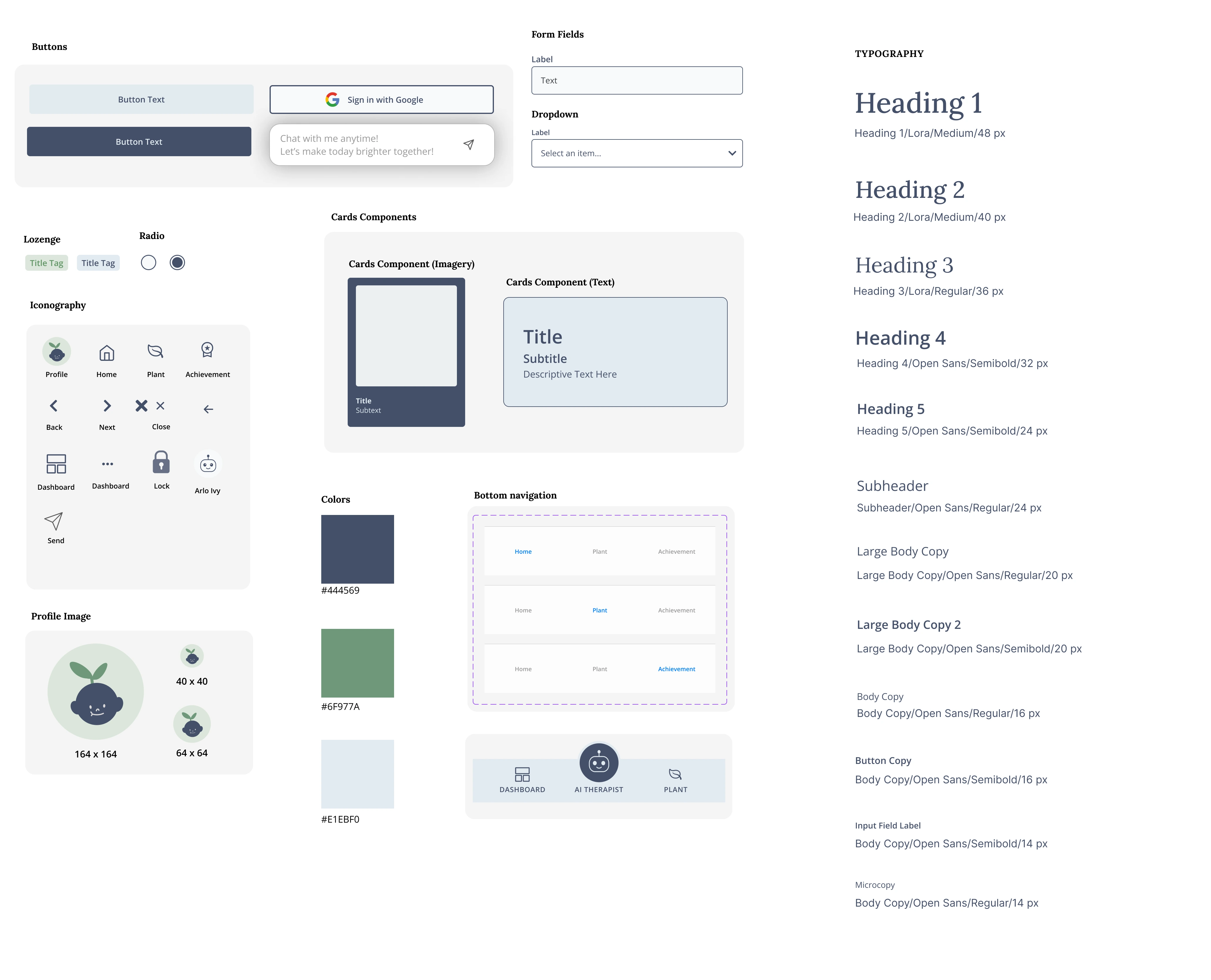
While creating the style guide for the appc inspiration from established leaders like Google Material Design and Atlassian, prioritizing a calm user experience. Soothing pastel colors, particularly calming shades of blue, were chosen alongside rounded elements in corners and icons to create a tranquil atmosphere. Accessibility remained paramount, with layouts and CTAs designed for users with varying dexterity levels, ensuring a seamless experience for everyone.
MVP Mockups
Collaboratively building the MVP mockups, I used this hackathon to challenge myself with both animation and UI. Recognizing the splash screen's importance as the user's first impression, I designed a gentle, soothing animation. This calming welcome aims to assure users they've made a positive step in seeking mental health support.
Premium Features
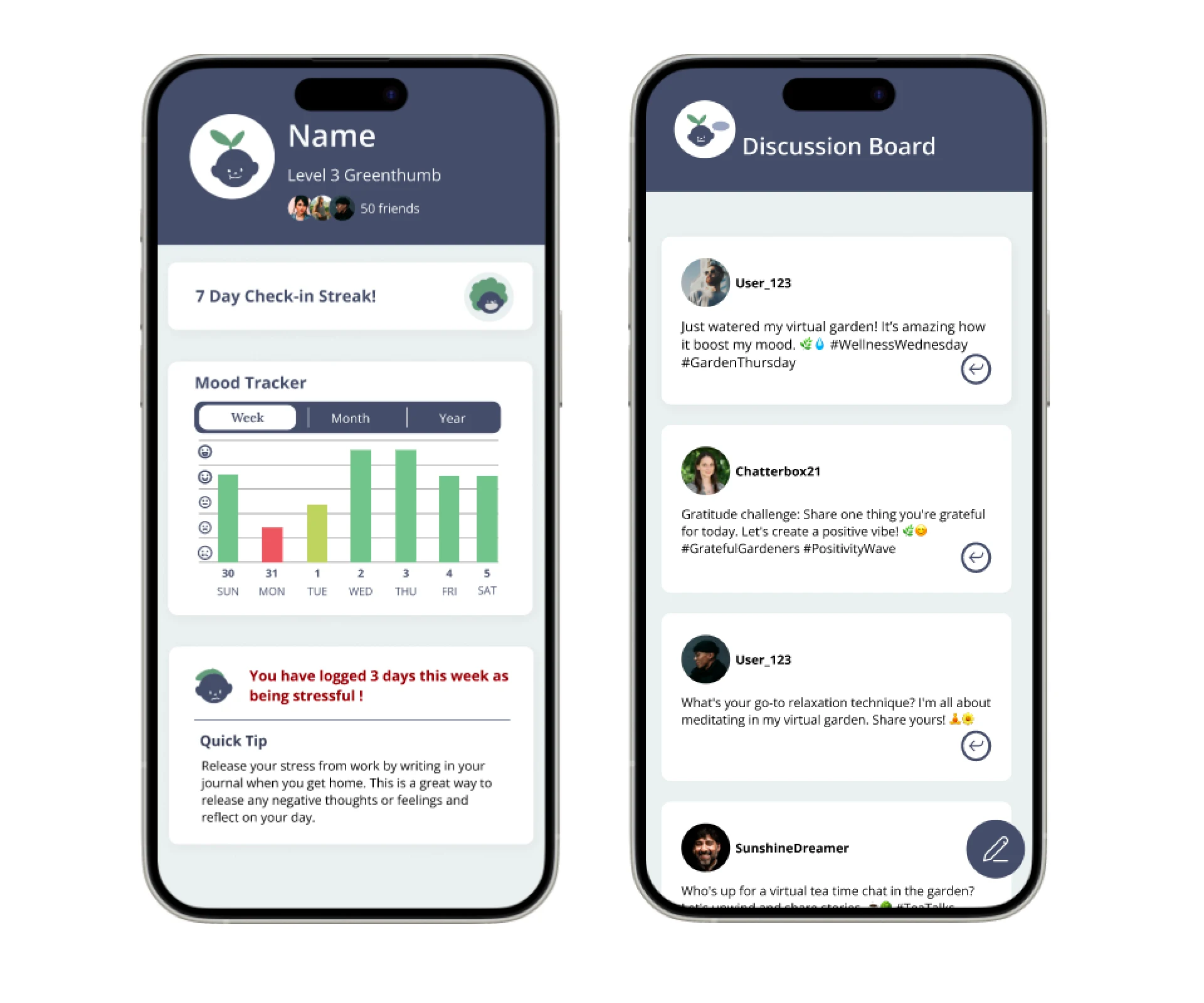
Beyond the initial interface, I also focused on premium feature mockups. These included a light and minimalist discussion board and a personalized progress report dashboard. The mood tracker, a key element, showcased data visualization with color variations reflecting mood shifts. As well as using a red variation to highlight important messages for users.
Screen design displayed in a mockup
Screen design displayed in a mockup
Reflection
I am beyond proud of both myself and my team for challenging ourselves to create a product that has potential to help millions in need of support! I was initially very nervous going into this due to it being my first hackathon, but I made it an effort to get out of my comfort zone. I am happy I was able to leverage both my psychology and research background during this experience as it aided in our research efforts during this project and allowed for deep synthesis and understanding of potential user needs. It's beautiful what eight strangers can create in just two days.
Alex Smith
UX designer
Like this project
Posted Jul 19, 2024
A mobile app that introduces 'Arlo,' an AI Chatbot, aiming to provide mental health support. It gamifies the user experience with medically approved CBT activi…
Likes
0
Views
11

