Austral Hospital Surgery System
Re-designing the entire Surgery system.
The client came with a problem about his system for internal use.
It covered all uses related to the surgery area: patient evolution, operating rooms, schedules, needs and allergies, patient check-in, quick-view information screens and more.
Their system back then was super backwards. An old design, screens that did not fit the information in an organized way, obviously nothing responsive. It was really discomforting when someone uses it. Many steps to perform actions that could be greatly simplified.
After doing the corresponding user tests, along with some research on some similar system behaviors, I was able to get to work on the new design and structure of the system.
Here's the result.
Agenda
This is the main screen. It is the overview of all available operating rooms.
It consists of a schedule with a real time marker, which determines at a glance which operating rooms are busy and which are available, in case of an emergency or simply to organize the day.
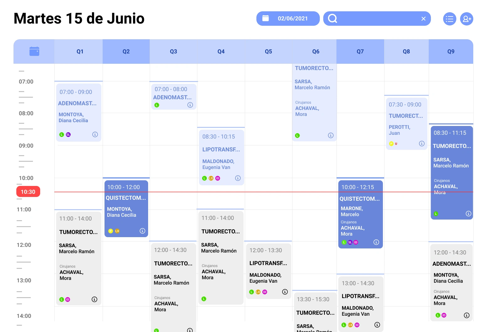
Agenda view.
Each of the surgeries is represented by a card.
These cards have the drag & drop function, which makes it easier for the user to rearrange each surgery without having to complete several steps or enter each one individually to be able to modify it.
Cards
These cards, because they have a reduced space in the agenda, only show the essential data for doctors.
These are: the type of surgery, the name of the patient and the surgeons. The time is also in the card, but you can see it also on the left.
An added item of great value were the allergy indicators. These are individual patient indicators that room preparers should be aware of before the patient is admitted, such as "latex allergy (LX)", "difficult intubation (ID)" and "sulfite allergy (SL)".
The green L means that the patient is ready for surgery. While the orange P indicates that it is still pending review.
Grid
There is also the option of being able to change views.
By tapping on the top right button (bullet points) the user can switch to a grid view type. Where it covers less of the screen content of the operating rooms, but has a clearer view in case you need to focus on a single room.
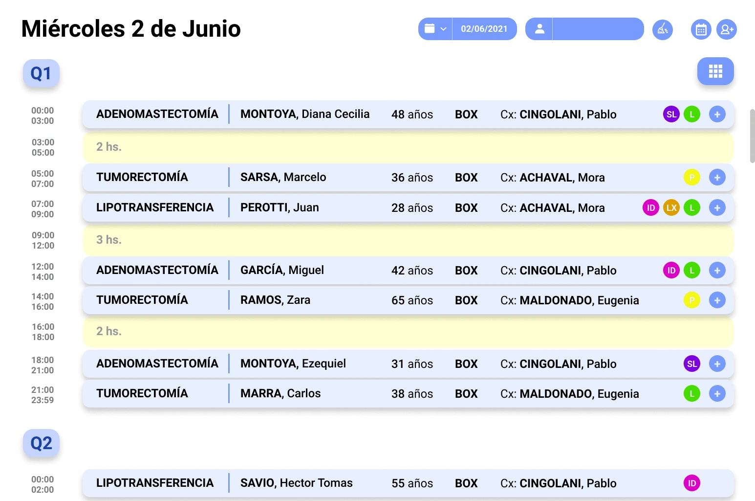
Grid view.
A new button is also enabled here, the operating room button. By being able to modify the view, and being able to focus the user on a single room, the option of being able to jump directly to another operating room that you want without having to scroll is enabled.
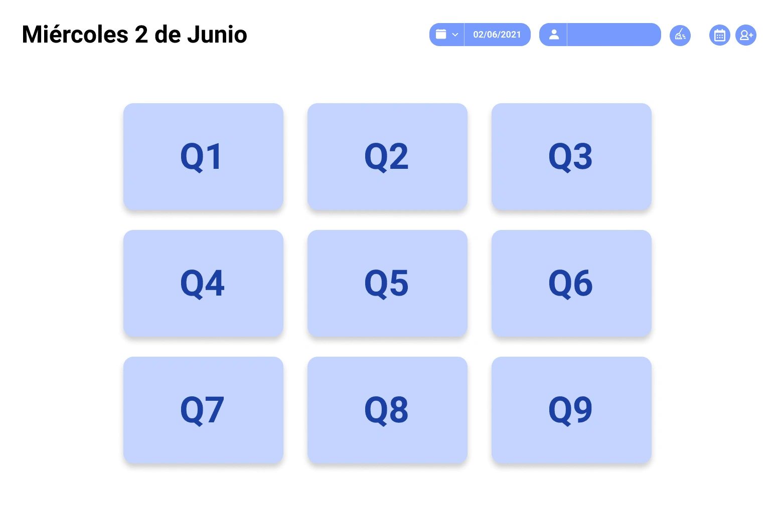
Rooms
In this way you can move from one room to another more quickly.
Backlog
The Agenda also has a backlog where unassigned surgeries are found. These are separated by date of creation, and ready to be dragged into the operating room.
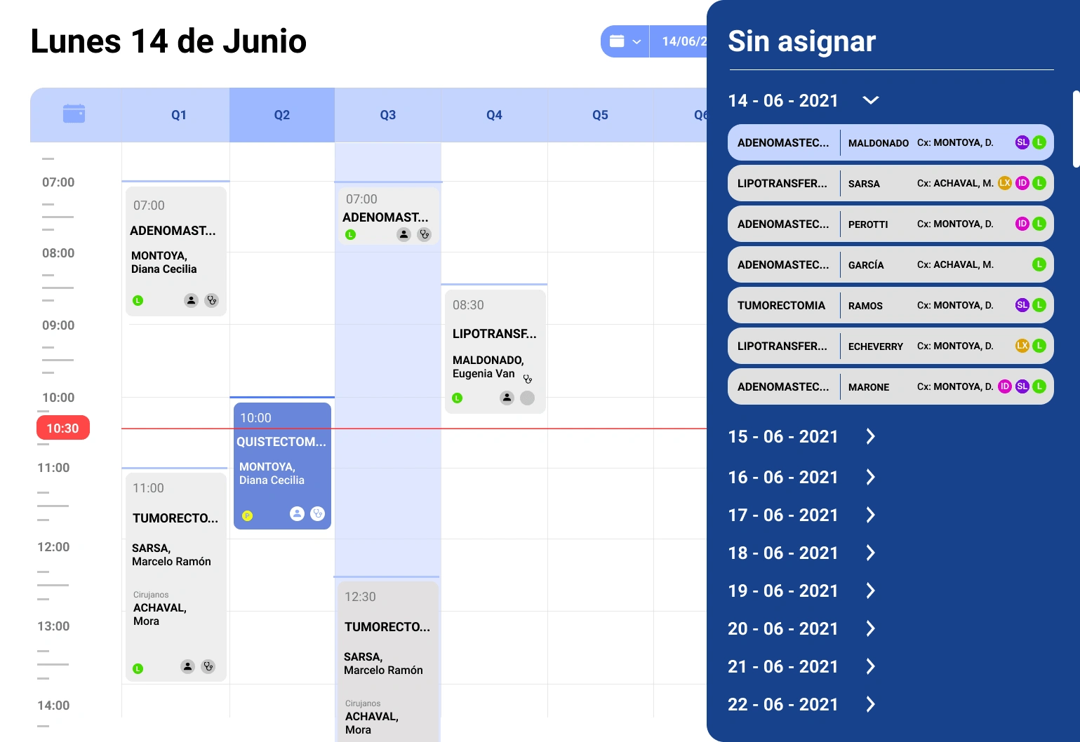
Agenda Backlog
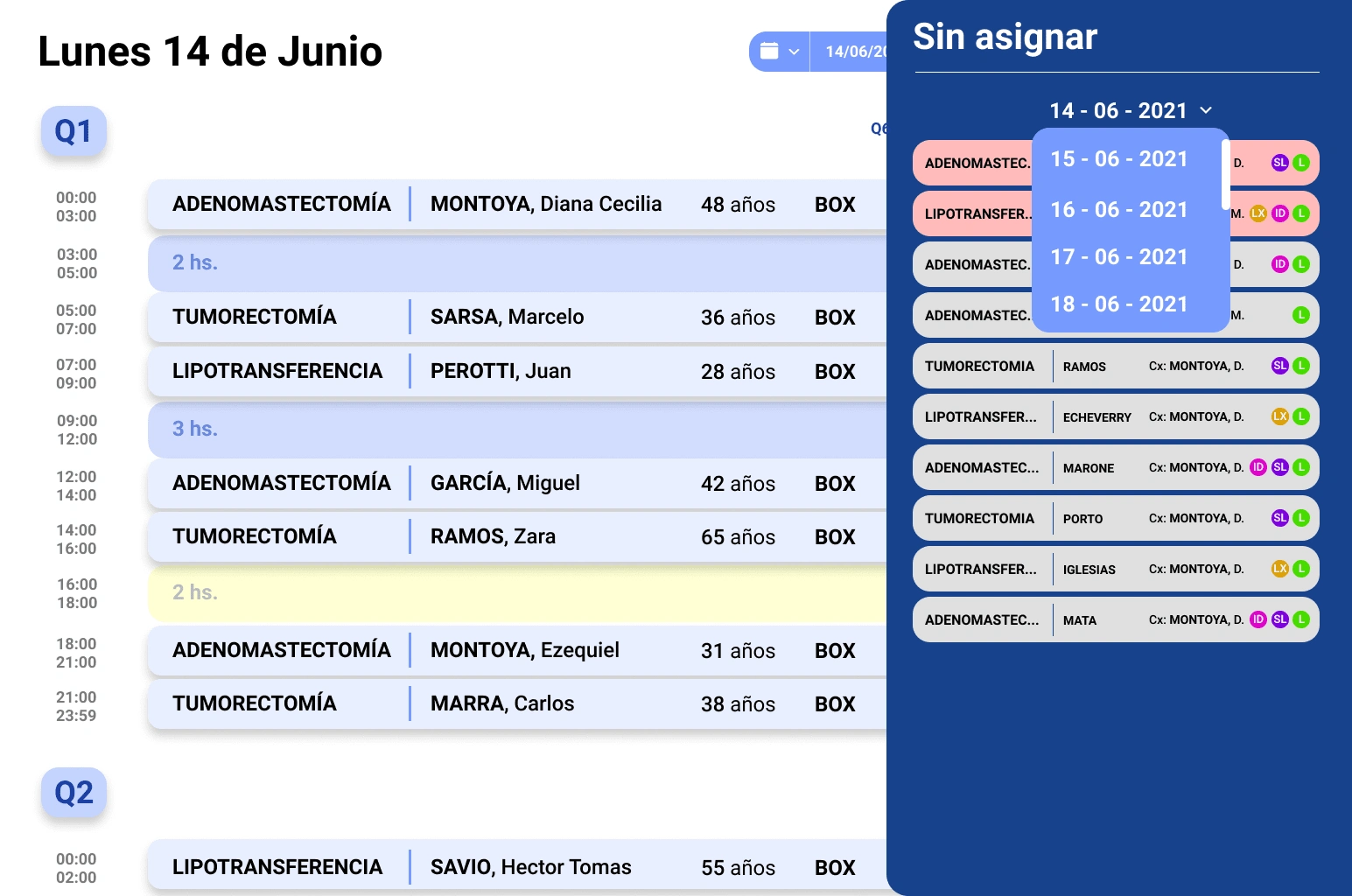
Grid backlog with date filter.
When selecting an unassigned surgery, a small visual help is produced to the user based on the estimated duration of the operation. Marking with a light blue the spaces that have enough time to be assigned, and with a yellow the empty spaces that do not have enough time.
Timers
This window is the patient history.
The procedure to be performed, your personal data and the assigned surgeons. The available beds are also shown depending on the sector in which the operation is to be carried out, so that it can be assigned more efficiently taking advantage of the facilities and times.
Medical coverage and allergies or medications are also recorded here.
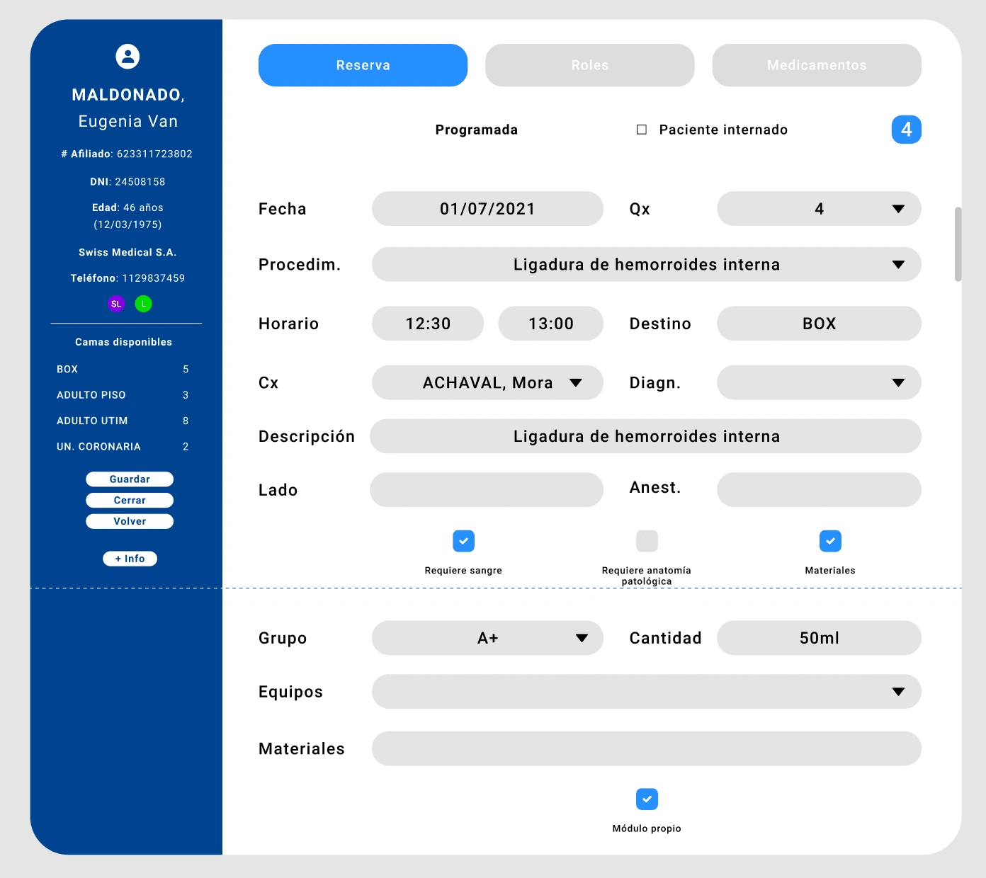
Patient profile
There are also the so-called timers. What is the registration and step-by-step evolution of the patient, from admission to discharge.
There is a record of every minute that passes inside the hospital.
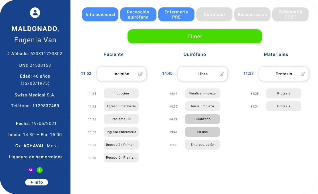
Timers
With this I close the project.
There are many more screens as the task was to recreate an entire system from scratch, but I think these screens and the flows explained are the core of the project.
Like this project
Posted May 27, 2023
Re-design from scratch of the Surgery System of Hospital Austral.
Likes
0
Views
33
Clients
Hospital Universitario Austral

