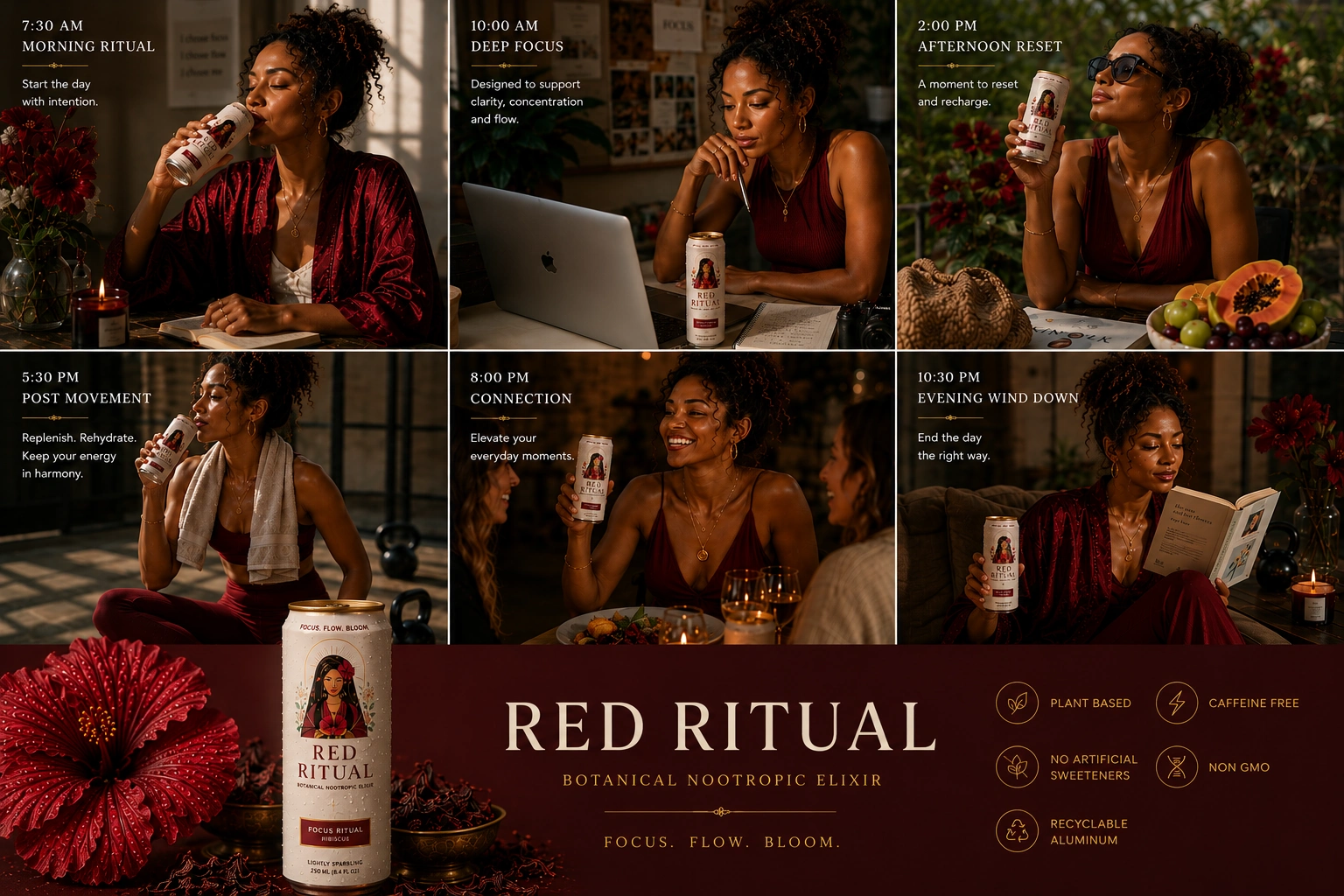
Red Ritual Brand Campaign Concept
Catherine Gomersall
Packaging, branding, and festival activation for a hibiscus drink brand (concept)
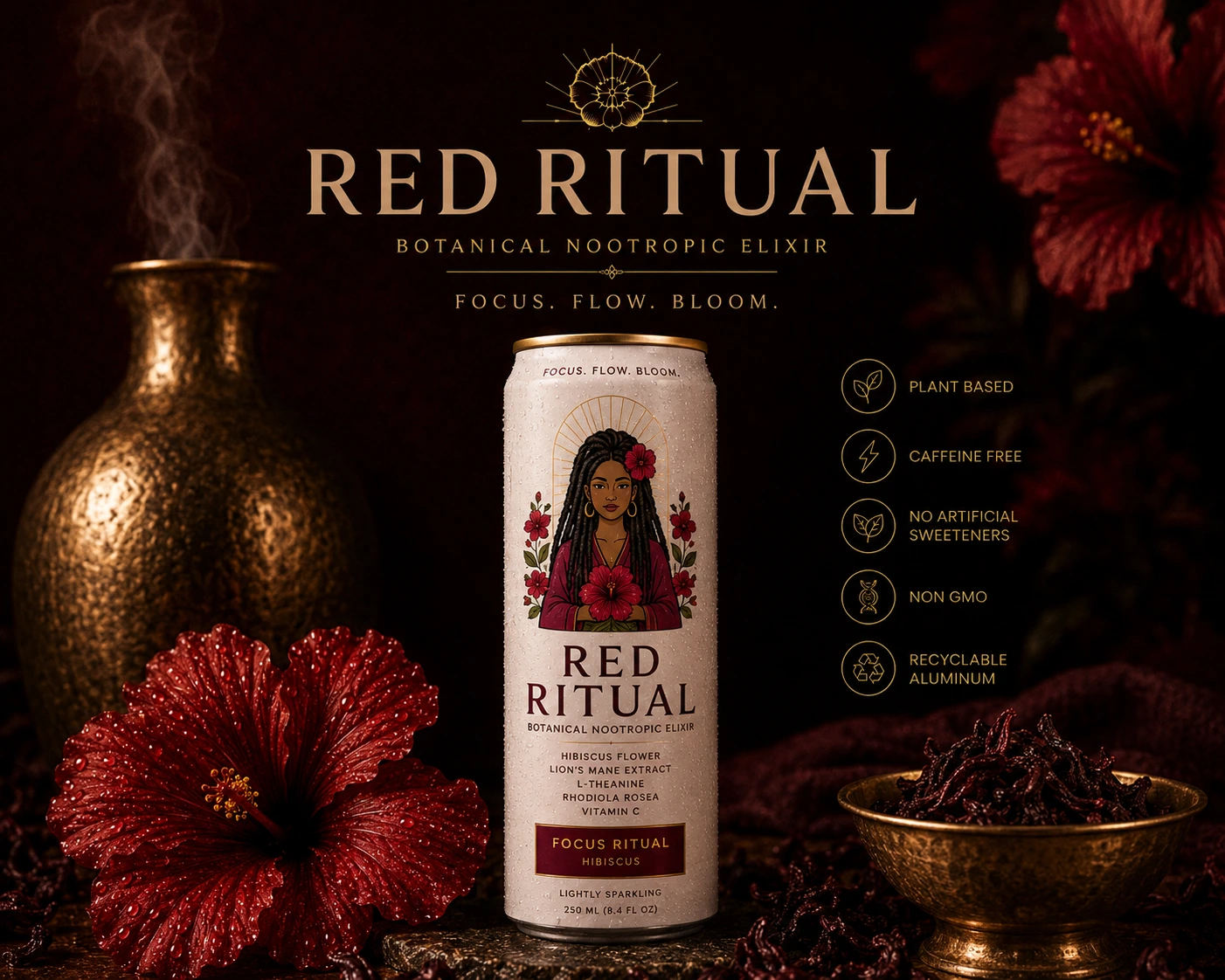
Red Ritual is a spec brand concept built around the Hibiscus goddess character from my Sacred Trios Oracle Deck. The idea: take an existing illustration and extend it into a full brand world, from packaging through to festival activation.
This is entirely self-initiated. No client, no real product. It exists to show how I develop a brand identity from a single character illustration into a cohesive campaign system.
What the concept covers
Packaging design — bottle labels, can wraps, and box formats built around the Hibiscus goddess illustration
Brand identity — colour system, typography direction, and visual language rooted in the character's world
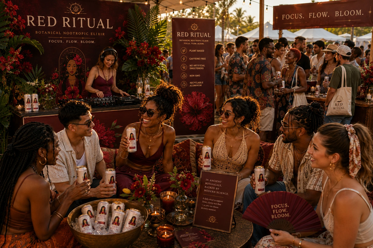
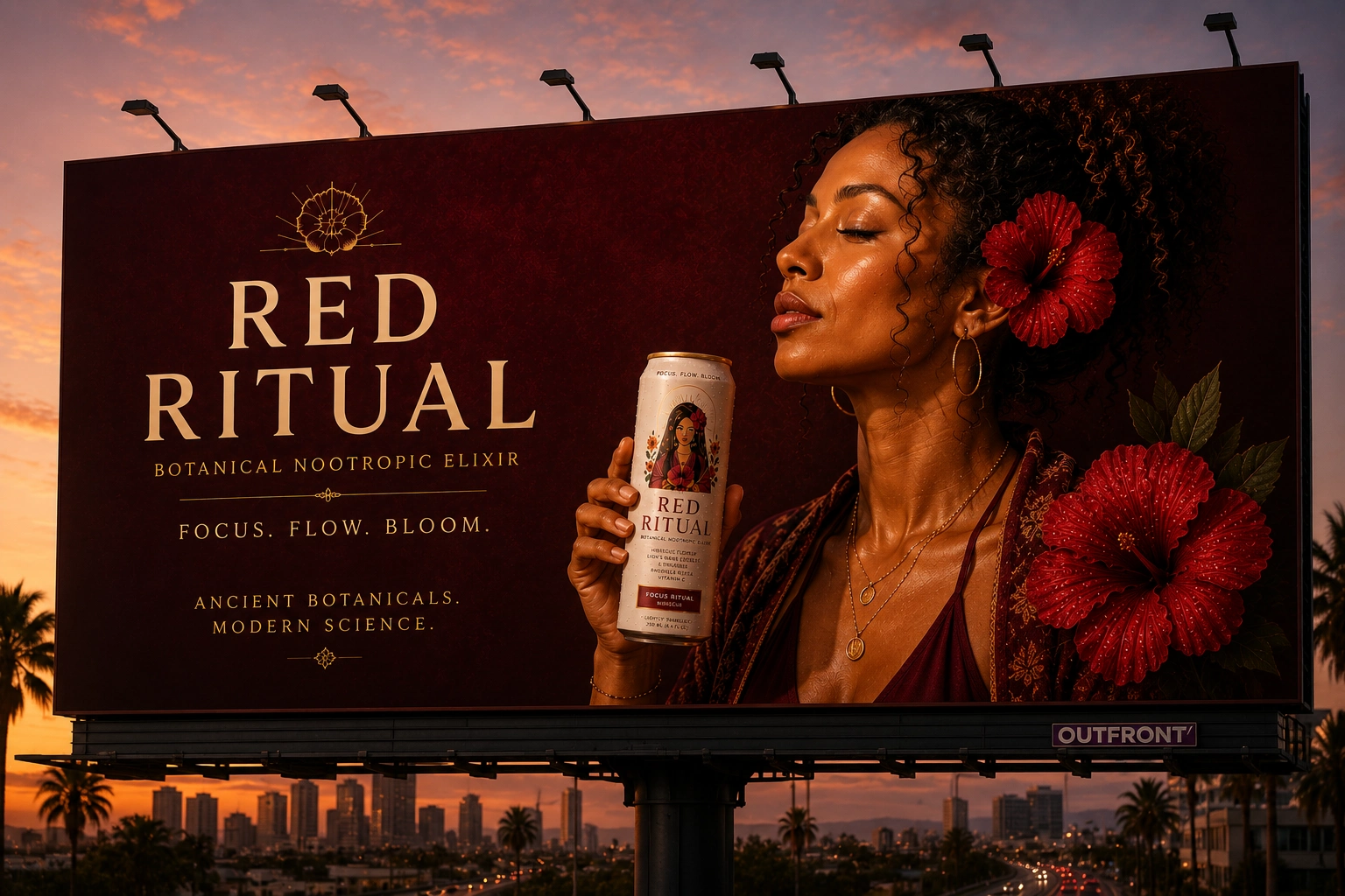
Campaign art direction — hero imagery, lifestyle scenes, and product photography concepts generated with ChatGPT
Festival activation — how the brand would show up in physical space: signage, merch, experiential touchpoints
How it was made
The character illustration was drawn in Procreate, originally created for the Sacred Trios Oracle Deck project. Campaign imagery and art direction were developed using ChatGPT, with the illustration as the anchor for every visual decision: colour palette, mood, composition, and styling all flow from the character.
Why this kind of project matters
Brands built around illustration have a distinct advantage in crowded markets. This concept demonstrates how a single strong character can carry an entire brand system across packaging, digital, and physical activation, the kind of work I do for real DTC and CPG clients.
Like this project
Posted Jun 24, 2026
Likes
0
Views
0