Mokja! - Identity Design
Project Overview 👀
Who?
Mokja! Is a meal-kit concept (I wish this was real!) specializing in curating and providing ready-to-cook authentic Korean meals in their homes.
Why?
Mokja! seeks to create a distinctive brand image that sets it apart from its competitors. They want to communicate its unique selling proposition and value proposition to its target audience as they are one of the very few in the industry catering to Korean cuisine. The client is also looking to improve its online presence and engagement with its customers.
Phase 1: Strategy ✍️
We started the project with a strategy session with the client. Our aim is to align on the project's goals, success measures, and challenges. The client already had a good idea of what their success measures looked like, so this phase was for me to document as a reference and set a good foundation before moving to the initial creative direction.
In this phase, our goal was to create a "roadmap" for our creative work. This helped us all understand who our customer is and what we want to convey to them.
Deliverables for this phase:
Clear Vision/Mission statement.
Clear persona(s) for our primary customer.
Positioning statement defining our unique market position.
"Big Idea" statement summarizing the brand's core concept.
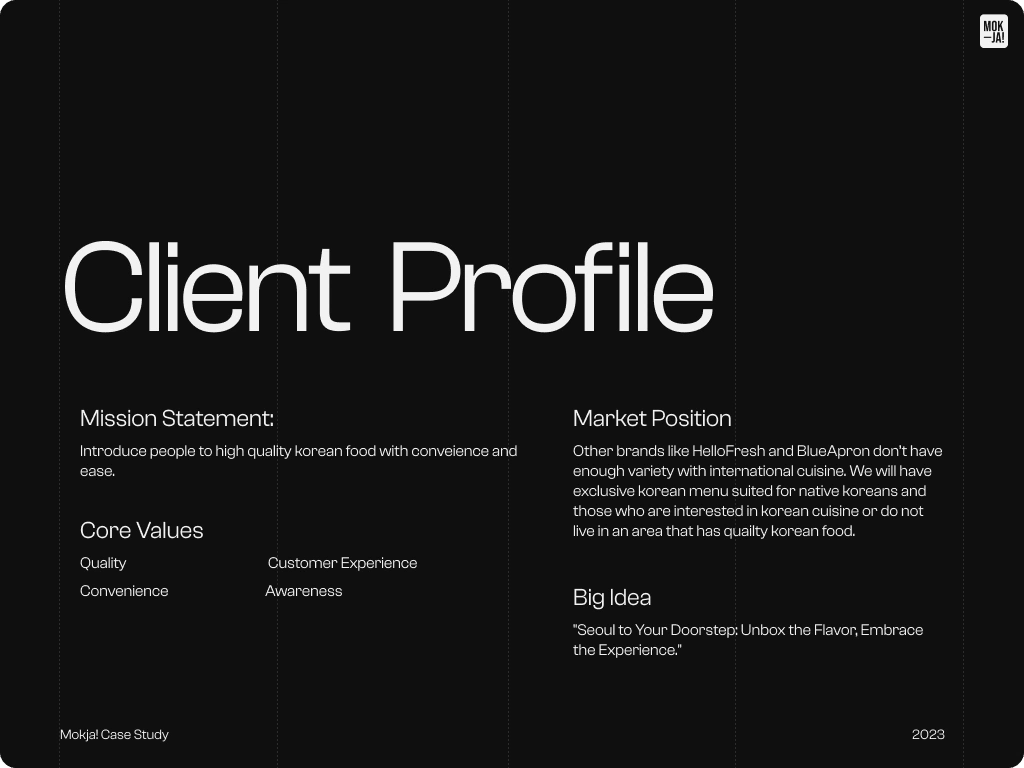
setting the groundwork for project scope
Phase 2: Creative Direction 🎬
Using my insights from the strategy phase, I translated the strategy into a visual "look & feel" which will help us understand the direction of the identity design.
Voice & Tone:
Mokja! understands the market they’re dealing with. Gen-Z and Millennials are the core audience. The goal is to create a tone that speaks to this demographic and catches their attention in the sea of media that they’ve become inundated with. The tone should be fun and vibrant yet trustworthy and transparent.
Deliverables for this phase:
3 Stylescapes for exploring different visual directions
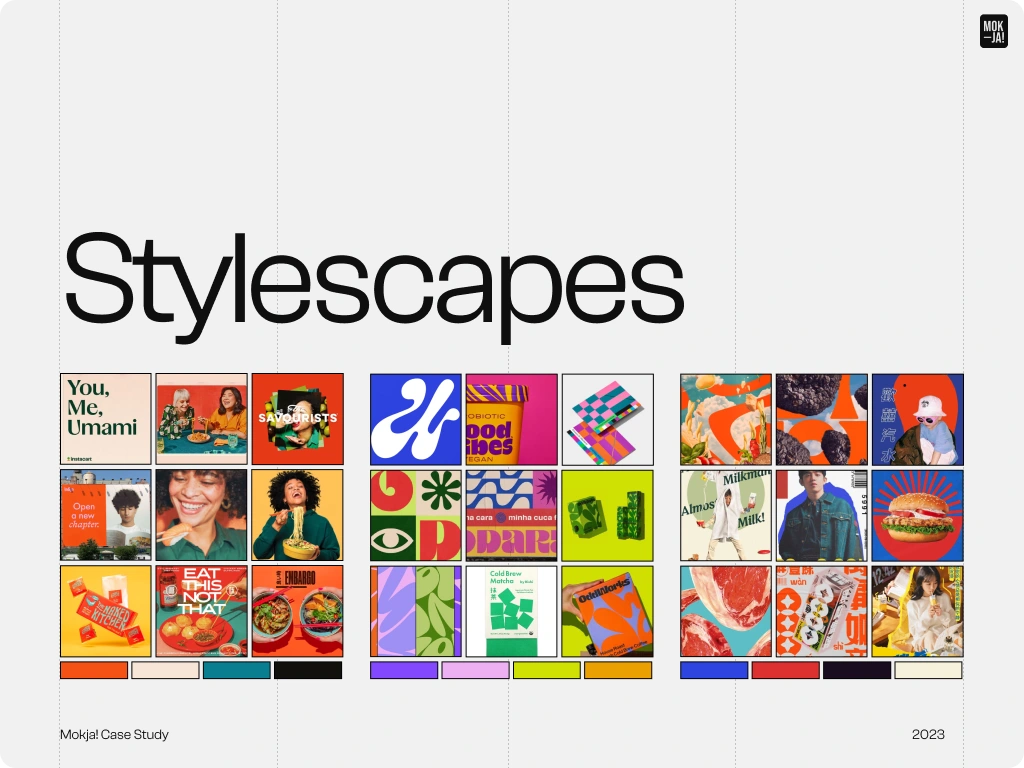
Different visual directions from the strategy research phase
Phase 3: Design 🎨
After getting approval on the creative direction, it was time to start exploring designs for the identity, logo, and applications.
Deliverables for this phase:
Creative presentation presenting the designed identity
Brand book describing how to apply the new identity
Final tangible assets including logo suite, and graphics

Logo Mockup with falling bowls of bibimbap. It's a miracle!
Logo
Designed to evoke the exhilaration preceding a delectable meal, the logo encapsulates the essence of excitement, resonating with our audience's anticipation for a delightful dining experience at their doorstep.
To get around some of the budget limitations around photography, we were able to pull together a visual direction that borrowed from collage design. By doing this, we were able to pull off eye-catching elements while touching on the theme of delivering this unique experience through food.
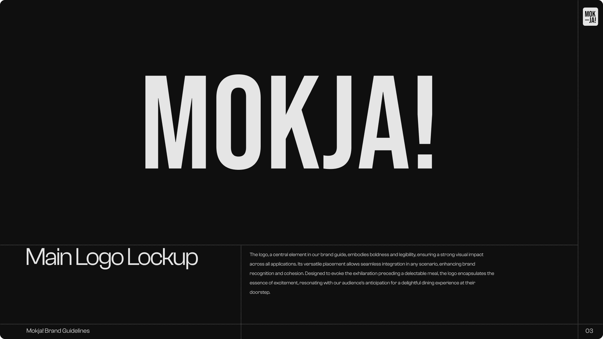
Lockup
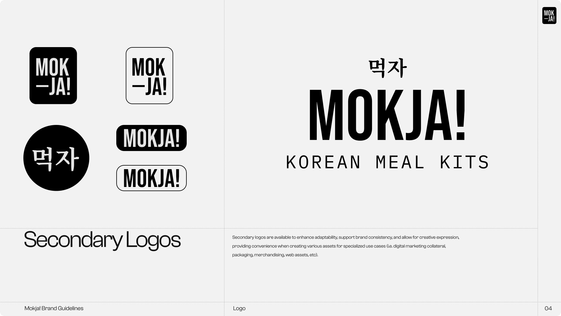
Secondary Logos
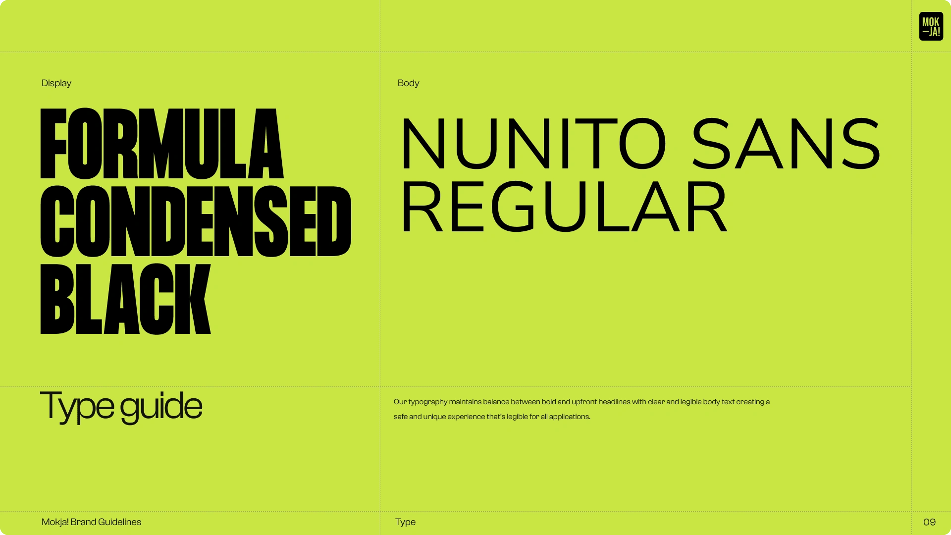
Typography
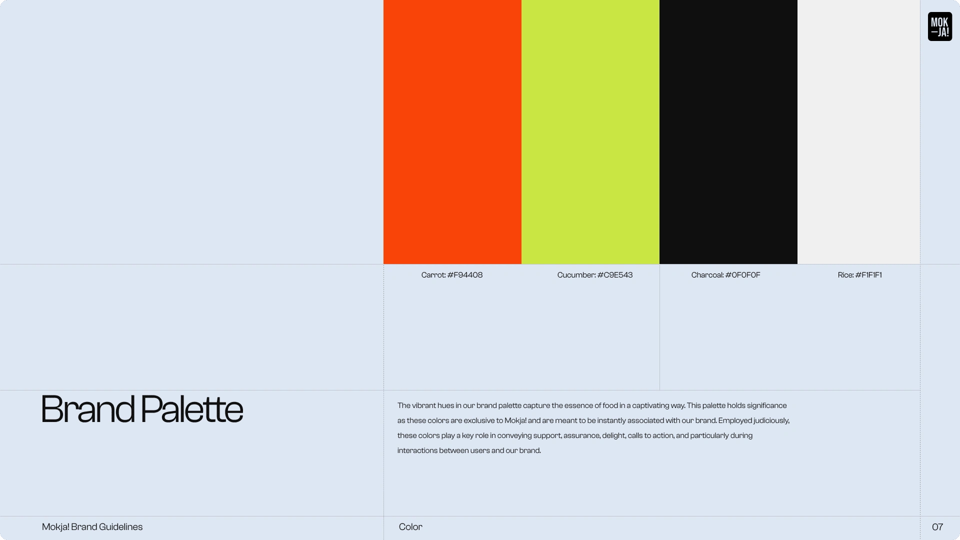
Primary Brand Colors
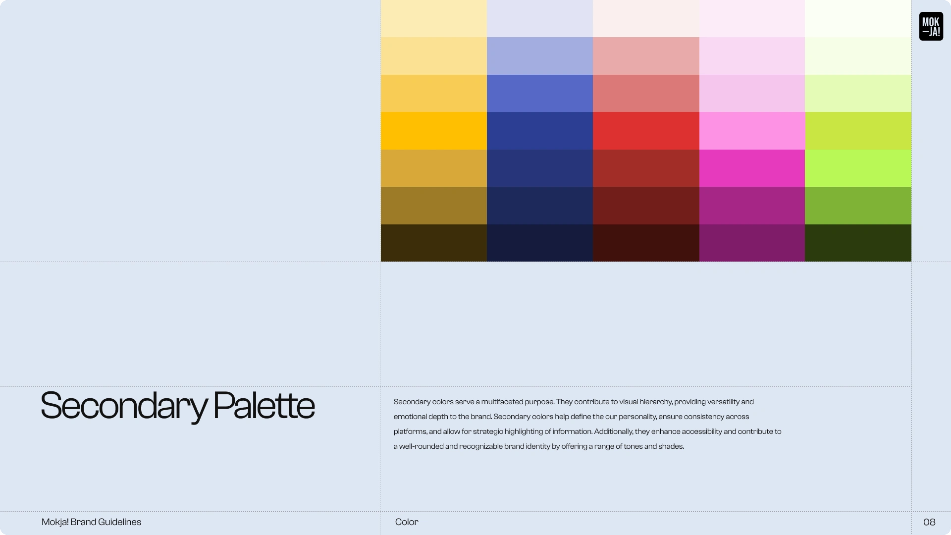
Secondary Colors
Social Media & Marketing
Through these assets, we wanted to evoke this message of elevated experience by trying a potential new cuisine and exploring the variety that Korean cuisine has to offer. This creates dream-like visuals that combine with bold and almost daring messaging.

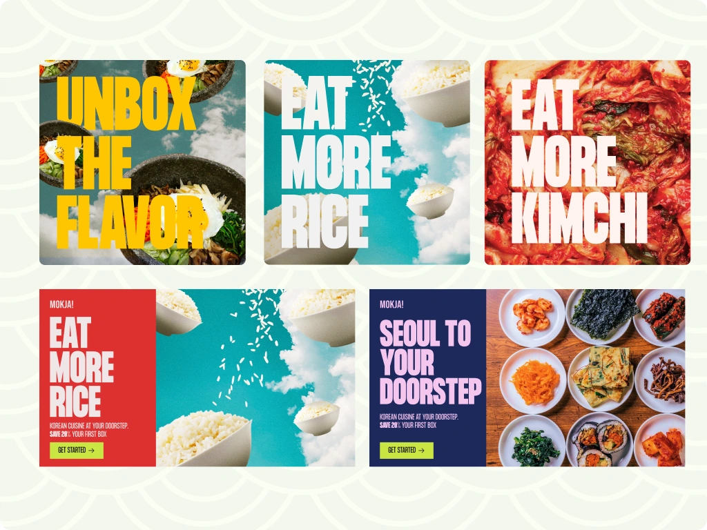
Mockups
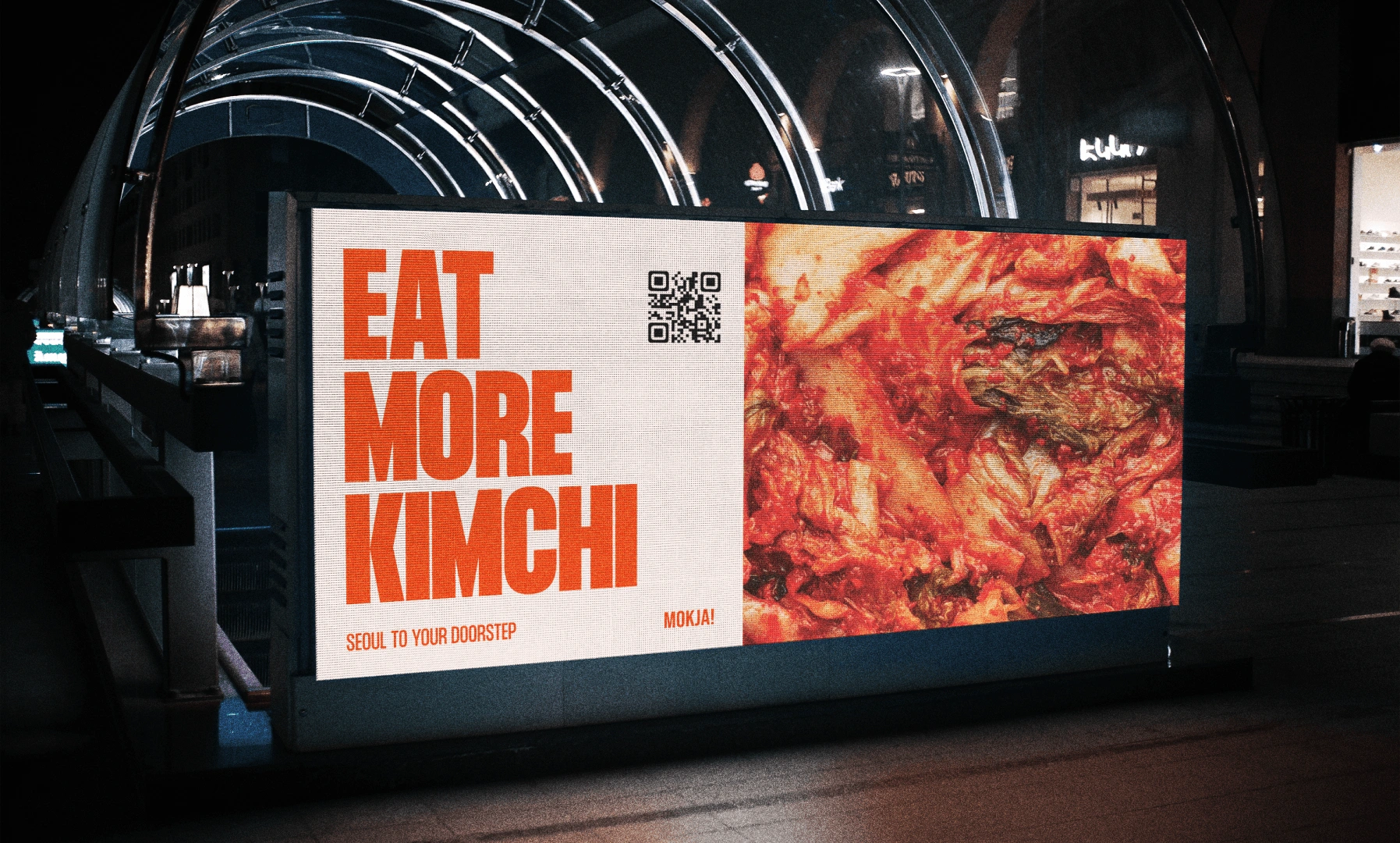
Digital Billboard with QR Code--kimchi in all its glory
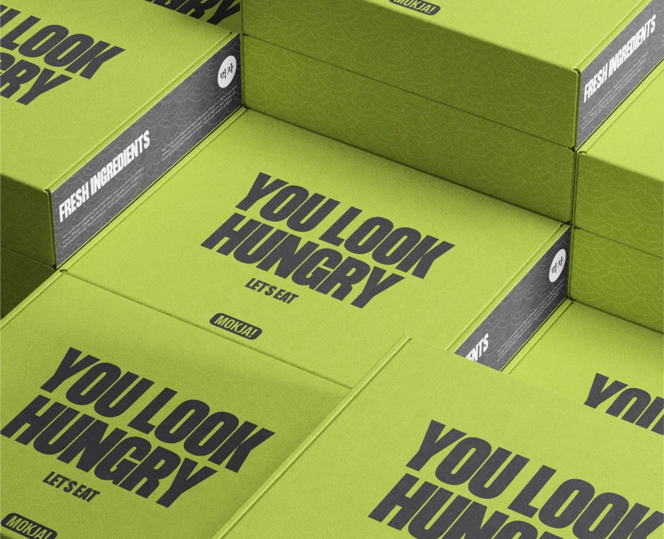
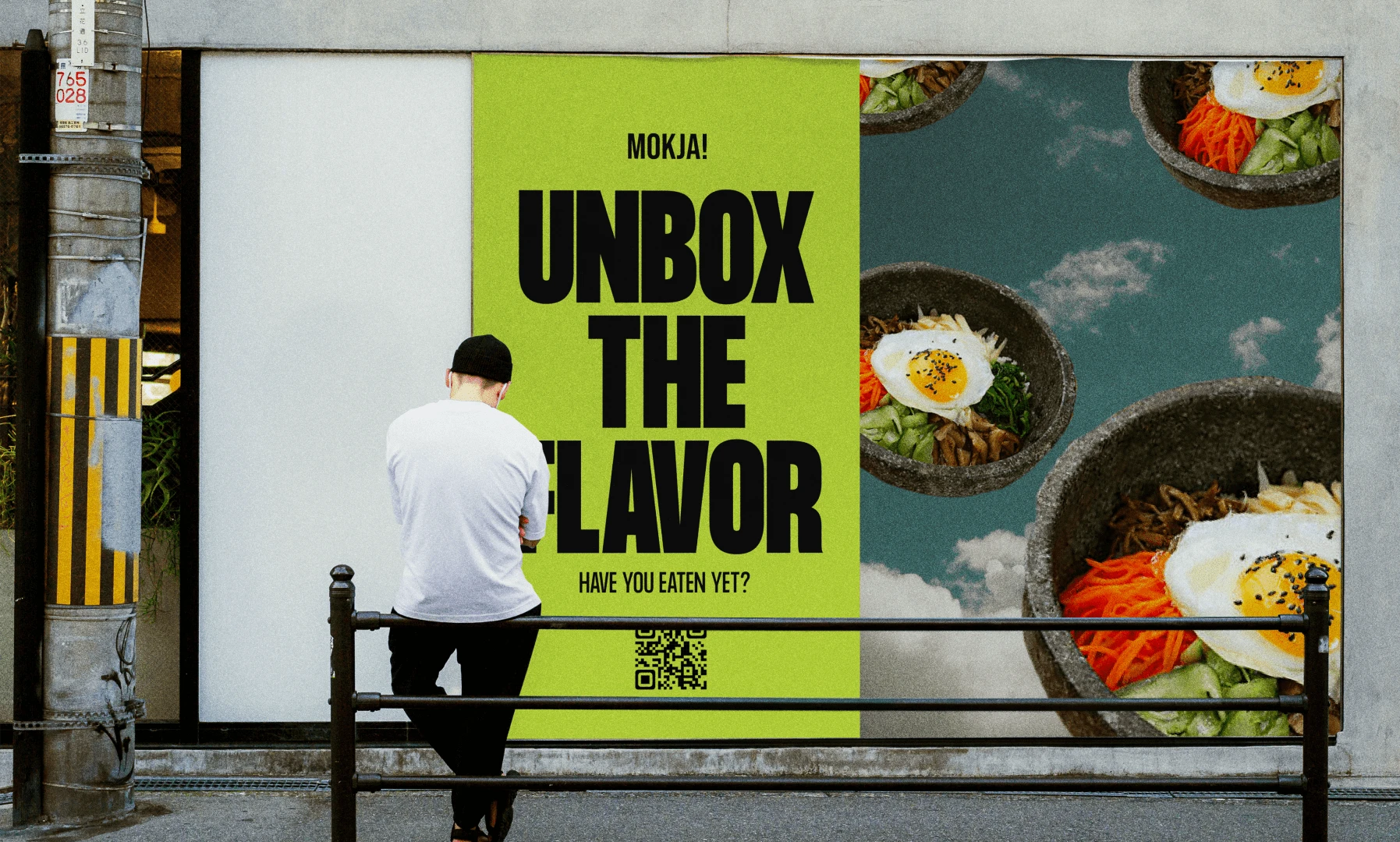
Street billboard with QR code (the person in front is definitely interested)
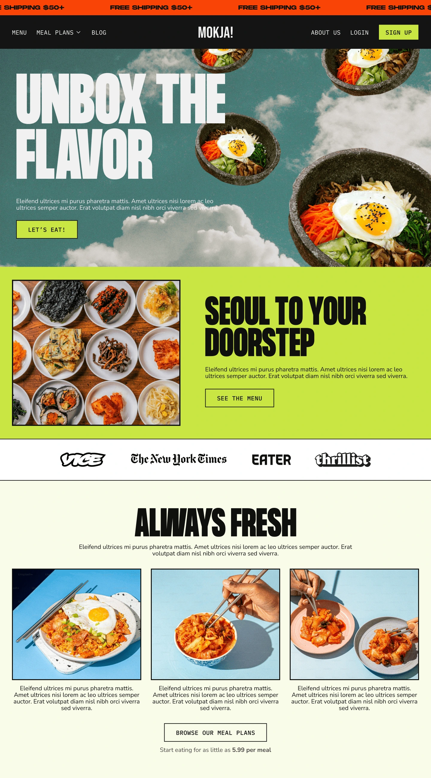
Lander mockup
Like this project
Posted Nov 24, 2023
Brand Identity design concept for a meal-kit service for lovers of Korean cuisine.


