Website Design + Dev for SaaS Clinical Health Startup
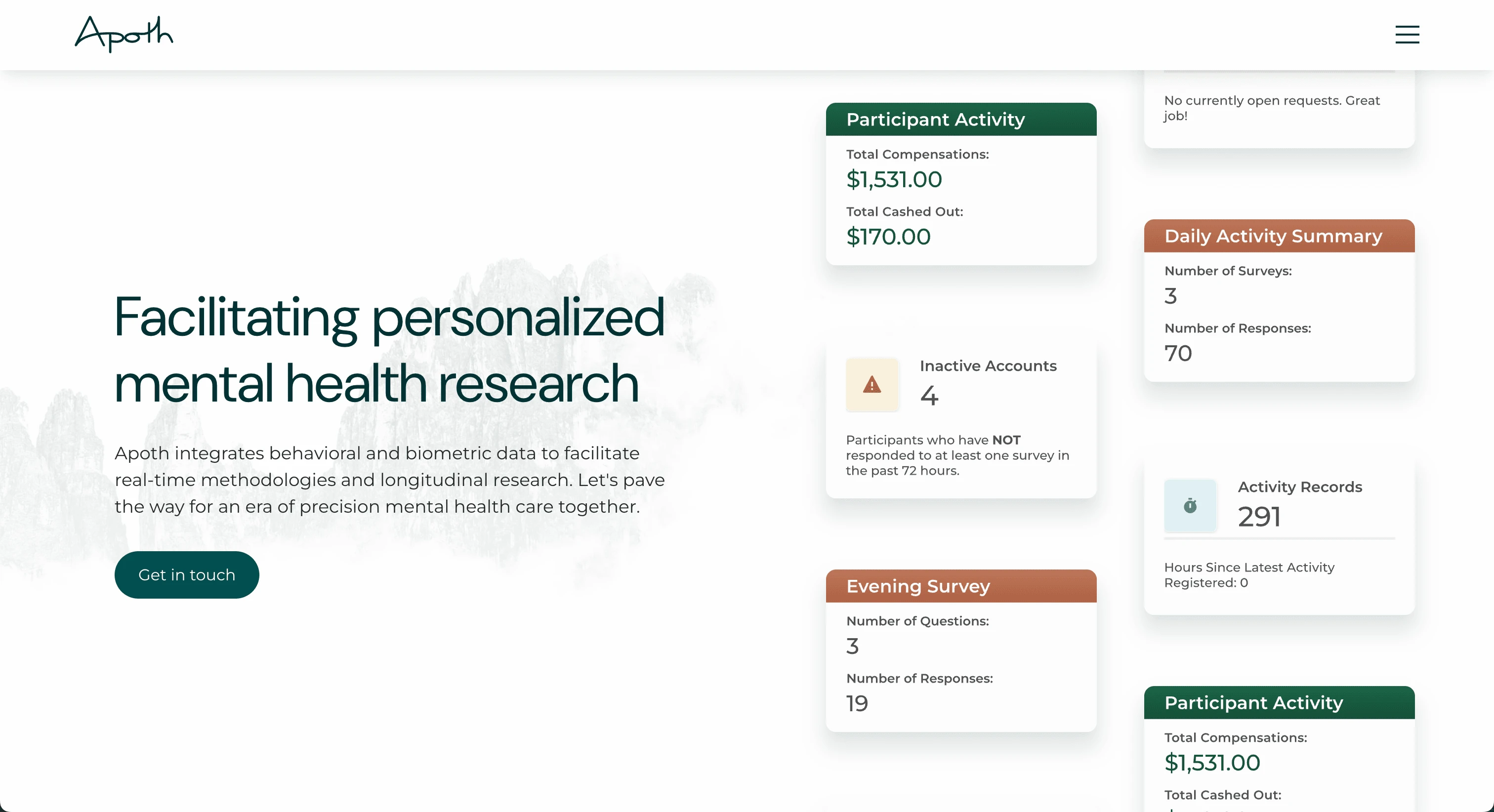
Facilitating personalized mental health research.
Overview
Apoth integrates behavioral and biometric data to facilitate real-time methodologies and longitudinal research.
Apoth worked with me on a web design project to increase their online reach, convey a professional, empathetic, and pioneering brand face, and to get researchers excited about using Apoth's tools.
Live Site: https://apoth-health.webflow.io/
Goals
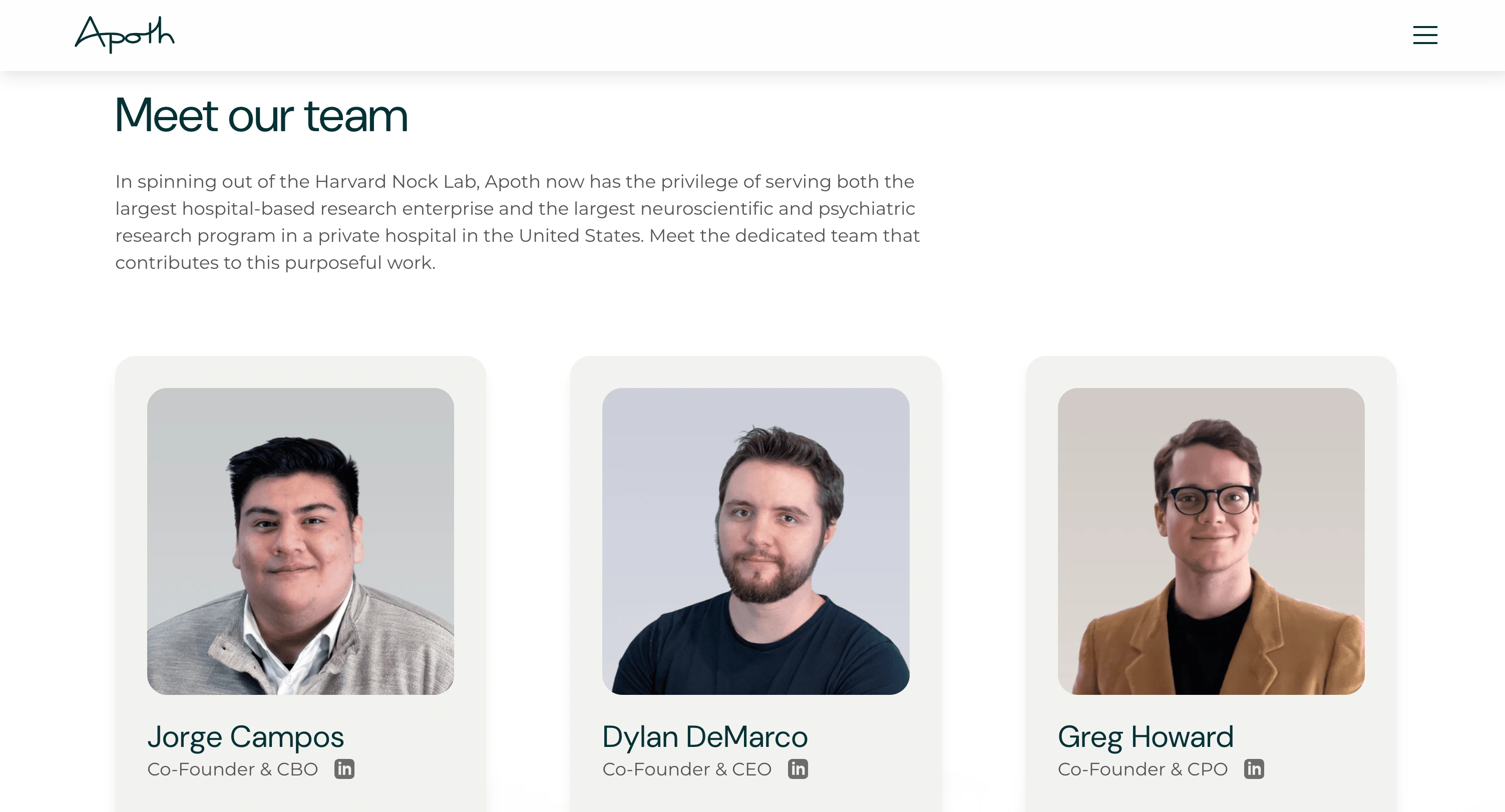
Give credibility to the Apoth brand: As a company that works with confidential patient healthcare data, Apoth needs to be seen as highly credible and secure in order to convert customers. For this reason, I emphasized hard evidence to this point, including testimonials from current users, HIPAA and SOC 2 compliance badges, team member qualifications, and published studies that have employed Apoth tools.
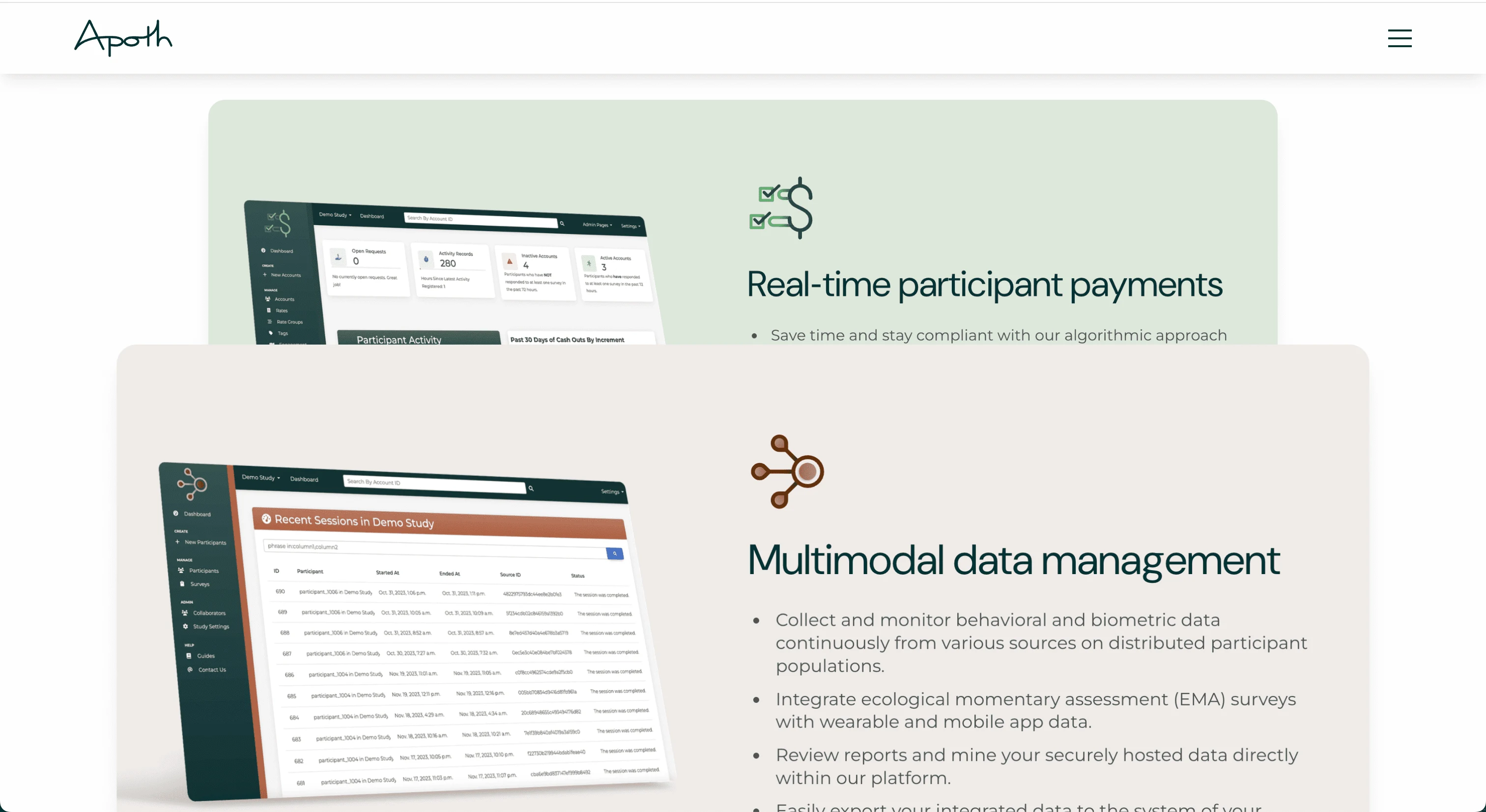
Scalability as they develop new tools: Apoth offers several products, and plans to grow. I intentionally designed the site layout to accommodate future updates. For example, the product carousel on the home page can easily have cards duplicated, images and text swapped out, and the site will be up-to-date again in about five minutes.
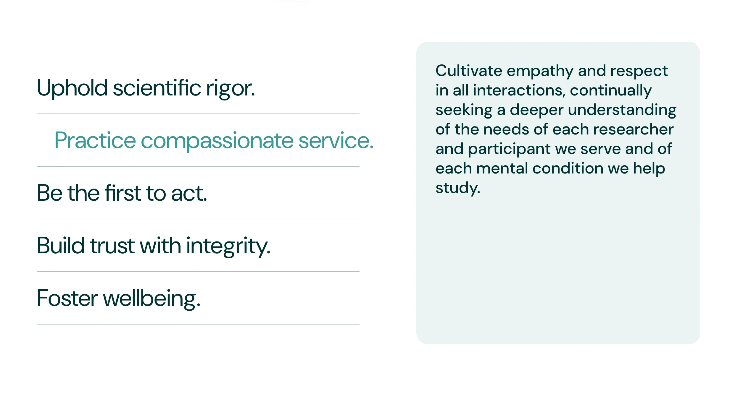
"The Apple of mental health research tools": Apoth builds tools that get the job done, are a joy to use, and look good while doing it. To be authentic, this brand has to come through on all platforms. That's why the visual design throughout the site is clean, calming, uncluttered, and unpretentious.
Process
We started with a ground-up brand design, which identified Apoth's goals, strengths, weaknesses, ideal customers, etc. Getting granular here helped the site come together quickly.
Then we translated our answers from the brand work into a visual language. What does a pioneering, efficient, and accredited tool look like? To Apoth, it looks like elegant product mockups, graceful site interactions, lightweight text, breathing room between information sections, and no unnecessary graphics.
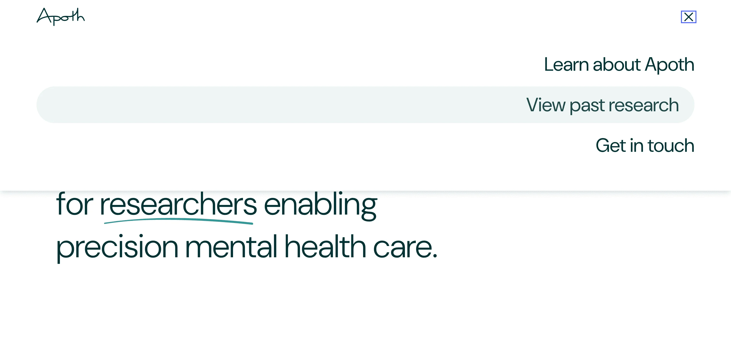
Finally, we focused on ease of use. The mobile version gives an equally full viewing experience, the site meets accessibility best practices, search visibility is optimized, the navigation makes sense and is easy to access, and there's no unnecessary clutter.
Results
Apoth launched recently and has received positive feedback on the site! We remain in contact for any edits that may pop up.
Like this project
Posted Sep 17, 2022
A responsive website design for Apoth, a suite of clinical research tools, featuring custom microinteractions and graphics.
Likes
0
Views
182
Clients
Apoth

