Supply Chain Dashboard Usability Overhaul for Johnson & Johnson
Alyssa Durante
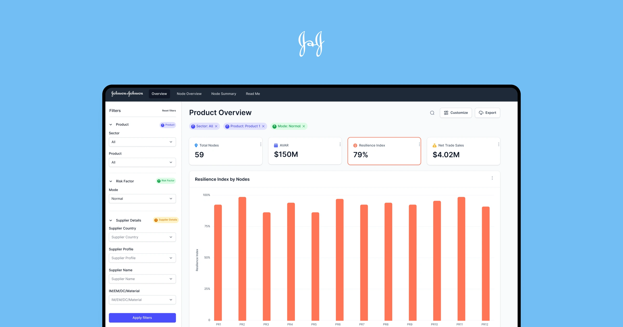
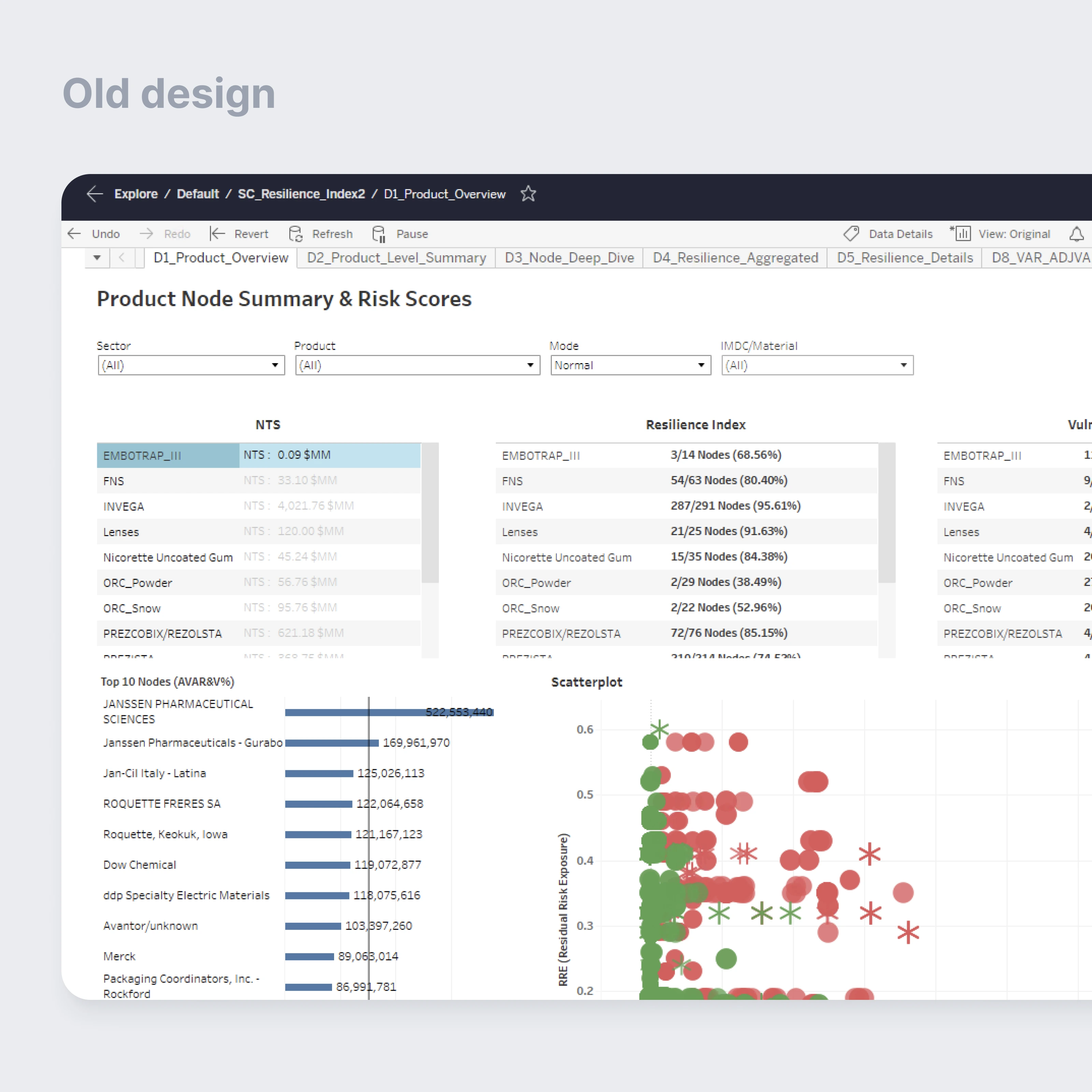
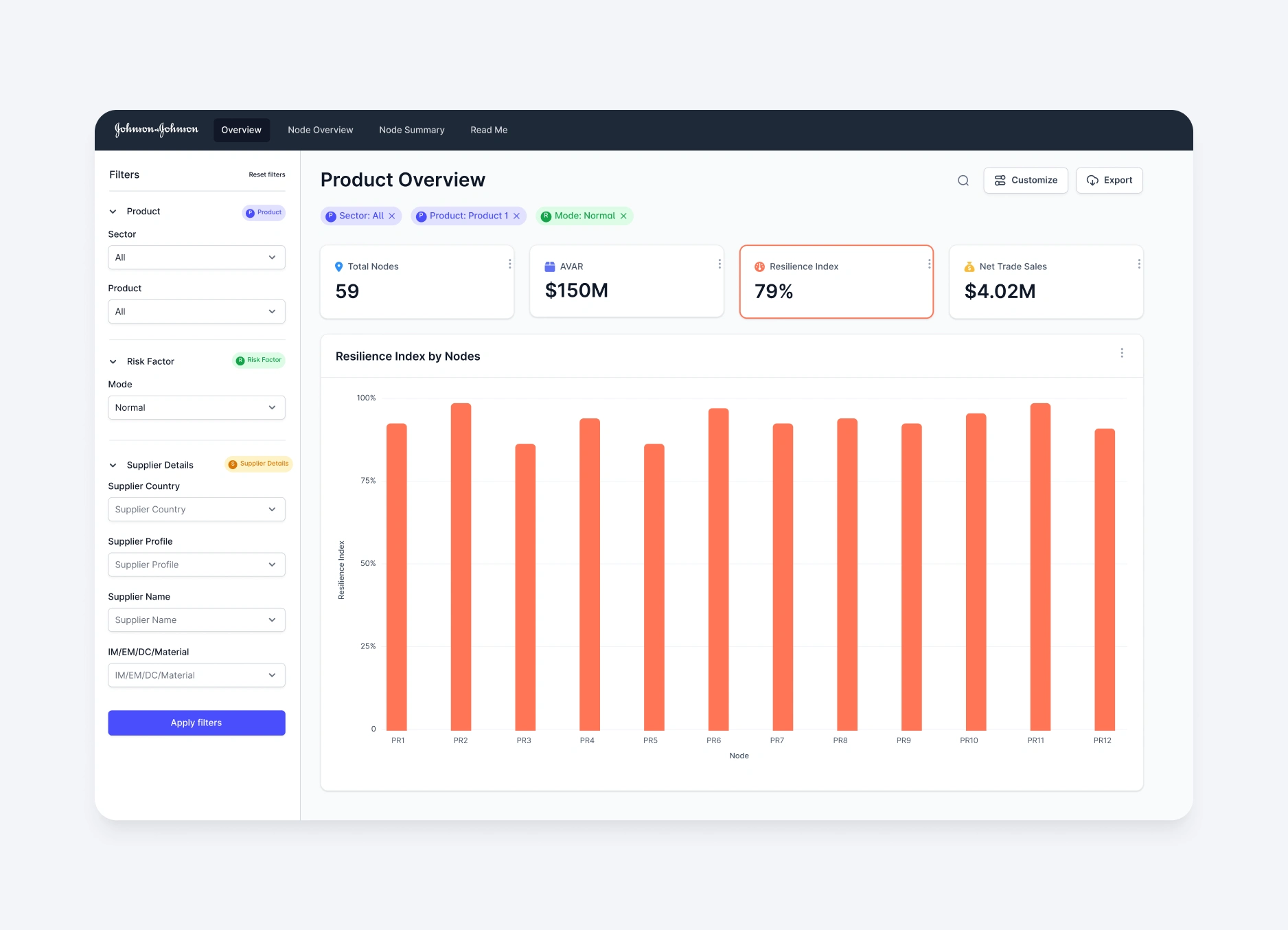
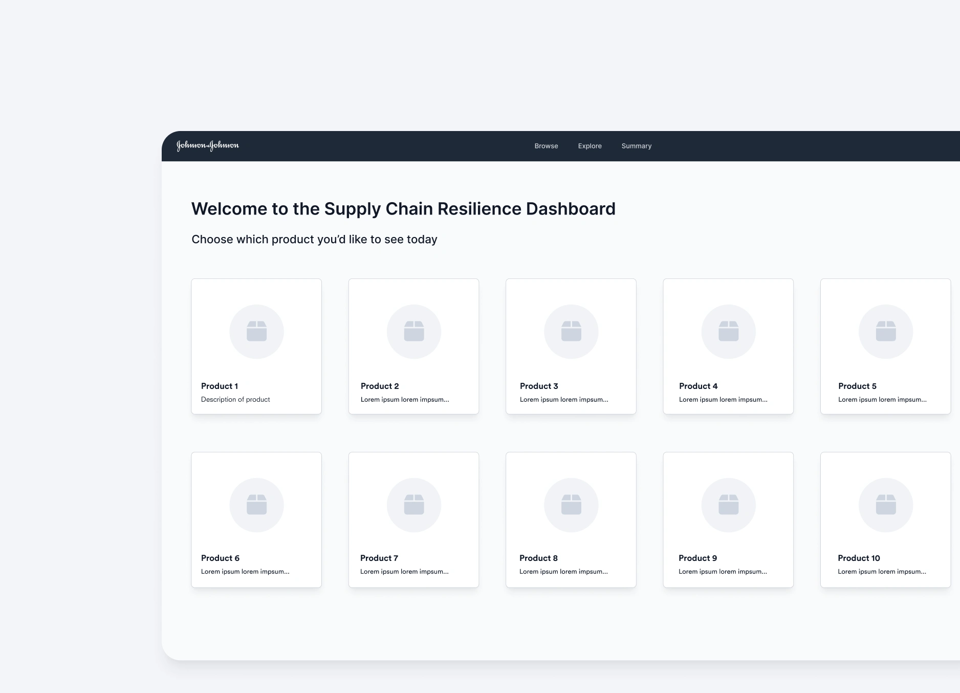
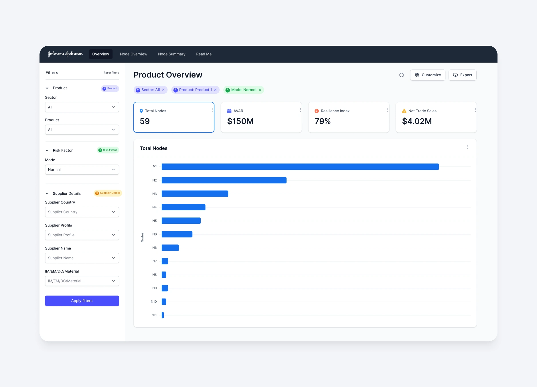
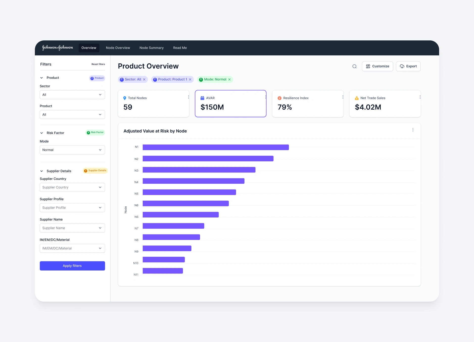
Johnson & Johnson’s internal supply chain dashboard was packed with data - but underused due to confusing layouts, unclear navigation, and poor integration into workflows. I was brought in to improve usability and drive daily adoption among product managers.
Through interviews and observations, I learned that 100% of users struggled to find key data, and 80% said the tool disrupted their workflow. My approach focused on simplifying access and enhancing clarity without overhauling the backend.
Key improvements included:
• A redesigned IA with four clear tabs for “storytelling” navigation
• A sidebar filter layout (validated in user testing) that resolved internal debate
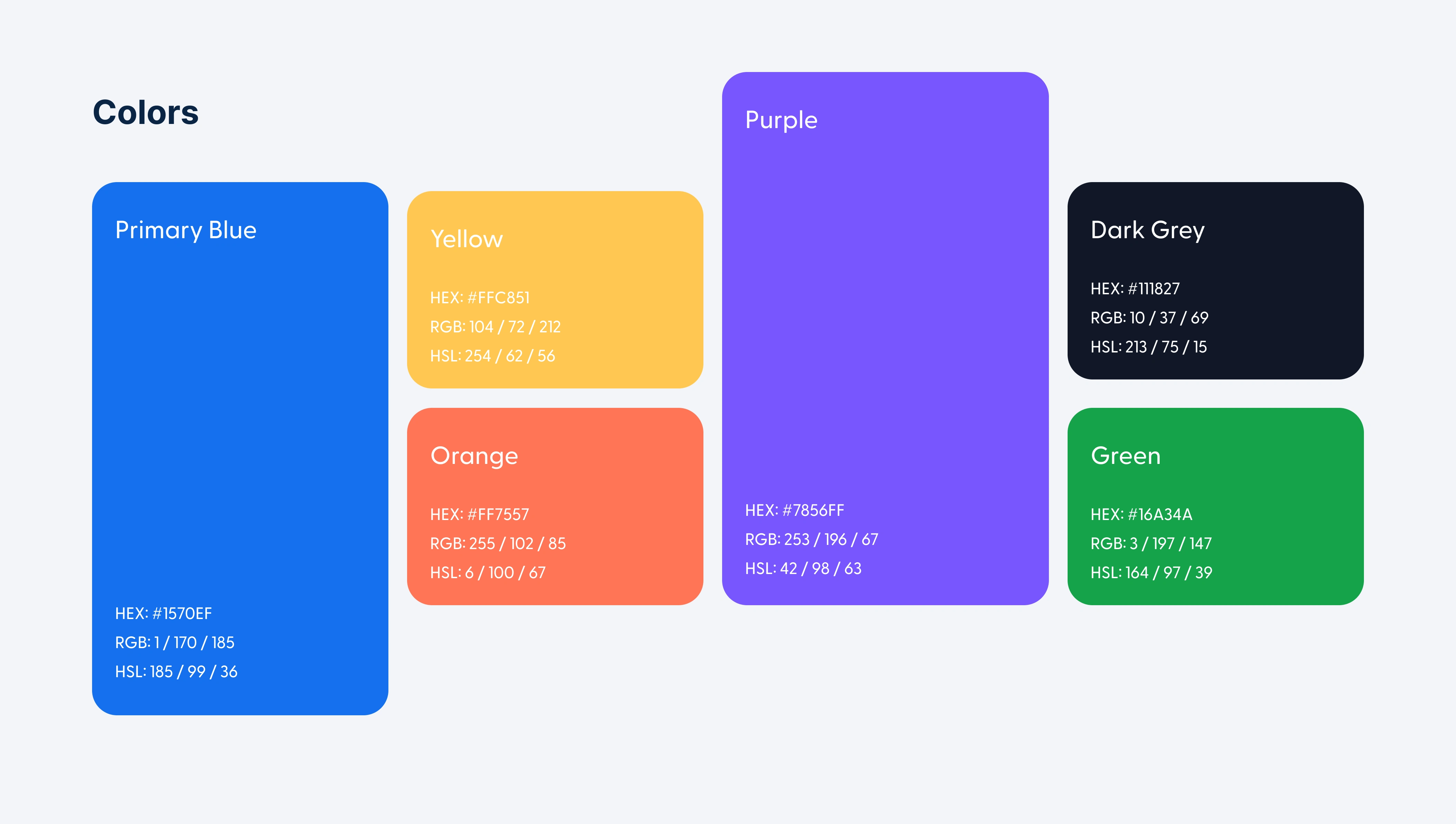
• A lightweight design system to ensure visual consistency and streamline development
Impact:
• 75% faster data access
• 80% of managers now use the tool daily
• 92% rated navigation as “significantly easier”
This project turned a frustrating tool into an essential one—boosting efficiency, engagement, and satisfaction with minimal tech overhead.
Like this project
Posted Jun 17, 2025
Redesigned Johnson & Johnson's supply chain dashboard for better usability and adoption.
Likes
1
Views
34
Clients
Johnson & Johnson