BRISCA — Branding & Packaging for a Pinot Noir

Vitalii Rigalovskyi

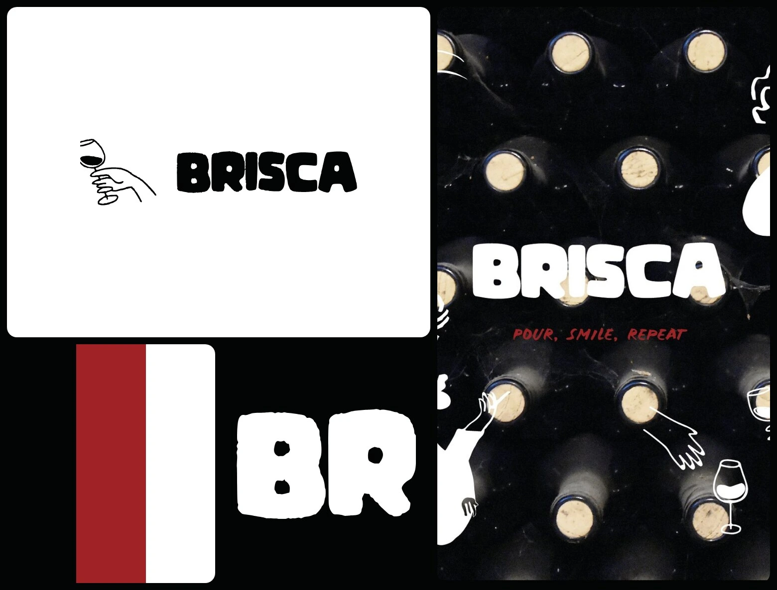
Branding and packaging for BRISCA Pinot Noir from Friuli: a heavy rounded wordmark, line drawings of people with a glass, and three colours — black, wine red and white. Designed by Sonya, our brand designer.
Scope: Logo · Illustration · Label · Packaging
The brief
A Pinot Noir from the Italian region of Friuli, with notes of ripe raspberries, juicy cherries and light spices — made, as the label says, for a festive evening and a leisurely dinner alone alike.
What we did
Sonya set BRISCA in a heavy, rounded wordmark and drew a cast of characters in simple black lines: women in sunglasses, hands pouring and raising glasses. The label carries the story of the wine, the gift bag turns the bottle into a red silhouette, and “Pour, smile, repeat” runs in red under the name.
Full case: webraw.studio/work/brisca
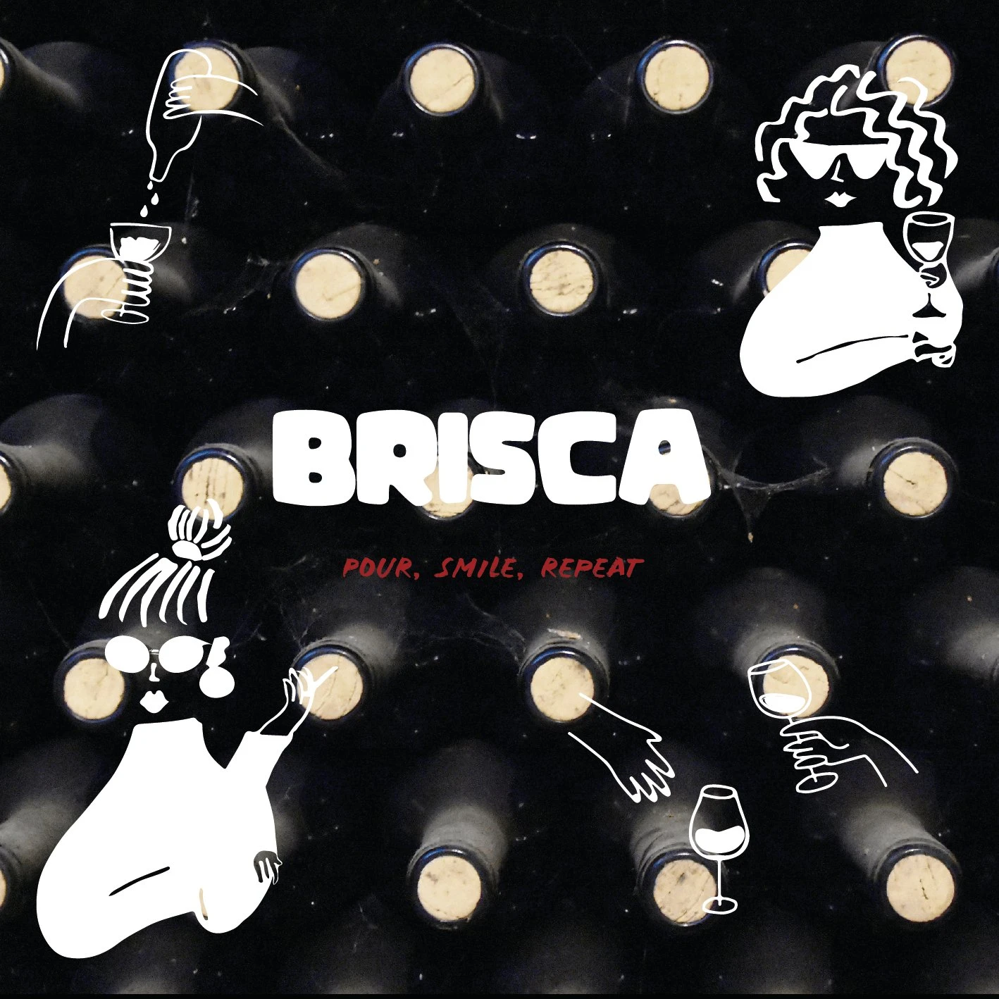
Key visual
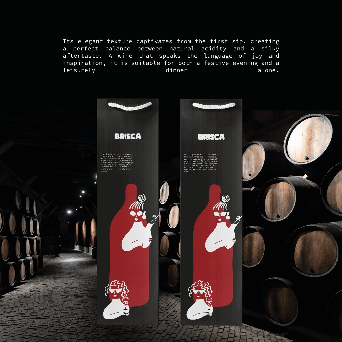
Gift bag
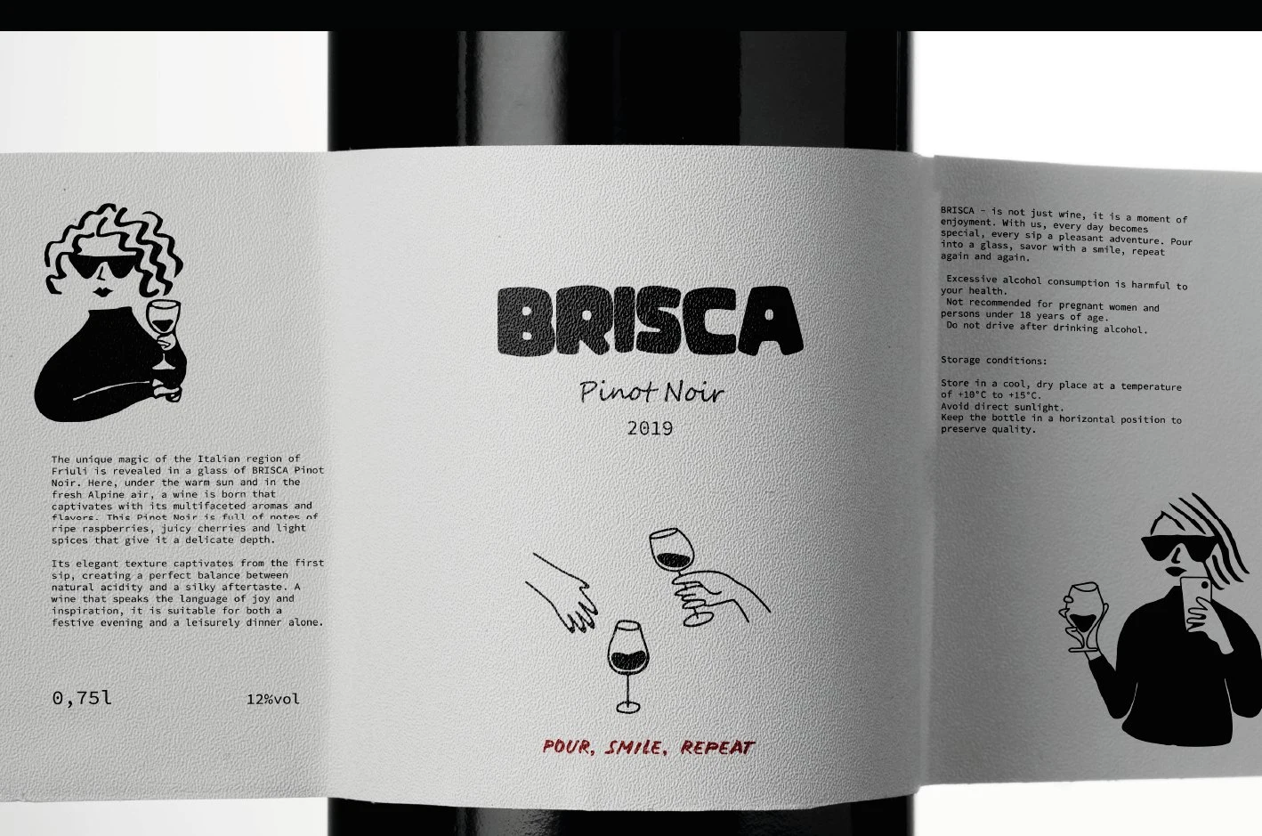
Label
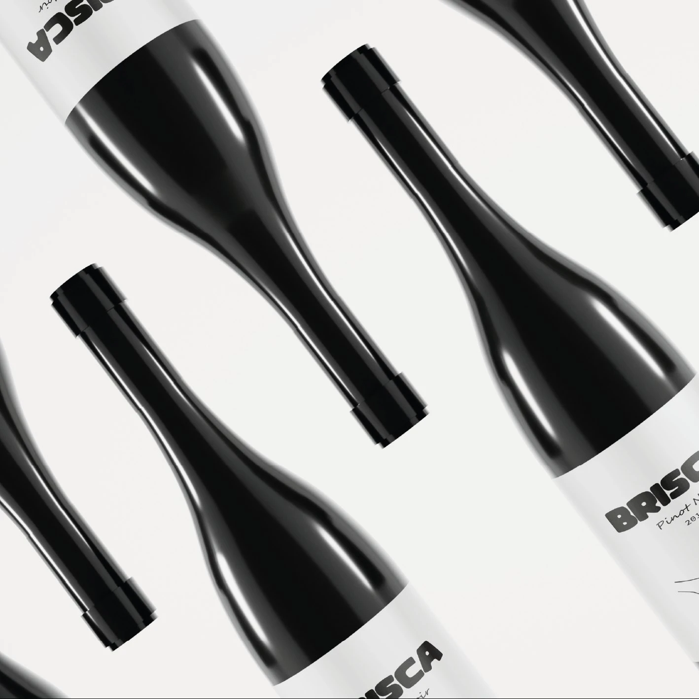
Bottles
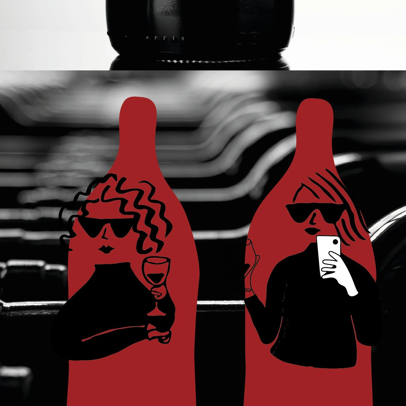
Characters
Like this project
Posted Oct 14, 2026
A heavy rounded wordmark, line-drawn characters and three colours for a Pinot Noir from Friuli — on the label, the bottle and the gift bag.
Likes
1
Views
0