
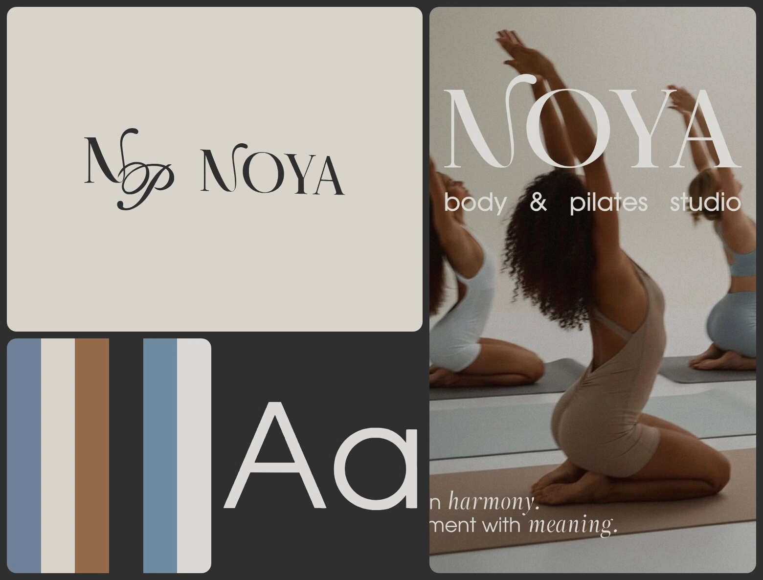
Brand identity for a body & pilates studio: a wordmark with a flowing N, an NP monogram, a round emblem and a palette of stone, walnut and slate blue. Designed by Sonya, our brand designer.
Scope: Logo · Monogram · Colour · Type · Print · Signage
The brief
A body & pilates studio wants a brand as calm as a good class — one that works on the facade, on the door, on a mat and in an Instagram grid.
What we did
Sonya drew a wordmark where the N rises into a soft loop, then built an NP monogram and a round “Body & Pilates Studio” emblem from it. Hikasami sets the text and ZT Neue Ralewe Italic carries the accent words. Stone, walnut, graphite and two slate blues run from the facade sign and business cards to the gift certificate, mat, stickers and app icons.
Full case: webraw.studio/work/noya
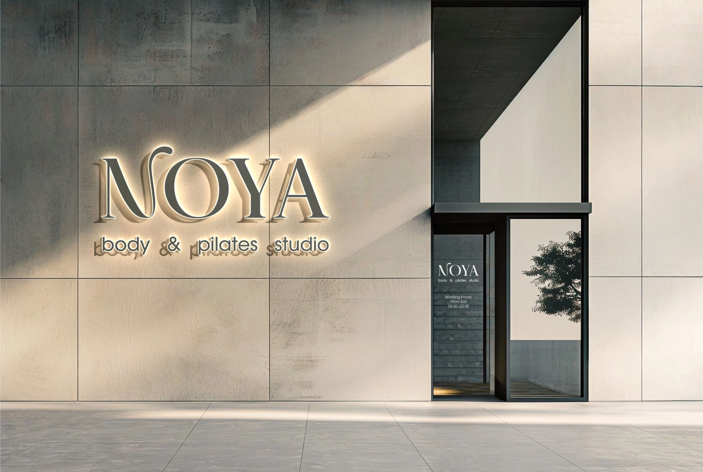
Facade sign
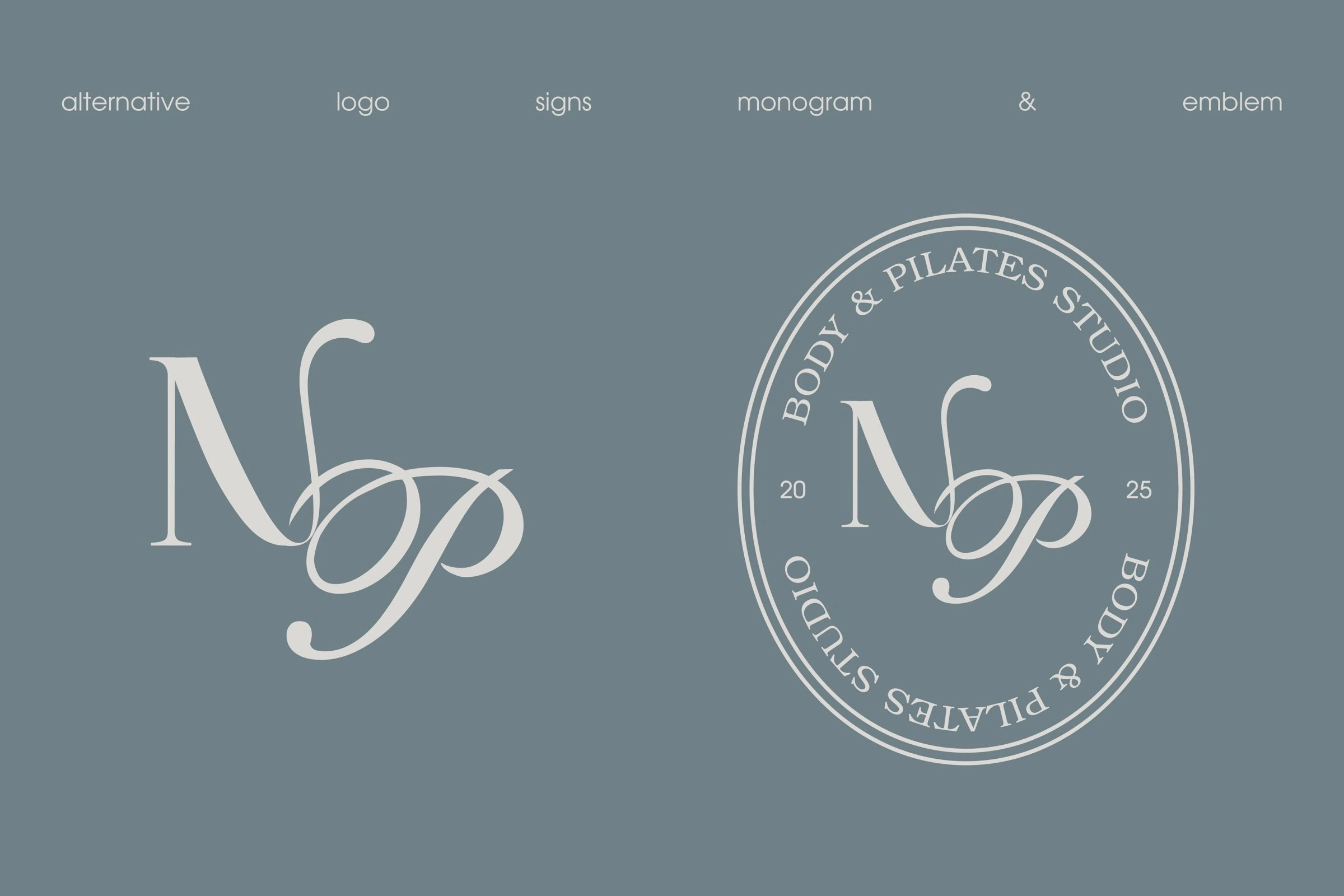
Monogram and emblem
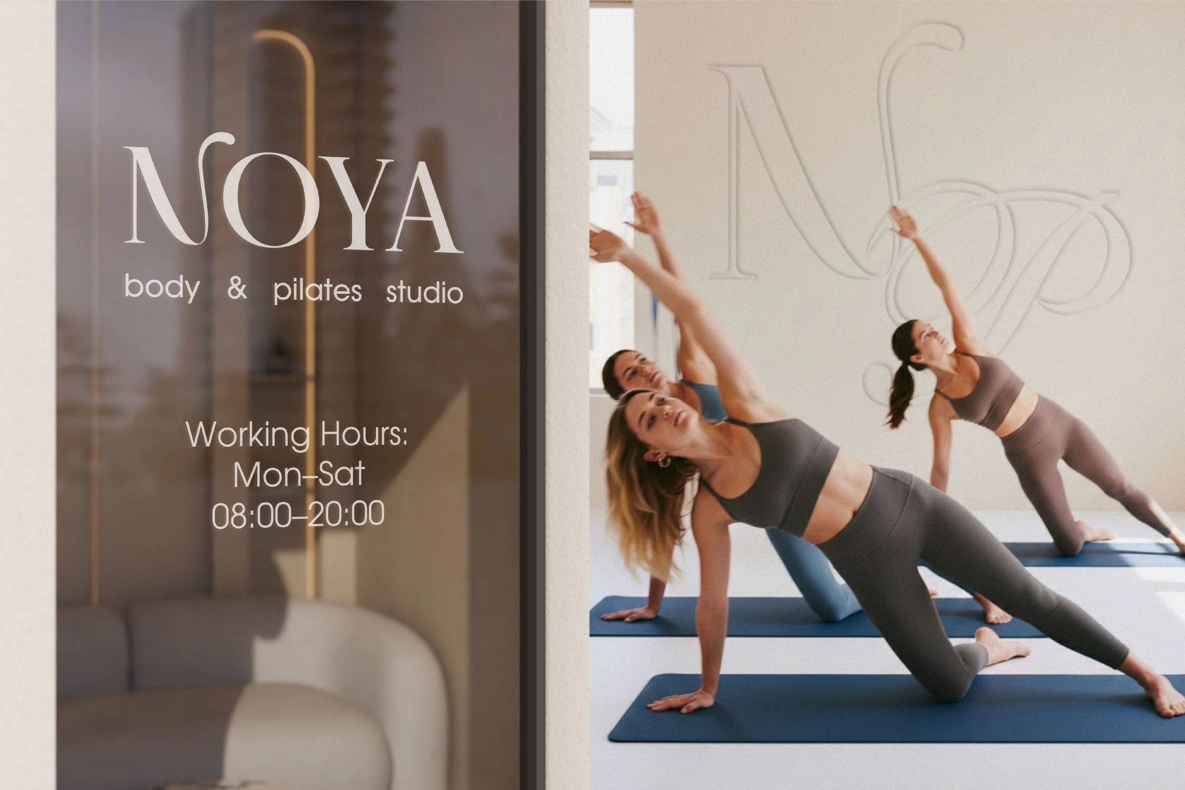
Door sign
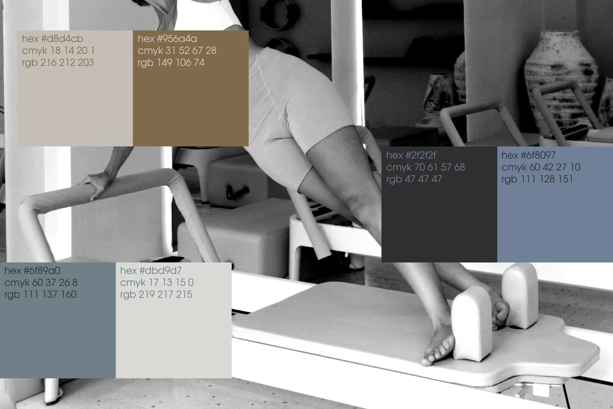
Colour: stone, walnut, graphite and two slate blues
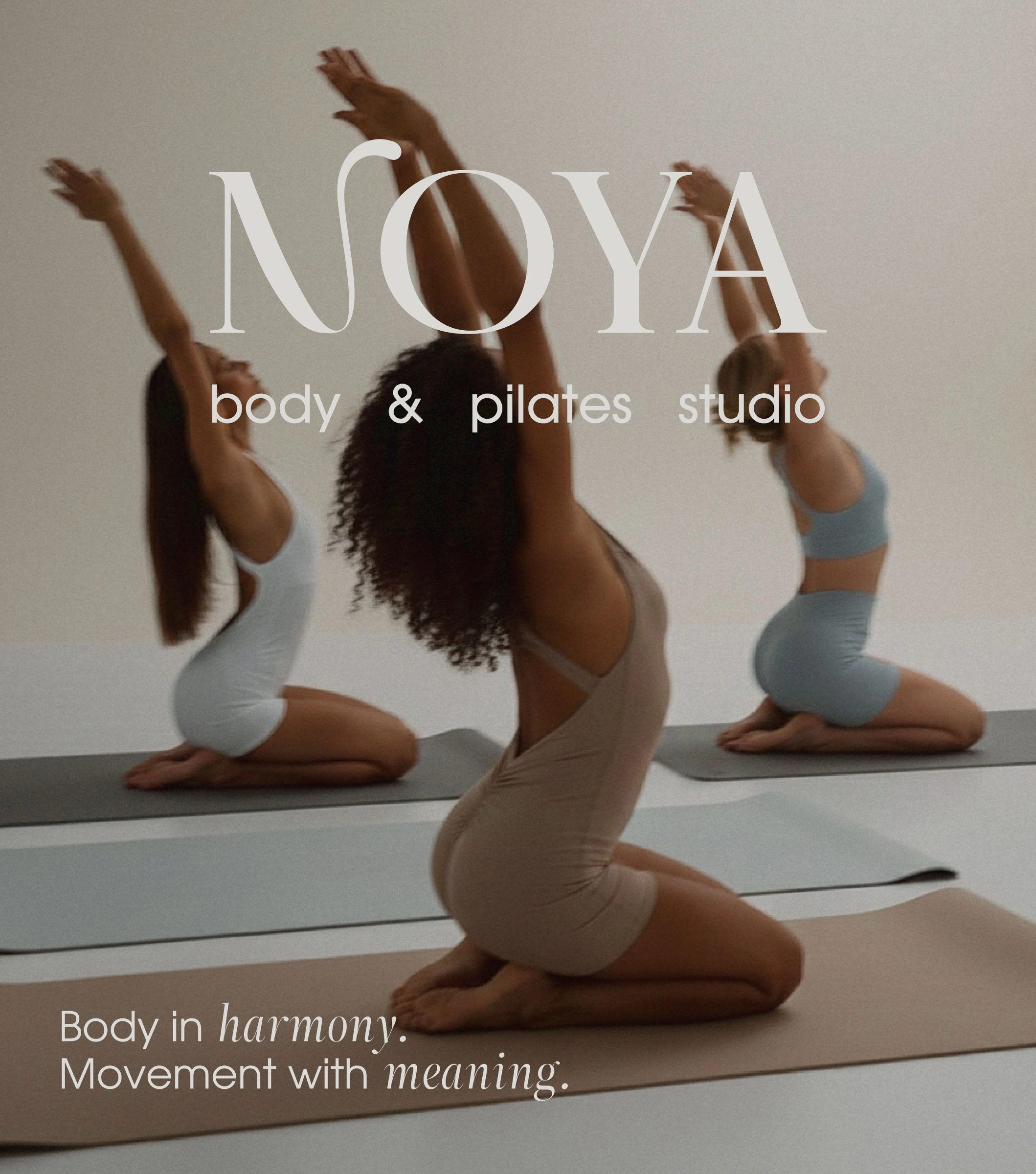
Poster
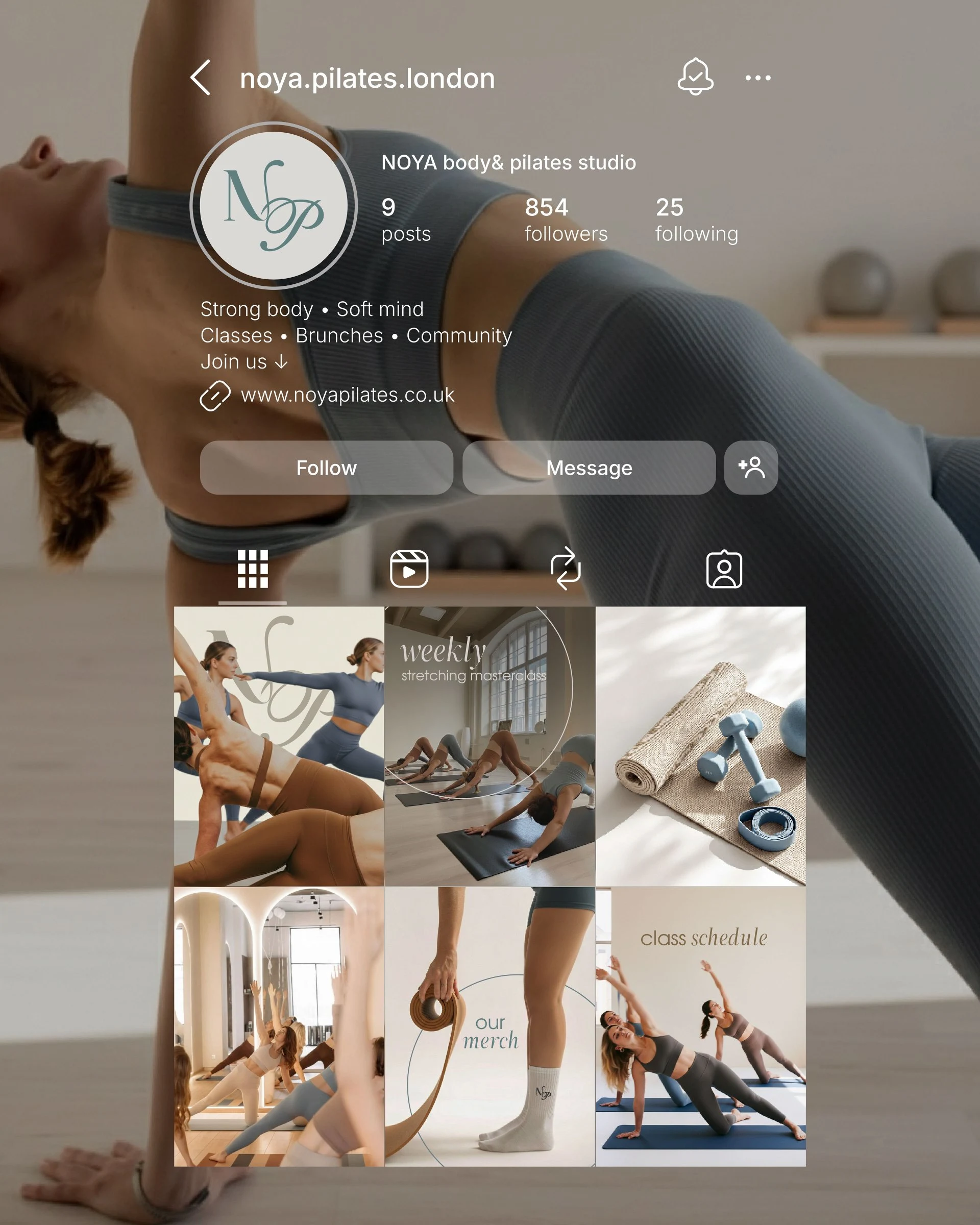
Instagram
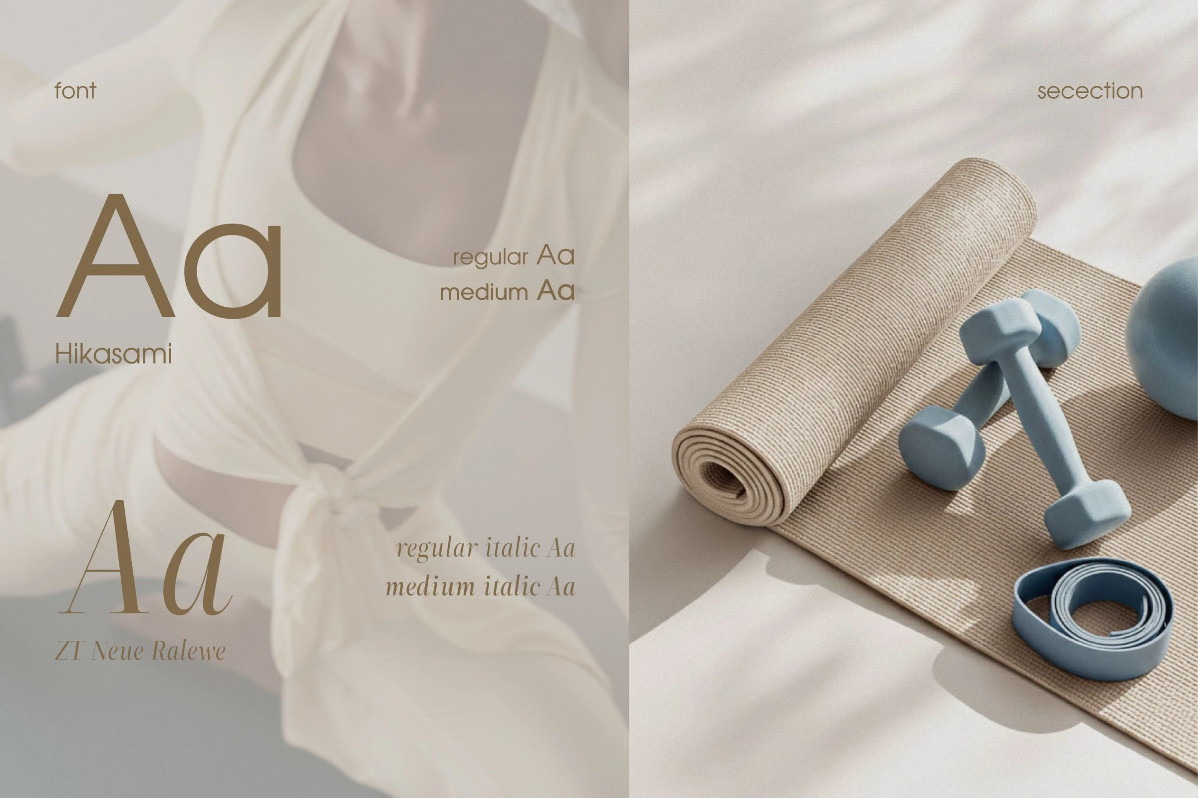
Typography: Hikasami and ZT Neue Ralewe
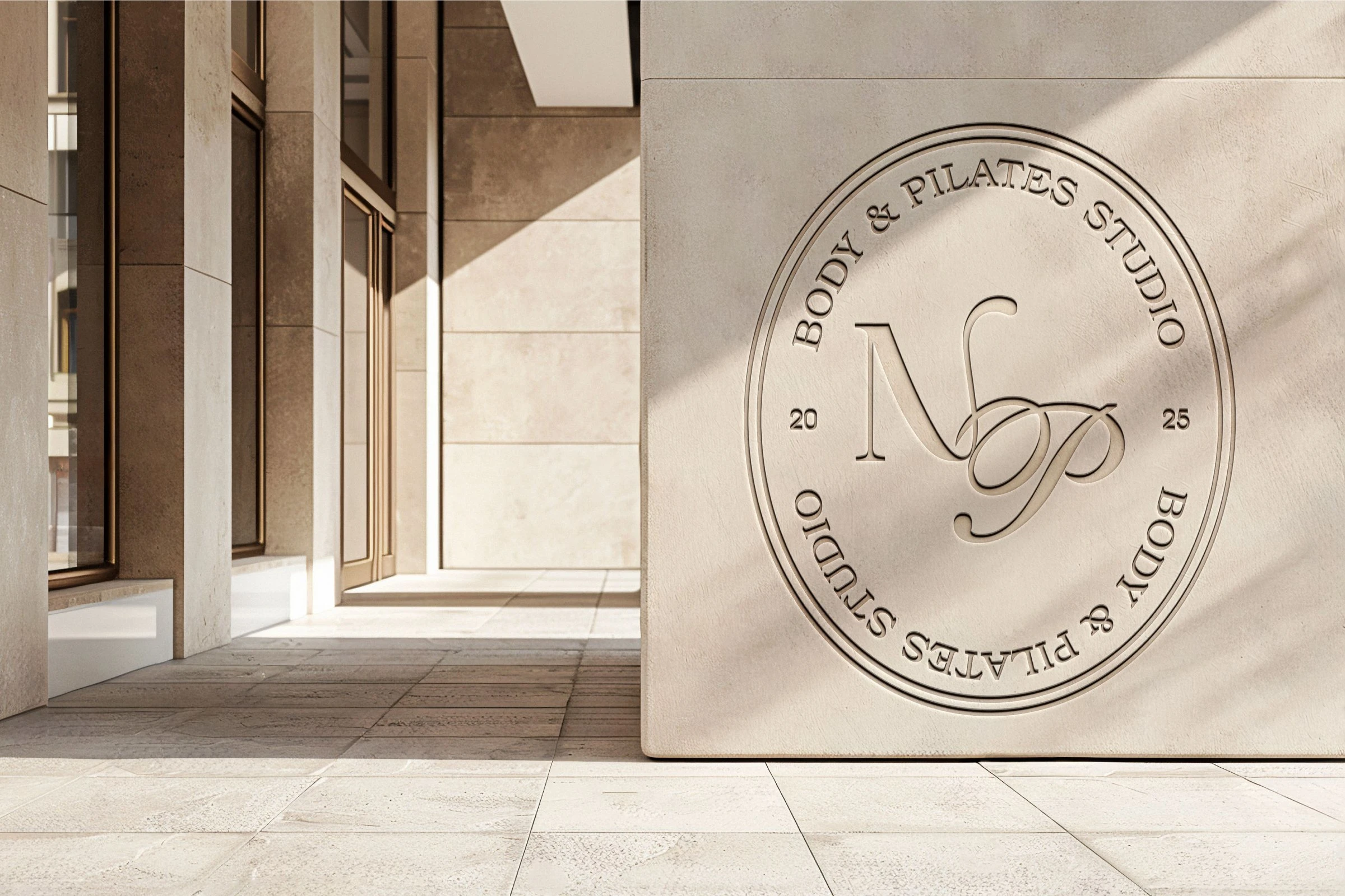
Emblem on stone
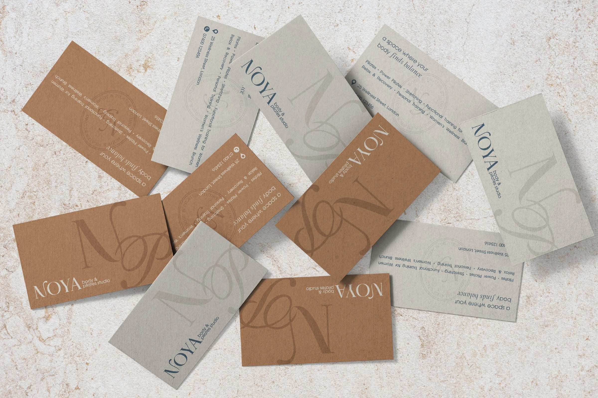
Business cards
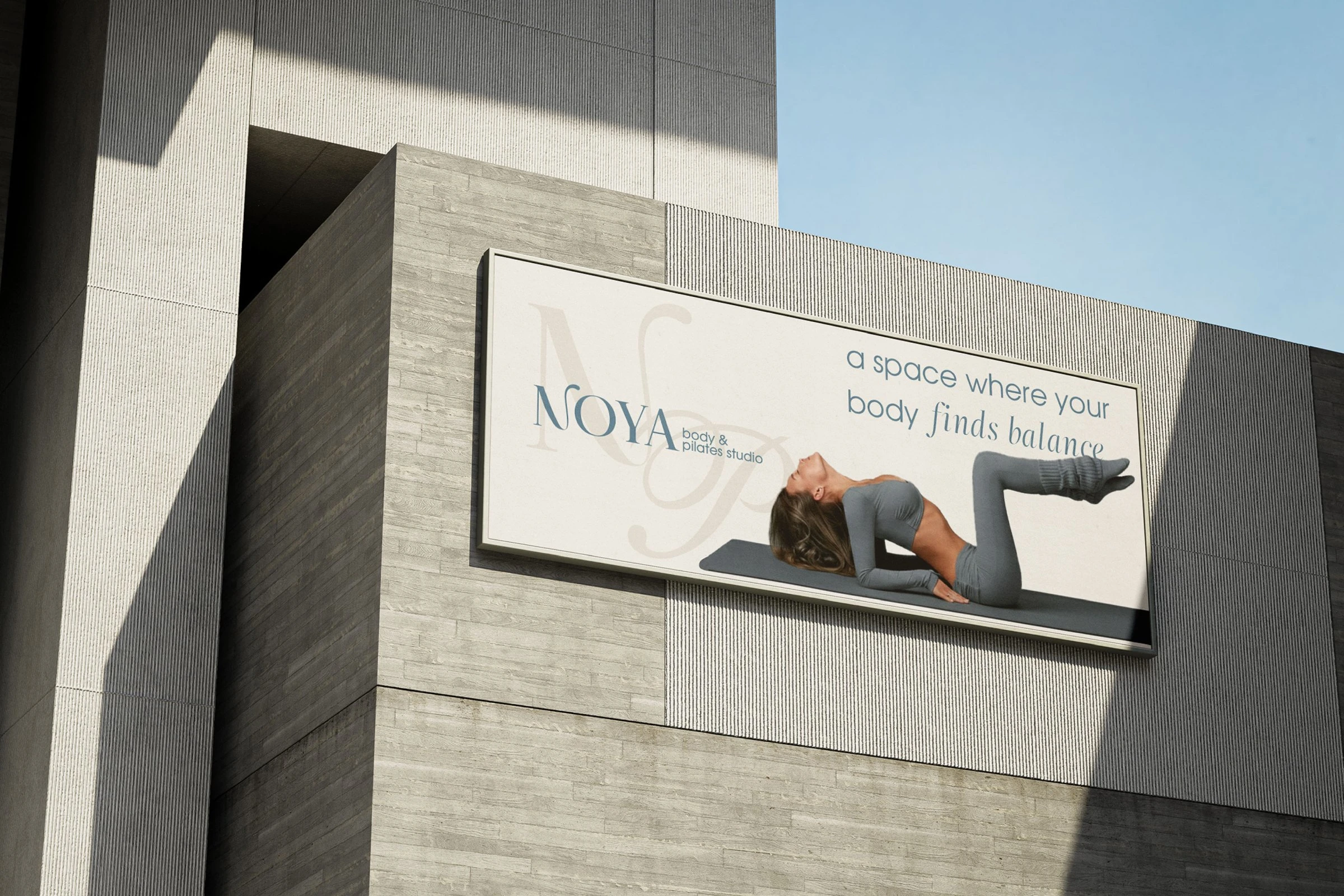
Billboard
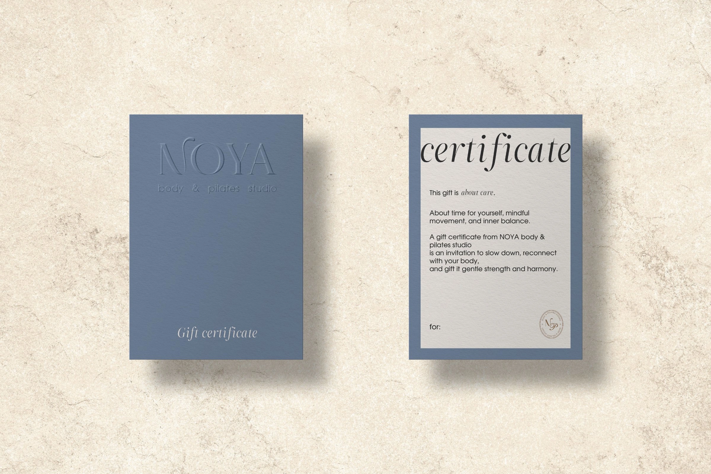
Gift certificate
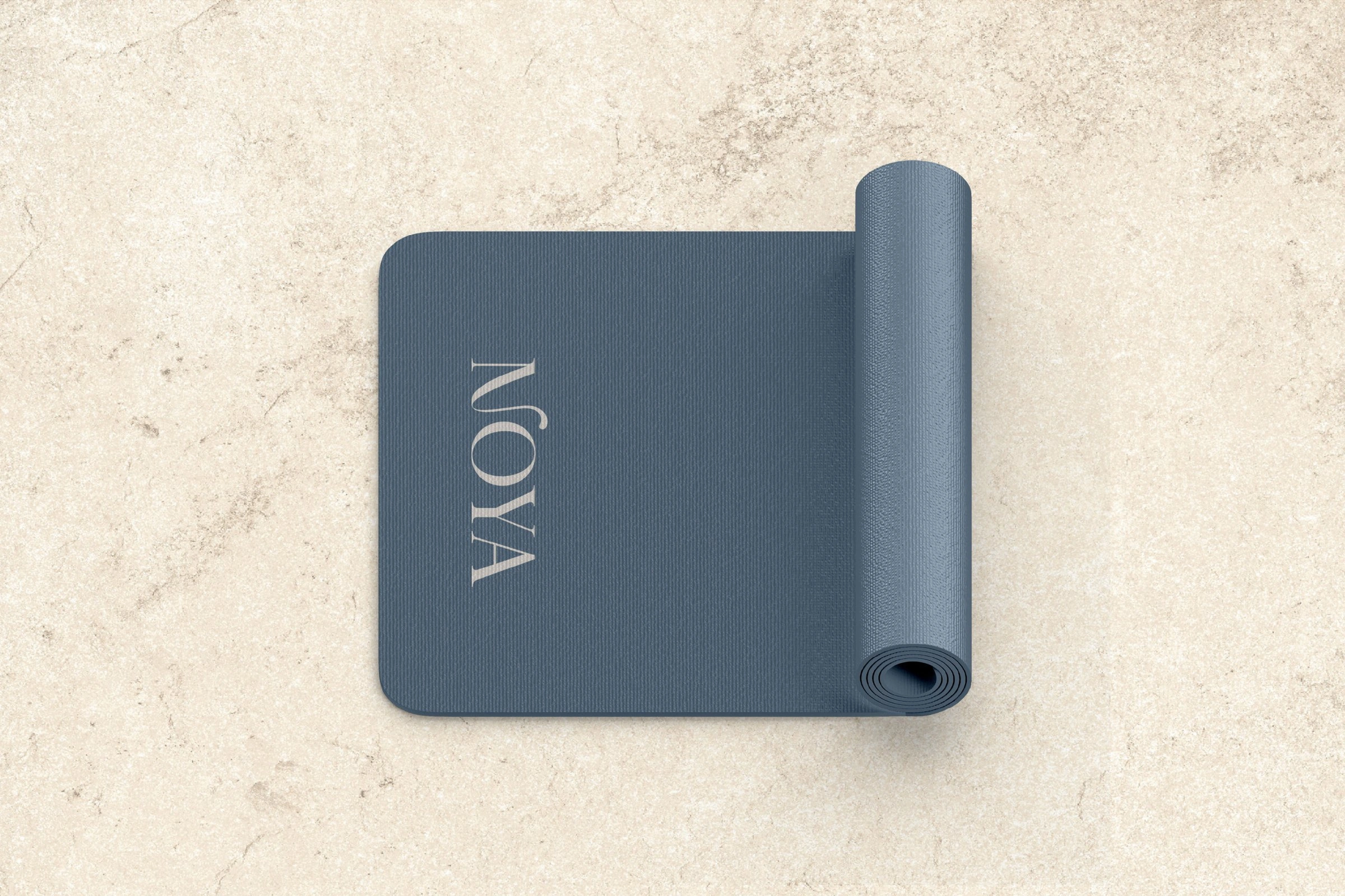
Mat
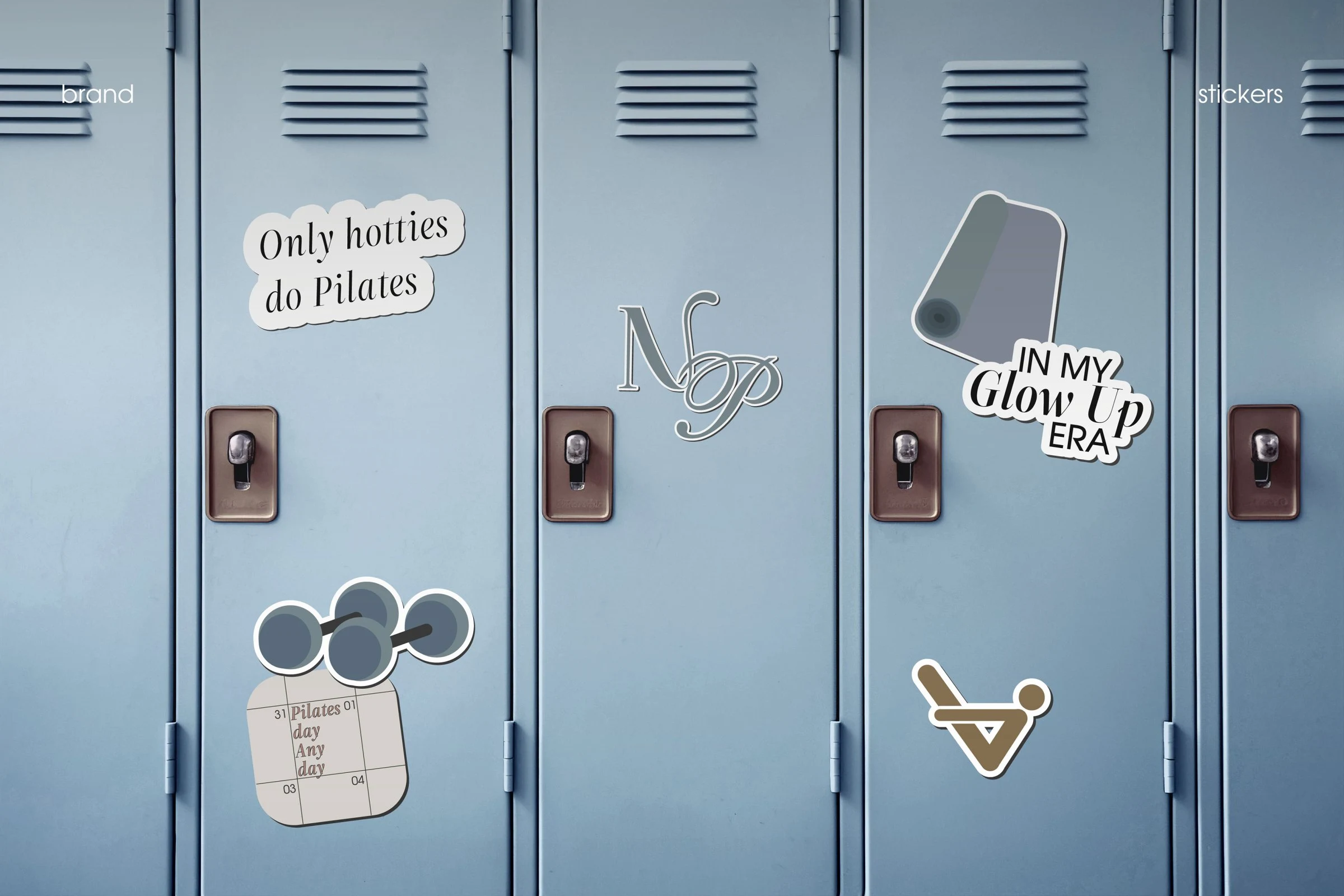
Stickers
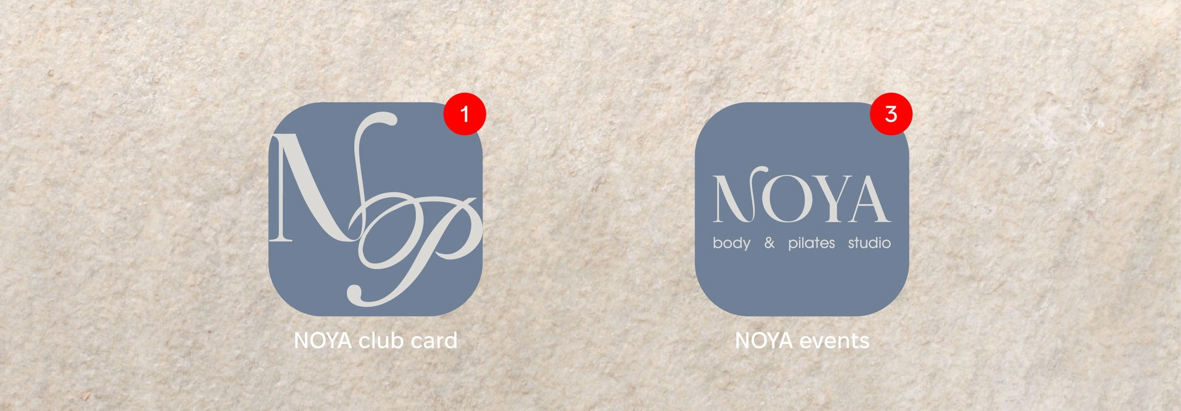
App icons: club card and events
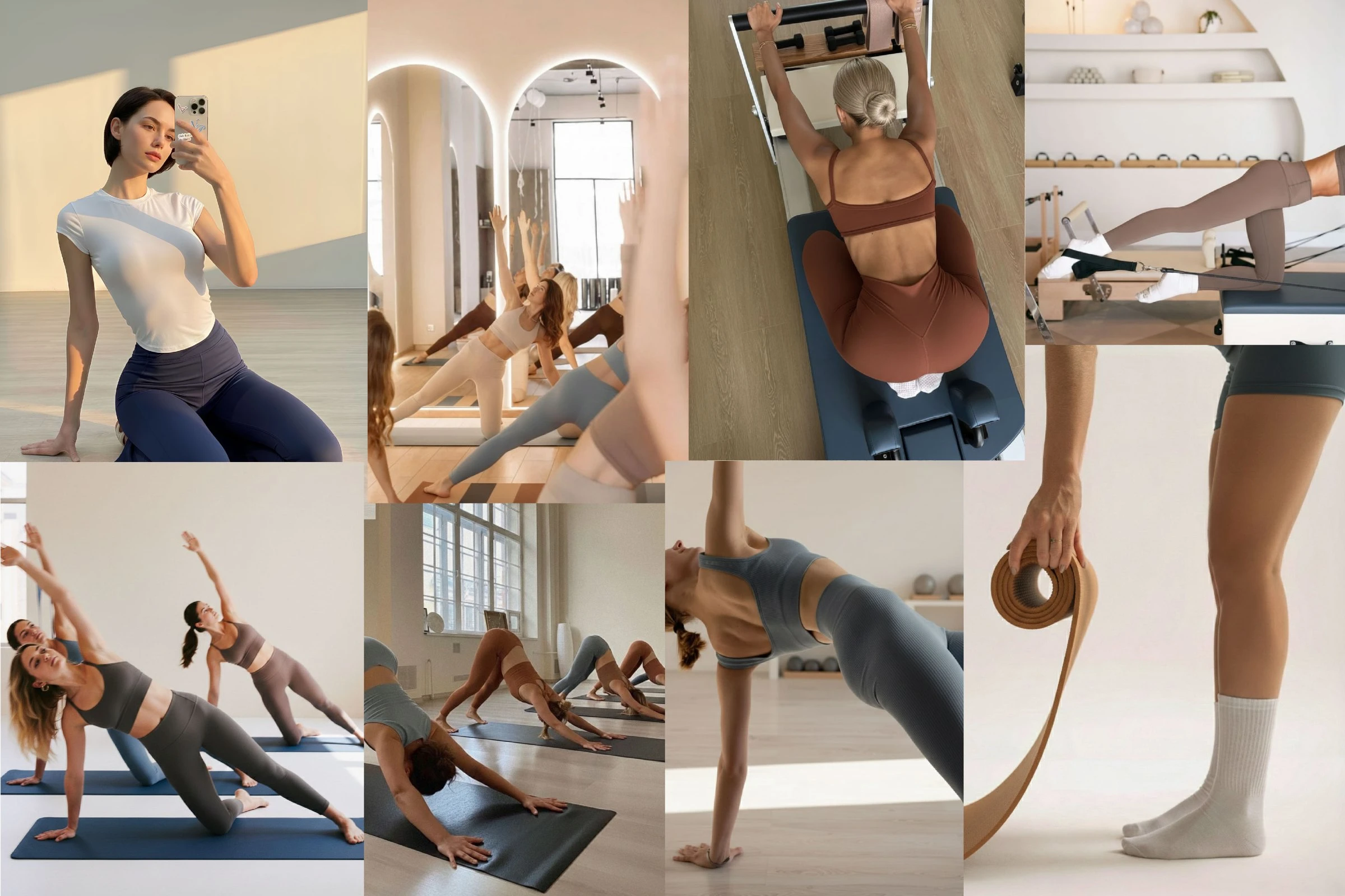
Mood
1 like · 6 views · Oct 14, 2026
A flowing N, an NP monogram and a round emblem in stone, walnut and slate blue — on the facade, cards, mat, stickers and app icons.
