

Brand & Identity · Mobile App UI/UX · Creating opportunities for memorable connections

Q. What could a brand designed to foster new connections among university students look like?
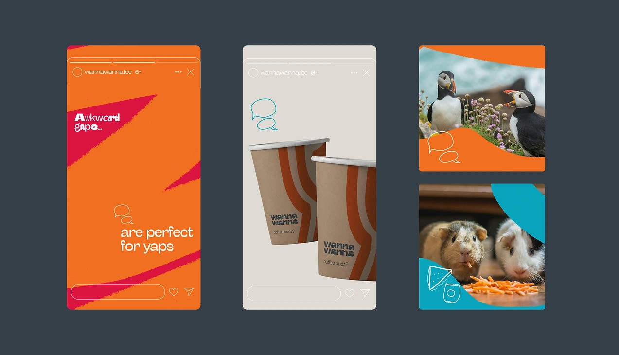
Wannawanna turns the awkward gaps around us into opportunities for memorable connections. Based in UAL’s London College of Communication's campus, wannawanna is a branding project that nudges students with ice-breakers, conversation starters, fun games, and an online platform to find a new buddy.
The brand is situated between the cultures and behaviours of "grab-and-go" (accessible, affordable, variety, and convenience) and "Indian street food" (social interaction, storytelling, personalisation, and conversations).
Branding · Mobile app design · Illustrations · Animation · Collaterals & Copy


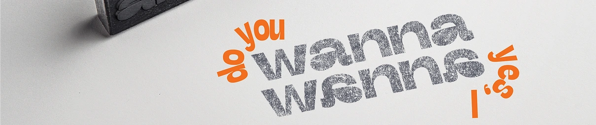
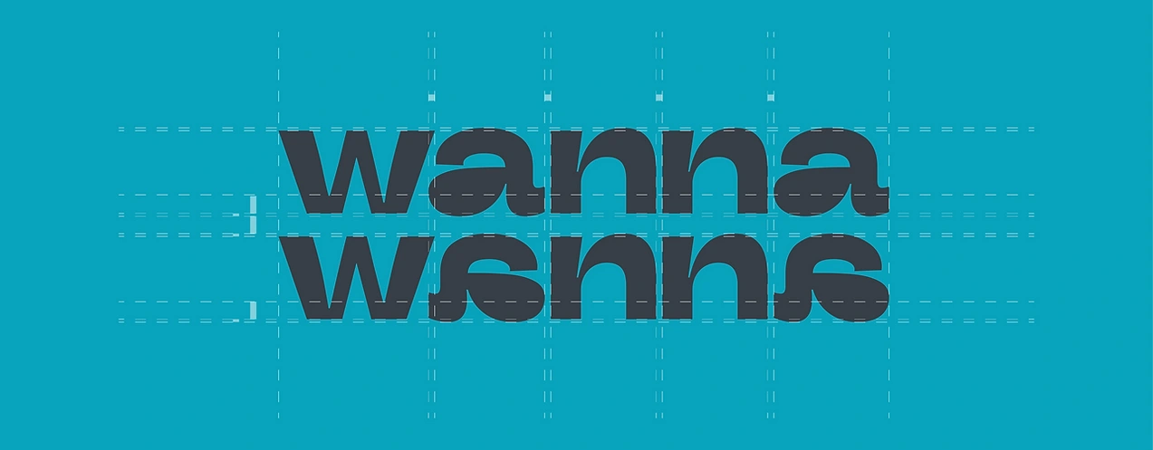
In wannawanna’s wordmark, the ‘a’s have been flipped to highlight two people and their different perspectives in each interaction.

#comp-m20kxgst svg [data-color="1"] {fill: #000000;}
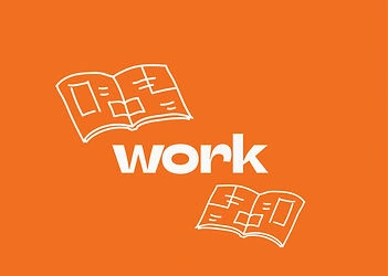
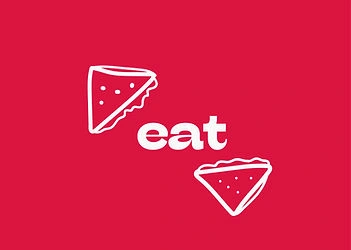
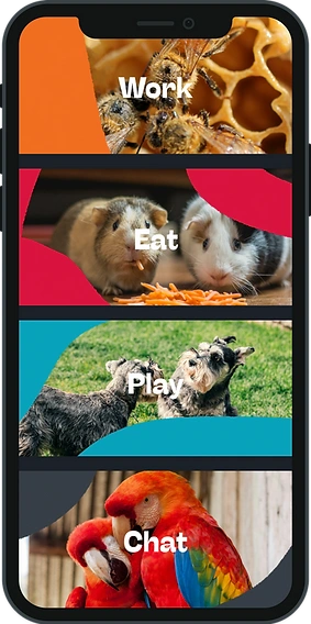
The modes of wannawanna
Play, chat, work and eat.
Whether it's sharing a meal, grabbing a coffee, or brainstorming ideas with someone new, wannawanna makes those fleeting moments more interesting and maybe even spark a friendship!

The Wannawanna app
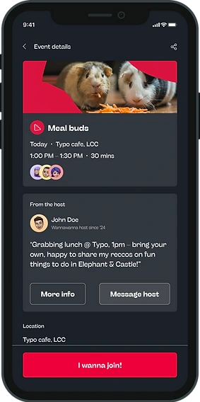
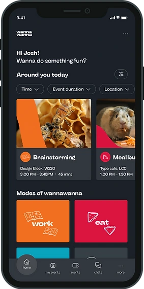
Wannawanna is the digital home of the brand: a campus app where students find and host small, low-pressure meetups, like sharing lunch, brainstorming over coffee, or just chatting with someone new.
Events are organised by four modes (play, chat, work and eat), so students can pick the kind of connection they’re up for, and most happen the same day, close to where they already are on the LCC campus.
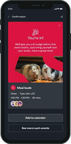
Hosts post a short, casual invite. Users browse what’s around today, filter by time, duration or location, and join in a tap.
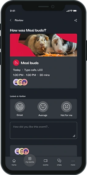
After the event, a quick review helps surface the kinds of meetups people enjoy most.
Brand system
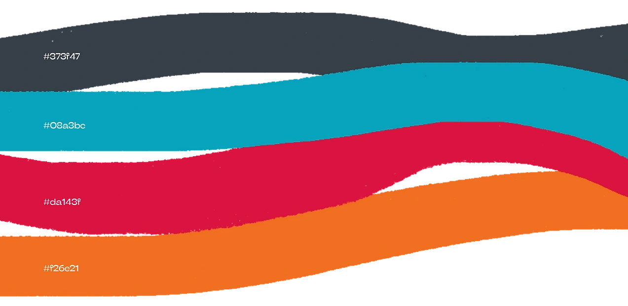
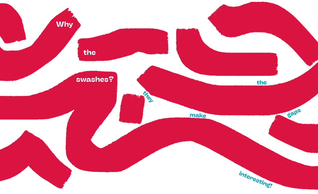
The four modes double as the app’s colour logic, so orange (work) and red (eat) identify an event type at a glance across tiles, cards and icons. The swash shapes from the identity crop the event photography, so the content looks branded without extra decoration.
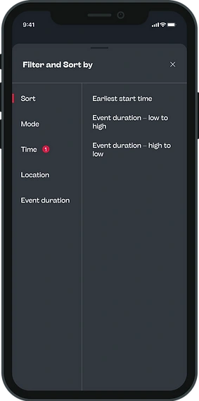
Two-tier filtering
Time, duration and location are the most common choices, so they live as chips on the screen. Everything else goes in a Filter and Sort sheet with categories on the left and options on the right, and a badge marks which categories are active.
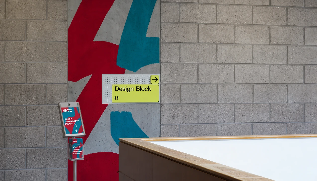
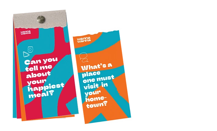
Grab-n-go conversation starters
Use when waiting in lines, while eating lunch at a table of unknown peers, or even with friends.. just grab-n-go!
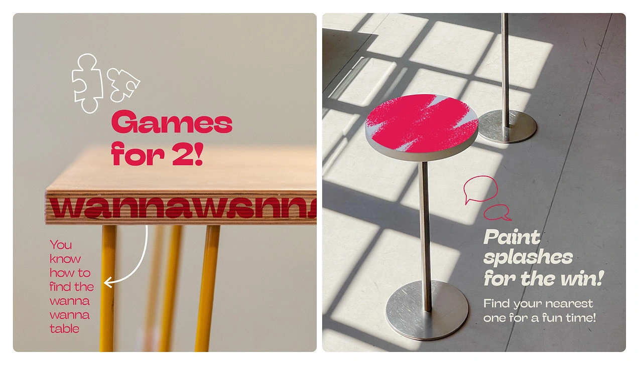

Typeface : Stinger variable. Regular, wide, fit ; thin to black. 40 weights, for each mood!
0 likes · 0 views · Nov 2, 2026
Wannawanna — brand system, illustrations, app design and copy for a campus app that facilitates low-pressure meetups and connections.


