Wedding Photography Logo
Amber LeBlanc
logo design/illustration
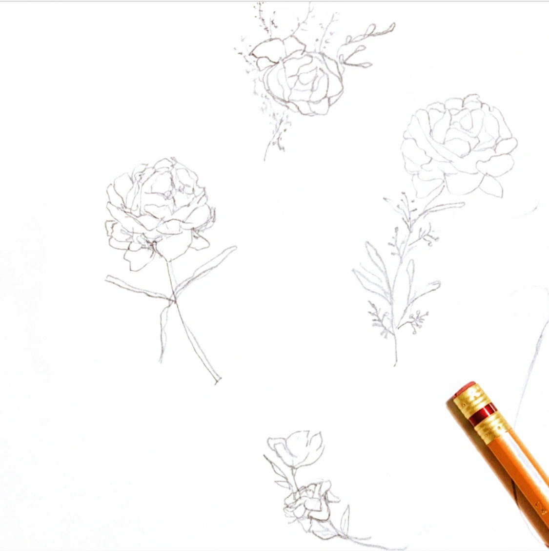
My creative process always starts with a pencil and paper, jotting down ideas and concepts, researching inspiration, sketching out layouts, and thinking about the problem and the solution.
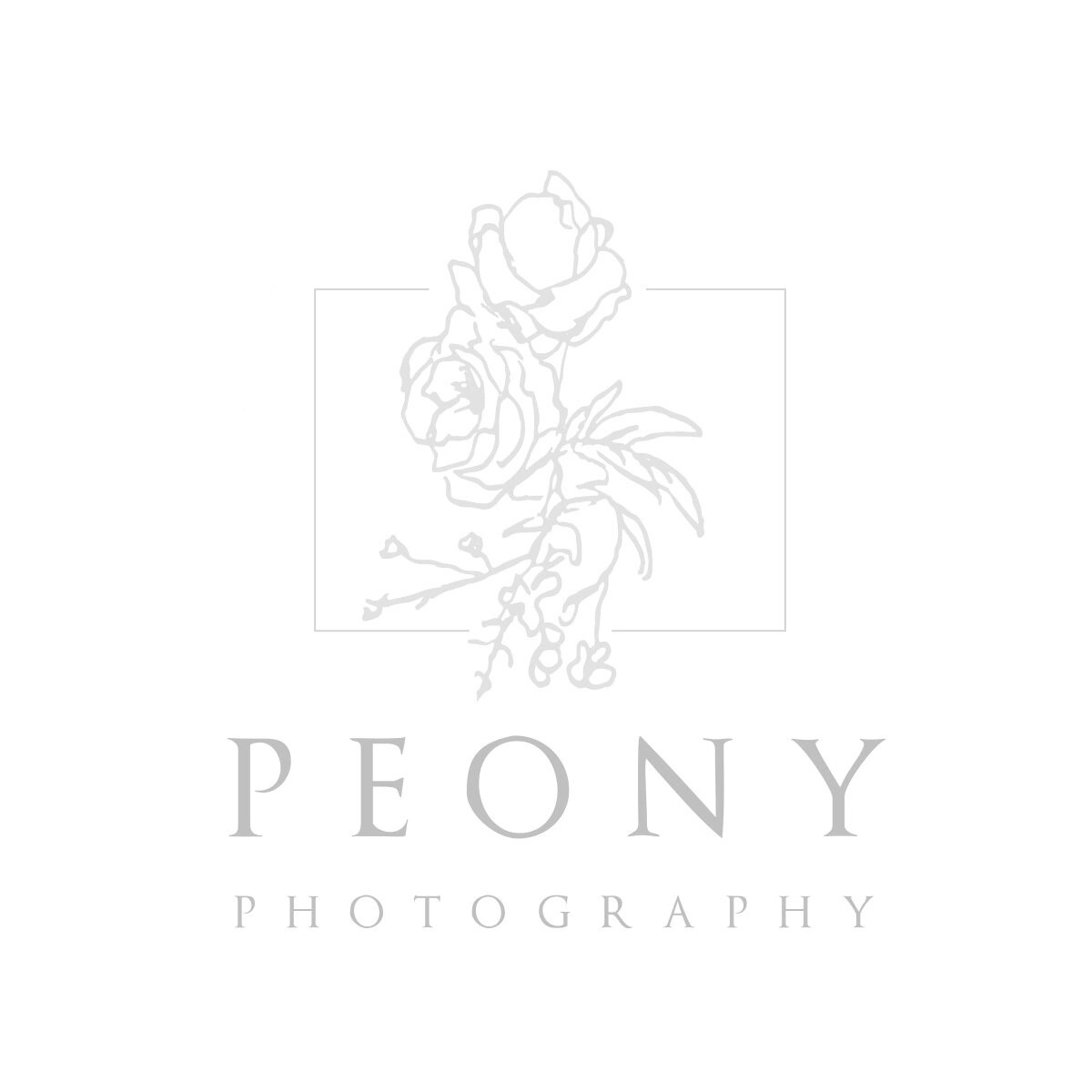
For this specific logo design, a peony flower was the main aspect that was wanted by the client to portray an artistic visual of their photography name: Peony Photography.
In the main logo, a thin rectangular border was used around the hand drawn peony flower to mimic the act of focusing in on an object when taking a photograph. As peony’s are a natural object, the typeface that was used was an organic serif.
Main Logo
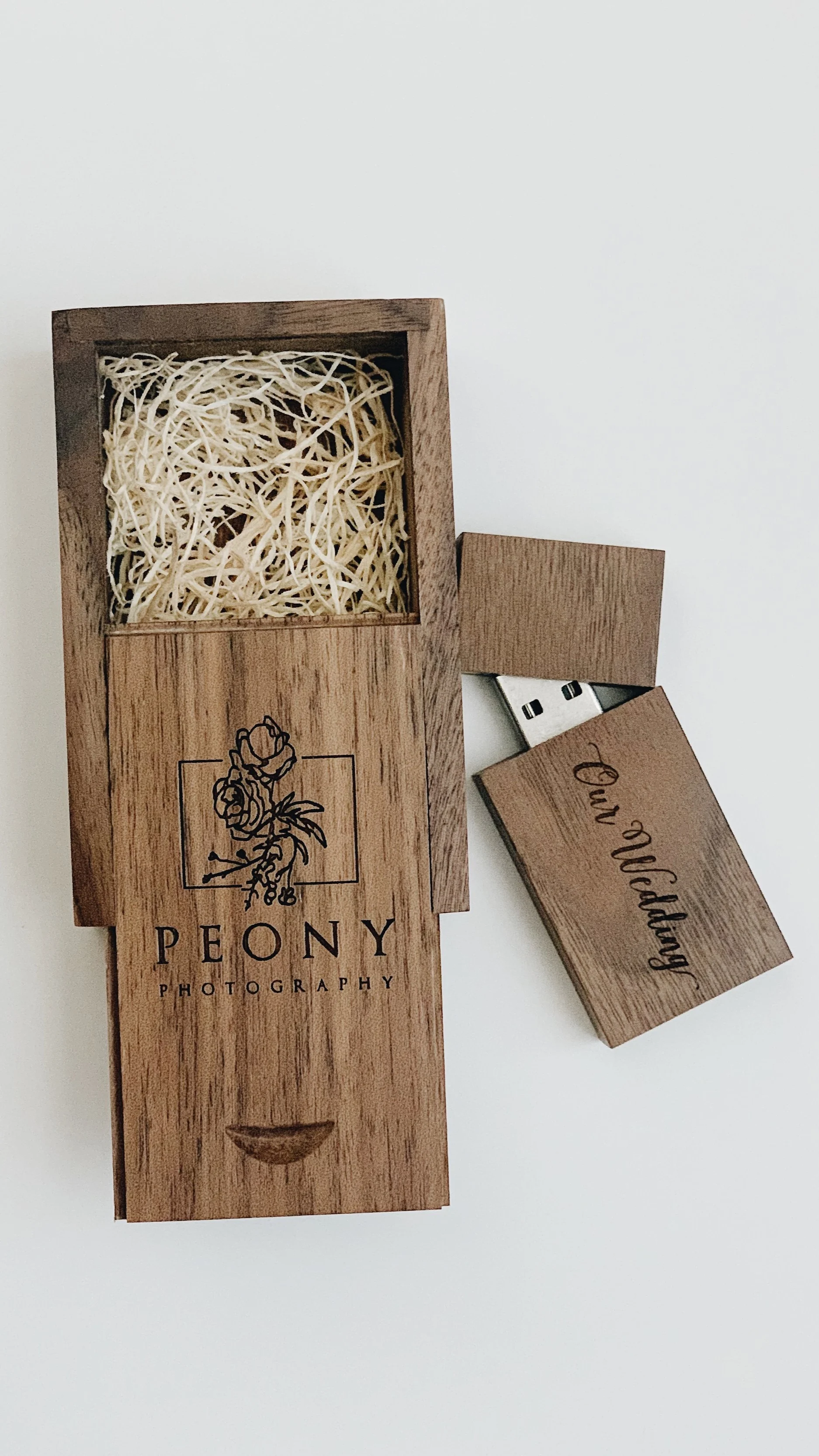
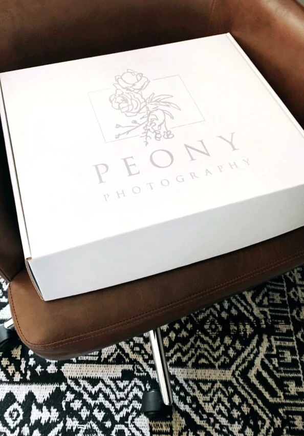
Used on print materials and packaging
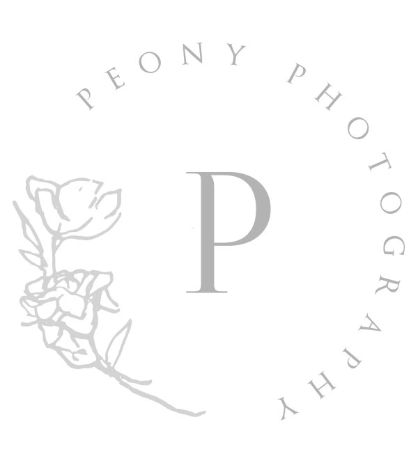
Secondary Logo
Used ON website/social media and labels/stickers
Like this project
Posted Nov 17, 2024
For this photography logo, a hand drawn peony flower was the imagery created along with a minimalist typeface to represent the artistic luxury brand.