Musuko Media - Re - Brand Identity
Isaac Bartlett
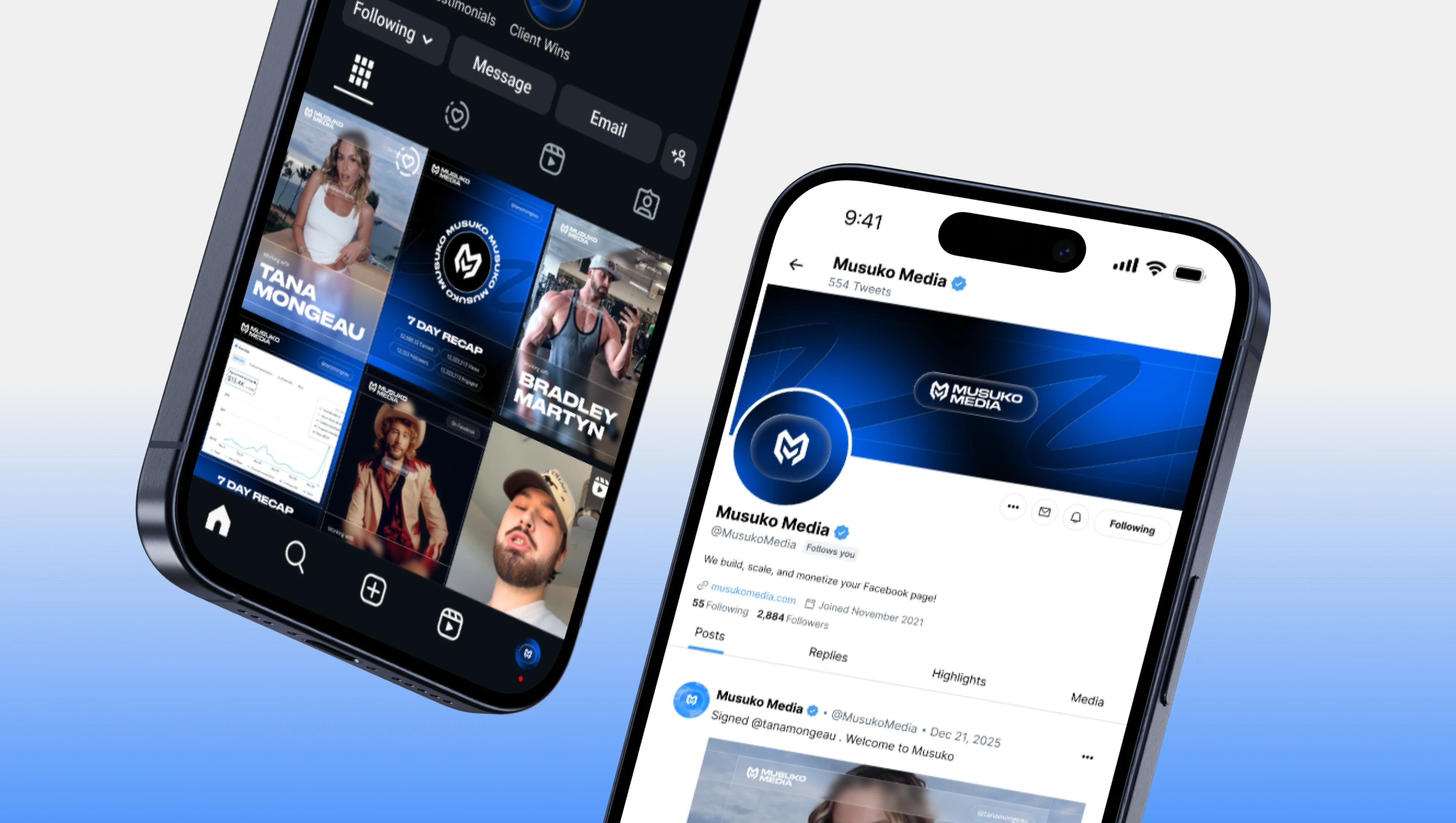
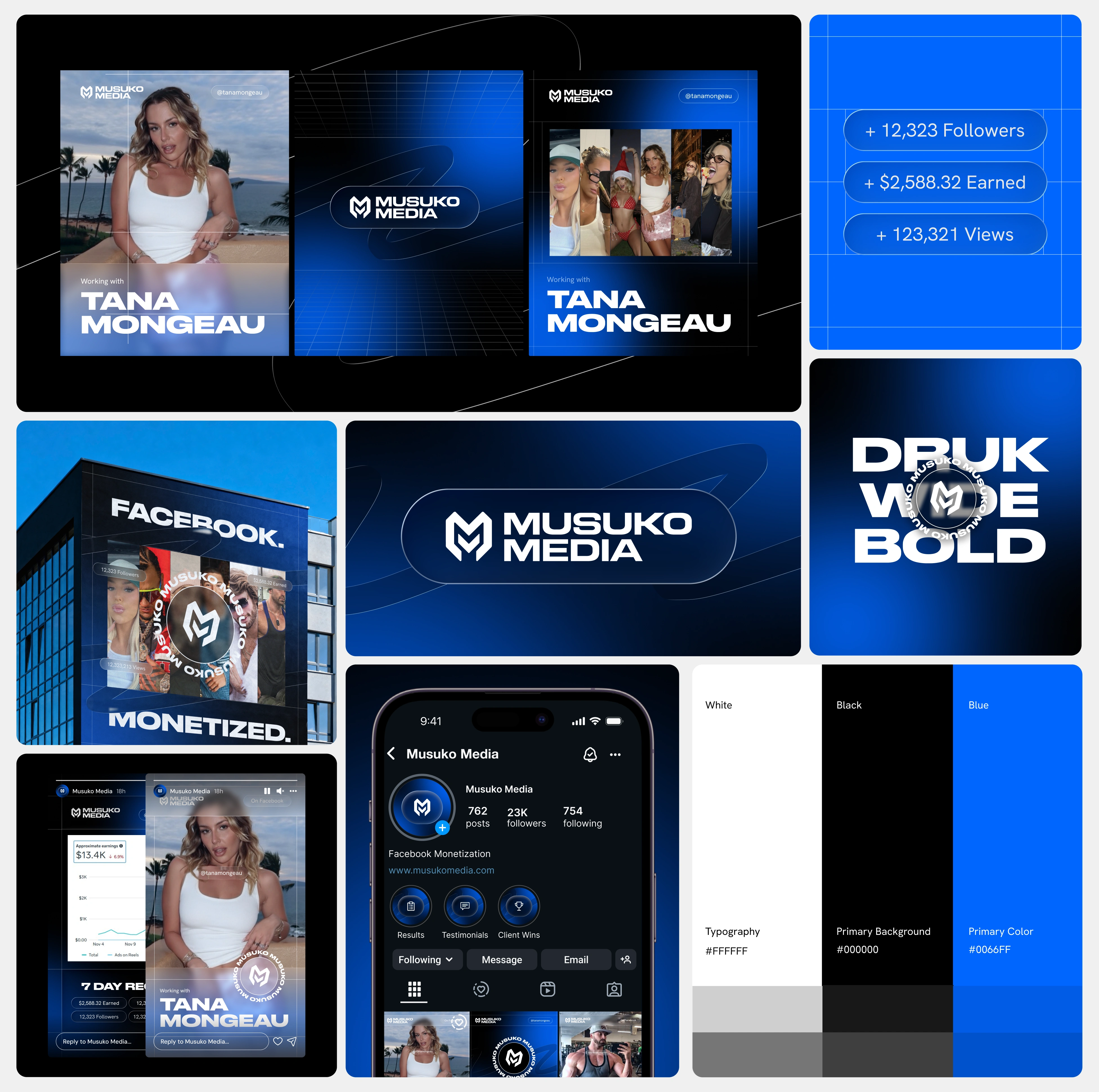
Musuko Media is a Facebook monetization agency that helps creators and influencers turn their audience into consistent income. They came to me needing a complete brand identity built from the ground up, one that could stand alongside the creators they work with and command attention in a crowded social media landscape.
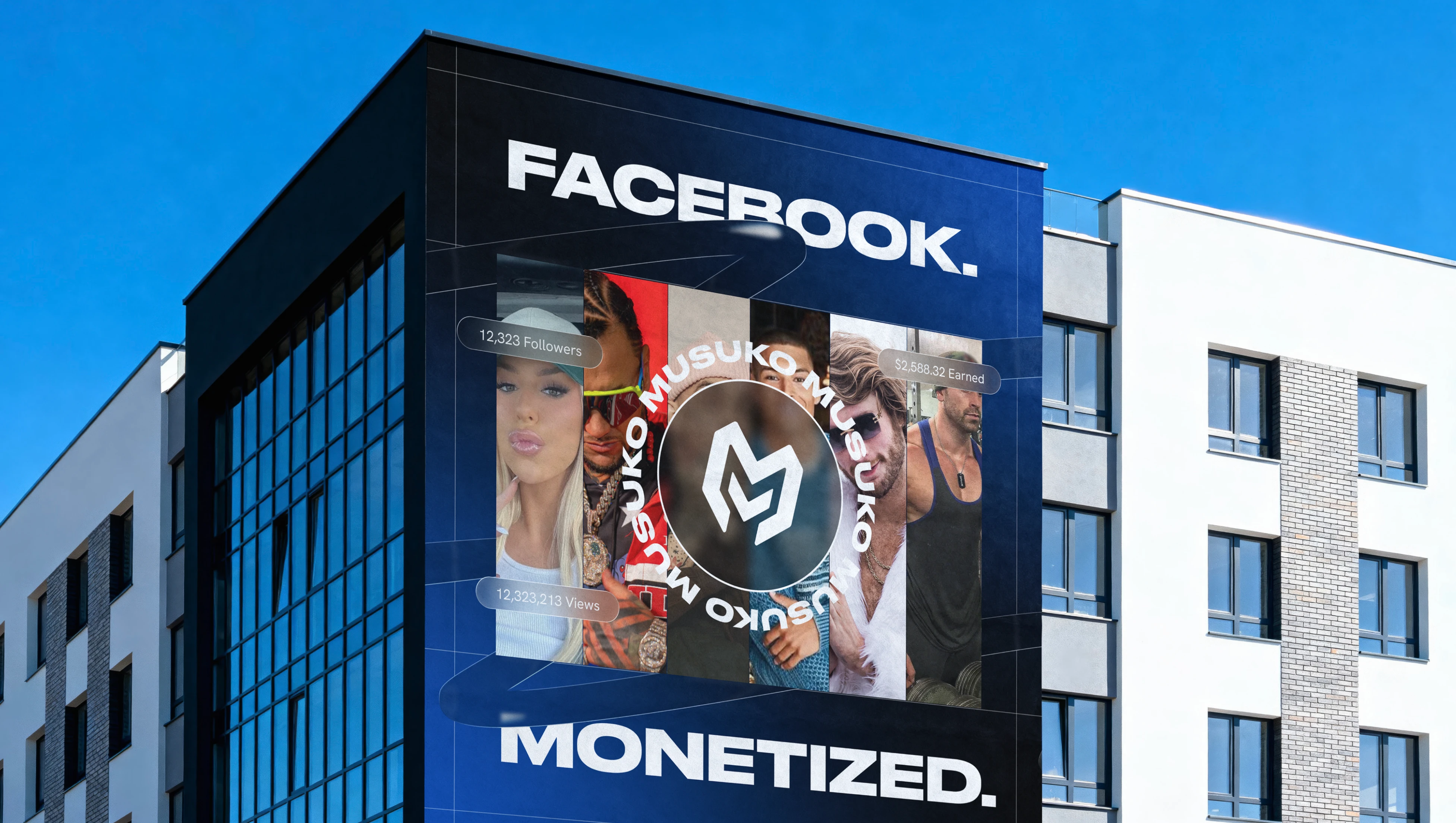
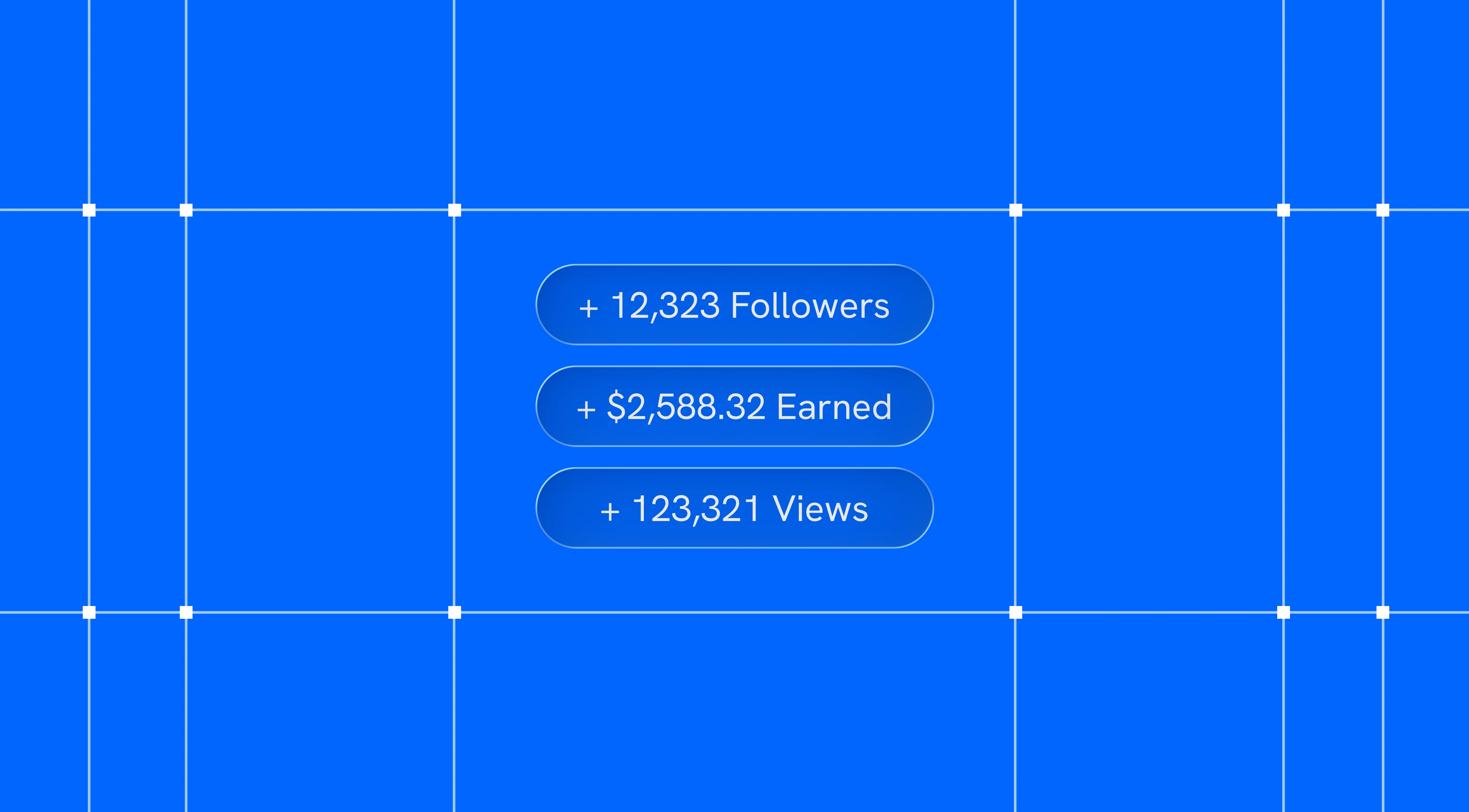
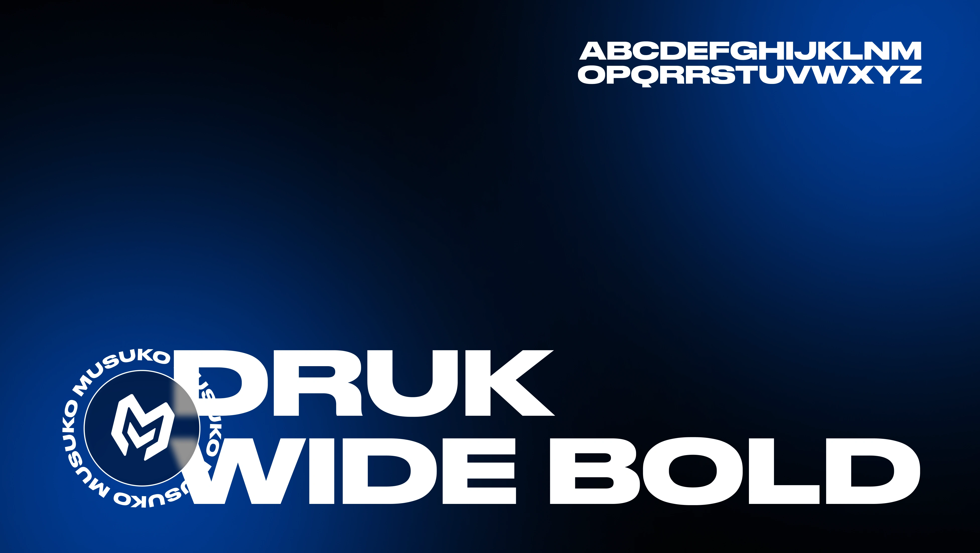
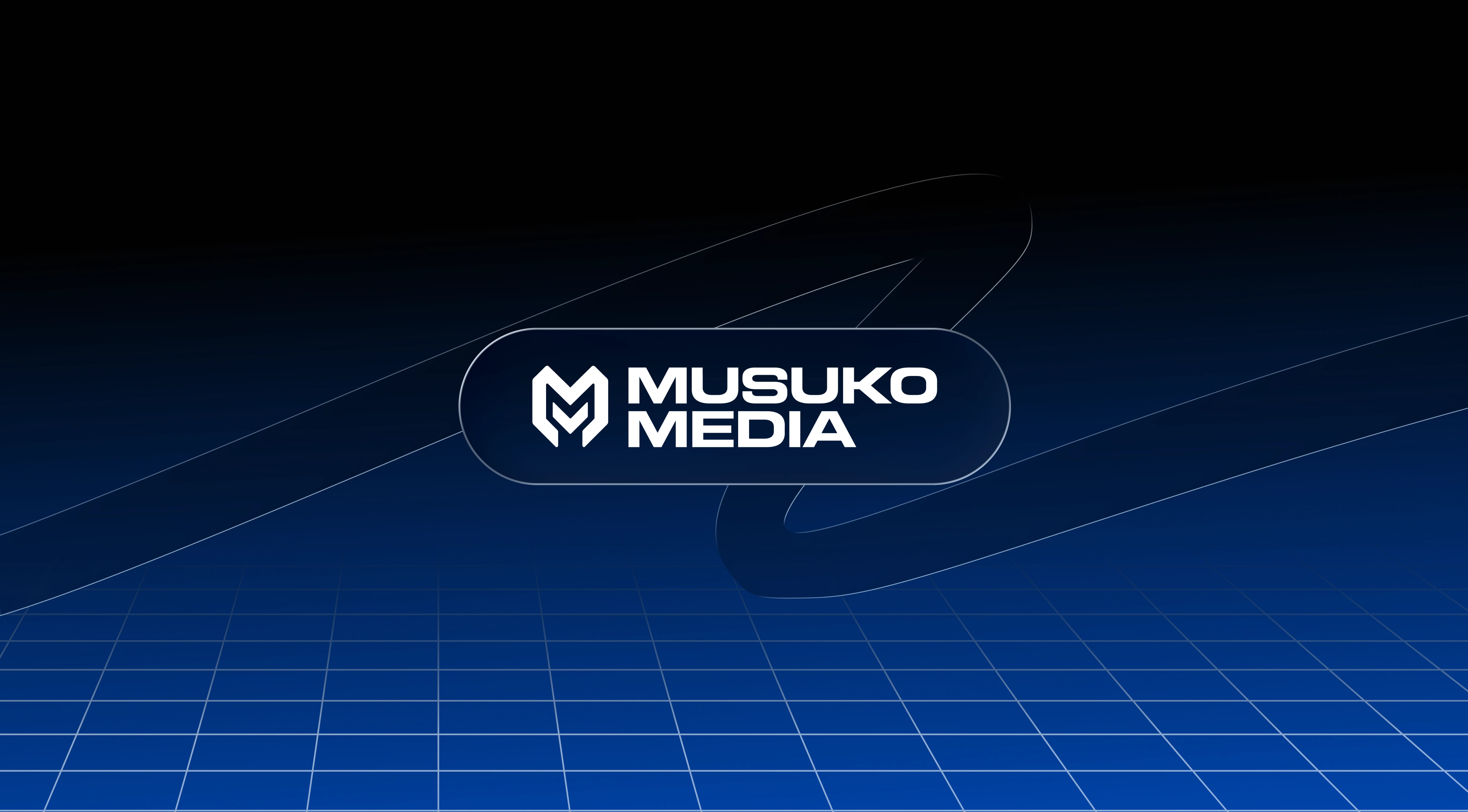
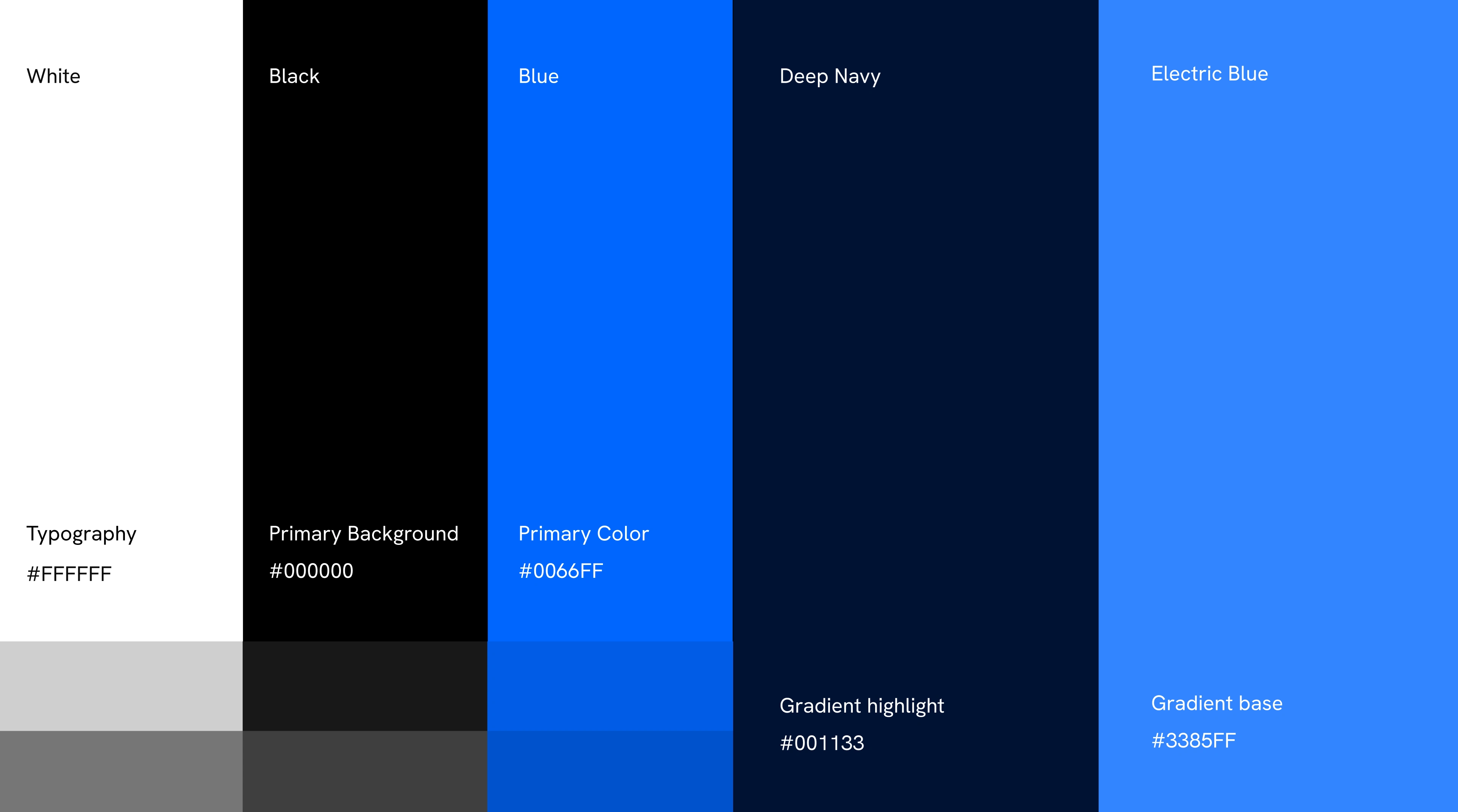
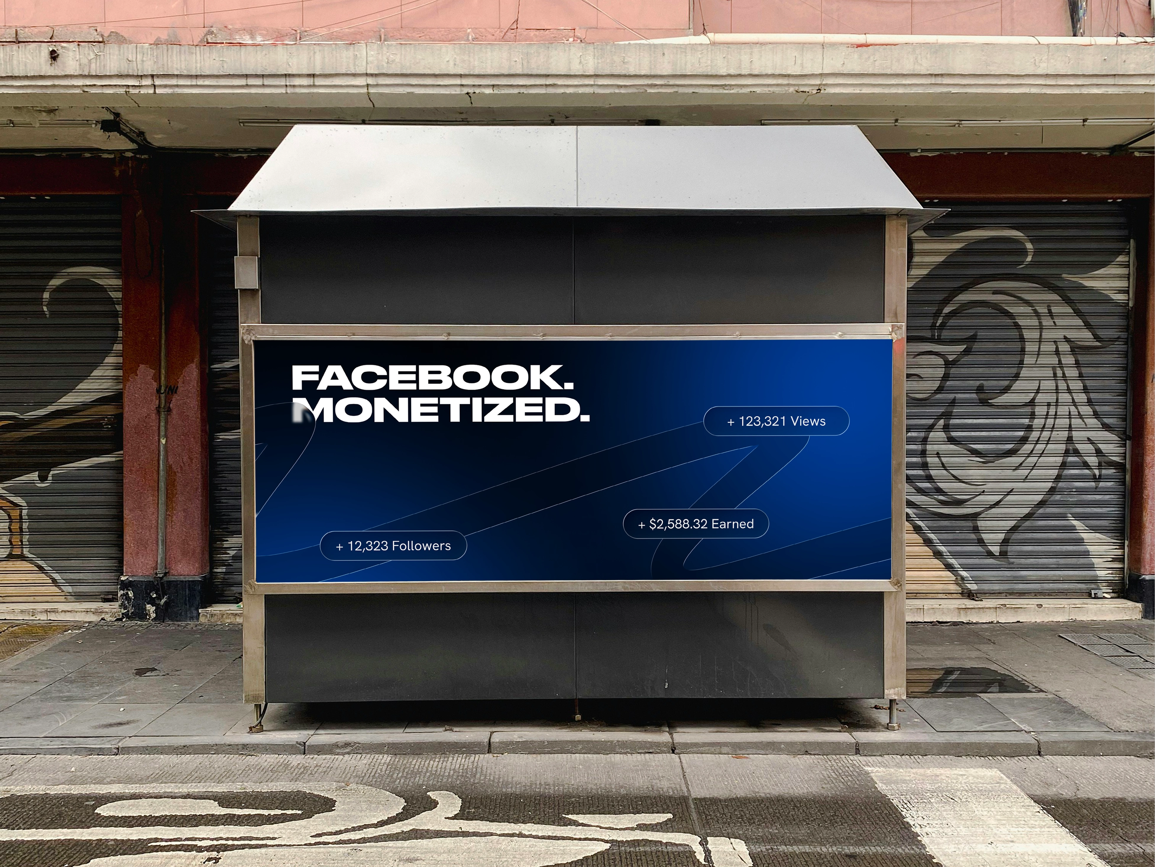
The project included a logomark, textmark, horizontal and vertical lockups, and a circular badge variant. The visual system was built around a bold three-color palette of black, white, and electric blue, paired with Druk Wide Bold for headlines and Hanken Grotesk for body and UI copy. Graphic elements including a lined grid texture, spot gradient, and glass UI components give the brand a layered, digital-native feel that lives natively across social platforms.
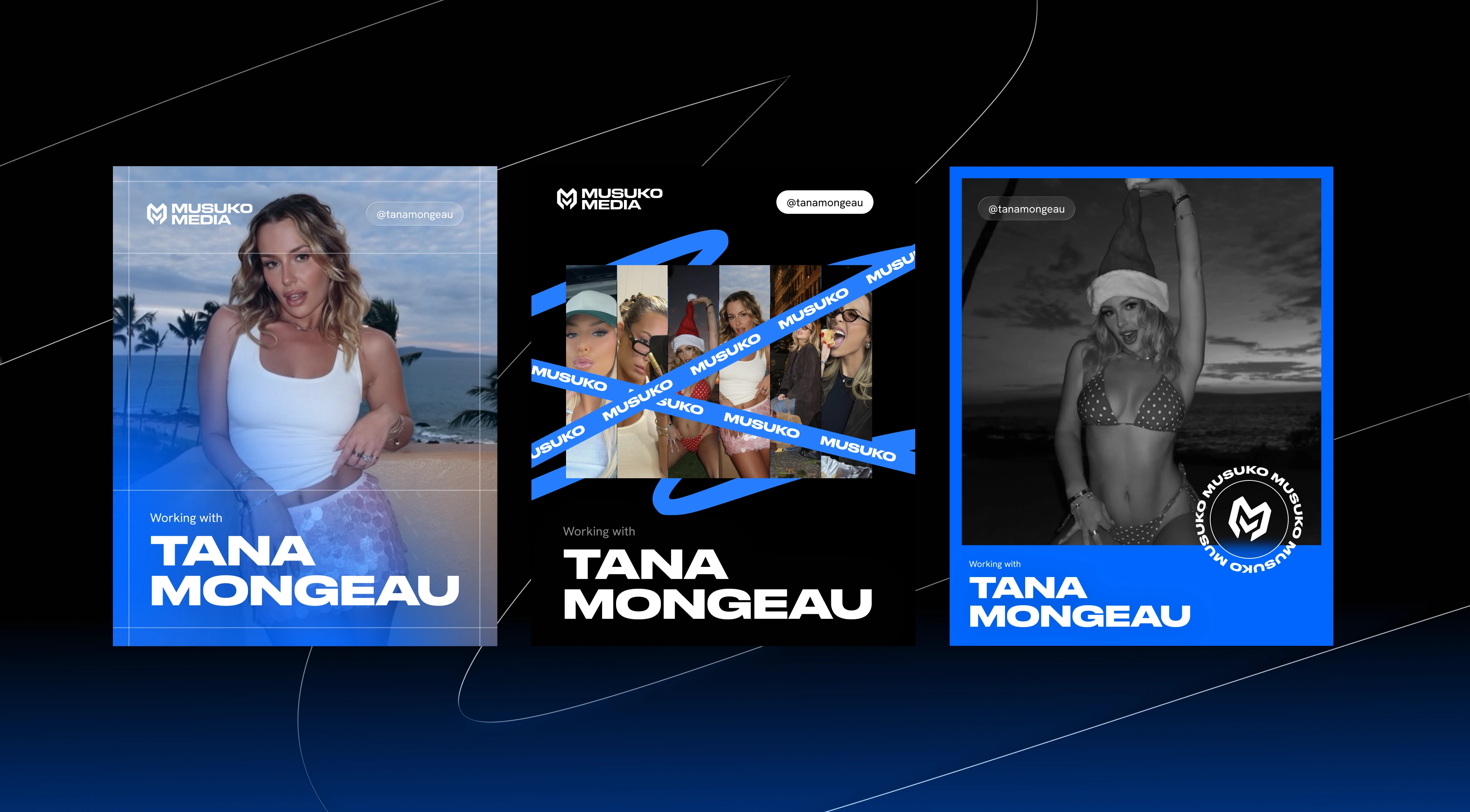
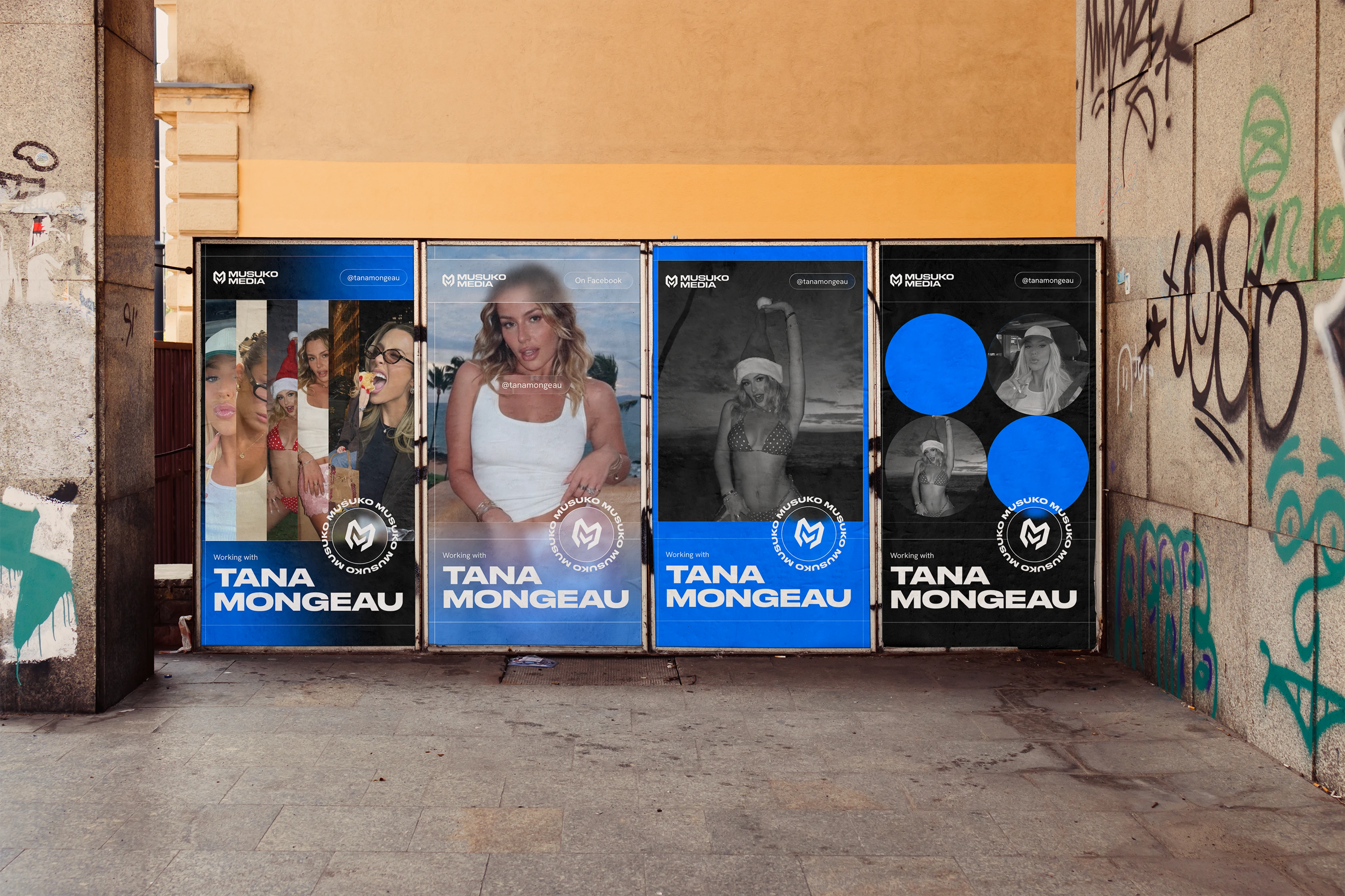
Deliverables also included a full social media template system covering X, Instagram, and Facebook Story formats, and a comprehensive brand guidelines document covering logo usage, color, typography, graphic elements, social templates, and voice and tone.
The result is a brand that feels as bold and results-driven as the clients Musuko Media works with, built to scale.
Like this project
Posted Jun 4, 2026
Created a dynamic brand identity for Musuko Media with logo, visual system, and social media templates.
Likes
0
Views
3