Equinox Gym Supplements Branding and Packaging Design
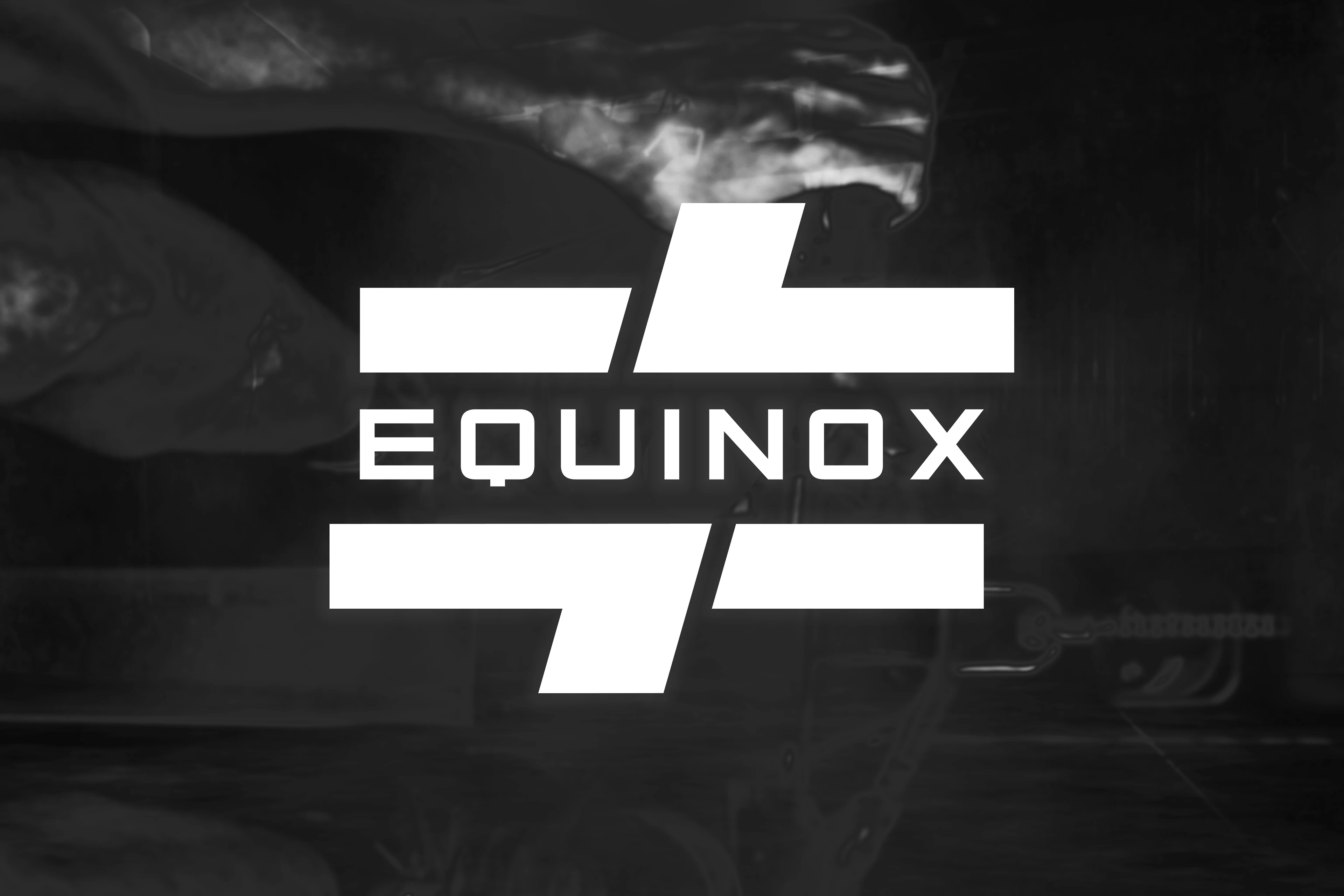
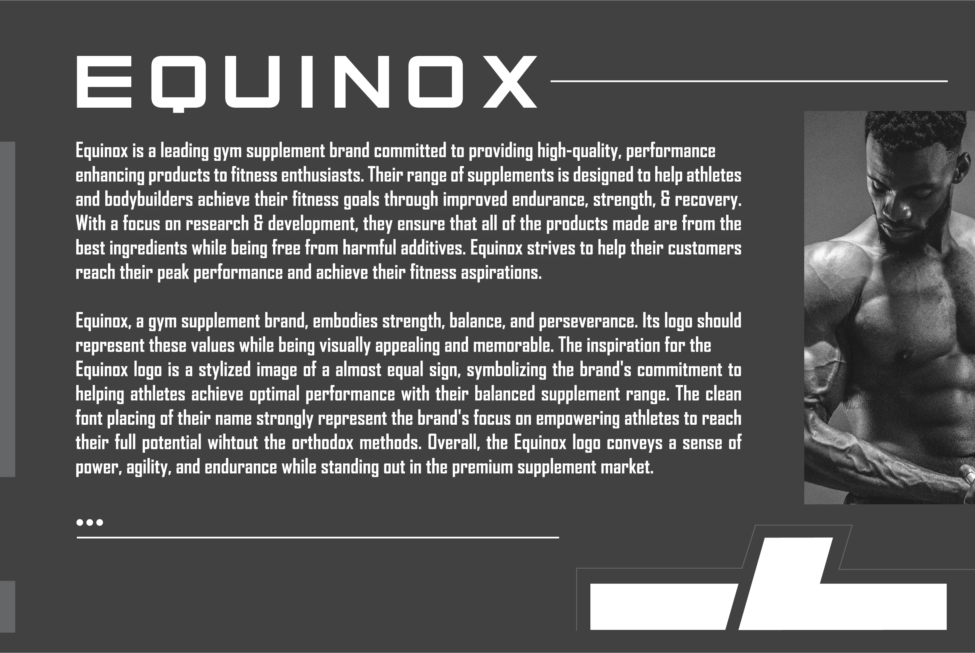
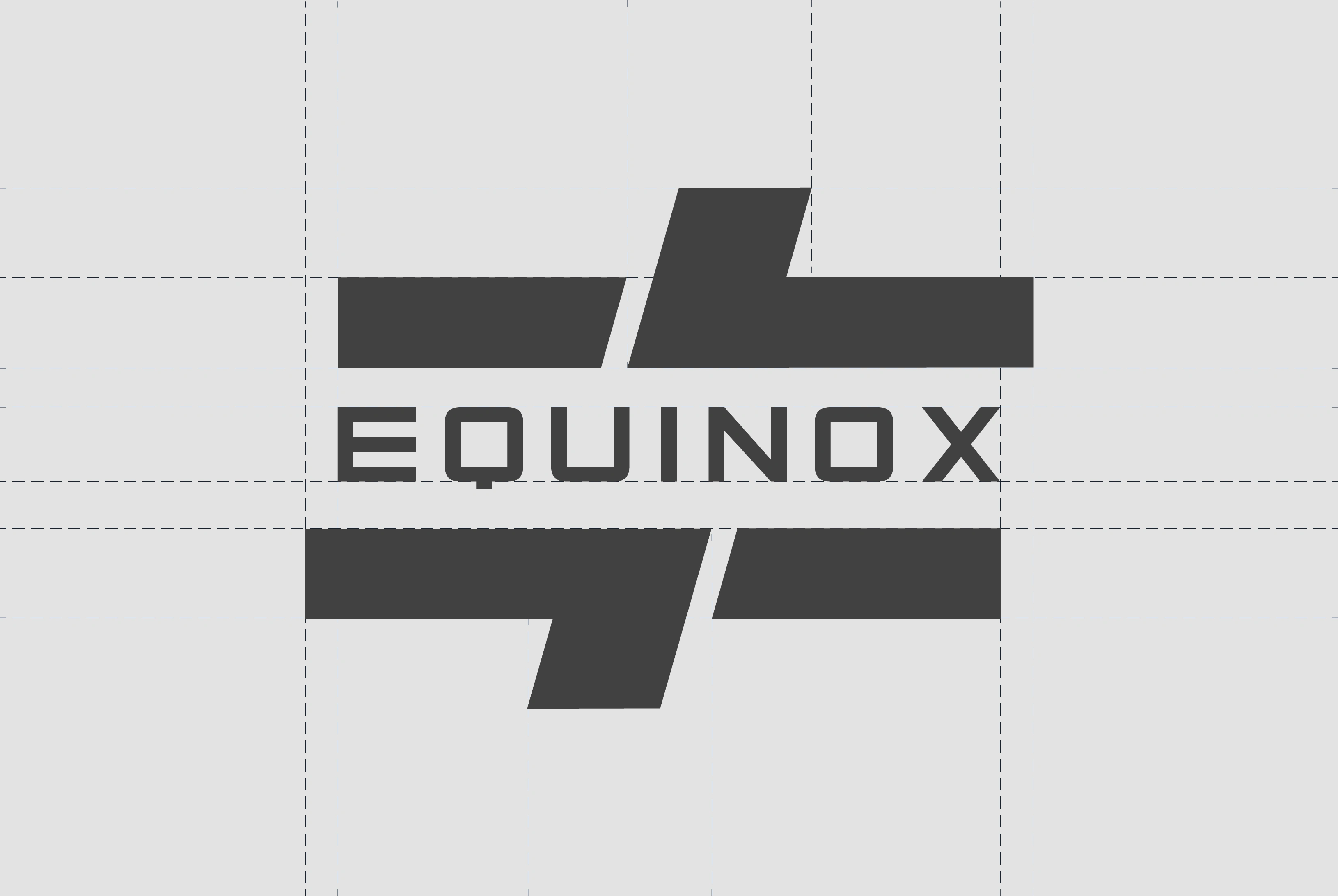
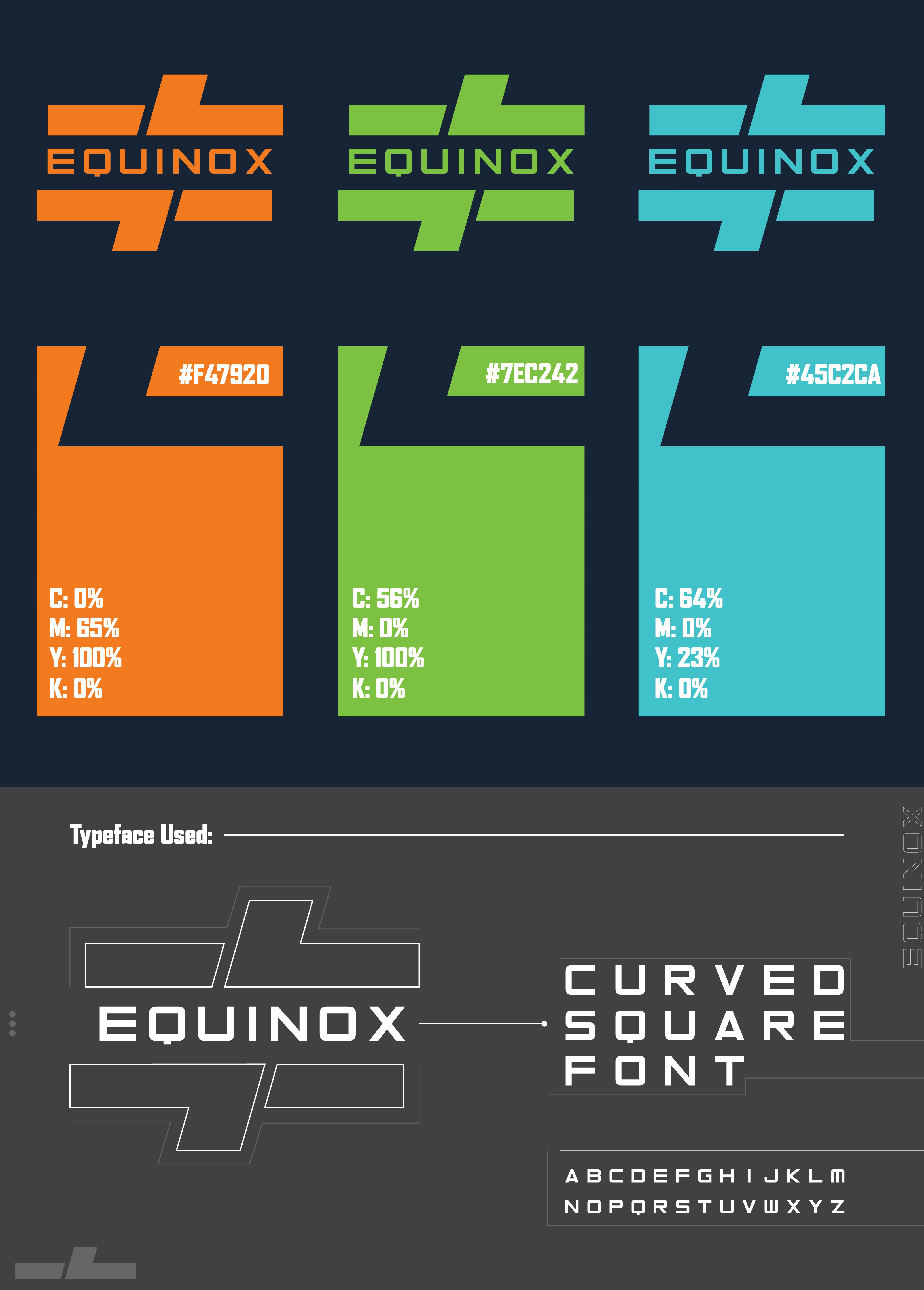
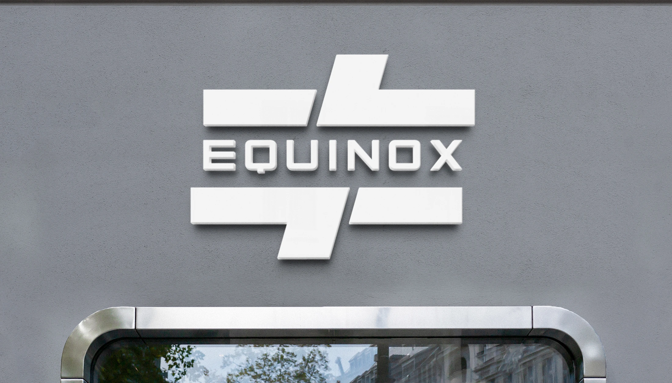
Logo designing using the grids for better placement understanding, this logo was inspired by the symbol = with a twist of " / " added to it, since the name is Equinox the brand uses an equal sign to show nobody in the market serves to an equal quality compared to them, a slight cut was added in a stylized way forming a not equal-to sign " ≠ ".
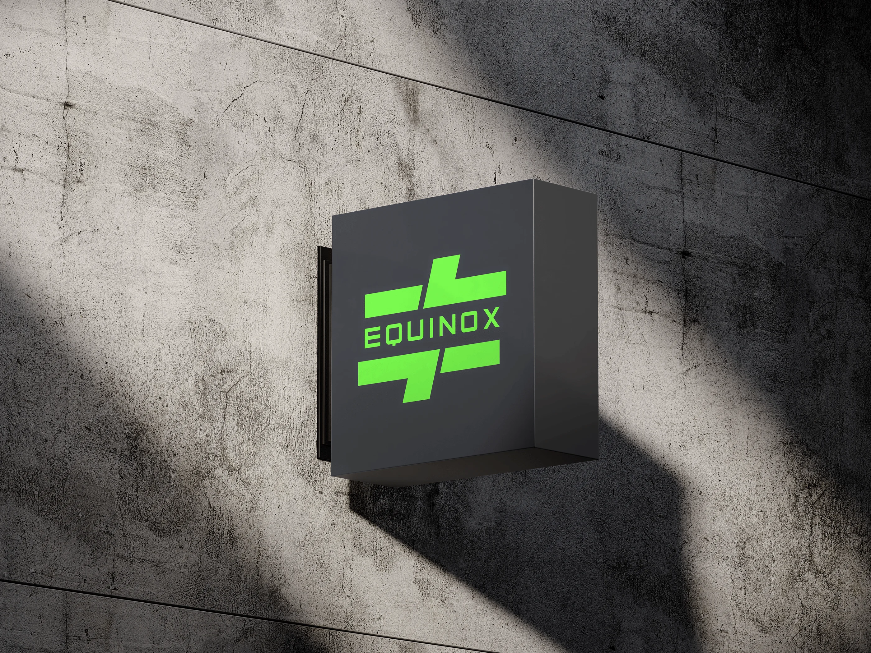
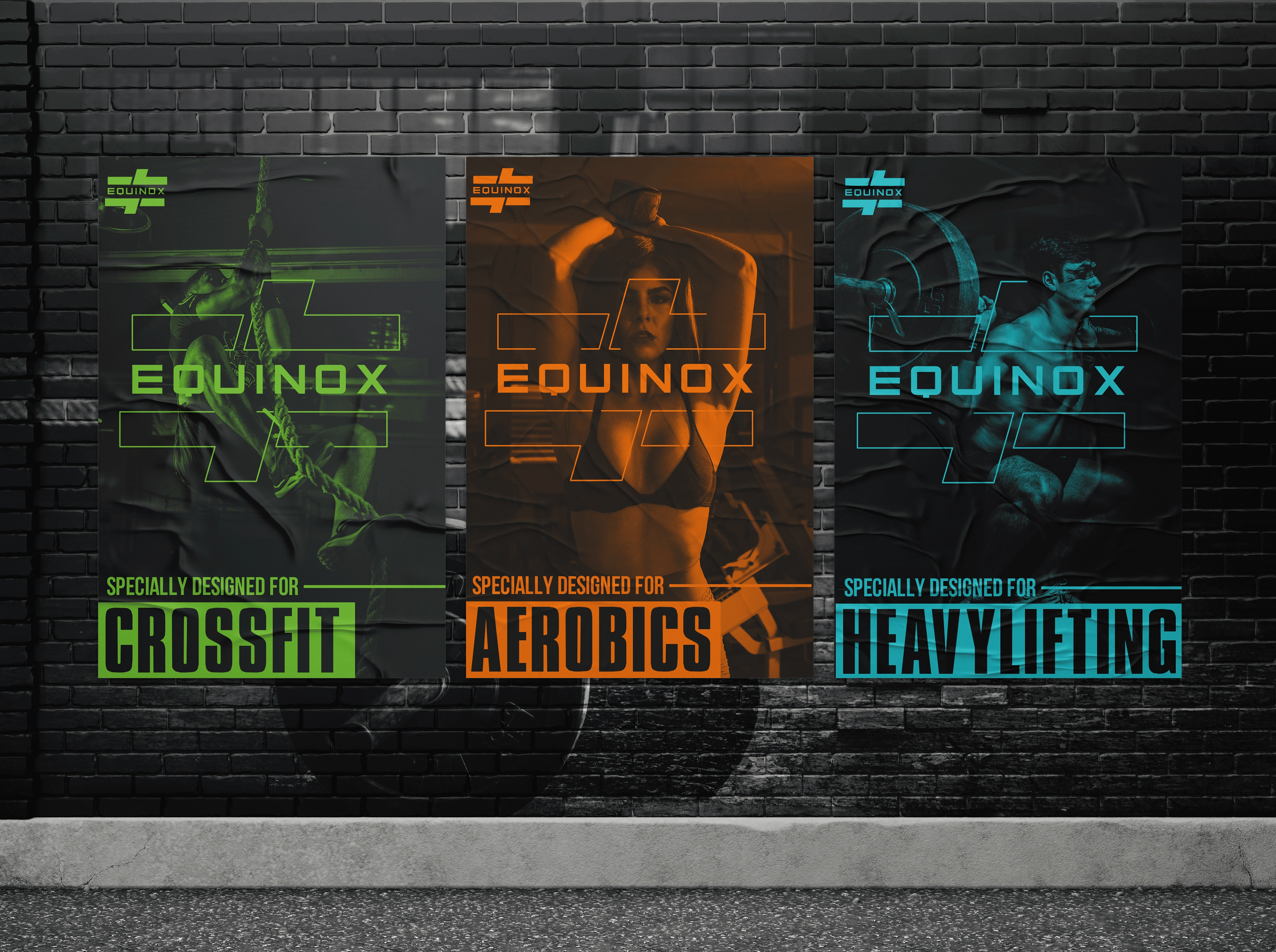
Proper Visualization using posters for a better understanding of which fitness market streams the brand is focused on to serve and capture the audience. Each of their supplements and products is scientifically and specifically designed for the target audience.
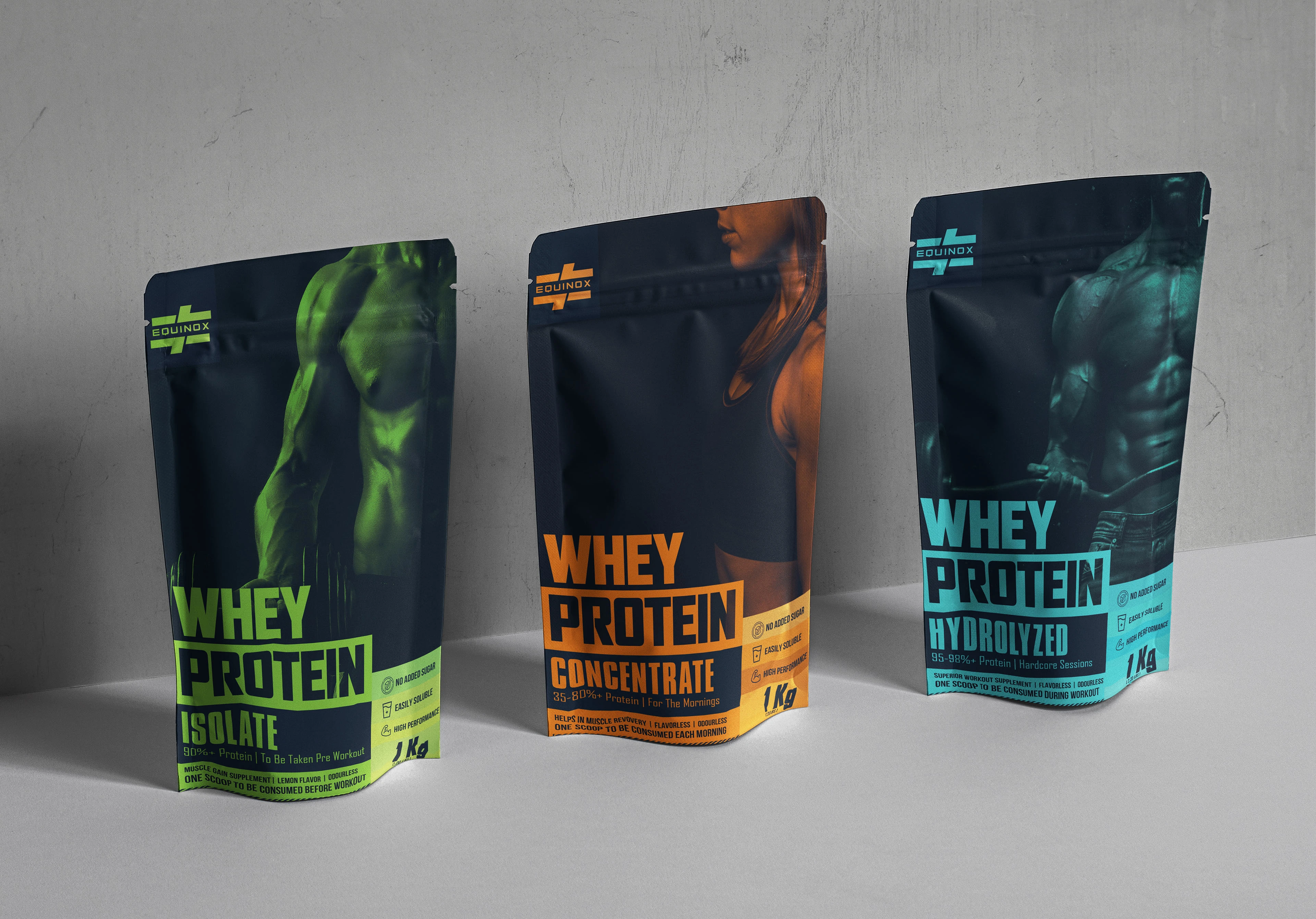
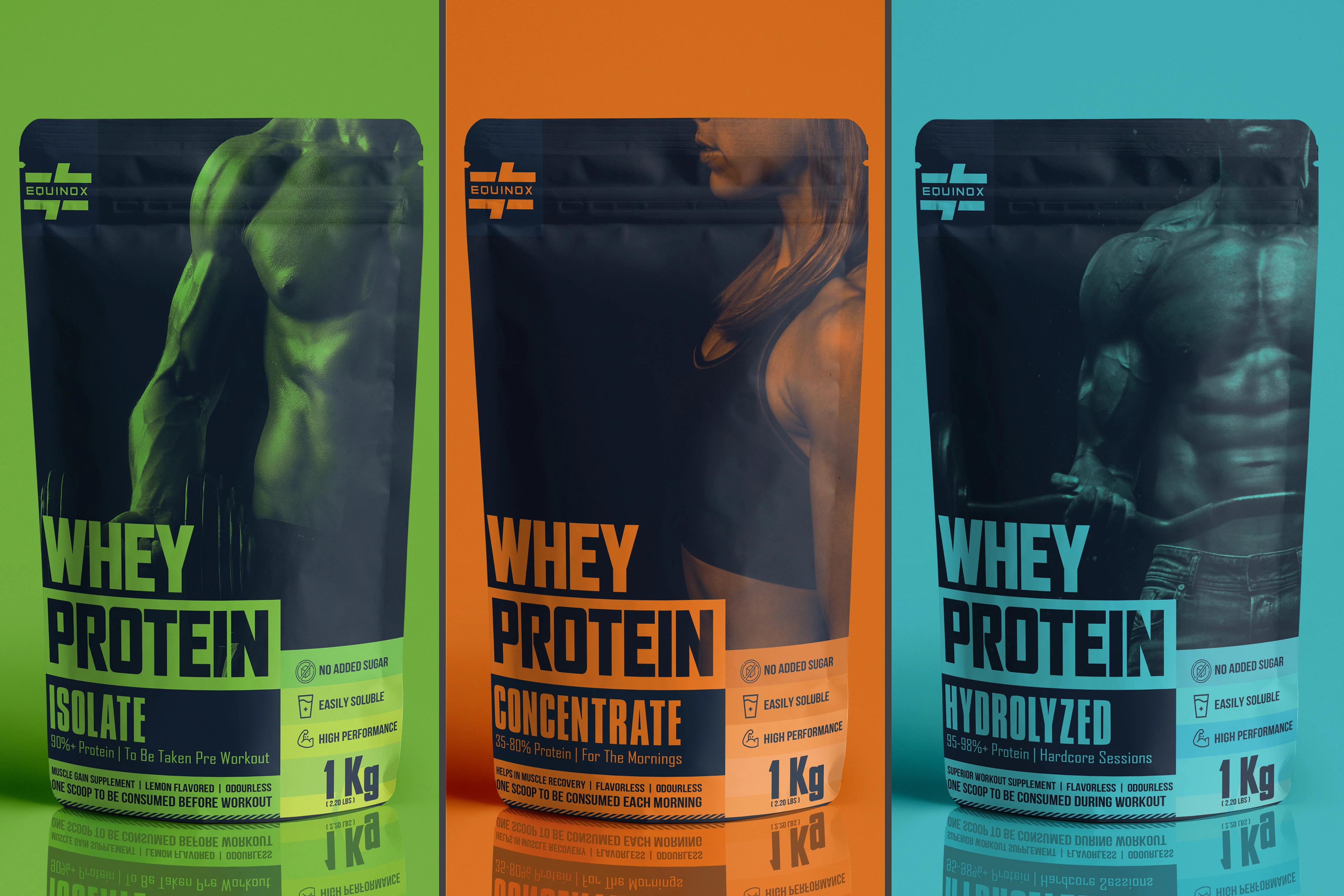
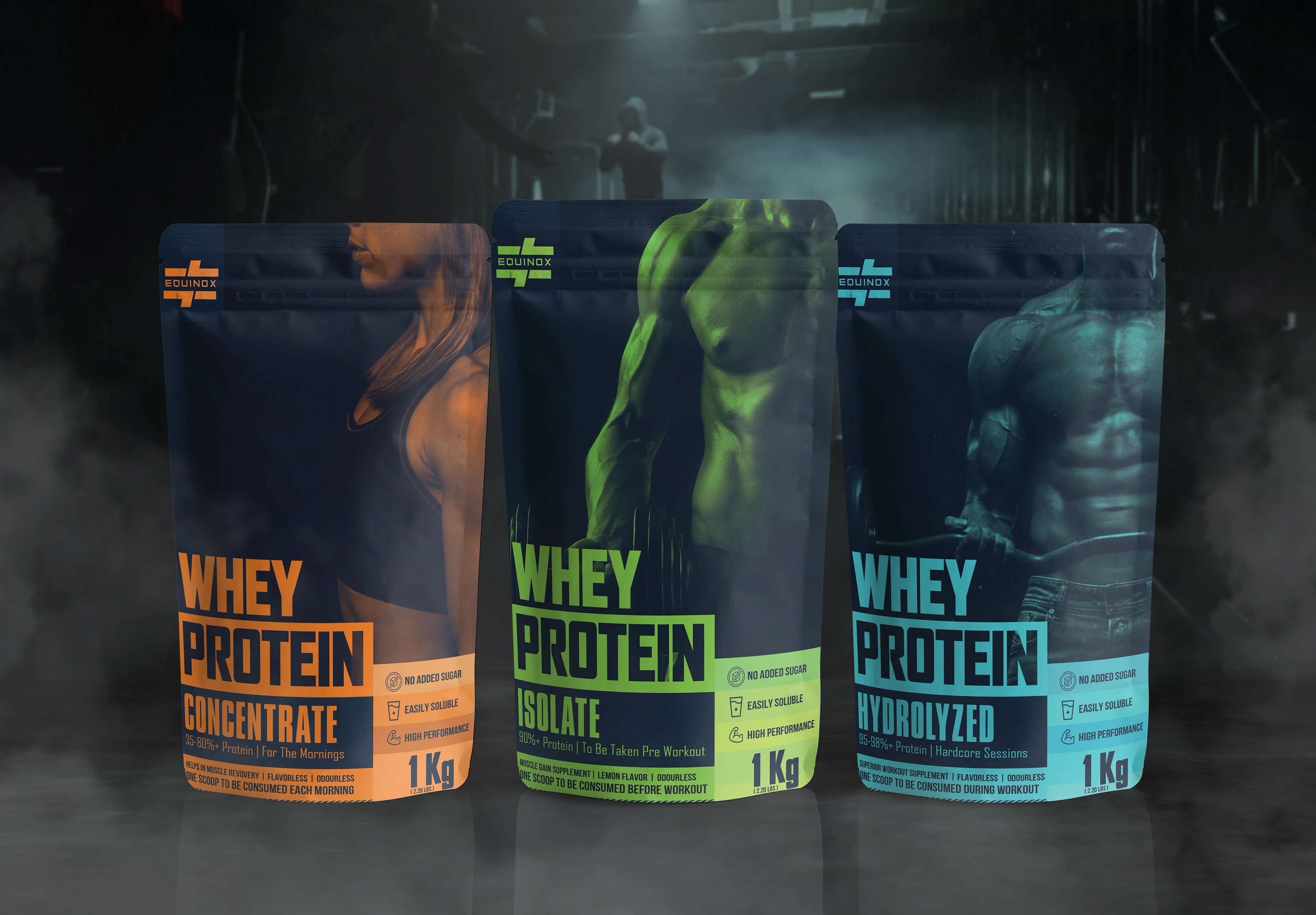
Original Packaging Design was done as part of the project for the brand, the scope was to imply what areas of the fitness industry the brand supports with its multiple ranges of products, with three entry-level whey powders to be introduced in the market.
Like this project
Posted Jun 22, 2023
Graphic Design,Branding,Packaging,Adobe Illustrator,Adobe Photoshop

