Recule - IV Therapy Branding

Othmane SAMODI



ABOUT
Recule stands as an innovative trailblazer, spearheading the evolution of NAD+ therapy and revolutionizing the landscape of holistic wellness. Their unwavering dedication to transparency and groundbreaking innovation resonates profoundly with their visionary approach to future medicine. Embracing biologics, custom therapies, and cutting-edge data analysis tools, Recule sets a new standard in healthcare.
At the core of Recule's ethos lies a compelling narrative, a narrative that transcends traditional wellness paradigms. It's a narrative of vitality, urging individuals to seize a revitalized life. Their commitment to science-backed transformative therapies not only redefines wellness but also reimagines the very essence of healthcare.
Fueled by a profound belief in pioneering solutions, Recule's values of boldness, honesty, and trailblazing define their relentless pursuit of reshaping healthcare. Their mission is about empowering individuals to embark on a journey towards lasting health and well-being. Each step they take is a testament to their dedication to ushering in a new era of healthcare—one that's grounded in innovation, guided by transparency.
Service : Brand strategy - Branding
Sector : Healthcare
Year : 2023
BRAND AUDIENCE
Defining the audience for a brand specializing in NAD+ therapy presents multifaceted challenges. These complexities arise from the diverse backgrounds, needs, and motivations of individuals seeking wellness solutions. Segmentation becomes intricate due to the varied demographics, from athletes seeking performance enhancement to professionals combatting fatigue. Educating this diverse audience about NAD+ therapy's benefits and the science behind it poses another layer of complexity.
Furthermore, staying attuned to evolving wellness trends and expectations adds to the challenge of accurately targeting and engaging with this dynamic audience. Overcoming these hurdles necessitates continuous research, data analysis, and the ongoing refinement of buyer personas to ensure the brand remains relevant and resonates effectively within the ever-evolving landscape of wellness.
LOGO DESIGN
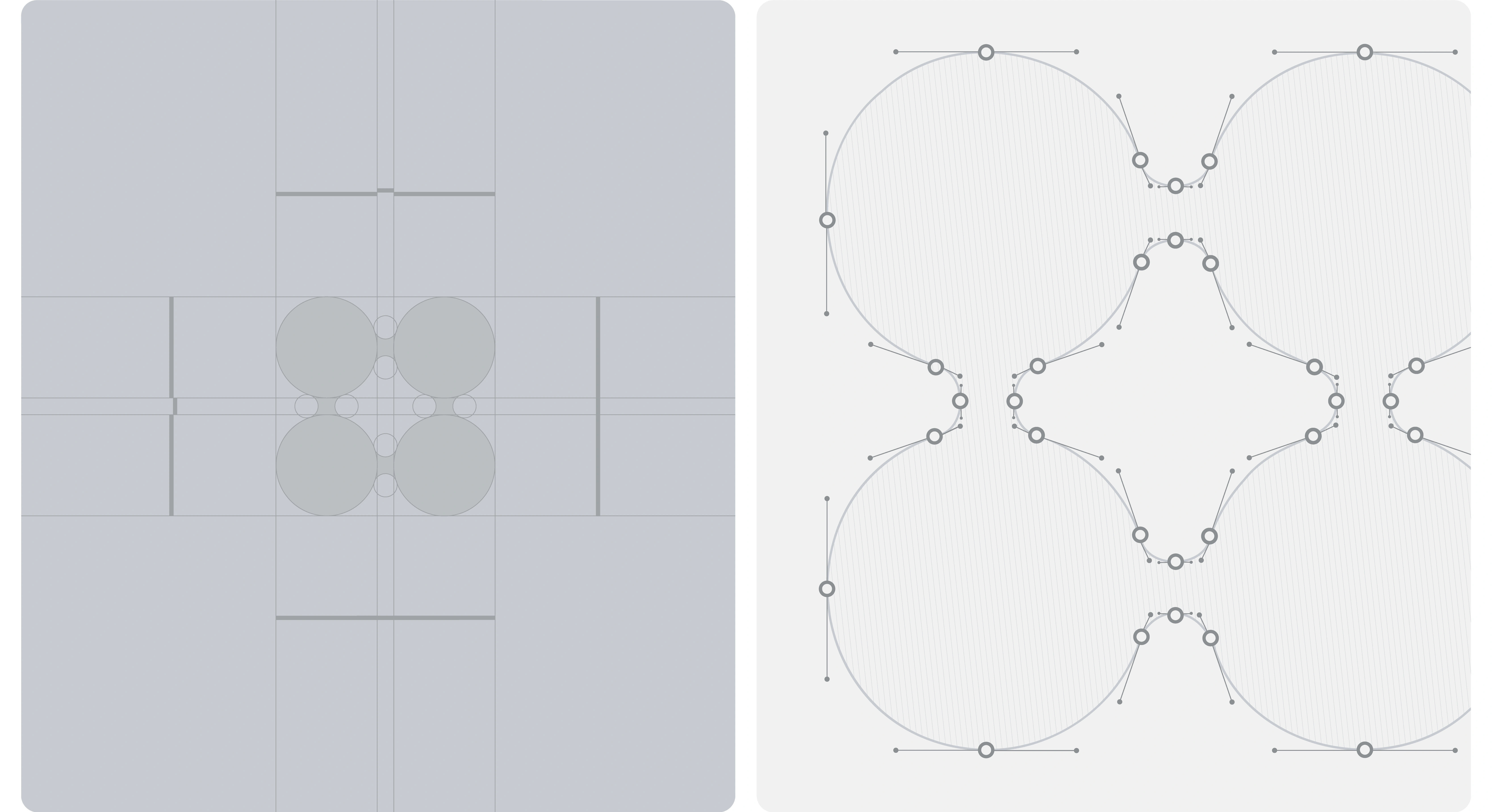
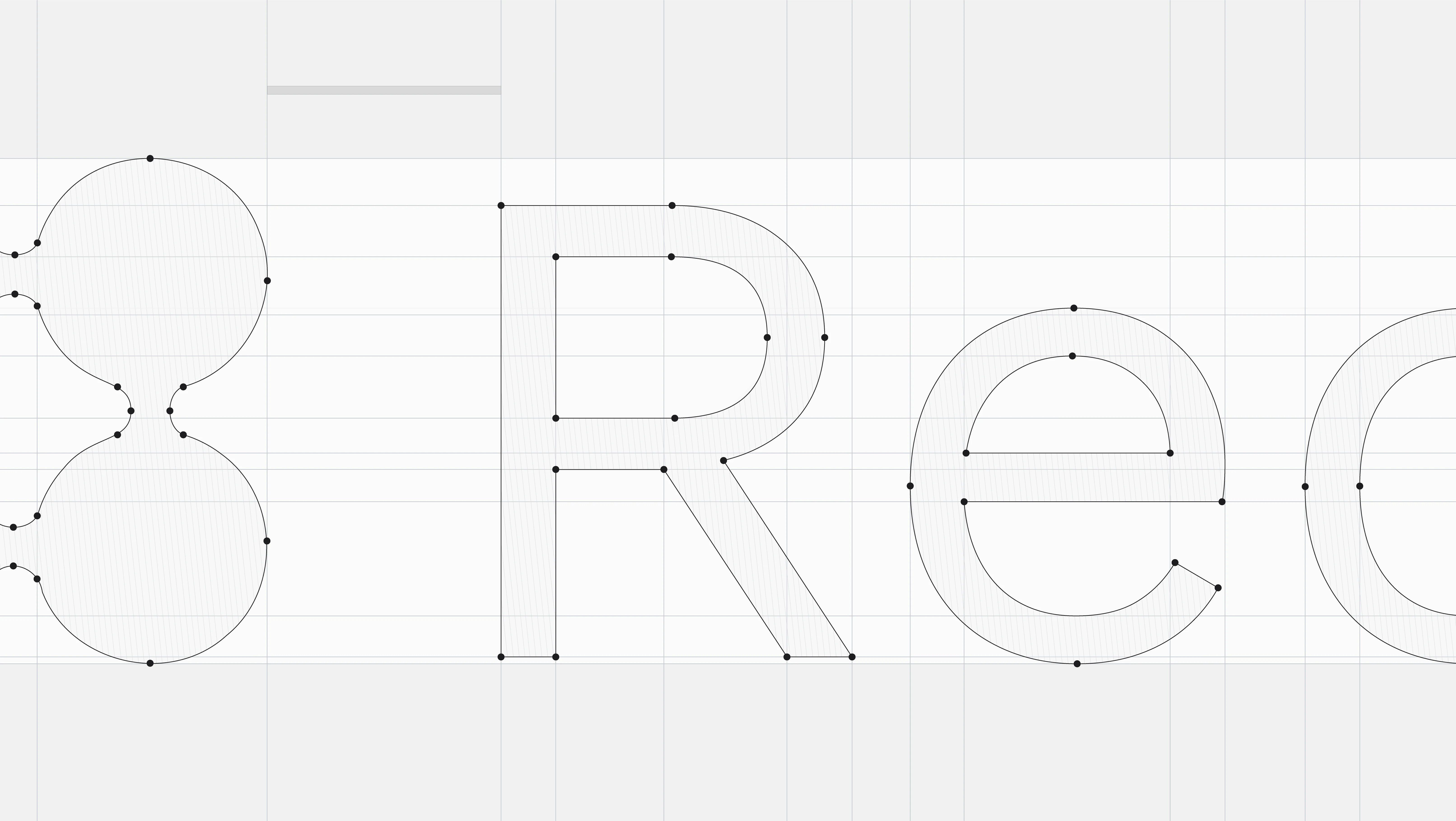
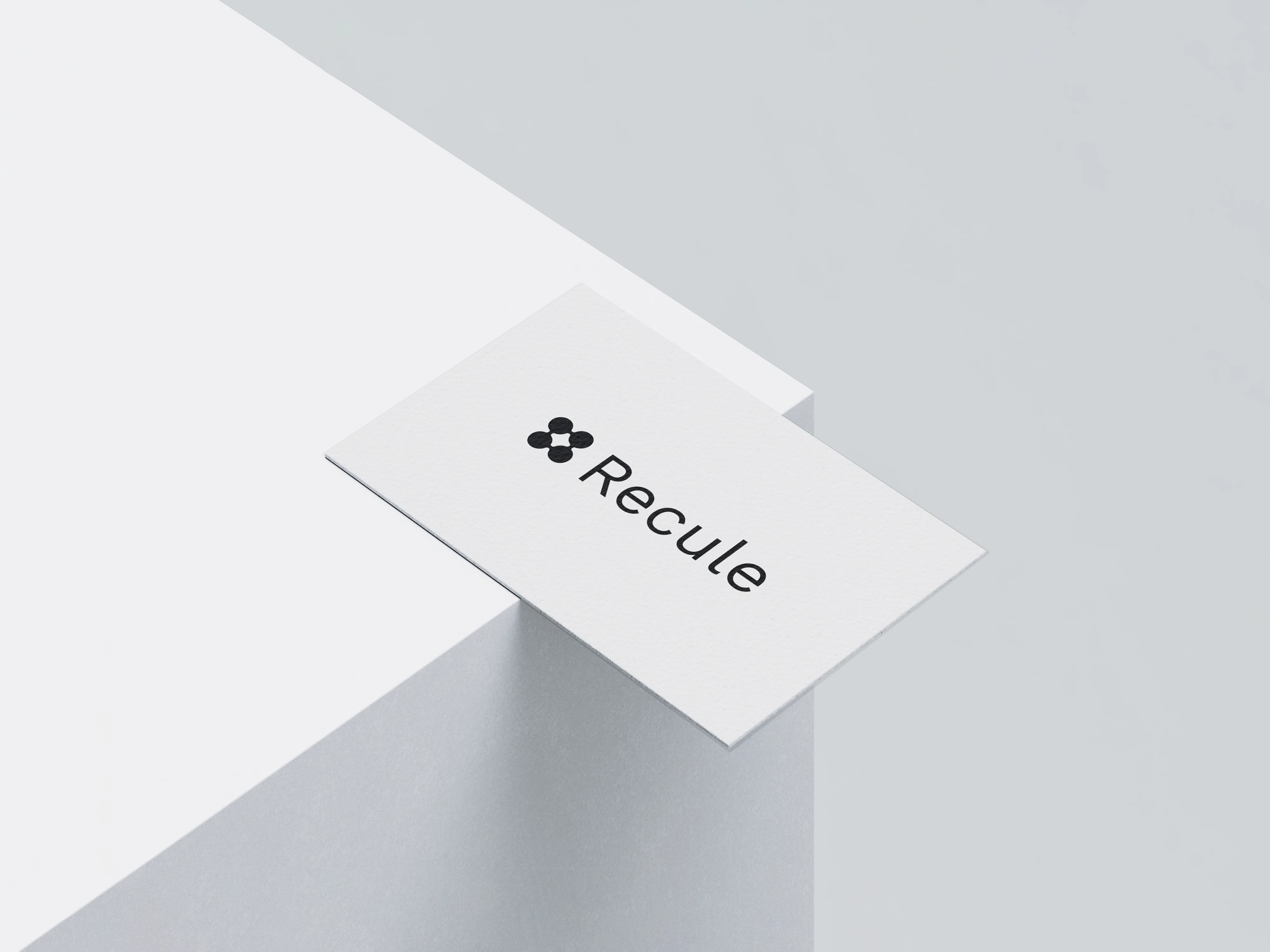
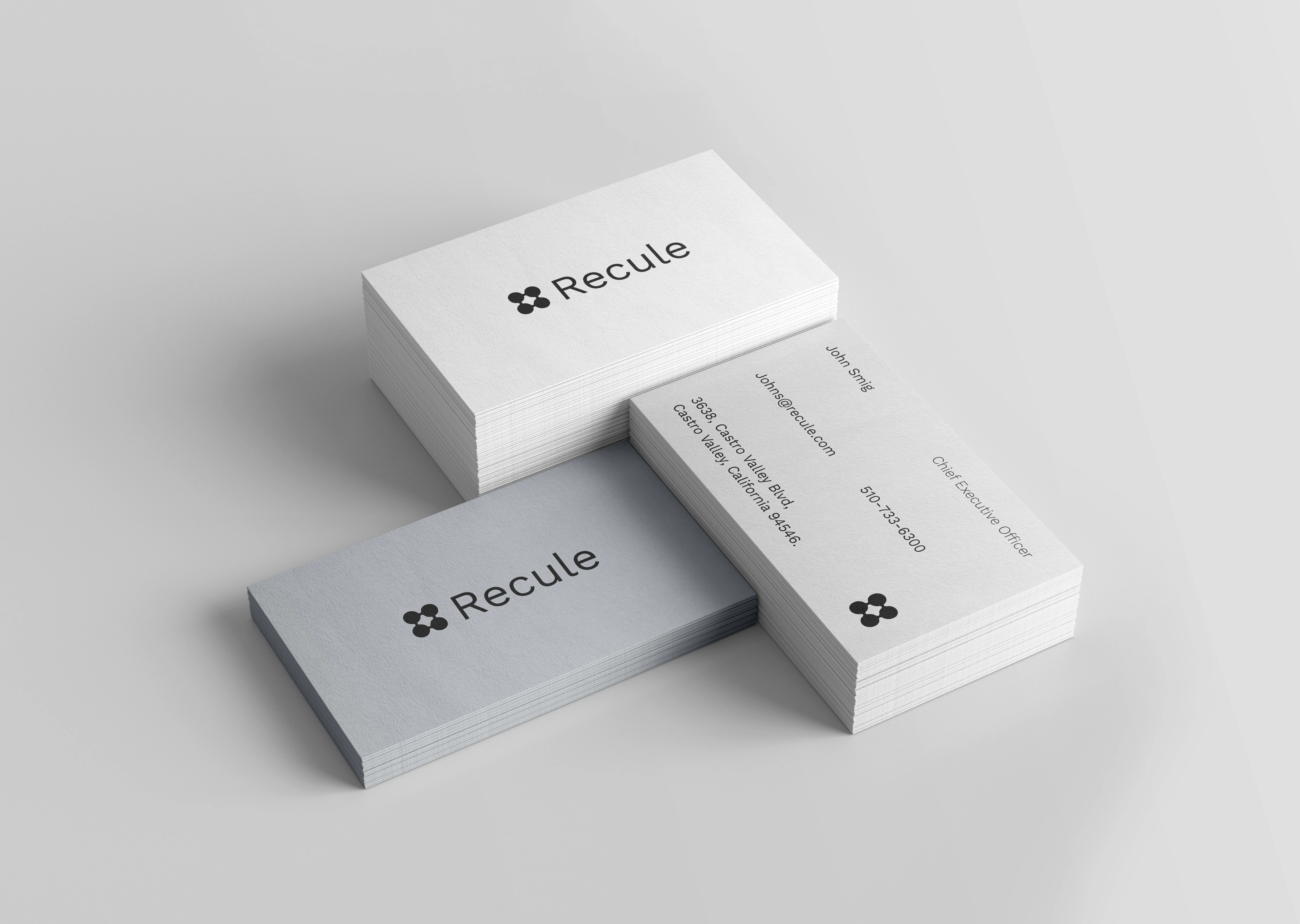
The logo stands as a pivotal anchor in this unfolding narrative. Crafted with four circles forming a molecular structure, the clever use of negative space forms a bold ‘+’, epitomizing Recule's design philosophy, clean yet contemporary. Beyond its apparent simplicity lies a profound representation, encapsulating stability, molecular innovation, and a foundation built on cutting-edge ideas.
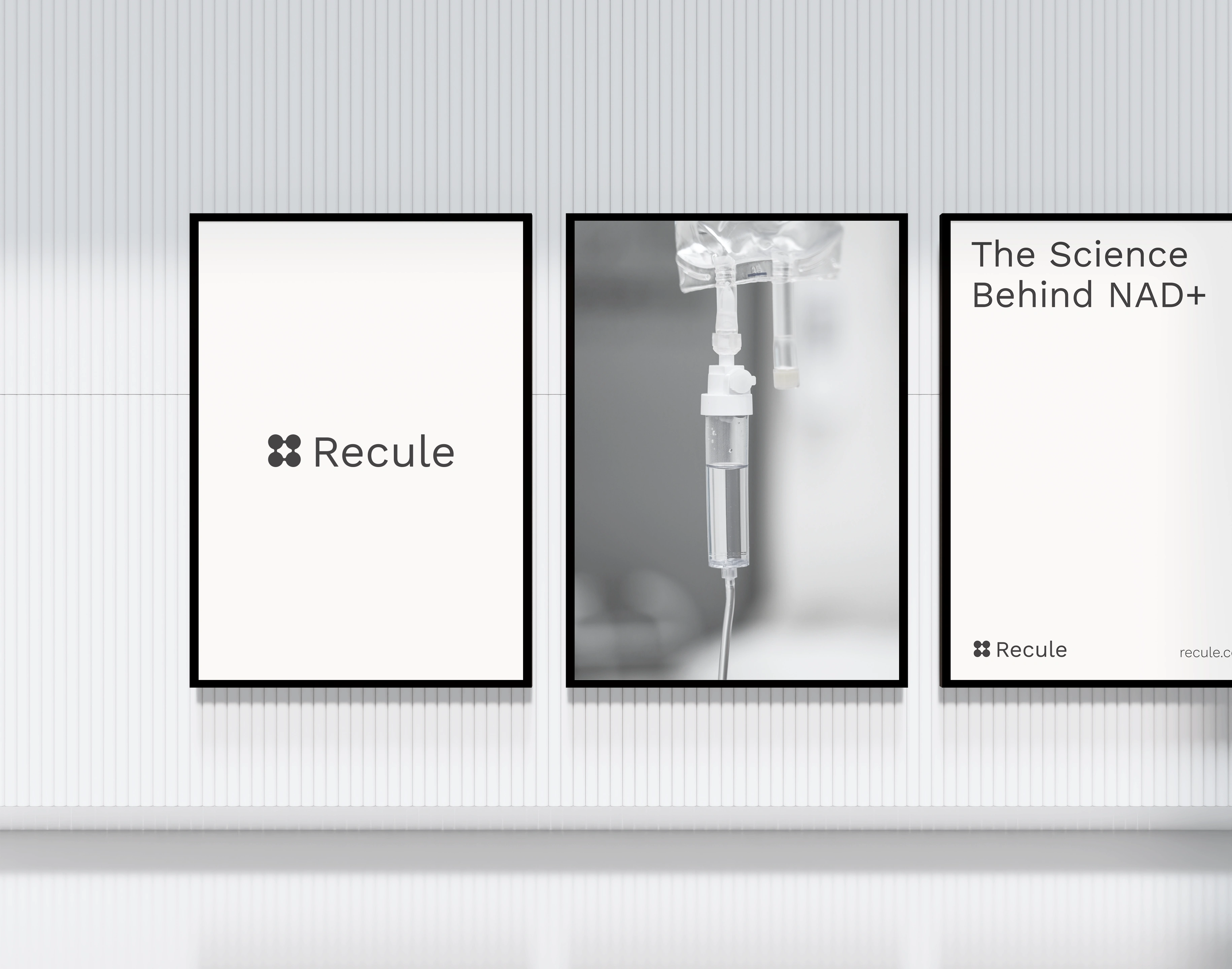
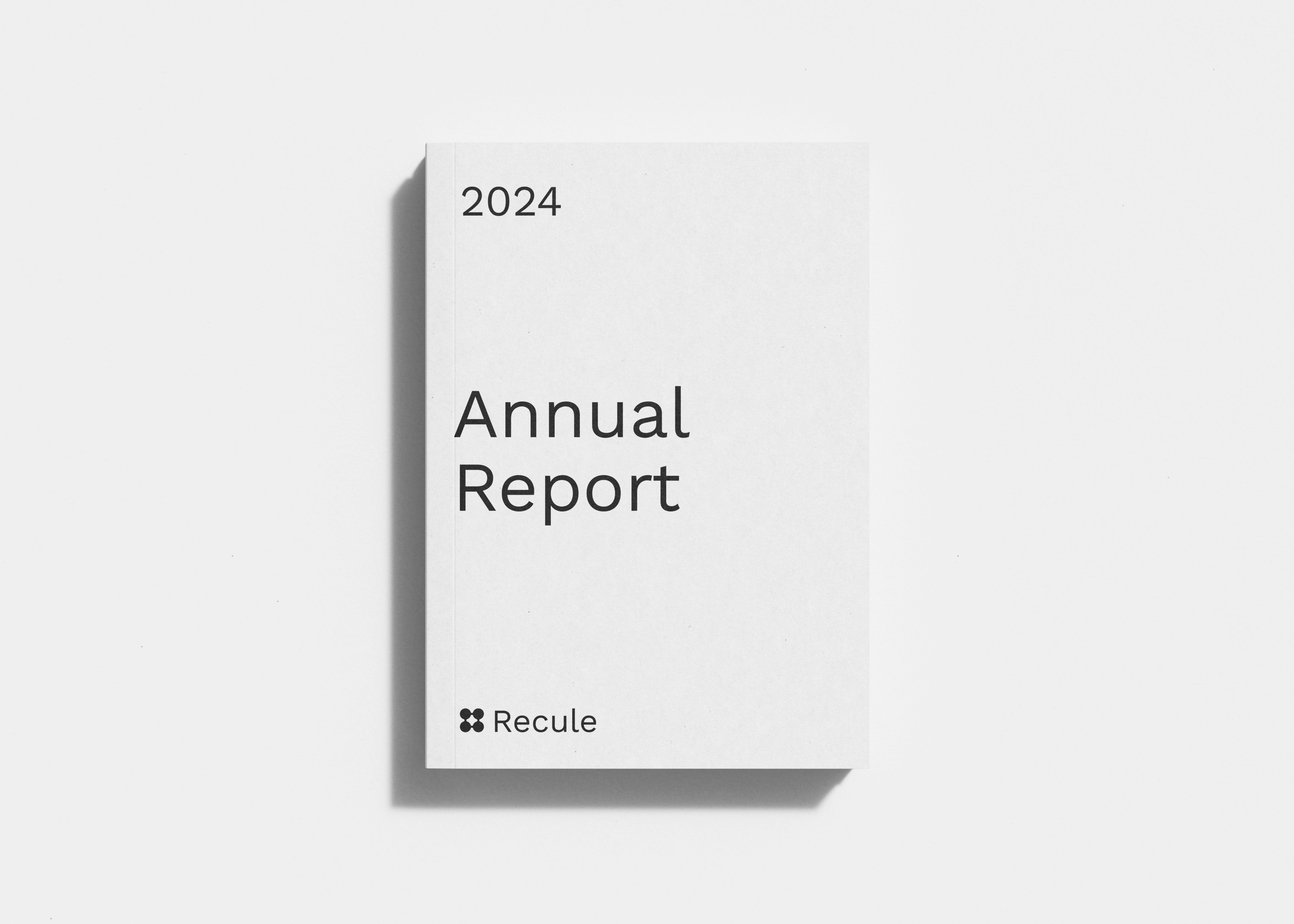
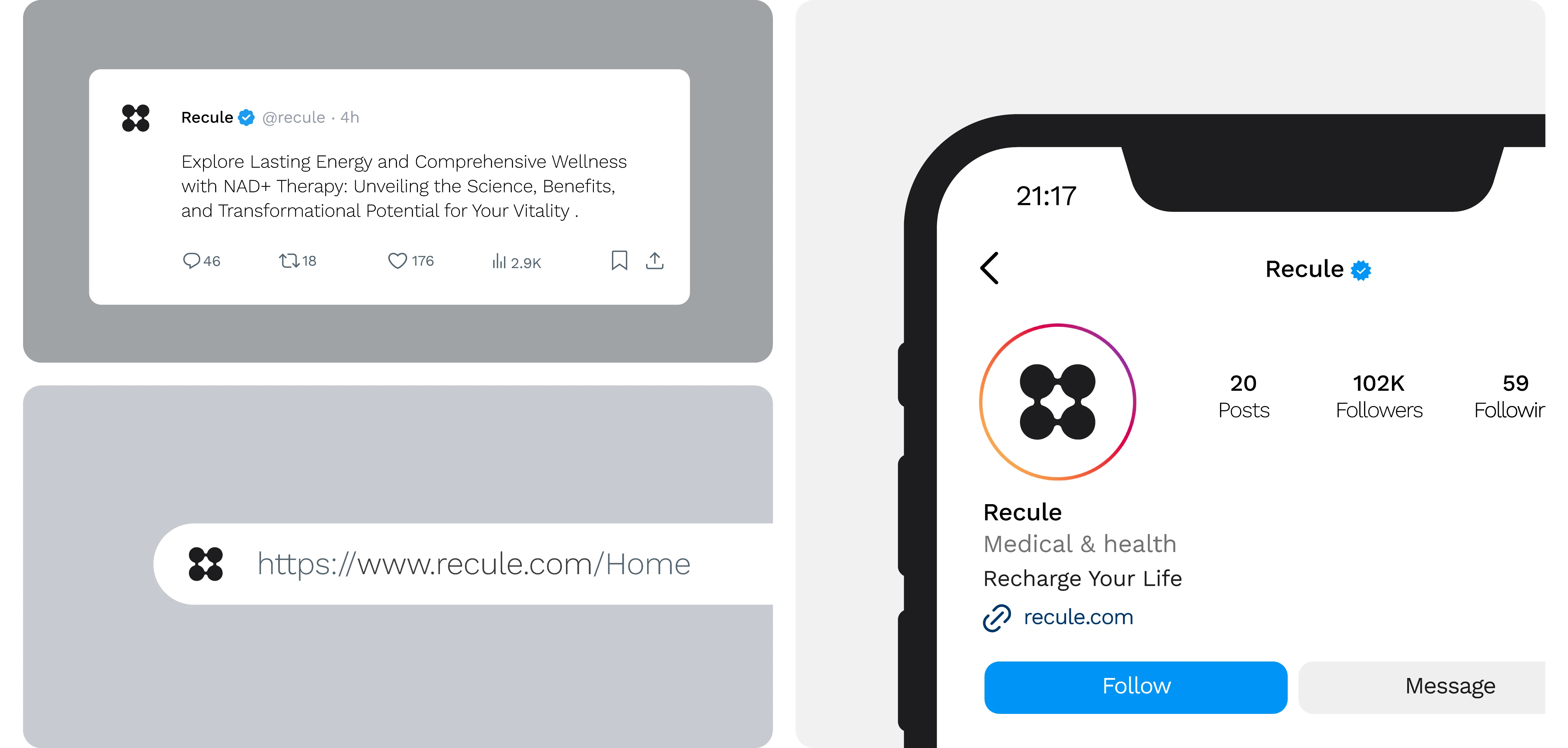
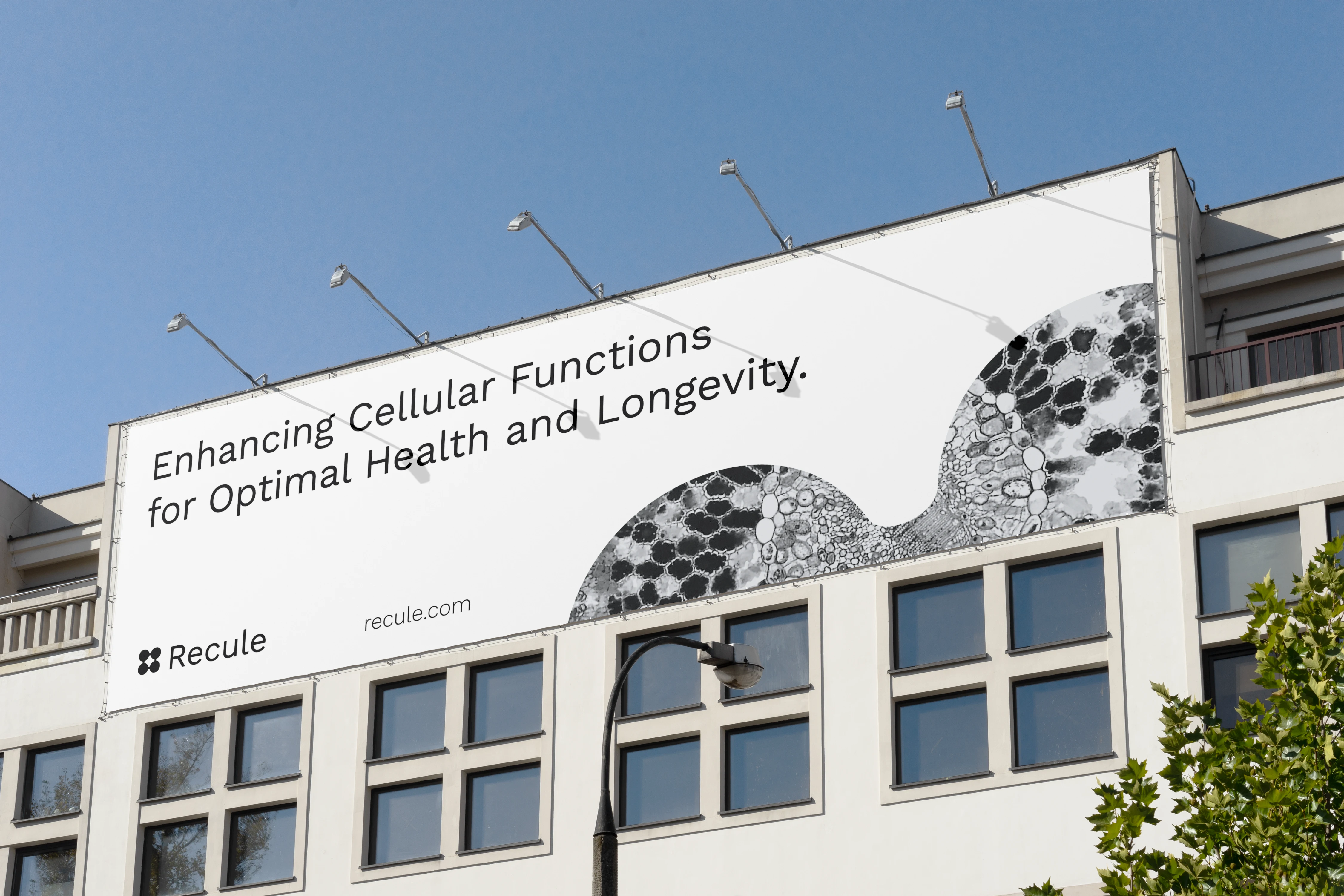
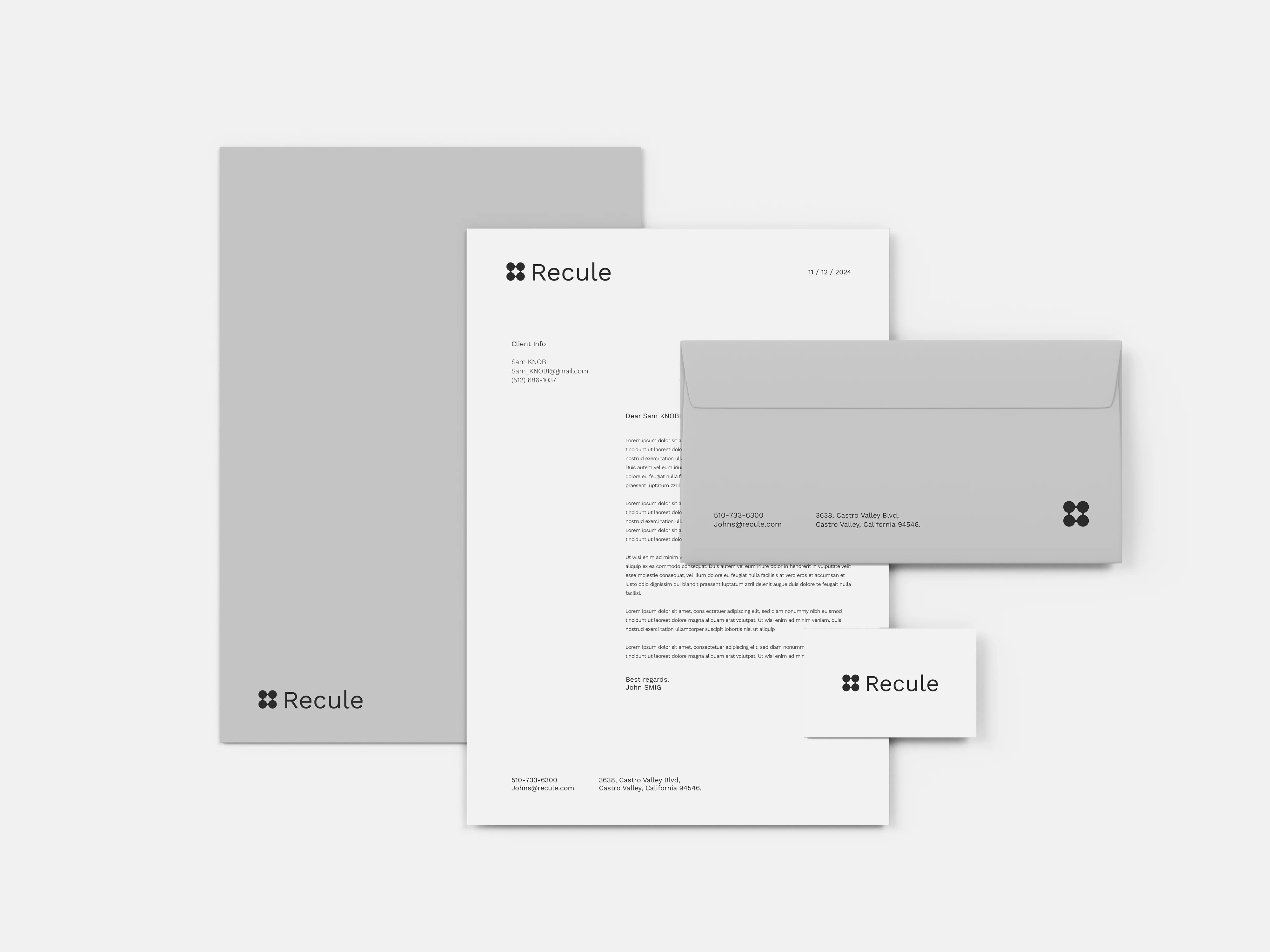

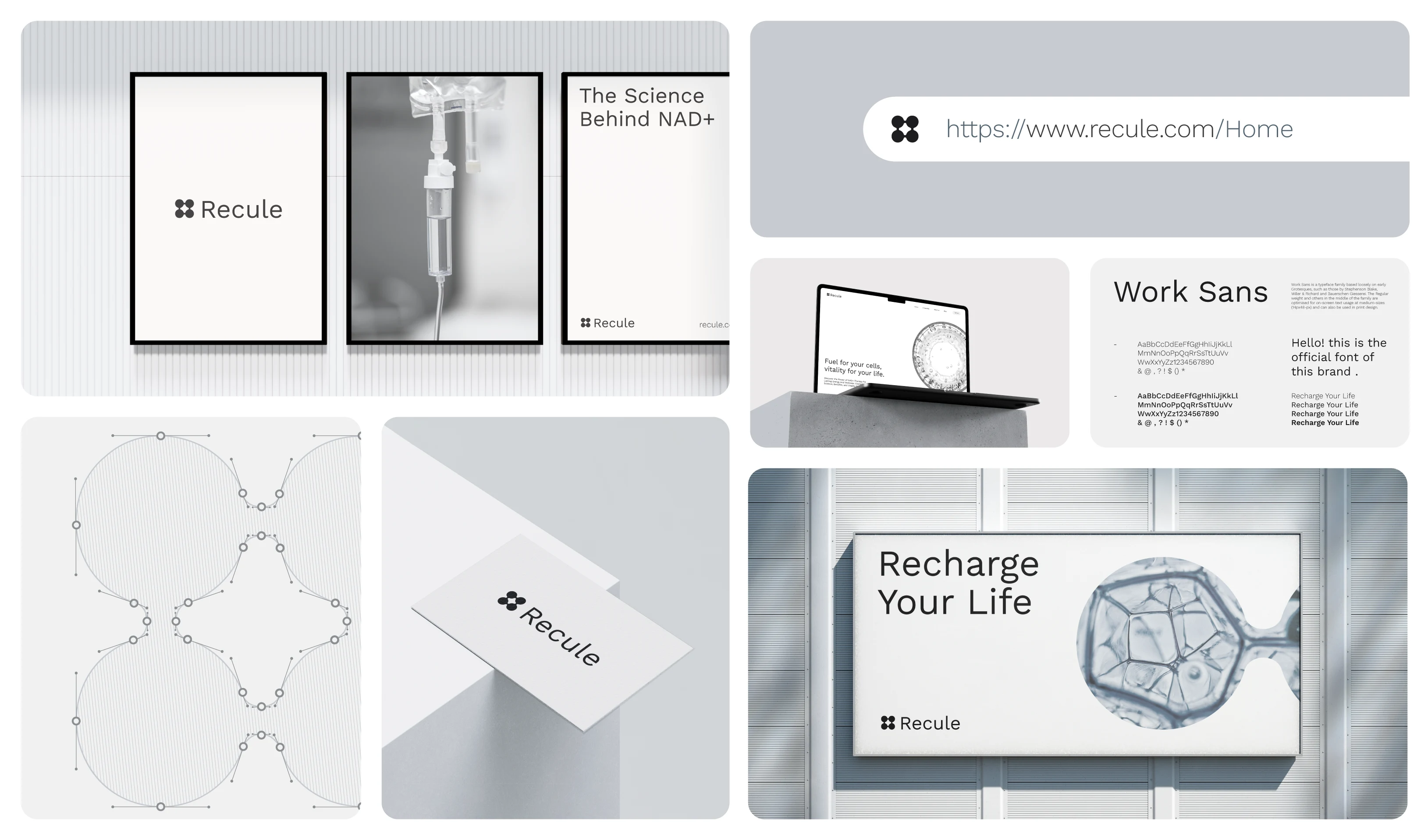
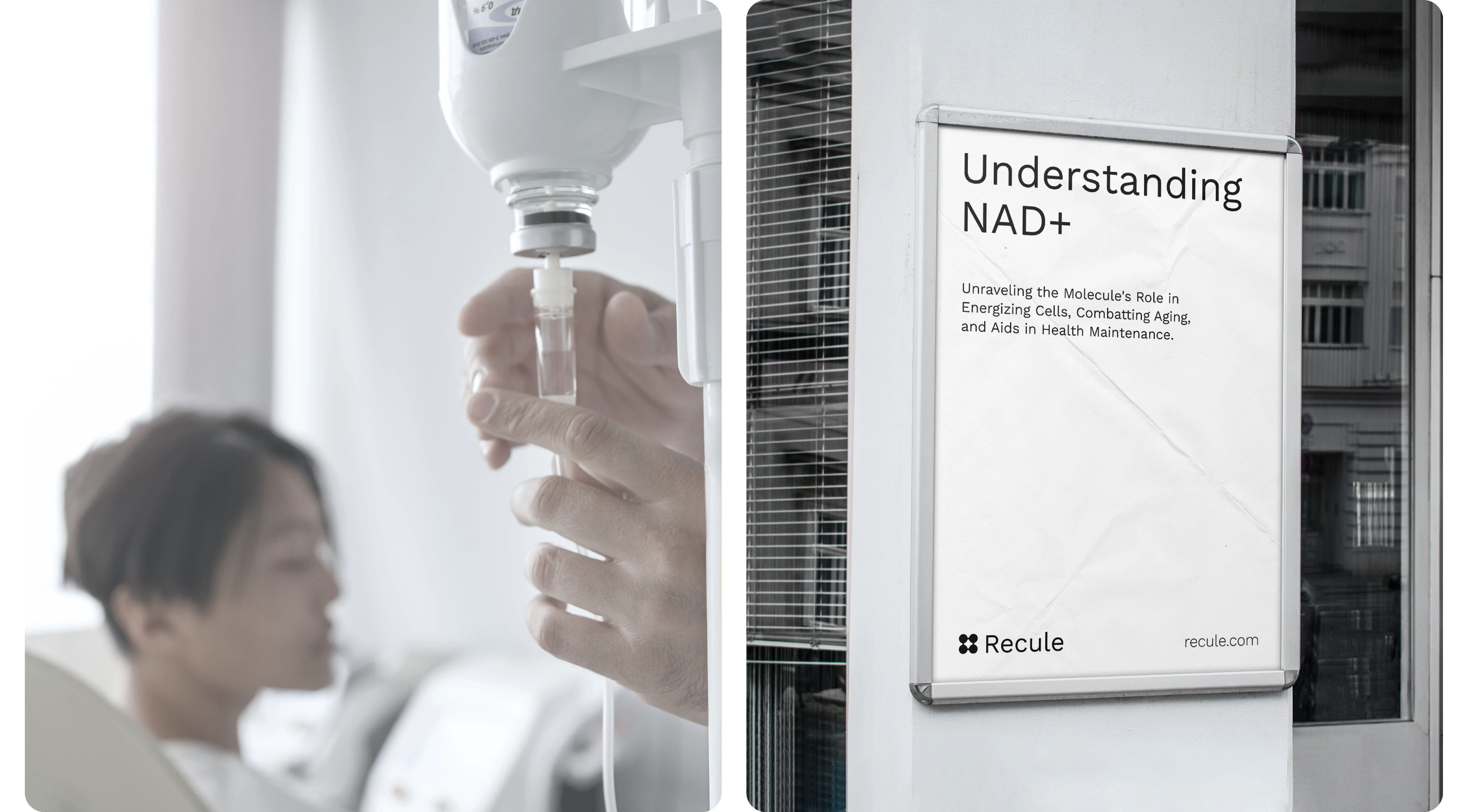
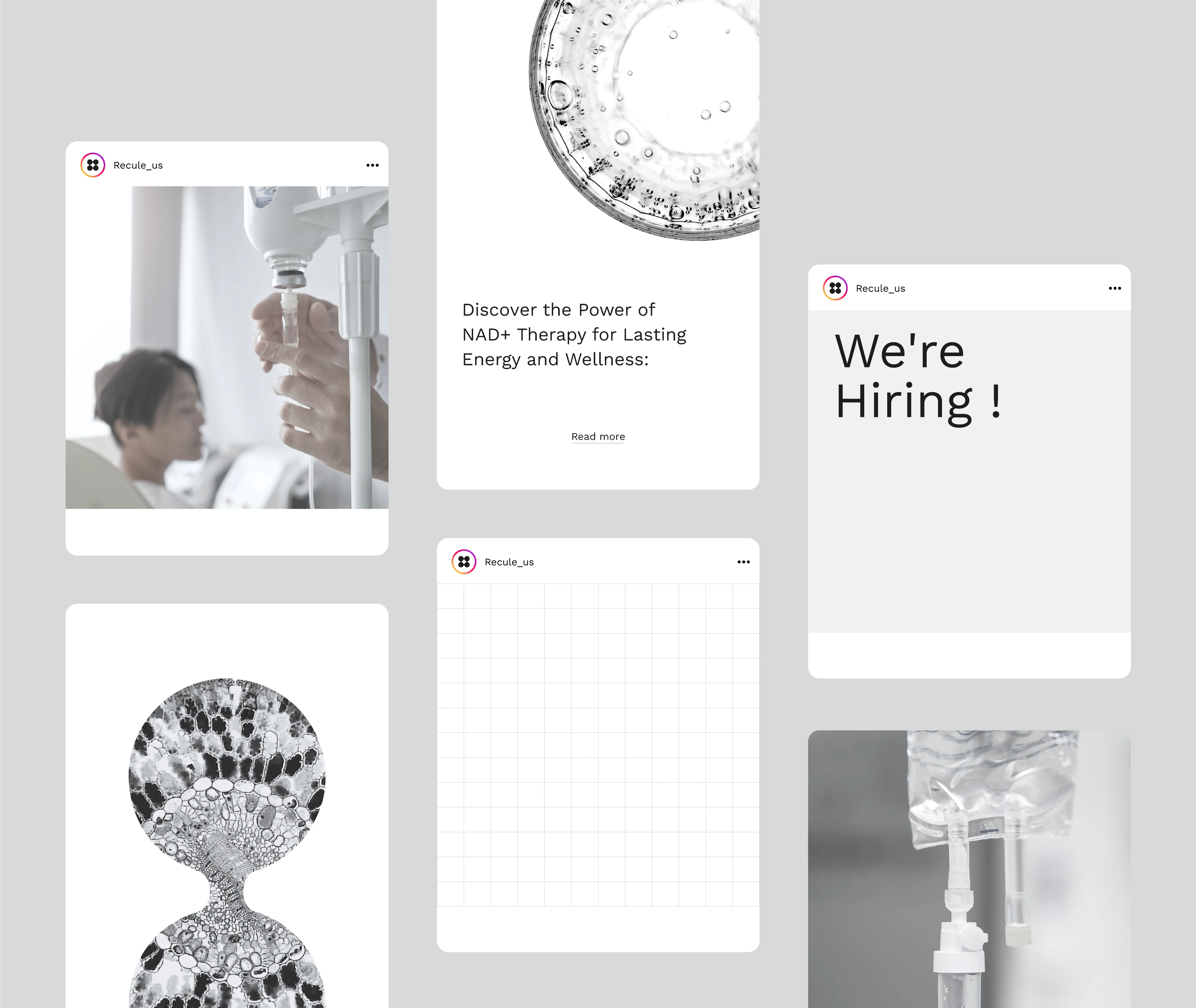
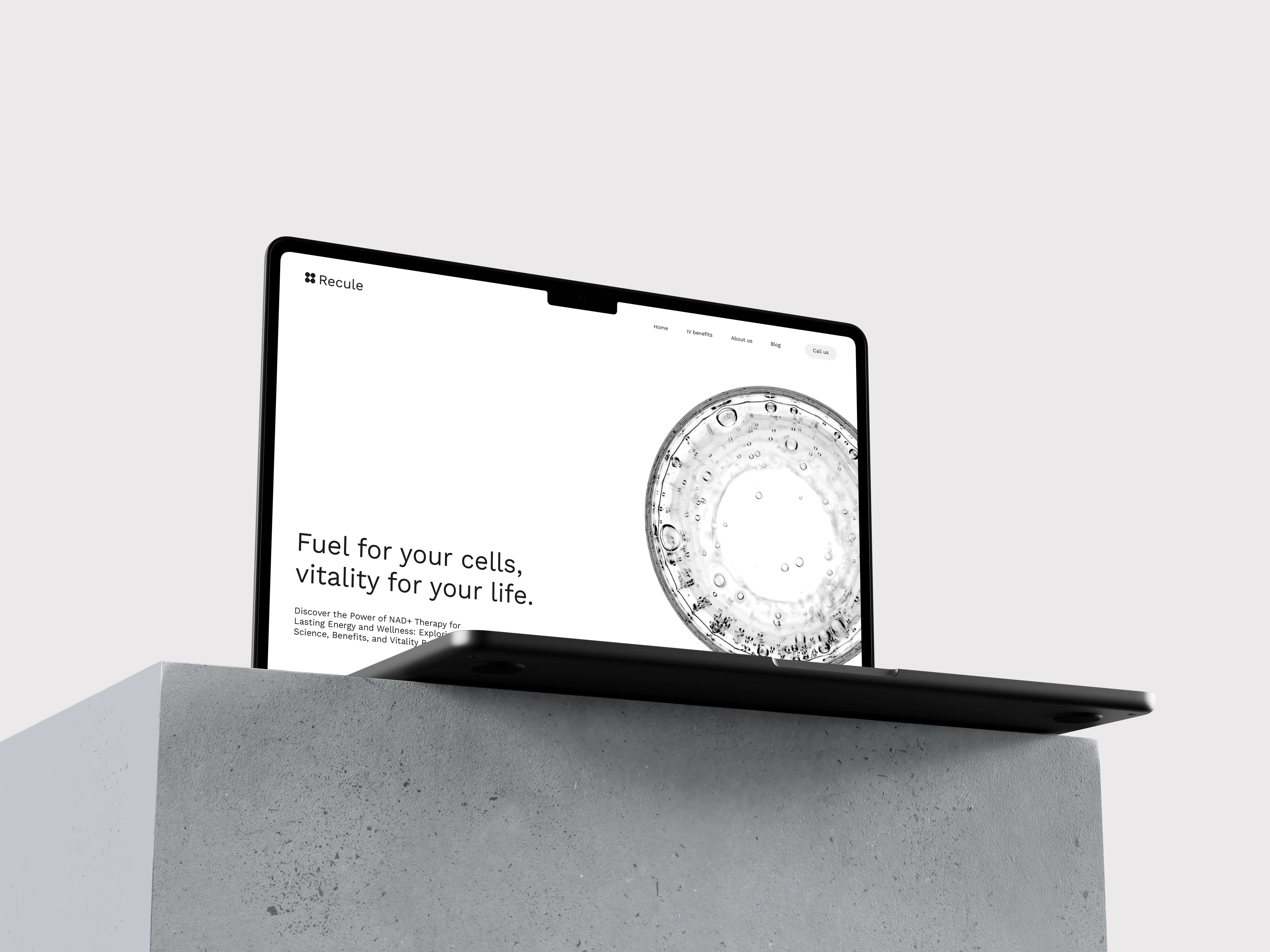
Recule's branding effort transcended traditional visual cues. It ventured into a vast array of collaterals, spanning both print and digital domains, each meticulously conceptualized and brought to life.
Designed by : Othmane SAMODI
Let's turn your vision into a powerful brand ↓
Get in touch with Us
Like this project
Posted Sep 26, 2026
Developed brand strategy and designed a molecular-inspired brand for Recule.
Likes
1
Views
1
Timeline
Jan 1, 2023 - Dec 31, 2023