Casa Coco | Beach Bar | Brand Identity
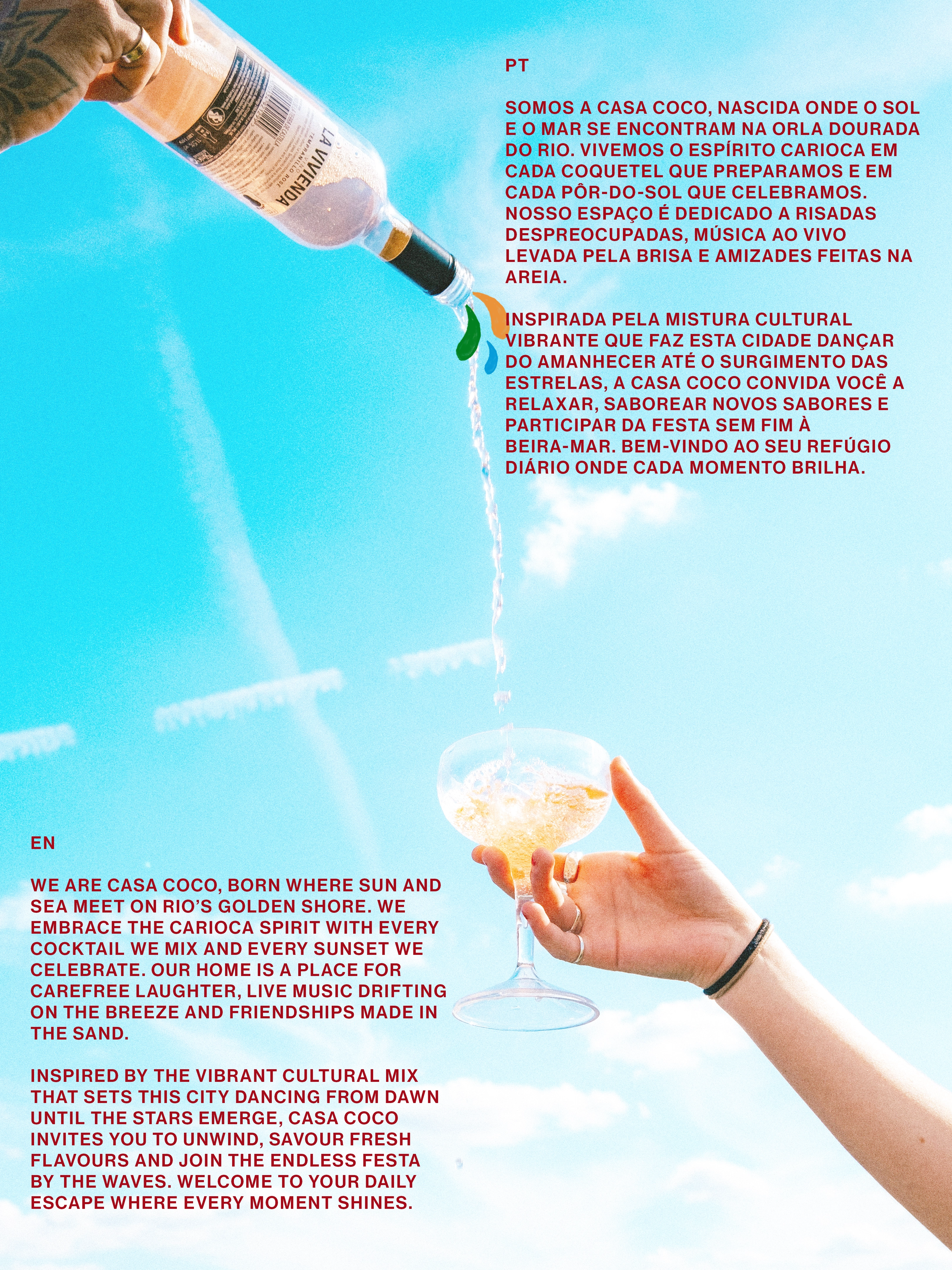
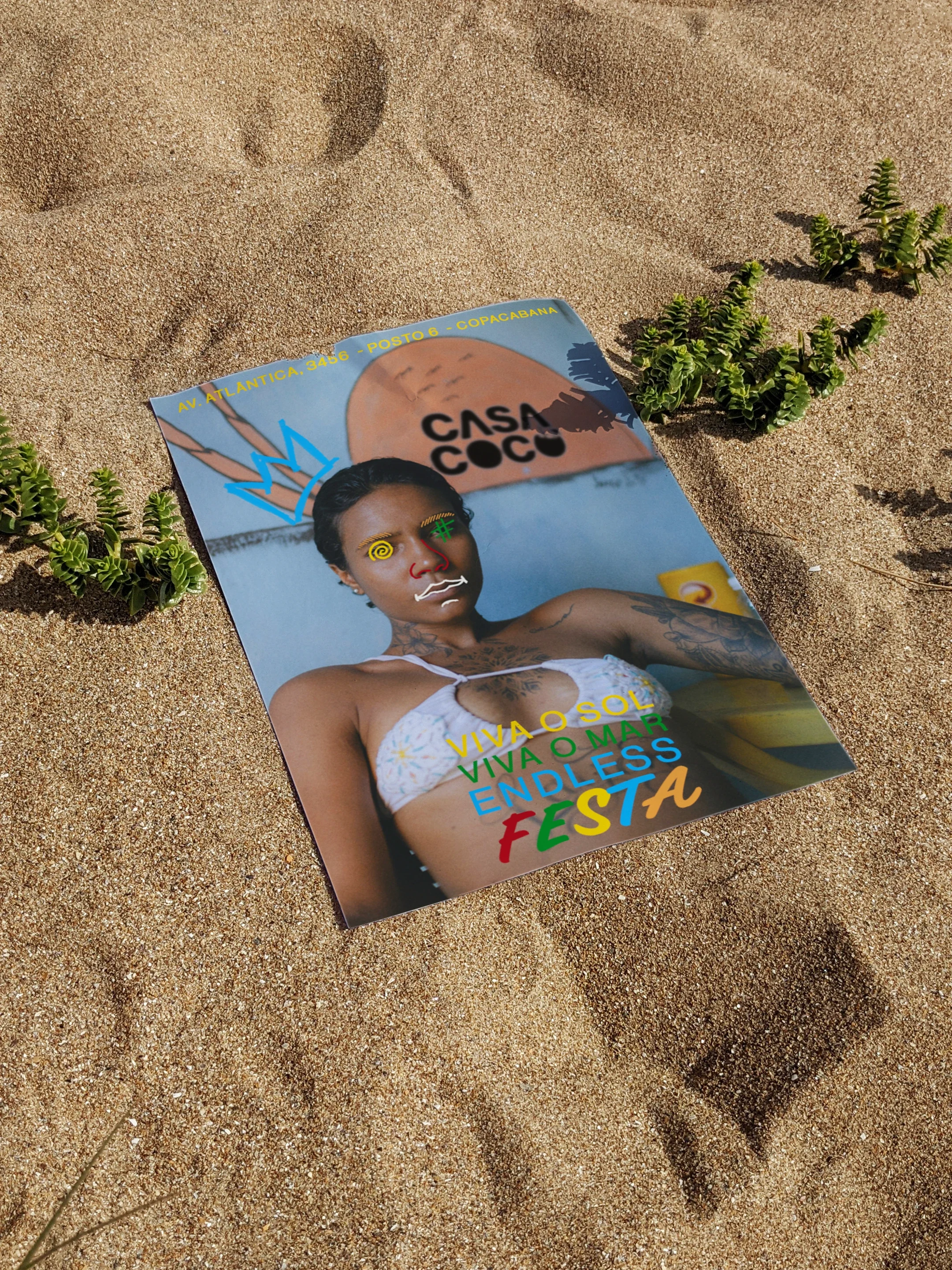
For this brand identity, I created a moodboard inspired by Rio’s vibrant, relaxed and rich culture.
Research uncovered challenges of gentrification in Rio de Janeiro, particularly in the Port Region and favelas with ongoing issues surrounding community displacement and urban development. With this in mind, I landed on a wordmark that not only stands out but speaks to Rio’s heart and its commitment to community.

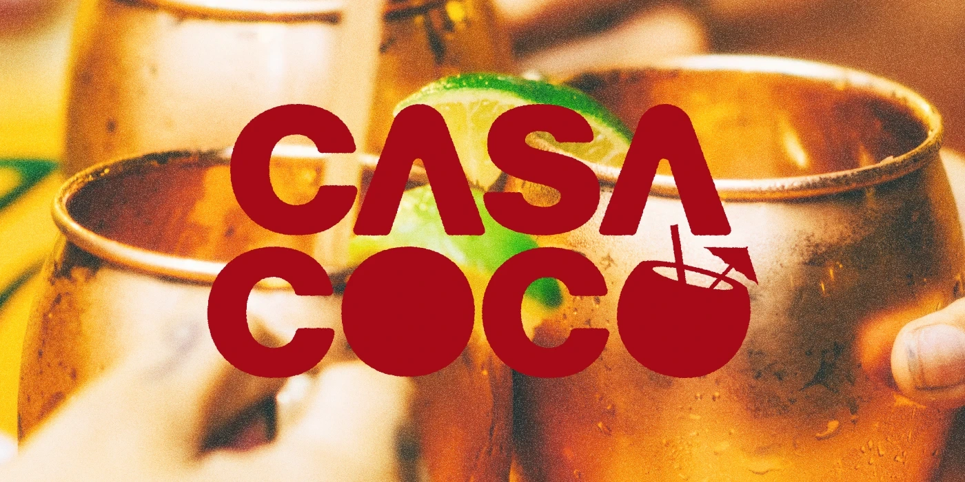
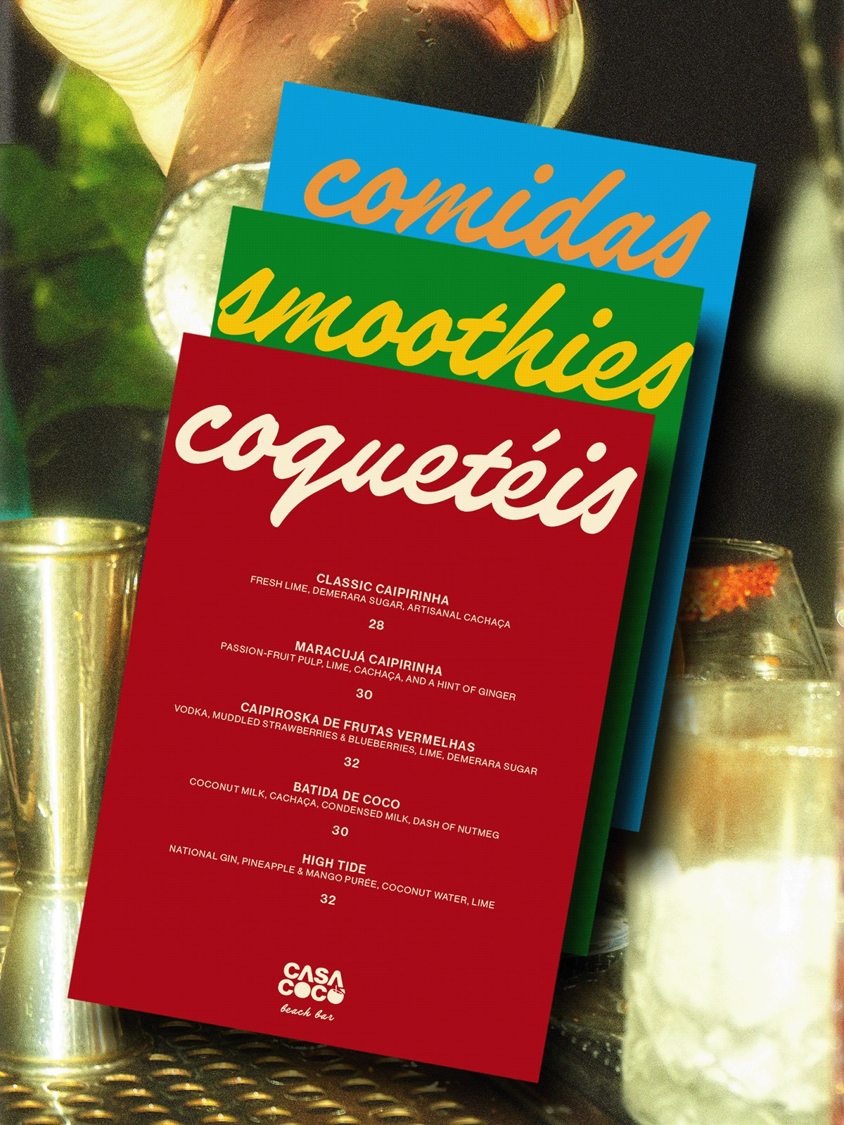
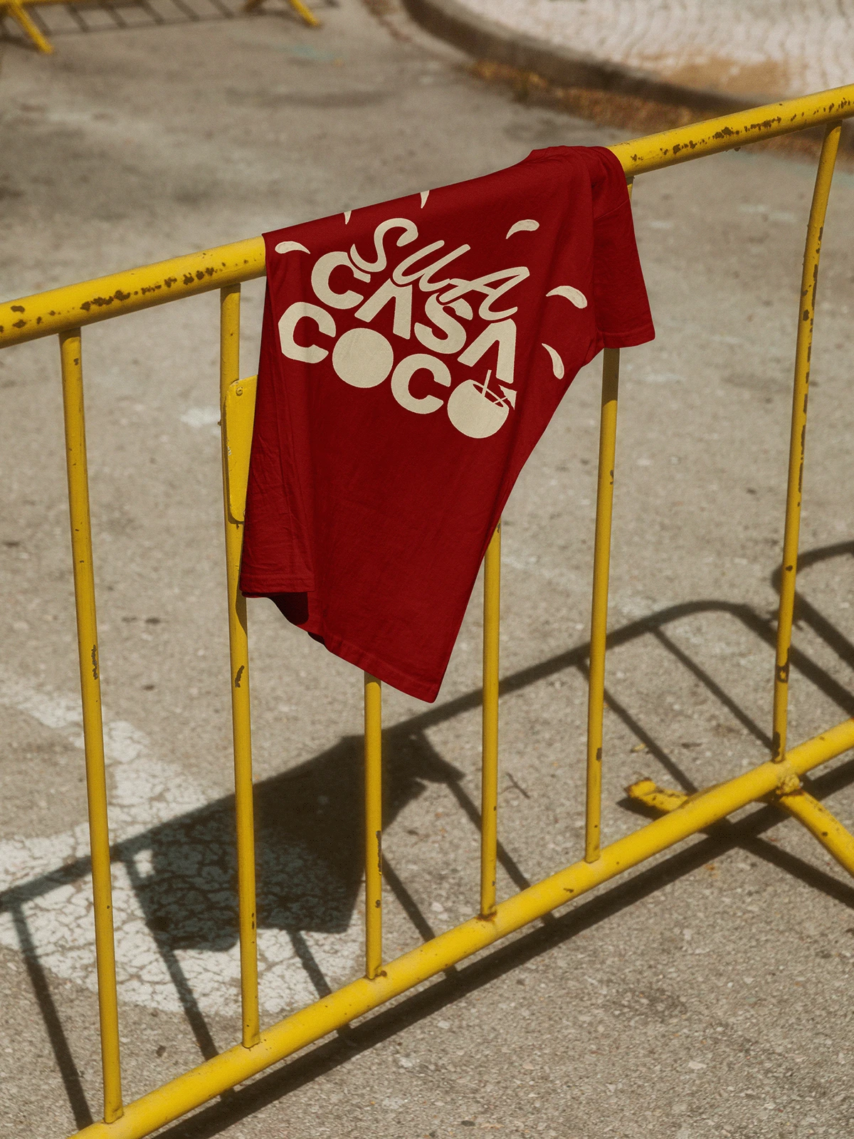
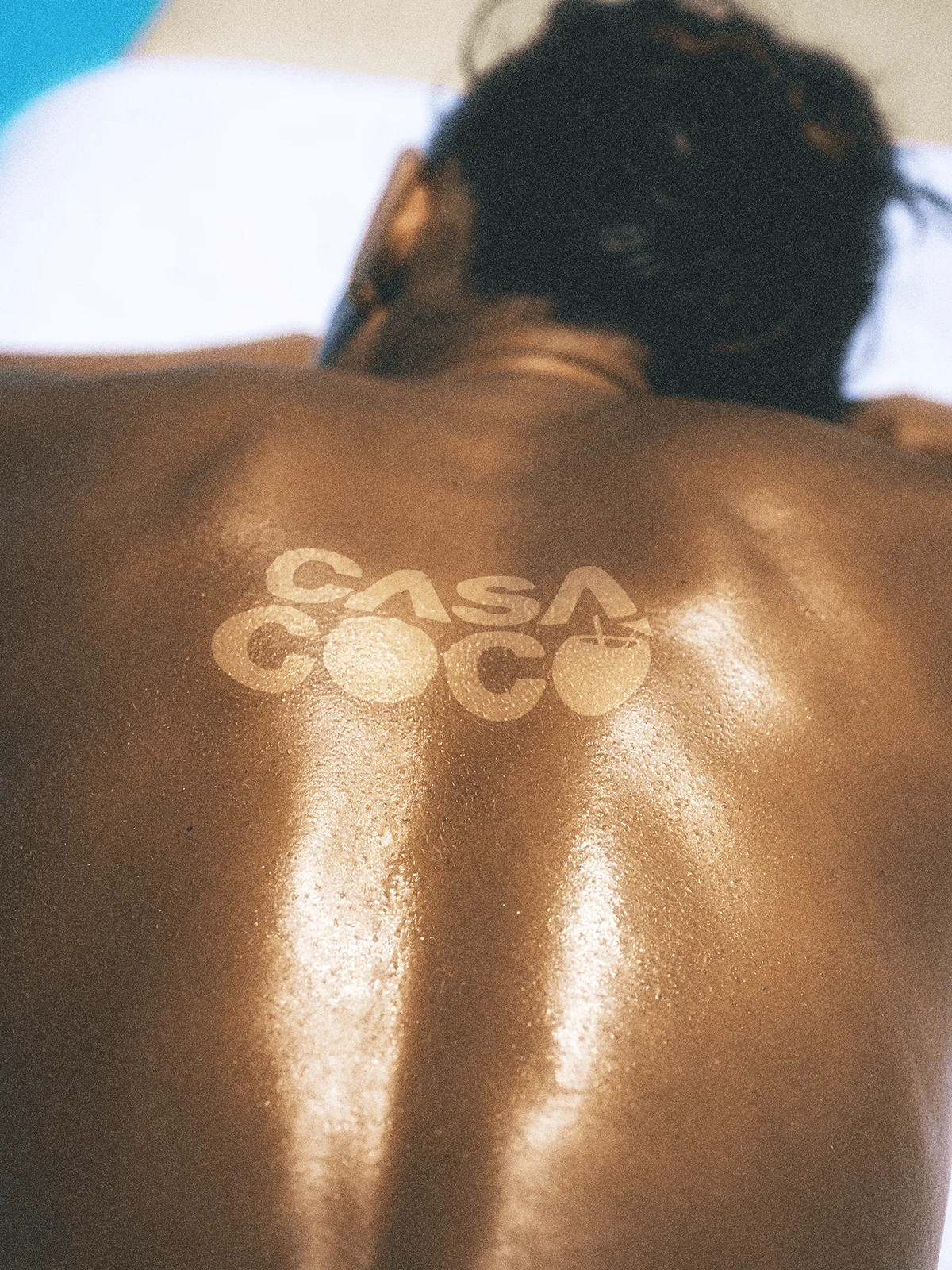
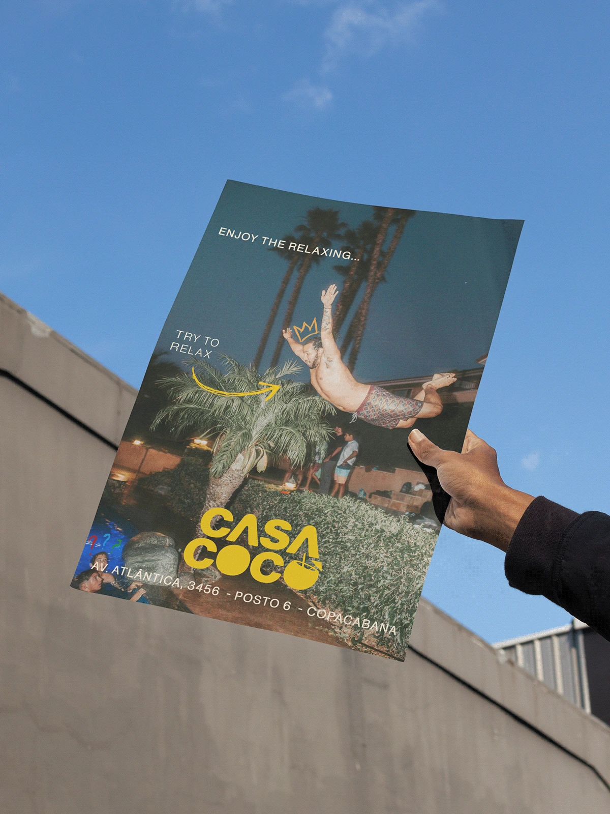
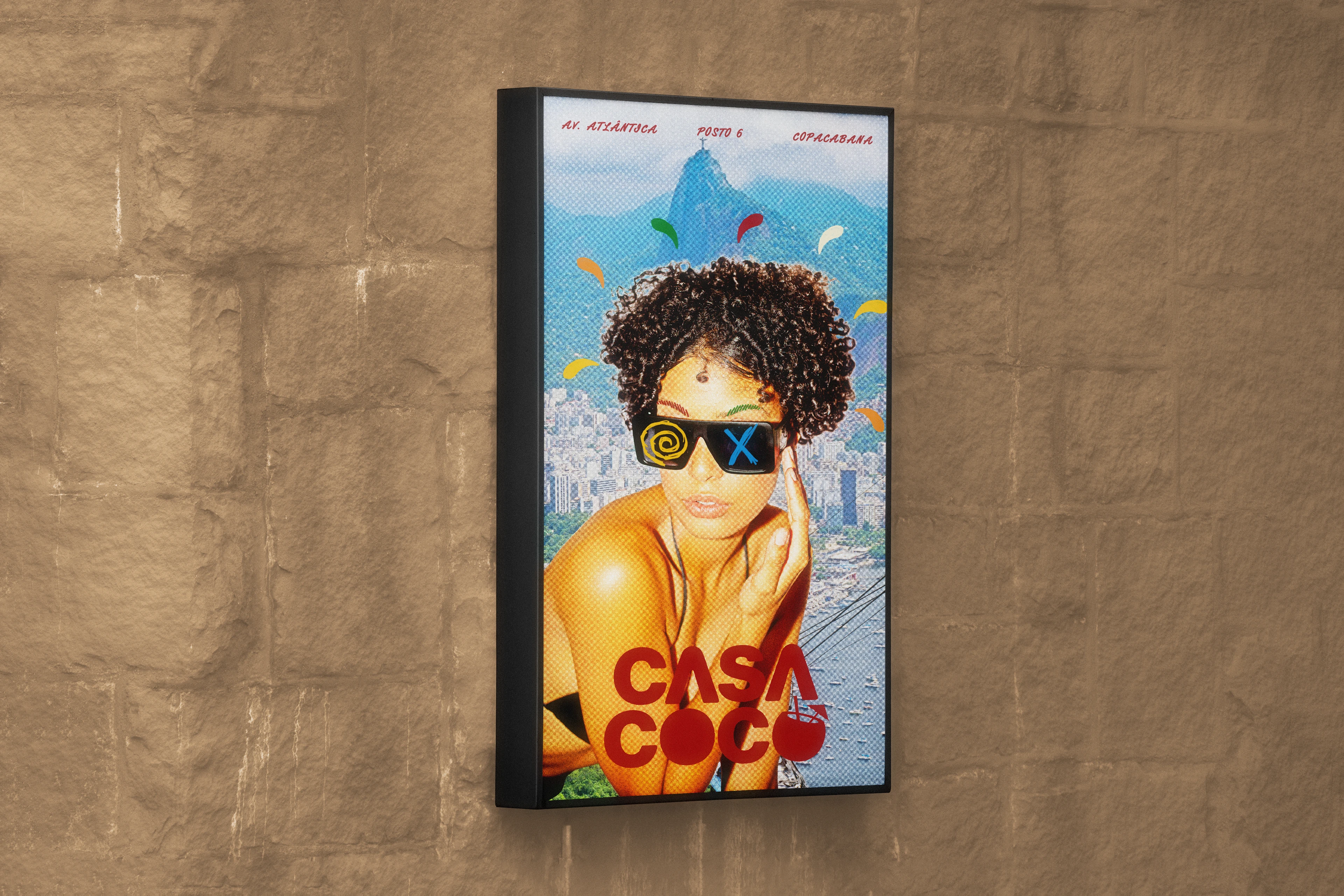
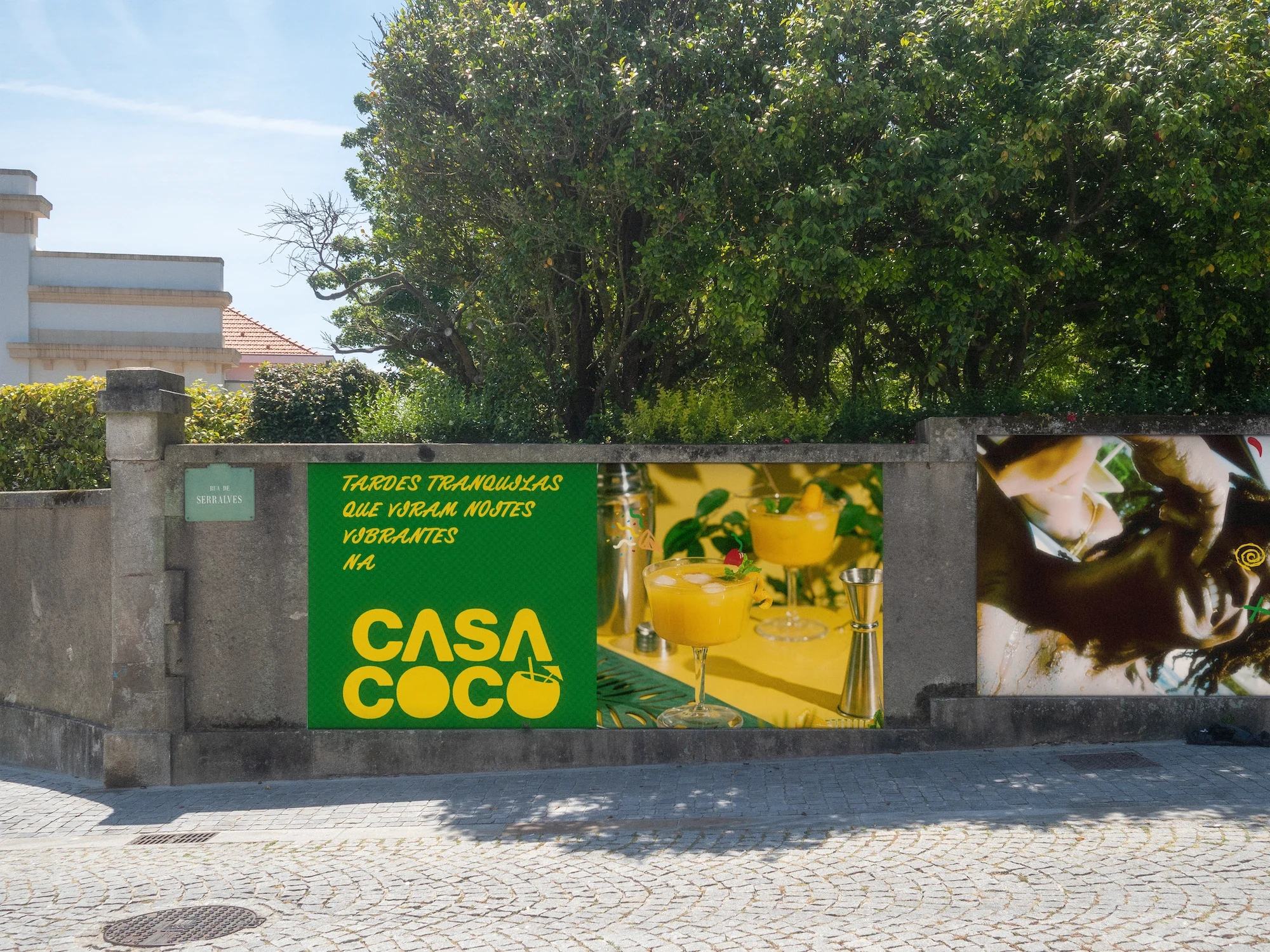
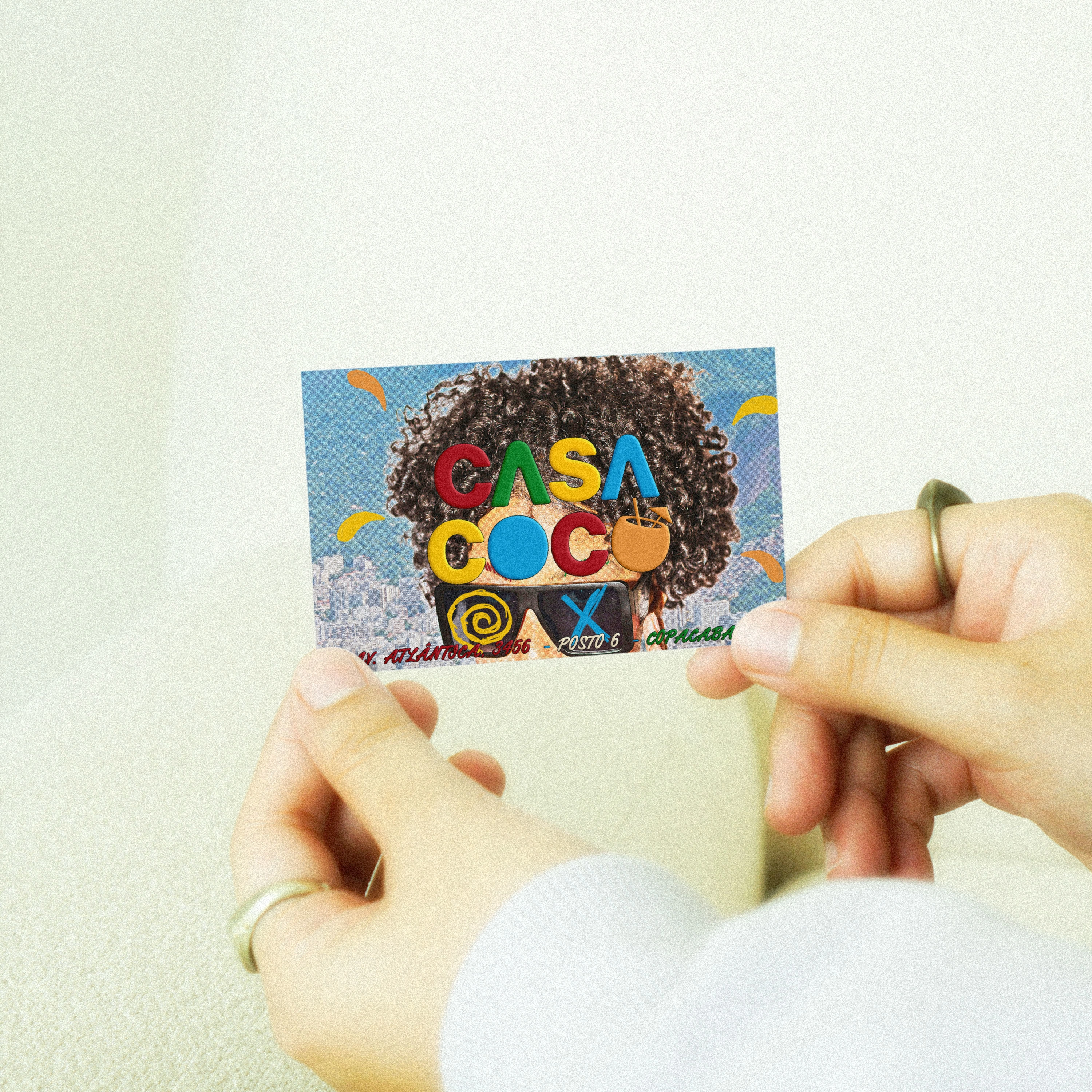
The wordmark features two crossbar-free “A”s echoing Mirante do Sacopã and Sugarloaf Mountain, set in a bold red that pulses with Rio’s energy.
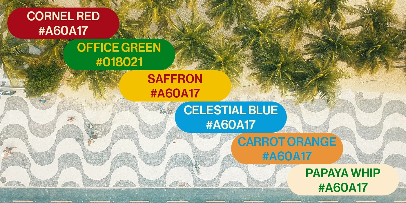
The colour palette connects with every aspect of the city:
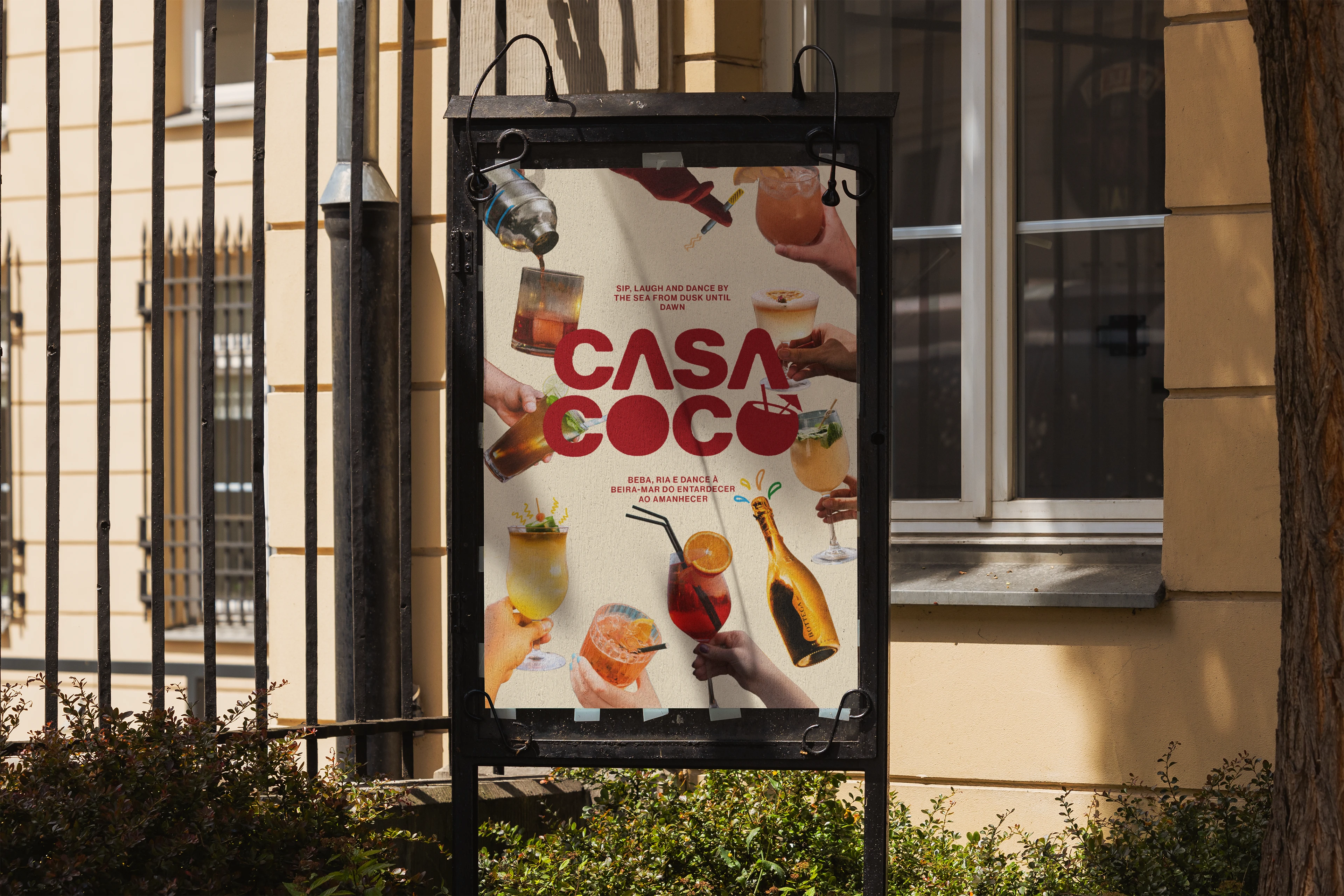
This identity is a tribute to Rio’s soul, a celebration of its landscapes, its people and the endless festa by the waves.
Feel Rio’s heartbeat in every detail.

Like this project
Posted Aug 7, 2025
Casa Coco, born where sun and sea meet on Rio's golden shore. Embrace the Carioca spirit with every cocktail mixed and every sunset celebrated.

