Building a visual identity that

Beby Triee


Building a visual identity that feels both established and approachable.
For this British School English Course project, I explored how a classic academic identity could be translated into a more cohesive and contemporary visual system.
The direction focuses on:
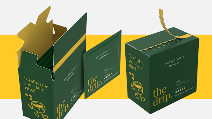
— A deep British green as the core brand color
— A refined and institutional visual language
— Consistent logo applications across apparel, stationery, and merchandise
— Editorial-inspired layouts for communication materials
— A balance between tradition, curiosity, and youthful energy
The goal was to create an identity that feels trustworthy enough for an educational institution, but engaging enough for young learners.
From the smallest logo placement on a uniform to the larger communication pieces, every touchpoint is designed to feel like part of the same brand world.
Designed to feel academic. Built to feel curious.
#BrandIdentity #BrandDesign #VisualIdentity #GraphicDesign #CreativeDirection #Branding #EducationBranding #Designer
Like this project
Posted Sep 11, 2026
Building a visual identity that feels both established and approachable. For this British School English Course project, I explored how a classic academic id...
Likes
0
Views
0