Stillmere | Visual Identity

Alex Robertson


Stillmere | Visual Identity
Stillmere began with a deep discovery phase. Before any sketches or naming routes, we unpacked how the client saw himself, his industry, and the frustrations surrounding it.
A series of key words surfaced repeatedly.
• Jigsaw, problem solving.
• Scalpel, precision.
• Positive.
• Fluid, workflow and process.
• Technical, nerdy, a genuine passion for software and the craft of engineering itself.
One comment carried particular weight. There is a stigma that engineers create problems rather than solve them, and that perception shaped everything that followed.
When reviewing competitors, the pattern was clear. Drab palettes, stock imagery of flooding, crisis-led narratives. The tone felt reactive and heavy, reinforcing the very perception the client wanted to move away from. The opportunity was not to ignore the subject matter, but to reframe it.
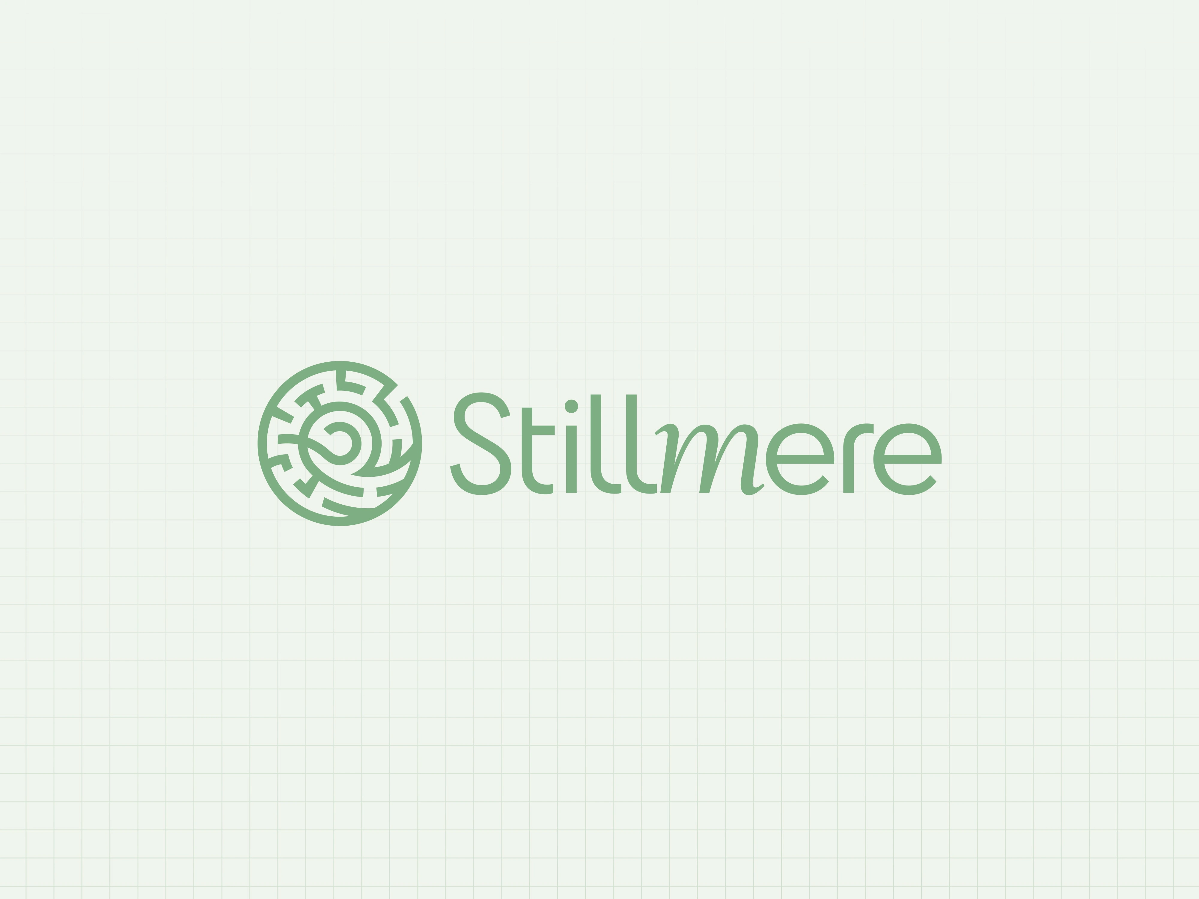
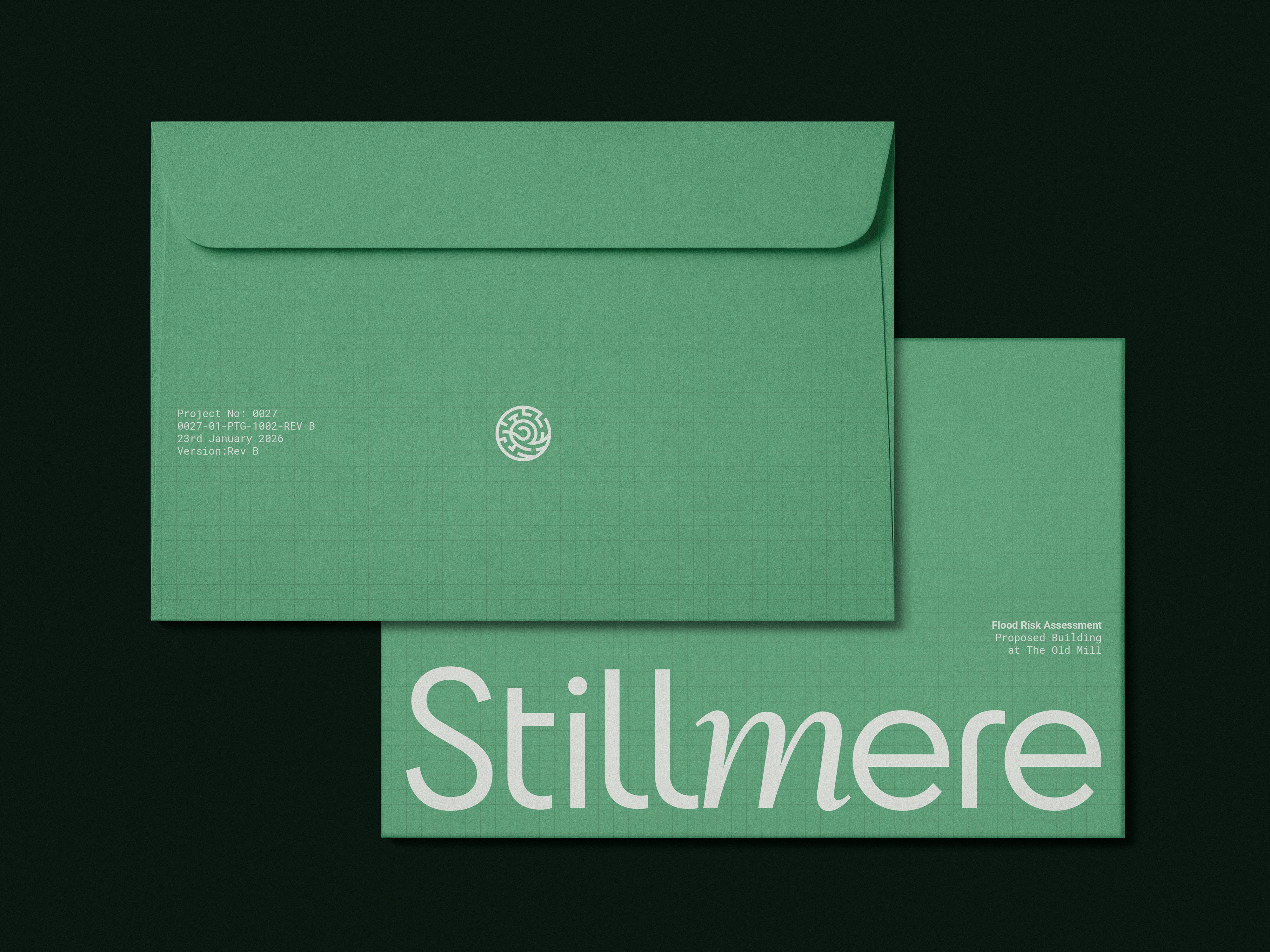
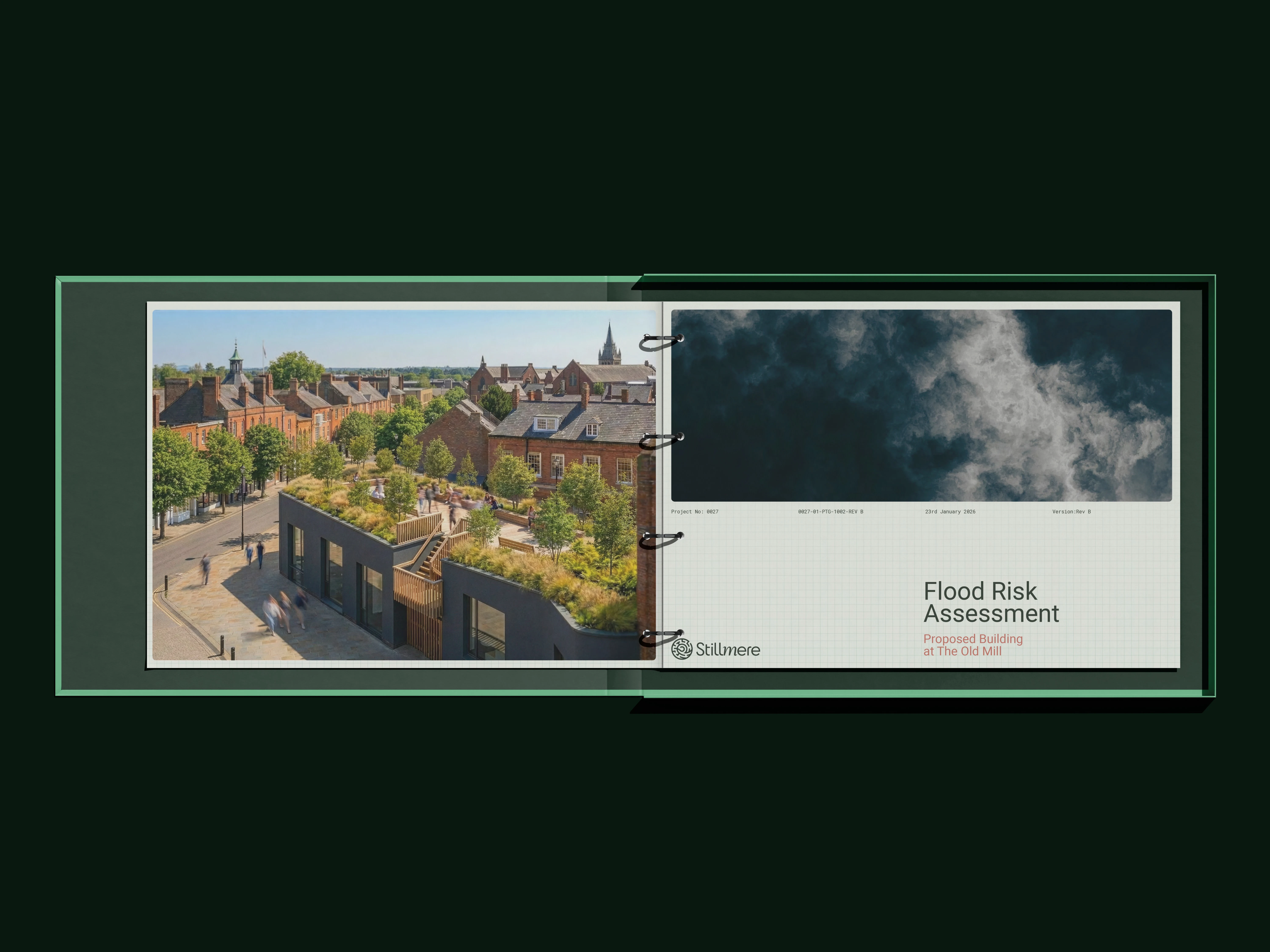
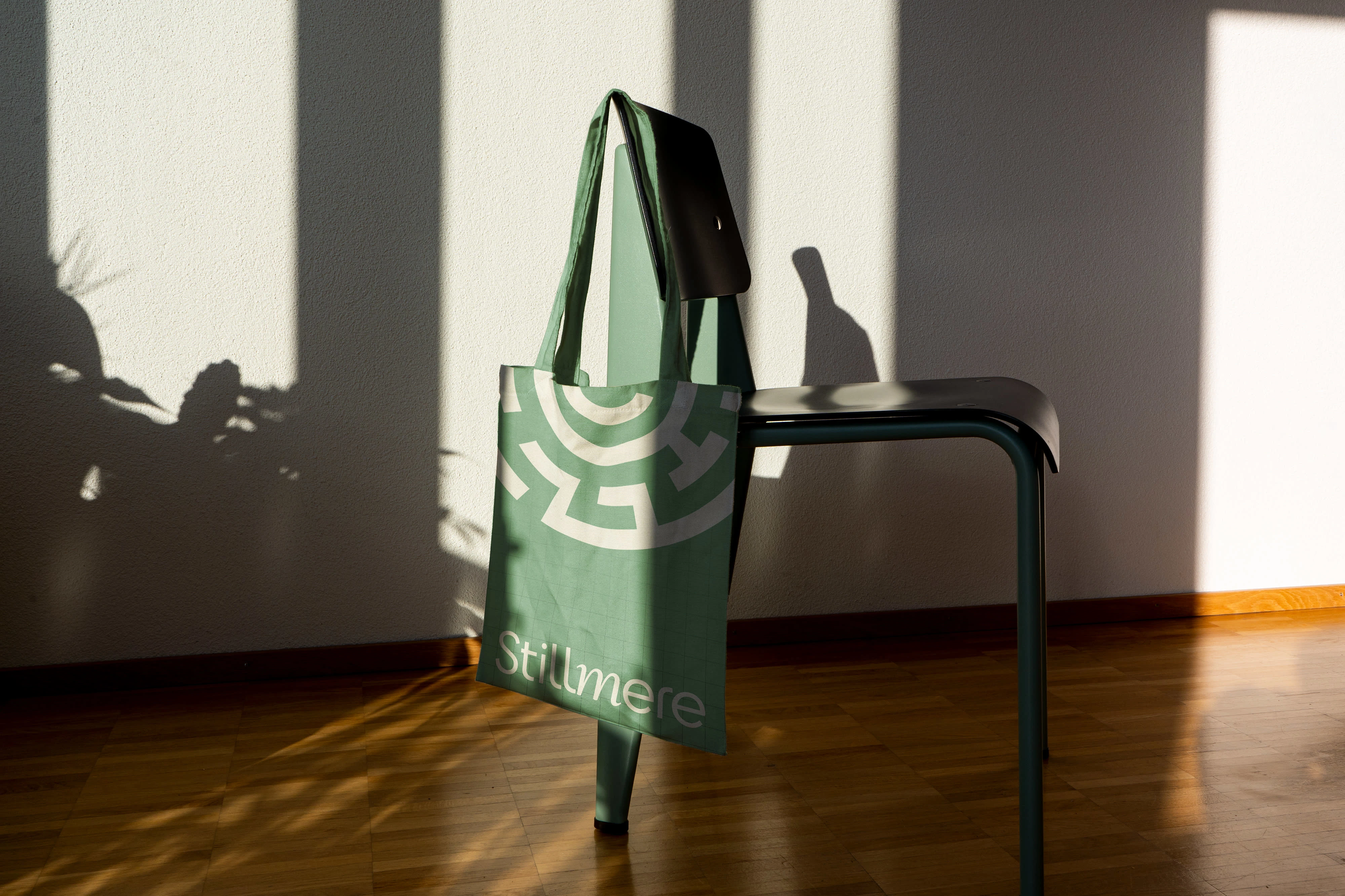
The name Stillmere emerged from this shift in perspective. In a sector associated with overflow and emergency, still water suggests calm, balance, and control. It positions the consultancy as measured and solution-led before a single visual is seen.
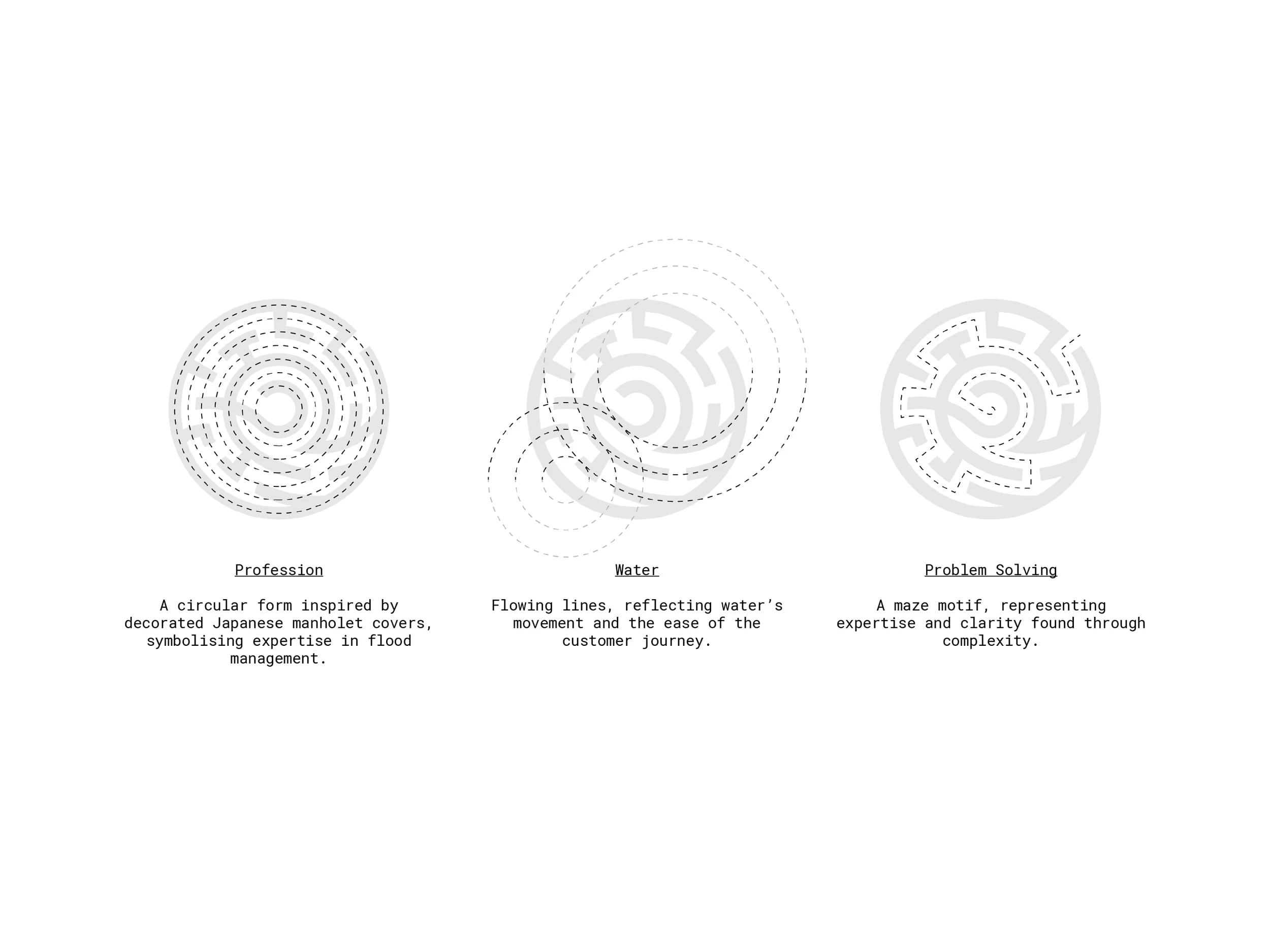
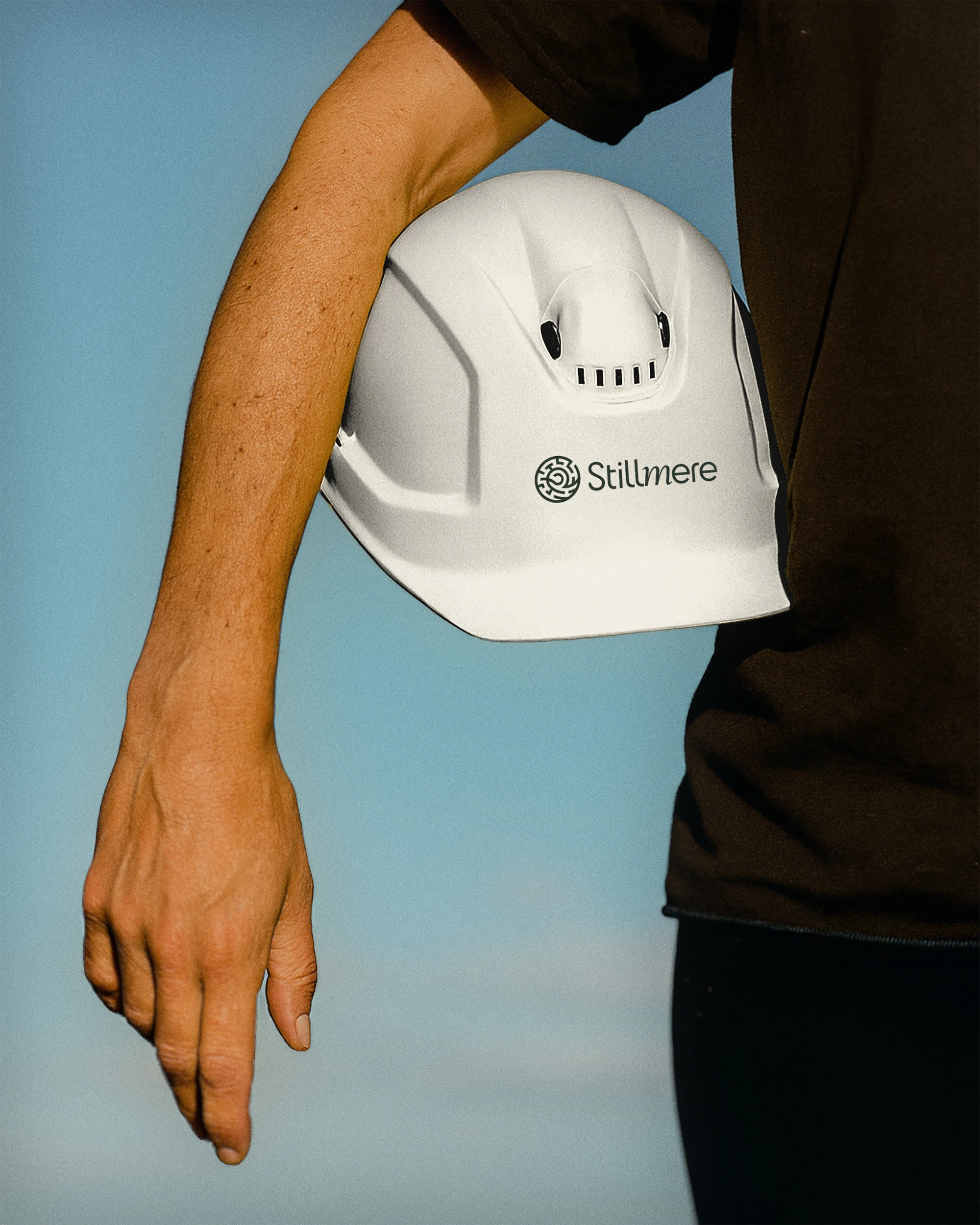
The logo builds directly from those discovery words.
At its core sits a maze-like structure, echoing the idea of a jigsaw. Flood risk and drainage design involves navigating regulations, site constraints, and fixed boundaries. The maze represents moving methodically through complexity with logic and patience.
A subtle flowing form moves through the structure, representing both water and fluid workflow. Water is not shown as a threat, but as something controlled and considered. Rain can exist within the brand world, but always positively framed as part of a managed system.
Encasing the mark is a circular decorative form inspired by Japanese manhole covers, everyday infrastructure elevated through craft. It anchors the identity in the profession while avoiding predictable clichés.
The precision of the geometry nods to the scalpel. The structured symmetry reflects technical capability and a love of the software behind the work. Together, the naming and identity reposition engineering as calm, capable, and quietly confident.
Like this project
Posted Mar 2, 2026
Naming, logo, visual identity and website design for Stillmere, a civil engineering consultancy specialising in flood risk, drainage, and training.
Likes
0
Views
3
Timeline
Sep 2, 2025 - Oct 7, 2025