Signalworks | Logo Design (Concept)
Alex Robertson
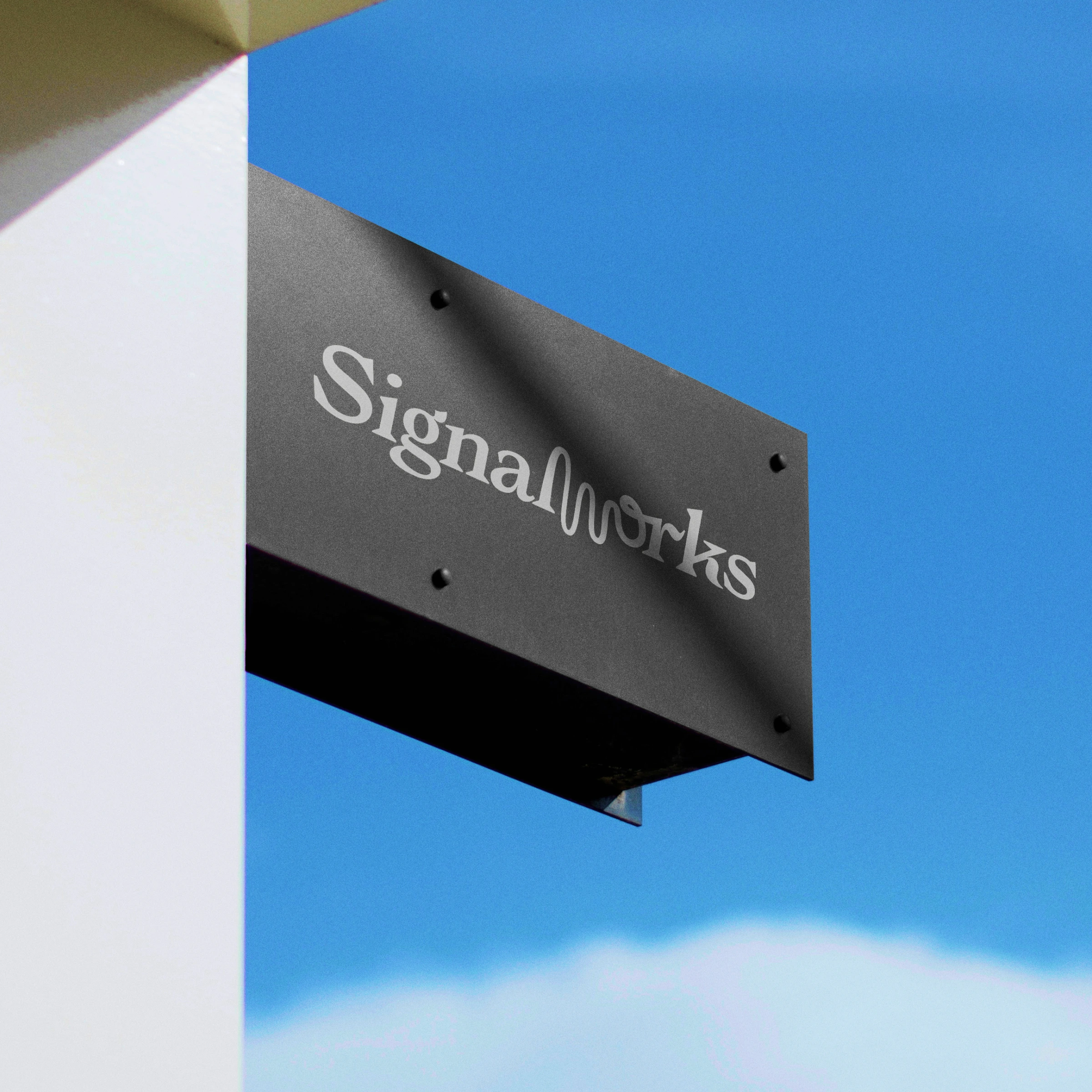
Signalworks | Logo design & visual direction
This was a fun little concept project I put together between actual client projects. Yep. When I'm not designing, I'm designing 🤓.
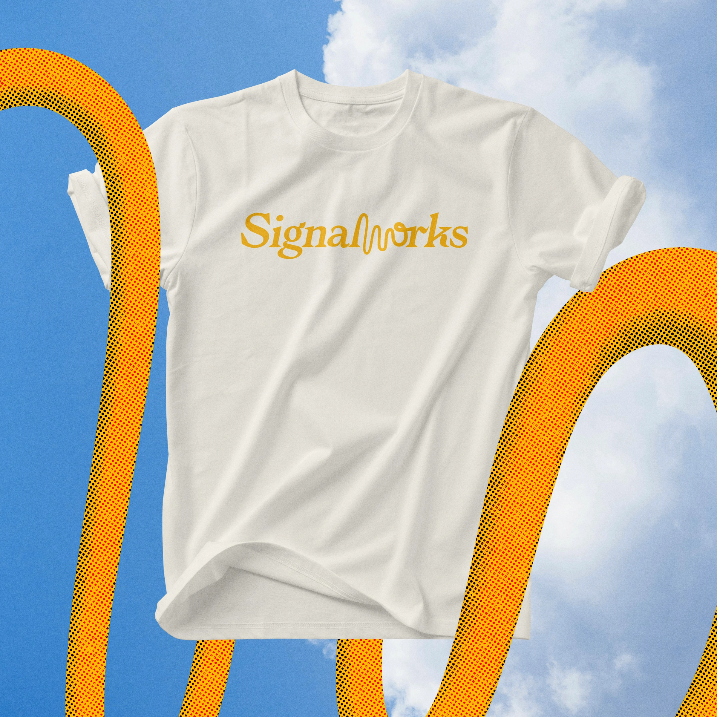
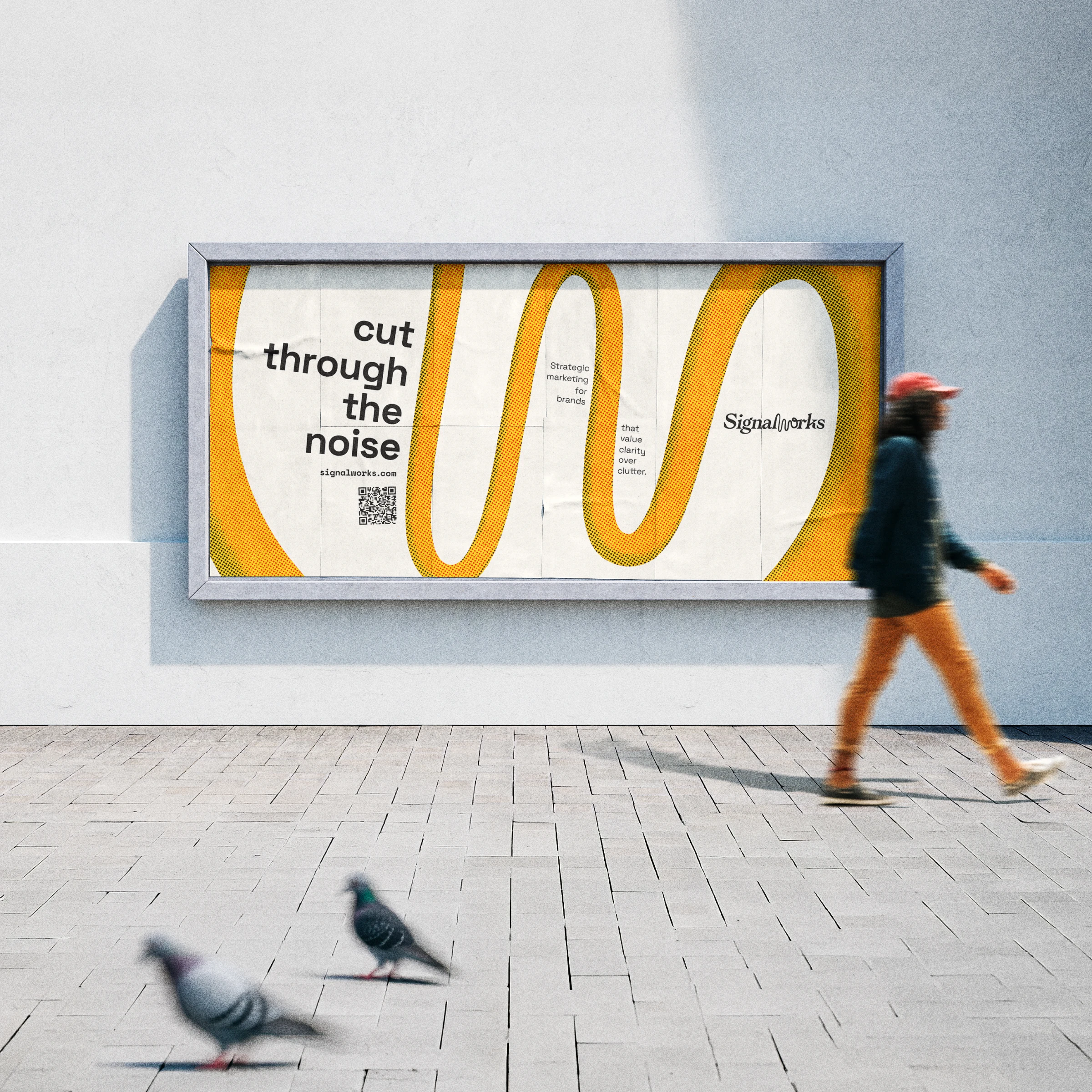
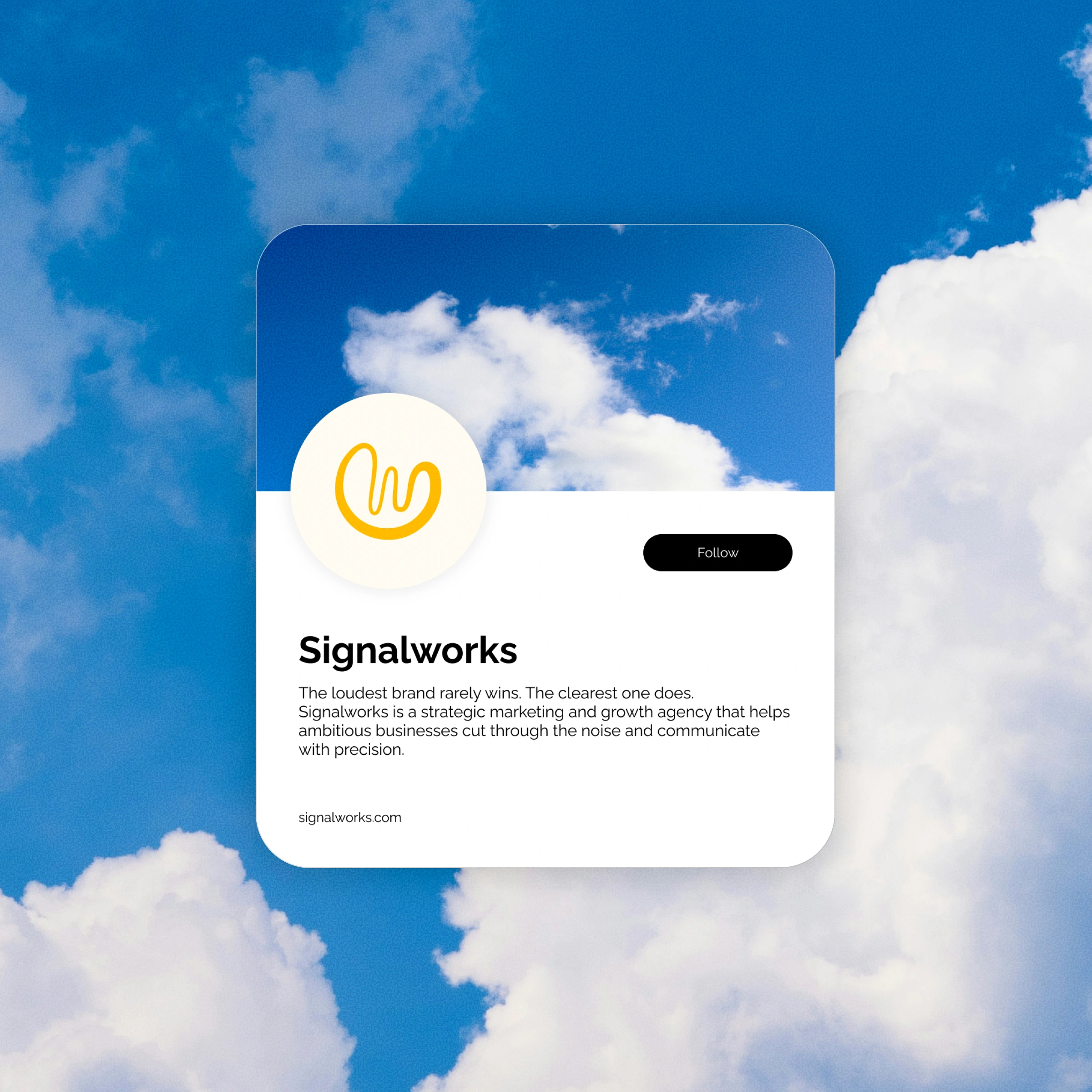
Signalworks is a strategic marketing and growth agency focused on signal over static, helping brands cut through noise and communicate with clarity.
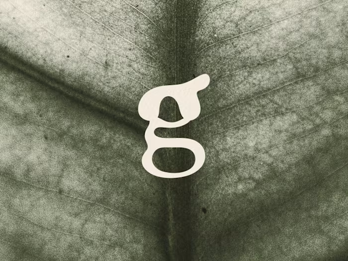
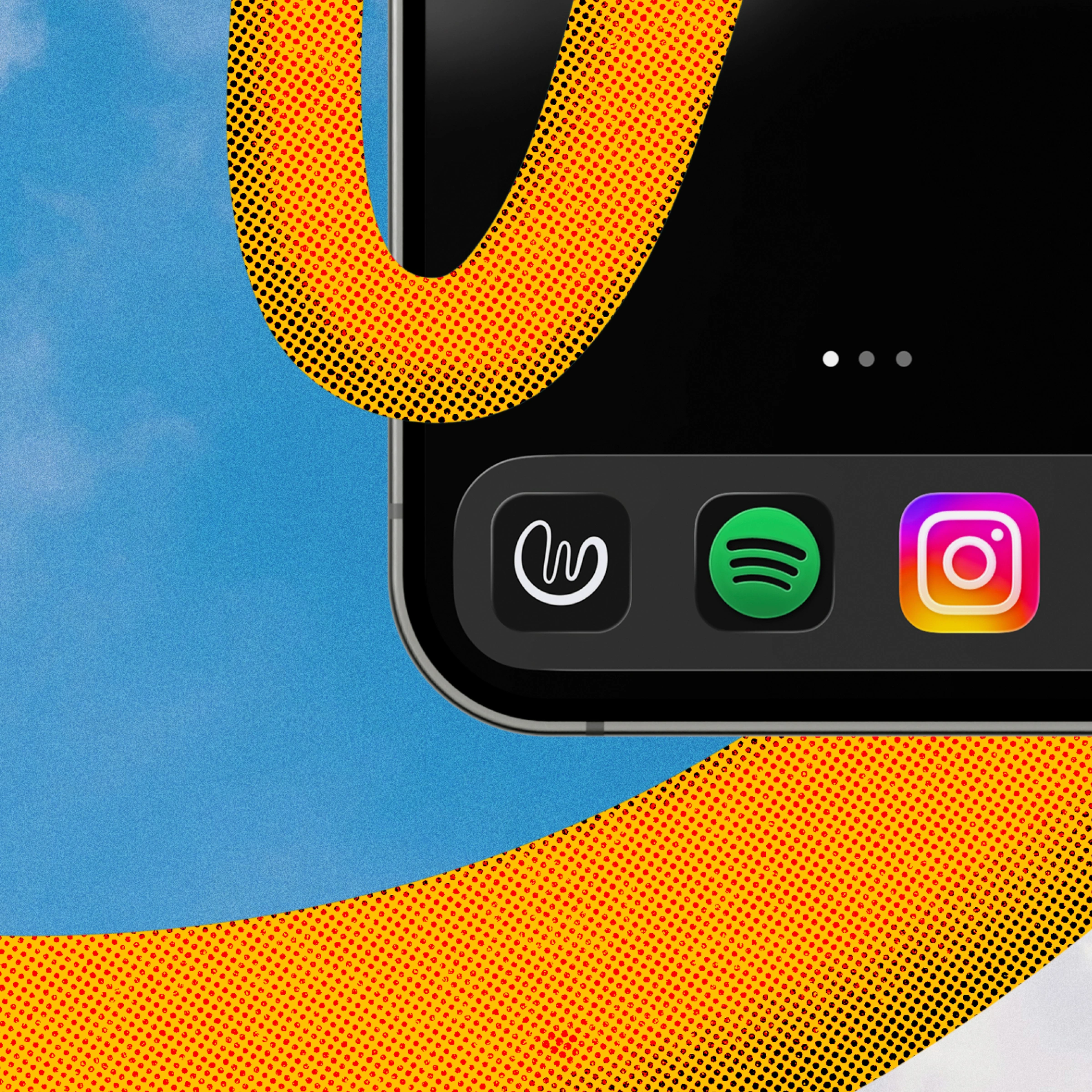
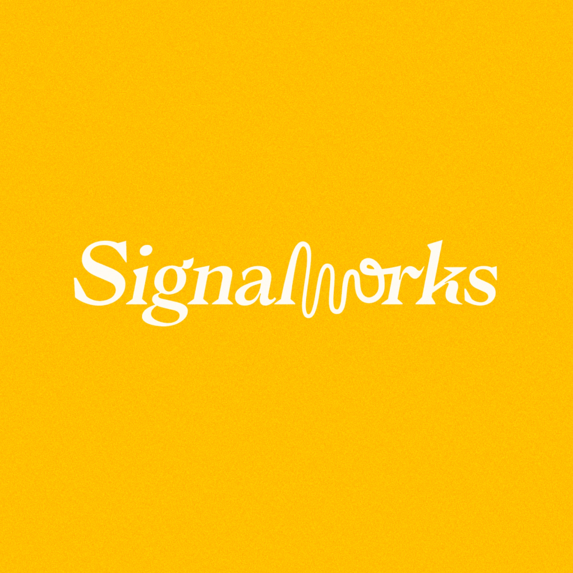
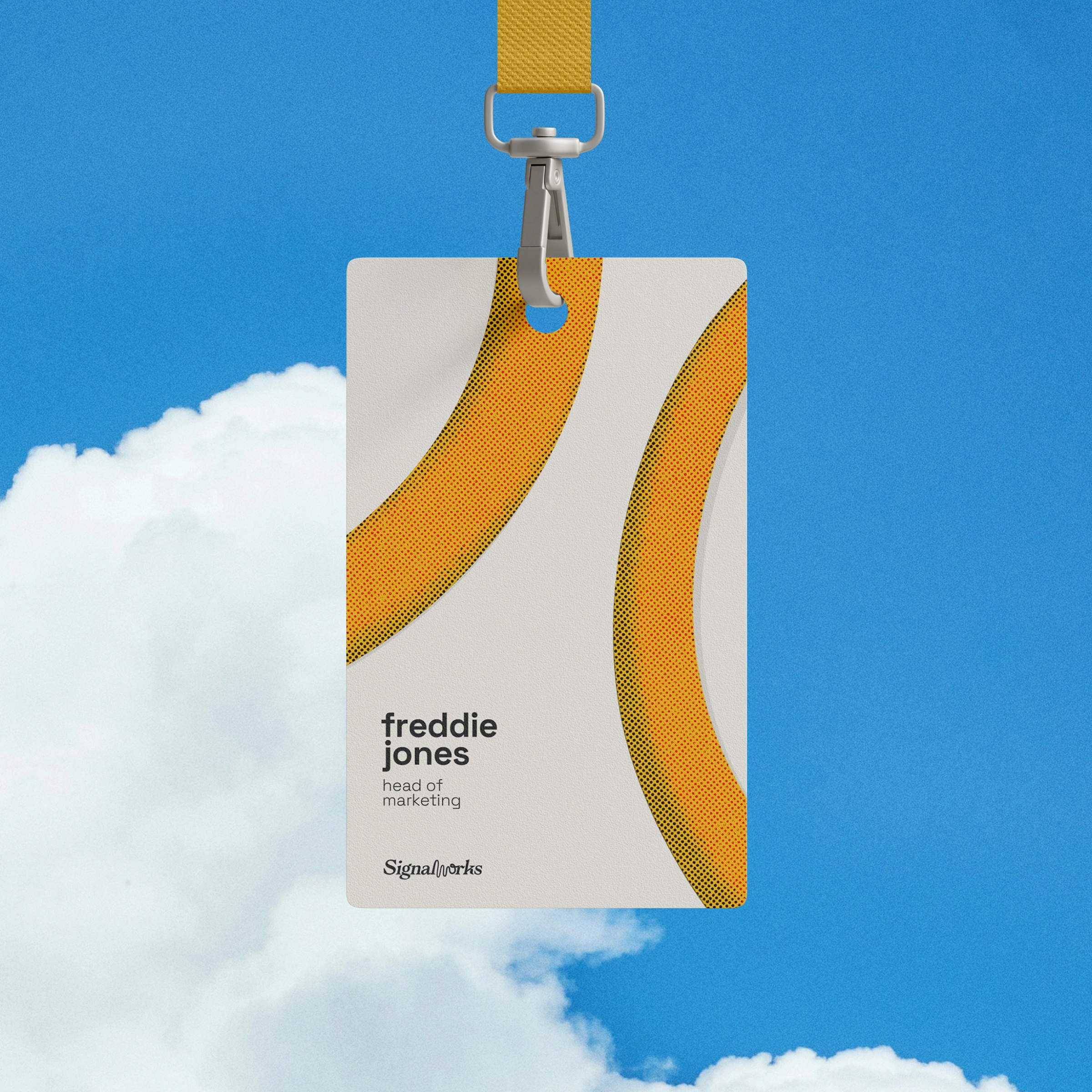
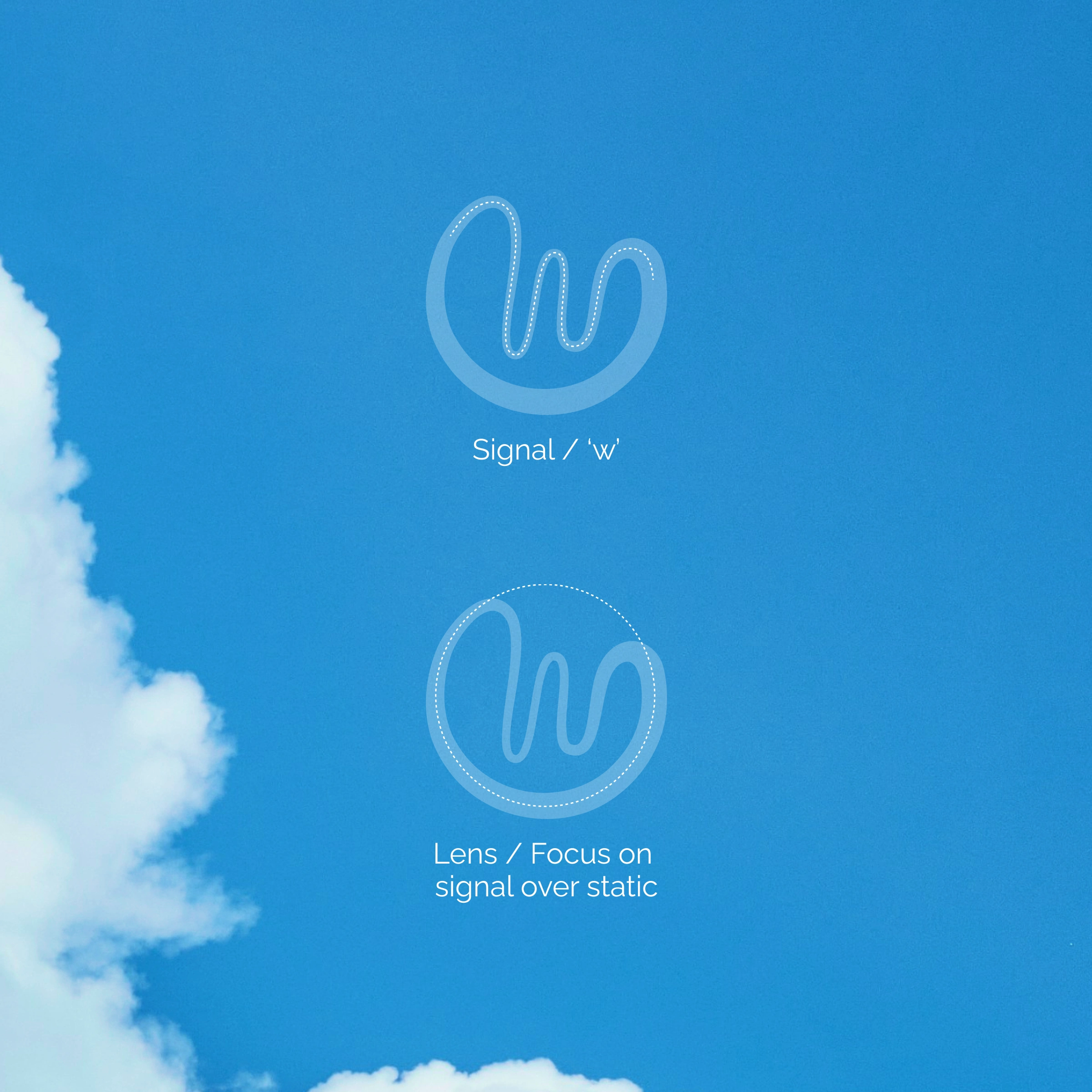
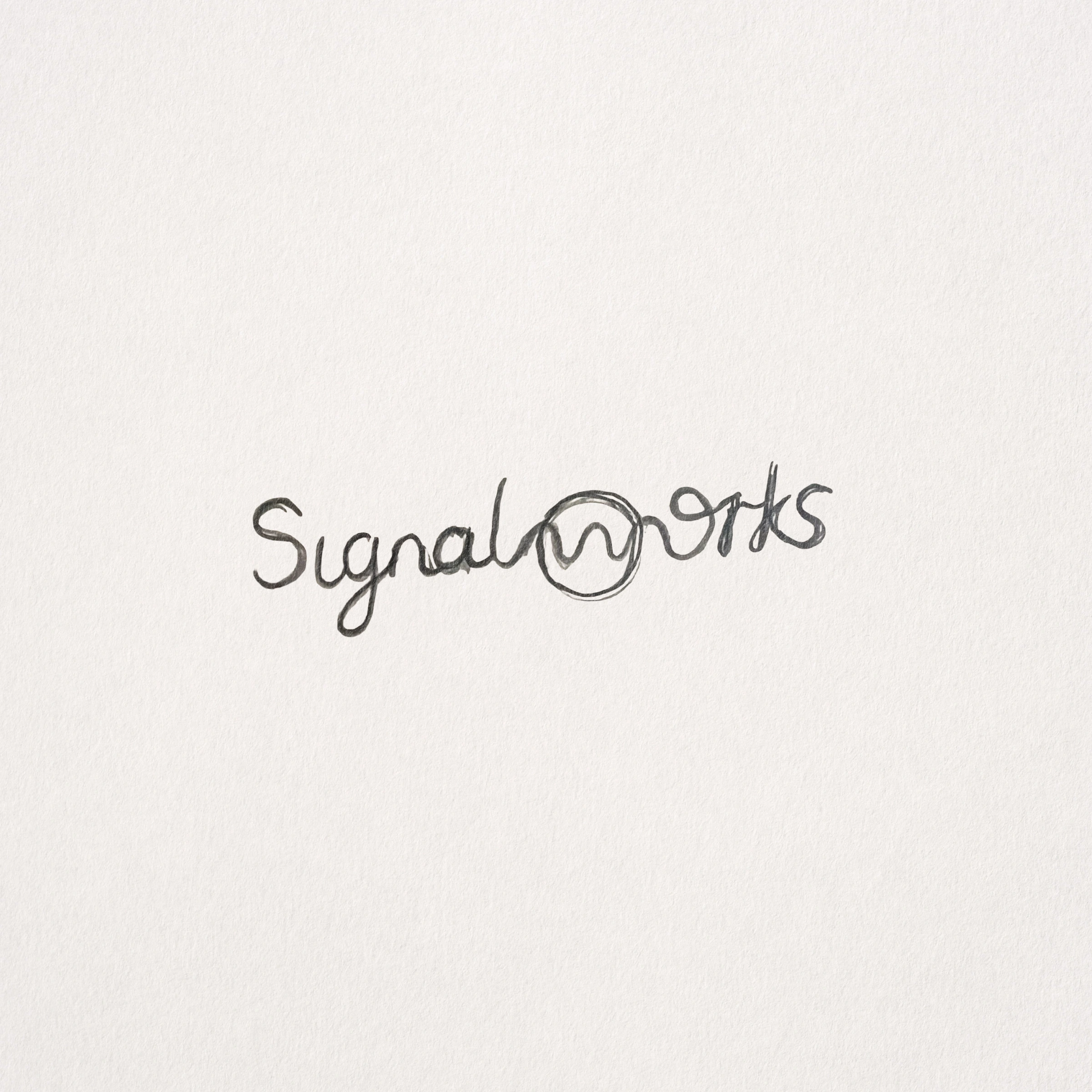
The identity is built around a refined wordmark that interrupts a classic serif structure with an organic signal wave, forming the ‘w’ before resolving back into the typeface. This moment creates a focal point and visually represents clarity emerging from clutter. The logomark isolates this wave within a rounded lens, reinforcing ideas of focus, amplification, and precision.
The result is a confident, ownable identity that avoids familiar marketing tropes and reflects Signalworks’ alternative but considered approach to strategic communication.

Like this project
Posted Jan 20, 2026
Concept logo design and visual direction for a strategic marketing and growth agency. Inspired by signal waves to express clarity, focus, and insight.
Likes
1
Views
12
Timeline
Dec 15, 2025 - Jan 12, 2026