Grow Your Gullak - Brand Identity
Grow Your Gullak -
Personal finance advisor
Brief
Grow Your Gullak offers financial advice for individuals. They are a relatively new player in the industry. They intend to position themselves as a traditionally educated and experienced advisory firm that assists in creating goal-oriented guiding steps rather than fast remedies. The goal was to assist them in projecting a reputation as a seasoned and conventional company.
Challenge
Because they take a conventional approach to their business, they prefer to keep a physical record over Google Forms and utilise a calculator over MS Excel. Online marketing, social media, and print marketing are not their favourites. Although they are a virtually non-existent entity in this internet-driven world, they wanted everyone who contacts them to get the gist of their way of operating without explaining it.

Understanding the culture
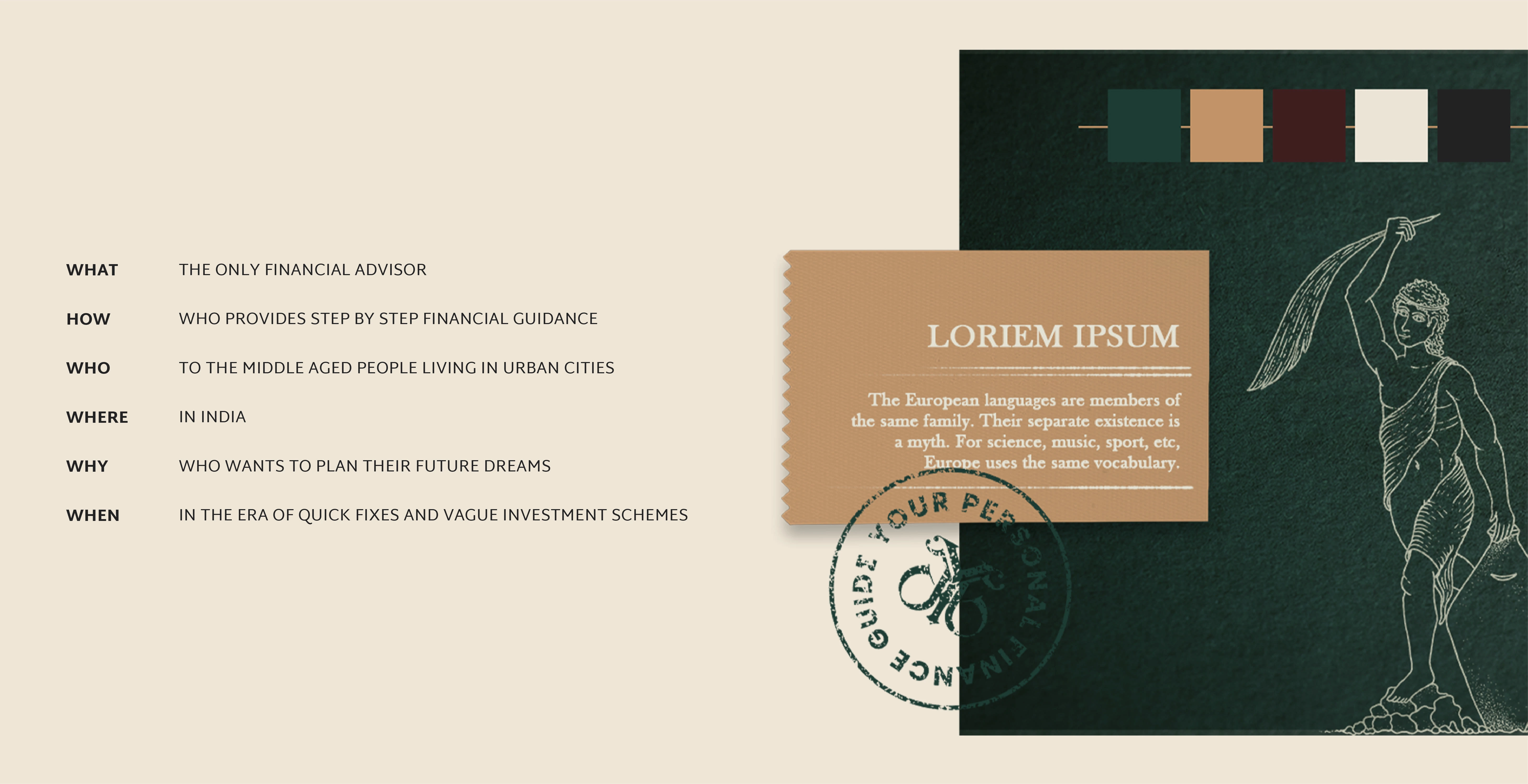
A distinct brand personality and story evolved from the in-depth discovery session. An attribute exercise was done to establish the voice and tone of the brand to align the whole brand. This was the situation when collective intelligence started to work. Strong words were buzzing around the table. Words like "foundation" and "direction" described them, whereas "trust," "simple, and "practical" described working with them.

Exhibiting distinction in the marketplace
After we aligned the tone and voice of the brand, we progressed to the subsequent phase-brand positioning. It is the phase where we define how "GYG" will present itself.
The client was so clear about the brand that it helped to narrow down the distinguishing statement of the brand in simple and straightforward language.
The new mark
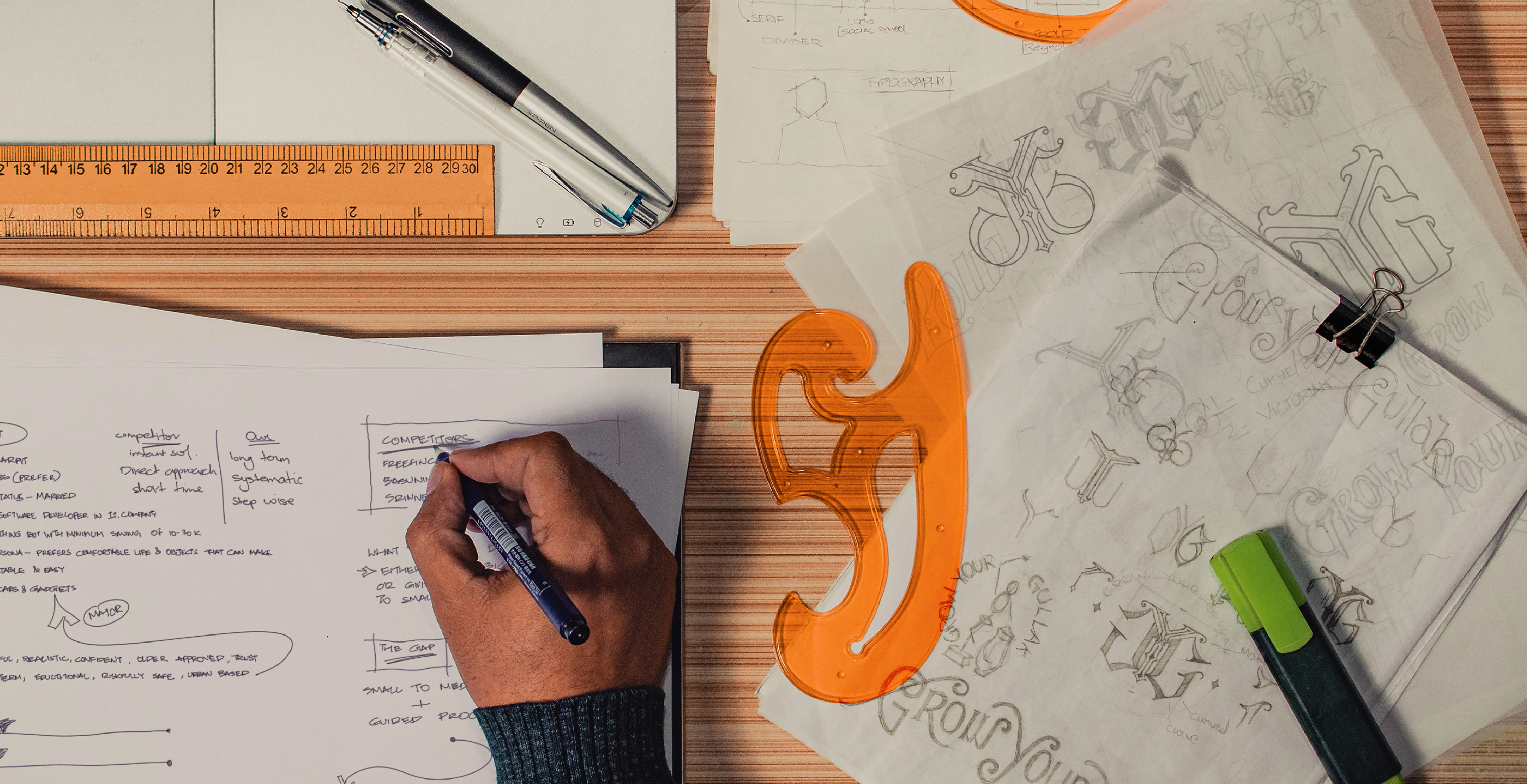
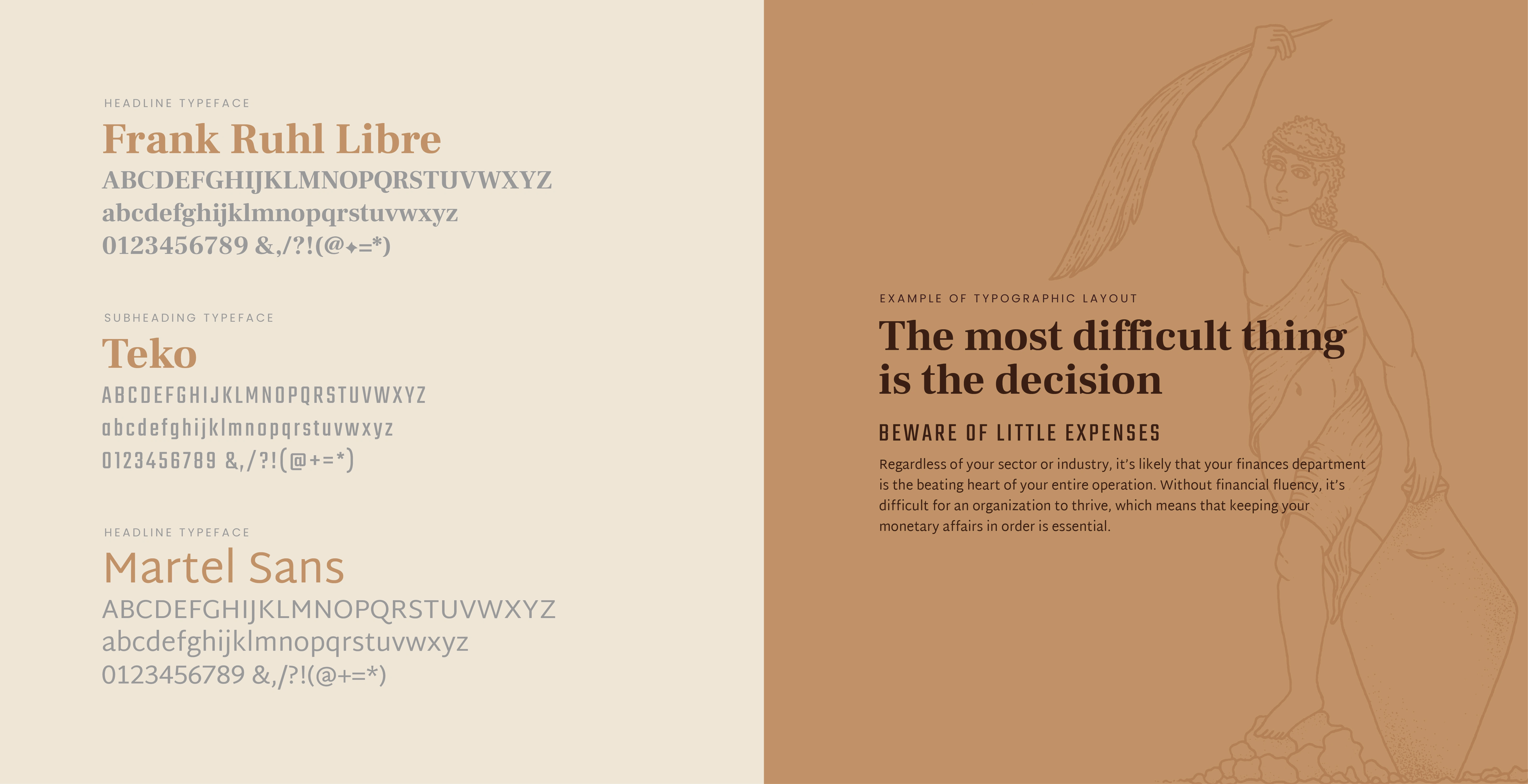
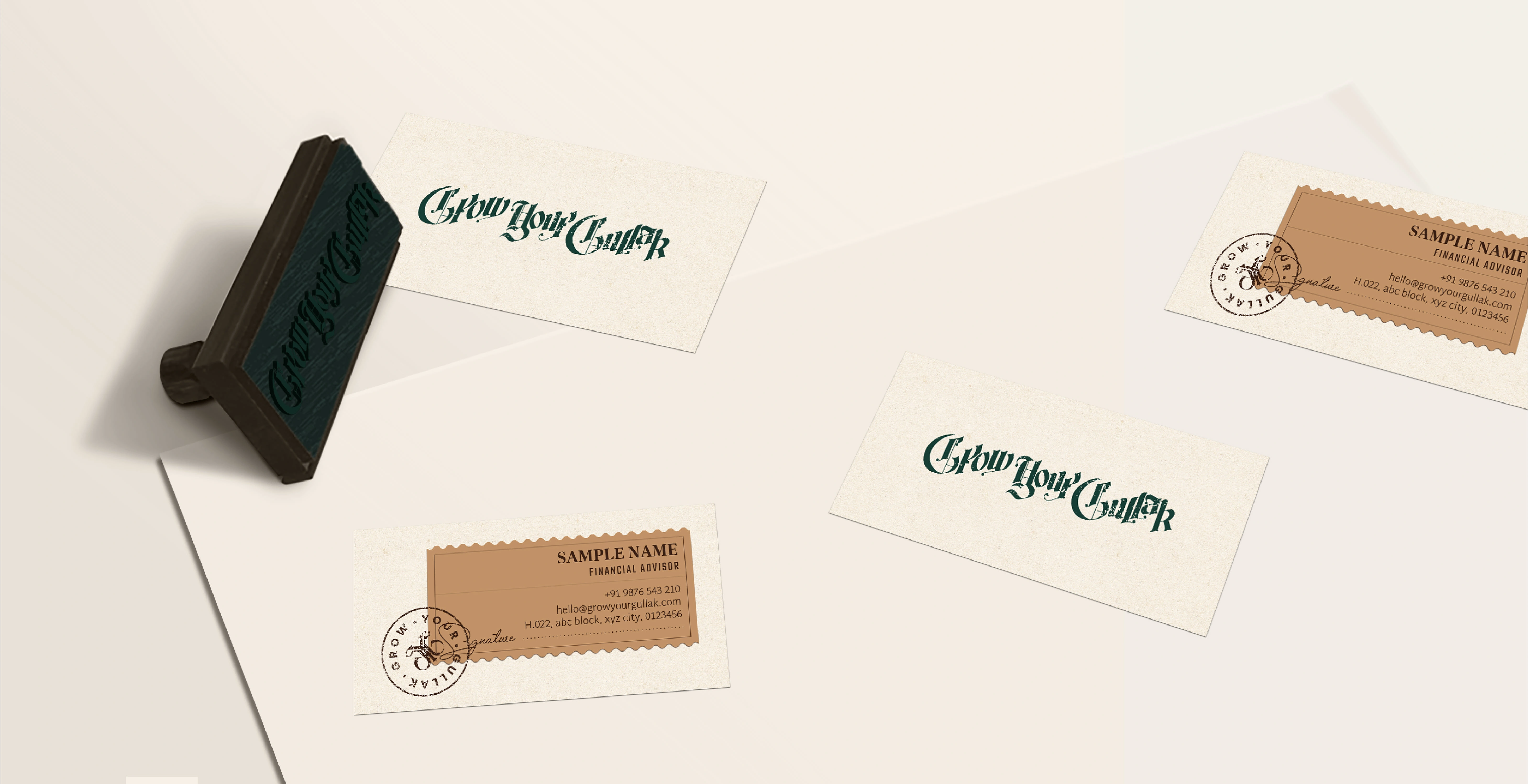
The wordmark is inspired by classic newspaper marks. Its hand-drawn nature matches the company's conventional approach. Tilted positioning of words assists in keeping the size of the wordmark brief, which further led to a monogram which was created with comparable features to be utilised where a smaller mark was necessary. The newly developed mark has a proud and serious appeal, which helps to identify "GYG" as an experienced agency.

Rethinking the colour palette
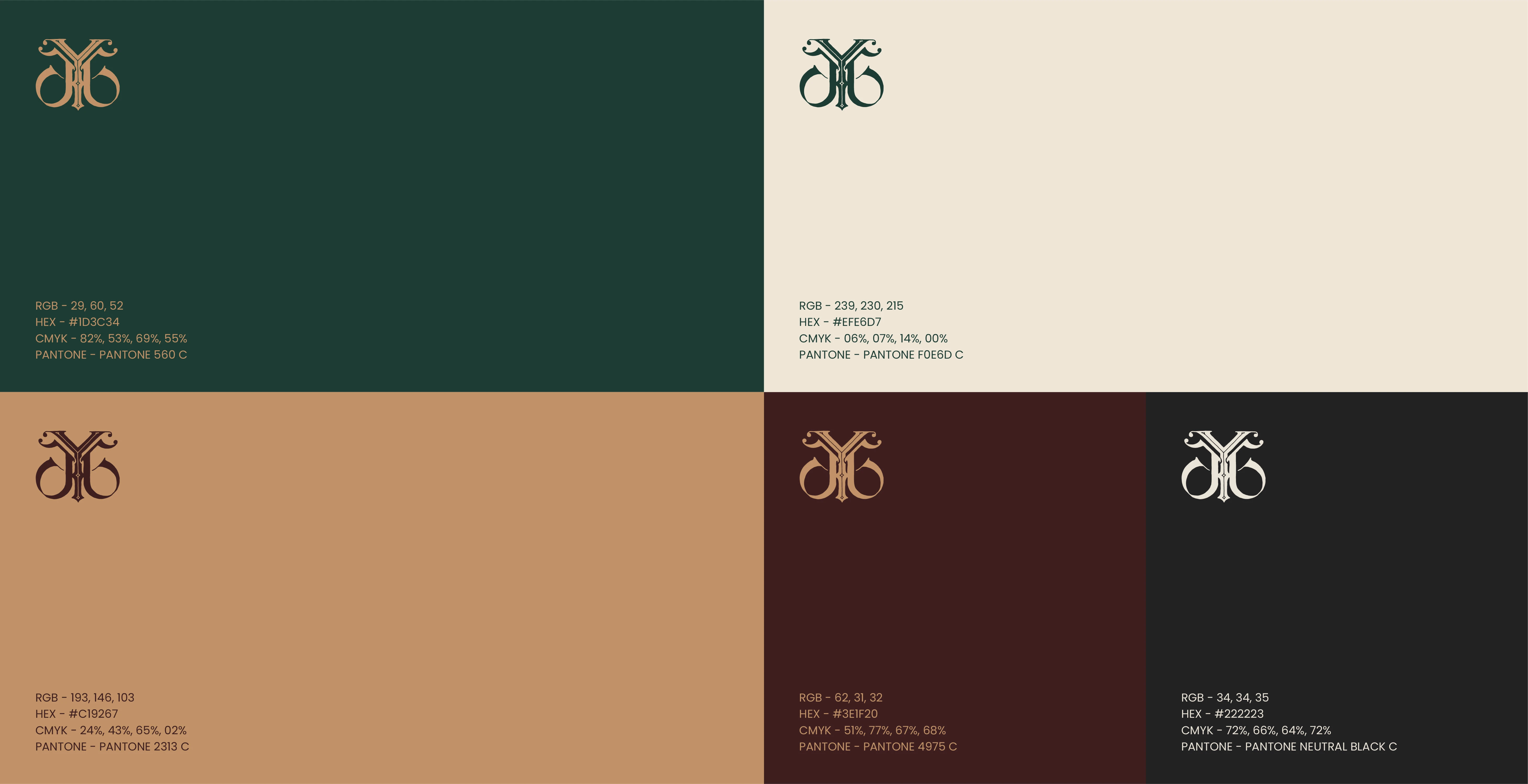
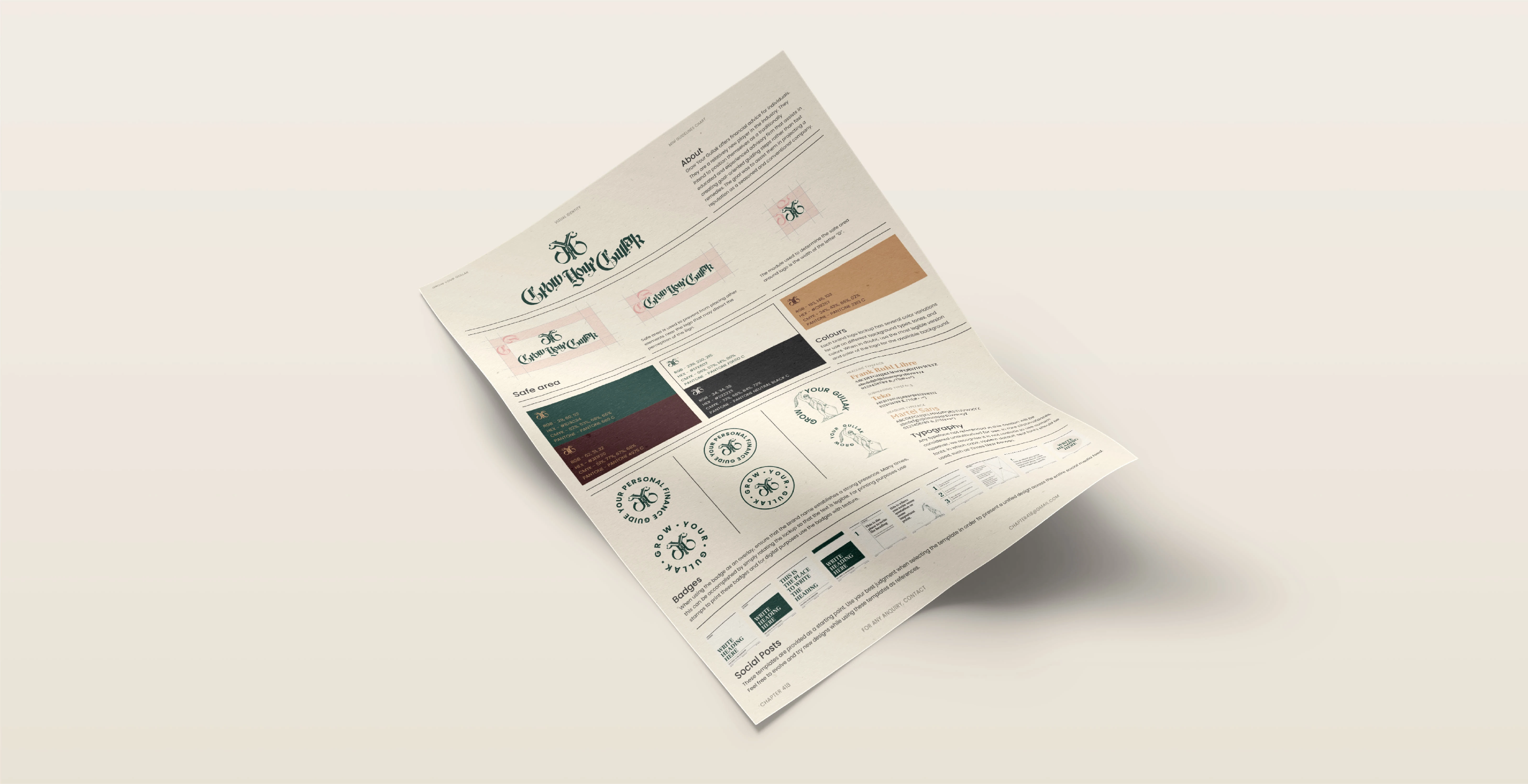
When I questioned the client about the original colours, the answer came within a second, and that was "green and gold symbolise money, and we are in the business of money". No matter how basic that sounds, believe me, half of the time, this is what designers are attempting to accomplish 'to relate'.
So the original hues were preserved and merely toned down to fit the essence of 'GYG'. Some other toned-down hues were added to the palette for accent use.
Additional Badges
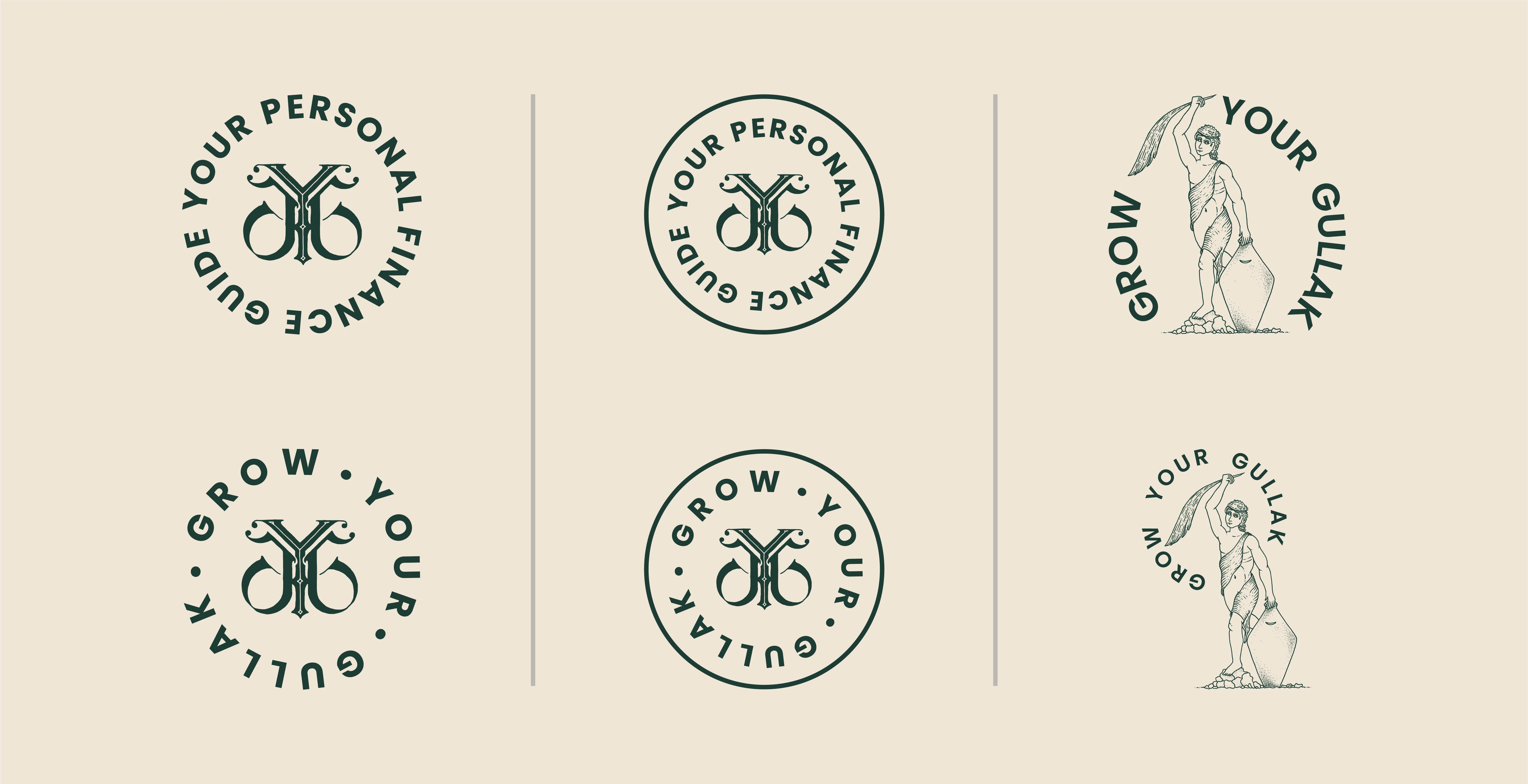
Some badges were designed to be used as an overlay for both print as well as web use. For printing purposes, stamps are to be used to print the badges. For web-based purposes, badges with grunge texture were provided.
Designing brand stationery - An interesting challenge
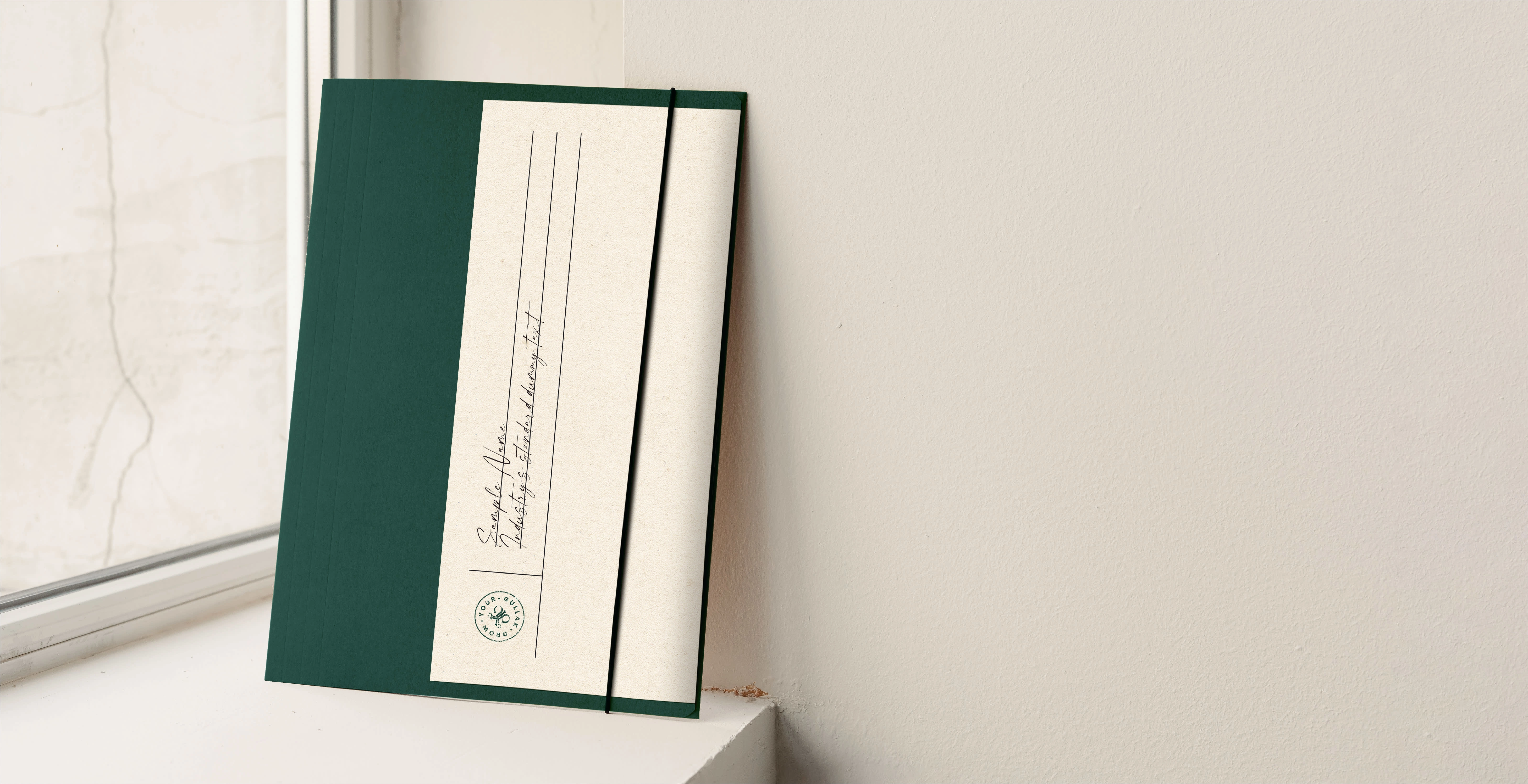
It was not enough to make the brand stationery seem or feel old-school while creating it. It must feel as though it belongs to someone who still keeps physical files and prefers pen and paper over typing on a screen.
The primary goal behind the design was to allow those behind "GYG" to make the stationery goods by themselves whenever needed. The difficulty was that owing to small batch preparation, we could not let the costs go high; otherwise, it was not a solution. Also, making stationery should be comfortable and not like labouring in a printing press.
Helping advisors save some of their money
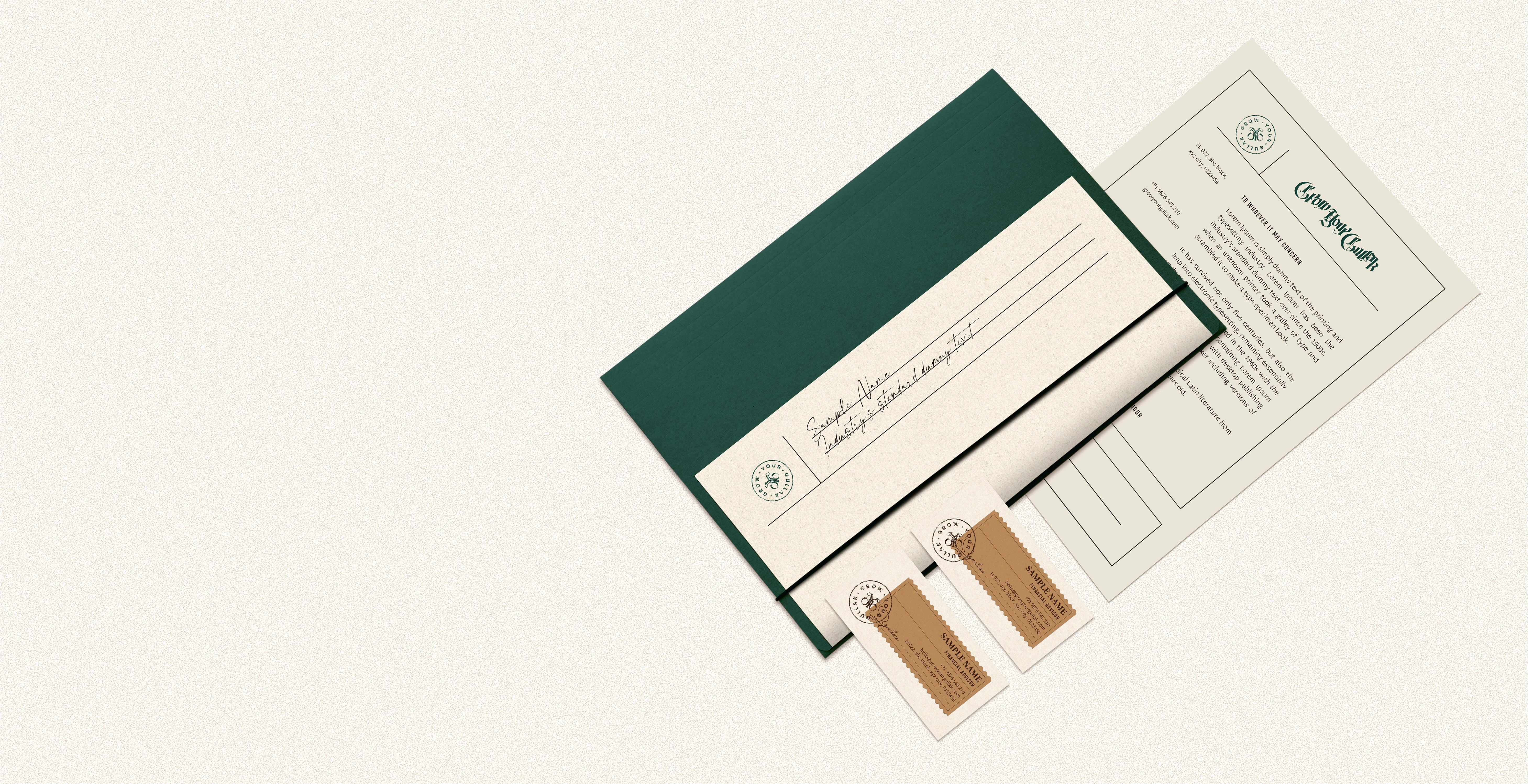
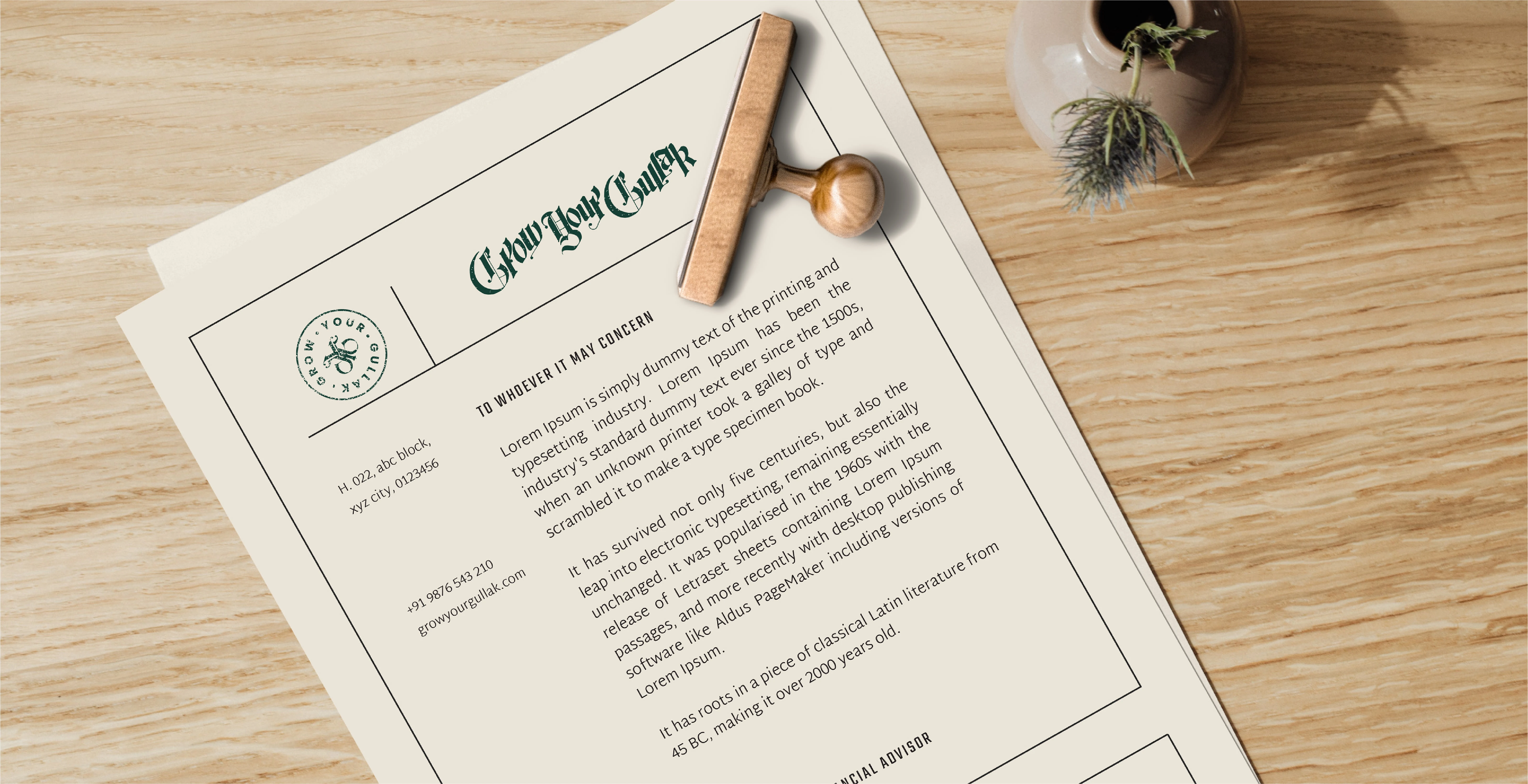
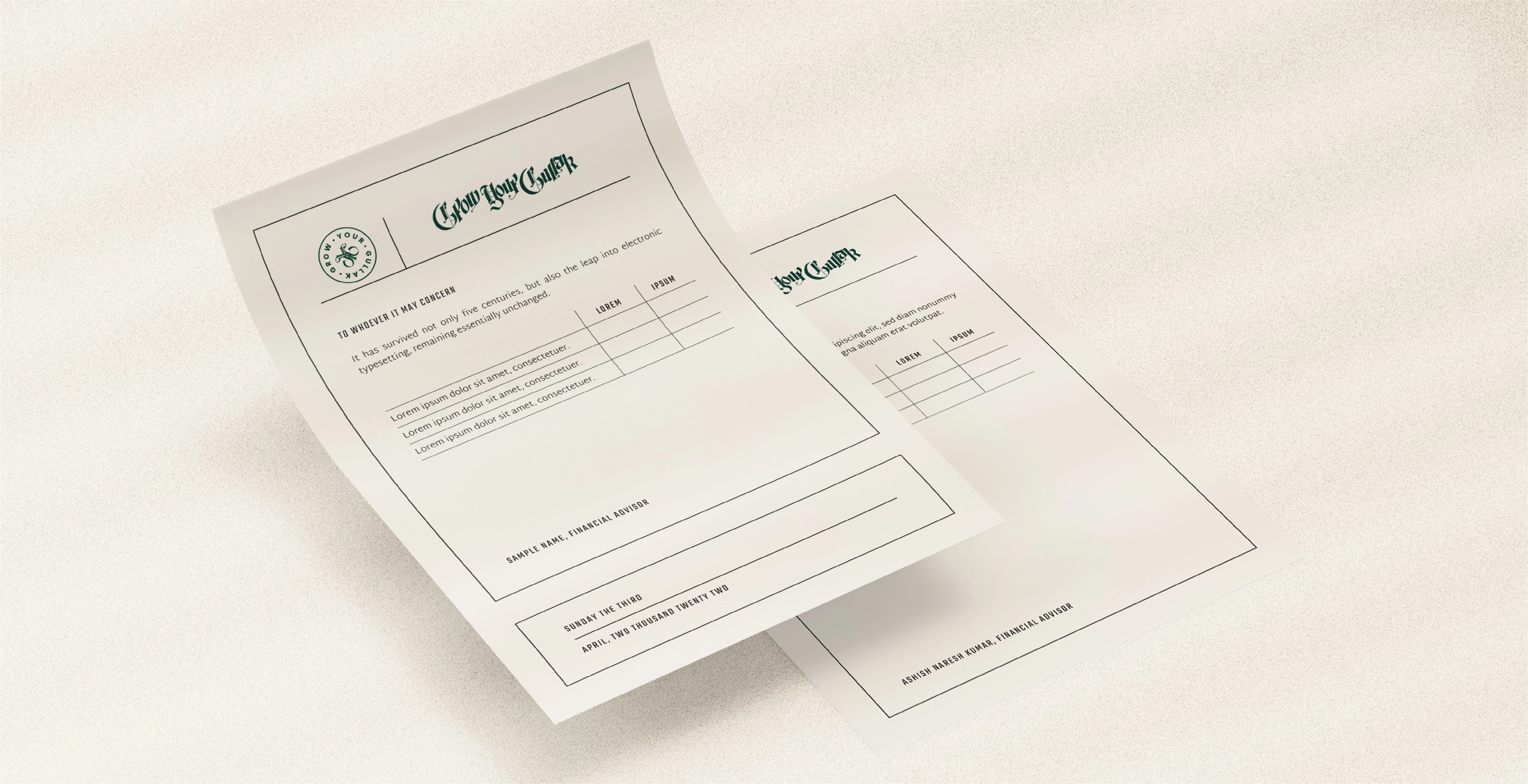
For the letterheads and client's documentation, black colour printing was proposed on cream-coloured paper to minimise printing expense. The brand's logo and the badge were set using stamps, which gives colour and classic charm to the stationery.
Added lines function as guides for the stamps and text and offer a sense of modern aspect, so the stationery doesn't seem entirely old school.
Crafting the business cards
For "Grow Your Gullak", business cards are one of the top marketing tools, and they will be required to carry the company's spirit the most.
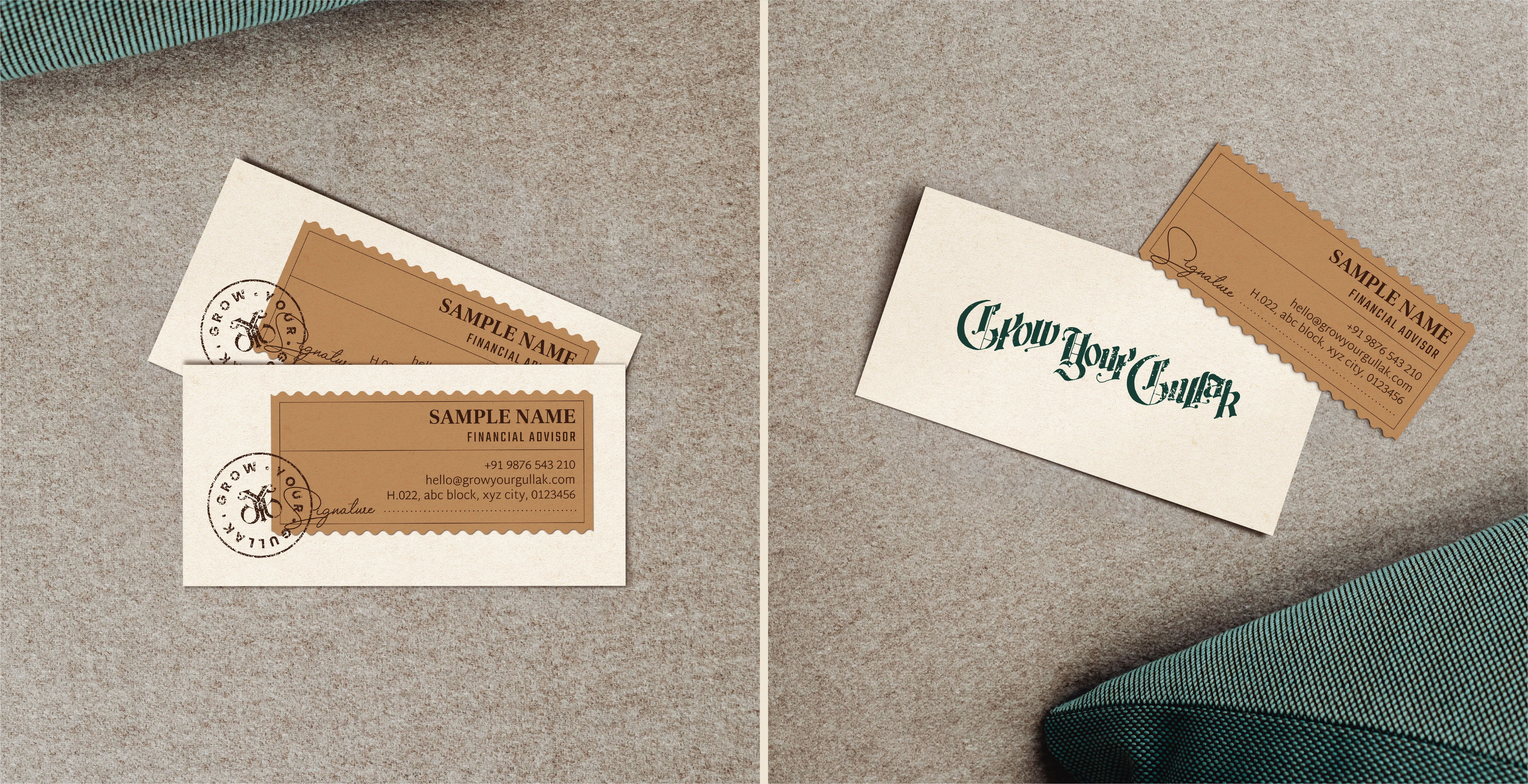
Two coloured papers were utilised and stuck together to produce these cards, which offer the design an additional dimension and distinguishing qualities over any other business card we come across. Adding stamps and signing the cards gives them the crafting component and demonstrates how much effort the people behind "Grow Your Gullak" put into their business.
It is crucial to keep the cost low for anything that demands so much commitment. So, I didn't go with the basic measurements but divided the ordinary paper sheets into equal parts that could be cut in-house.
Introduction to social media
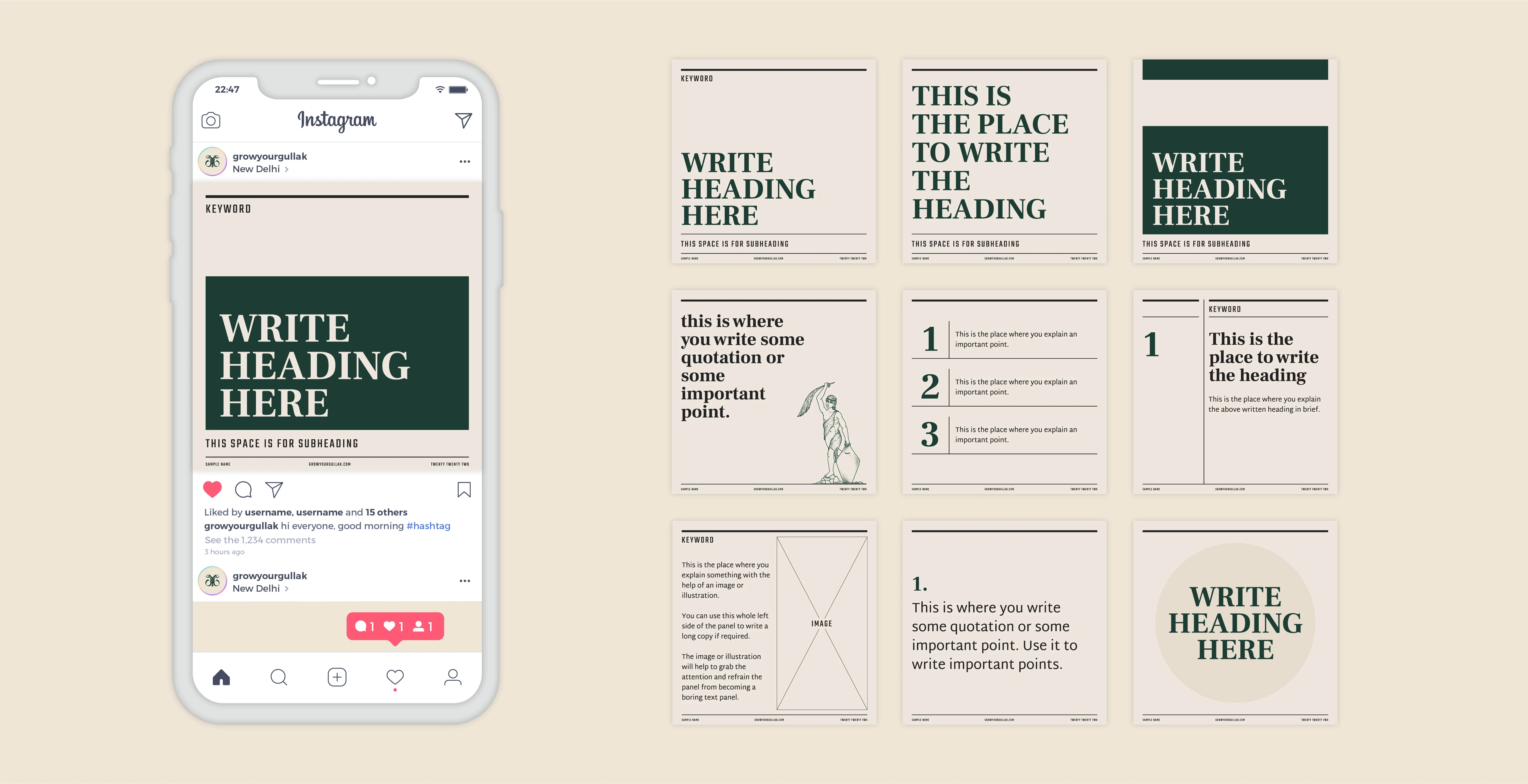
Social media is where many people spend a lot of time and the people behind "Grow Your Gullak" have practically no presence. So to give them a starting point for using social media, we designed some text-based templates that they may use to share knowledge.
Like this project
Posted Oct 28, 2022
A standard financial counselling business that is new to the market. The idea was to help them portray a reputation as a seasoned and traditional business.

