New York Butterfly Observatory
Jessie Cohen
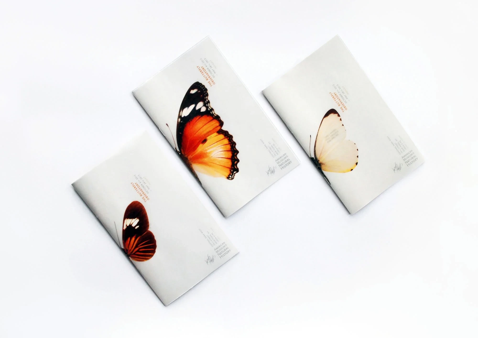
New York Butterfly Observatory
A conceptual editorial design project completed as part of my BA (Hons) Graphic Design final year showcase portfolio.
The challenge
Part of my BA (Hons) Graphic Design degree coursework – the brief was to create an editorial campaign project for any brand of our own choosing.
The solution
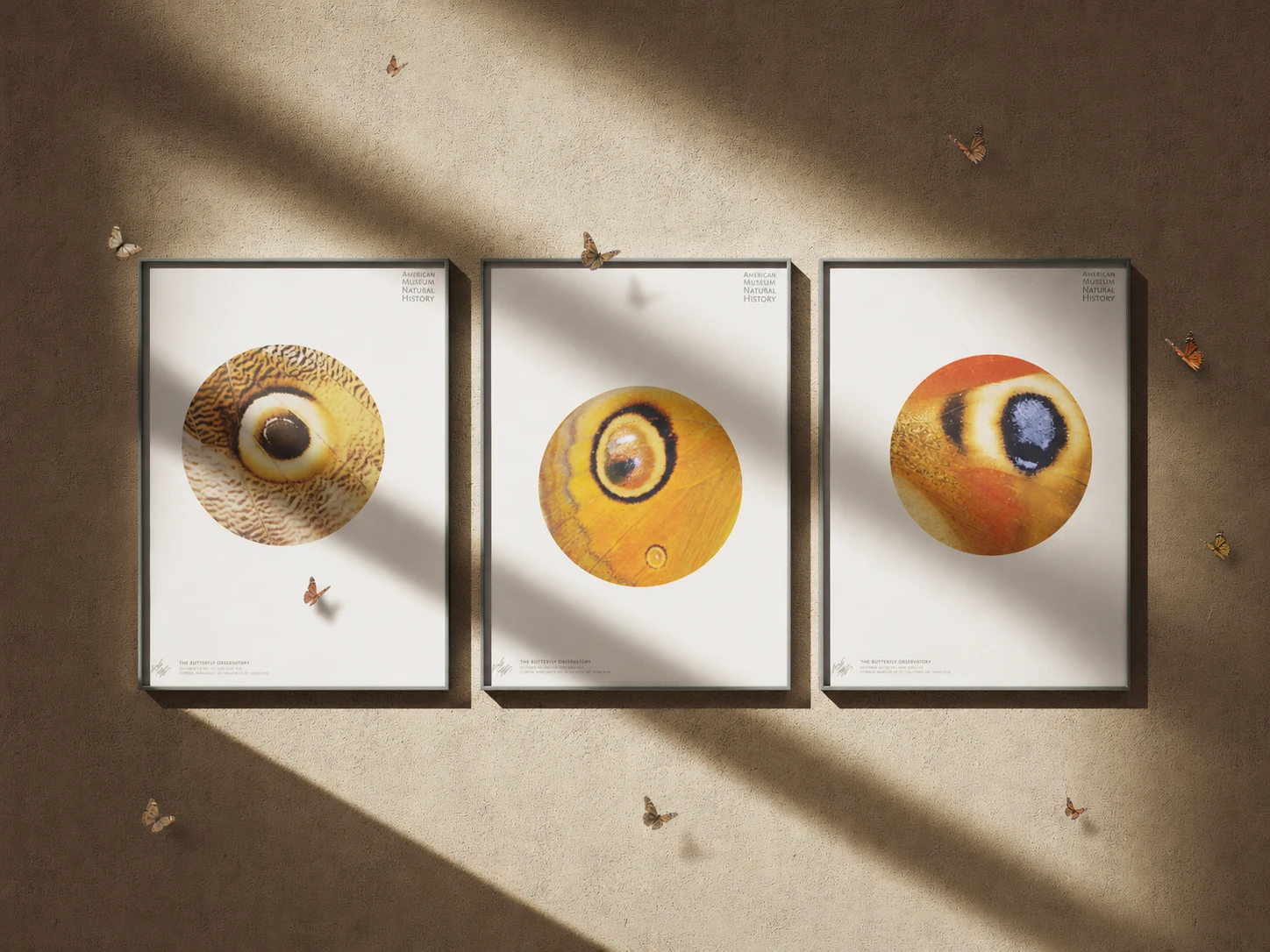
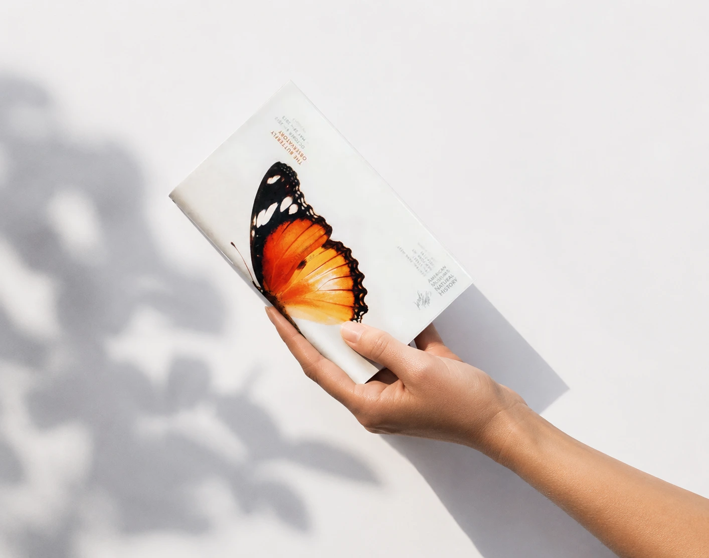
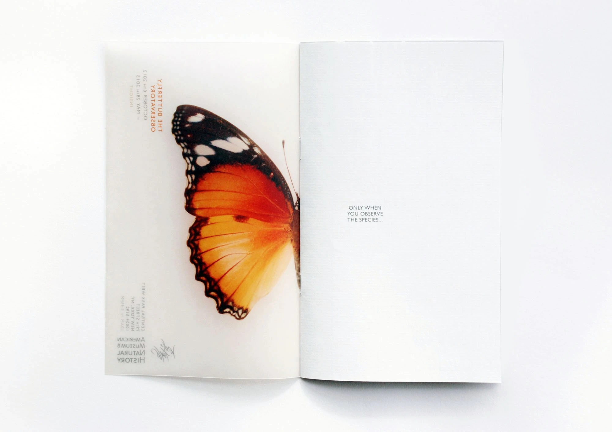
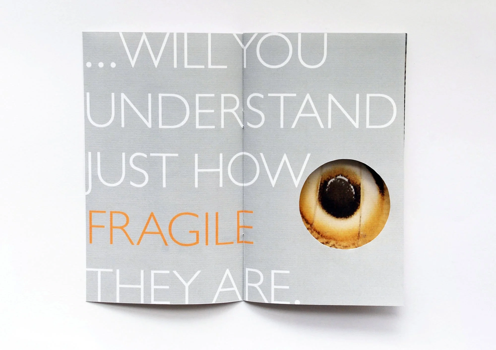
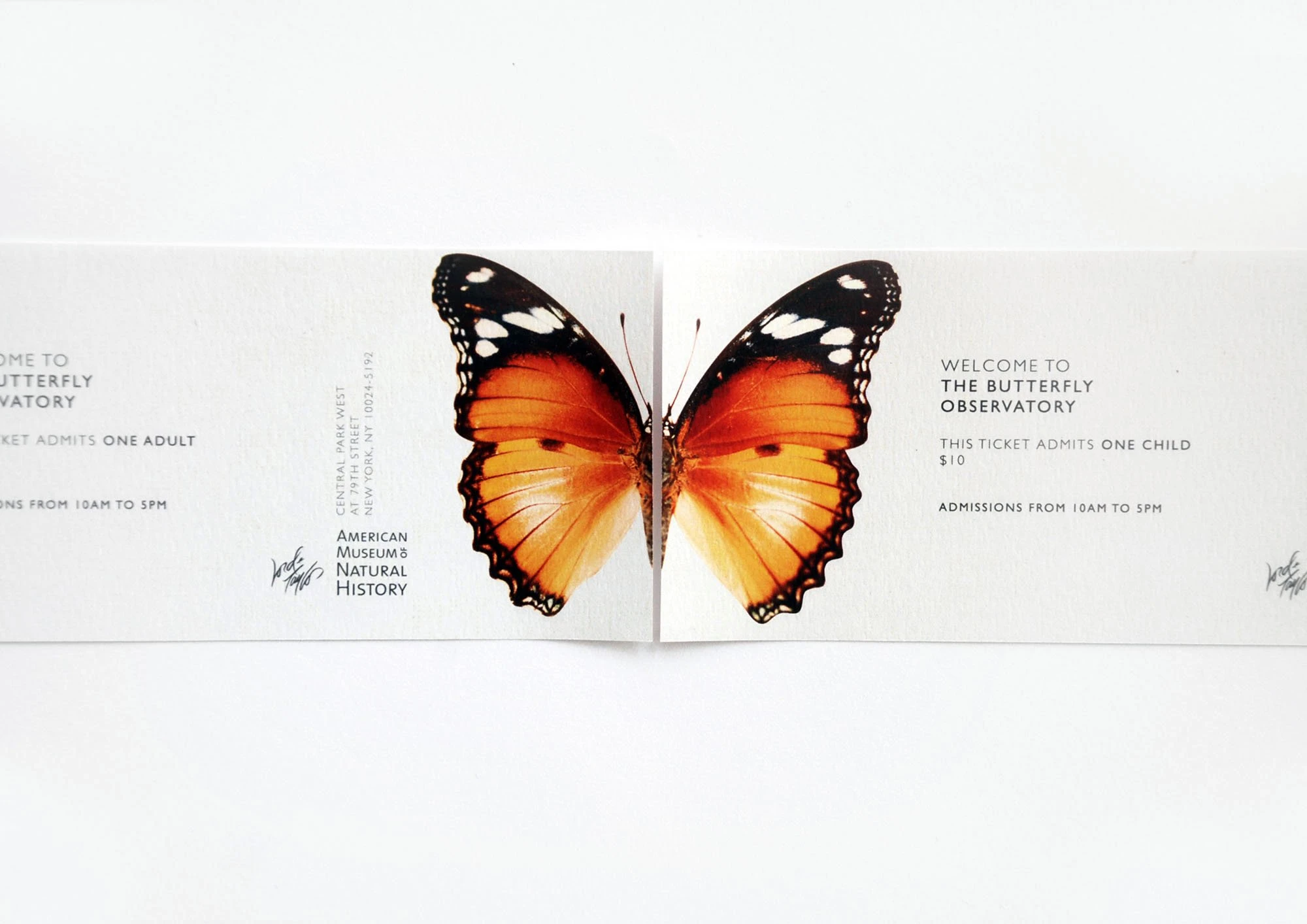
A witty response for the American Museum of Natural History’s New York Butterfly Observatory, which raises awareness of the fragility and beauty of butterfly species. From using the eye-like patterns in butterfly wings to suggest the idea of observing up close, to emulating the lightness of a butterfly on a finger with a brochure design printed with tracing paper.
Scope
Art direction, Editorial design, Layout design, Poster design, Stationery design, Typography
22%
overall decline in butterfly populations across the US, with about 1.3% fewer butterflies each year, driven by habitat loss, pesticide use and the climate crisis – more awareness is needed around the conservation efforts happening to protect these species.
One of my proudest student pieces until this day, this project combines witty ‘smile in the mind’ design thinking with experimental use of materials.
Design takeaways
The value of experimenting with materials in print design. Considering different finishes for paper and card stock, for example, can help push a piece of work beyond purely visual communication into something tactile, physical, and memorable.
Designing for an important cause. From emotional connection to a sense of community purpose and engagement, projects like these, even though conceptual, can be hard to come by in corporate design. I appreciate each opportunity I get to work on projects with visible social and environmental impact – they are a special kind of fulfilling and rewarding.
Let’s work together
If you have a similar project you’d love a new design perspective on, get in touch with me at hello@chromakane.com – I look forward to finding out about your brand’s story.
Like this project
Posted May 13, 2026
Conceptual editorial design project for the New York Butterfly Observatory, focusing on butterfly population awareness.
Likes
0
Views
2