Phantom Forge Case Study
Bogdan Vezeteu
About the Project
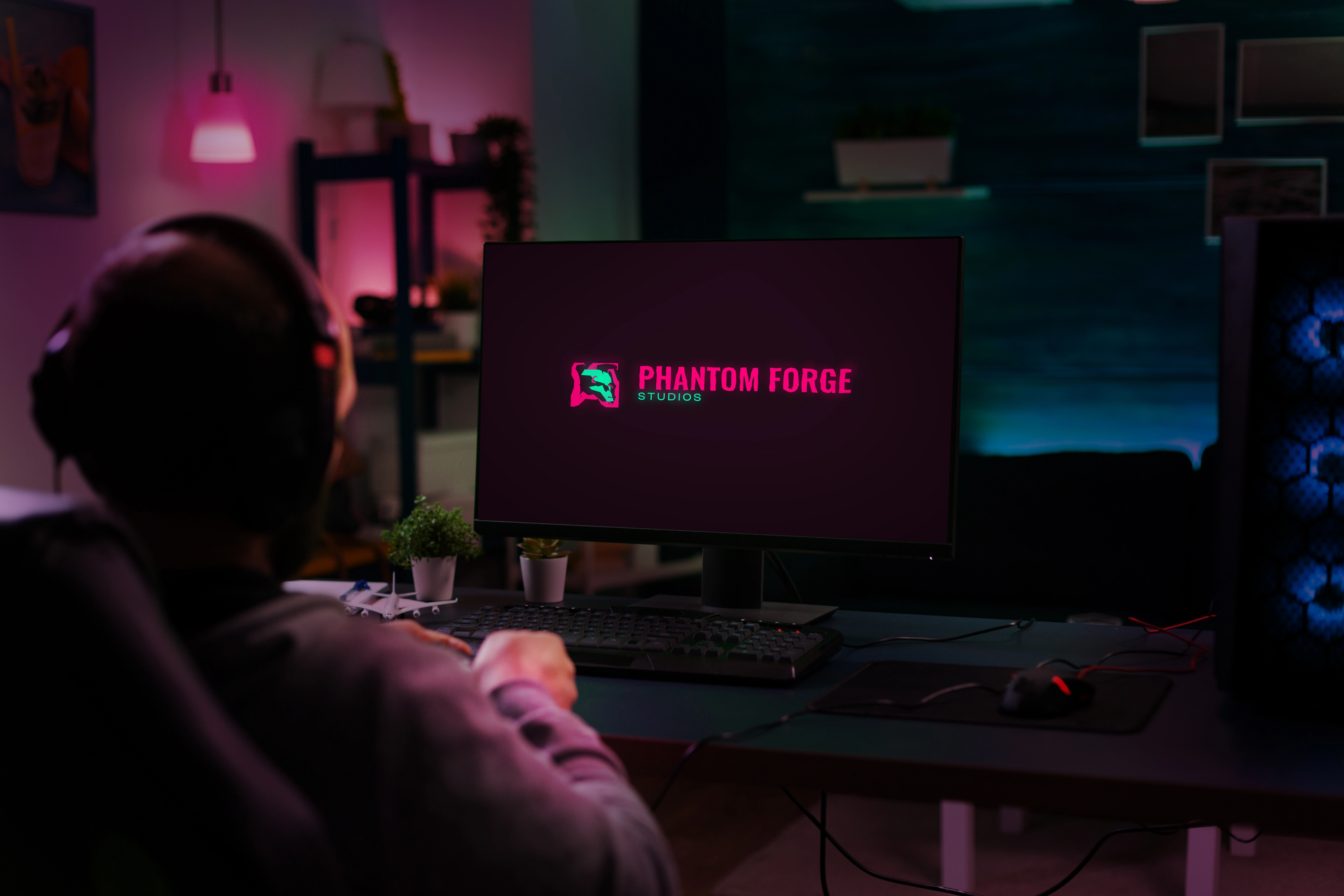
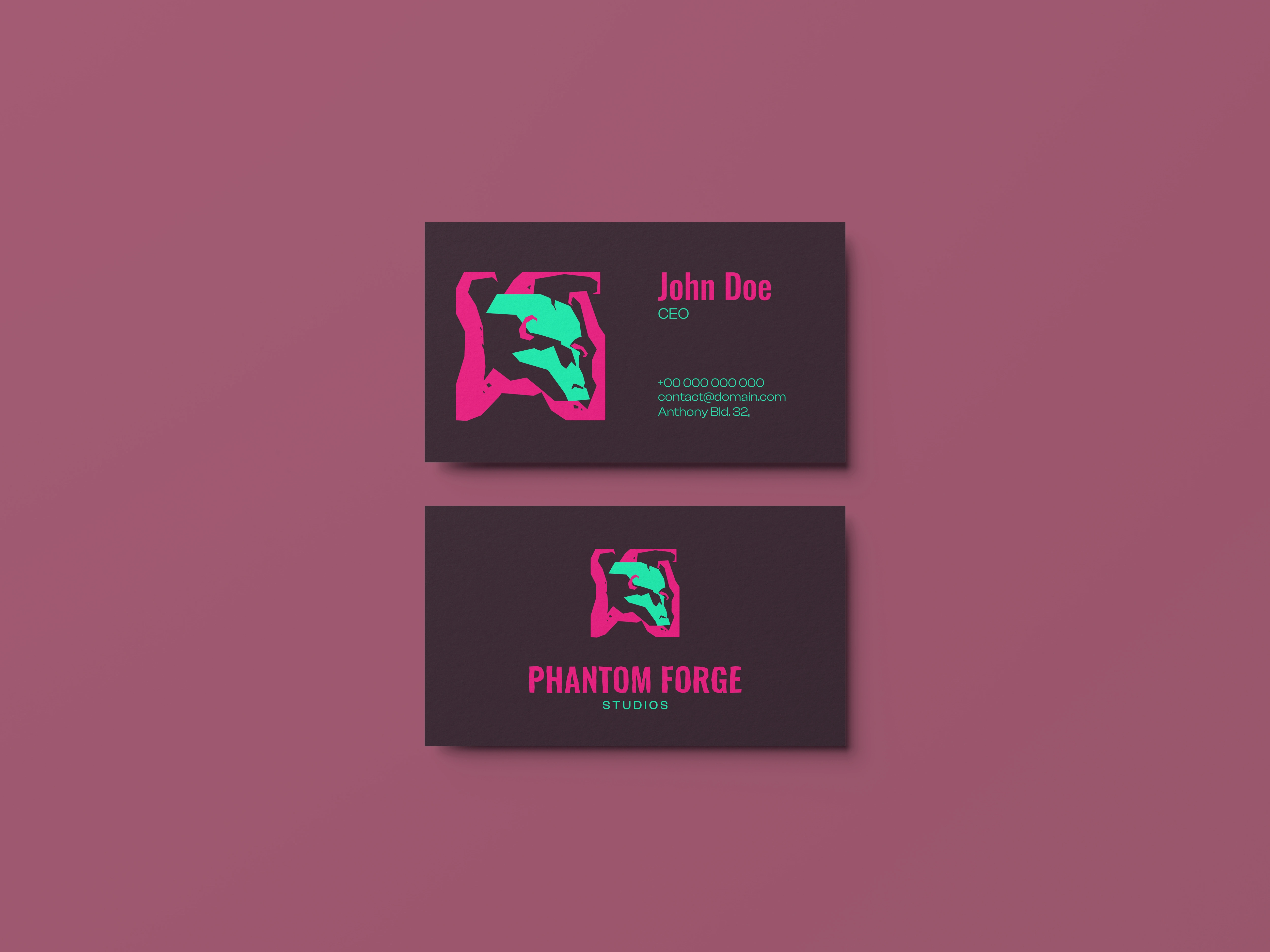
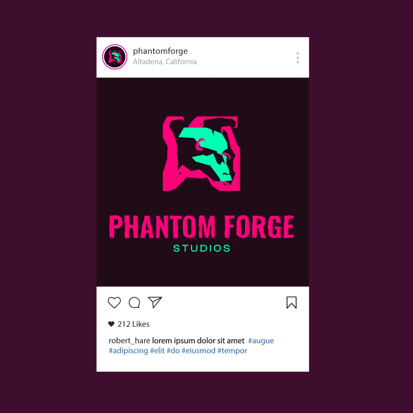
Phantome Forge - a game studio with a penchant for horror games. This specific brief was all about creating a visual identity that mixed lovecraftian horror and cyberpunk aesthetics. As such, the logo shows a tentacled deep-sea horror, feeling a human skull, which ties into the "phantom" from the title.
Important Brief Considerations
"A modern yet timeless logo that conveys mystery, intensity, and artistic craftsmanship.
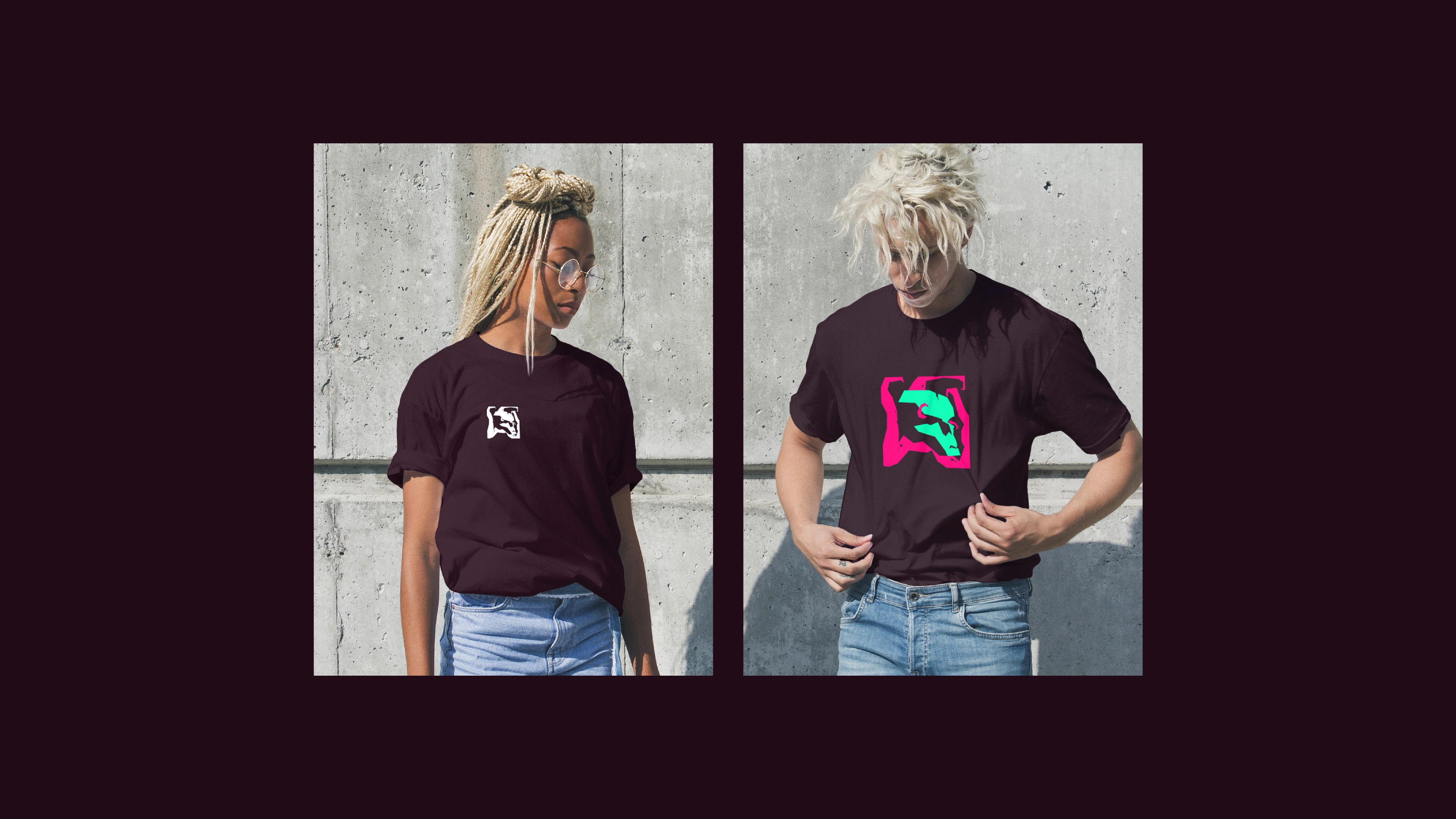
Needs to be versatile (usable on merch, social media, website, and game splash screens). Must work in monochrome as well as full color."
Also, the logo is for a game studio. As such, it has to look strong on a dark background, and it should serve as a basis for potential animations
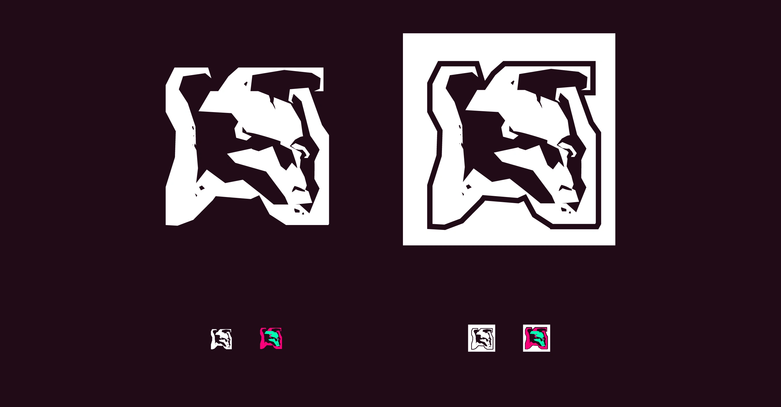
I've accomplished this by creating a strong silhouette for the logo, one that works in both color, but also in monochrome, and also works in small favicon sizes
Initially I had the idea of presenting a wraith in the logo, with the hood and back shoulder used for visual rhythm. But after contless fiddling with it, the shape language of the skull, the colorisation, the shape language of the hood, I ultimately decided to scrap the idea as it was too complicated for a logo.
The Sketch & Iterations
This concept underwent many iterations and reworks.
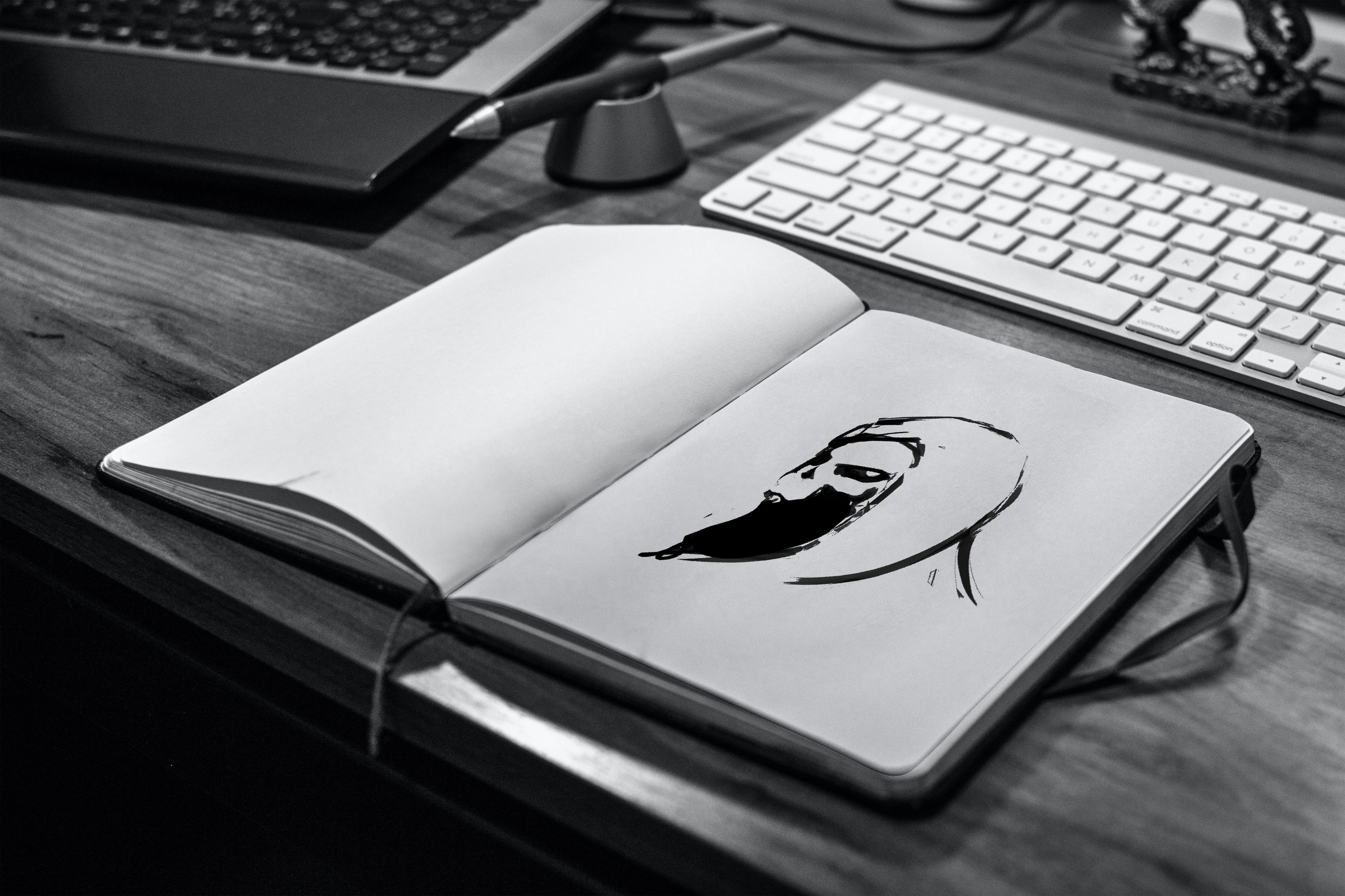
After the initial sketch, I went and vectorized the idea. As you can see, the roundness of the first version was the first think to go away. I did not want the character to seem friendly, or cute. Neither did I want to make it seem threatening. Horror is in the middle, when the amount of threat is unclear, but you know that danger looms.
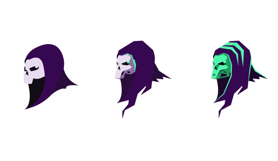
After conducting more resarch in cyberpunk imagery, decided to apply some of the trends that I found. Mostly, a change in shape language and colors were in order.
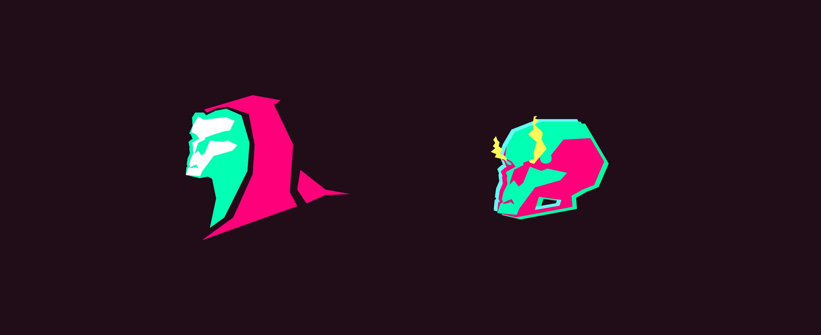
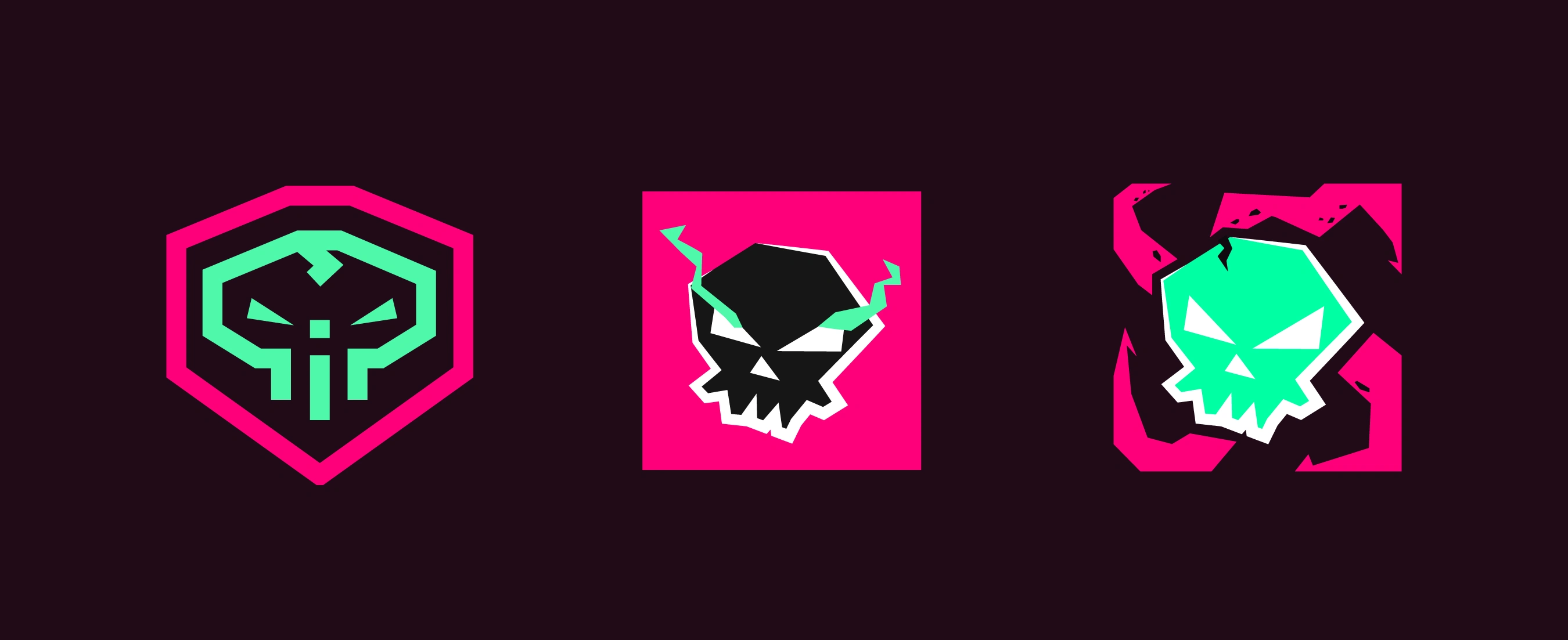
But these didn't feel eldritch or cyberpunk enough. I decided to take inspiration from Cthulhu imagery, a cornerstone of lovecraftian literature. I also took Red Hook's logo for inspiration. Scrapping the previous idea, I decided to go heavily into the cyberpunk aesthetic, with a slight rebel-grafitti vibe. Design is built on experimentation.
EUREKA
After testing out the idea of a skull with tentacles, the moment of "Eureka!" came. I introduced the tentacle motif in the previous logo idea, altering the skull to strengthen the silhouette. The result?
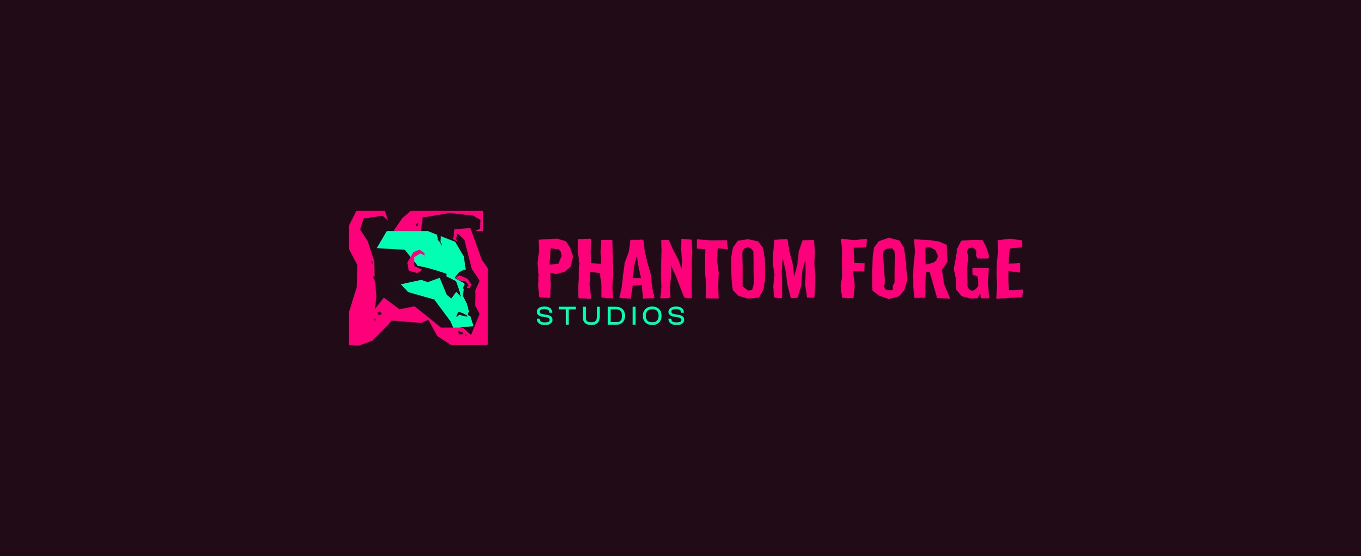
A well balanced logo, with eldritch/lovecraftian elements, using a cyberpunk-style color palette, and some more rigid shape language found in cyberpunk imagery.
As you can see, during the process for this logo's creation, there were many problems that arose. But through experimentation and perseverence, designers solve these issues.
Like this project
Posted Sep 21, 2025
The key challenge I had to overcome was how to incorporate Cthulu imagery with cyberpunk. I did that by using the 2nd's color palette and a tentacle-based logo.