Dacia x Inês Lopes Gonçalves
First Animatic
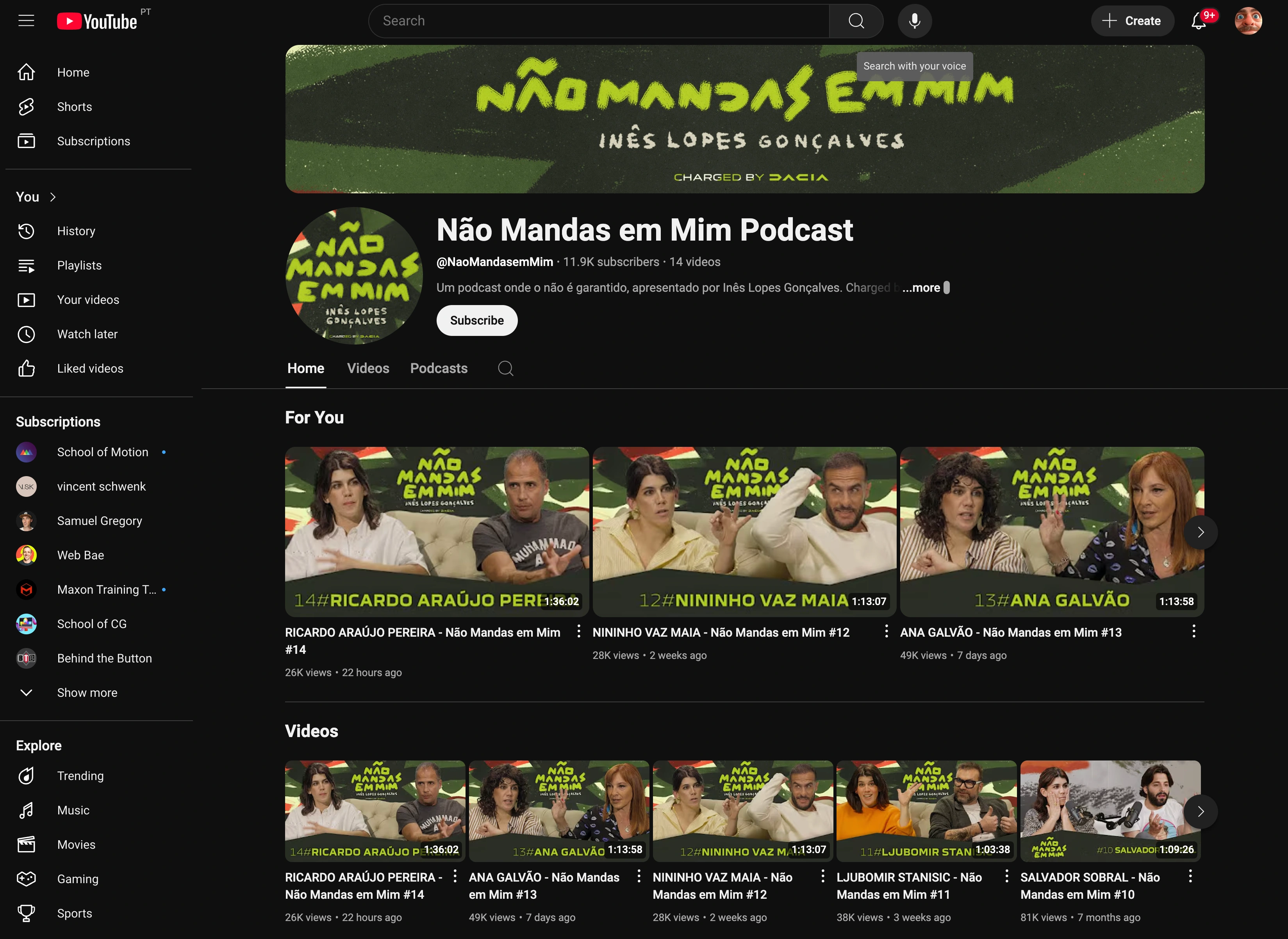
Youtube Profile Assets
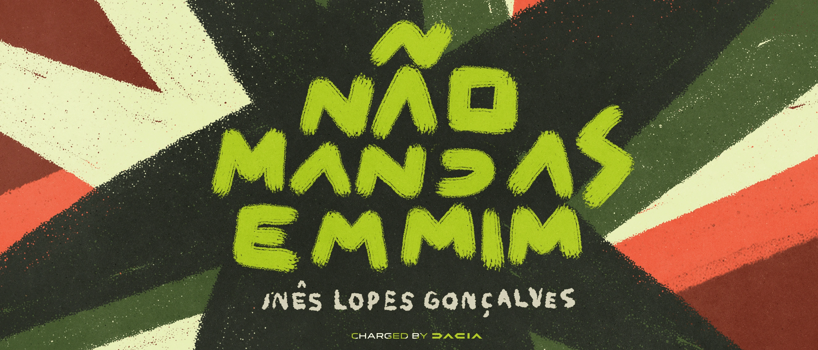
Hero Illustration

Backdrop Design
Behind the Scenes
Project Overview
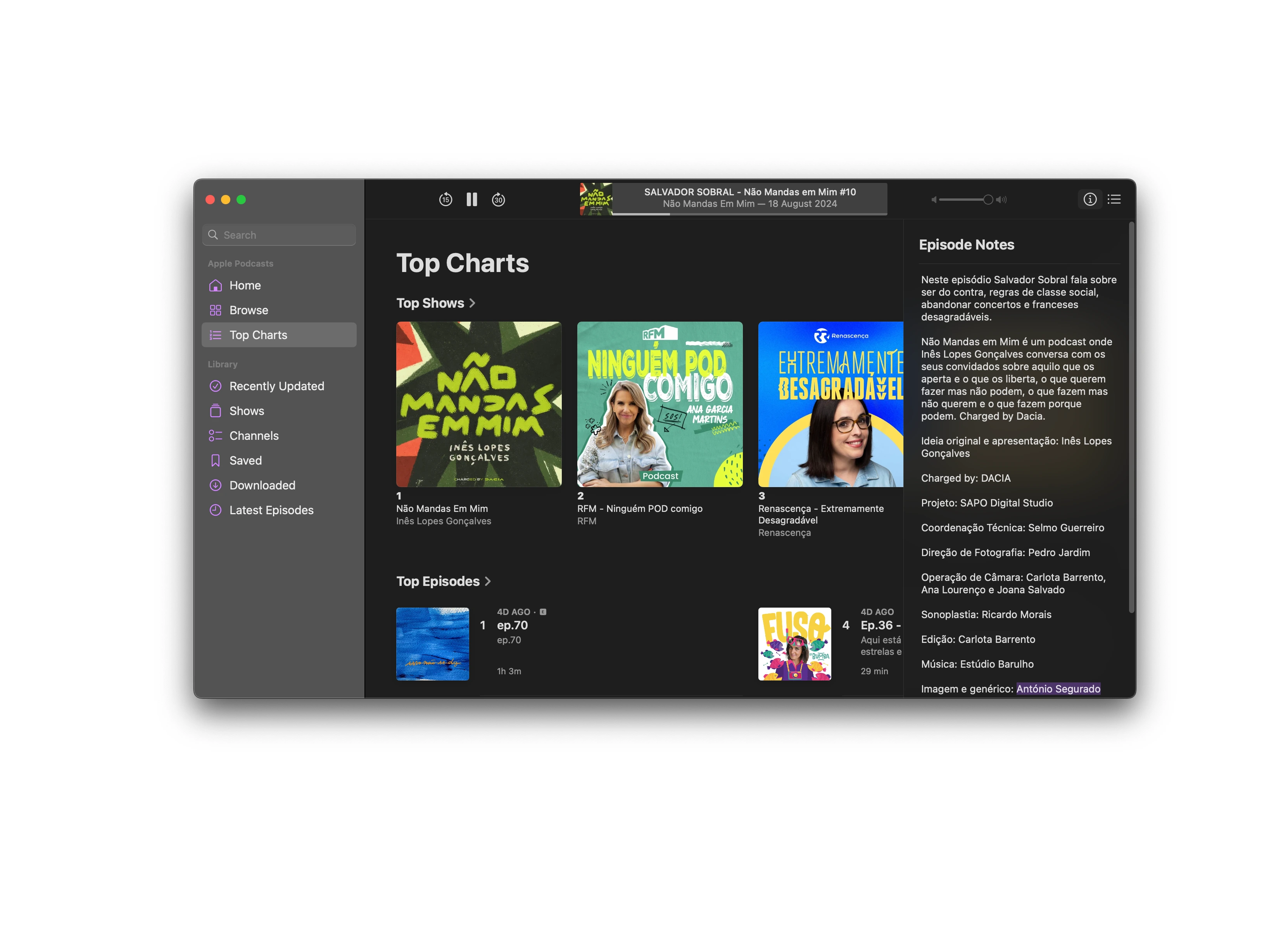
Created the complete visual identity system for “Não Mandas em Mim,” Portugal’s top-ranked comedy podcast (Apple Charts #1) hosted by Inês Lopes Gonçalves and sponsored by Dacia. The project delivered cohesive motion graphics, illustrations, and brand assets that balanced sponsor presence with the podcast’s authentic, irreverent personality.
The Brief
Client: VML Portugal (for Dacia)
Timeline: April - June 2024 (3 months)
Challenge: Execute the agency's concept for a visual identity that would:
Reflect Inês Lopes Gonçalves’ fresh, modern, and irreverent personality.
Incorporate Dacia’s brand elements without overshadowing the podcast’s authentic voice.
Create a sense of freedom and breaking boundaries as the central theme.
Ensure the podcast maintains its own identity to reach its true potential.
The Solution
Visual Concept
I developed the entire visual aesthetic based on the agency’s “breaking chains” starting point. The goal was to create a “journey without impediments” .
• Aesthetics: Shifted away from rigid corporate styles to a “playful illustrative style” defined by spontaneous, hand-drawn typography and abstract visual elements .
• Color Palette: Harmonized Dacia’s corporate colors (Khaki, Terracotta, Sand, White) with vibrant accents to evoke youth and dynamism .
• Brand Integration: Reinterpreted the Dacia “Link” logo not just as a static symbol, but as a “command”—an invitation to action that triggers the motion sequence .
Creative Approach
Balanced sponsor visibility with content authenticity by using the “Link” element to physically “order” the chaos, transforming abstract shapes into the clear, bold typography of the podcast title
Deliverables
Motion Graphics & Animation
Title sequence animations (12").
Episode intro/outro graphics with breaking chain motif.
Social media animated assets.
YouTube thumbnail templates.
Lower thirds and graphic call-outs for video format.
Illustration Work
Large-scale illustrated backdrop (8m × 2.5m) for studio set.
Character illustrations and podcast artwork.
Visual assets for episode promotion.
Brand Elements
Complete logo system with sponsor integration.
Graphic templates for va ideo podcast format.
Consistent visual language across all touchpoints.
Technical Execution
Production Process:
File Preparation: Asset adaptation and file setup.
Storyboard: Ended up to be an Animatic with StyleFrames:
Animation: 2D/3D production using Adobe Creative Suite and Cinema 4D (blocking).
Post-Production: Video editing, music synchronization, and audio mixing (music, voice-over, SFX).
Delivery: Final rendering in 1920×1080 (.mov + .mp4) with iterative client feedback.
Results & Impact
Successfully launched a visual identity that helped reach Portugal’s #1 comedy podcast on Apple Charts.
Replaced typical corporate sales language with a spontaneous, human, and playful visual tone
Created a cohesive brand system that maintained podcast authenticity while showcasing Dacia sponsorship.
Delivered end-to-end motion and social assets that elevated the podcast’s professional presence.
Established a scalable visual system for ongoing episode production.
Transformed the “chain” metaphor from a negative symbol of restriction into a positive journey of freedom
First Concept (Rejected)
First Styleframes Animation (Rejected)
First Styleframes Animation (Rejected)

Graphic Call Out Examples
↑ See the Pitch Here ↑
Do you like what you see?
Book now for motion like this for your brand.
Like this project
Posted Mar 24, 2025
Created the complete visual identity system for “Não Mandas em Mim,” Portugal’s top-ranked comedy podcast hosted by Inês Lopes Gonçalves and sponsored by Dacia.
Likes
0
Views
10
Timeline
Feb 1, 2024 - Mar 24, 2025
Clients

Dacia
VML

