Re-designing Audible’s Mobile App Experience
OverviewProblem StatementHow Might We...Business GoalRoleResearchAnalysis of the Current AppCompetitive AnalysisCustomer InterviewsSolutions User FlowsInformation ArchitectureWireframingDesign SystemBrandingAccessibilityHigh Fidelity FramesSurfacing Collections: building a second brain Discovery PageCheckout ProfileSettingsKey Takeaways
Overview
Audible is a leading audiobook platform owned by Amazon. It also offers podcasts product offerings include Audible Originals and, uniquely, Audible Originals — exclusive audio titles produced in the Audible studios. Audible has a subscription-based business model but offers the option to purchase single titles too. However, the UX to manage subscriptions is clunky and confusing.
Problem Statement
Audible’s clunky UX makes it difficult for users to navigate. This is especially so in the checkout flow process, which hurts incoming revenue.
How Might We...
Improve the user experience of the app to reduce friction when navigating the app?
Business Goal
Increasing revenue through purchase of audiobooks
Role
This is a concept project where I assumed the role of both the UX Research and Product Designer.
Research
Analysis of the Current App
Note: this analysis was made in mid-2022. There has since been significant improvements to the UX of the app. Notably, the clunky checkout flow pointed out in this case study was improved.
To begin the analysis, I “walked” the user flow and took screenshots of each step in the process. I highlighted pitfalls in the UX that made it difficult to buy new audiobooks.
I also noticed that the Profiles and Settings page were overlooked. In the Profiles page, gamification efforts were poorly executed and made the UI cluttered. In the Settings page, there was unnecessary nesting and opening the options for each group required opening a new page.
However, I also noted that the use of images was effective - the visual appeal attracted users’ attention.
Since the business goal is to increase revenue, I looked into the psychology of how consumers choose their books. This surfaced three things:
Up to 80% of people are initially interested in a book because of its cover.
A big factor driving book purchasing decisions is recommendations by store.
79% of customers put as much weight on customer reviews as they do personal recommendations..
Competitive Analysis
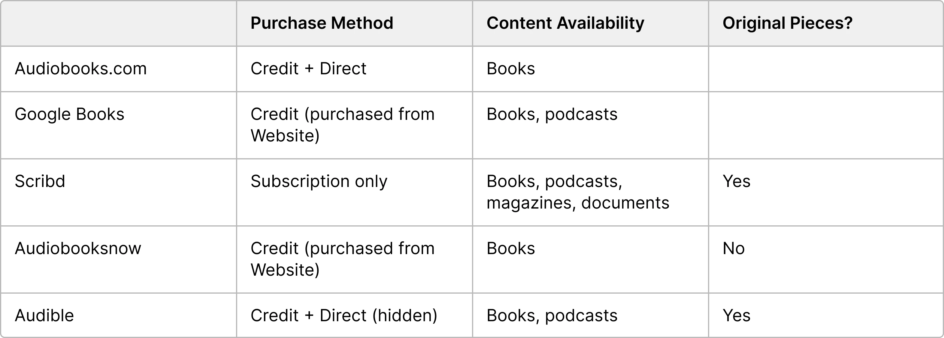
This analysis surfaced that:
Audible’s extensive collection is a major differentiator
Flexibility of pricing models should be highlighted as it is also be a differentiating factor
In general, the user interface and experience of apps in the face has room for improvement. While Audible is the leader for app experience, there is an opportunity to lean into its extensive collection and pricing flexibility.
Customer Interviews
I carried out 3 user interviews, with the goal of understanding:
Why current users are using Audible
How they are using Audible (for books, podcasts, etc.)
What their current experience with the app is like
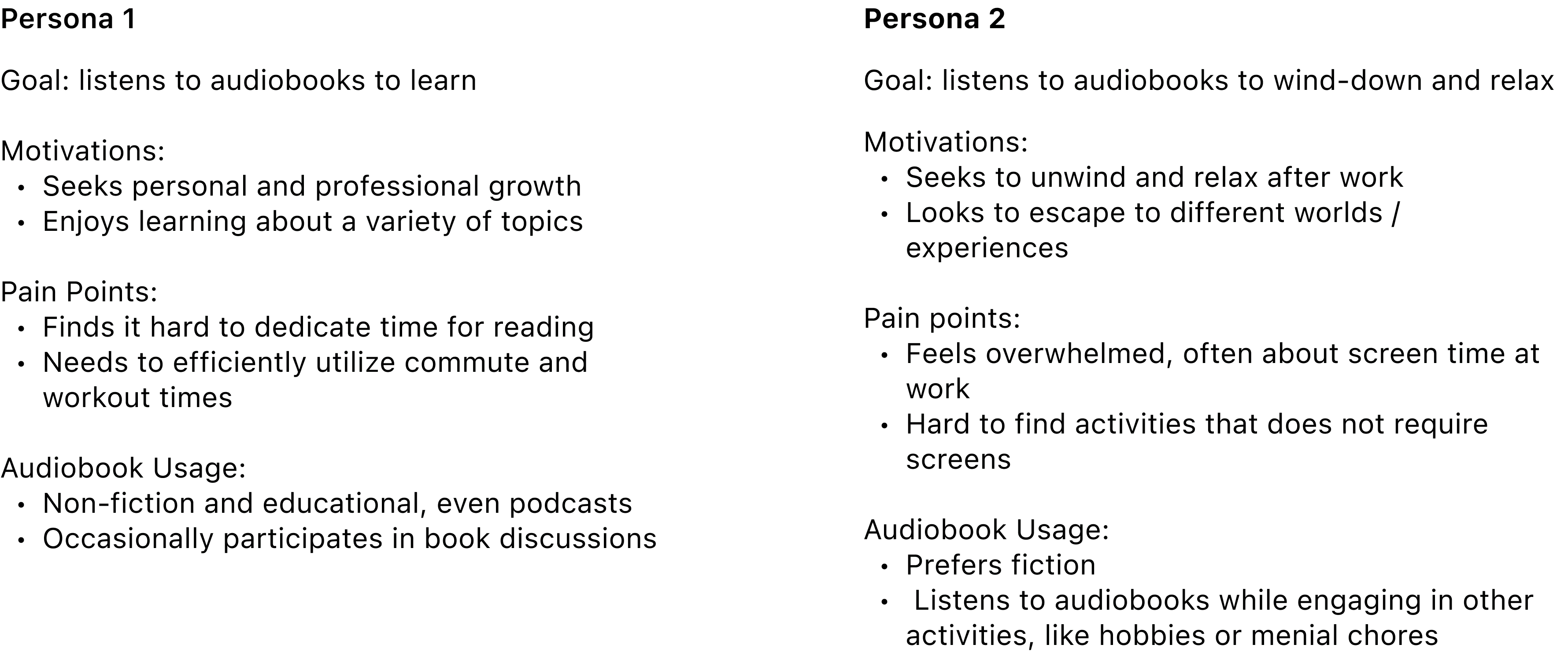
From there, I created 2 user personas who use audiobooks to achieve different goals.
Solutions
User Flows
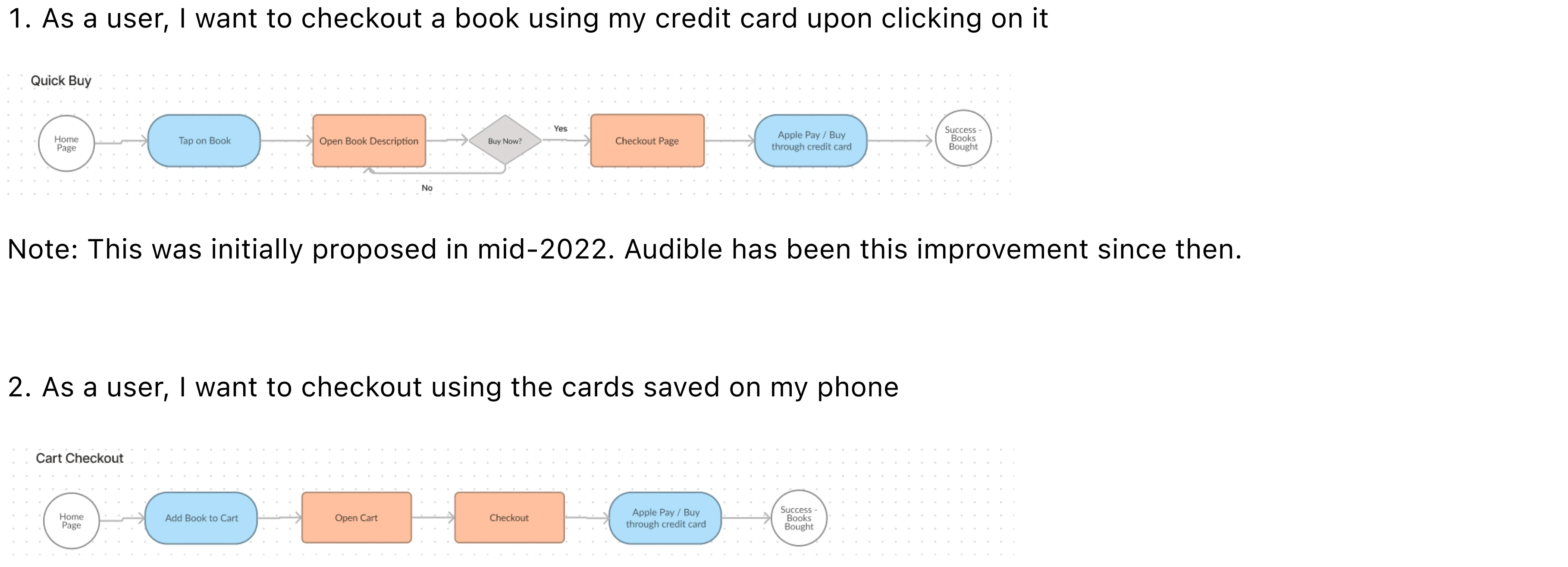
Based on the above analysis, I wanted to ensure improvements to 2 core user flows that, while are minor changes, can make a significant improvement to the user experience.
Information Architecture

Wireframing

Design System
Branding
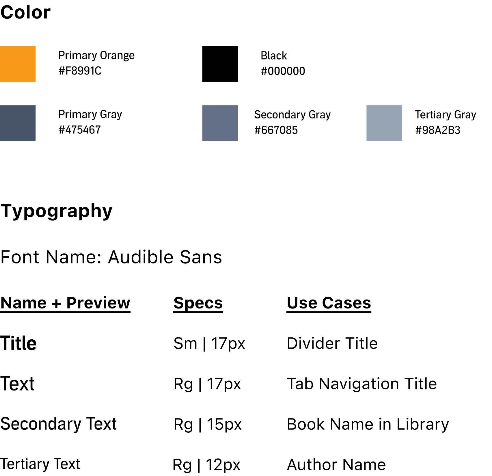
For branding purposes, I used Audible’s distinct orange color for highlights. Black and shades of gray was used for text and to differentiate between importance of information.
Accessibility
For accessibility, the primary text font used was 17, with secondary information using a smaller font. Since users are attracted to books initially on the visual appeal, and the book title is usually on the cover, images were made bigger and titles could be reiterated using secondary text.
The mock-ups were prototyped on a 375 x 812 frame as designs usually scale-up better, rather than down.
High Fidelity Frames
Surfacing Collections: building a second brain
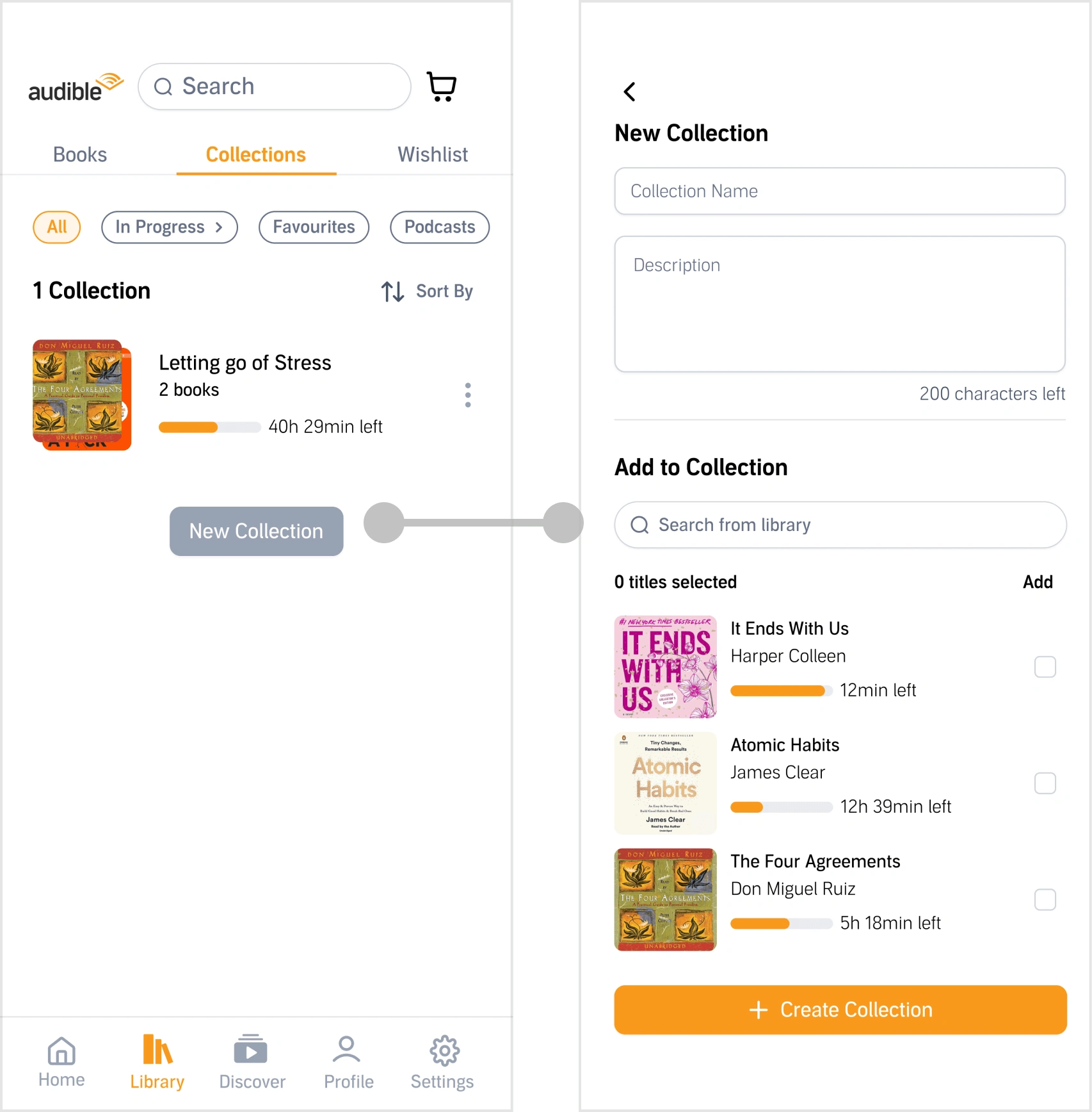
I noticed that Google Books and Audible both have a similar feature that allows users to “group” their books together. However, Google Books surfaces this feature and calls it “Bookshelves”, while Audible dubs it as “Collection” and nests this.
Tying back to our user persona, I propose that Audible surfaces this feature for their goal-oriented audience so that they can build a “second brain”. This helps users form and keep track of the connection between books, curating a collection based on their objectives.
Discovery Page
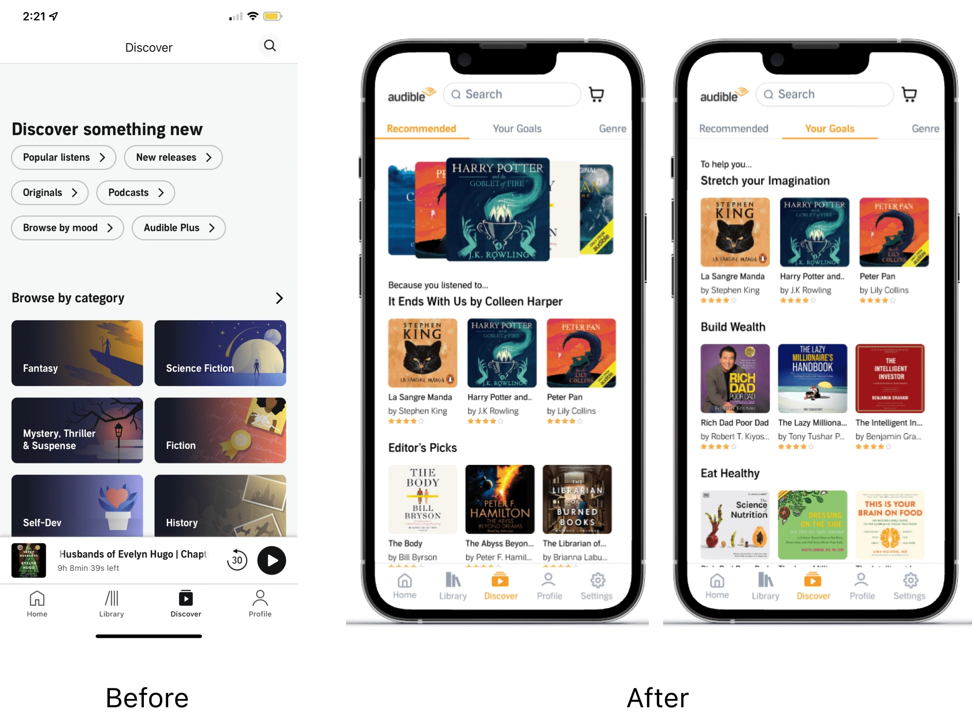
One of Amazon’s strengths is its recommendation engine. Audible can benefit from the same engine, particularly with regards to making recommendations based on readers’ goal, which is a (currently lacking) feature that was formulated based on user feedback.
Further, while Amazon’s greatest draw is its vast collection, this may also lead to decision paralysis. Audible can potentially alleviate this paralysis by taking a page from Indigo, Canada’s only major English bookstore chain. “Heather’s Picks” is a special tag bestowed on books that the founder (Heather) has read and love. Her endorsements act as a heuristic shortcut, simplifying the decision-making process.
Introducing this simply calls for improved information hierarchy - by moving Editor’s Picks high up the page, Audible can introduce this heuristic shortcut to users to streamline decision making.
Checkout
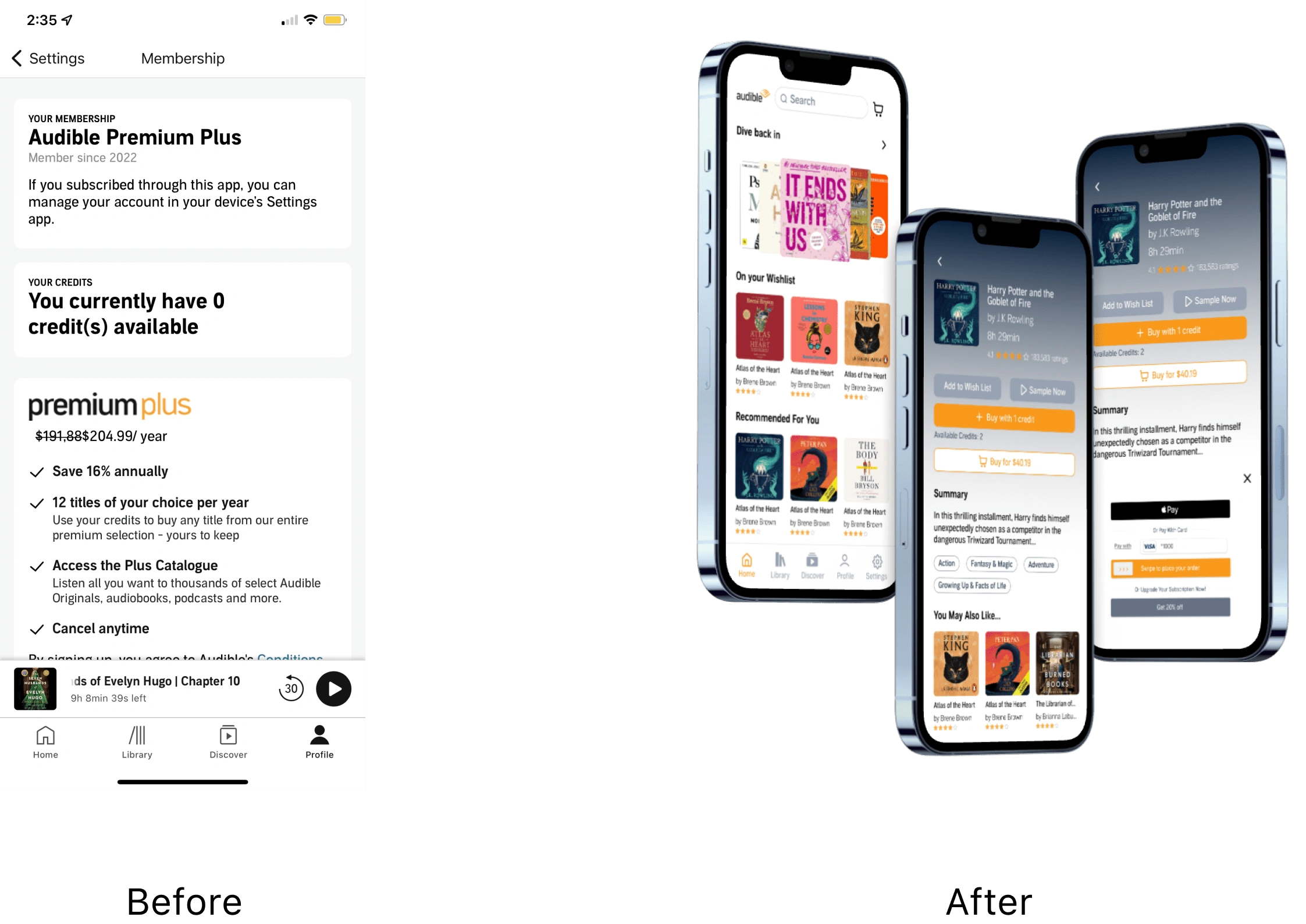
Before: The previous checkout experience made it difficult for users to modify their subscription and it was not clear that it is possible to purchase single audiobooks with dollars rather than credits.
After: the proposed checkout experience surfaces the ability to
Checkout via credit card instead of credits
Compare the potential savings by upgrading plans
Allowing users to add items from their wishlist to the checkout directly
Profile
Before
The original Profile page nested the membership management options, making the UX clunky and detrimental to conversion to higher paying plans.
Further, the original gamification efforts had little meaning to users. It was hard to understand the badges available and what the titles were.
Recommended Design
The recommended design draws the user’s attention to the gamification aspects of Audible and streamlines the membership management process.
This is done by shrinking the amount of space used for the user’s name (which does little for the user), adding icons to highlight badges and including a status bar to give users a visual representation of how to get to the next level.
The membership management also gives users the option to upgrade plans directly and highlights its benefits.
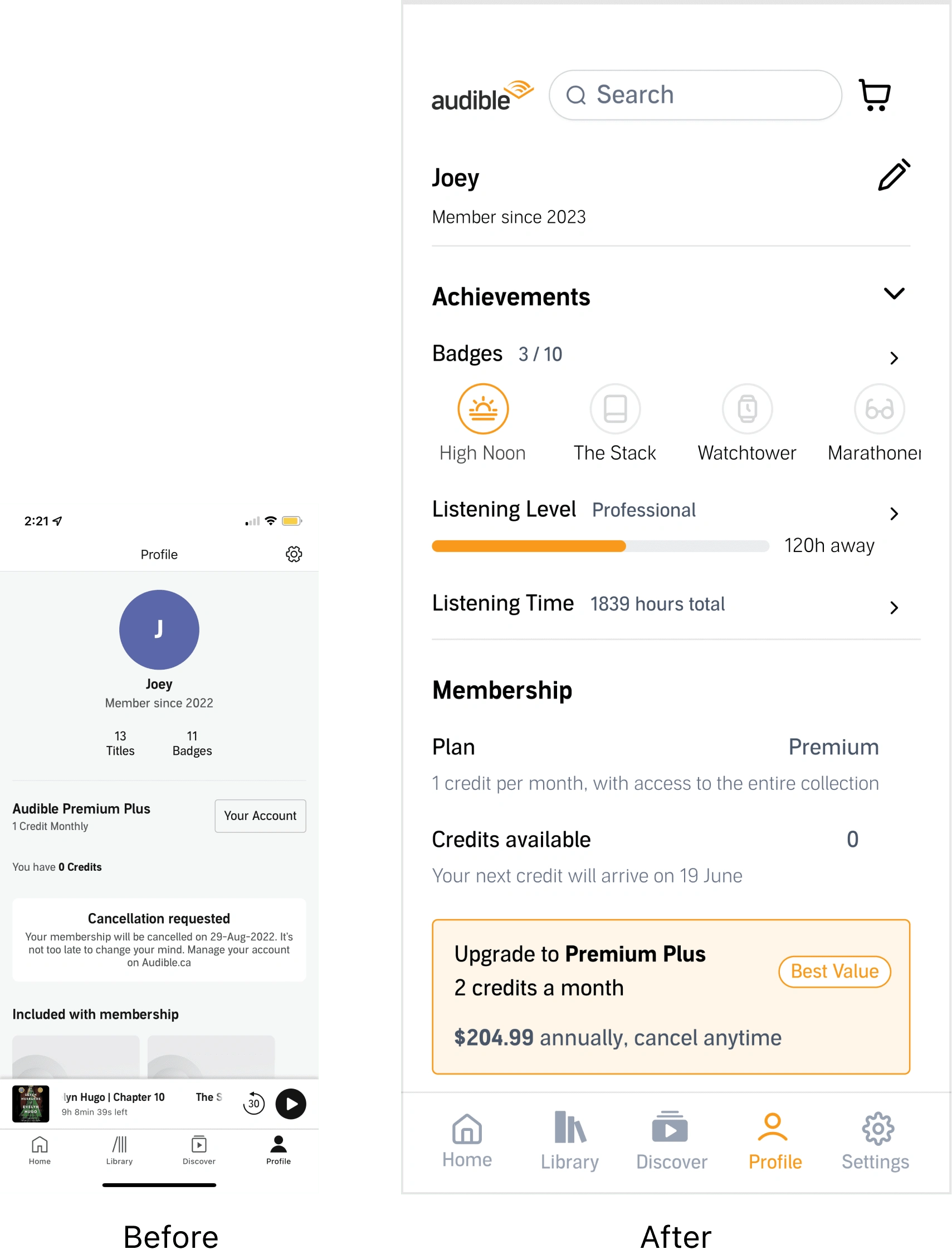
Audible Profile Page: Comparing Original and Proposed Designs
Settings
Before
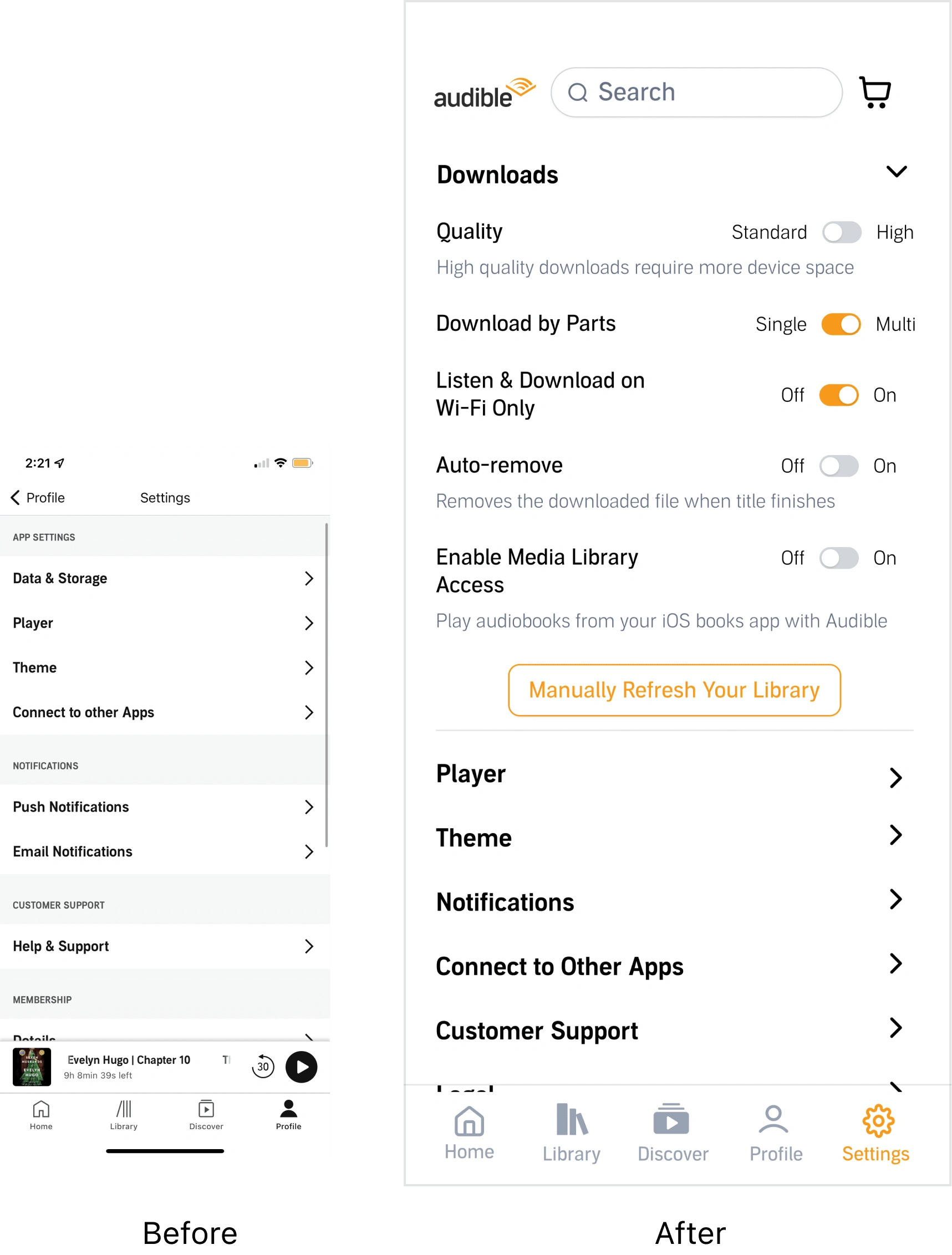
The original Settings page nested each setting, where each each section will open up on a new page. However, this meant that a lot of toggling between pages is needed to find the right setting.
Recommended Design
The recommended design proposes having a dropdown with toggles to streamline the flow to change a setting
I also included explainers for settings that may be unclear.
Key Takeaways
Streamlining user flows for time-efficient navigation
The analysis revealed that Audible users, often pressed for time or seeking a stress-free experience, faced hurdles due to inefficient user flows. To address this, the redesign focused on simplifying navigation paths, reducing the number of steps to complete actions like finding, purchasing, and starting an audiobook. This streamlining is particularly crucial in the mobile app environment, where users expect quick and effortless interactions. By making the process of discovering and acquiring audiobooks more intuitive and less time-consuming, we anticipate a direct positive impact on revenue conversion rates, as a smoother user journey typically encourages more frequent and larger purchases.
2. Leveraging information hierarchy to enhance feature accessibility
The redesign emphasized a more strategic use of information hierarchy to improve overall user experience. By prioritizing key features and content based on user preferences and behaviors, such as highlighting new releases or personalized recommendations, users can more easily navigate and utilize the app’s offerings. This approach not only makes the app more user-friendly but also ensures that existing features are fully leveraged, enhancing user satisfaction and engagement.
3. Aligning with Consumer Purchasing Decisions
Understanding what drives consumer purchasing decisions is crucial. Our research indicated that book reviews are a significant factor in these decisions. Therefore, the redesign gives greater visibility and accessibility to reviews, allowing users to easily access and evaluate them when considering a purchase. This transparency not only aids users in making informed decisions but also builds trust in the platform. By aligning the app’s design with the factors that influence purchasing decisions, we can create a more user-centric experience that resonates with the needs and preferences of our audience, ultimately driving sales and fostering loyalty.
Like this project
Posted Jan 26, 2024
Re-designed Audible to improve navigation and checkout UX, with the business goal of increasing revenue through surfacing differentiators and reducing friction
Likes
0
Views
24

