Aura Bora "Unhinged" Email Campaign
The Client 🍓
Aura Bora — a unique sparkling water company. Notable for their herbaceous, fruity, and flowery flavors 🌸
The Brief (1 time project)
Craft an email campaign to potentially launch in Aura Bora's "unhinged" content series
Include a subject + preview line
Demonstrate understanding of brand tone, voice, imagery, and aesthetic
The Research 🔎
I scoured the Aura Bora Instagram, website, and emails to gather intel (I became a legit detective here).
Their "unhinged" email campaigns typically includes:
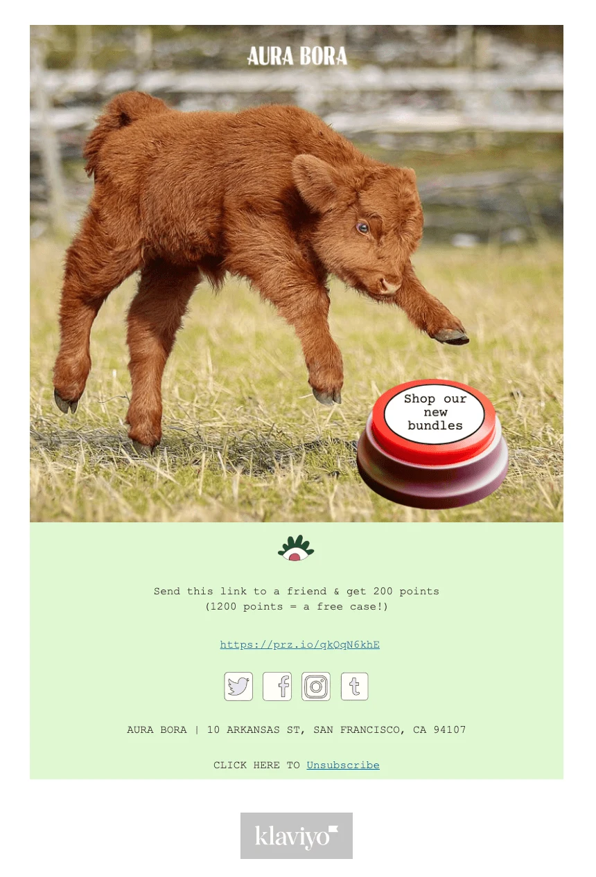
Imagery: A meme-like picture of an animal. The animal is the main focus with a simple background.
Subject + preview lines: witty, playful, and slightly absurd. Sometimes all lowercase.
CTA button: a distinct, oval shaped button with a clear call-to-action.
Overall aesthetic: endearingly bizarre, cute, or nature inspired.
Creation Tools + Process
Image sourcing: I went through Pinterest to find photos that would match the brand aesthetic and spark interest.
Conceptualization: I noticed that Aura Bora launched new bundle packs. Therefore, I thought it wise to use the email campaign to advertise those.
Utilized Canva and Photoshop to craft the main image for the email.
Imported photo into Klaviyo (the email service Aura Bora uses). Completed the email campaign with their footer + social links.
Final Result 🌀
Subject Line: press the big red button
Preview Line: we dare you
CTA: Shop our new bundles

P.S. for the footer, I had to investigate to determine the font and spacing. I also imported the icons they use for the socials and logo.
Like this project
Posted Aug 9, 2023
Crafted an email campaign for Aura Bora's "unhinged" content series.


