Nordic Botanical Elixirs — Concept Packaging System

Tatyana Burova


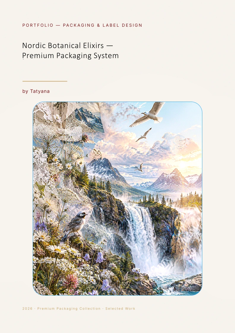
Nordic Botanical Elixirs — Premium Packaging System
A conceptual packaging system inspired by Nordic botanicals, exploring premium elixir identity, refined typography and a cohesive multi‑SKU visual direction. This series expresses mood, storytelling and visual identity through restrained composition, natural motifs and a calm Scandinavian palette.
Brief
Create a conceptual visual system for a series of premium Nordic botanical elixirs.
Creative Direction
Nordic restraint, botanical motifs, clean typography, and the feeling of a small‑batch artisanal product.
System
Color, illustration motifs, and typographic hierarchy distinguish each SKU while keeping the entire line cohesive.
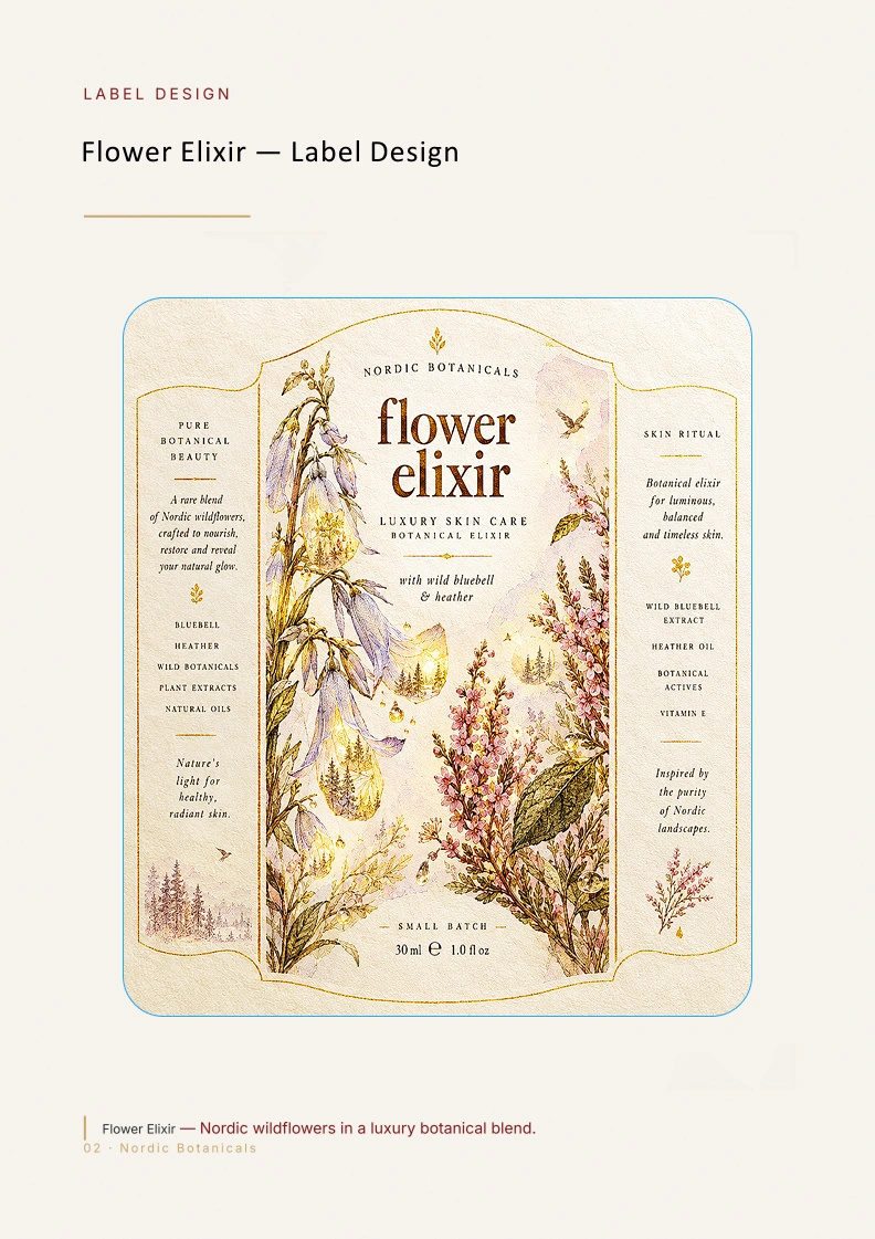
Flower Elixir — Concept Label Design
Exploration of Nordic botanicals, clean typography and premium skincare aesthetics. This label establishes the visual tone for the botanical elixir series.
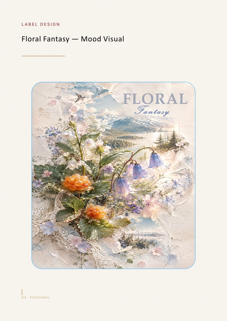
Floral Fantasy — Concept Mood Visual
Mood visual defining palette, light, and botanical textures for the packaging system.
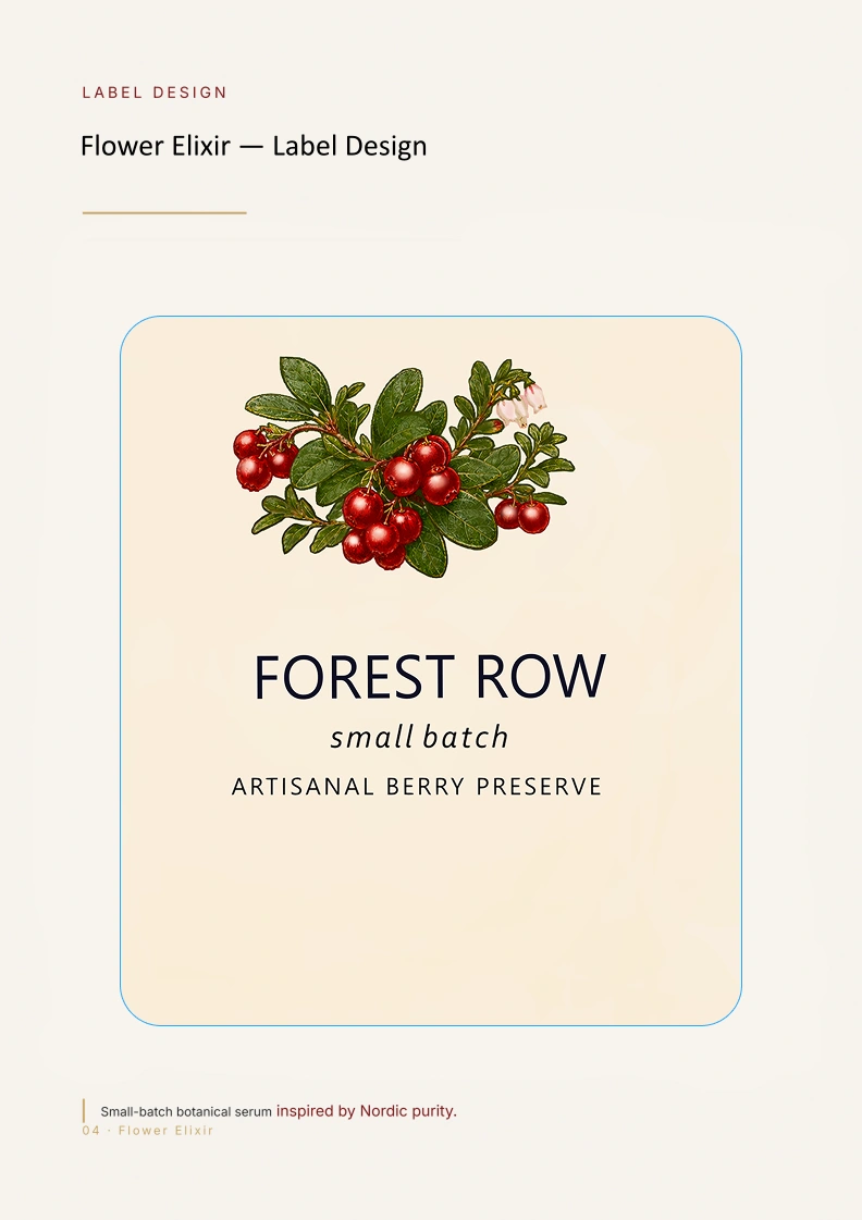
Forest Row — Concept Label Exploration
Exploration of typographic clarity and small‑batch identity within the Nordic botanical direction.
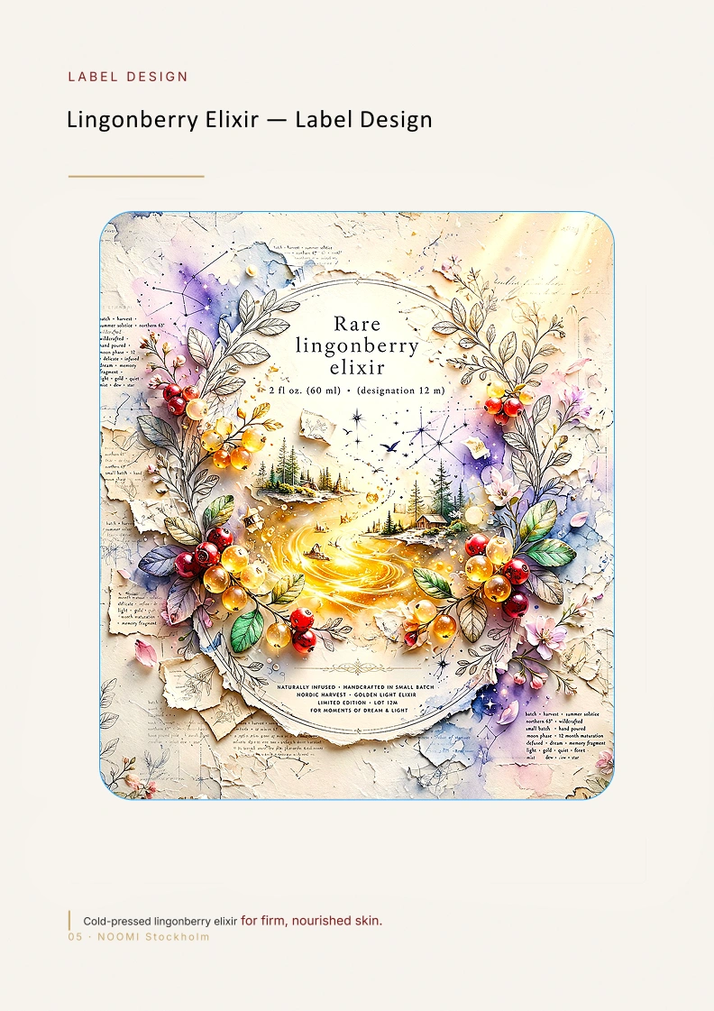
Lingonberry Elixir — Concept Label Design
Color and motif development for berry‑based SKU variations within the system.
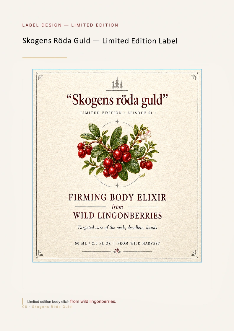
Skogens Röda Guld — Concept Limited Edition Label
Limited‑edition direction showing how illustration and color shift for premium seasonal releases.
Like this project
Posted Sep 21, 2026
Premium packaging system inspired by Nordic botanicals, blending refined typography, natural ingredients and a calm Scandinavian visual direction.
Likes
0
Views
3
Timeline
Sep 20, 2026 - Sep 21, 2026