Tatyana Burova - Art Director | Contra
Work by Tatyana Burova
Sign Up
Post a job
Sign Up
Log In
Tatyana Burova
Brand Designer · Visual Systems · Character Branding
Message
Follow
New to Contra
Tatyana is building their profile!
Kraków, Poland
Work
About
Kraków, Poland
1
Auraform Auraform is a minimalist architectural studio presentation built with a modern typographic system, custom atmospheric backgrounds, and a clean, intentional layout. The interface includes functional navigation between the main page and the Selected Works section, creating a smooth, gallery‑like experience. The design emphasizes spatial calm, material tactility, and conceptual clarity. All visuals- including the abstract background textures - are created from my own materials. The project demonstrates how architectural identity can be expressed through refined digital presentation, combining modern aesthetics with functional UI logic.
1
118
1
Green Molecule Green Molecule is a premium skincare concept built around plant‑based ingredients, molecular science, and a clean, eco‑minimalist visual identity. The project presents a complete brand experience with a calm, organic aesthetic and fully functional navigation between the main page and the product collection. The interface is designed in a soft, natural palette with abstract botanical shapes and smooth transitions. Users can explore the full collection - serums, creams, and balms - and return to the main brand page through animated, eco‑styled buttons. The layout emphasizes ingredient transparency, molecular precision, and sustainable production principles. All visuals - including backgrounds, compositions, textures, and product imagery - are created from my own materials. Green Molecule demonstrates how natural skincare can be expressed through modern digital design, combining clarity, softness, and scientific storytelling.
1
123
1
ECHO ORIGIN — Golden Unicorn Coffee Brand Concept Golden Unicorn is a premium coffee‑brand concept built around a signature emblem — a golden unicorn filled with coffee and whipped cream. The project explores how expressive art, metallic textures, and radiant energy can shape a luxurious product identity. The unicorn appears as a central brand symbol across multiple touchpoints: coffee packaging, featuring golden gradients and high‑contrast detailing a branded coffee cup, where the emblem becomes a focal visual element digital presentation screens, including a color‑shifting title and atmospheric motion All visuals — including the unicorn illustration, golden textures, and product compositions — are created from my own authorial images. The concept blends premium aesthetics with playful myth‑inspired storytelling, forming a distinctive identity for a high‑end coffee brand named ECHO ORIGIN.
1
123
1
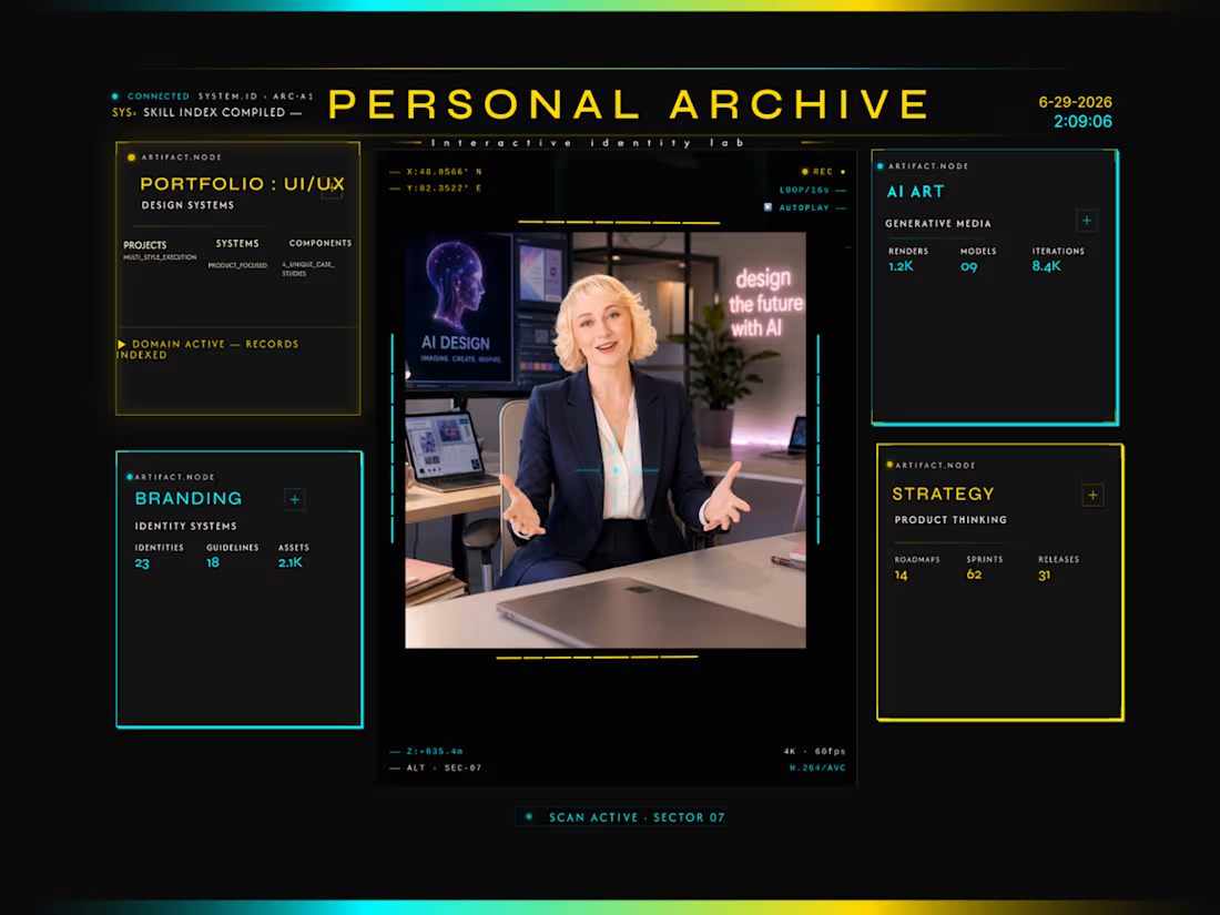
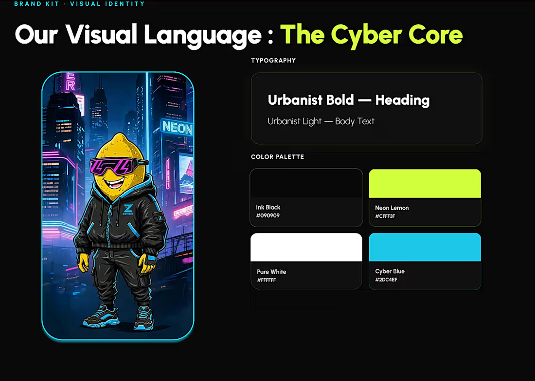
Personal Archive Personal Archive is an interactive AI‑driven portfolio system that organizes my work into dedicated, fully navigable sections. The main interface acts as a hub, with reactive neon buttons, animated indicators, and smooth transitions that lead into separate, fully designed pages. UI/UX Portfolio — a structured portfolio page with six project models. Each project opens into its own detailed view, where the full case can be explored with dedicated navigation (Back to Gallery, Back to Portfolio). Branding — a brand lab for my Cyber Lemon identity, featuring an animated character, lip‑sync motion, product prints,and a button with a transition to the store window. AI Art — a generative media archive that presents my AI‑art projects across renders, models, and iterations, all created from my own materials. Strategy — a product thinking page that outlines my core principles, methods, and approach to building bold, expressive visual projects. All visuals, motion systems, lip‑sync, video editing, and UI logic are created by me, forming a cohesive AI‑art portfolio and interactive archive rather than a single static page.
1
135