Female Fairness | Brand Strategy & Visual Identity

Marcella Fagundes



SERVICES
Brand Strategy
Visual Identity
—
DESCRIPTION
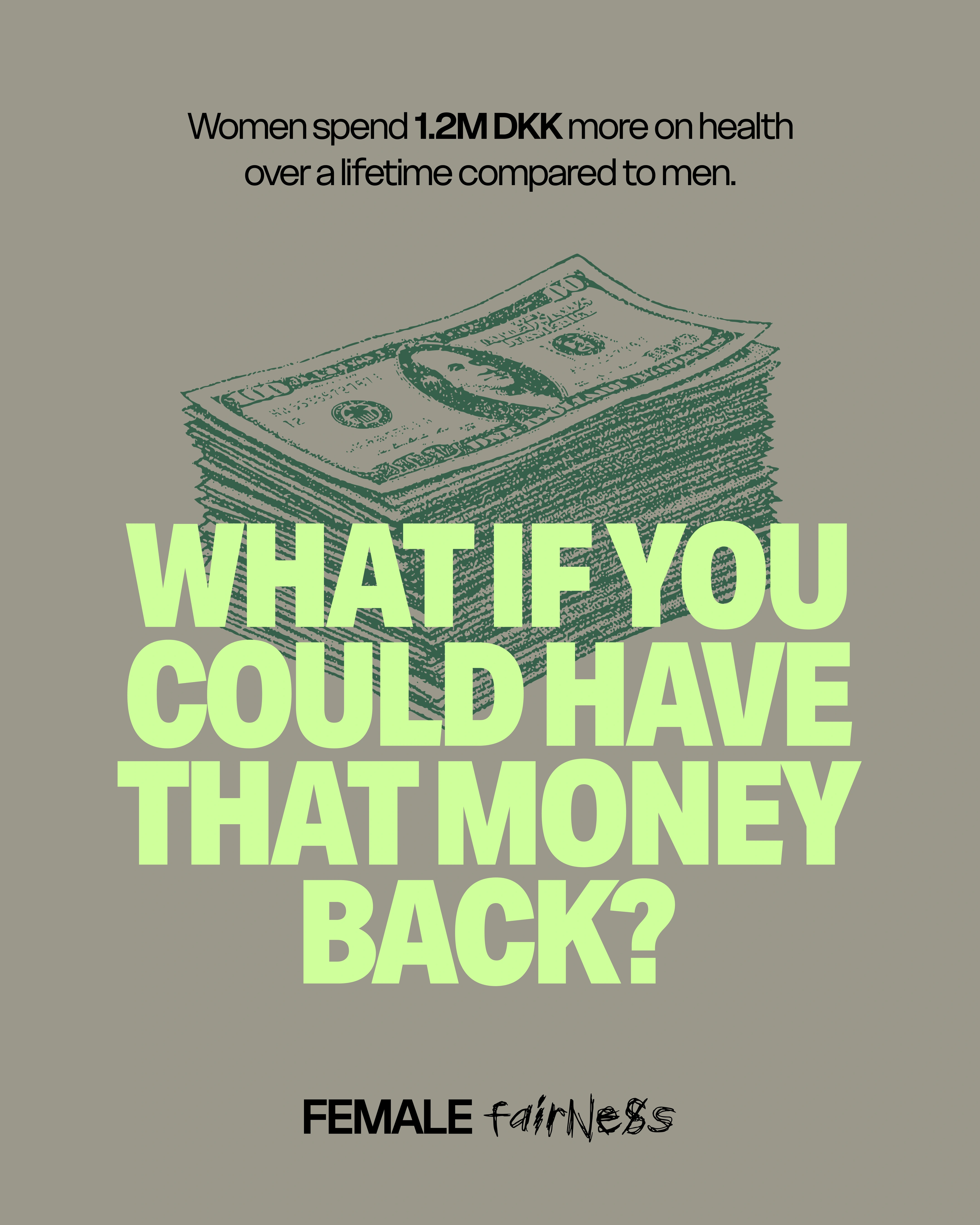
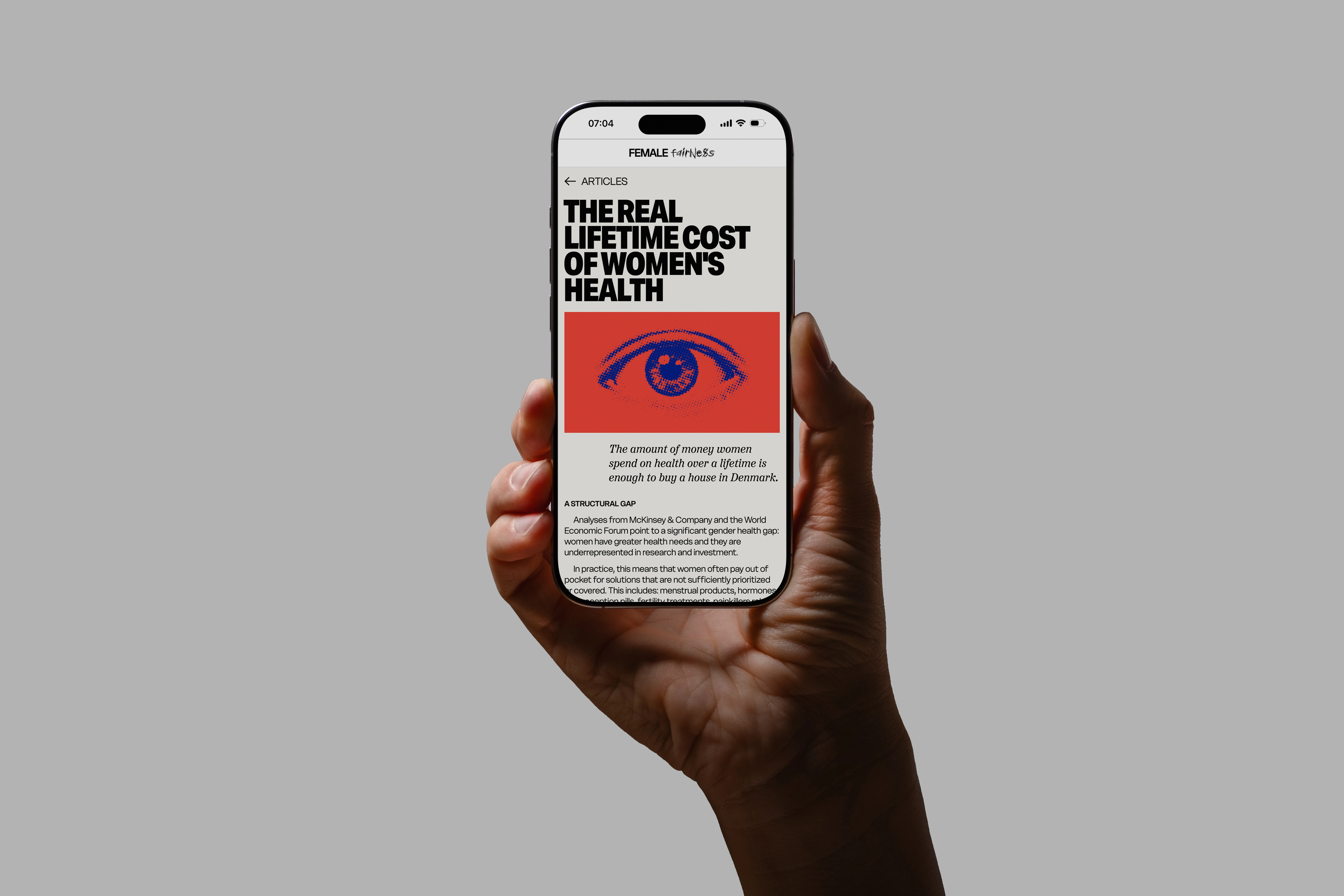
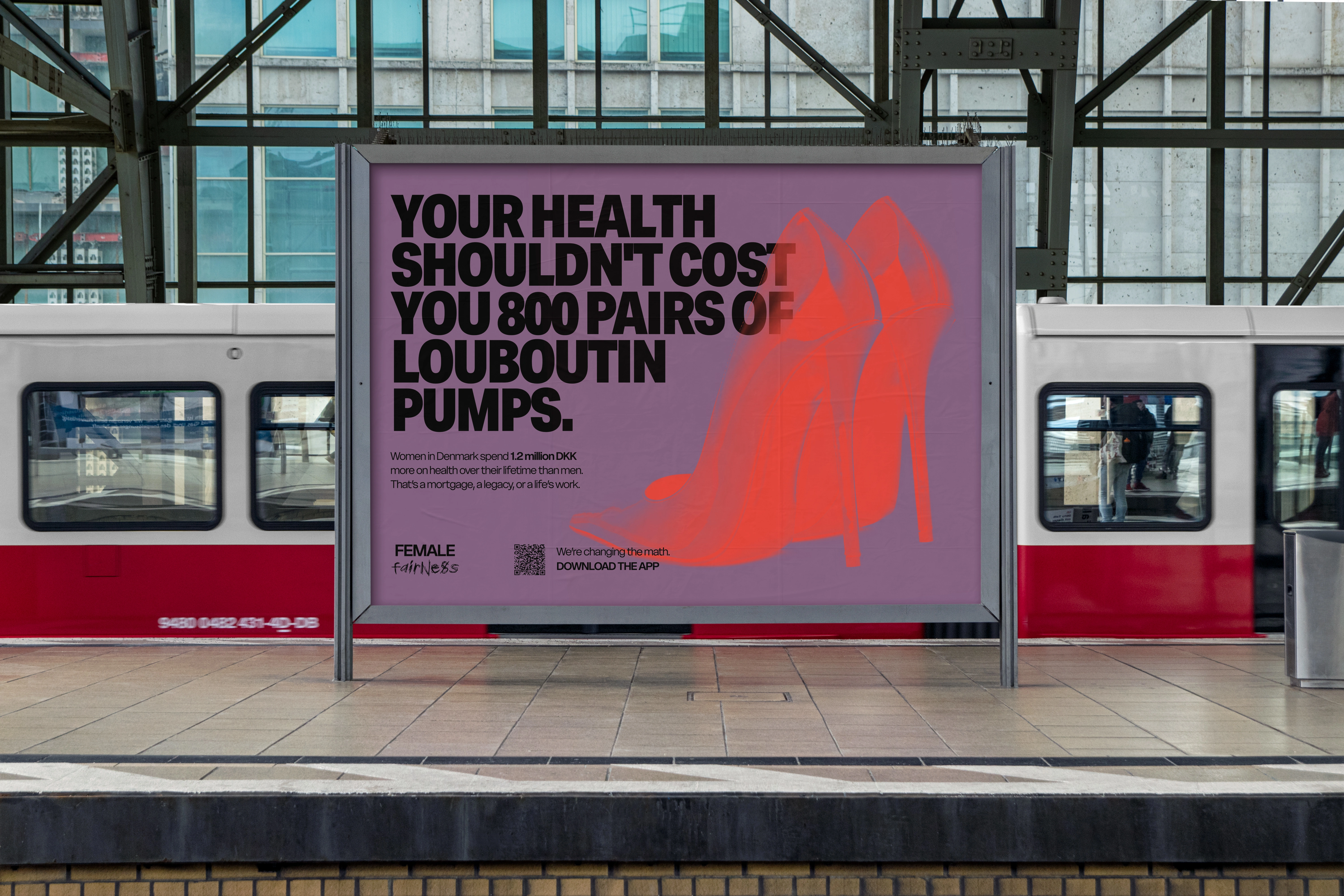
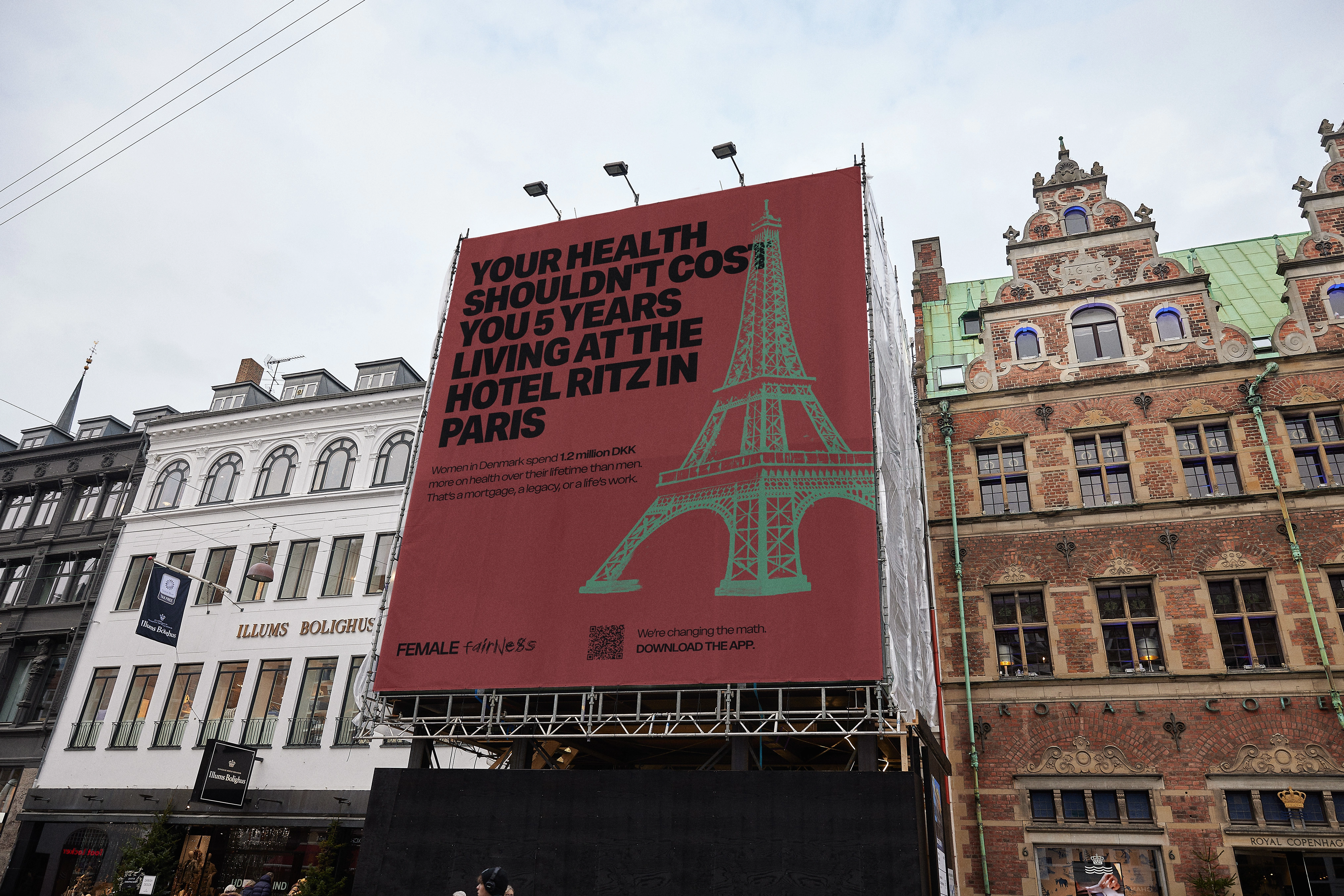
Female Fairness is a Danish Femtech-Fintech company created by Maria Høyer Olsen, focused on making the hidden cost of being a woman visible, understandable, and actionable. In Denmark, women spend about 160,000€ more on health over a lifetime compared to men. That's a house they could have bought and never got the chance to.
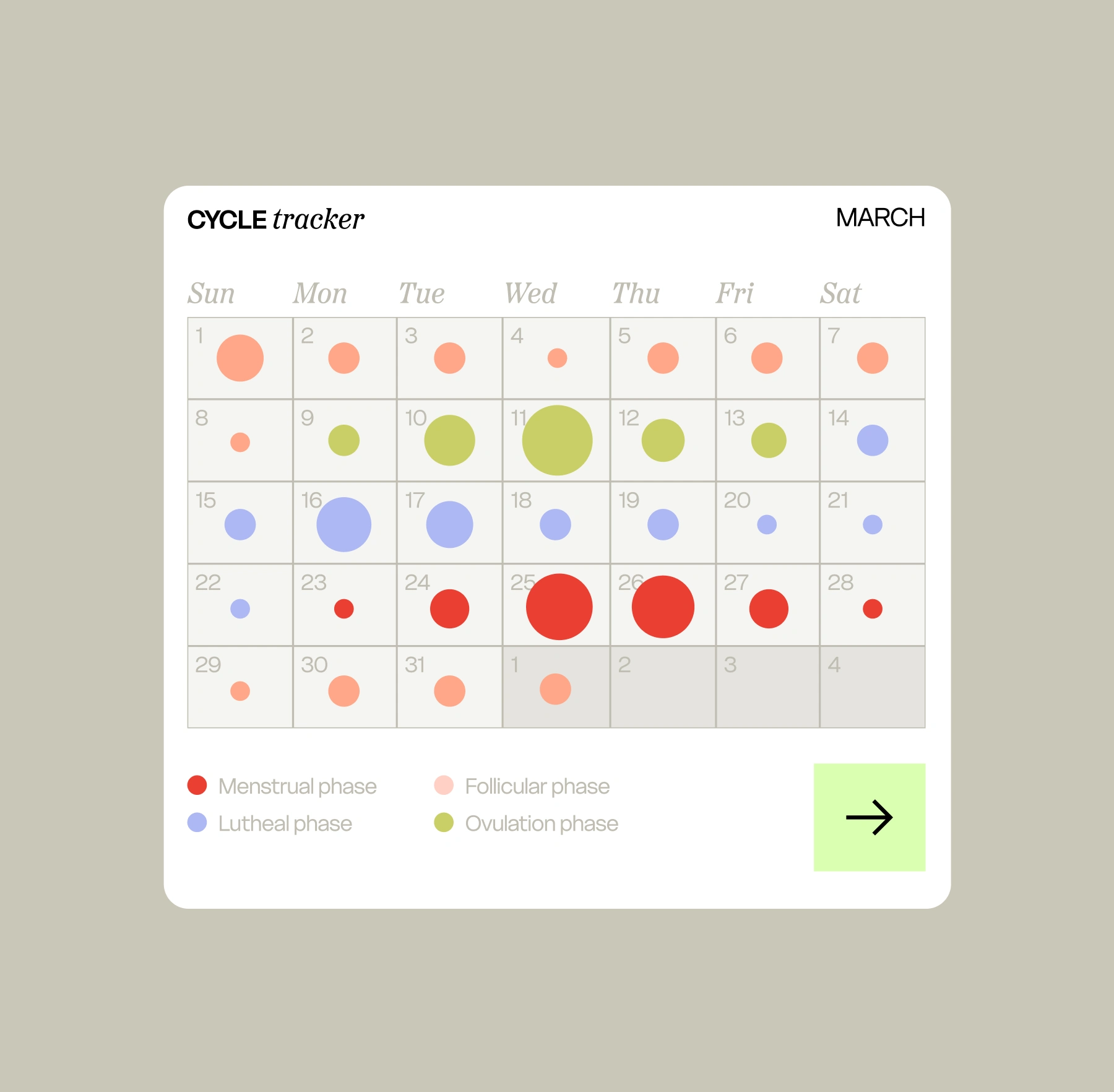
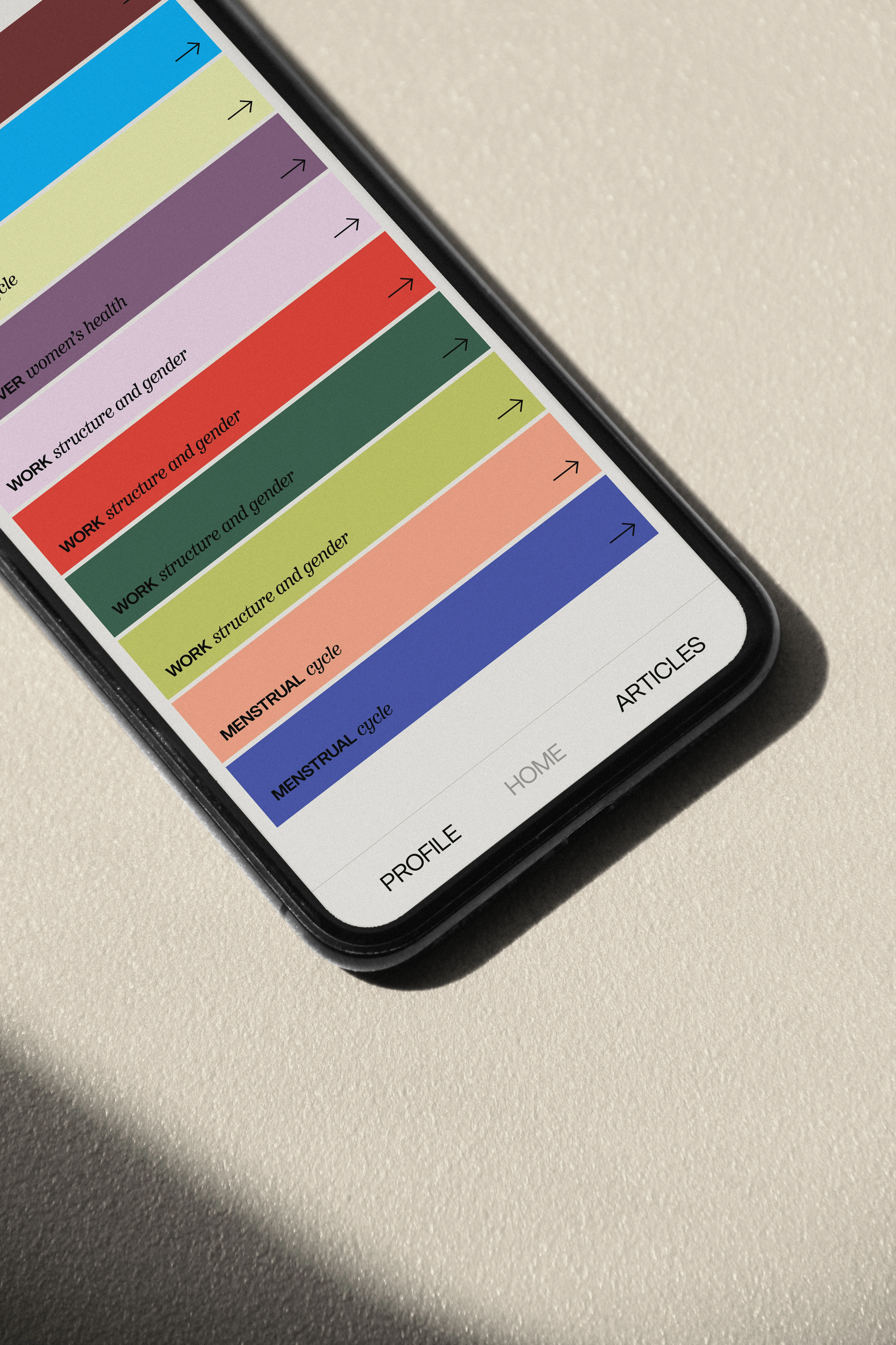
The Female Fairness app does something simple but radical: it helps every woman calculate her personal health spend, and then works to get her that money back, combining health data and financial tools, and collaborating with local shops and government to generate actual financial cashback.
Maria's biggest challenge was: how do we bring Danish women into the conversation about the gender health-wealth gap? And how do we look serious, but also honest and fresh, so they'll trust us with the task?
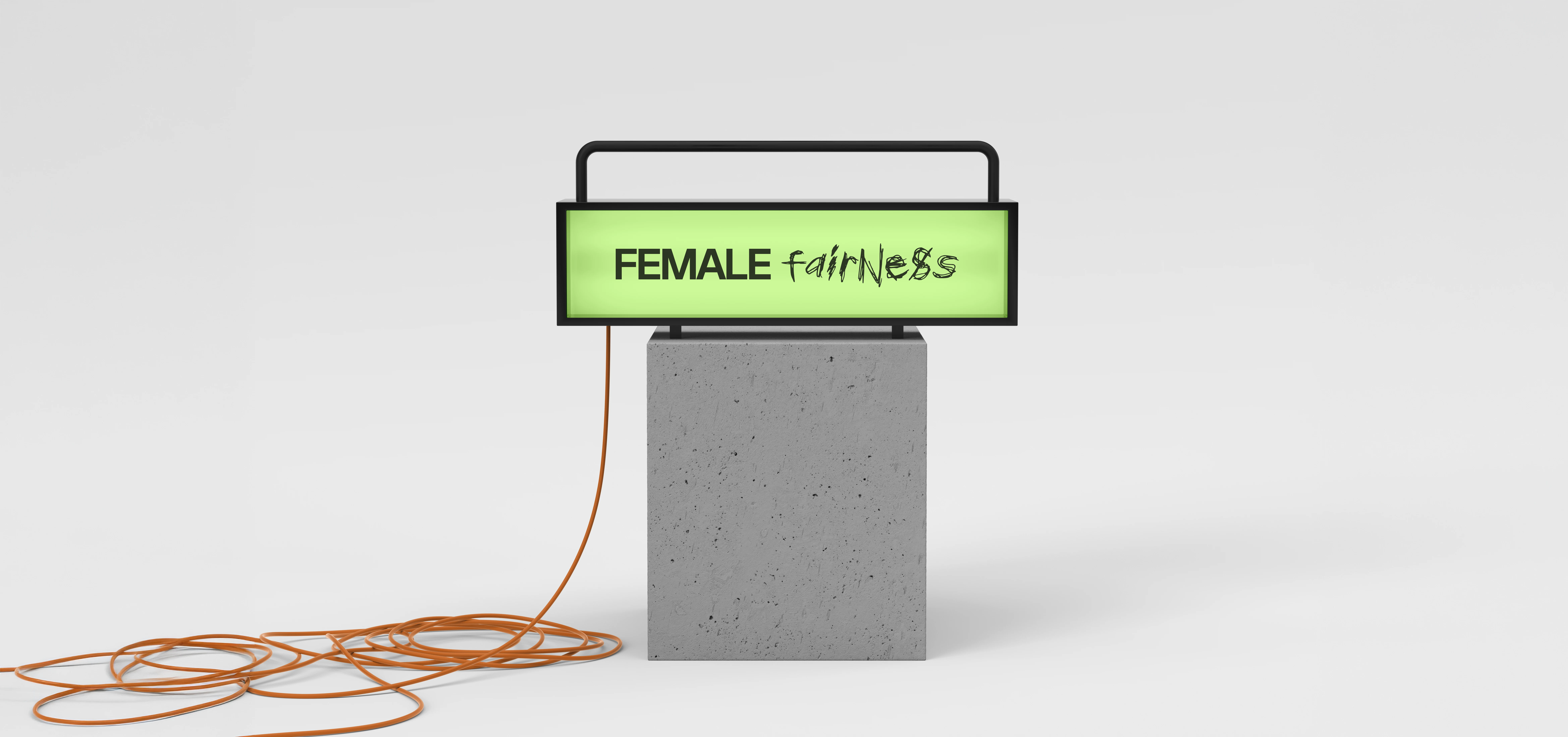
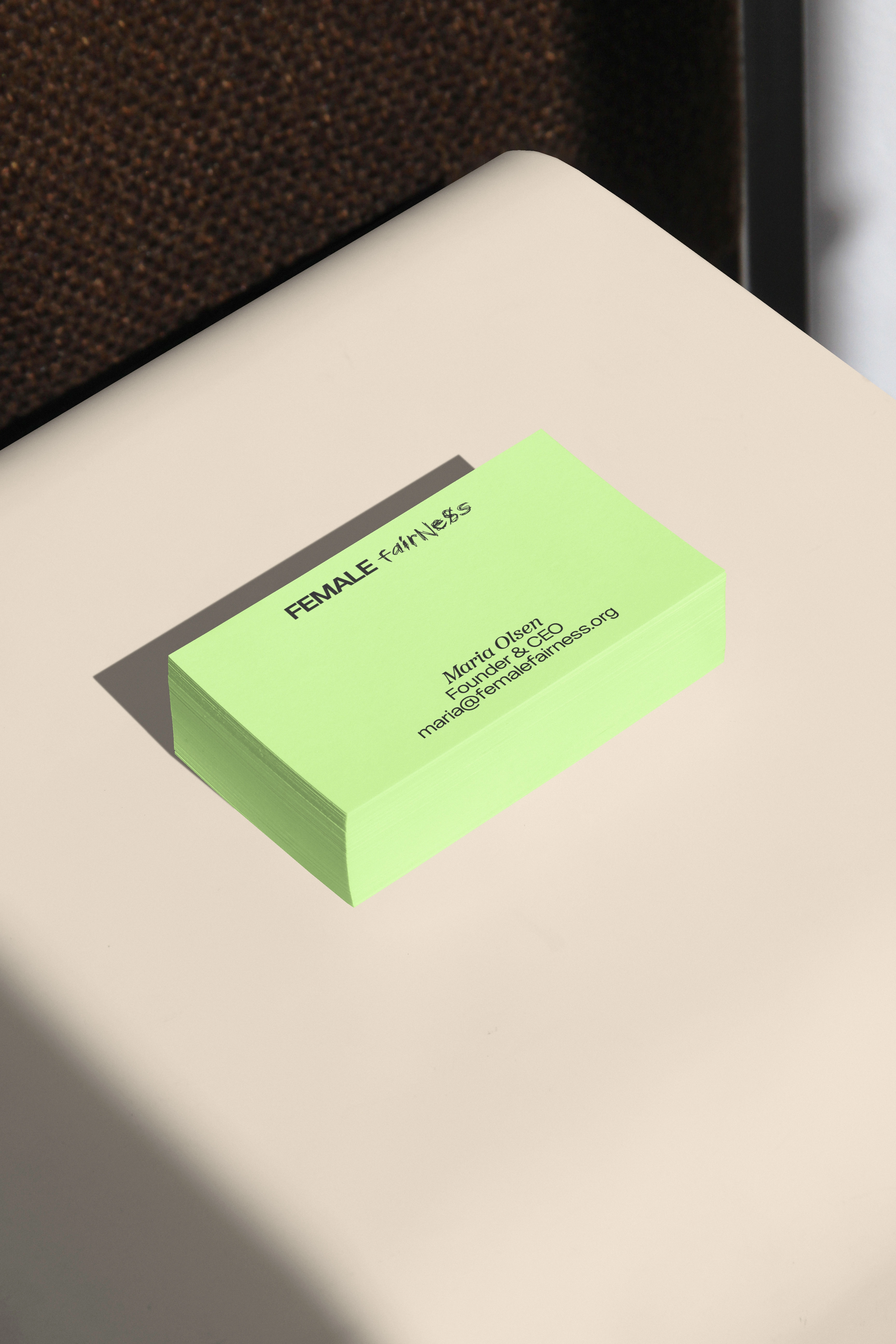
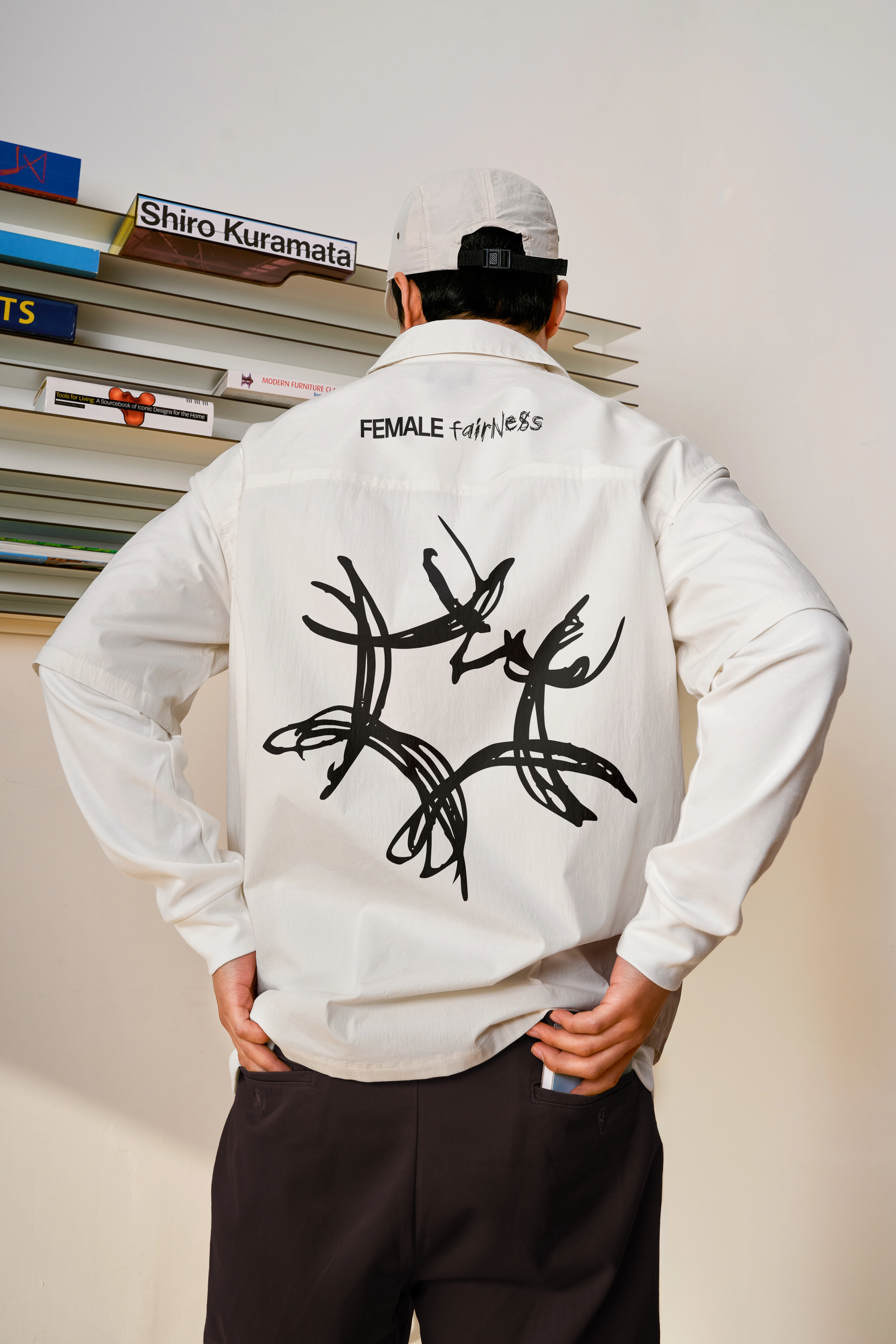
The brand strategy was to put women at the center, to take ownership of their destiny. The handwritten "fairness" highlights the female position of taking up space and being the pivot point for creating more equality.
The design mixes minimalistic Scandinavian style with contemporary, artistic strokes. The handwritten word and brand symbol give an assertive feel, as if women were saying: "we want it done, we want it right." The icon symbolizes a net, almost like a spiderweb, representing that change is only possible when people do it together. It's raw, just like the information Female Fairness freely gives on gender inequality, and just as raw as their desire to change the data.
The result is a brand that feels as direct as the problem it's solving: Scandinavian clarity with a raw, handmade edge, built to make Danish women feel seen, not lectured to.
Like this project
Posted Sep 28, 2026
Developed a brand strategy and visual identity for Female Fairness.