Vértice | Brand Strategy & Identity

Marcella Fagundes



SERVICES
Brand Strategy
Visual Identity
—
DESCRIPTION
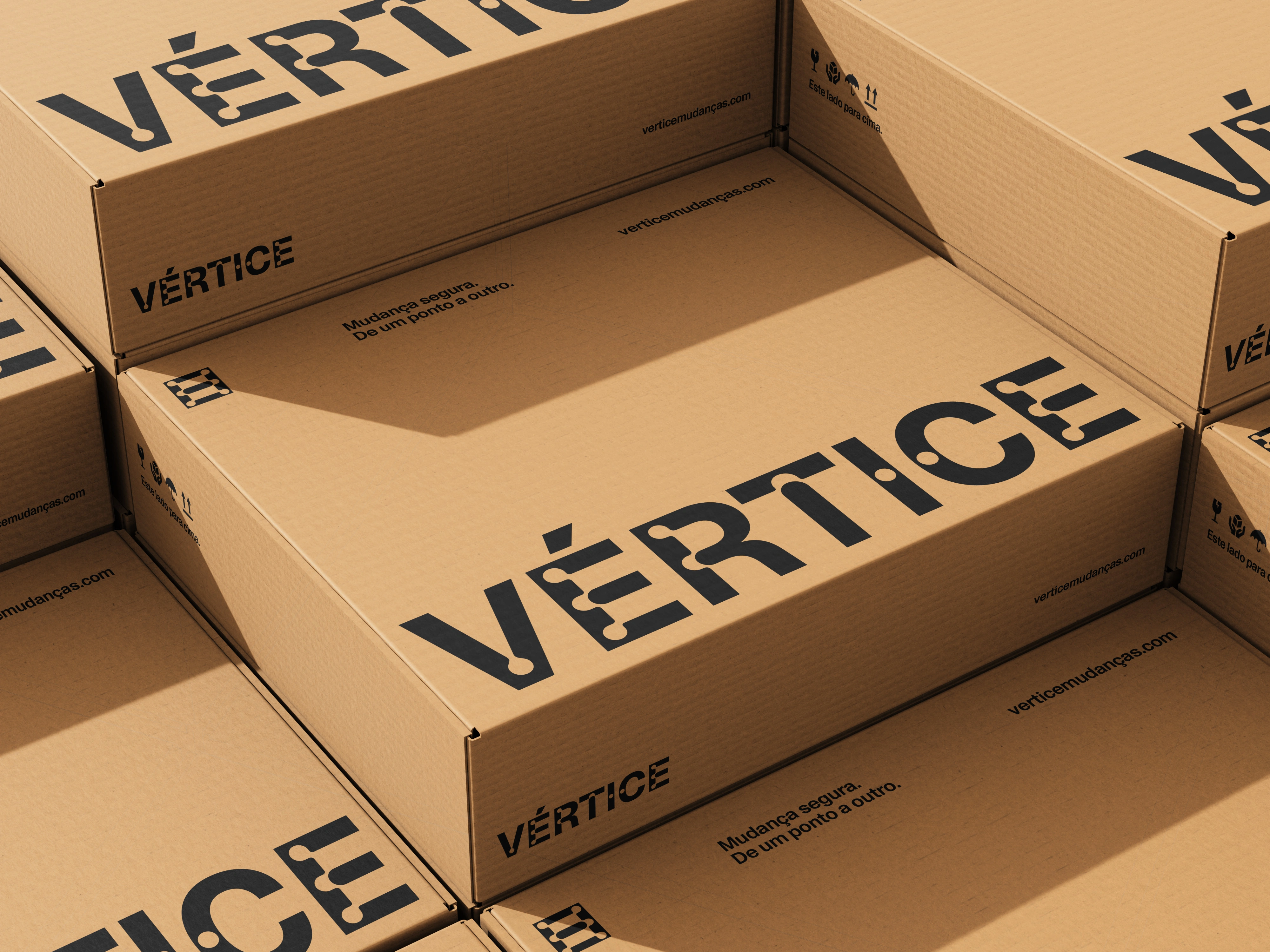
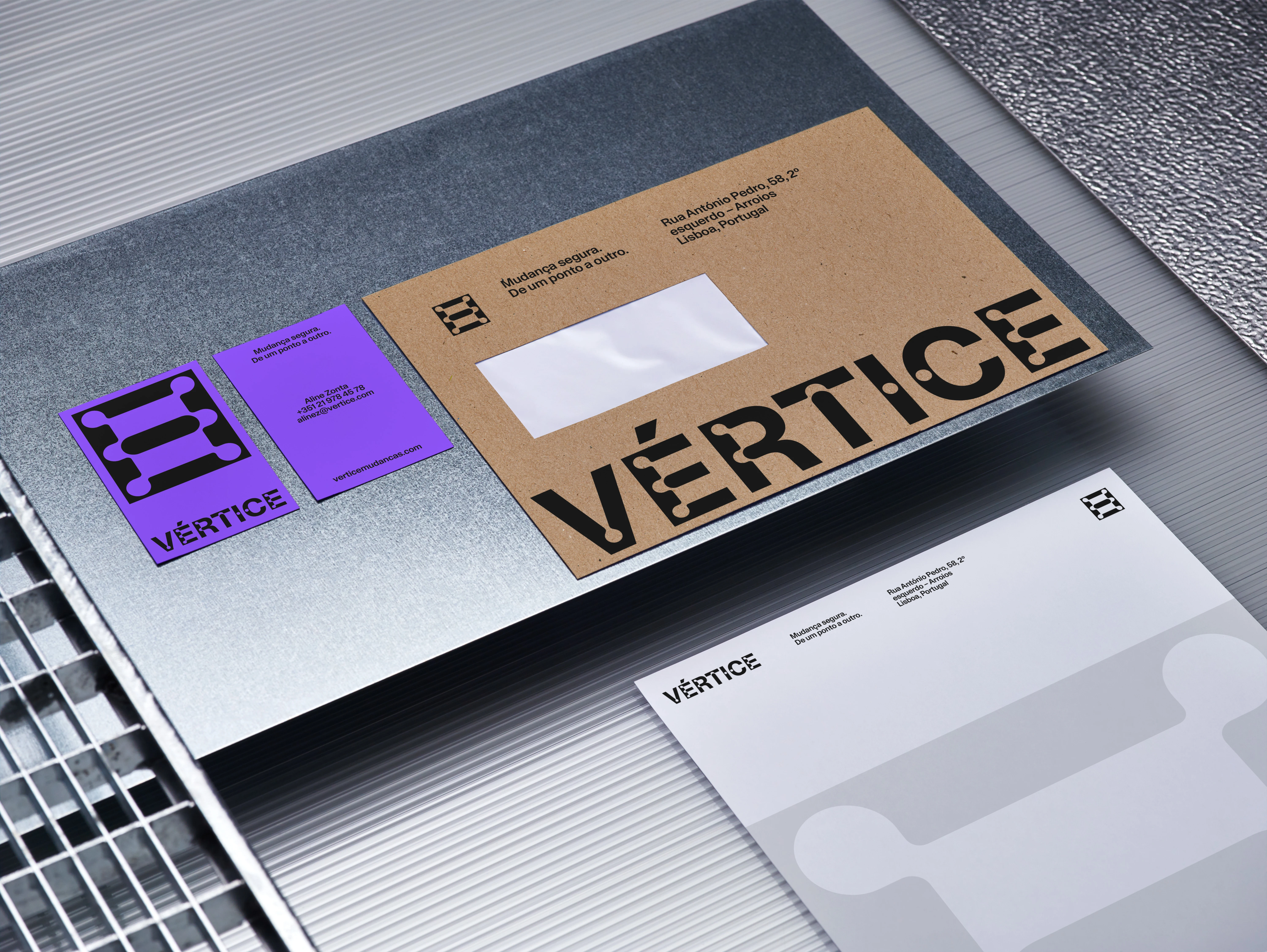
Vértice is a Lisbon-based moving and logistics partner for high-end residential and commercial clients who require a higher standard of precision. In a category historically saturated with generalist "sea of blue" identities, the strategy was to identify and occupy the market’s white space—shifting the narrative from a simple moving service to an unmistakable business of trust.
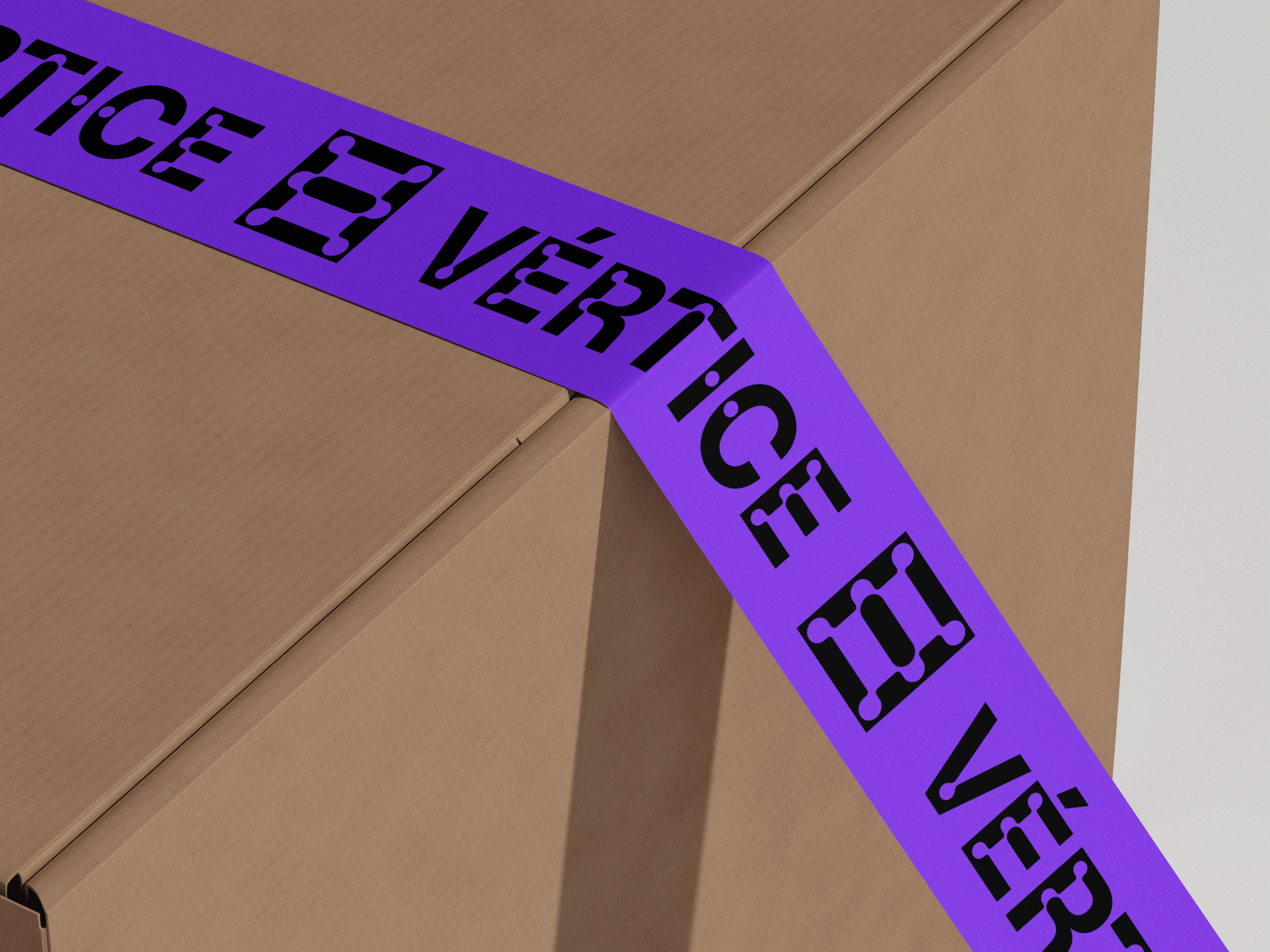
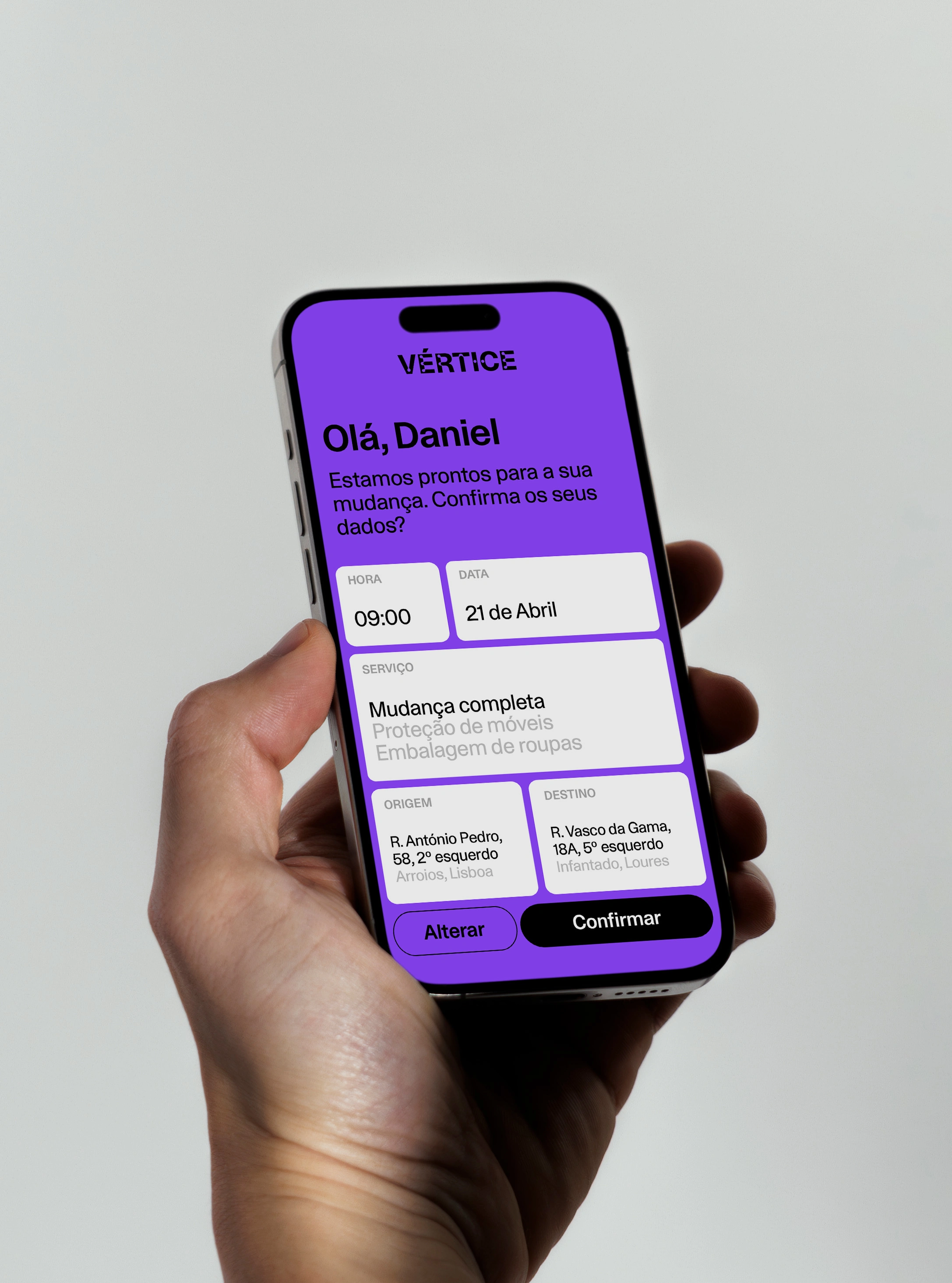
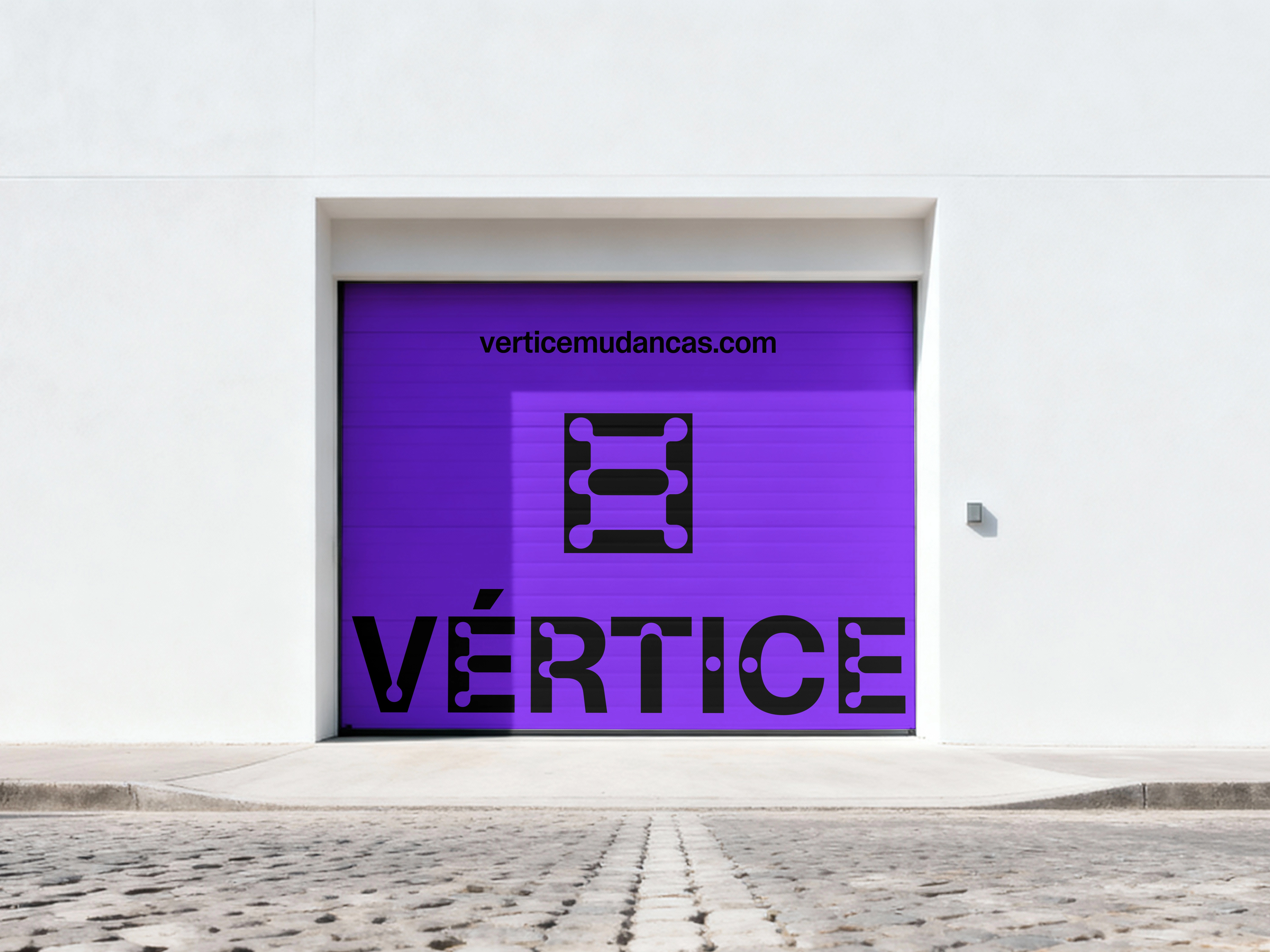
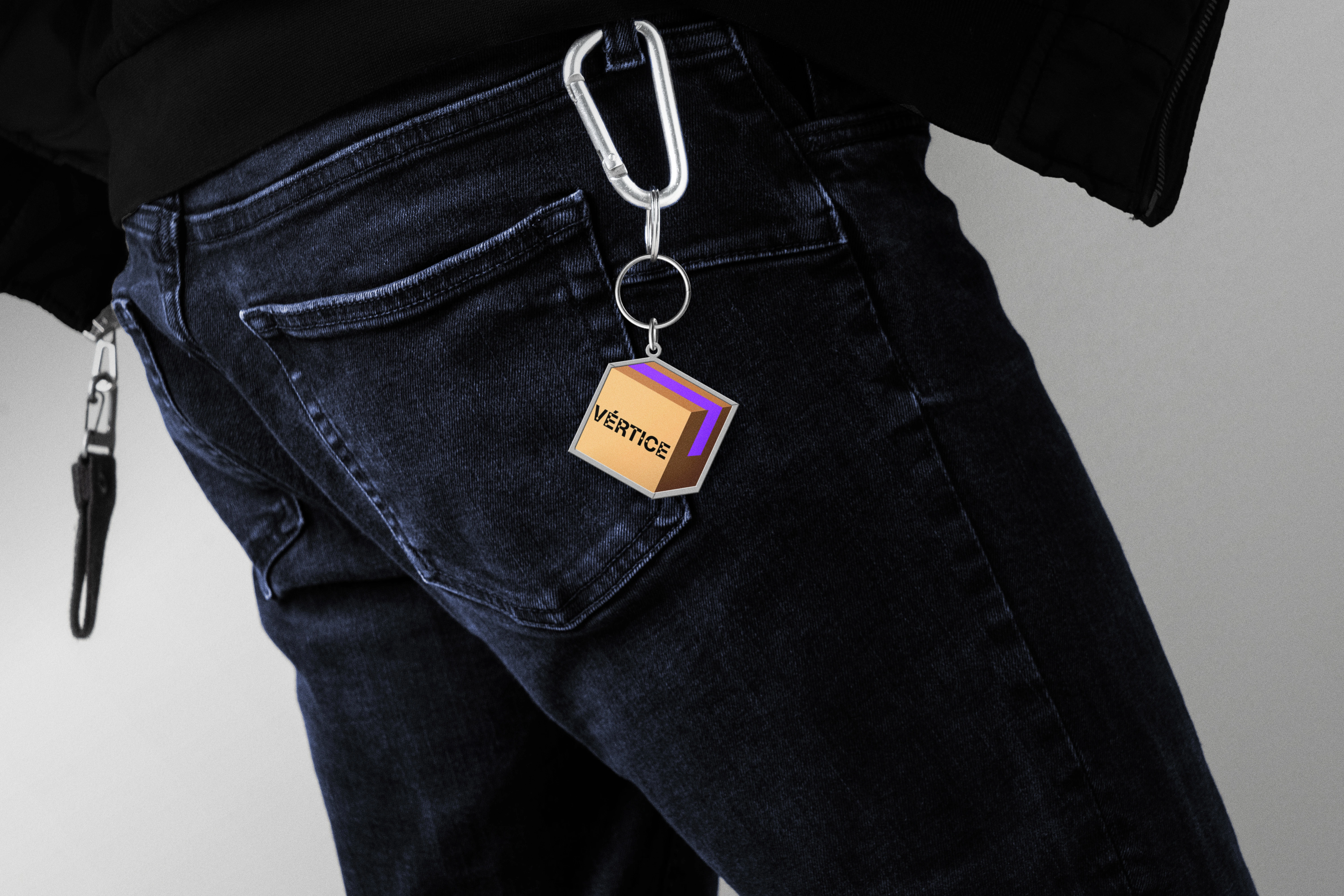
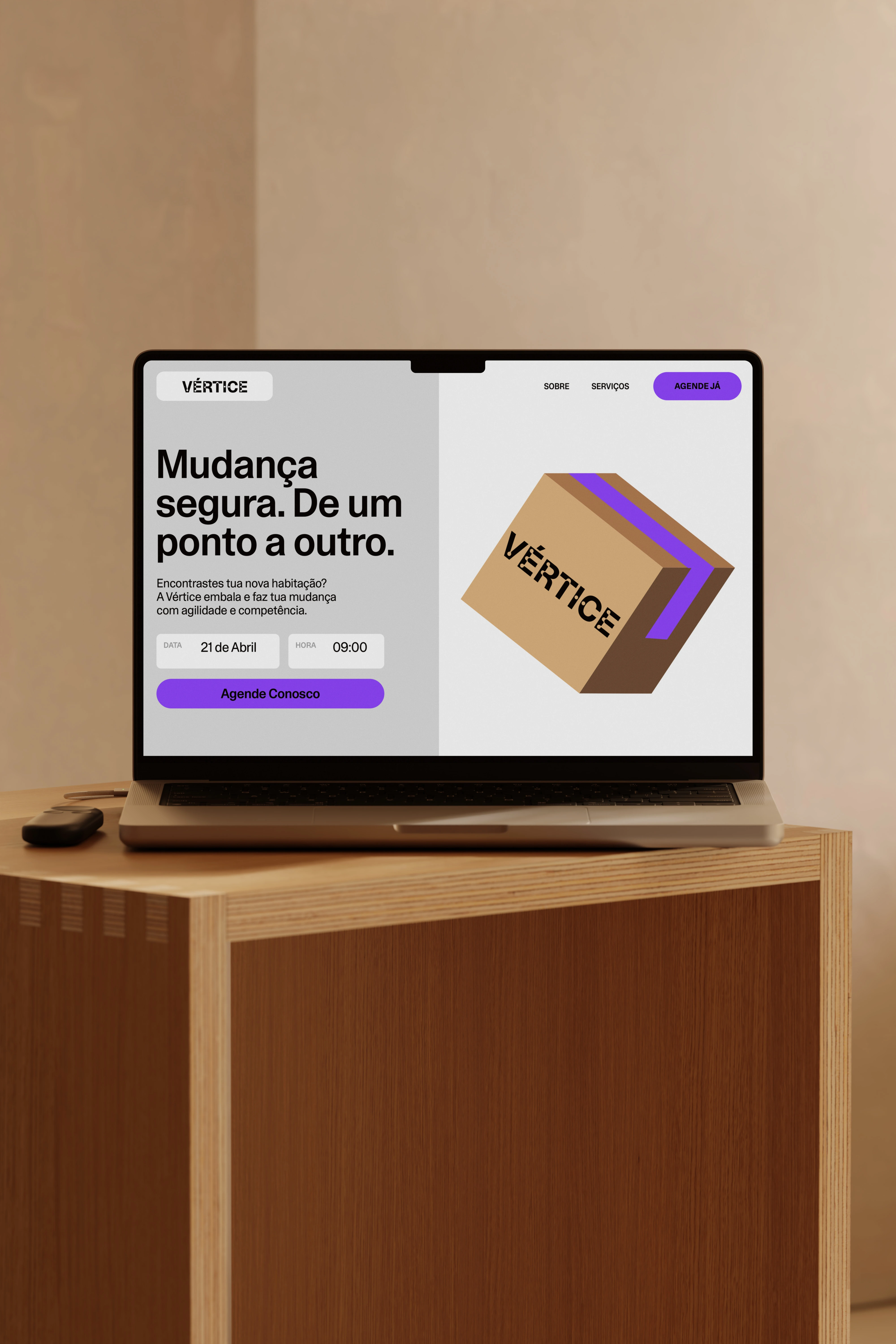
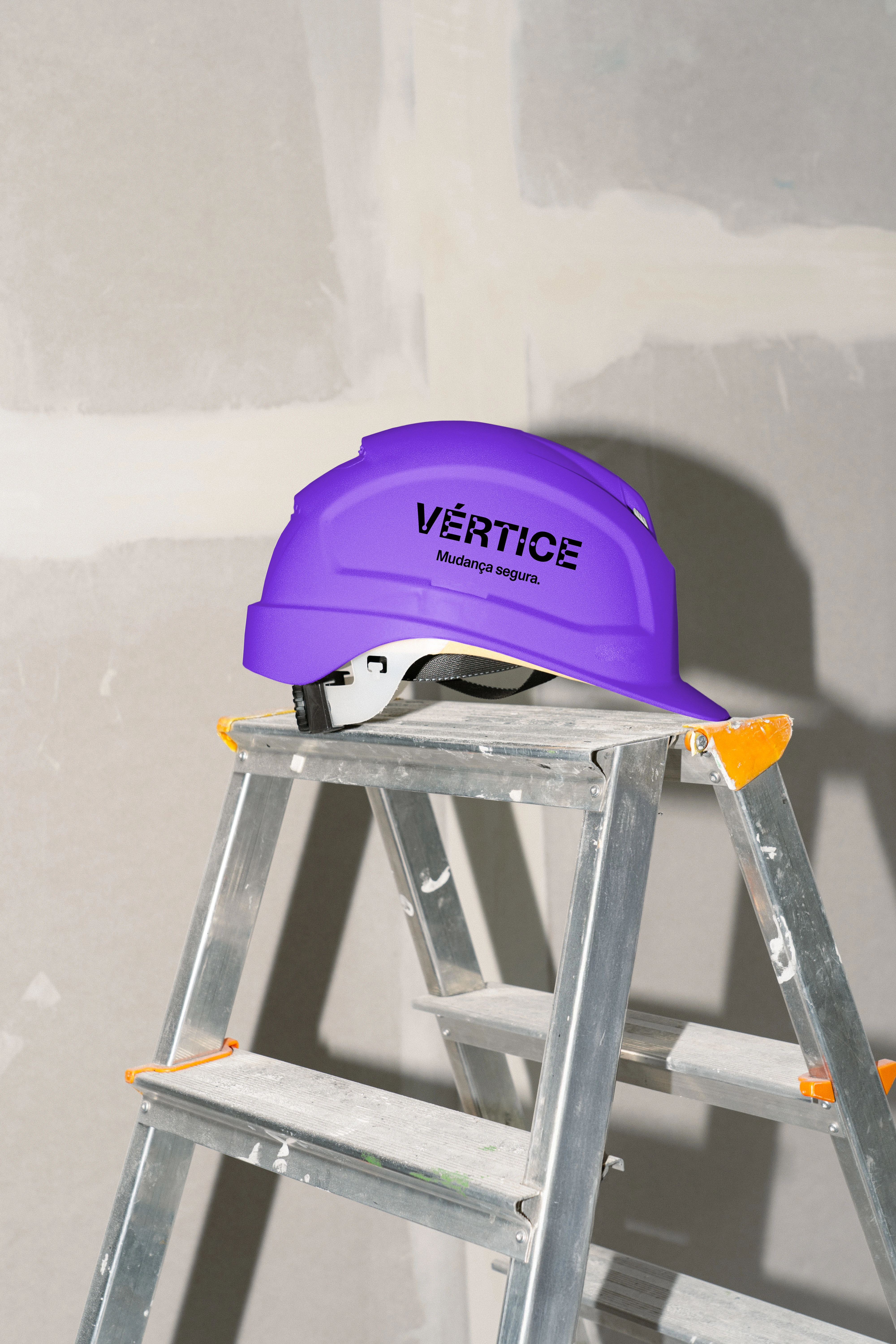
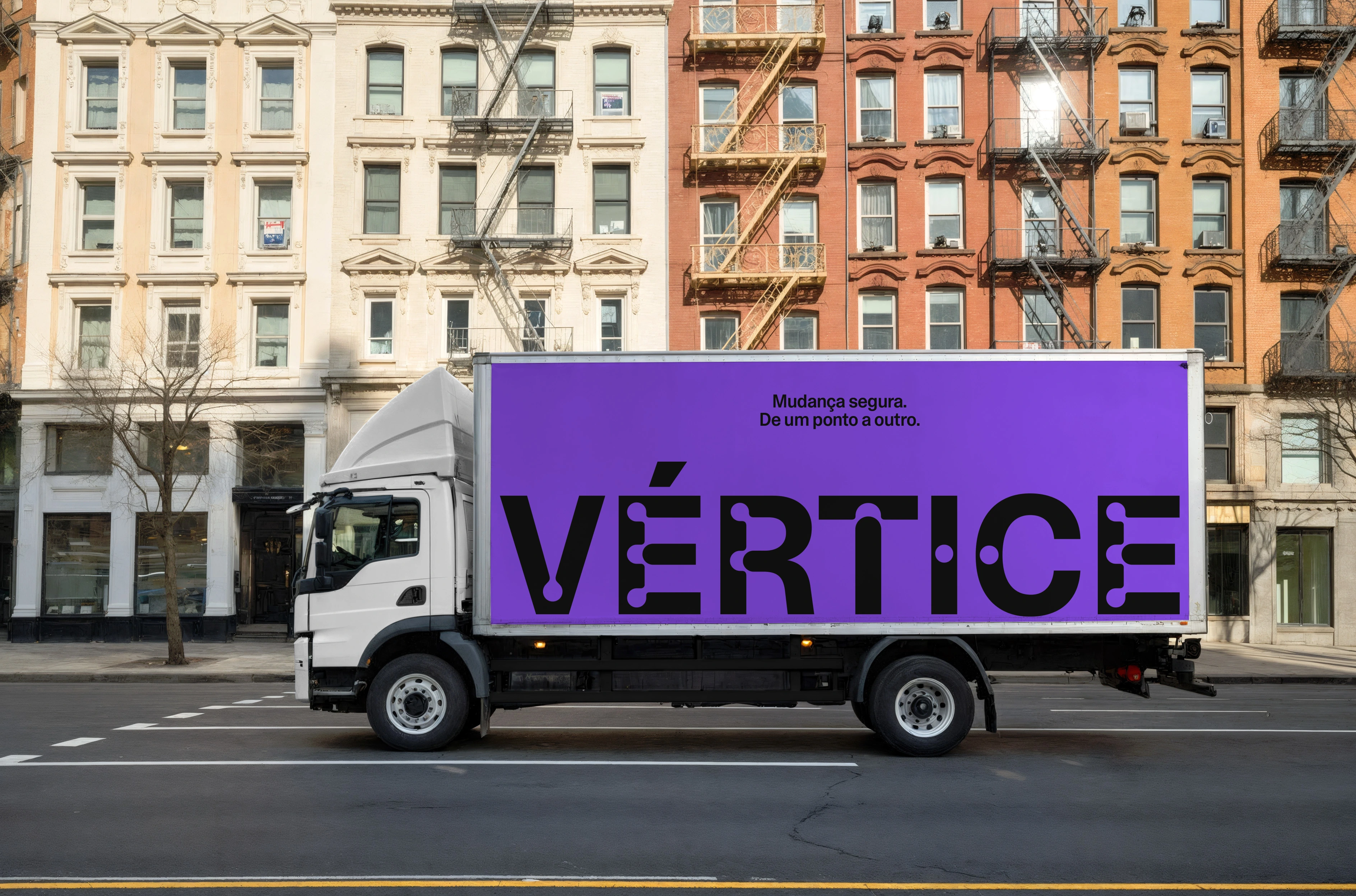
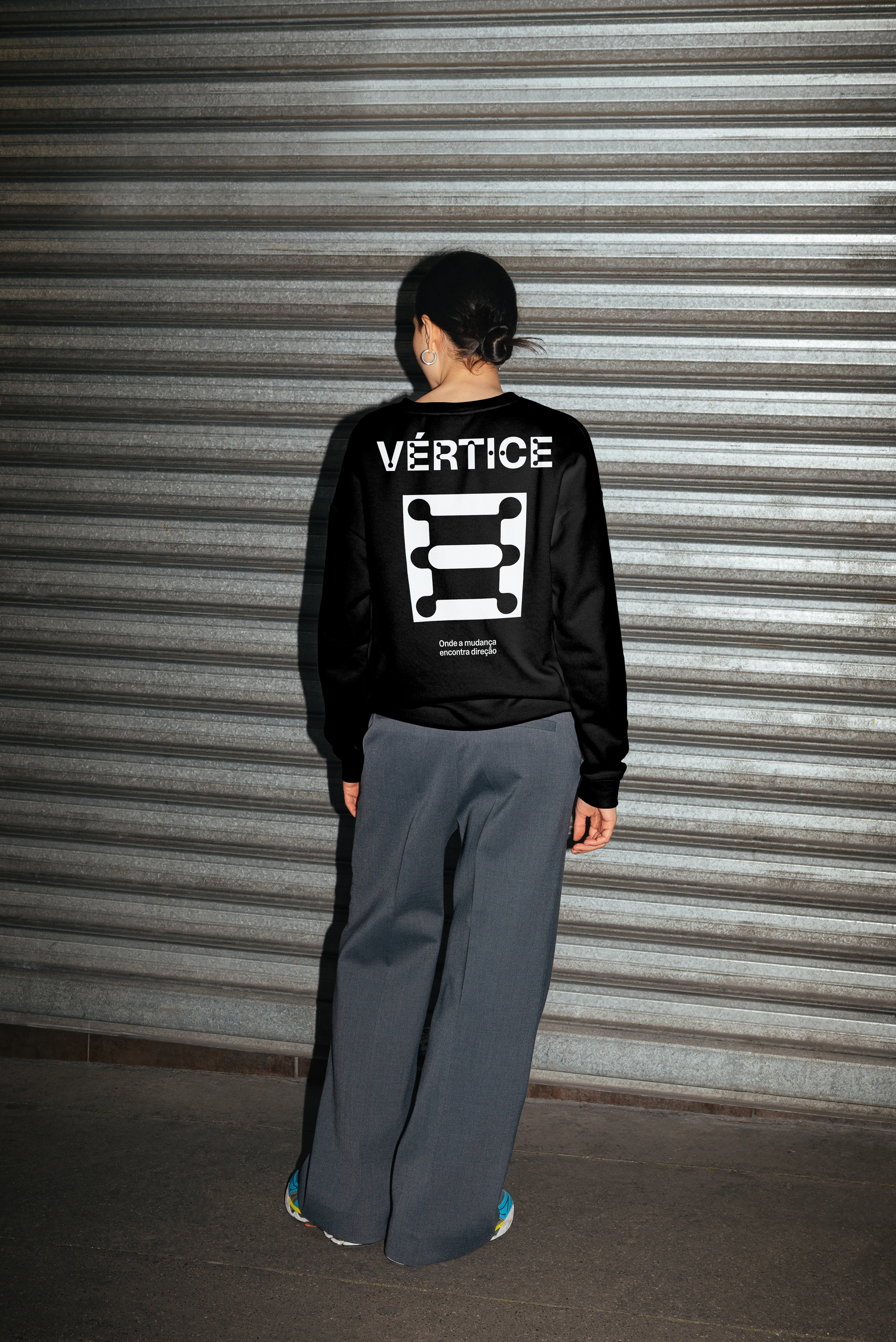
The visual system is built on a foundation of structural clarity, rooted in the concept of a secure transition from one point to another. The typography intentionally highlights the intersections (the vertices) of the letterforms, visually anchoring the brand in the technical nature of logistics. Moving away from traditional industry blues, a sophisticated bright purple was chosen to feel both established and modern. The system was designed to work at scale, creating a cohesive "Visual Moat" across everything from truck fleets and garage banners to high-visibility apparel and digital interfaces.
By prioritizing high-visibility authority over industry clichés, we created an identity that is impossible to ignore on the street and effortless to scale as the company grows.
Like this project
Posted Sep 28, 2026
In a category saturated with "sea of blue" brands, the strategy was to identify and occupy the market’s white space, creating an unmistakable brand of trust.