Dreamshare: Brand Identity & UX/UI Design
Trae Spears
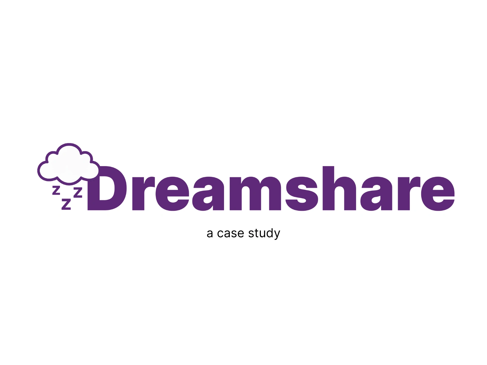
Dreamshare: Case Study
Brand Identity & UX/UI Design for a Dream Rental App
Designer: Trae Spears
Project Type: Concept Design / Portfolio Piece
Timeline: 2025
Platforms: iOS Mobile App
Project Overview
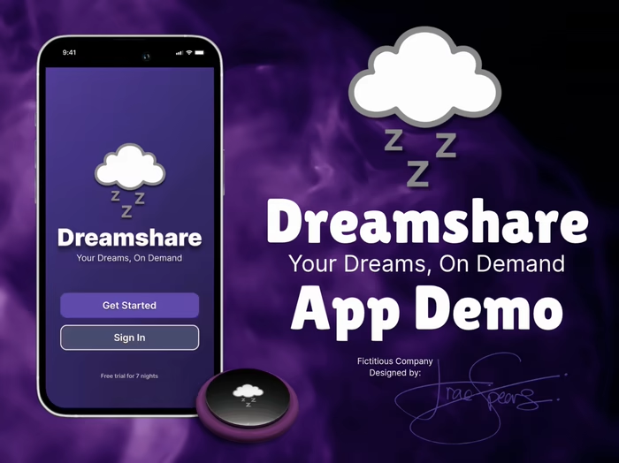
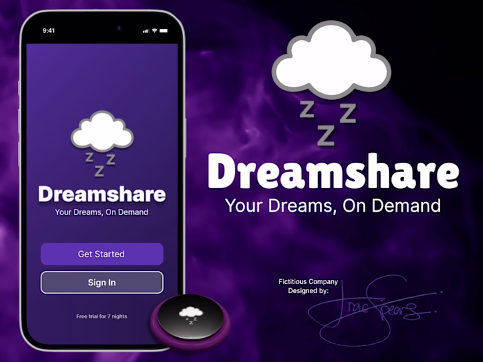
Dreamshare is a conceptual mobile application that reimagines the future of sleep and dream experiences. The platform allows users to "rent" dreams for a night - either organic dreams by real people, or premium crafted experiences designed by our DreamTeam. Through our small Dream Node Technology, users can experience curated dreams during their chosen sleep cycle.
This project showcases comprehensive brand identity development and mobile UX/UI design, demonstrating the ability to create cohesive visual systems and intuitive user experiences for innovative tech concepts.
The Challenge
Create a complete brand identity and mobile app experience for a product that doesn't exist, making the impossible feel not only believable, but desirable. The design needed to:
Balance tech-forward innovation with approachable, calming aesthetics
Create a premium brand position while maintaining accessibility
Design intuitive browsing and discovery patters for an entirely new content category
Establish trust for a product that involves something as intimate as sleep
Make the absurd concept feel legitimate through serious, polished design execution.
Design Approach
The design strategy centered on treating Dreamshare like a real tech startup with Apple-level product sensibility and Netflix-style content discovery. Rather than leaning into whimsical or overly fantastical aesthetics, the approach was to ground the concept in premium, sophisticated design that could exist in today's tech landscape.
Key Principles:
Luxury through simplicity
Trust through polish
Accessibility through familiar patterns
Delight through subtle details
Brand Identity
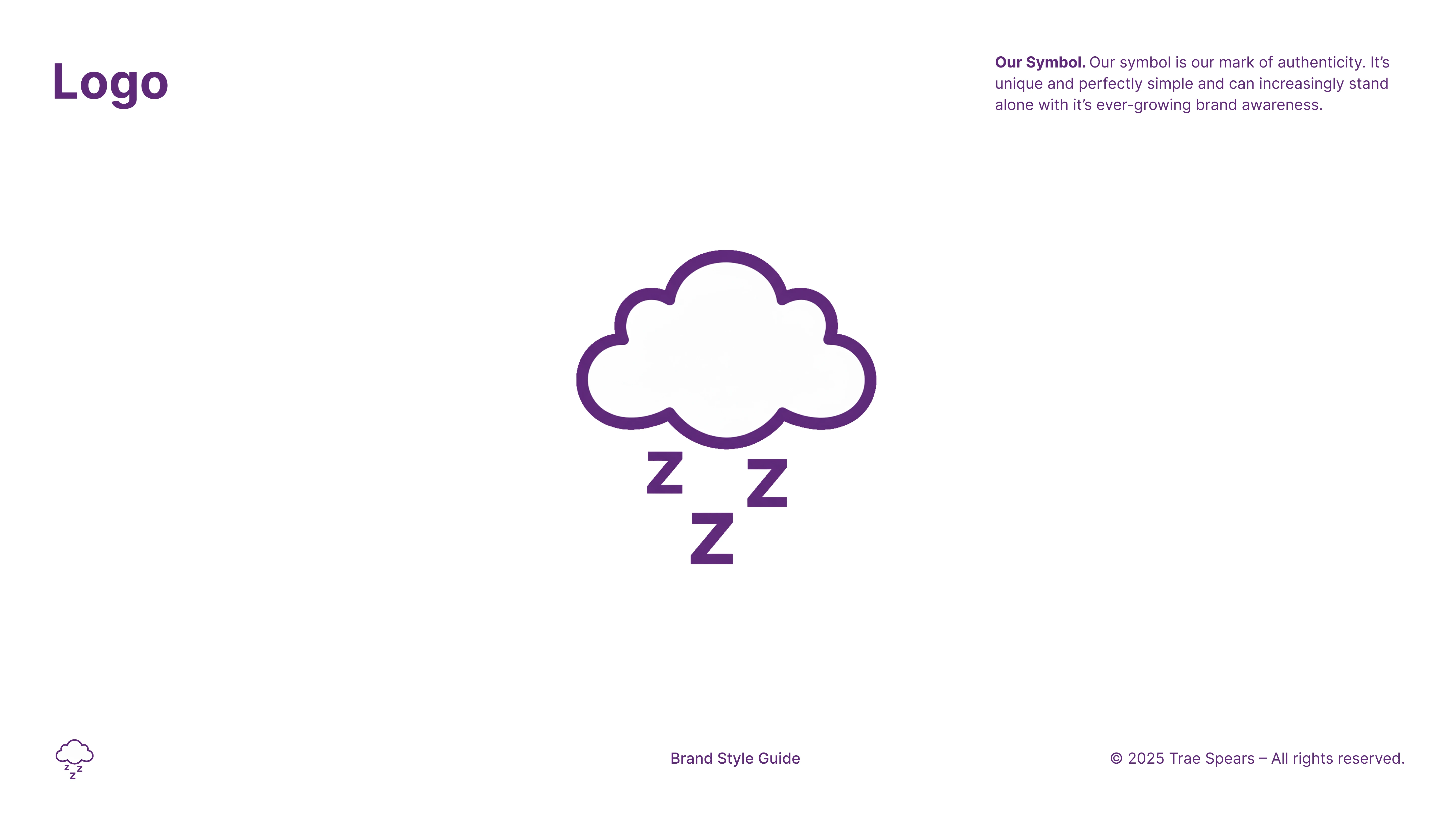
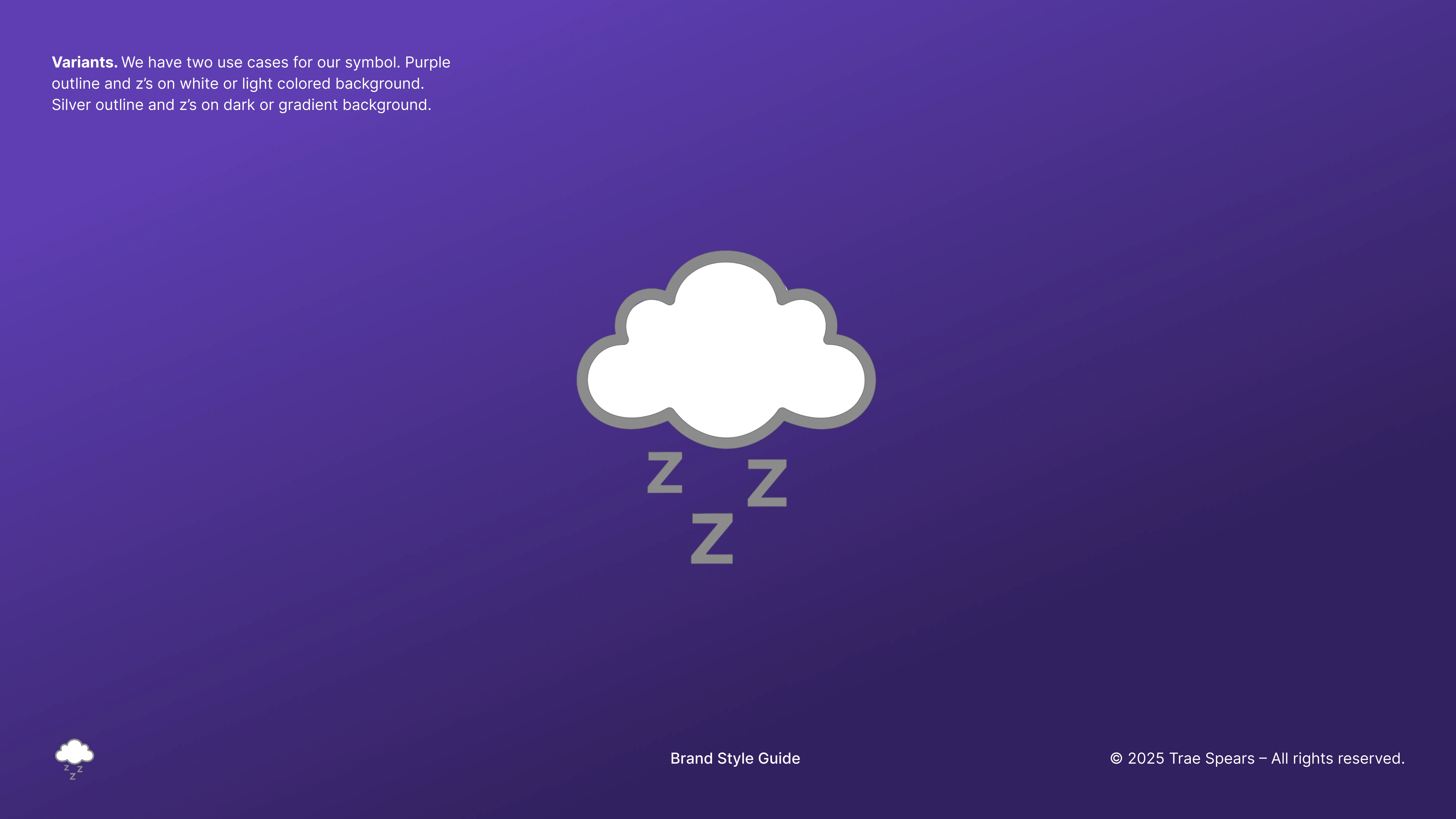
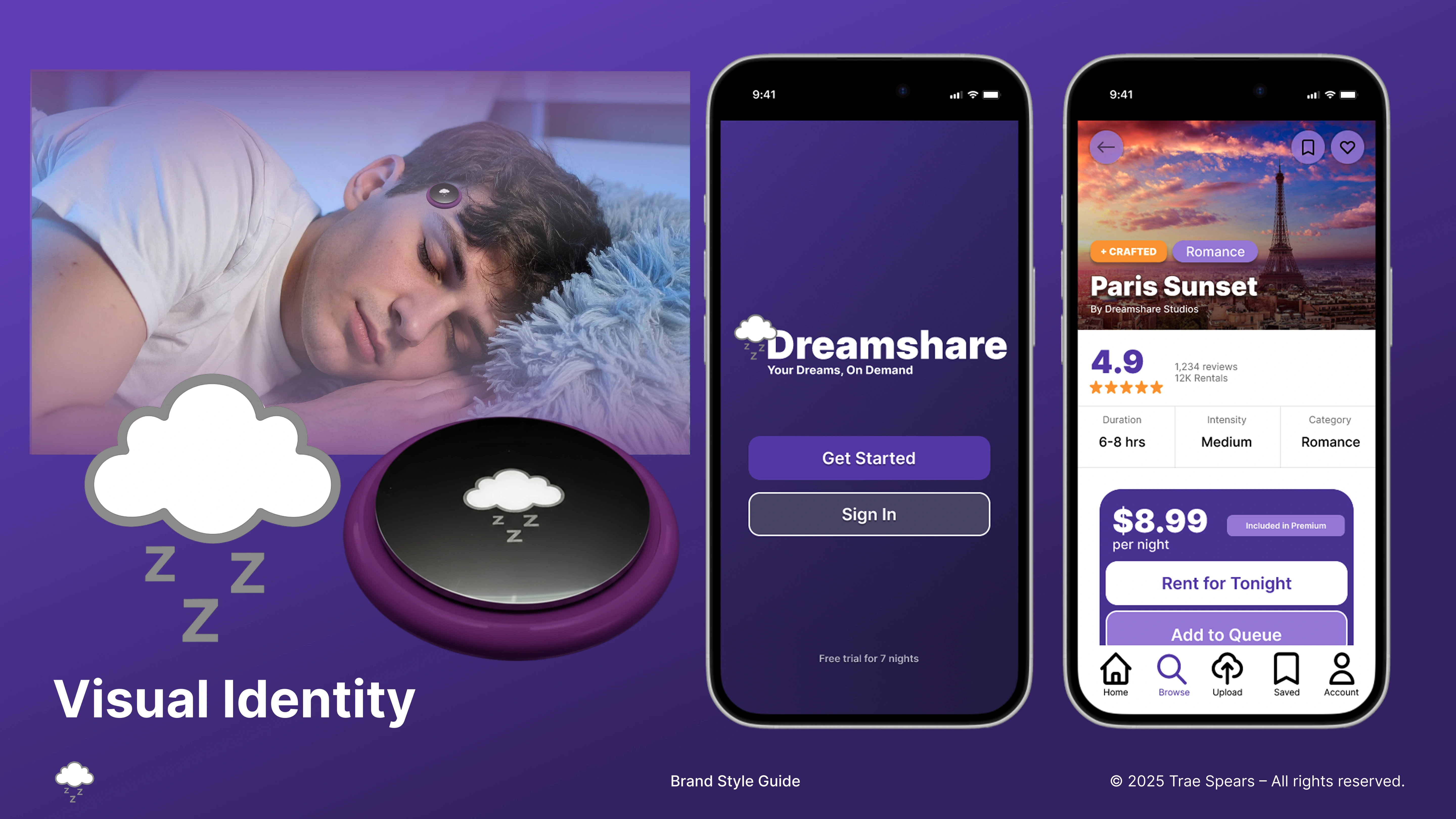
The core symbol is a cloud with three Z's. It is perfectly simple and instantly communicates the brand essence. The rounded, friendly cloud shape softens the tech-forward concept, while the Z's clearly connect to sleep and dreams.
Two variants were created for versatility:
Purple outline with Z's for light backgrounds
Silver outline with Z's for dark or gradient backgrounds
Wordmark
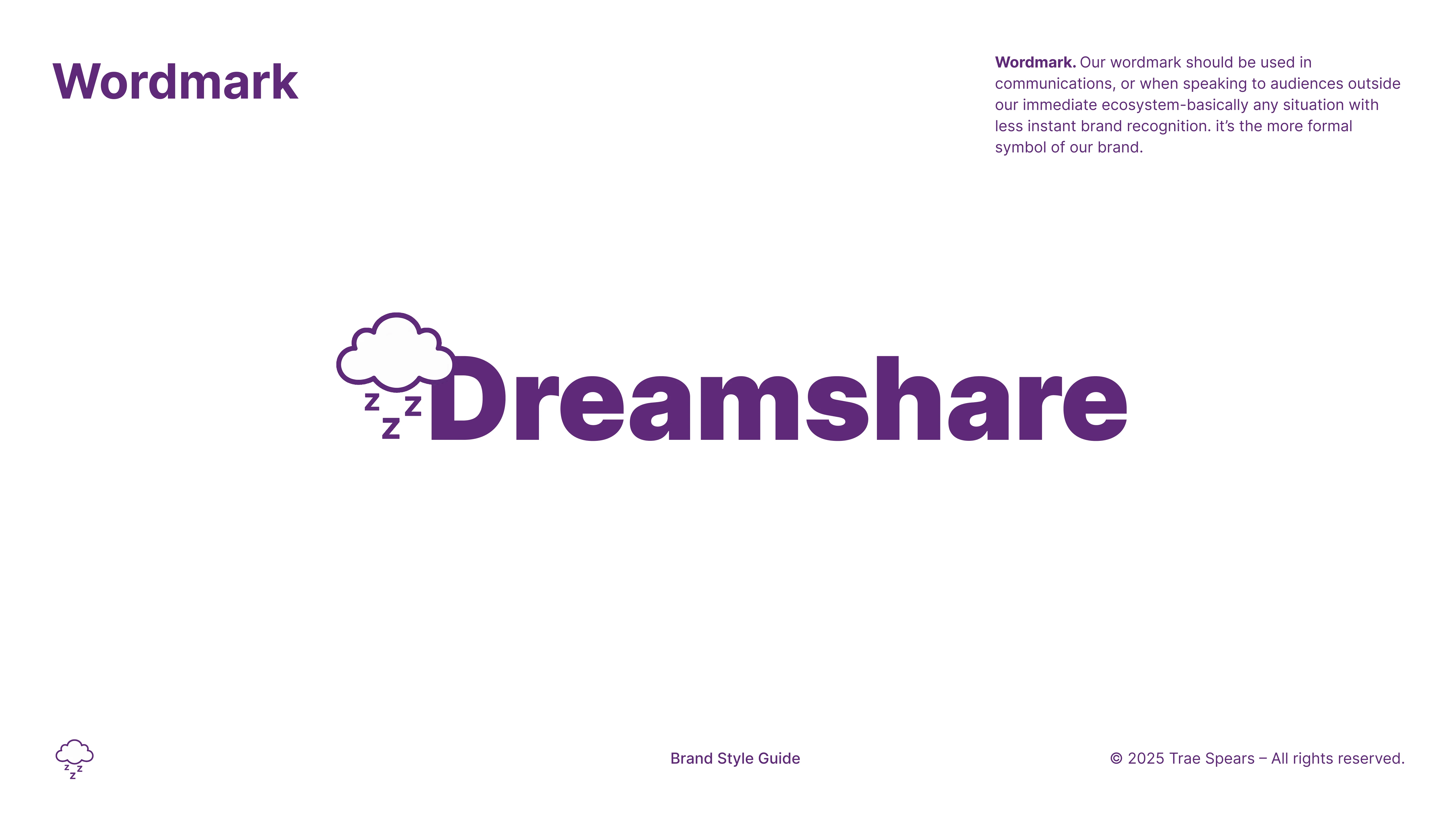
The Dreamshare wordmark pairs the symbol with clean, modern typography. The integration feels natural with the cloud becoming part of the letter D, creating a cohesive mark that works in both horizontal and stacked layouts.
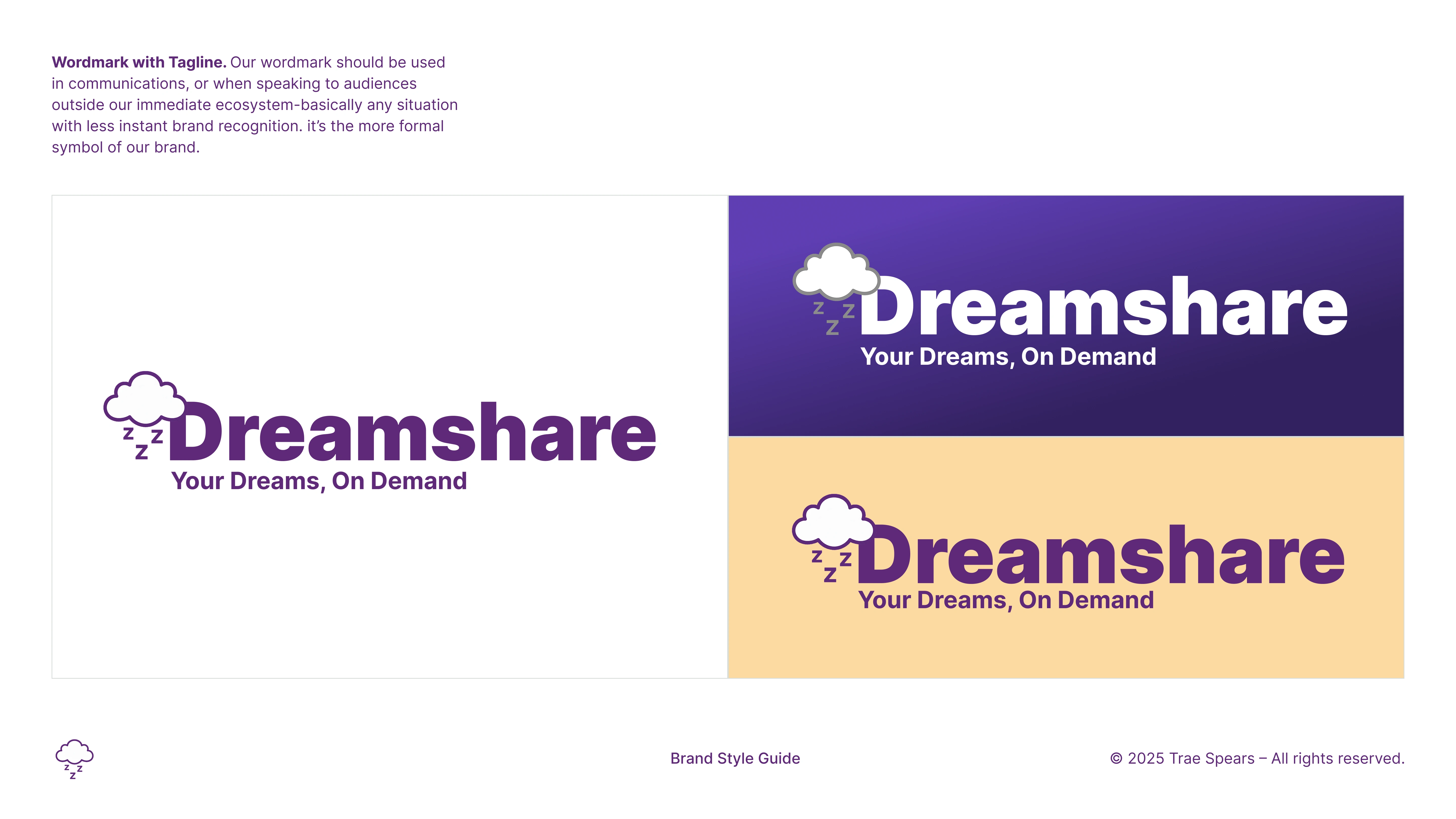
The tagline "Your Dreams, On Demand" was crafted to immediately communicate the value proposition while nodding to the Netflix-style content model.
Color System
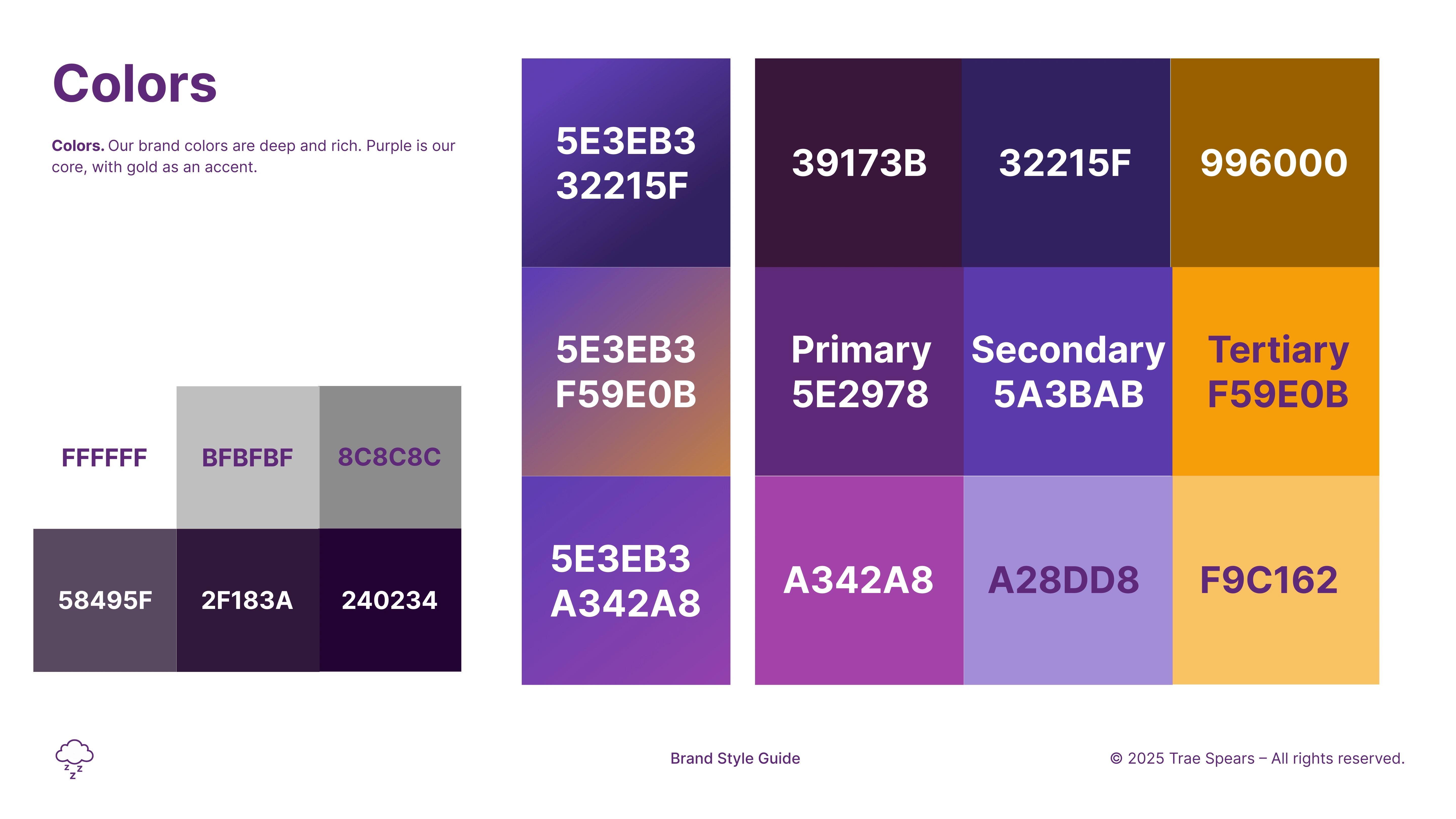
The color palette was carefully selected to evoke both luxury and rest:
COLORS
• Primary (#5E2978): The core brand color, representing mystery, luxury, and the night
• Secondary (#5A3BAB): Secondary purple for UI elements
• Tertiary (#F59E0B): Reserved for premium "Crafted" content, creating a clear visual hierarchy between organic and expert-designed dreams
NEUTRALS
• White (#FFFFFF)
• Light Gray (#BFBFBF)
• Medium Gray (#8C8C8C)
• Charcoal tones (#58495F → #2F183A → #240234)
The purple-dominated palette immediately distinguishes Dreamshare from competitors while the gold accent provides a premium indicator for crafted content.
Typography
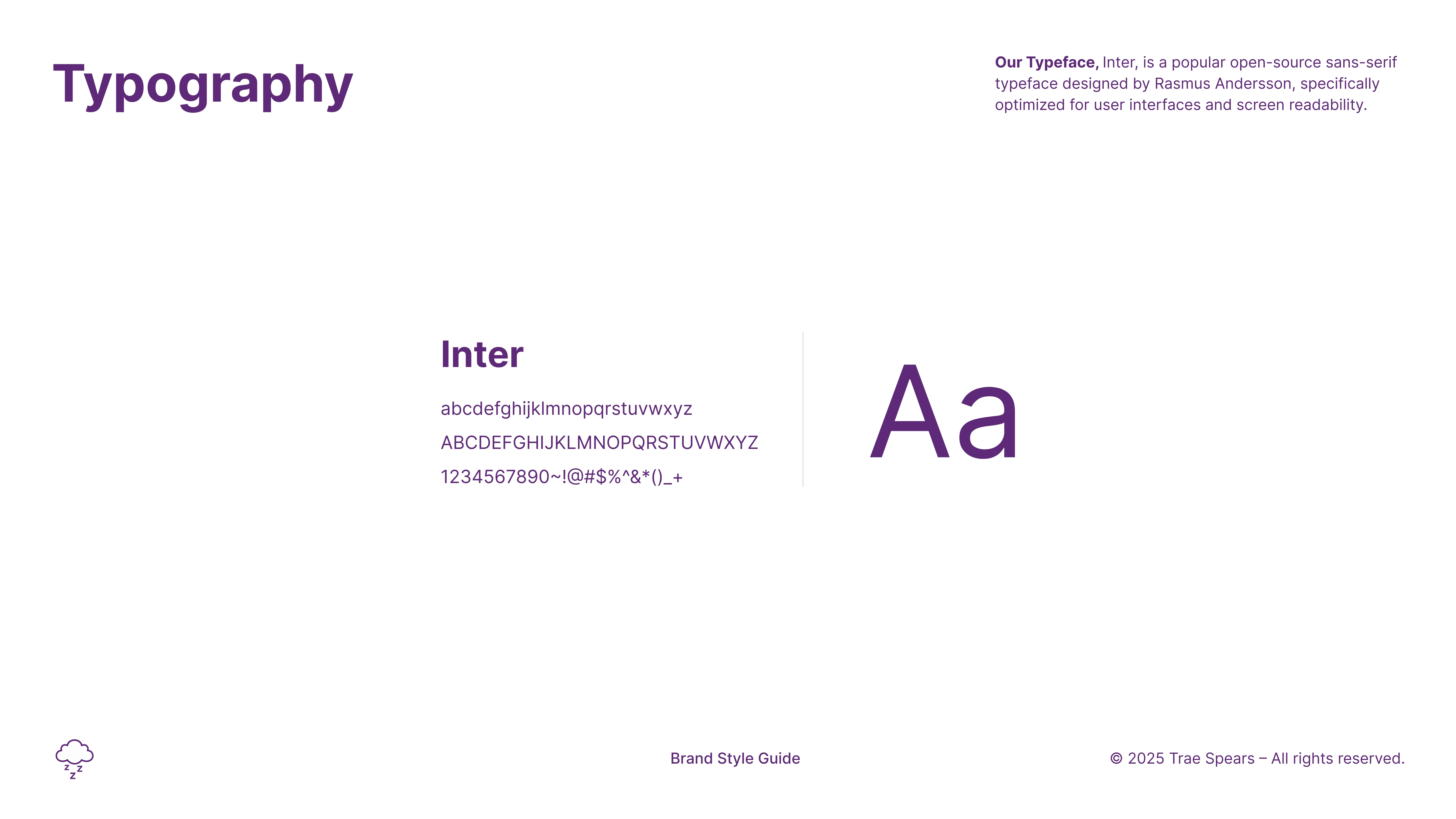
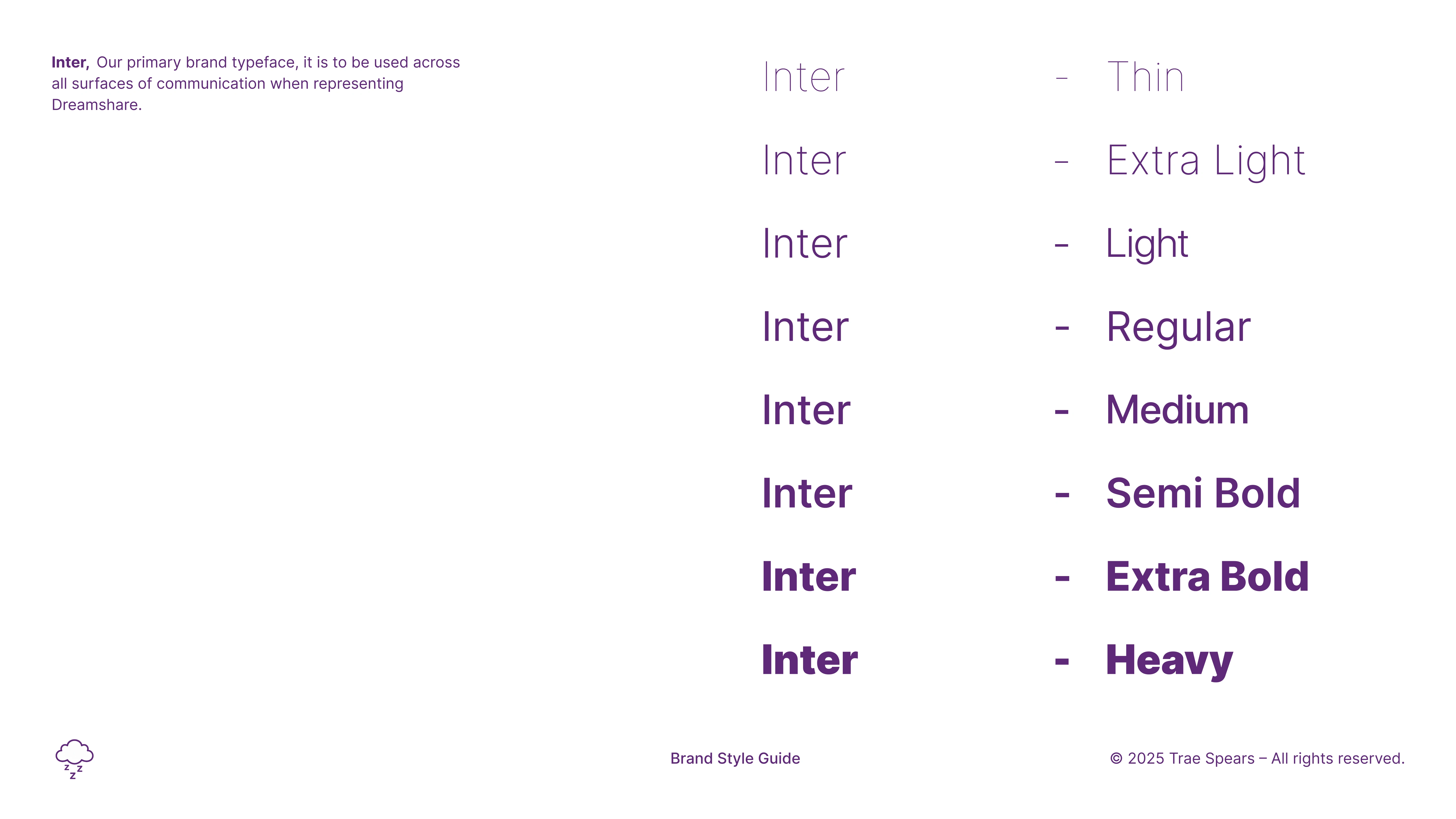
Inter was selected as the primary typeface for its exceptional readability in digital interfaces and modern, neutral aesthetic. As an open-source sans-serif specifically designed for screen readability, Inter ensures the app maintains clarity across all device sizes.
The full weight range (Thin through Heavy) provides flexibility for establishing visual hierarchy while maintaining consistency.
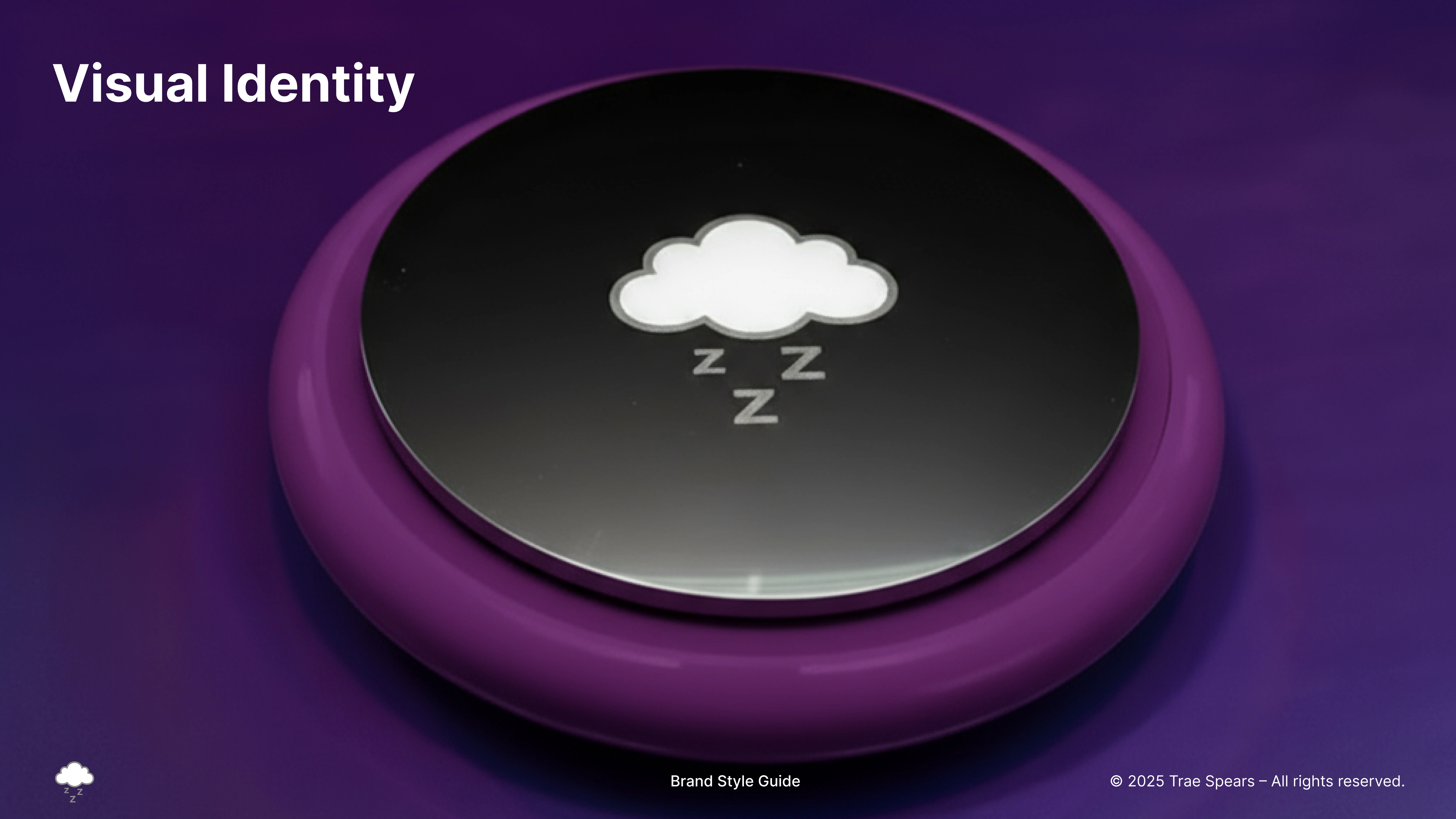
Physical Product Design
The temple device is rendered as a premium, minimalist product that could sit comfortably next to an iPhone or Apple Watch. The purple circular form with a matte black face creates an object that feels both high-tech and calming—appropriate for a sleep-related device.
Visual Identity
Outcomes and Learnings
Project Outcomes
This project successfully demonstrates:
✓ Complete brand identity system from concept to execution
✓ Cohesive visual design across multiple touchpoints
✓ Intuitive UX patterns for a novel product category
✓ Professional presentation suitable for portfolio use
✓ Understanding of mobile design constraints and best practices
✓ Ability to make absurd concepts feel legitimate through design execution
Key Learnings
Constraints breed creativity: The "ridiculous but serious" approach forced more thoughtful design decisions than a purely fantastical treatment would have.
Systems thinking matters: Establishing the color, typography, and component systems early made execution faster and more consistent.
Familiar patterns reduce risk: For innovative concepts, leveraging known interaction patterns helps users focus on the novelty of the content rather than learning new navigation.
Details sell the concept: The physical device rendering, consistent badge system, and polished micro-interactions make the impossible feel possible.
Like this project
Posted Oct 26, 2025
A case study on the conceptual dream rental app that makes the impossible feel real through premium brand identity and intuitive UX/UI design.
Likes
0
Views
12
Timeline
Dec 31, 2024 - Dec 30, 2025