Greetings. So I made an update

Astra Z

Greetings.
So I made an update on the Mahaasin synthetics logo, I made it more woven and thicker in typography.
This was all thanks to a critique on the previous version, shoutout to @Artur Mikhov.
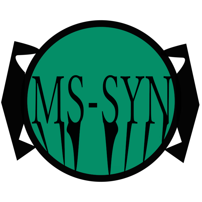
By the way, more information related to the typography change in this logo, I took a bit more information and references from late 1940s logos, especially the logo of Toyota in 1949, and the letters in the bottom are merged together, this was intentional, so this isn't a contradiction to the hairline critique, so yeah if this brand concept was real and had advertisements on certified physically-sticked versions of their logos, then the merging in the letters was purely intentional and is a part of the brands image.
I will put below the 2 versions.
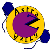
Left: first concept, with hairlines.
Right: second concept, aka the one with thicker typography and more design, but still with the same mint green color palette.
Like this project
Posted Sep 18, 2026
Greetings. So I made an update on the Mahaasin synthetics logo, I made it more woven and thicker in typography. This was all thanks to a critique on the pr...
Likes
0
Views
1
Greetings.
So I made an update on the Mahaasin synthetics logo, I made it more woven and thicker in typography.
This was all thanks to a critique on the previous version, shoutout to @Artur Mikhov.
By the way, more information related to the typography change in this logo, I took a bit more information and references from late 1940s logos, especially the logo of Toyota in 1949, and the letters in the bottom are merged together, this was intentional, so this isn't a contradiction to the hairline critique, so yeah if this brand concept was real and had advertisements on certified physically-sticked versions of their logos, then the merging in the letters was purely intentional and is a part of the brands image.
I will put below the 2 versions.
Left: first concept, with hairlines.
Right: second concept, aka the one with thicker typography and more design, but still with the same mint green color palette.