Astra Z
Brand Design | Graphic Design | Can't do paid projects yet.


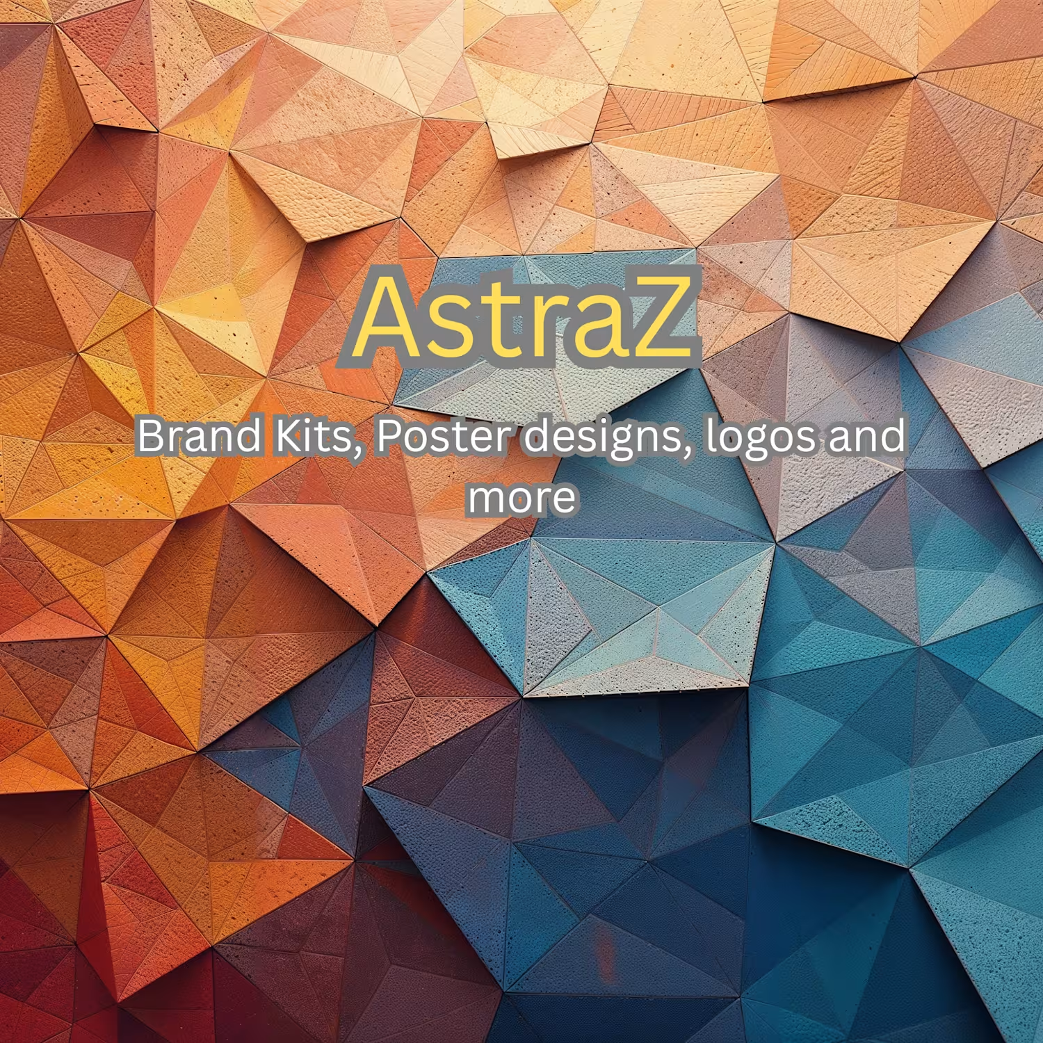
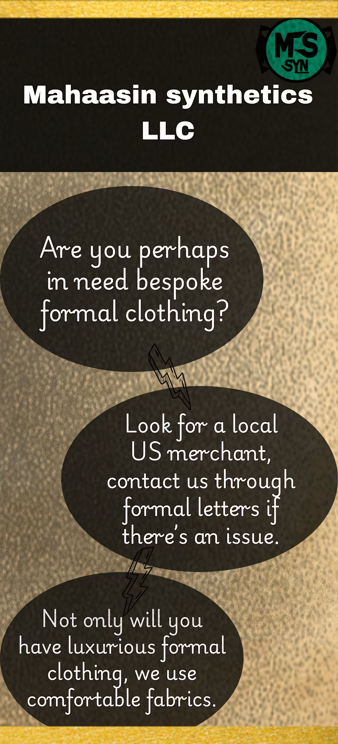
Mahaasin synthetics Advertisement.
1
43
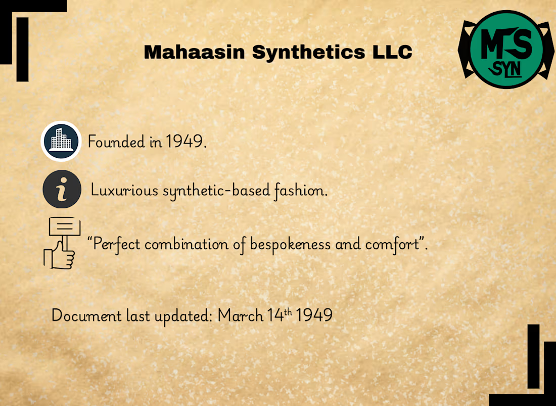
Mahaasin Synthetics Brand "image" Identity
1
3
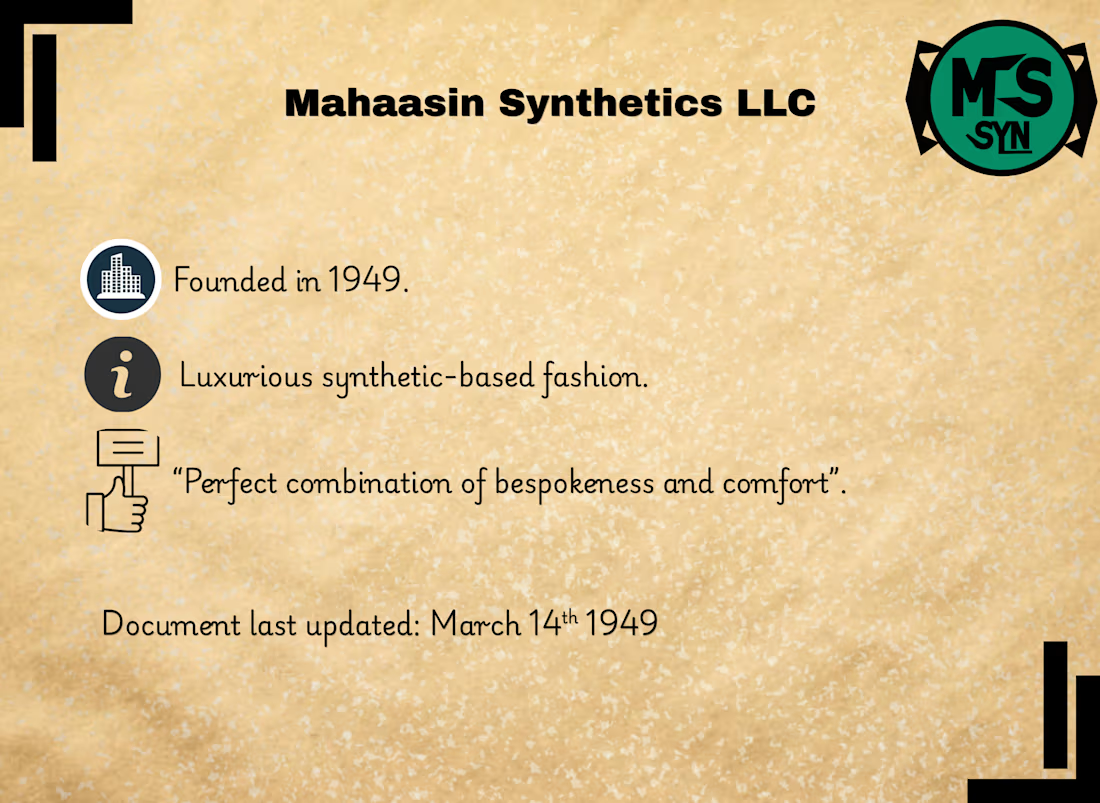
I finished the 1949-founded Mahaasin synthetics LLC concept fictional brand identity.
I can say for sure, I wasn't able to remake all the ways they made the brand "image" identity back in 1949, especially with the mockups, and since mockups didn't exist, they called it comprehensive layouts, they either drew them by hand using ink, or they used cardboard, although I was able to copy that cardboard effect with typography, the full document is 7 pages, I cannot put the full version here as the contra post limit is 4 pages, so I will put the first 4 pages here as the short version, and make the full 7 pages one a case study.
You would notice a few problems with this design, it kind of looks modern, I made it mix modernity with how brands were like back then, as it isn't fully possible to fully copy their style.
Still, it was very fun to research deep into archives, and see how late 1940s brands were generally like, and how quality was affected by ink shortages, at first I was planning to make it using the aesthetic we invented about the past, which is mostly the noise effect and other nostalgic effects, but then I decided "Why not research and go deep into archives to see the reality" one of the most interesting things I noticed in those 1940s brands is how the color palette changed from navy and olive mostly in the early 1940s, and went towards mint green and colors that symbolized peace and luxury.
1
126
Greetings.
So I made an update on the Mahaasin synthetics logo, I made it more woven and thicker in typography.
This was all thanks to a critique on the previous version, shoutout to @Artur Mikhov.
By the way, more information related to the typography change in this logo, I took a bit more information and references from late 1940s logos, especially the logo of Toyota in 1949, and the letters in the bottom are merged together, this was intentional, so this isn't a contradiction to the hairline critique, so yeah if this brand concept was real and had advertisements on certified physically-sticked versions of their logos, then the merging in the letters was purely intentional and is a part of the brands image.
I will put below the 2 versions.
Left: first concept, with hairlines.
Right: second concept, aka the one with thicker typography and more design, but still with the same mint green color palette.
1
94