Ao Endocannabinoid Health Supplements
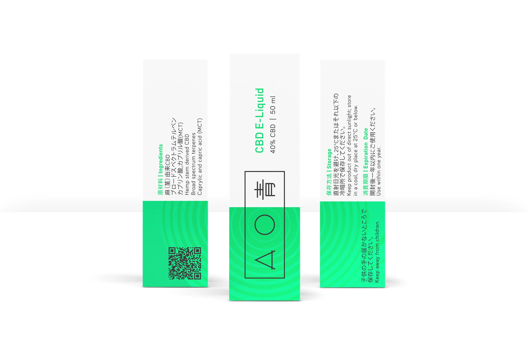
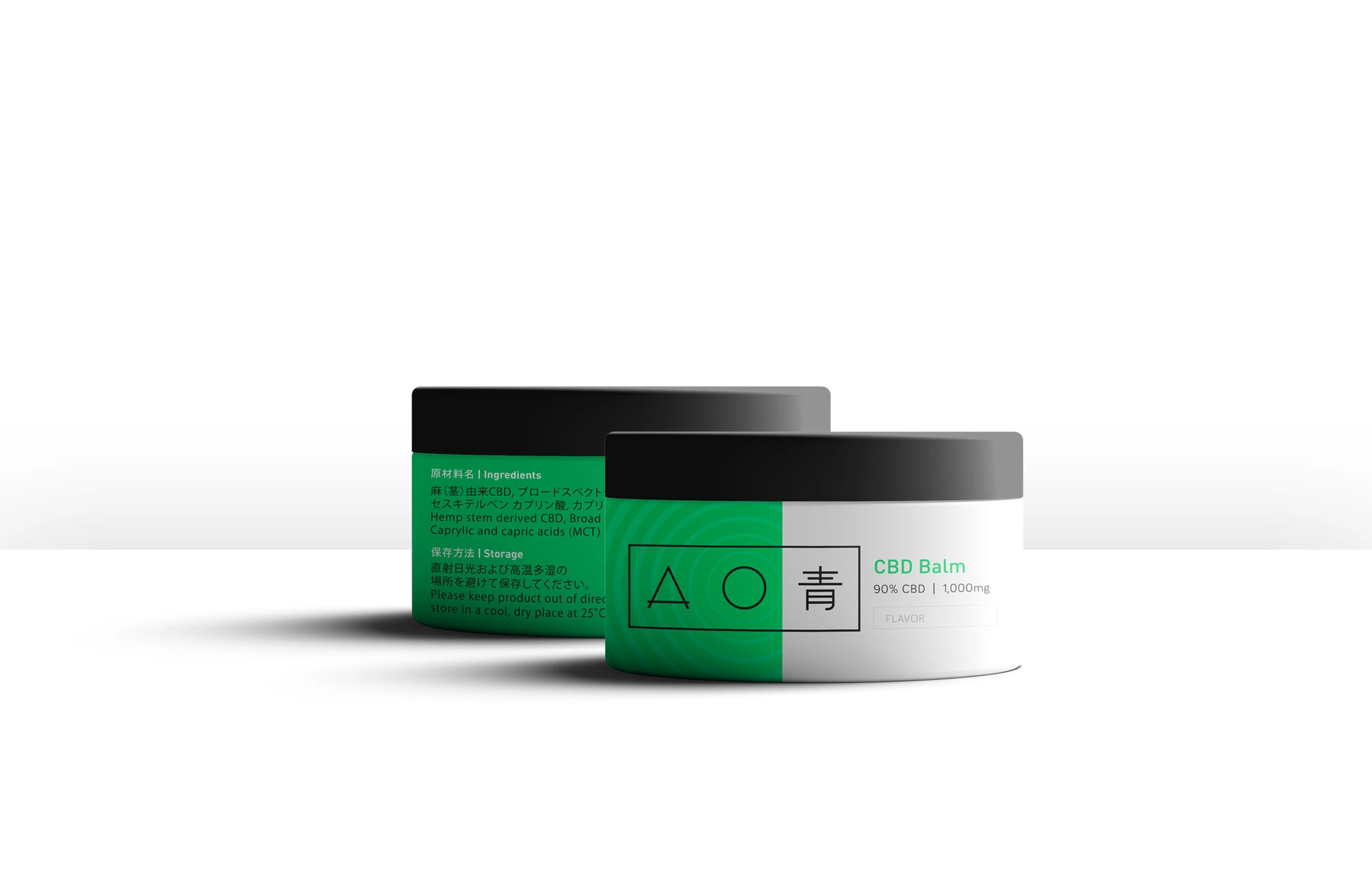
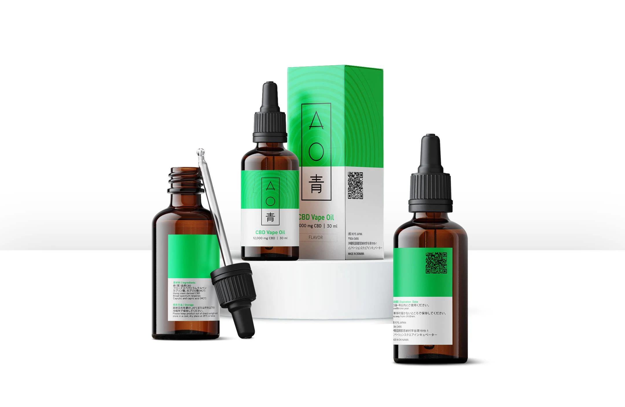
Ao is an Endocannabinoid Health Supplement designed to heighten your ability to perceive the world. Their innovative line of CBD products offers various ways to tap into your psyche and biohack your performance.
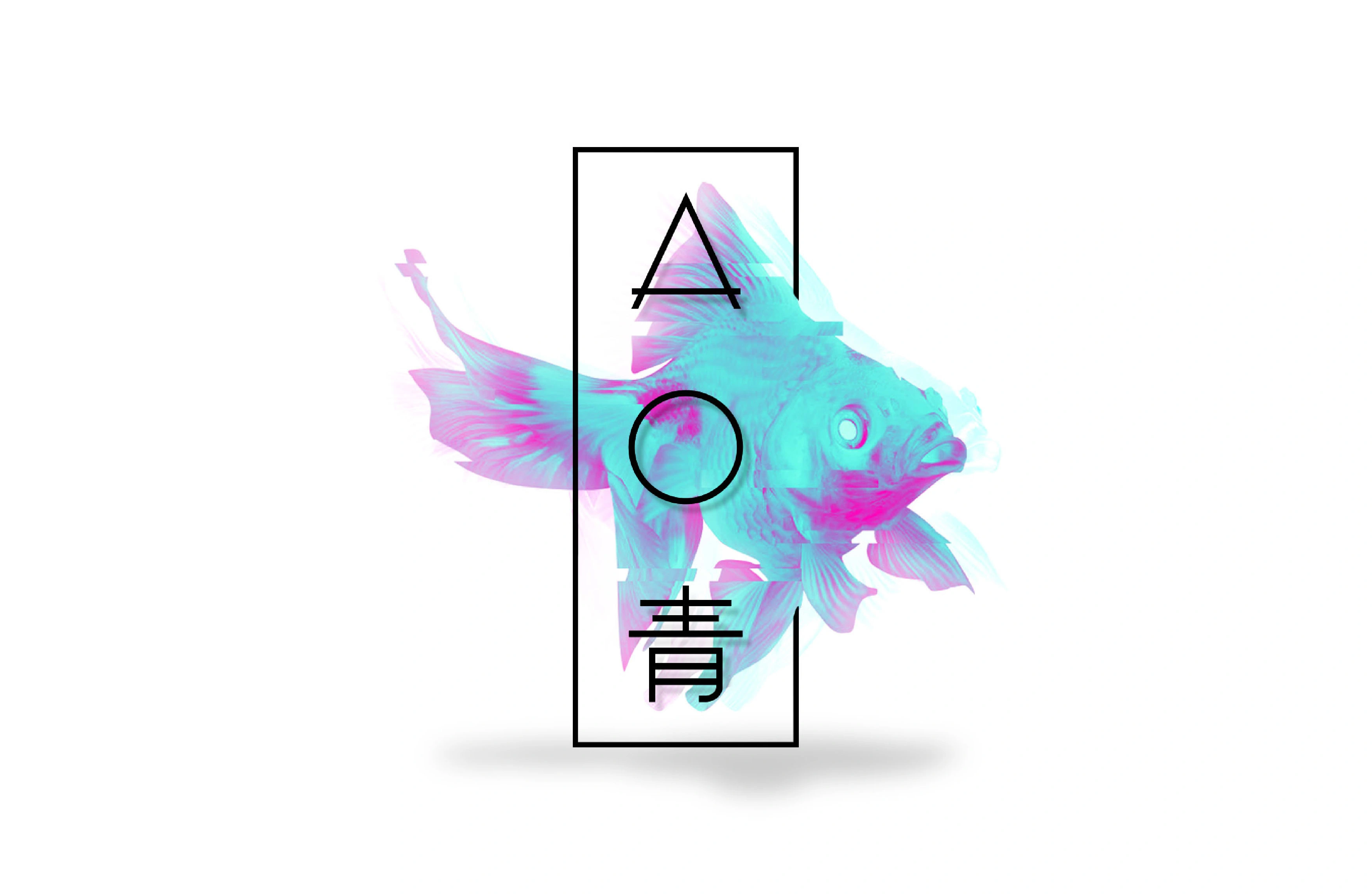
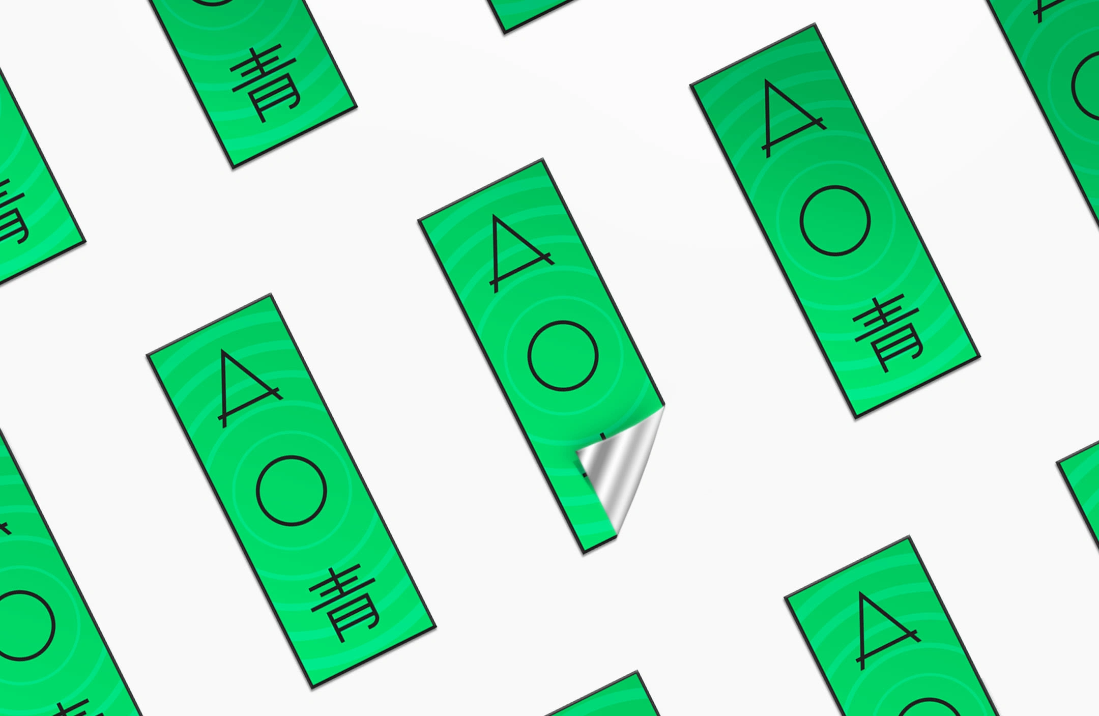
Tha AO brand consists of three rune-like characters that resemble the ‘A’ and ‘O’ letterforms, and the kanji for ‘Ao’ which means ‘blue’. They are designed as such so the viewer doesn’t immediately read it as ‘Ao’, but rather see it as a series of arbitrary symbols.
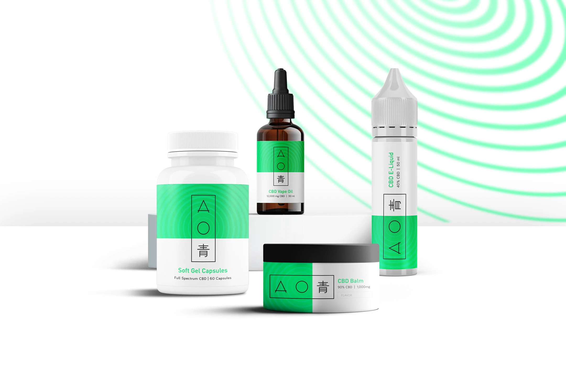
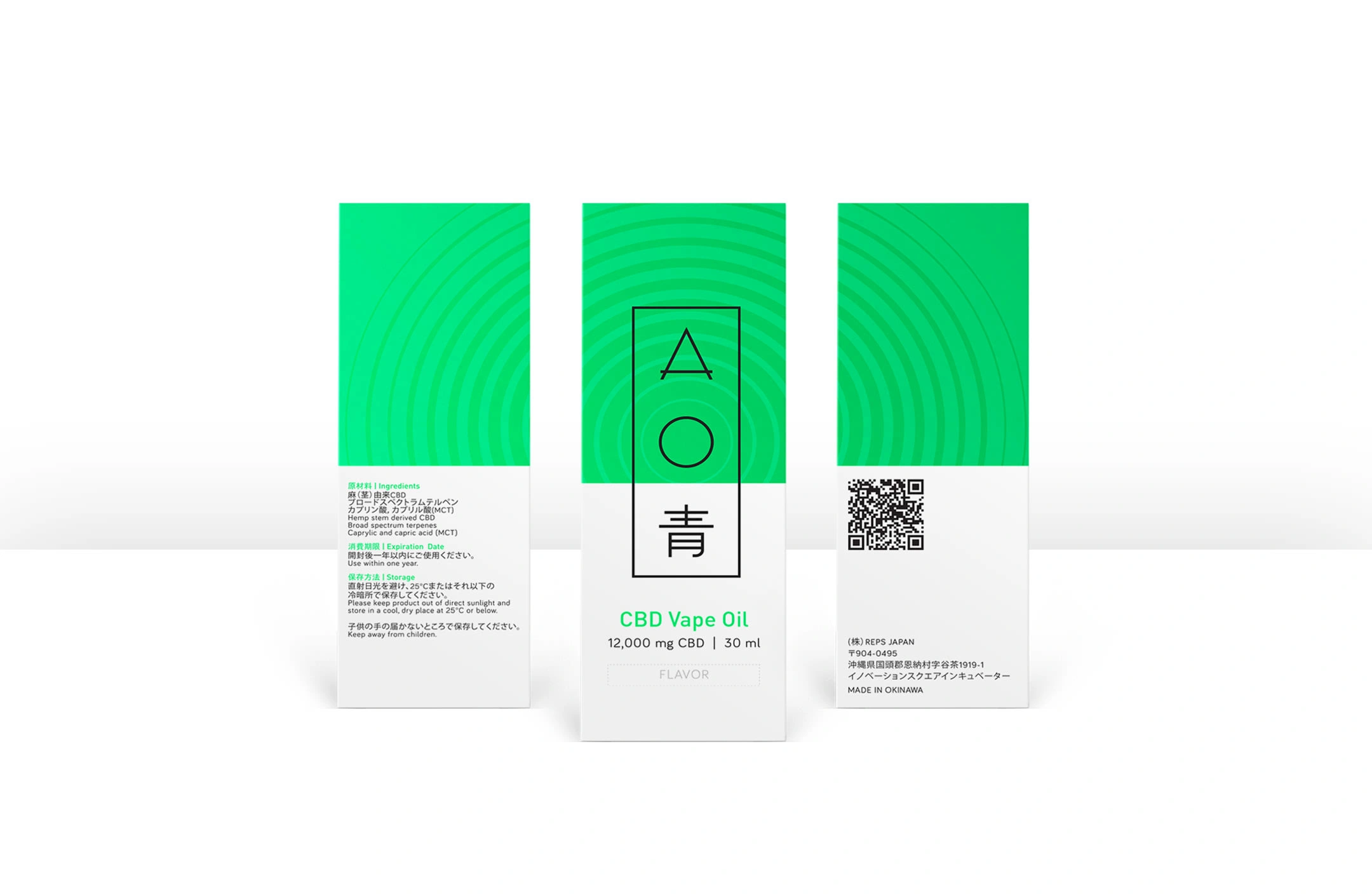
The brand slogan is ‘Changing Perceptions, Enhancing Your Senses’, and this is represented by the stylized triangular form of the ‘A’, which means delta or change, and the circular ‘O’, which represents notions of perception, infinity, and life. This is further symbolized by the key visual of pulsating concentric circles on which the brand mark is perfectly centered.
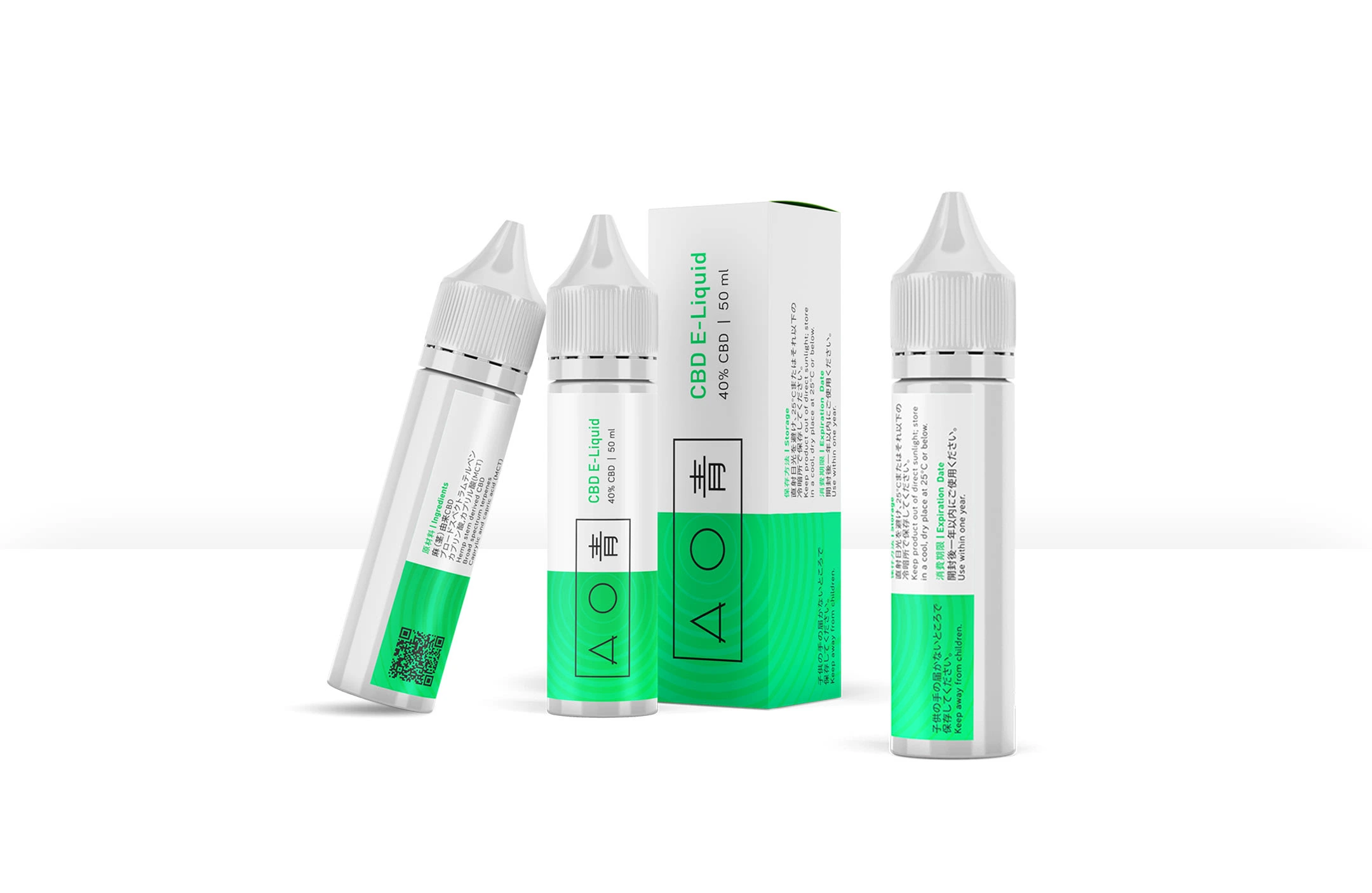
Applied on packaging, the kanji in the brand mark is perfectly delineated so Japanese viewers immediately perceive it separately from the English name.



Like this project
0
Posted Jun 25, 2023
Brand Identity and Packaging Design for Ao, an innovative line of CBD products that offers various ways to tap into your psyche and biohack your performance


