Report Builder Redesign
The Problem:
Our clients frequently expressed frustration with the report creation process, especially in the "Report Layout" step. Users found the interface confusing, leading to difficulties in understanding the purpose of the screen. Testing revealed a significant issue, with 3 out of 5 users consistently getting lost during this crucial step.

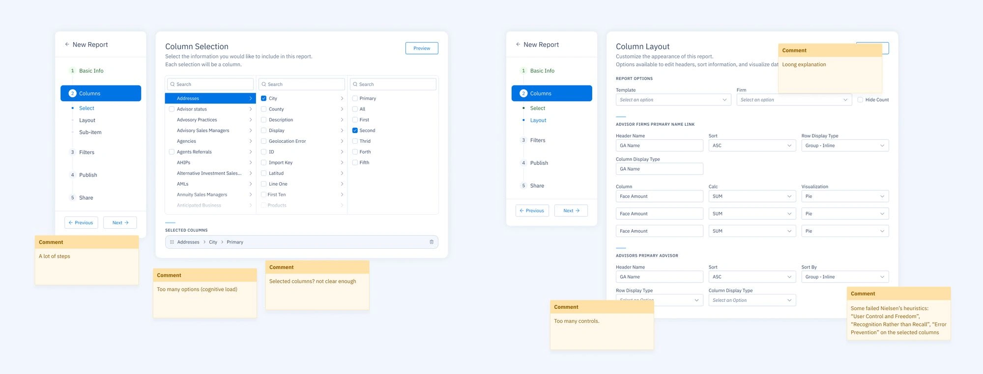
First issues noticed on desk research
Research Insights:
Upon closer examination, it became apparent that the traditional approach, requiring users to fill out a complex form with various layout settings, was a major source of confusion. Users struggled to grasp the goal of the screen and the report's final output.
What some users mentioned:
*I always have trouble finding the settings I need. It feels like I'm lost every time I try to make a report. *****
I find the report builder too complicated, it's hard for me to understand.
*Everything is too difficult and the directions aren't clear. It's like putting together a piece of furniture with no instructions. *****
Initial Attempts:
To address the confusion, we experimented with refining the copy in the interface. Despite our efforts, testing indicated that the issue persisted, with a substantial number of users still feeling disoriented during the report layout stage.
Revamping the Approach:
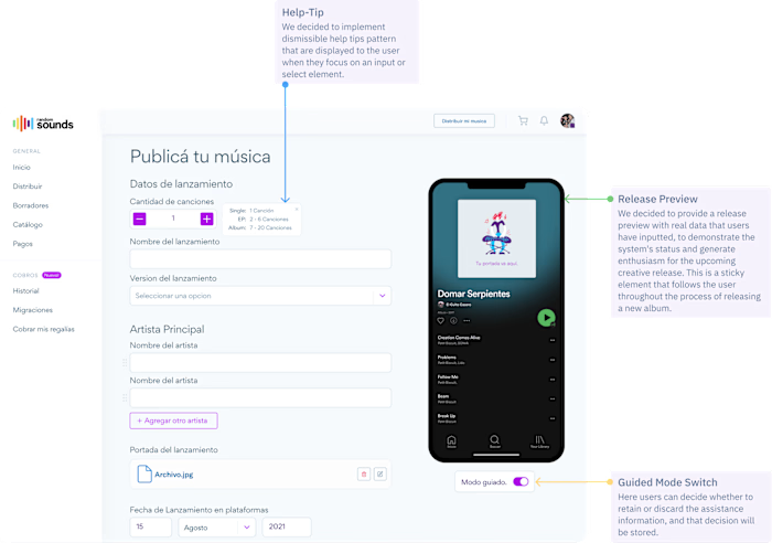
Recognizing the need for a more drastic solution, we opted for a complete revamp of the "Report Layout" screen. Instead of relying on a form-based approach, we introduced a direct interaction model. Users could now touch the actual report output to make changes, eliminating the need for a complicated form.
Testing the Redesigned Interface:
After implementing the new approach, we conducted comprehensive testing. The results were transformative. Users found the redesigned interface intuitive, leading to a remarkable improvement in task completion times and overall user satisfaction. The direct interaction with the report output significantly enhanced clarity and usability.
I love being able to interact directly with the report. It's so much more intuitive.
The changes make everything smooth. I can see updates as they happen,
Results:
The redesign resulted in a substantial improvement in the overall user experience. Task completion times were significantly reduced, and user feedback indicated a newfound satisfaction with the clarity and usability of the "Report Layout" screen.

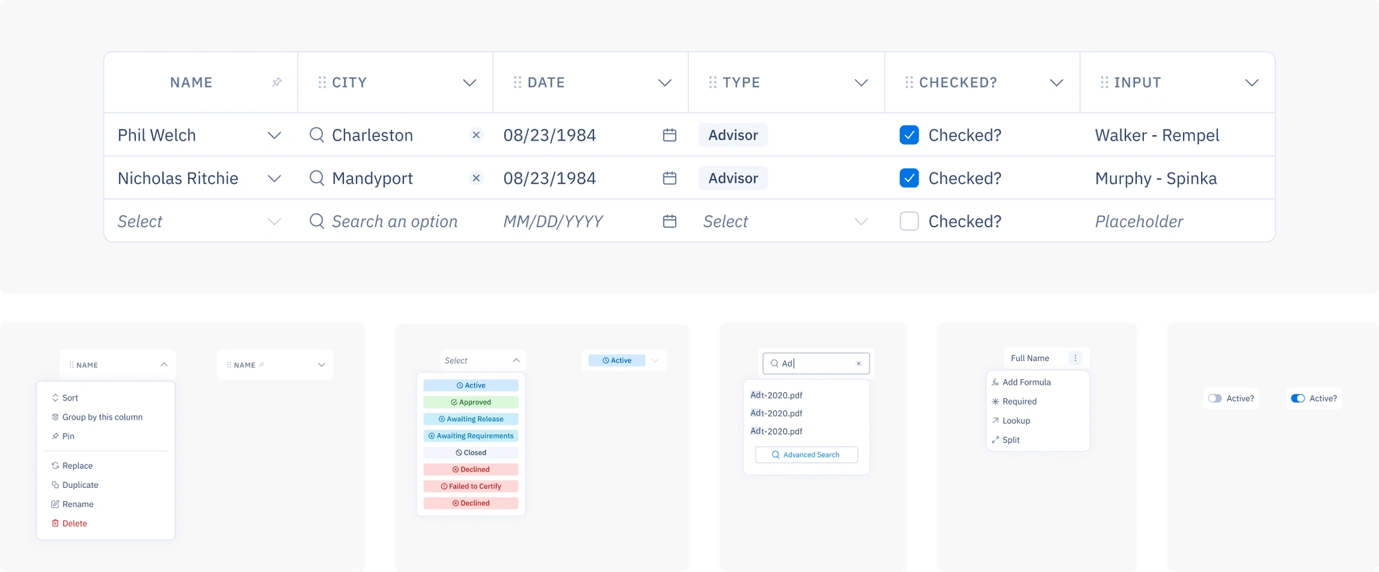
The data grid, one of the patterns designed for this improvements.
Conclusion:
By prioritizing user interaction and focusing on clarity, we successfully addressed the longstanding issues surrounding the report creation process. The revamped design not only met but exceeded user expectations, showcasing the impact of a user-centric approach in solving complex usability challenges.

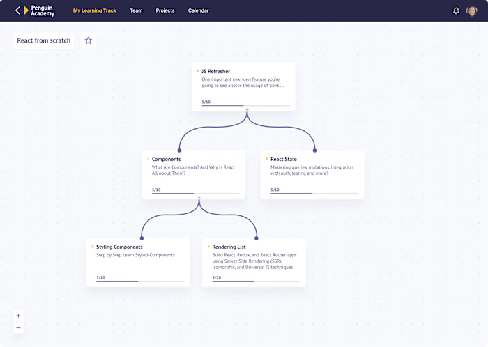
New version, we have 2 less steps in the process without a condensed set of controls
Like this project
Posted Apr 24, 2024
Revamped report builder: direct interaction streamlines creation, improving clarity and user satisfaction. Reduced task times and confusion.
Likes
0
Views
9


