FastMailBox — Product Marketing Deck
Zain Khan
Verified
FastMailBox — Product Marketing Deck
Role: Visual & Presentation Design
Scope: 5-slide product marketing deck + visual system
Deliverable: Flexible asset kit for landing page, social, and pitch use
The brief
FastMailBox is an AI email product with real depth — it connects to Gmail and Outlook, auto-categorizes your inbox, pre-drafts replies using your calendar and email history, surfaces analytics on who's clogging your inbox, and handles bulk unsubscribes. Genuinely useful. But when the team tried to explain all of that, it came out as a feature list — flat, hard to scan, and easy to confuse with every other AI inbox tool on the market.
They needed a visual story. Something that could anchor their landing page, carry a pitch, and work as a standalone social asset without losing coherence. One deck, five slides, one clear promise per slide.
The approach
Before designing anything, I mapped the product down to five distinct moments a user would actually feel:
Getting set up
Seeing a clean inbox for the first time
Letting AI draft a reply
Customizing how it works
Cleaning out the noise
Each slide had to land one of those moments on its own, while still reading as part of the same product when placed side by side. That meant building a visual system first — typography, background texture, 3D accent language, UI treatment — then applying it consistently across all five.
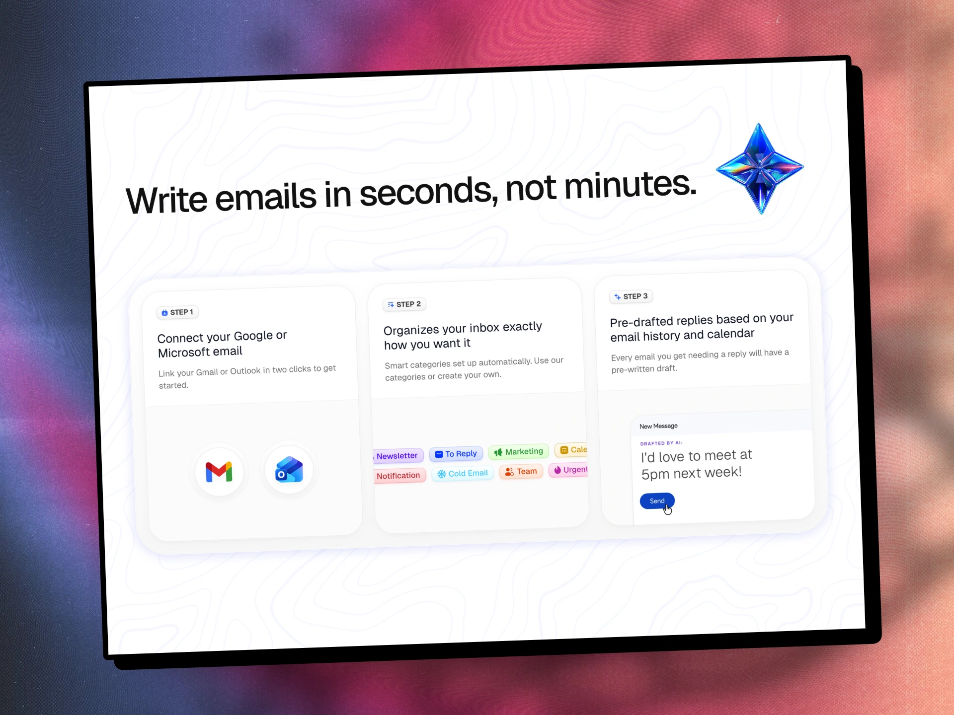
Slide 1 — Onboarding in three steps
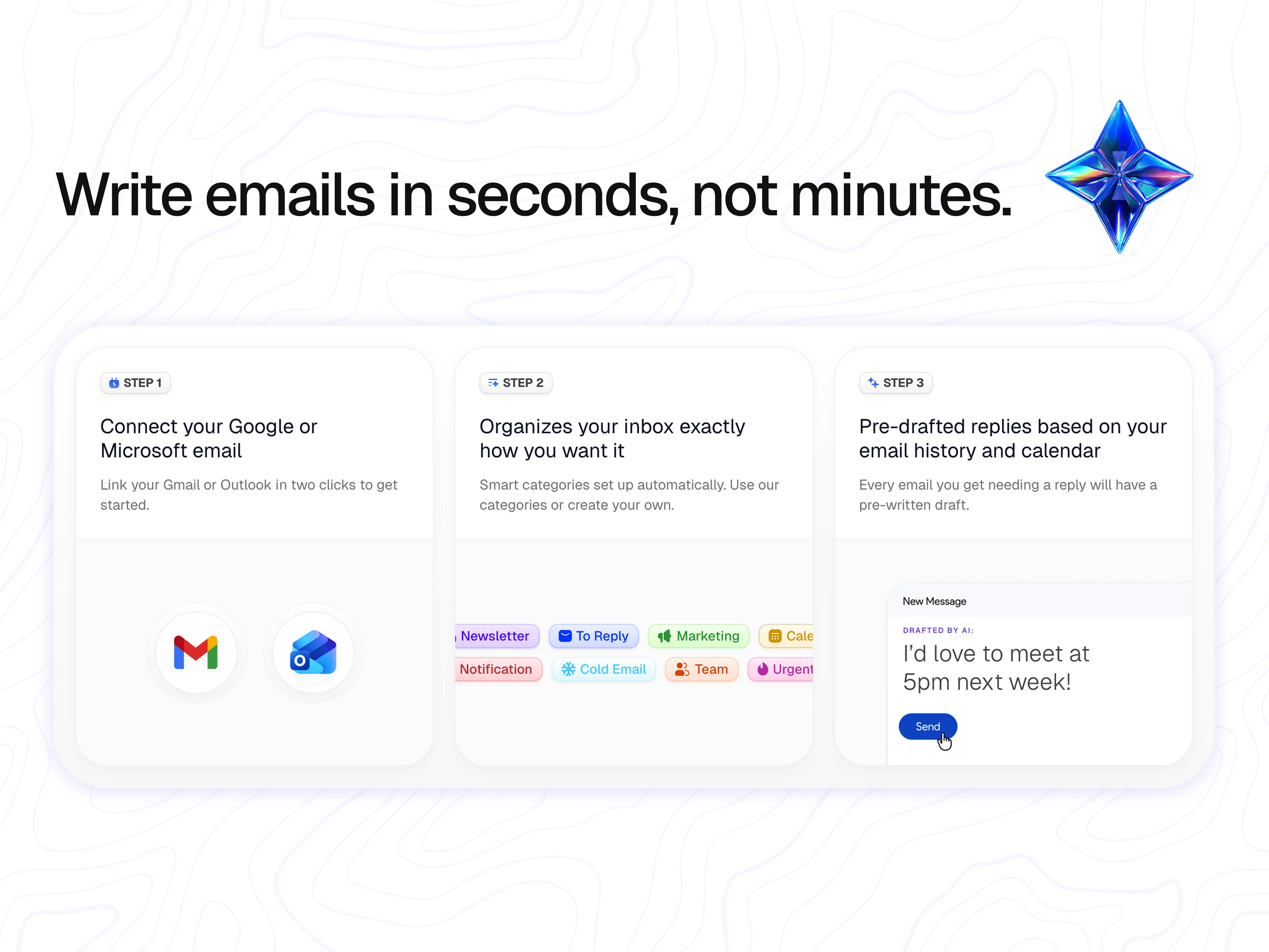
"Write emails in seconds, not minutes."
The deck opens on the core promise. I chose a three-card layout because the actual product onboarding is three steps, and mirroring that structure in the visual sets expectations immediately: this is simple, and here's exactly how simple.
The Gmail and Outlook logos in Step 1 anchor credibility — users know instantly this isn't a new email client to migrate to. Step 2's category pills (Newsletter, To Reply, Marketing, Cold Email, Team, Urgent) preview the organizational payoff. Step 3 shows the draft moment with a casual, human example ("I'd love to meet at 5pm next week!") — intentionally warm, not corporate, to signal the tone of AI you're actually getting.
The iridescent 3D star in the top-right became the visual anchor I'd carry through the whole deck.
Slide 2 — The before/after
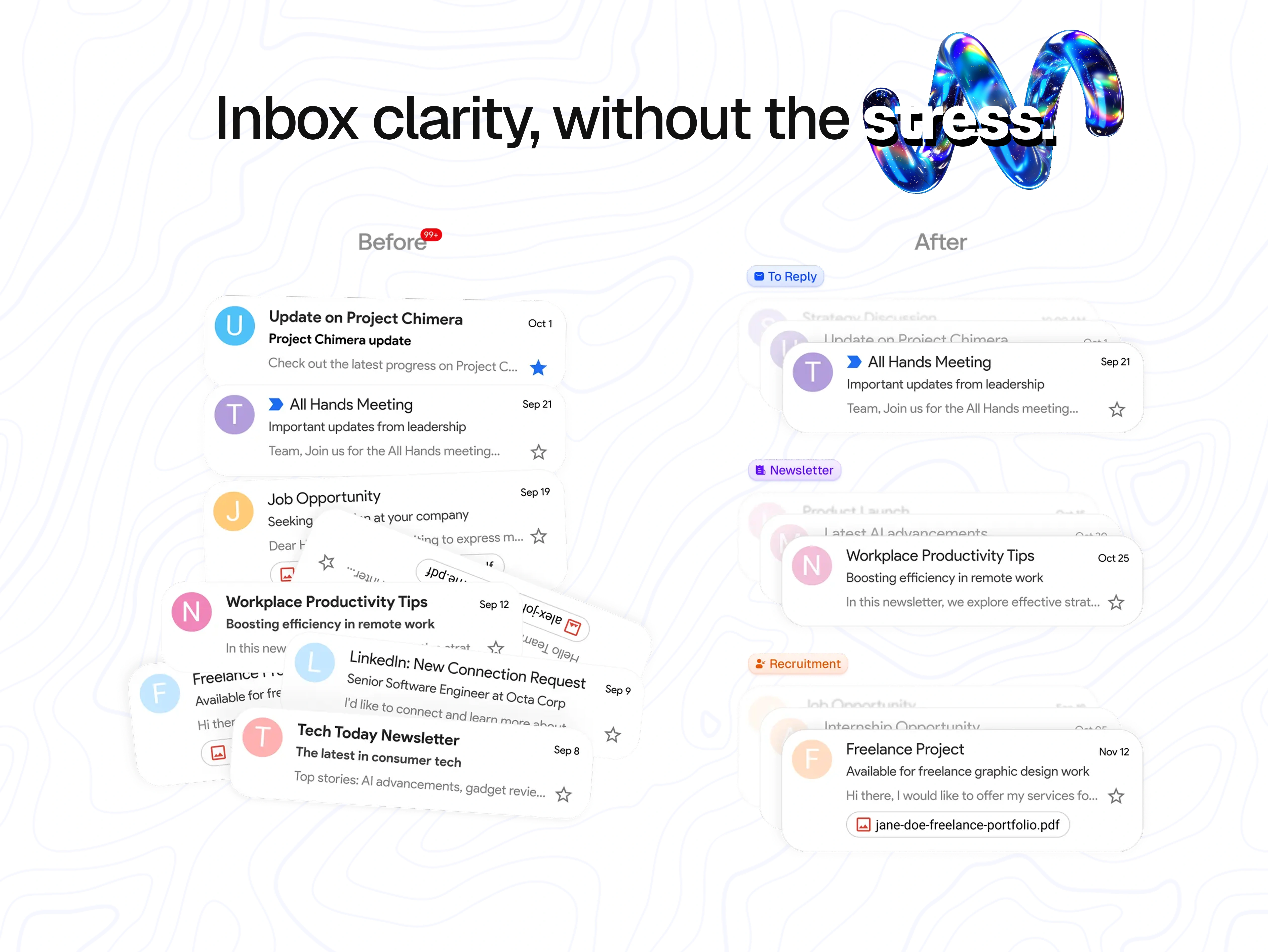
"Inbox clarity, without the stress."
This is the emotional slide. The "before" side is deliberately chaotic — overlapping, rotated email cards with a "99+" unread badge. You can feel it before you read it. The "after" side is calm: clean vertical stack, clear category labels (To Reply, Newsletter, Recruitment), one thing at a time.
The headline itself reinforces the shift — "stress" is styled in an outline treatment that visually dissolves under the 3D spiral form, as if the word itself is being unwound. Small typographic move, but it does a lot of work.
This slide is the one that tends to stop scrollers on social. It trades on a universal pain point without needing any explanation.
Slide 3 — AI drafting + integrations
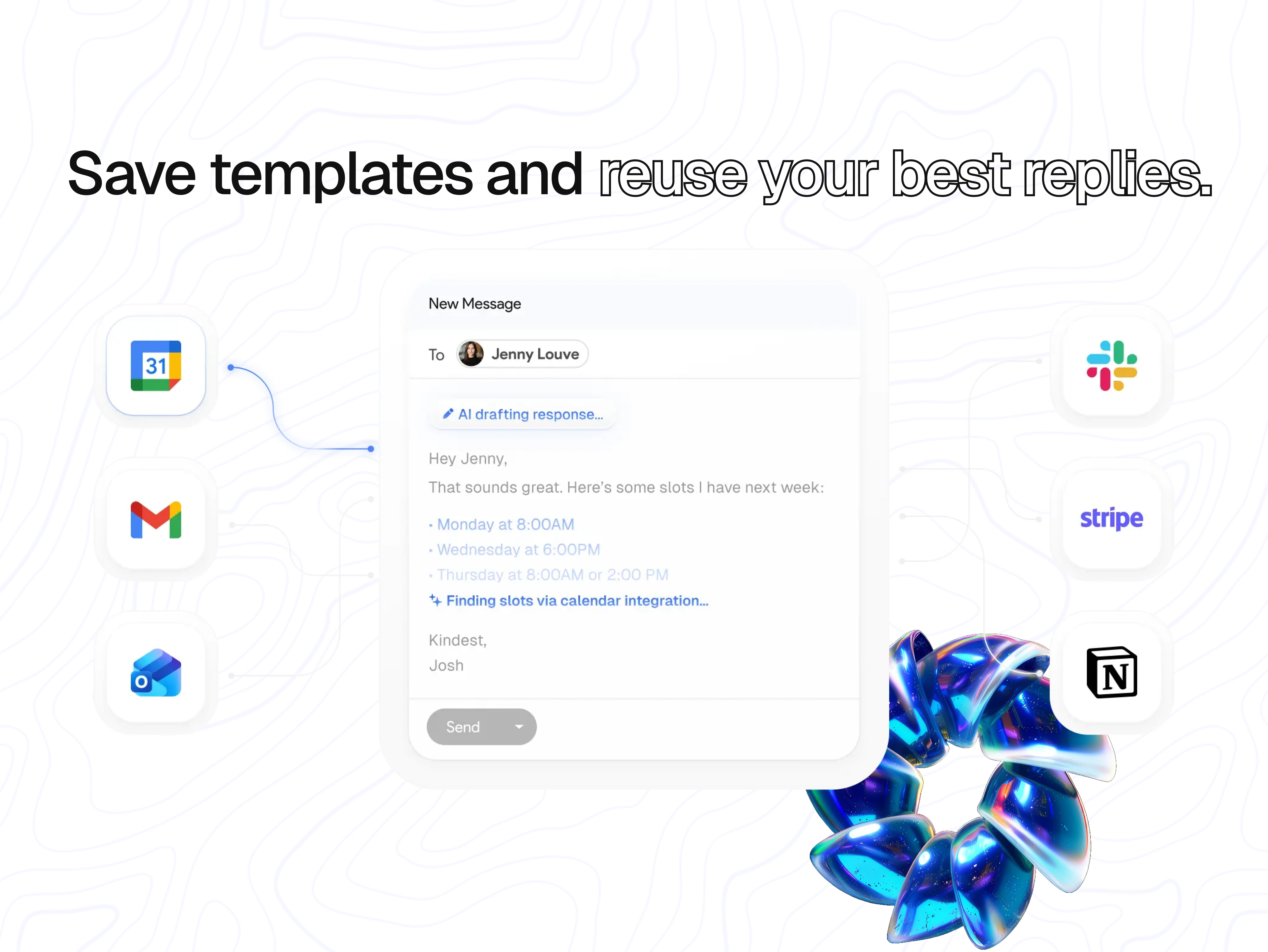
"Save templates and reuse your best replies."
Now that the user trusts the product can organize, slide 3 shows what it can do. The centerpiece is an AI-drafted reply mid-generation — "AI drafting response..." at the top, "Finding slots via calendar integration..." in the body — demonstrating the product isn't just generating generic text, it's pulling from the user's actual schedule.
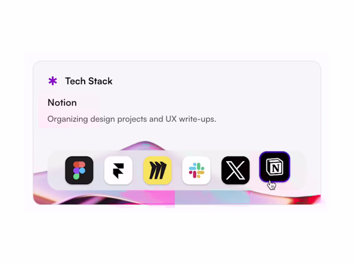
The surrounding app icons (Google Calendar, Gmail, Outlook, Slack, Stripe, Notion) do double duty: they show ecosystem compatibility and quietly establish FastMailBox as a workflow tool, not just an inbox skin. The headline uses the same outline-type treatment ("reuse your best replies") to maintain visual rhythm with slide 2.
The iridescent 3D flower form in the bottom-right breaks the grid and adds premium weight without competing with the UI.
Slide 4 — Depth features
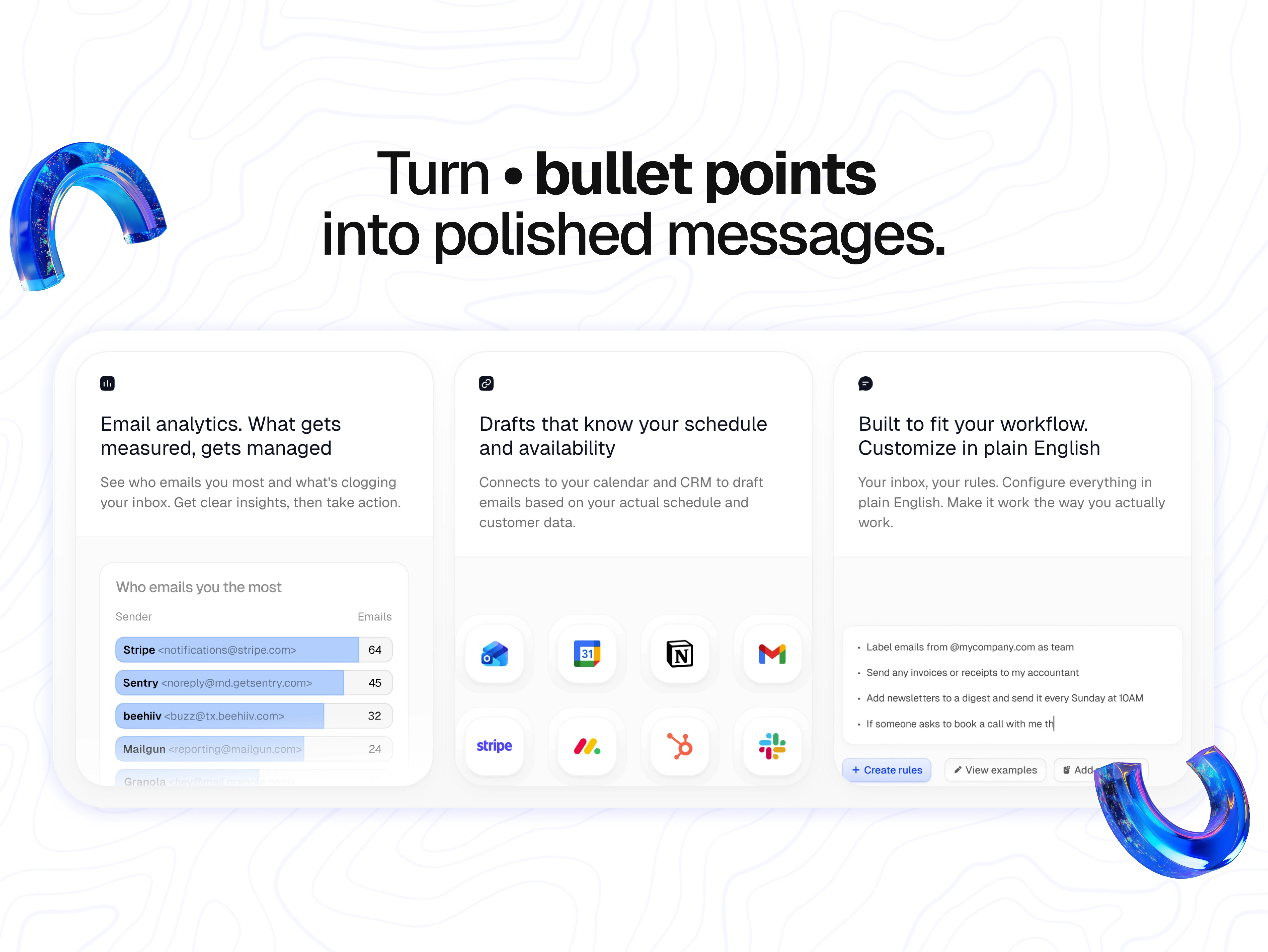
"Turn bullet points into polished messages."
Slide 4 is the power-user slide. Three feature cards, each tackling a different objection:
Email analytics — "What gets measured, gets managed" — with a real sender breakdown (Stripe, Sentry, beehiiv, Mailgun) that feels honest rather than mocked up
Calendar/CRM-aware drafts — a tight icon grid showing deep integrations (Outlook, Calendar, Notion, Gmail, Stripe, Monday, HubSpot, Slack)
Plain-English rules — showing the actual interface where users type things like "Label emails from @mycompany.com as team" or "Add newsletters to a digest and send it every Sunday at 10AM"
The headline mimics a markdown bullet ("Turn • bullet points / into polished messages") — a small wink to anyone who's ever written notes that way. The two 3D arc forms frame the slide without enclosing it.
Slide 5 — The cleanup payoff
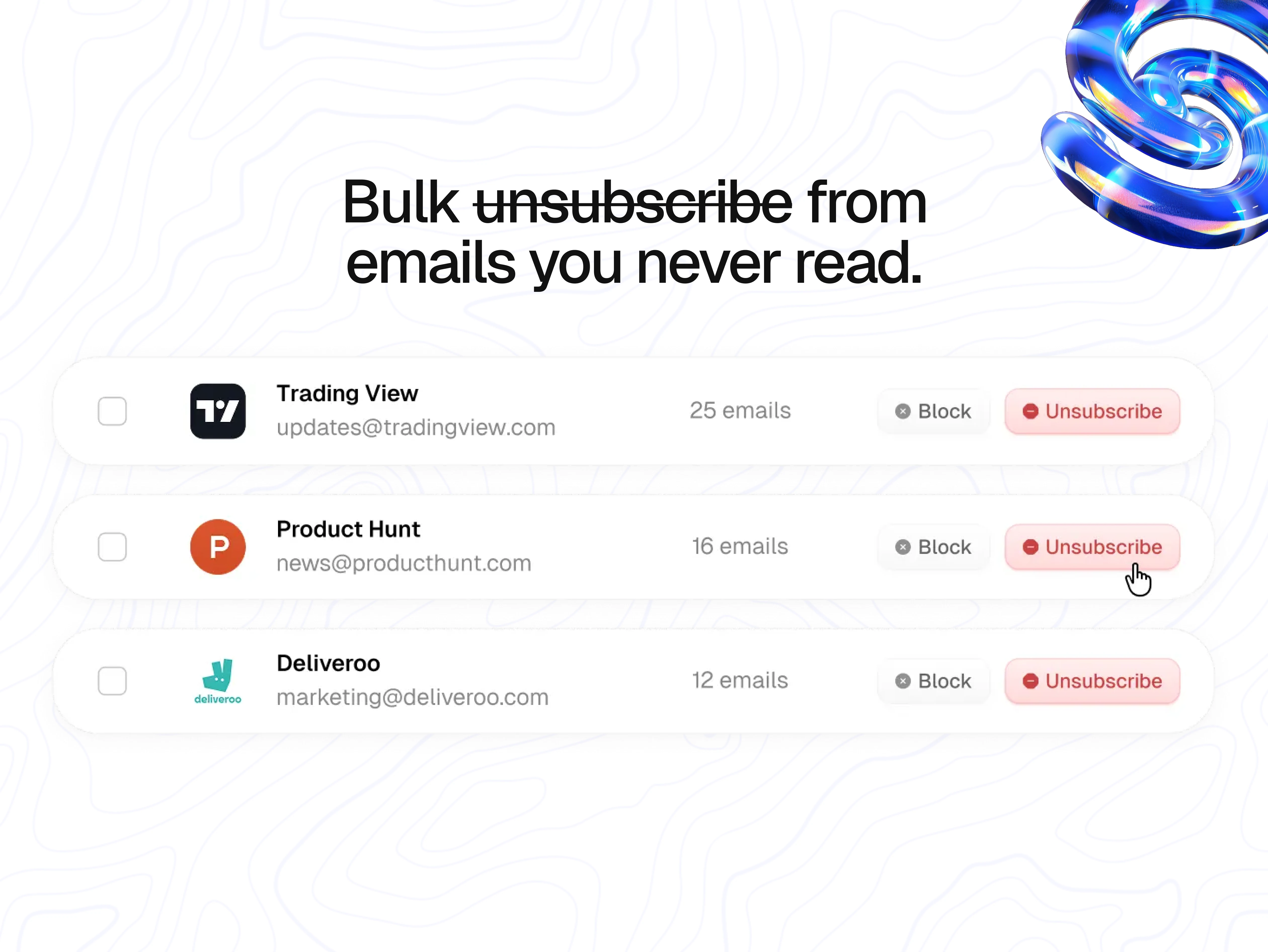
"Bulk unsubscribe from emails you never read"
The deck closes on the most satisfying action in any email tool: getting rid of stuff. I used real, recognizable senders (Trading View, Product Hunt, Deliveroo) because generic placeholders would've undercut the relatability. Everyone reading this has 25 unread Trading View emails.
The headline strikes through "unsubscribe" itself — a literal demonstration of what the feature does. The red Unsubscribe buttons and cursor hover state make the action feel one-click easy, which is the whole point.
The iridescent 3D spiral in the top-right closes the visual loop with slide 2's form language.
The visual system holding it together
Four things repeat across every slide, and that repetition is what makes five different feature explanations feel like one product:
Topographic line background — subtle, never competing, but signature enough that any single slide is instantly recognizable as FastMailBox
Iridescent 3D accents — star, spiral, flower, arcs, spiral — different forms, same material language
Outline typography on emphasis words — "reuse your best replies," "bullet points," "stress" — creates rhythm across the deck
Isolated UI fragments instead of full screenshots — each slide shows one product moment, not a cluttered app view
Skills applied: Product marketing design · Presentation design · Visual design · Art direction · Typography · Layout · 3D accent direction · Visual storytelling
Like this project
Posted Apr 22, 2026
Built FastMailBox's visual story — a 5-slide deck translating complex AI email features into clear, scannable product moments.
Likes
0
Views
10
Clients
YaseenAI, Inc.