Viggle.ai UI/UX Design Project
Approve request to show earnings
View
Yusra Shoaib
Verified
Viggle.ai – Web & Mobile UI/UX Design
Designing the moment where AI feels like magic
Viggle.ai is an AI-powered creative platform that transforms still images into motion, enabling users to animate faces, scenes, and characters with ease. I was brought in to design the end-to-end web and mobile experience, shaping how creators interact with advanced AI in a way that feels intuitive, expressive, and effortless.
The core objective was simple, but ambitious:
turn a powerful AI engine into a creative experience anyone can enjoy.
The Challenge
Viggle had impressive underlying technology, but the early interface felt technical, dense, and geared toward experienced users. For a product built on creativity, the experience lacked emotional pull.
The challenge wasn’t just usability, it was perception.
We needed to:
Translate complex AI workflows into something visually intuitive
Remove friction without removing creative control
Make the product feel inspiring rather than instructional
Design a seamless experience across both web and mobile
Deliver instant value within the first interaction
At its core, this was about bridging the gap between engineering and imagination.
Strategic Direction
We repositioned Viggle from a tool into a creative playground.
Instead of guiding users through steps, we focused on helping them feel momentum. The experience needed to reward curiosity immediately, letting users see results fast while still offering depth for exploration.
Every decision was driven by one principle:
reduce thinking, increase creating.
The Solution
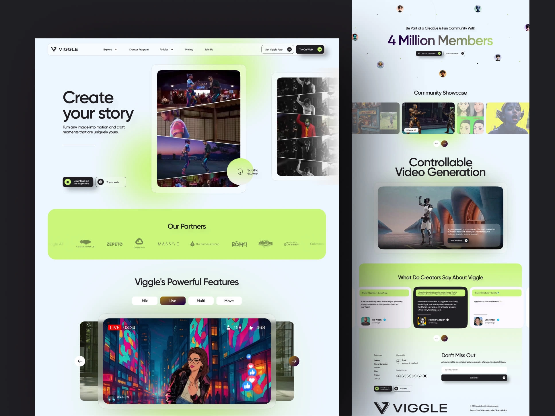
1. Cinematic Web Experience
The web platform was designed with a distraction-free, immersive layout:
Fullscreen previews to highlight output over interface
Minimal UI chrome to keep focus on the content
Contextual controls that appear when needed
Clear separation between input, preview, and actions
This created a workspace that feels more like a studio than a dashboard.
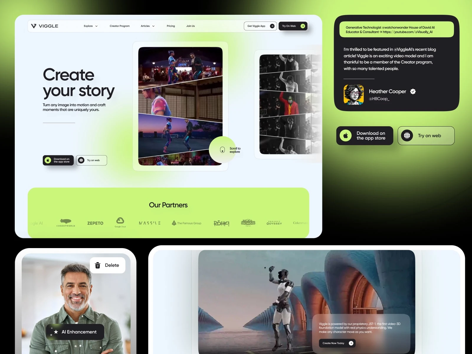
2. Mobile-First Interaction Design
On mobile, speed and ease were critical.
Thumb-friendly controls for quick edits
Gesture-based interactions for a more tactile feel
Fast upload-to-preview flow to maintain engagement
Optimized layouts for vertical content consumption
The goal was to make creation feel instant and natural, even on a small screen.
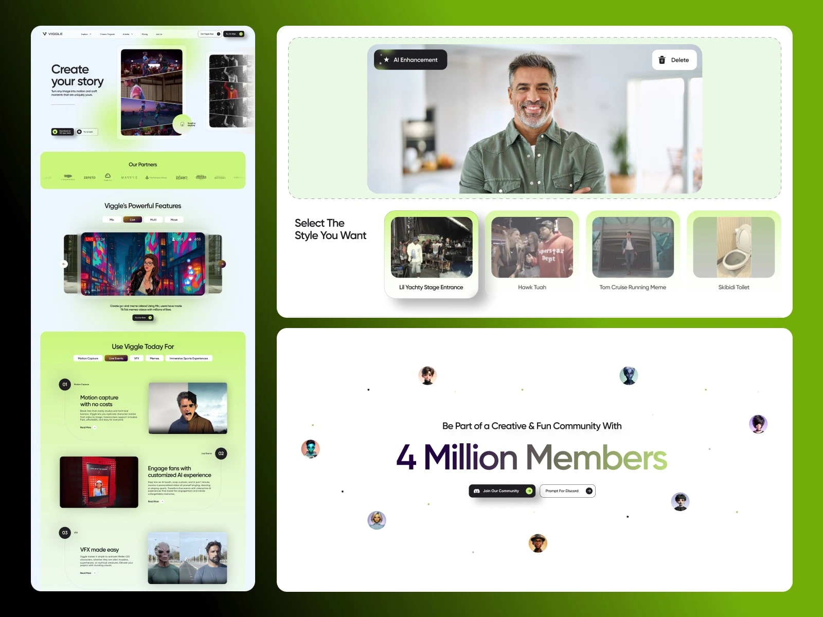
3. Onboarding That Converts Curiosity
Instead of explaining features, onboarding focused on showing results.
Guided first interaction within seconds
Smart defaults to remove decision fatigue
Visual cues to direct attention and next steps
Immediate output to create a “wow” moment
Users weren’t taught how to use the product, they experienced it.
The Process
Research & Product Understanding
I explored platforms like Runway, Kaiber, and Canva to understand how users approach creative AI tools. The key insight:
Users want speed and simplicity, but not at the cost of creative control.
This shaped the balance between automation and customization.
Flow Optimization
The entire journey was simplified into a clear path:
Upload → Edit → Animate → Share
Removed unnecessary steps
Introduced smart presets
Reduced decision points
Maintained continuous visual feedback
The experience was designed to feel like a flow, not a process.
Visual & Interaction System
The visual language was intentionally minimal and cinematic:
Dark, neutral base to highlight content
Subtle gradients and glow effects for depth
Bold typography for clarity
Motion used as feedback, not decoration
Every interaction, hover, click, transition, was designed to feel responsive and alive.
Testing & Iteration
User testing revealed friction points around:
Understanding editing controls
Export clarity
Navigation hierarchy
These were refined through:
Clearer visual cues
Simplified action states
Improved content hierarchy
The result was a smoother, more confident user journey.
The Impact
Faster Activation: Users reached their first successful animation significantly quicker
Higher Engagement: Reduced friction led to longer creative sessions
Broader Accessibility: Non-technical users could confidently use the platform
Stronger Brand Identity: Viggle evolved into a creative-first AI product, not just a utility
Most importantly, users didn’t feel like they were using AI,
they felt like they were creating with it.
Deliverables
Full web and mobile UI/UX design (Figma)
End-to-end user flows and interaction patterns
Onboarding experience and first-use journey
Design system with reusable components
Motion and interaction guidelines
Responsive layouts and accessibility considerations
Final Reflection
This project wasn’t about simplifying AI, it was about humanizing it.
By focusing on flow, feedback, and emotion, Viggle became more than a tool.
It became a space where ideas come to life instantly.
And that shift, from complexity to creativity, is where the real value lies.
Like this project
What the client had to say
short comment so you know this is real. we are very happy, strongest recommendation.
Hang Chu, WarpEngine Canada Inc
Jun 28, 2025, Client
Posted Jul 1, 2025
Designed a web and mobile UI/UX for an AI platform, turning complex image-to-motion tools into a seamless, intuitive, and engaging creative experience.
Likes
7
Views
230
Timeline
May 31, 2025 - Jun 28, 2025
Clients
WarpEngine Canada Inc