CAOS — Website Design & Interaction

Jorge Toloza


A bold digital identity for a culture agency
CAOS is a creative agency working across sport, fashion, music, and design, with a portfolio that includes Nike, Arsenal, and Valentino. This project brought that world into a website built around expressive typography, campaign imagery, and playful interaction.
Working with DDS Studio, I designed the website, with development by Diana Toloza. The project combined Figma for design, Nuxt.js for development, and Prismic as the content platform.
The design challenge
The central design challenge was balance: give CAOS a distinctive presence while keeping its work and capabilities easy to explore. With such varied campaign imagery, the interface needed a consistent visual language that could hold everything together.
The design pairs a restrained black-and-white foundation with oversized type and generous space. This gives the agency a strong voice while leaving room for the photography and film to carry the color, energy, and subject matter of each project.
From first impression to project discovery
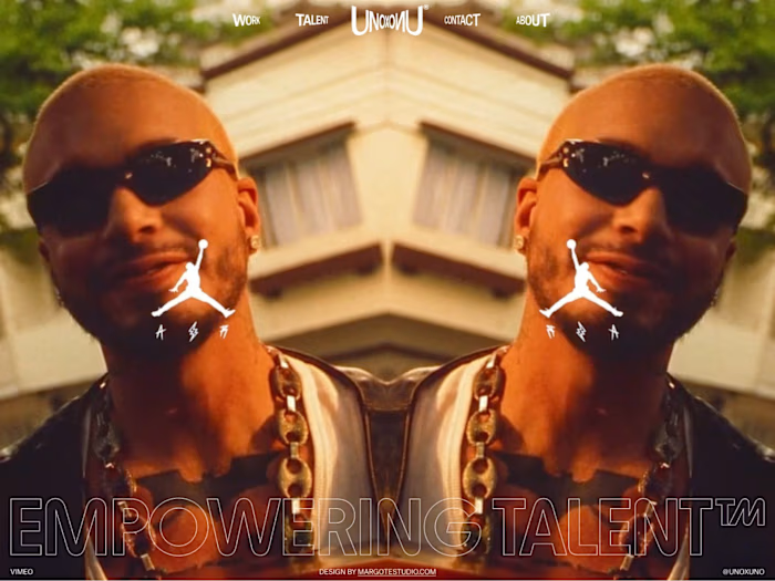
The homepage opens with an oversized CAOS wordmark and a stack of campaign images. The hero hover animation turns that composition into an interactive introduction, inviting visitors to engage with the work from the first screen.
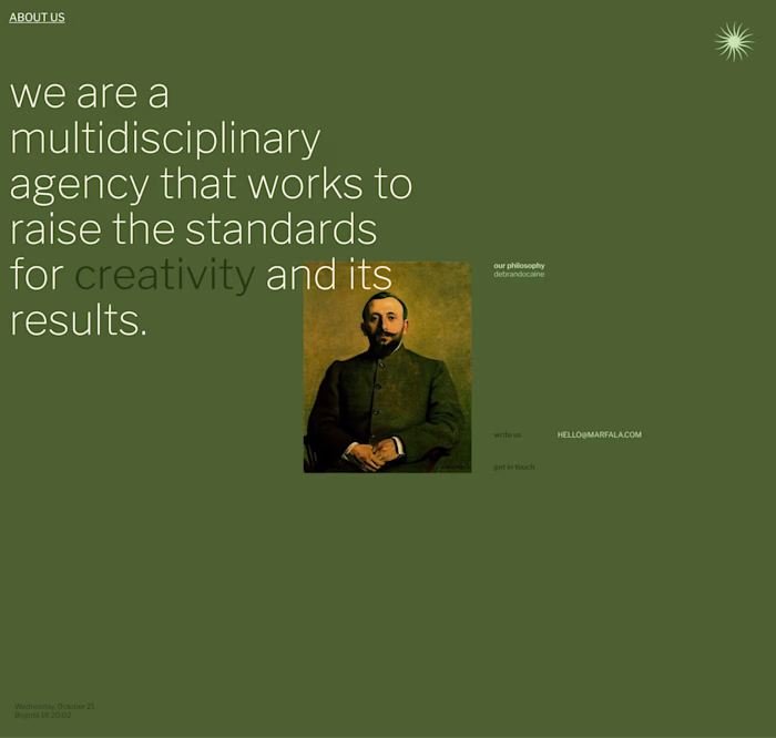
Across the About and services sections, large statements establish the agency’s positioning, while smaller text organizes supporting information. The contrast between expressive headlines and compact detail creates a clear hierarchy across very different types of content.
The Work page offers list and grid views, giving visitors a choice in how they browse the portfolio. The list treatment combines project names with image previews, carrying the site’s visual character into a practical discovery tool.
Contact details, social links, and navigation complete the journey. The footer returns to the oversized wordmark and layered imagery, giving the closing screen the same visual identity as the opening.
Project details
Scope: Website design and motion-led interaction
Tools: Figma, Nuxt.js, Prismic
Timeline: December 2024–March 2025
Design walkthrough
The visuals below document the project’s design and interaction direction, from the homepage through portfolio browsing and contact.
Credits:
Homepage interaction — a hovering stack of campaign images brings movement to the oversized CAOS wordmark.

About page — oversized statements, compact supporting copy, and generous space express the agency’s cultural positioning.

Services — imagery introduces the core capabilities, with detailed service lists organized beneath them.

Work discovery — list and grid views pair project names with visual previews, offering two ways into the portfolio.

Contact — a campaign-led invitation sits above direct contact details, social links, and navigation.

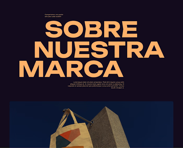
Story-page layout exploration — overlapping typography and portrait imagery, shown here with placeholder body copy.

Footer — an inverted palette reprises the wordmark and image stack, alongside new-business and social links.
The result
The project brings CAOS’s positioning, capabilities, and campaign portfolio into a consistent website experience. Oversized typography, layered imagery, and interactive project browsing connect the agency’s visual personality with clear routes to its work and contact information.
The design demonstrates how a portfolio can express an agency’s identity while helping visitors understand what it does. That balance shapes the opening impression, the service information, and the way the work is explored.
Like this project
Posted Sep 10, 2026
Website design for culture agency CAOS, combining bold typography, campaign imagery, and motion with list/grid portfolio browsing.
Likes
1
Views
47
Timeline
Dec 10, 2024 - Mar 15, 2025